Best Terracotta Paint Colors
Terracotta is back in style because it solves a real paint problem: it adds warmth without going beige or plain orange.
Benjamin Moore included it in their 2023 and 2024 color trends, while Sherwin-Williams named the lighter shade of terracotta, Redend Point SW 9081, as their 2023 color of the year.
I like seeing it return because it works in real homes, not just styled rooms.
Terracotta paint ranges from burnt orange to soft peach, pink, brown, coral, and even gray. The best version depends on your light, flooring, trim, and how much color you want to feel when you walk in.
In this article, I'll explain what terracotta is, where it works, where it can go wrong, and which terracotta paint colors are worth sampling in 2026, with tons of real photos.
What Color is Terracotta?

Terracotta, also known as terra cotta or terra-cotta, is an earthy orange-red color originally associated with baked clay.
This color sits in the orange family, but the better paint versions are softened with red, brown, pink, or clay undertones. That is why terracotta can feel grounded instead of loud. In rooms with natural materials, wood floors, linen, stone, plaster, or aged brass, it can even act like a warm neutral.
Brief History of Terracotta

Terracotta has been part of human color history for thousands of years. Early cave paintings used earth pigments in this red-orange family.

Terra cotta also became a practical building material. Fired clay has been used for floors and roofs for centuries because it is durable and fire resistant.
The villages around Sienna in Italy are especially known for their terracotta roofs.
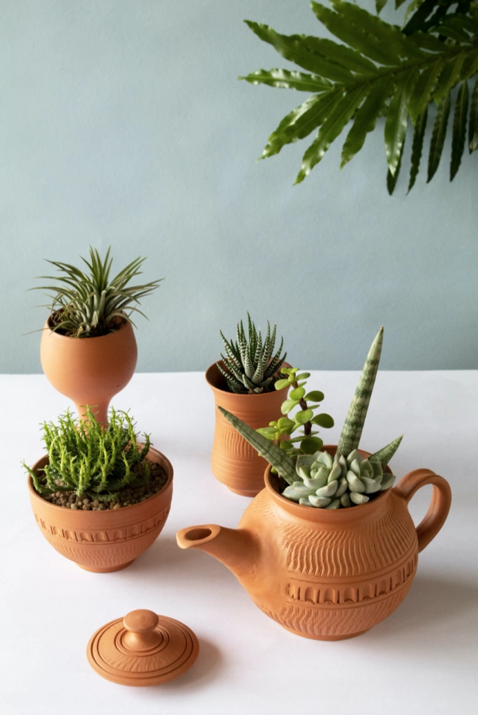
Because clay is easy to shape before firing, terra cotta is also common in pottery and sculpture. My mom still only uses handmade terracotta flower pots. She will defend them over plastic every time.
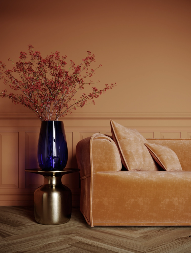
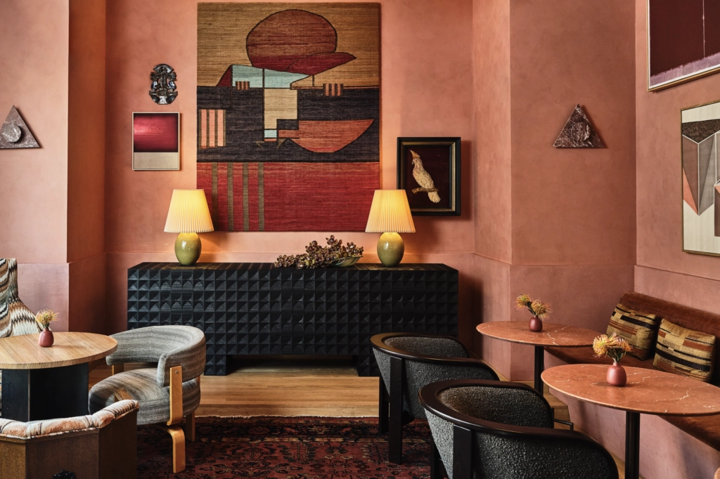
Terracotta is one of those colors that cycles in and out of trend reports but never really leaves. A soft peach version can read calm and plaster-like. A deeper orange-red version needs more confidence and better editing around it.
Now let's get practical and look at the terracotta paint colors I would actually put on a sample board in 2026.
30 Best Terracotta Paint Colors for 2026
Terracotta paint changes a lot from chip to wall. A color that looks muted on a fan deck can turn peach, rusty, or pink once it is surrounded by flooring and daylight.
I chose these colors because they cover the useful range: soft clay, pink terracotta, red-brown, copper, and deeper exterior-friendly shades from trusted brands.
This isn't a top-10 ranking. The right terracotta depends on your room exposure, fixed finishes, and how much warmth you want the walls to carry.
Benjamin Moore Terracotta Paint Colors
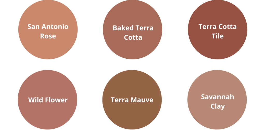
San Antonio Rose


San Antonio Rose by Benjamin Moore is a rosy terracotta that feels softer than the name suggests.
With a moderate LRV (Light Reflectance Value), it brings warmth without making the room too dark. The reddish undertone suits living rooms and bedrooms, especially if you want color but still need the room to feel calm at night.
Matching Colors: Whispering Spring, Sea Salt, White Dove
Baked Terra Cotta

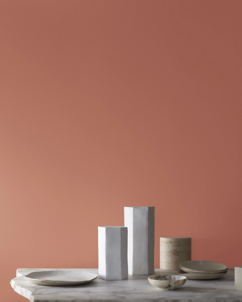
Baked Terra Cotta is close to the color most people picture when they hear terra cotta: baked clay with enough softness for interiors.
It has a relatively high LRV for this color family, so it is more forgiving in rooms that do not get strong natural light. I would still sample it on two walls because shaded corners can pull it browner.
Matching Colors: Swiss Coffee, Pale Oak, Nimbus Gray
Terra Cotta Tile

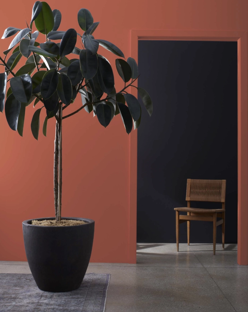
Terra Cotta Tile is one of my favorites on this list because it reads like real clay tile, not orange paint. It works well with aged wood, creamy trim, woven shades, and stone, but it can feel heavy beside very cool gray flooring.
Matching Colors: Edgecomb Gray, Stonington Gray, Navajo White
Wild Flower

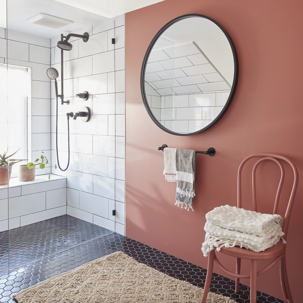
Wild Flower is a brighter, sunnier terracotta. In a bathroom, I would use it as an accent wall or vanity color unless the room has enough white tile, mirror, and daylight to balance it.
Matching Colors: Revere Pewter, Silver Chain, Platinum Gray
Terra Mauve

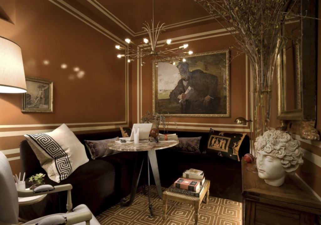
Terra Mauve by Benjamin Moore blends traditional terra cotta with a purple-pink undertone, which puts it close to mauve.
I've written more about mauve and its history as the first synthetic dye. If that undertone keeps catching your eye, that background is worth a look.
Terra Mauve is strongest in studies, libraries, and reading rooms because it feels more collected than playful. Pair it with clean whites or muted grays so the purple undertone stays intentional.
Matching Colors: Wickham Gray, Elephant Tusk, Simply White
Savannah Clay

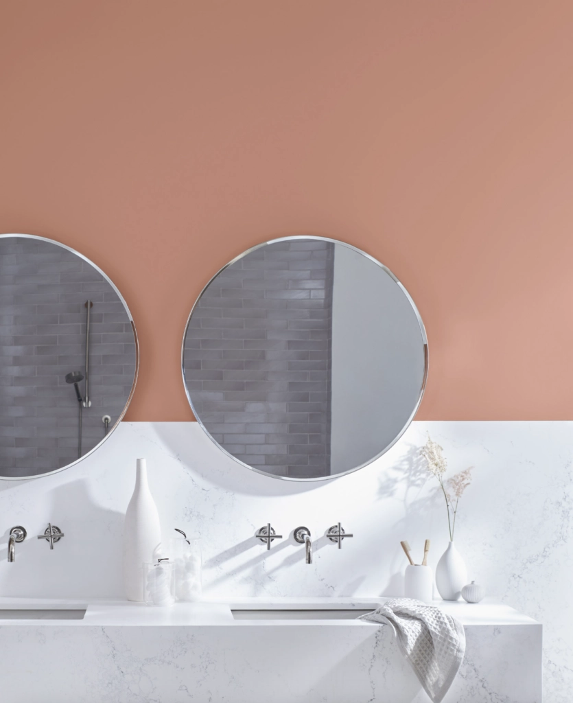
Savannah Clay has a rich but quiet red undertone. It is a good choice when you want a warmer room without going as brown or dark as a traditional brick color.
Matching Colors: Manchester Tan, Harbor Gray, Gray Owl
Sherwin Williams Terracotta Paint Colors

Cavern Clay

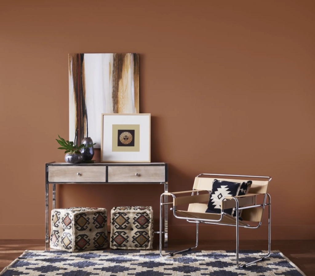
Cavern Clay gives a room a true Southwestern clay feel. It is warm and earthy, but it has enough body that I would treat it as a feature color unless the room has good light and simple furnishings.
Sherwin-Williams featured Cavern Clay SW 7701 as their 2019 Color of the Year.
The room above works because the wood furniture and art repeat the warmth instead of fighting it. I would add green plants or a muted blue-green accent to cool the palette down a little.
Matching Colors: Alabaster, Sea Salt, Repose Gray
Copper Wire

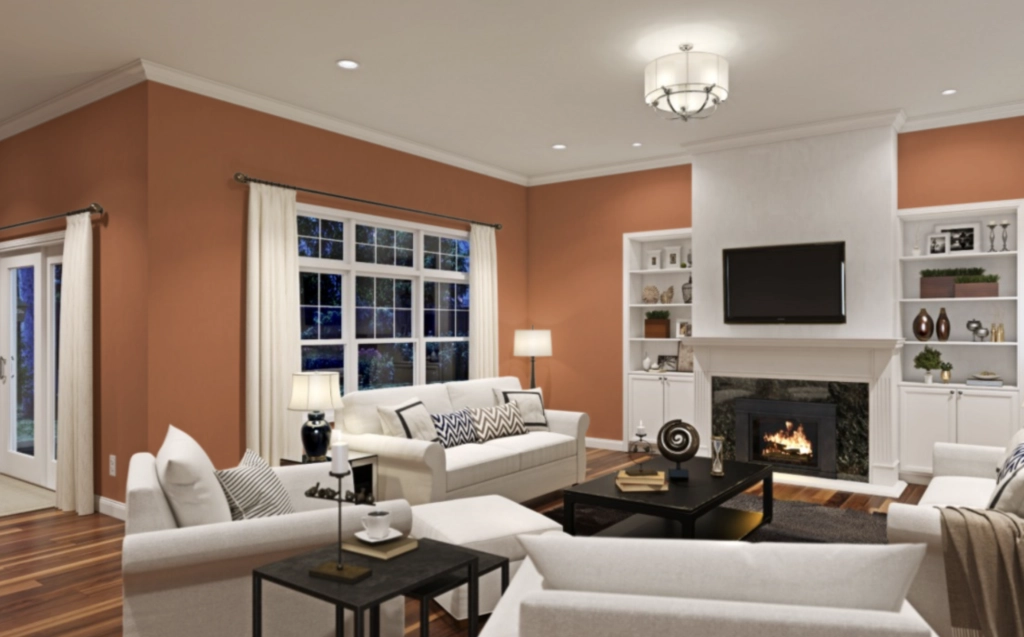
Copper Wire by Sherwin-Williams is a coppery terracotta with more polish than rustic clay.
Use it where you want the walls to carry the room, such as a living room with neutral upholstery, black accents, and warm metal finishes. It can look too sharp beside icy whites, so sample it next to your actual trim.
Matching Colors: Agreeable Gray, Tricorn Black, Extra White
Subdued Sienna

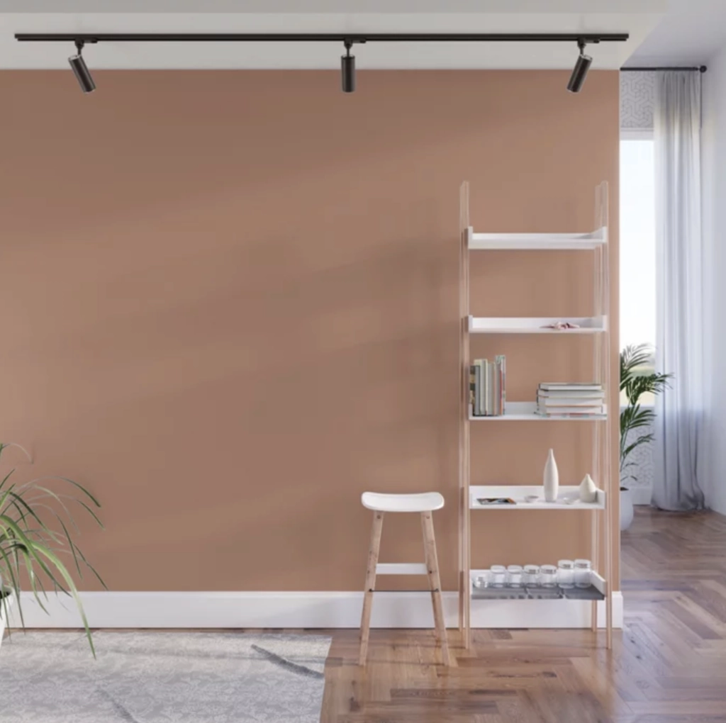
Subdued Sienna has an LRV of 35, so it sits in that useful middle range: not pale, not cave-like. It can work in a home office where you need focus or in a living room where you want warmth without a full rust wall.
Matching Colors: Mindful Gray, Dorian Gray, Oyster White
Rookwood Terra Cotta

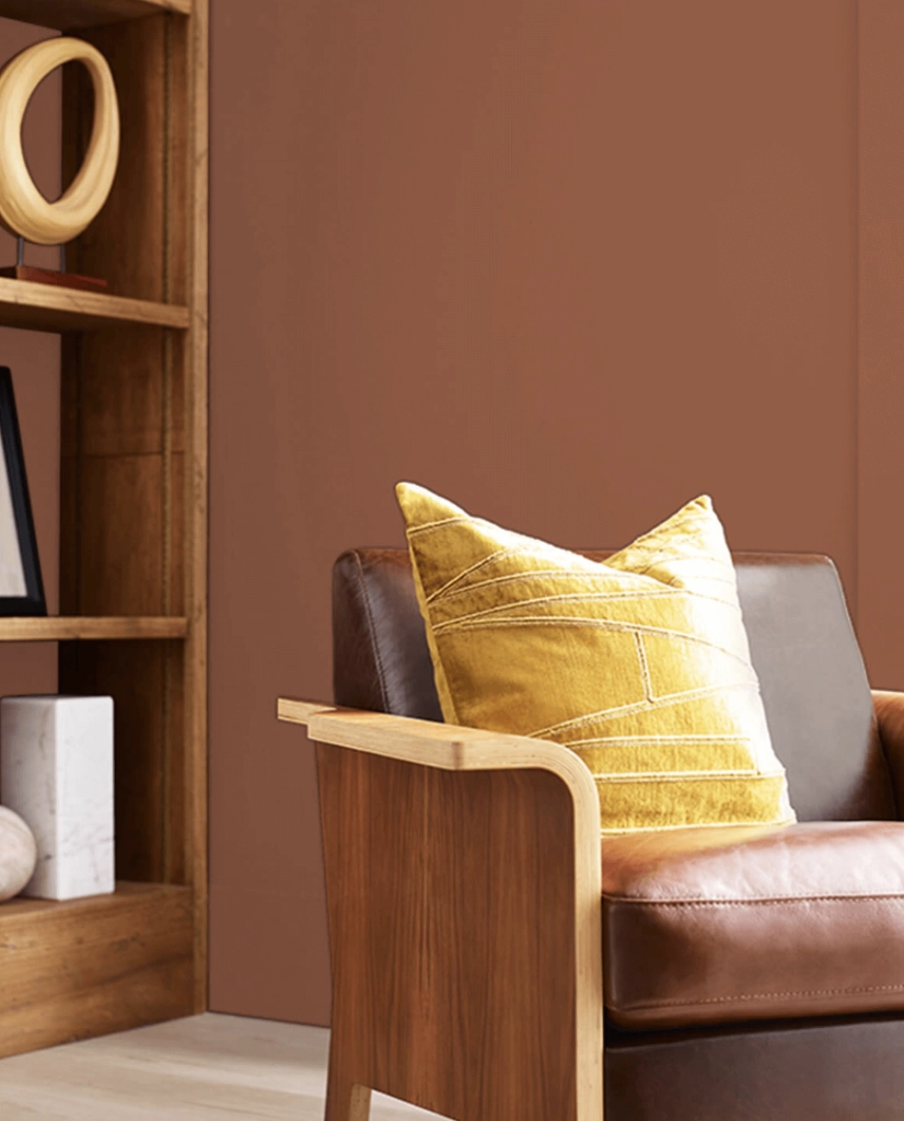
Rookwood Terra Cotta has an older, more traditional quality than the cleaner peach terracottas on this list.
It suits studies, older homes, bedrooms with vintage furniture, and rooms with deeper wood tones. If your furniture is very modern and white, this one can look disconnected unless you repeat the color in art, textiles, or tile.
Matching Colors: Pure White, Gauntlet Gray, Naval
Warming Peach

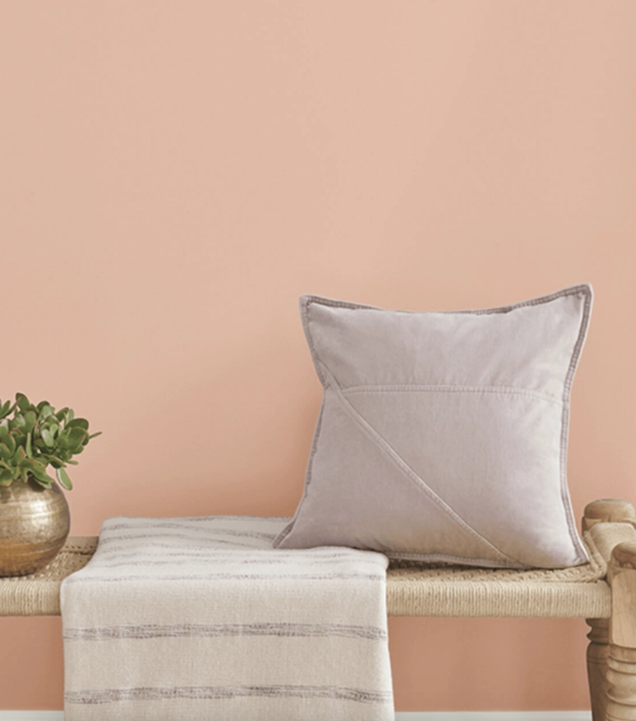
Sherwin-Williams Warming Peach is a light terracotta tint, closer to peach plaster than fired clay.
It is useful when you want warmth in a reading room, nursery, or busy family room but do not want a strong orange wall. In north-facing rooms, check that it does not turn dull or fleshy before committing.
Matching Colors: Snowbound, Balanced Beige, Eider White
Persimmon


I would describe Persimmon as a delicate peach terracotta with a softer, more decorative personality.
The kitchen pictured above shows where Persimmon makes sense: on cabinetry or accents with enough white around it to keep the color fresh.
As an accent color, Persimmon adds warmth without the weight of rust or brick. It is a good sample if you want terracotta but your room cannot handle a deep wall color.
Farrow & Ball Terracotta Paint Colors
Farrow & Ball does terracotta especially well because many of its colors have muted, historic undertones instead of looking freshly mixed and bright.
If I had to narrow this category by brand, Farrow & Ball and Benjamin Moore would be the two I would sample first.
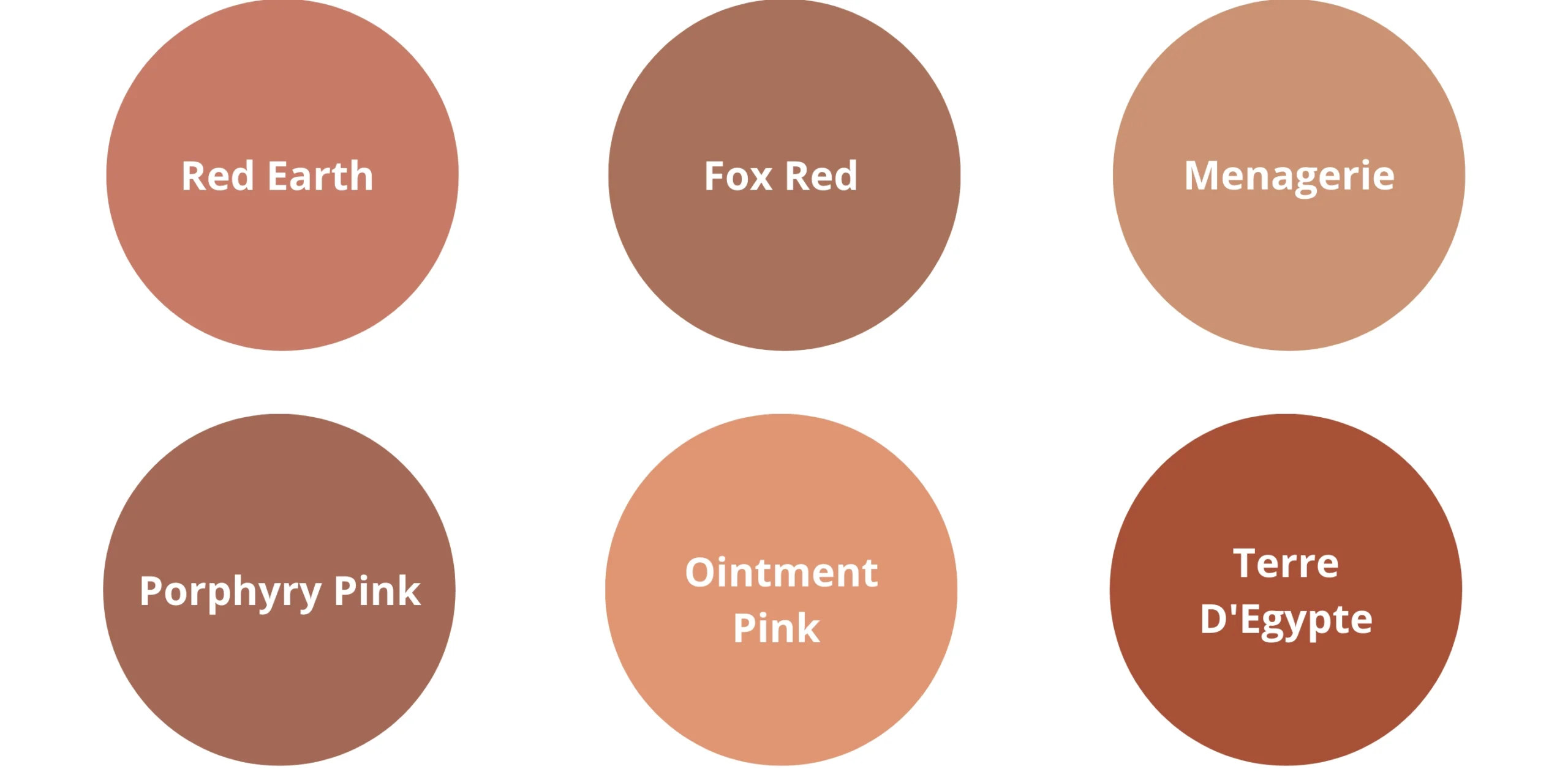
Red Earth

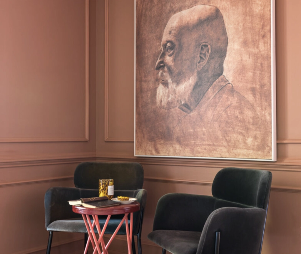
Red Earth by F&B is a warm terracotta that reflects more light than many deeper clay colors. It can work in a living room or study when you want color on all four walls but still need the space to breathe.
Matching Colors: Cream, Navy Blue, Forest Green
Fox Red

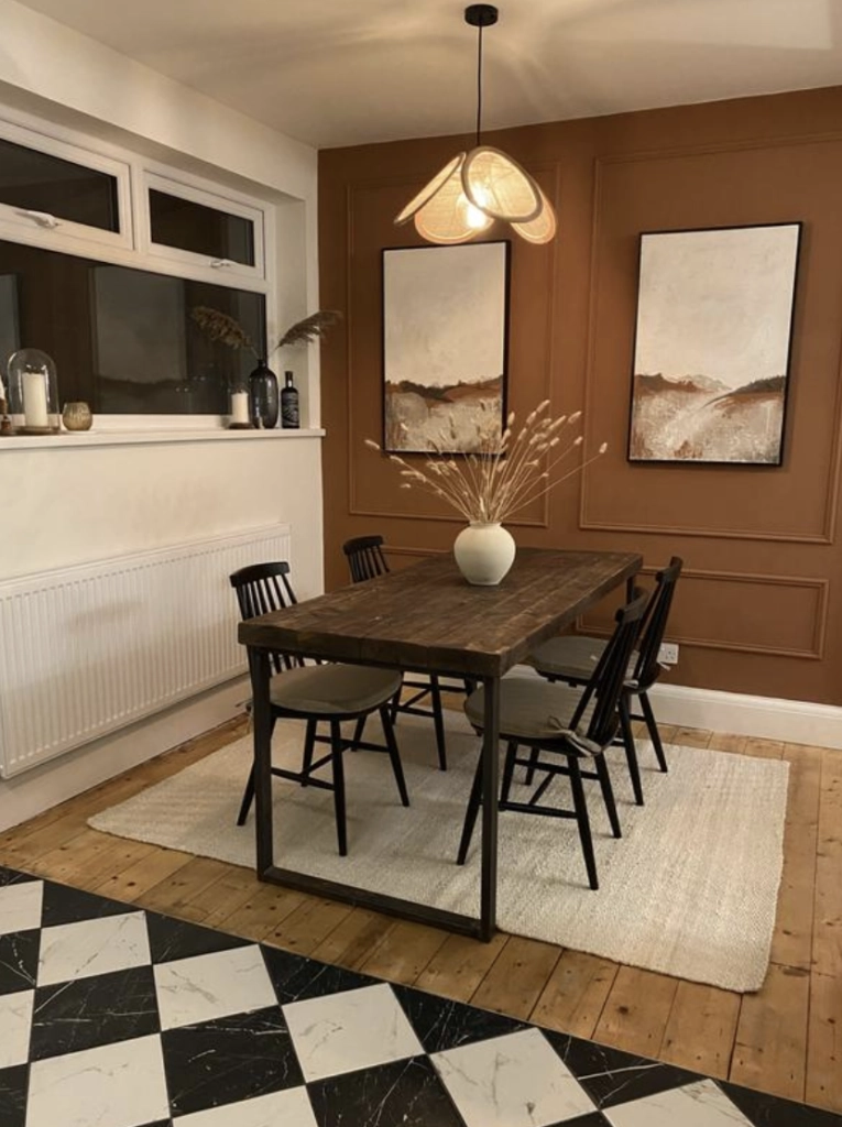
Fox Red is stronger and redder than Red Earth. It gives a room depth quickly, so it is best with edited furniture, softer textiles, and trim that is not too stark.
It looks especially good in warm artificial light because the red undertone becomes richer instead of muddy.
Matching Colors: Light Gray, Charcoal, Mint Green
Menagerie

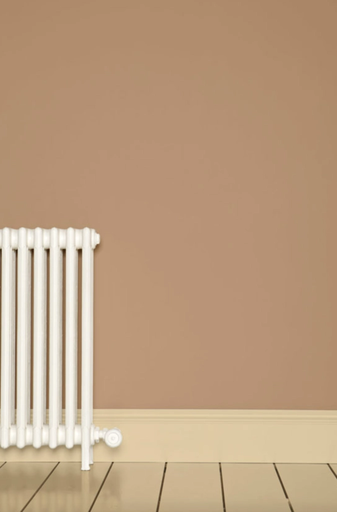
If classic terracotta is a red-brown clay pot, Menagerie is the softer brown-pink cousin.
This mid-tone terracotta is easier to live with than the stronger orange-reds. It pairs well with soft lighting, beige upholstery, olive green, and warm white trim.
Matching Colors: Beige, Baby Pink, Olive Green
Porphyry Pink

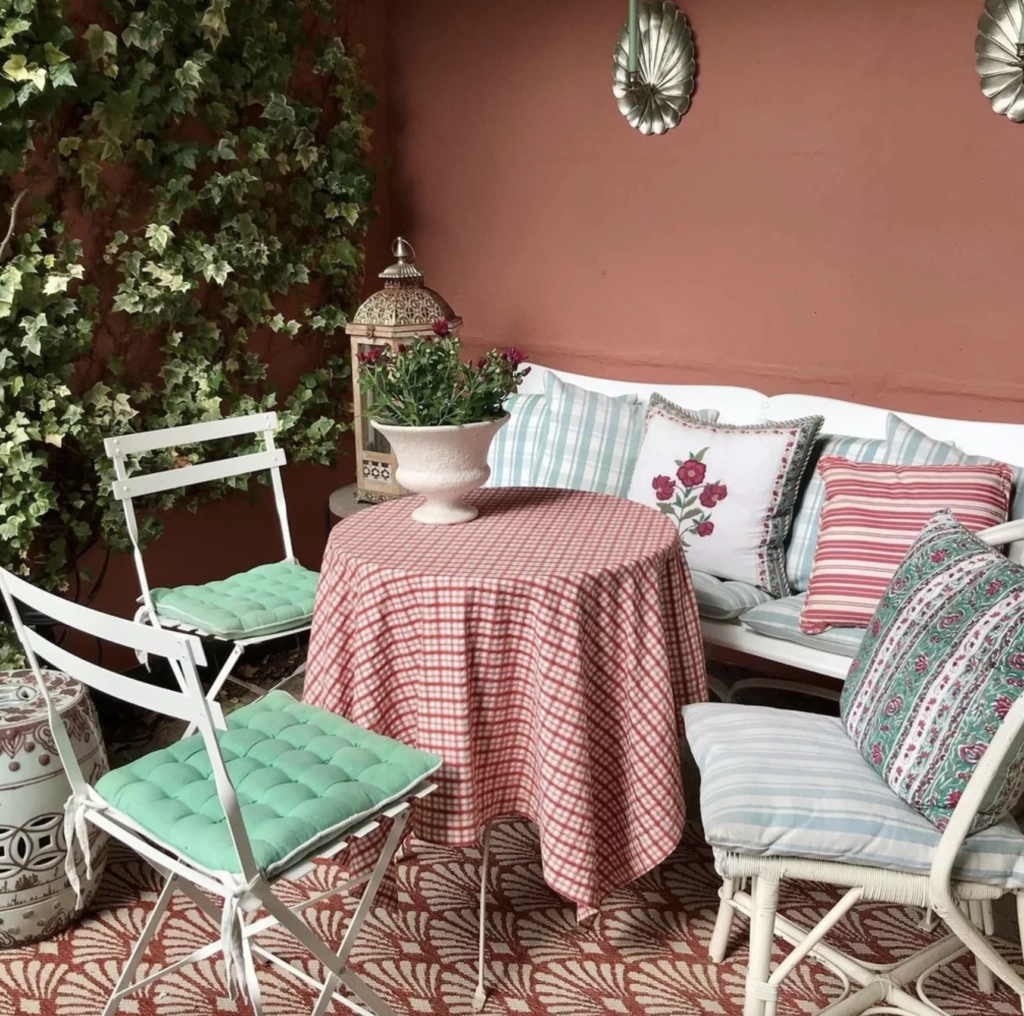
Porphyry Pink is a muted rose pink with a moodier edge than standard terracotta.
This color was inspired by the Regency period in England, so it makes sense in rooms with classic furniture, picture-frame molding, or softer traditional fabrics. I would sample it for a primary bedroom, home office, or nursery, but only after checking it against carpet and upholstery because pink undertones can clash fast.
Matching Colors: Light Gray, Lavender, Slate Blue
Ointment Pink

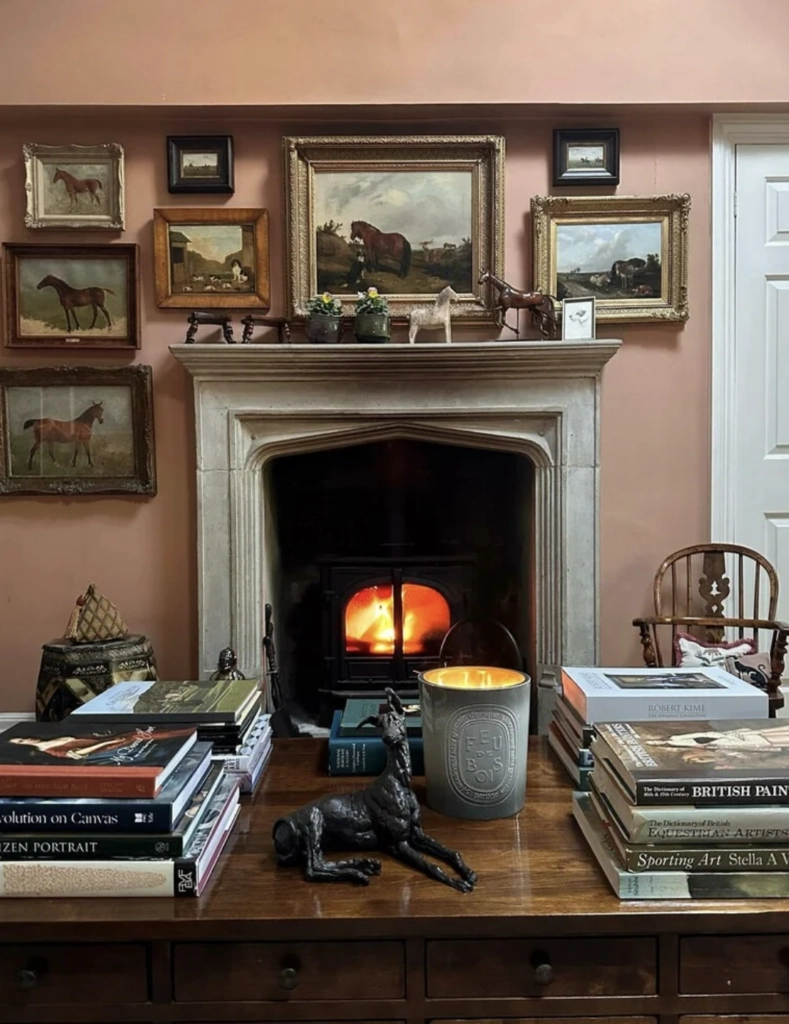
Ointment Pink is a soft terracotta with an orange-pink glow. It is a good choice for kitchens and family spaces where you want warmth but still need the room to feel light.
Matching Colors: Off-White, Sage Green, Coral
Terre D'Egypte

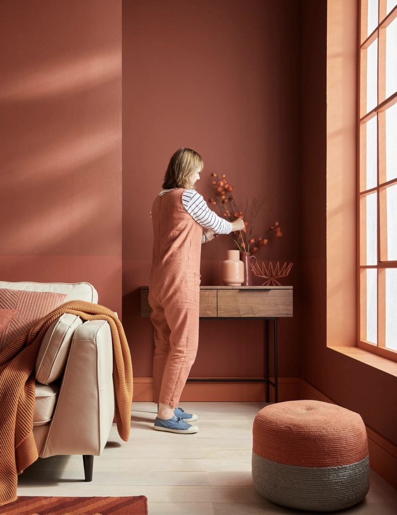
Terre D'Egypte is a bold terracotta with red and orange undertones. Outdoors, it gives stucco or masonry a warm clay glow. Indoors, it creates an enveloping room, so I would use it where you want drama rather than quiet background color.
P.S. The project above made me stop scrolling. Matching the clothing palette to the paint is a tiny styling detail, but it shows how strong this color is when everything around it is coordinated.
Matching Colors: Caramel, Teal, Deep Purple
Behr Terracotta Paint Colors

Deep Terra Cotta


Deep Terra Cotta blends dark brown and rich red, so it reads deeper and more exterior-ready than many soft terracotta paints.
That depth works in intimate dining rooms and bedrooms, and it can also be strong on house exteriors. On an exterior, test it in direct sun and shade because red-brown colors can look much darker on the north side of a house.
Matching Colors: White Linen, Soft Fern, Midnight Blue
Canyon Dusk

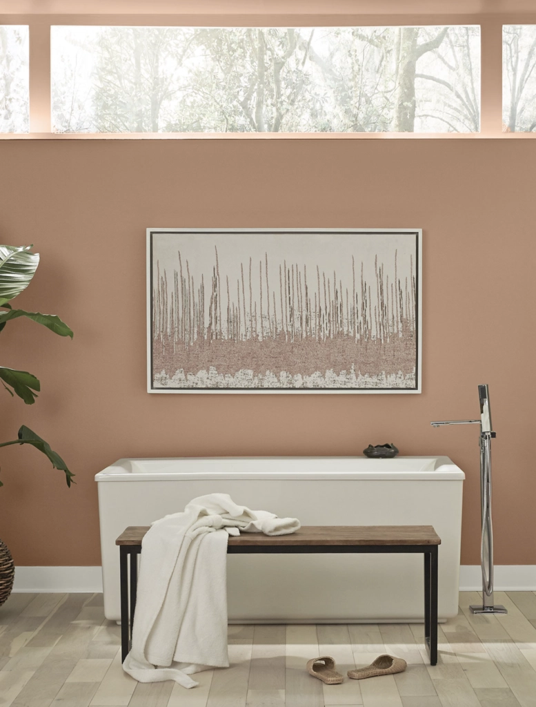
Canyon Dusk was part of the Behr Color Trends 2021 Palette, and it still feels current because it is soft rather than trendy-bright.
This color is a soft terracotta that leans toward rosy beige. It gives a room visible warmth without demanding that every other finish in the space be rustic.
I like it for bathrooms, bedrooms, and small rooms where a darker clay color would feel too closed in.
Matching Colors: Ivory Lace, Forest Path, Soft Pewter
Valspar Terracotta Paint Colors
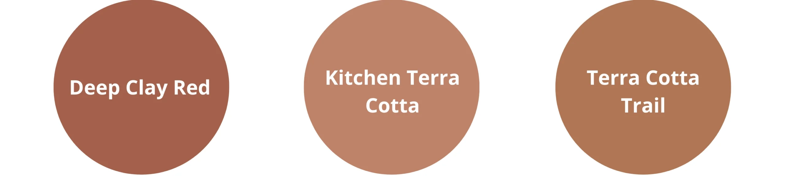
Deep Clay Red

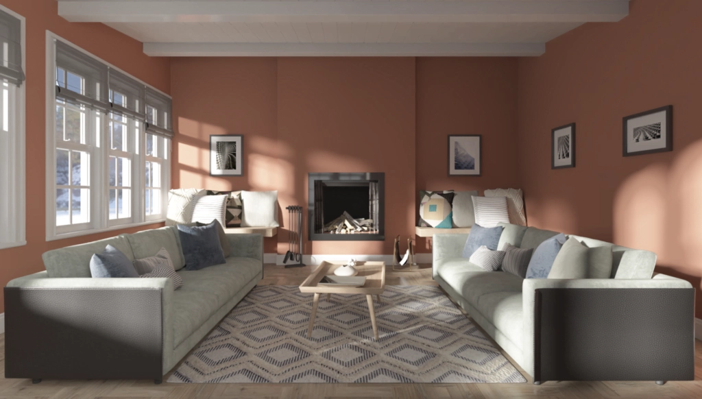
Deep Clay Red is a grounded red that can anchor a room without reading burgundy.
It is a good choice for a living room, study, or home office when the rest of the palette has enough neutrals to give your eye a break.
Matching Colors: Soft Wool, Tempered Gray, Navy Blue
Kitchen Terra Cotta

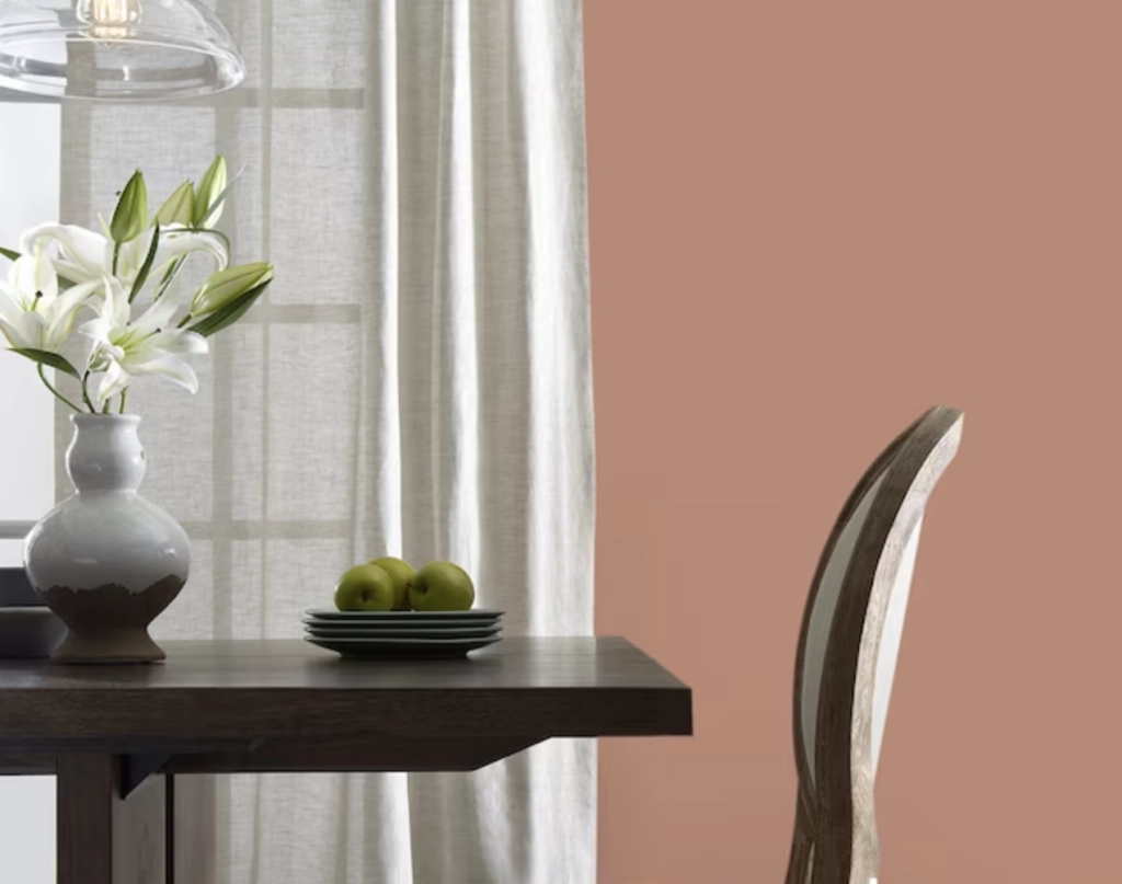
Kitchen Terra Cotta is a lighter red with orange undertones, and the name is actually useful here.
It belongs in kitchens and dining spaces because it plays well with food, wood, tile, and warm metals. I would avoid it next to cherry cabinets unless you want the room to go very red.
Matching Colors: Seafoam Green, Pale Gray, Rose Petal
Terra Cotta Trail

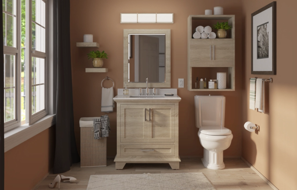
Terra Cotta Trail is a subdued orange terracotta with a sun-baked quality.
It works best with good natural light, especially in bathrooms, entries, and casual living spaces. In low light, check that it does not flatten into a dull pumpkin tone.
Matching Colors: Seafoam Green, Pale Gray, Rose Petal
What Colors Work Well with Terracotta?
Terracotta pairs best when you decide whether you want contrast or quiet warmth. The easiest mistake is surrounding it with too many other warm colors and ending up with a heavy room.
These four color directions are the ones I reach for most often with terracotta:
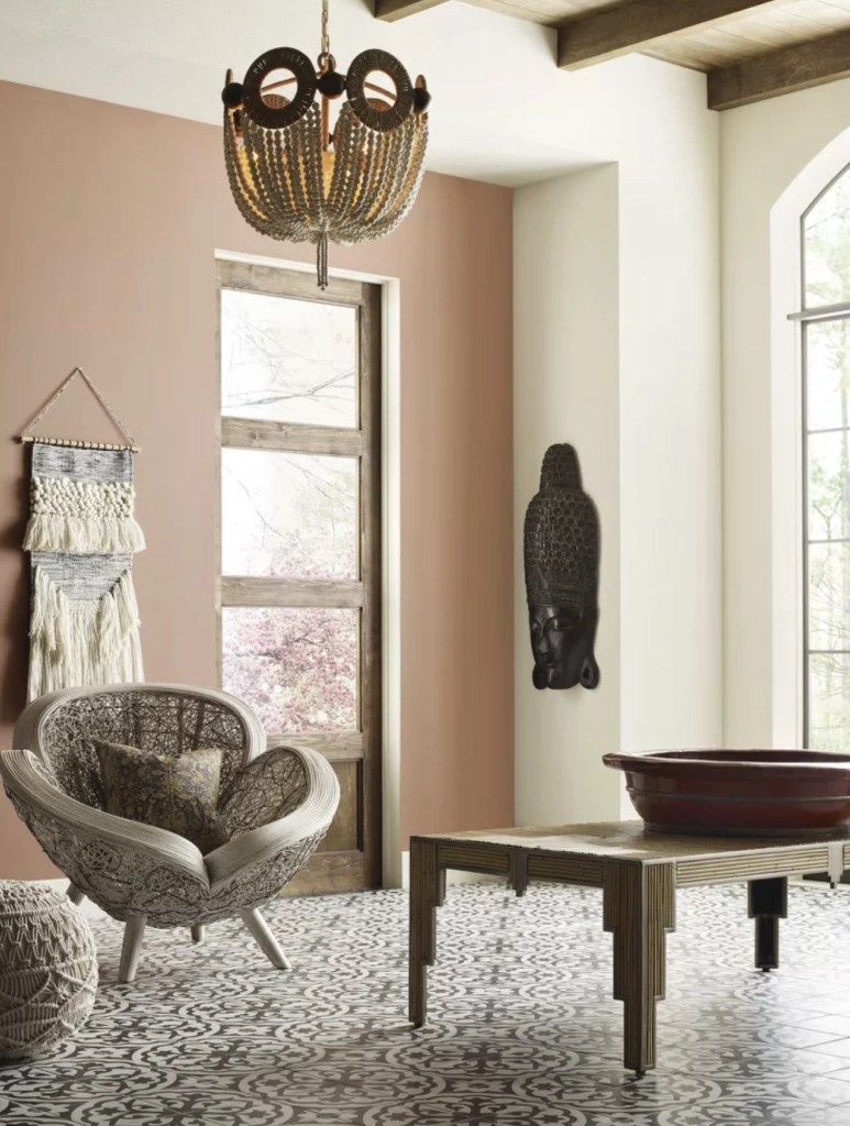

1. Neutrals: Soft whites, grays, and beiges give terracotta room to breathe. Use warm whites for trim if the terracotta leans orange, and use pale gray only when your flooring or counters already have a gray note.
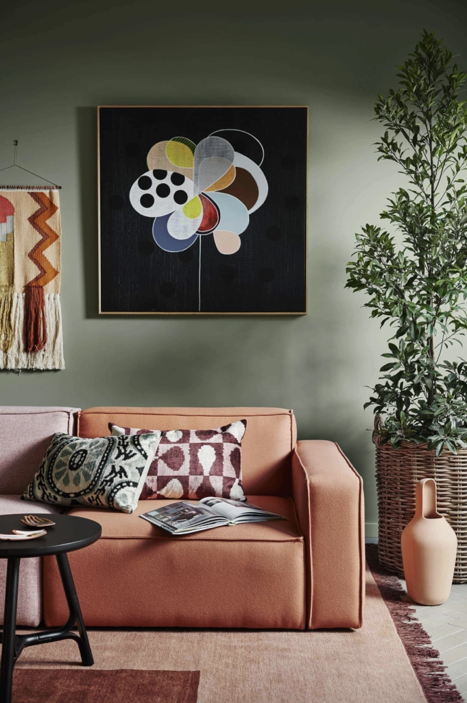

2. Blues and Greens: Cooler colors like blues and greens balance the heat in terracotta. Seafoam green softens it, navy blue makes it sharper, and olive green keeps the palette earthy.
3. Browns and Natural Wood: Walnut, oak, rattan, leather, and clay tile make terracotta feel intentional. Watch very orange oak from the 90s, though, because it can push a peach terracotta too far into orange.
4. Soft Pinks and Corals: Pink, coral, and muted blush can work with the peachier terracottas. Keep the saturation low so the room does not start to feel like a candy palette.
Test the color in your actual lighting. Natural light tends to make terracotta look more vibrant, while artificial light can either mute or intensify its warmth.
Which Should You Choose?
The best terracotta for your home is the one that works with your light and fixed finishes, not the one that looks prettiest on a screen.
Here are a few practical ways to narrow it down:
- Understand Your Space: Lighting, room size, and window direction all affect terracotta. In a bright room, a darker shade like "Deep Clay Red" can add depth. In a smaller room, lighter tones like "Pinata" can help the walls feel less closed in.
- Decide How Much Color You Want: Softer shades like "Terra Cotta Trail" feel calmer and easier for daily living. Stronger shades like "Auburn Glaze" need simpler decor, cleaner trim choices, and fewer competing warm accents.
- Sample Before Buying Gallons: Put peel-and-stick samples or painted boards on at least two walls. Check them in morning light, afternoon light, and with your lamps on at night.
- Match the Room's Purpose: Bedrooms usually handle softer terracotta better. Living rooms, dining rooms, and powder rooms can take more saturated color because they are often used for shorter periods or with layered lighting.
Choosing terracotta is not just about liking the chip.
You need to see how the paint behaves beside your trim, flooring, counters, furniture, and evening light.
There is no single best terracotta paint color for every house.
My usual rule is simple: if the sample looks good on a gray morning, in direct daylight, and under your warmest lamp, it is probably a serious contender.
I hope this guide makes your shortlist easier to test.

I'm Elizabeth, your go-to guide for all things paint and design! My days are filled with color swatches and innovative room makeovers. When I'm not painting the town - literally - I'm soaking up inspiration from my travels. This blog is my way of sharing my passion and making the world a more vibrant place, one color palette at a time.