Stunning Exterior House Colors
Exterior color is hard because you are not choosing a single paint chip. You are choosing how the body color, trim, roof, stone, brick, landscaping, and daylight will read together from the street.
I pulled together 69 exterior color ideas I would actually consider on client homes, from resale-friendly whites and grays to richer greens, blues, reds, and warm earth tones. Some are quiet. Some are brave. All of them need to be judged against the fixed materials you already have.
The real house photos matter because exterior paint changes wildly outdoors. Use them for direction, then test large sample boards on every side of your house before you commit.
How to Choose Exterior House Colors
Choose the exterior color after you study the parts that are not changing: roof, brick, stone, windows, gutters, driveway, and hardscape. Paint is flexible. Those fixed materials set the undertone rules.
I usually narrow a palette to one body color, one trim color, and one accent before sampling. If you are repainting siding only, hold the sample next to the roof and masonry first. A color that looks clean on a fan deck can turn pink, green, or chalky beside the wrong stone.
Let Your Architecture Guide You
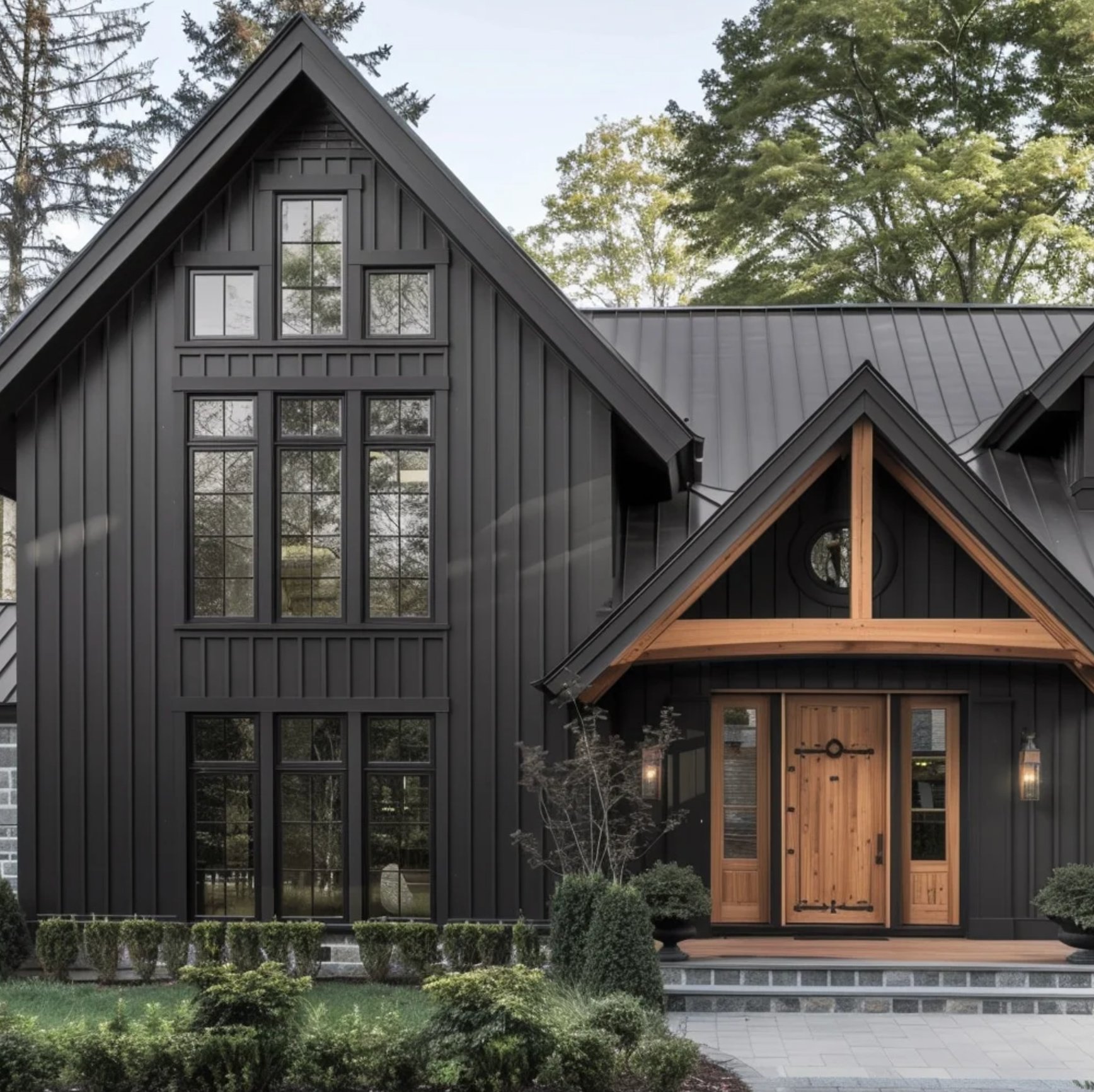
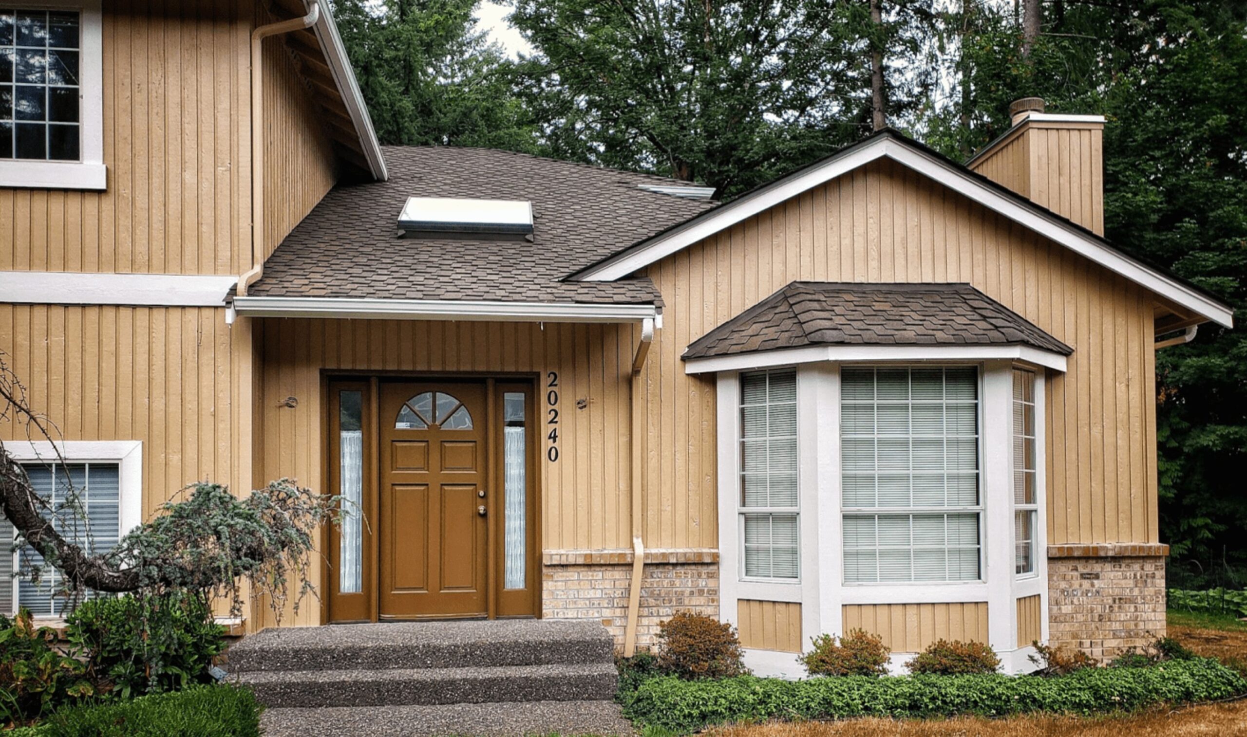
Your home's style often tells you how much contrast it can handle. Modern houses can carry a tight monochrome palette, from clean white to deep charcoal, because the shape and windows do the work.
Traditional country homes usually need softer contrast. Warm beiges, putty grays, sage greens, and off-whites tend to respect the rooflines, porch posts, and trim details instead of fighting them.
Work With Your Surroundings
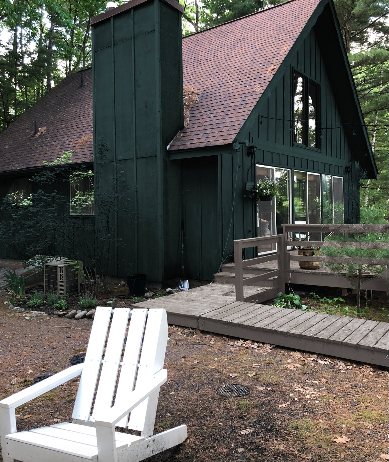
Think about how your house fits into its setting. On a wooded lot, earth tones and deep greens usually look calmer than bright white because they sit closer to bark, moss, and shadow.
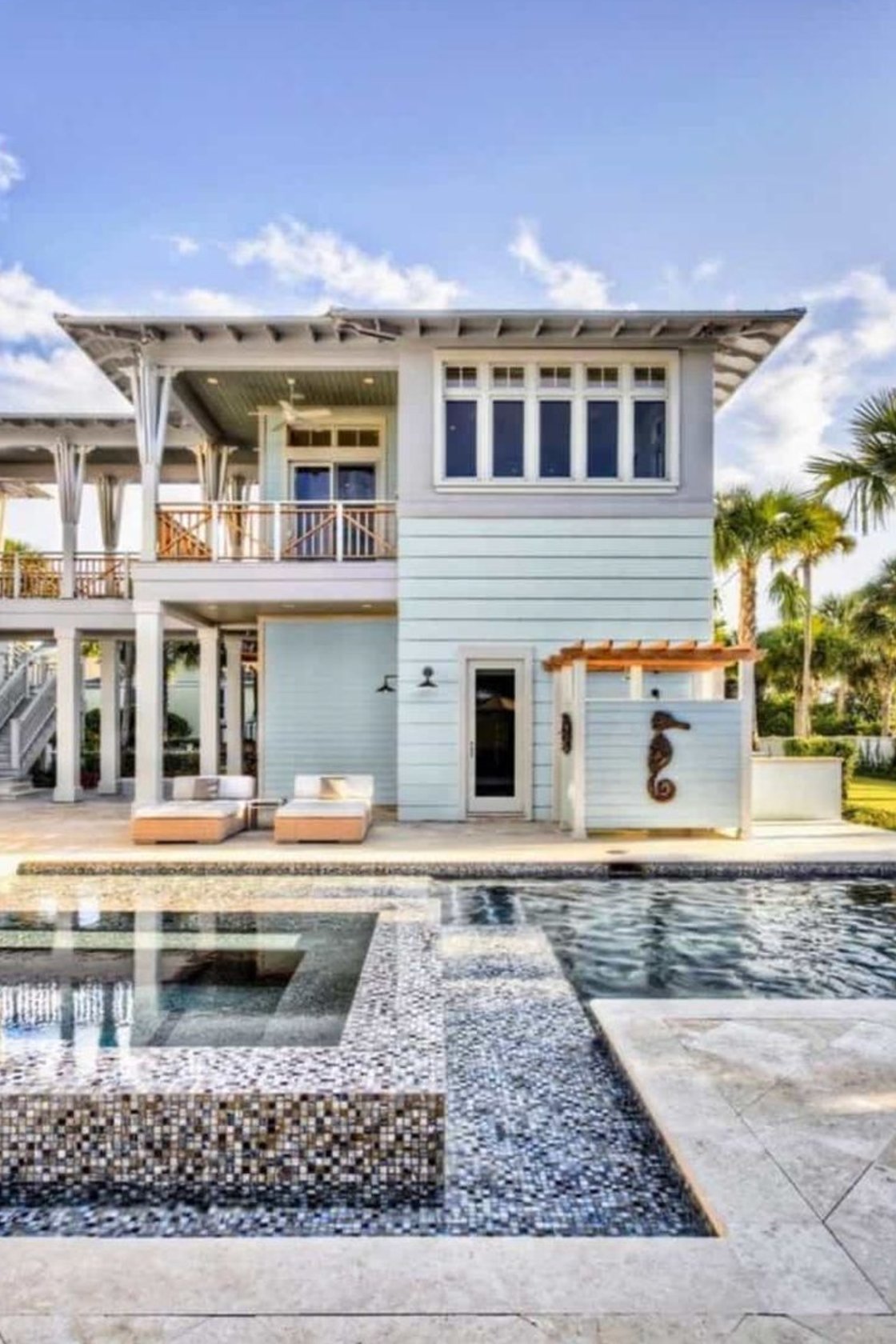
Near the ocean, light blue-grays can echo the water without turning the house into a theme. In a neighborhood with many brick homes, a softer neutral can keep the house from looking newly dropped onto the block.
Mind the Climate
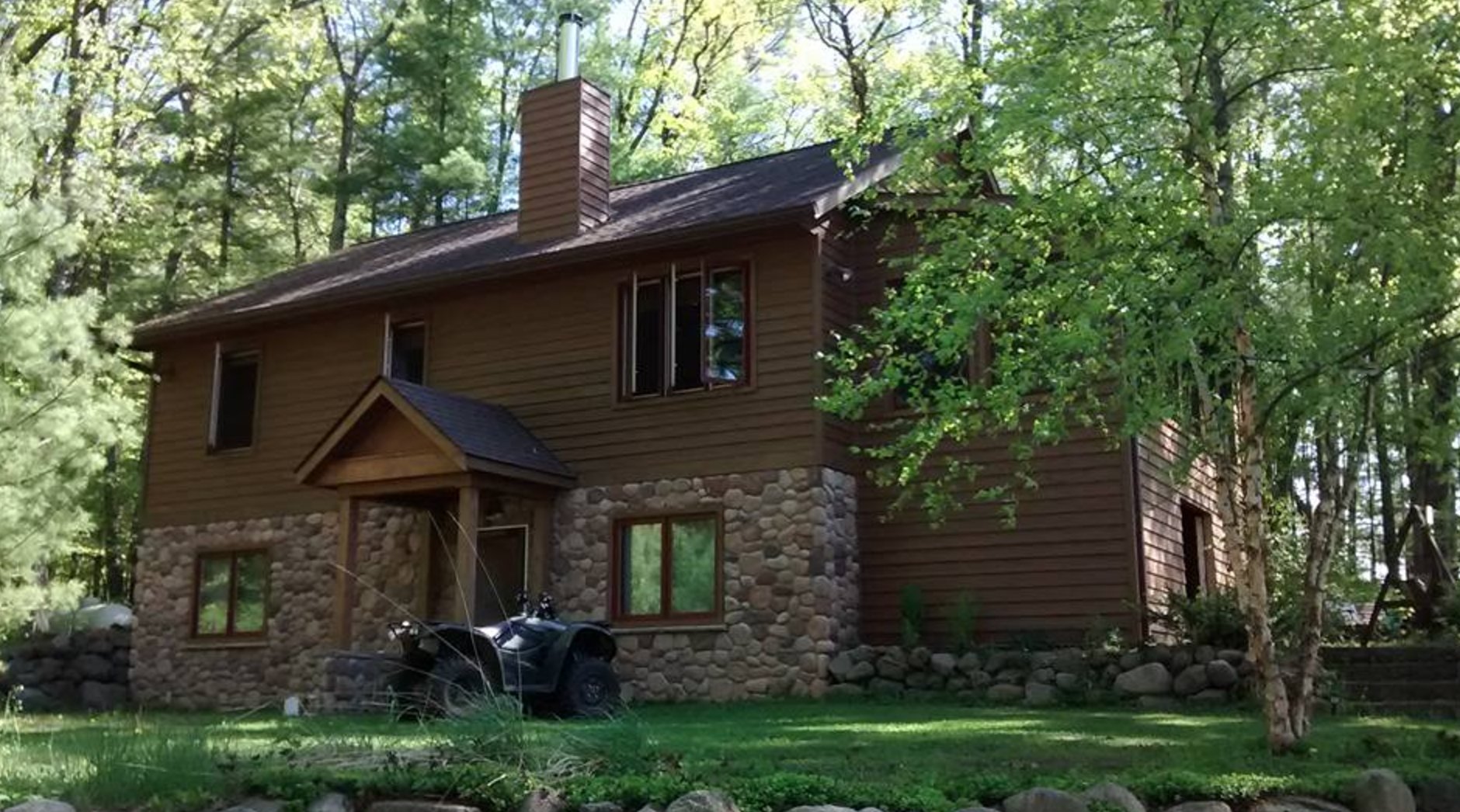
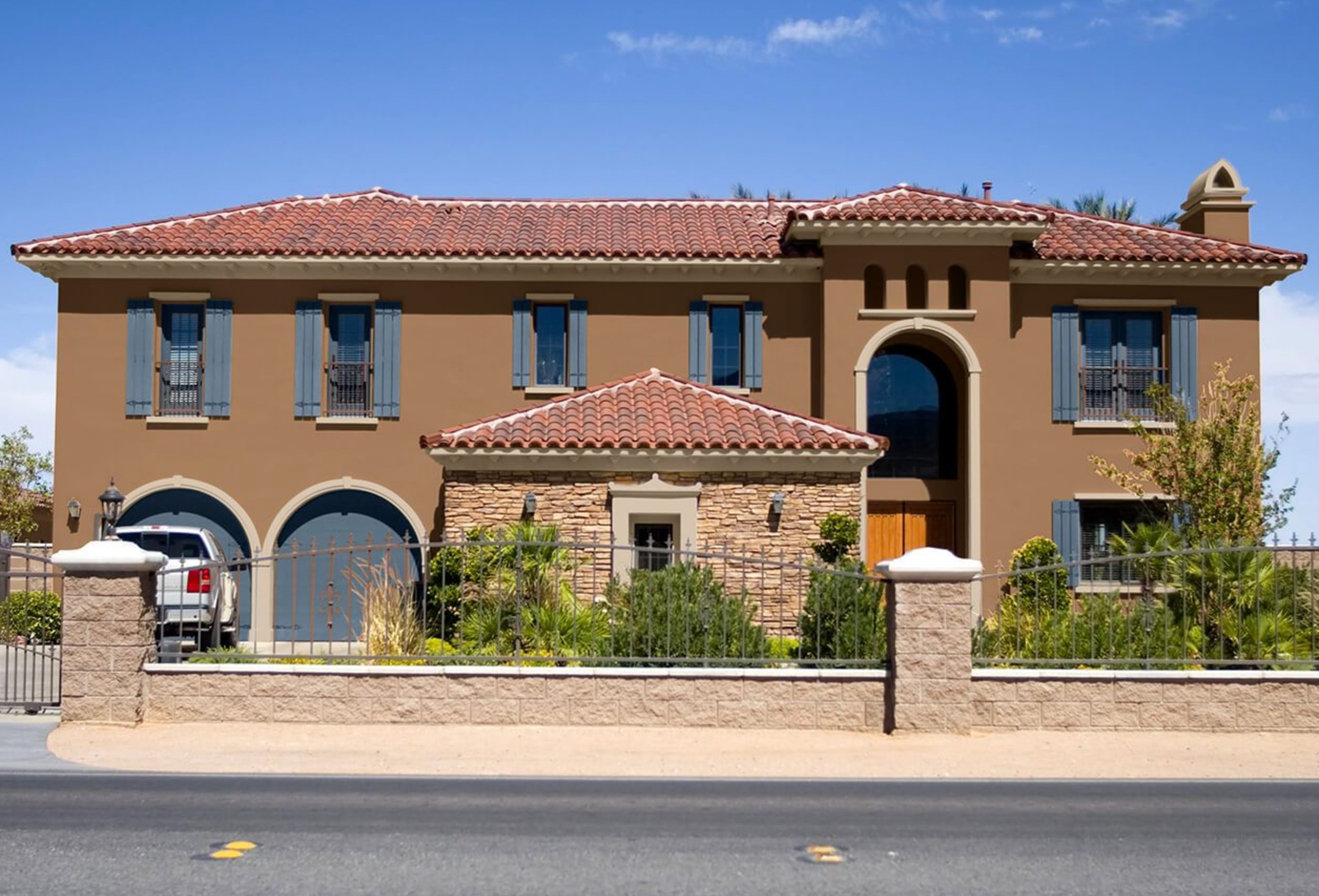
Climate changes both comfort and maintenance. Dark colors absorb more heat on full-sun walls, which can stress siding, make touch-ups harder, and raise cooling load in hot regions.
In colder climates, deeper shades are easier to justify, especially on north-facing or shaded elevations. In desert or coastal sun, I would sample dark colors in the hottest afternoon light and ask the paint store about exterior formulas rated for deeper bases.
Think About Longevity
Bold and very dark colors show fading sooner in direct sun, while neutral shades usually age more quietly.
If the house gets punishing west or south exposure, pay for a high-quality exterior paint with strong UV resistance. Also choose the sheen carefully. A glossier finish can make trim look sharper, but it will show imperfect siding faster.
Show Your Personality

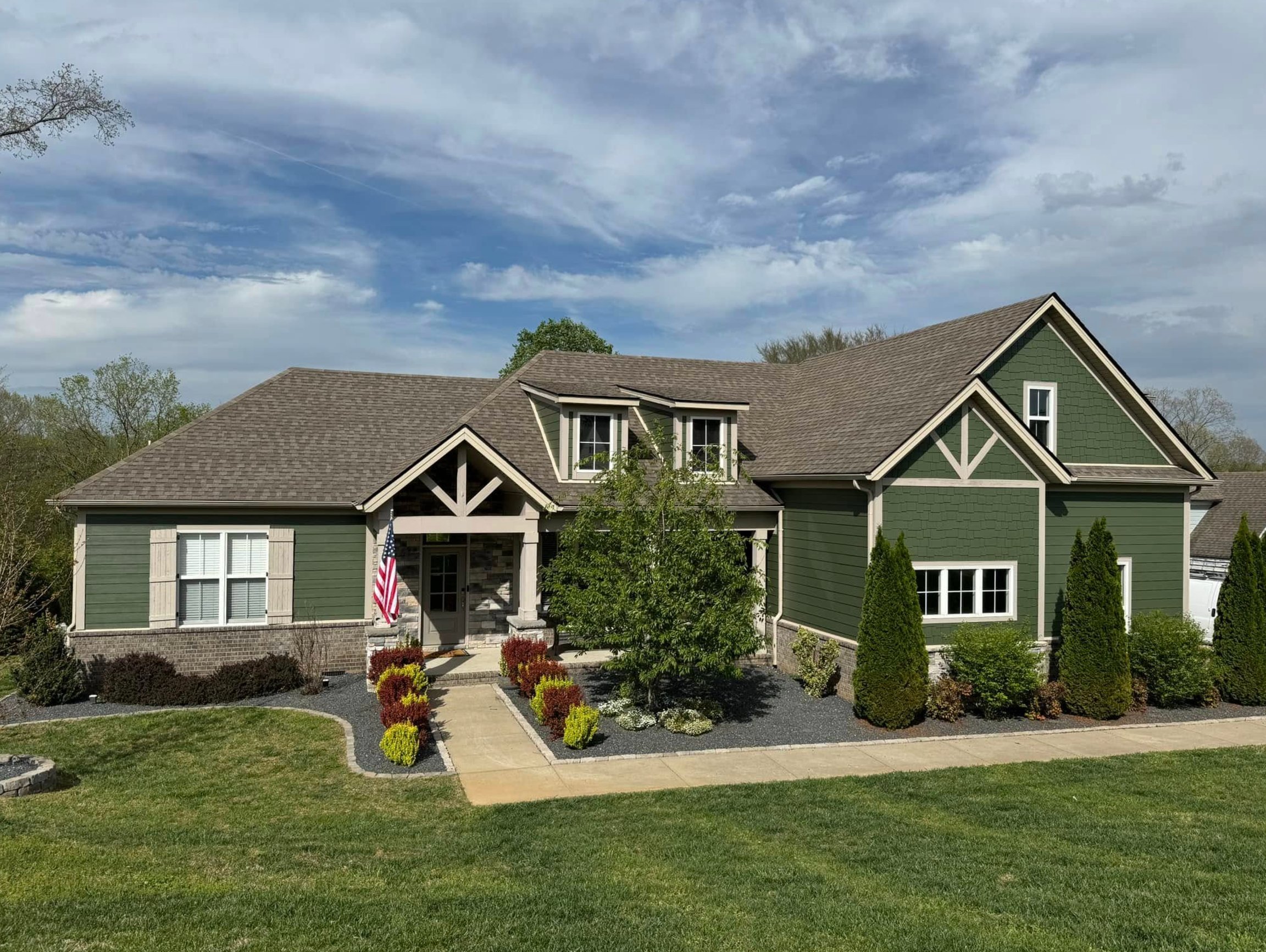
Your exterior can still have personality. The safest place to use a strong color is the front door, shutters, or porch ceiling, not necessarily the whole body of the house.
If you prefer a quieter house, use texture for interest: wood doors, stone, brick steps, black hardware, or a slightly deeper trim. The goal is a palette you will still like after the first season of leaves, snow, pollen, and full summer sun.
69 Best Exterior House Colors for 2026
1. Copper Dream
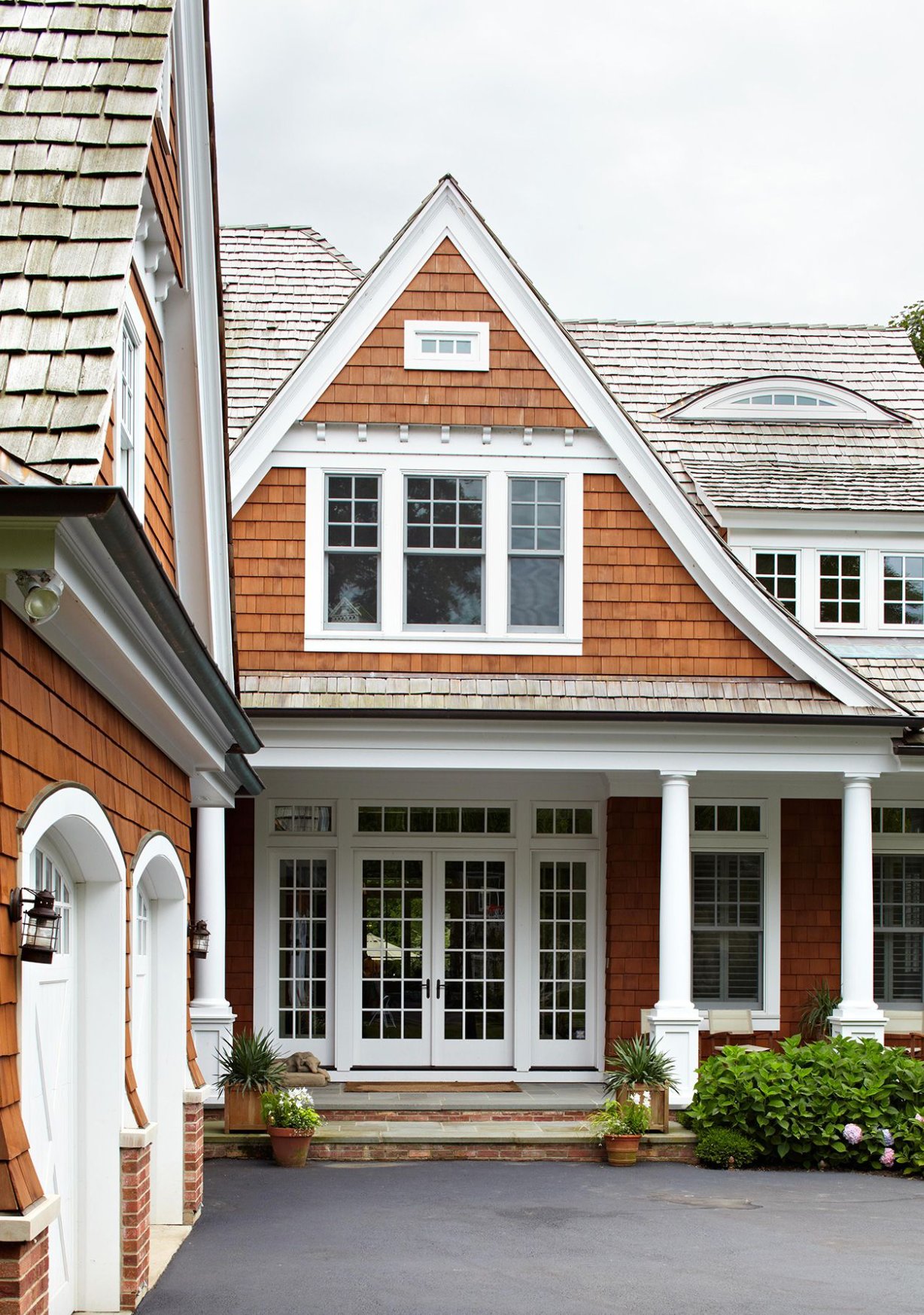
Medium-brown cedar siding gives this facade warmth without making it look heavy. The white trim is doing important work here because it separates the siding from the porch, roofline, and windows.
The gable and trim details are worth studying. They are not random white accents. They define the architecture and keep the brown from reading flat.
The French doors with white muntins repeat the trim color, so the entry feels intentional rather than added later.
Paint suggestion: Benjamin Moore Gingerbread (siding), Benjamin Moore Simply White (trim).
2. Timeless Cape Cod White
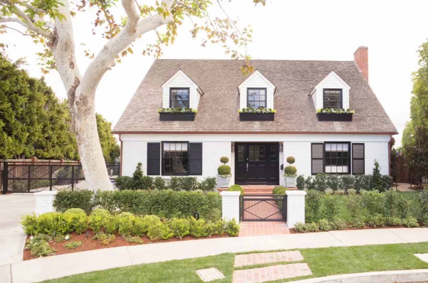
A white exterior with black shutters is classic Cape Cod, but the undertone is what makes it work. This white has enough cream in it to sit comfortably with the brick walkway and garden greenery.
The dark front door and window frames give the symmetrical facade a clear rhythm. I often suggest this kind of high-contrast palette for traditional homes when the roof is dark and the landscaping is already doing the softening.
Paint suggestion: Benjamin Moore Simply White (main facade color), Benjamin Moore Black (front door)
3. Obsidian Black
The deep charcoal works because the house has enough natural wood to warm it up. Vertical board-and-batten siding emphasizes the height, while the black-framed windows keep the lines clean.
A color this dark needs relief. Wood doors, pale gravel, layered planting, or lighter porch surfaces keep the exterior from turning into one dark block.
Paint suggestion: Benjamin Moore Iron Mountain (siding), Benjamin Moore Cedar Path (wood trim)
4. Navy and Yellow Contrast
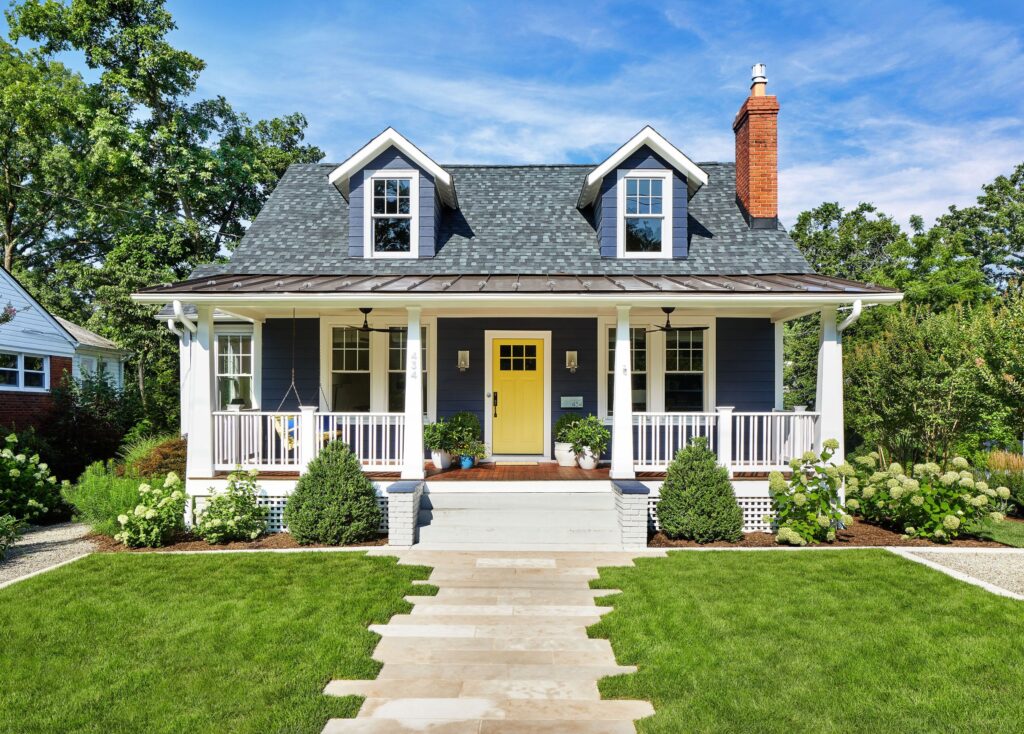
This deep navy has enough weight for the two-story facade, and the yellow front door keeps it from feeling too formal. White trim around the windows, columns, and porch railings gives the navy a clean edge, while the gray roof keeps the palette grounded.
Paint suggestion: Benjamin Moore Hale Navy (siding), Benjamin Moore Simply White (trim), Benjamin Moore Yellow Rain Coat (door)
5. Bordeaux
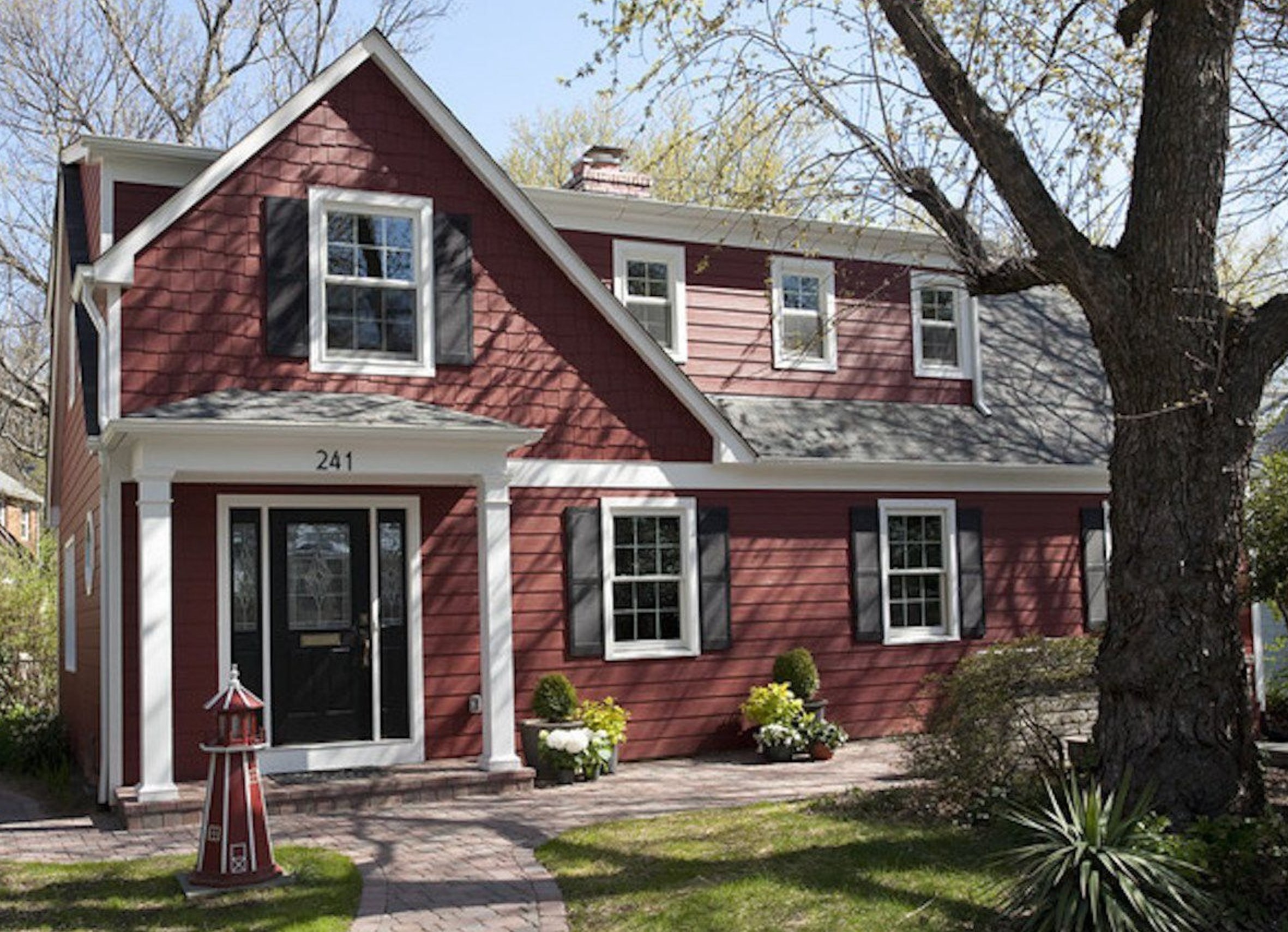
This rich reddish-brown works well with white trim and black shutters because it has enough brown to avoid looking too bright. In morning light it can read burgundy, then soften toward terracotta notes by midday.
The gray pavers are a useful counterweight to the warm siding. This kind of red-brown is a natural fit for Colonial-style homes, especially in the Northeast, where deep reds and black shutters have architectural precedent.
Paint suggestion: Benjamin Moore Cottage Red (siding), Sherwin Williams Pure White (trim)
6. Sage Green Craftsman
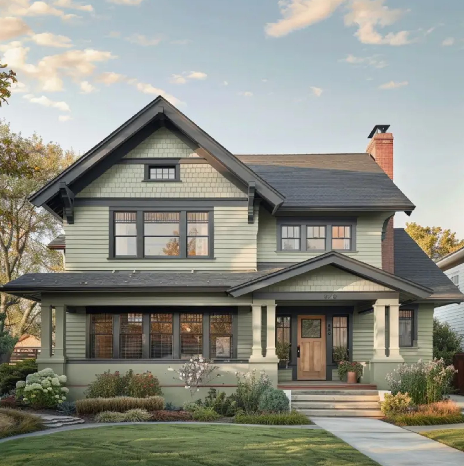
This sage green siding has the muted quality Craftsman homes usually need. The dark gray windows and trim sharpen the edges, and the natural wood front door keeps the palette from feeling cool.
The hydrangeas and ornamental grasses explain why this green reads so settled. With the red brick chimney and gray roof, the siding bridges warm and cool fixed materials instead of choosing one side.
Paint suggestion: Benjamin Moore Saybrook Sage (siding), Sherwin Williams Iron Ore (window frames and trim)
7. White + Graphite
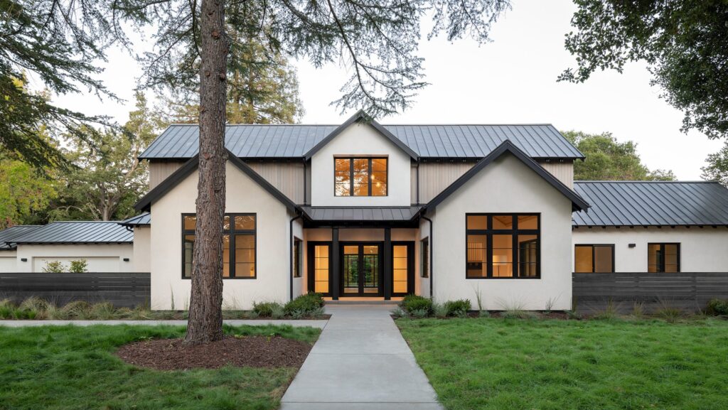
White and gray can look thin if every surface has the same finish. Here, the smooth white walls and warm gray vertical cladding give the modern farmhouse facade needed texture.
The graphite metal roof adds a modern edge against the light facade. Black window frames repeat that roof color, which is why they look deliberate instead of trendy.
Paint suggestion: Sherwin Williams Pure White (main walls), Benjamin Moore Storm Cloud Gray (vertical cladding)
8. Pumpkin Spice Farmhouse

Orange siding is a strong choice, so the supporting details have to be simple. White trim gives the bright body color a clean boundary and keeps the farmhouse shape legible.
The warm tone picks up the autumn foliage in the background, which is why it feels less random here than it would on a bare suburban lot. The stone foundation and clipped shrubs give the saturated facade a quieter base.
Paint suggestion: Sherwin Williams Robust Orange (siding), Benjamin Moore Simply White (trim)
9. Lavender Charm
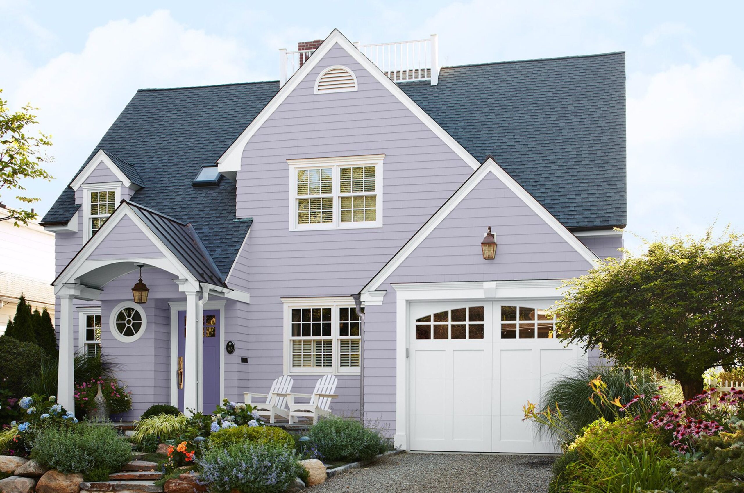
This gentle lavender siding sits between classic and current because it has a gray base. It can look cooler in morning light, then show pink undertones near sunset.
The white Adirondack chairs and coastal planting give the color context. Without those softer details, lavender can look too sweet on an exterior.
Paint suggestion: Benjamin Moore Sweet Lavender (siding), Sherwin Williams Extra White (trim)
10. Modern Olive Charm
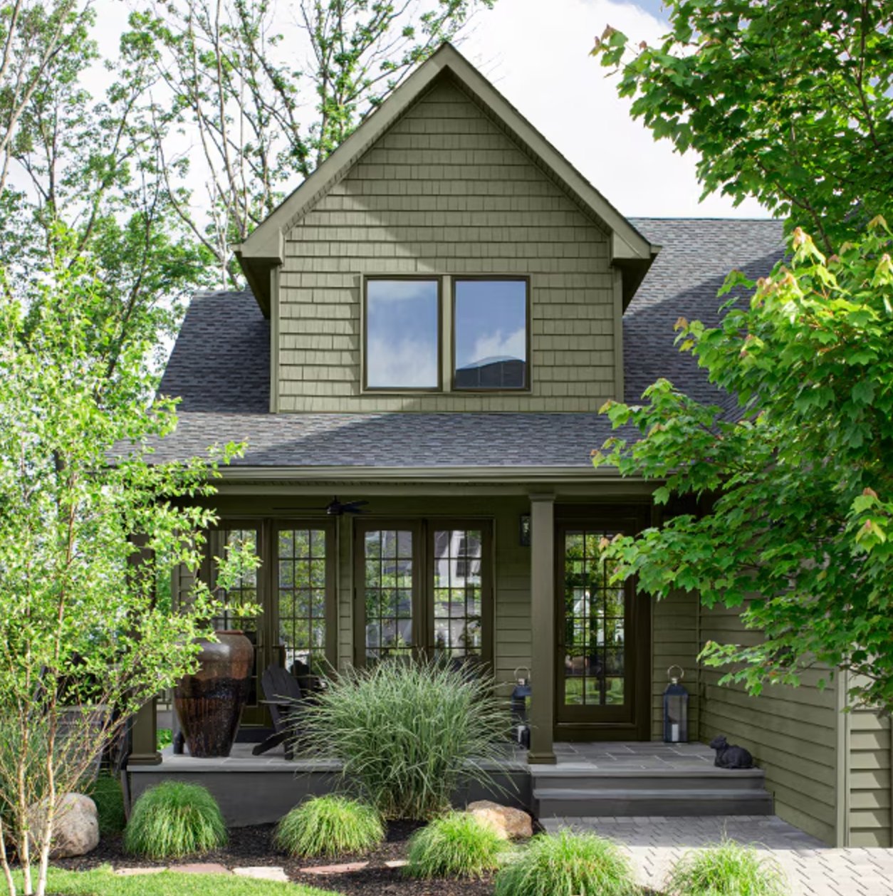
This mellow olive-gray is a strong choice for homes surrounded by woods or heavy planting. The siding blends with the ornamental grasses, while dark trim around the windows and doors gives the architecture enough definition.
Paint suggestion: Benjamin Moore Dry Sage (siding), Sherwin Williams Urbane Bronze (trim)
11. Blue + White + Red
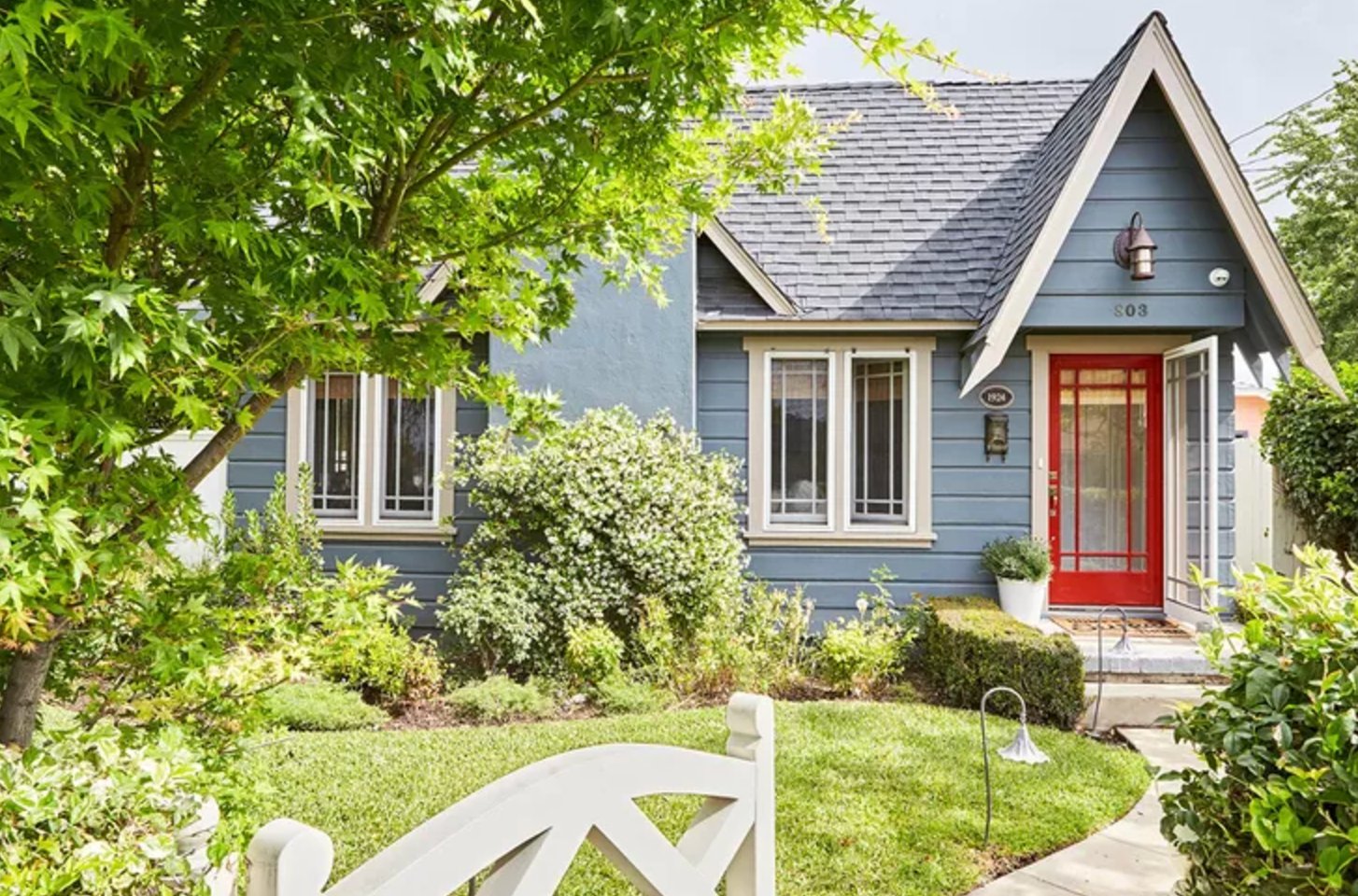
This is a good example of pastel blue on a country home because the shade is dusty, not baby blue. The red door adds personality, and the white trim keeps the whole palette from feeling faded.
Paint suggestion: Benjamin Moore Van Courtland Blue (siding), Sherwin Williams Extra White (trim)
12. Classic Brick Colonial

Red-orange brick with white trim and black shutters is a familiar American palette for a reason. The white trim around the windows and doors breaks up the visual weight of the brick.
It is also forgiving at resale because the paint colors are supporting the brick, not competing with it.
Paint suggestion: Benjamin Moore Georgian Brick (brick), Benjamin Moore White Dove (trim), Sherwin Williams Tricorn Black (shutters)
13. Coffee Bean
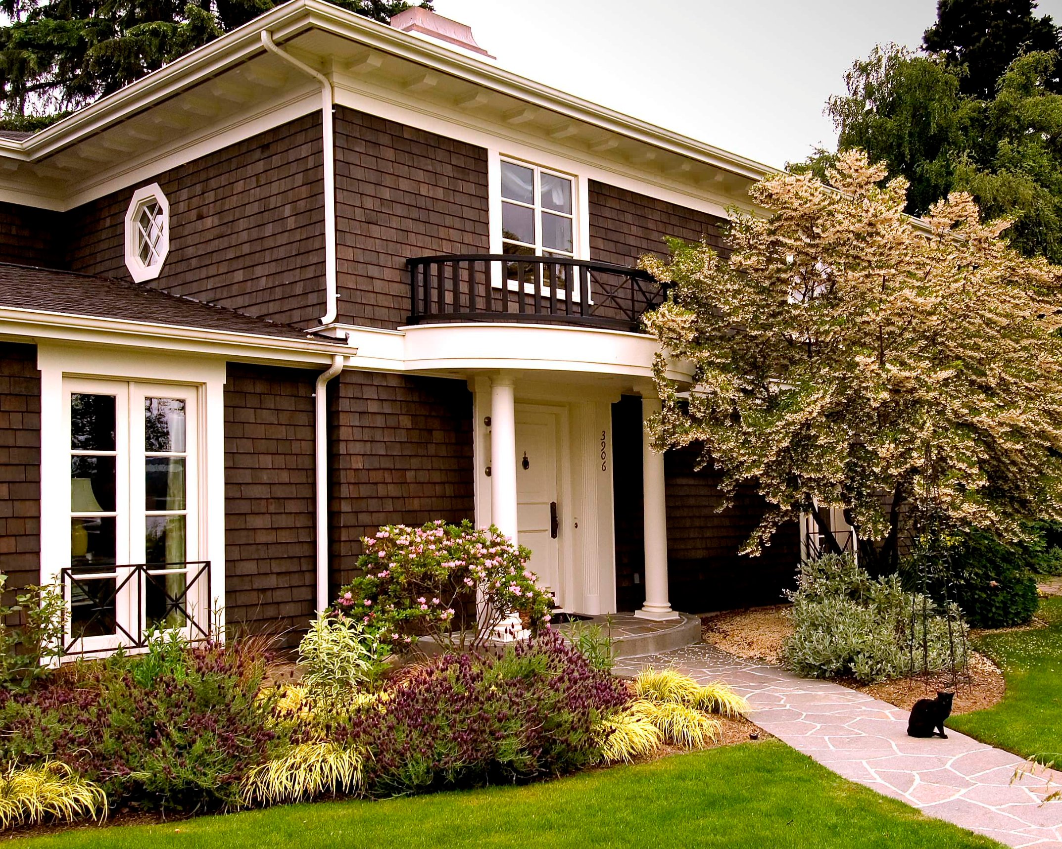
This two-story home can handle a rich chocolate-coffee exterior because the trim and columns are substantial. The white architectural features, from the cornices to the window frames, stop the dark siding from swallowing the details.
The yellow ornamental grasses and purple blooms help too. They add color at ground level so the house does not rely on paint alone for interest.
Paint suggestion: Benjamin Moore Chocolate Truffle (siding), Sherwin Williams Pure White (trim)
14. Arctic White + Charcoal
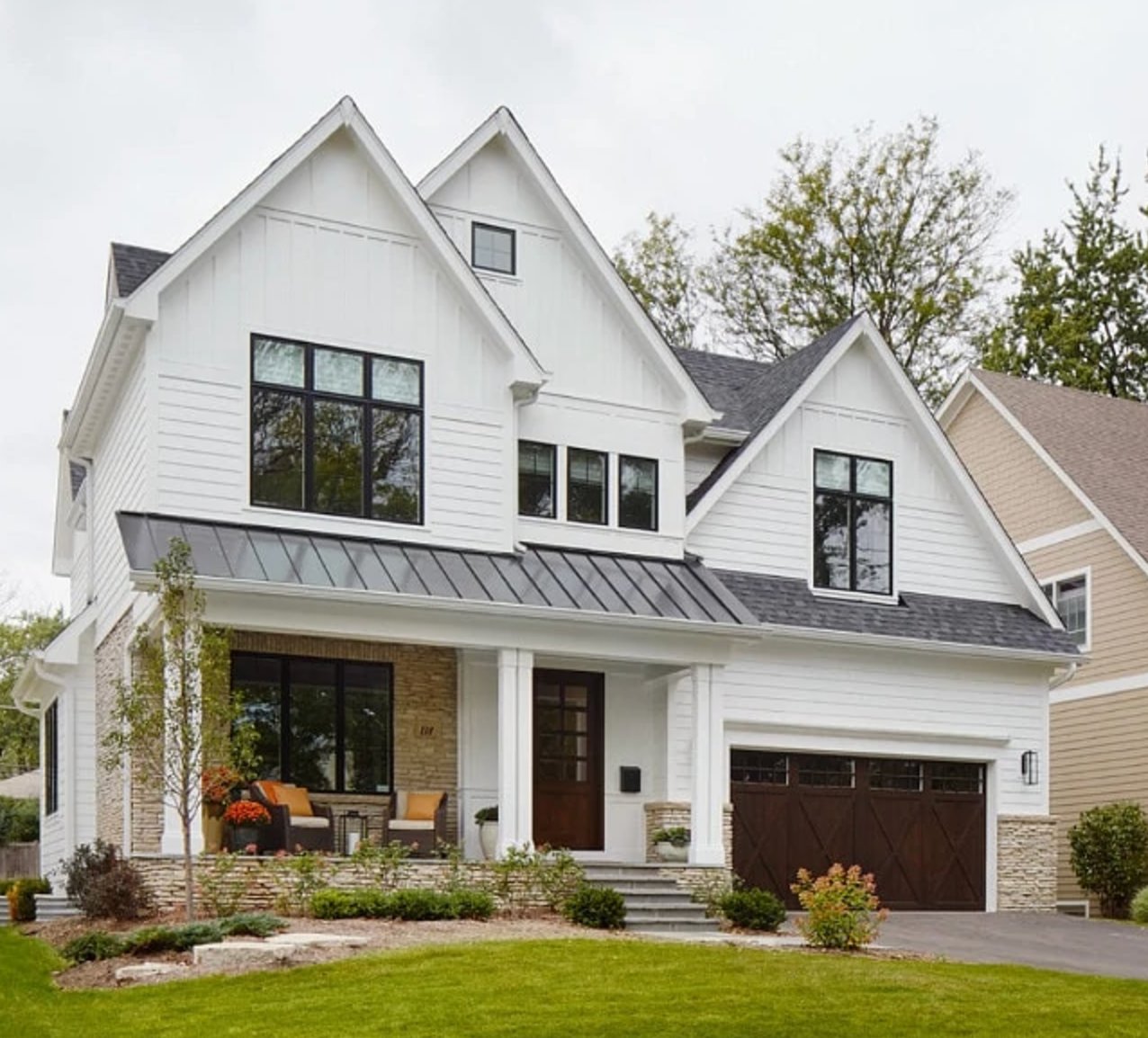
A crisp white exterior works on this modern farmhouse because the black windows, wood garage doors, and graphite porch roof give it structure. If your roof or driveway is very warm, sample this kind of white carefully so it does not look icy.
Paint suggestion: Sherwin Williams Extra White (main siding color), Benjamin Moore White Dove (trim)
15. Denim Blue
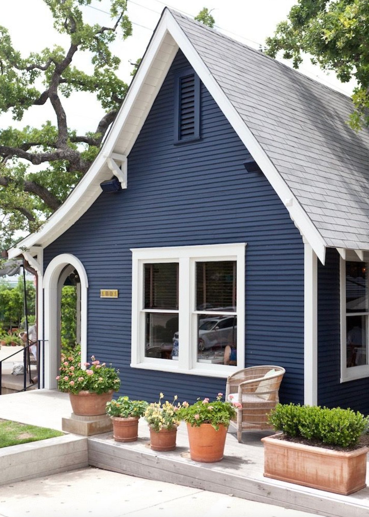
Deep navy with bright white trim is one of the most reliable palettes for a lakeside cottage. The color has enough depth to hold up against water, trees, and big sky.
The Craftsman-style arch and brackets under the eaves give the trim a reason to be bright. Terracotta planters add a warm note so the blue and white do not feel too nautical.
Paint suggestion: Benjamin Moore Hale Navy (siding), Sherwin Williams Pure White (trim)
16. Creamy Peach
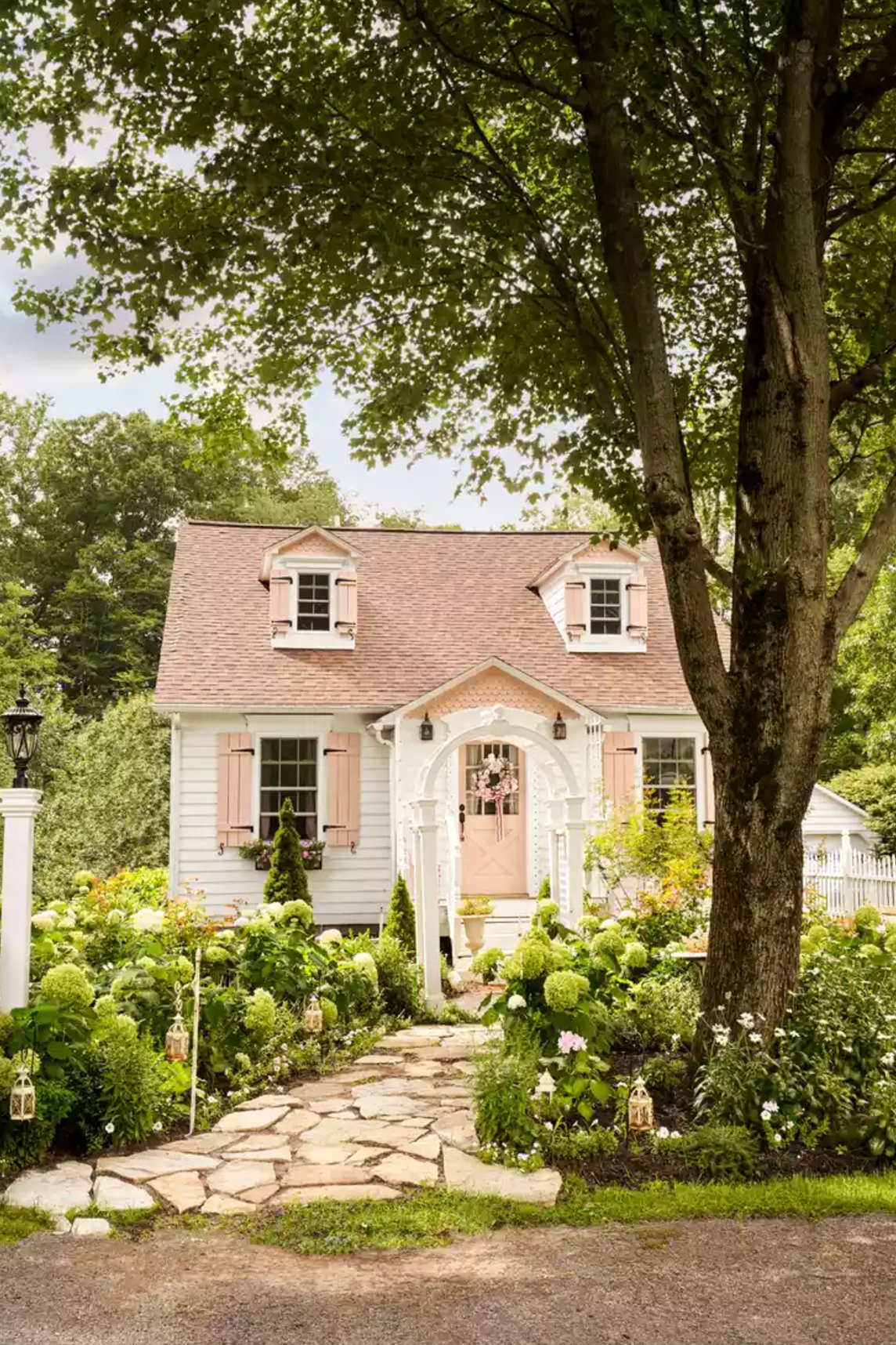
This house keeps the body color neutral and lets the peach accents carry the warmth. The shutters and door are strong enough to register from the street, but small enough that the palette still feels easy to live with.
The entrance arch and white lattice make the peach door feel tied into the architecture rather than treated as a one-off accent.
Paint suggestion: Benjamin Moore Swiss Coffee (siding), Sherwin Williams Peach Blossom (shutters and door)
17. Modern A-Frame Elegance
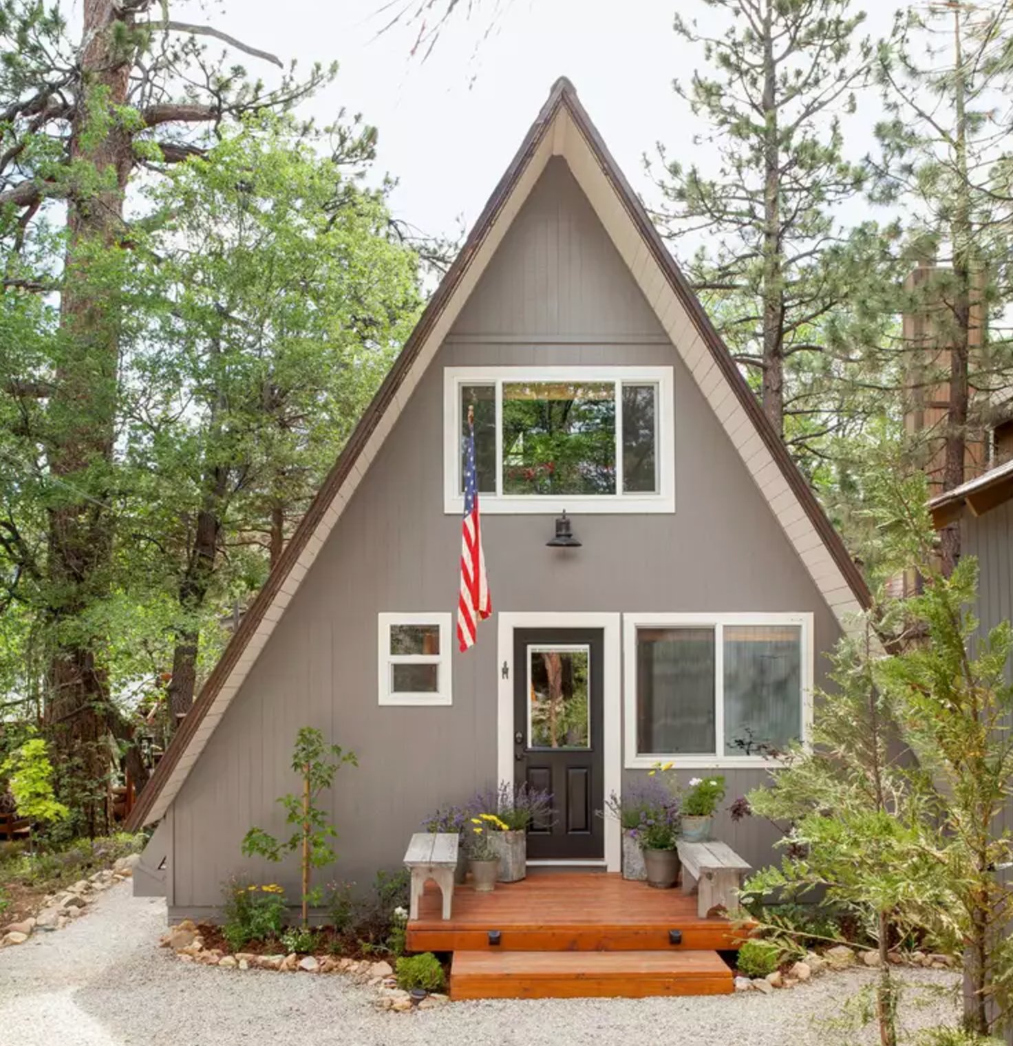
This gray A-frame works because the wooded setting adds natural contrast. The white trim keeps the roofline readable, and the pines make the gray look warmer than it would on an open lot.
Paint suggestion: Sherwin Williams Mindful Gray (siding), Benjamin Moore White Dove (trim)
18. Earth & Snow
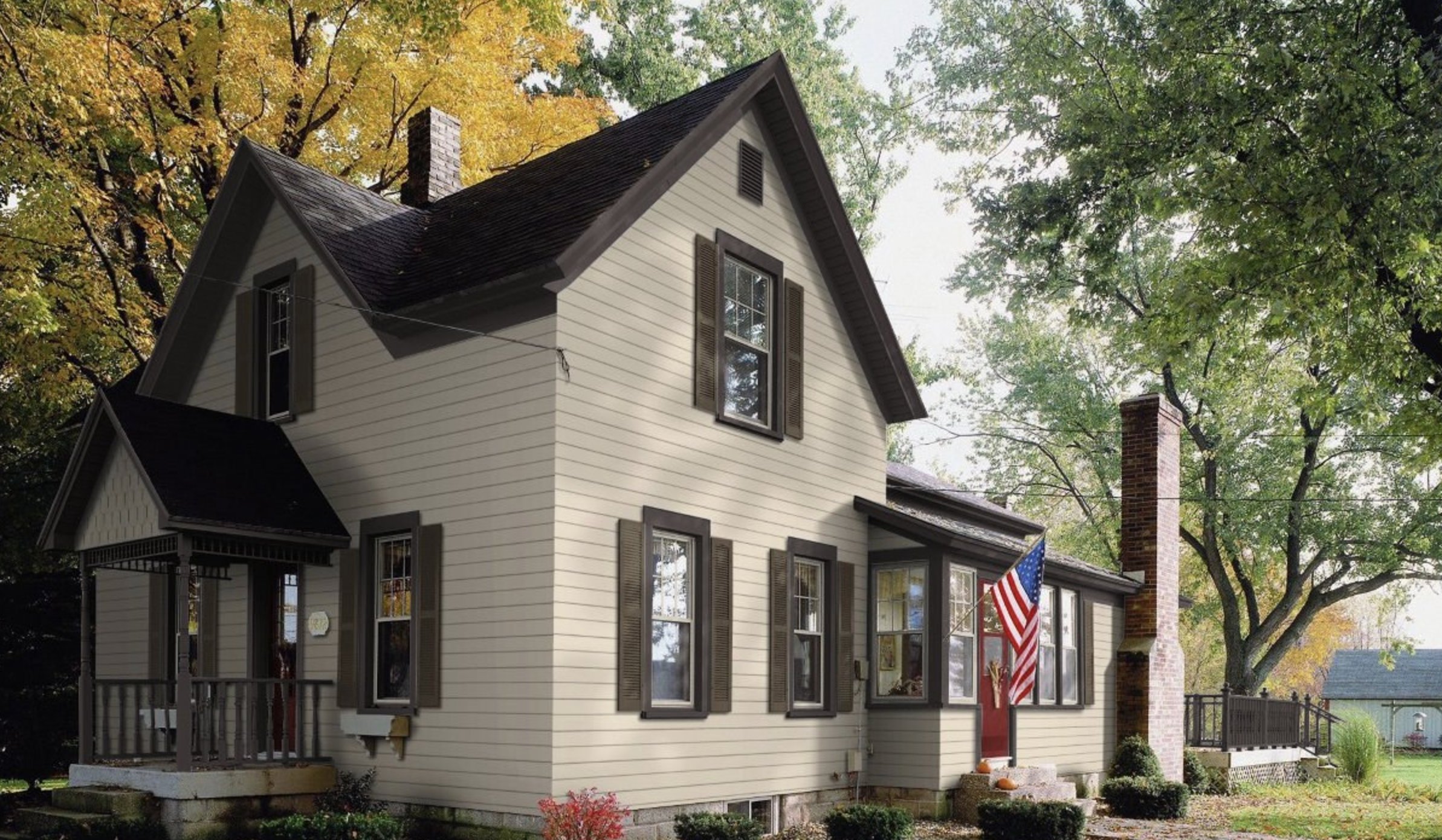
These classic neutral tones suit a modern farmhouse because they are warm without turning yellow. The cream siding pairs with deep brown shutters, while the beige walls soften in shade and read brighter in direct sun.
Paint suggestion: Benjamin Moore Navajo White (siding), Sherwin Williams Urbane Bronze (shutters)
19. Tuscan Clay

A white Spanish Colonial exterior is a natural fit for Southern California architecture, especially when the stucco has texture and the roof is terracotta.
The white walls let the tropical planting, arched openings, and decorative niches stand out. On stucco, always sample in the actual finish because rough texture makes many whites look slightly darker.
Paint suggestion: Sherwin Williams Pure White (walls), Benjamin Moore Swiss Coffee (trim)
20. Swedish Red Charm
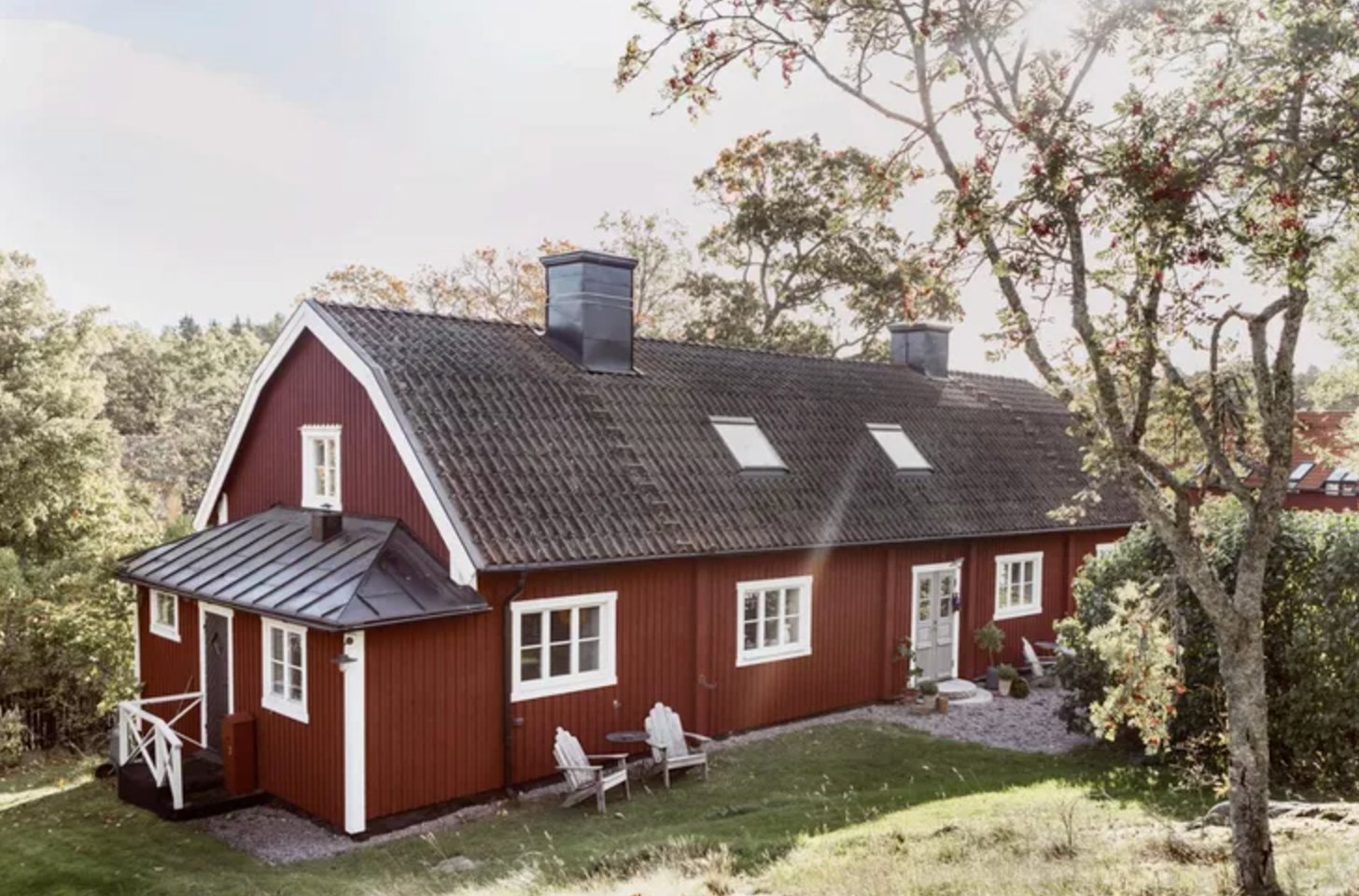
This classic Scandinavian red has enough depth to feel rustic rather than loud. White trim crisps up the windows and doors, while the black roof keeps the red from looking too sweet.
Paint suggestion: Farrow & Ball Incarnadine (main facade color), Benjamin Moore Simply White (trim)
21. Blue Craftsman Charm

This deep blue-gray siding updates the Craftsman shape without erasing its softness. The peachy-pink front door works because it is warm, muted, and used in a small dose.
Paint suggestion: Benjamin Moore Hale Navy (siding), Sherwin Williams Pink Shadow (door), Benjamin Moore Simply White (trim).
22. Vanilla Smoke
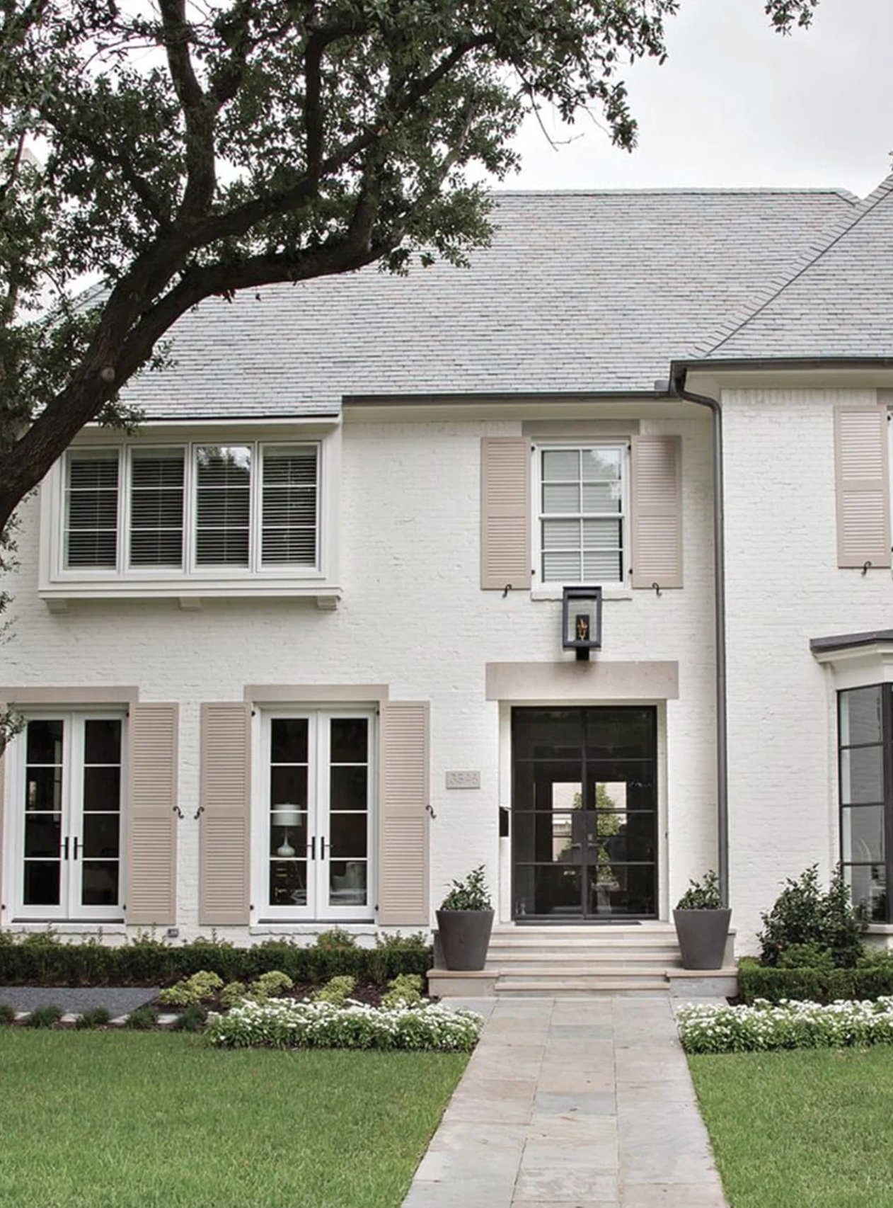
This home gets its French-style polish from low contrast, not bright color. Creamy white siding, beige shutters, and a black front door create a layered neutral palette that feels calm from the curb.
Paint suggestion: Benjamin Moore Swiss Coffee (main color), Sherwin Williams Accessible Beige (shutters).
23. Pistachio Green and White
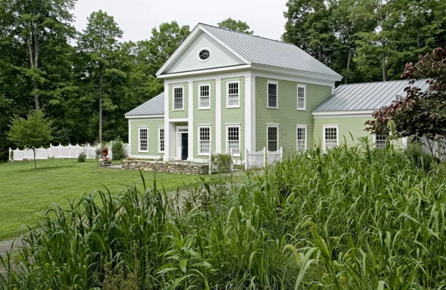
This light green shade belongs with the home's natural setting because it is soft enough to sit beside mature greenery. The silver metal roof cools the palette and keeps the green from reading too yellow.
Paint suggestion: Benjamin Moore Hancock Green HC-117 (siding), Sherwin Williams Extra White SW-7006 (trim).
24. Coastal Navy Charm
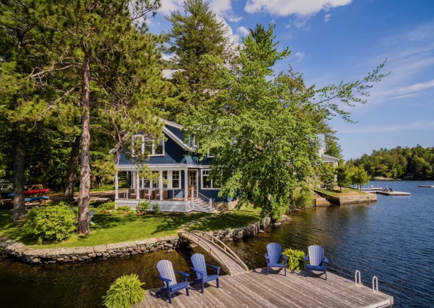
This deep blue earns its place near the water, where reflected light keeps it from looking too flat. White trim on the porch railings and window frames gives the siding a clear coastal edge.
Expect this kind of blue to shift during the day. It can look cleaner in bright sun and almost indigo near sunset, so sample it on the side of the house that faces the view.
Paint suggestion: Benjamin Moore Hale Navy (siding), Sherwin Williams Pure White (trim).
25. Cottage White & Chartreuse
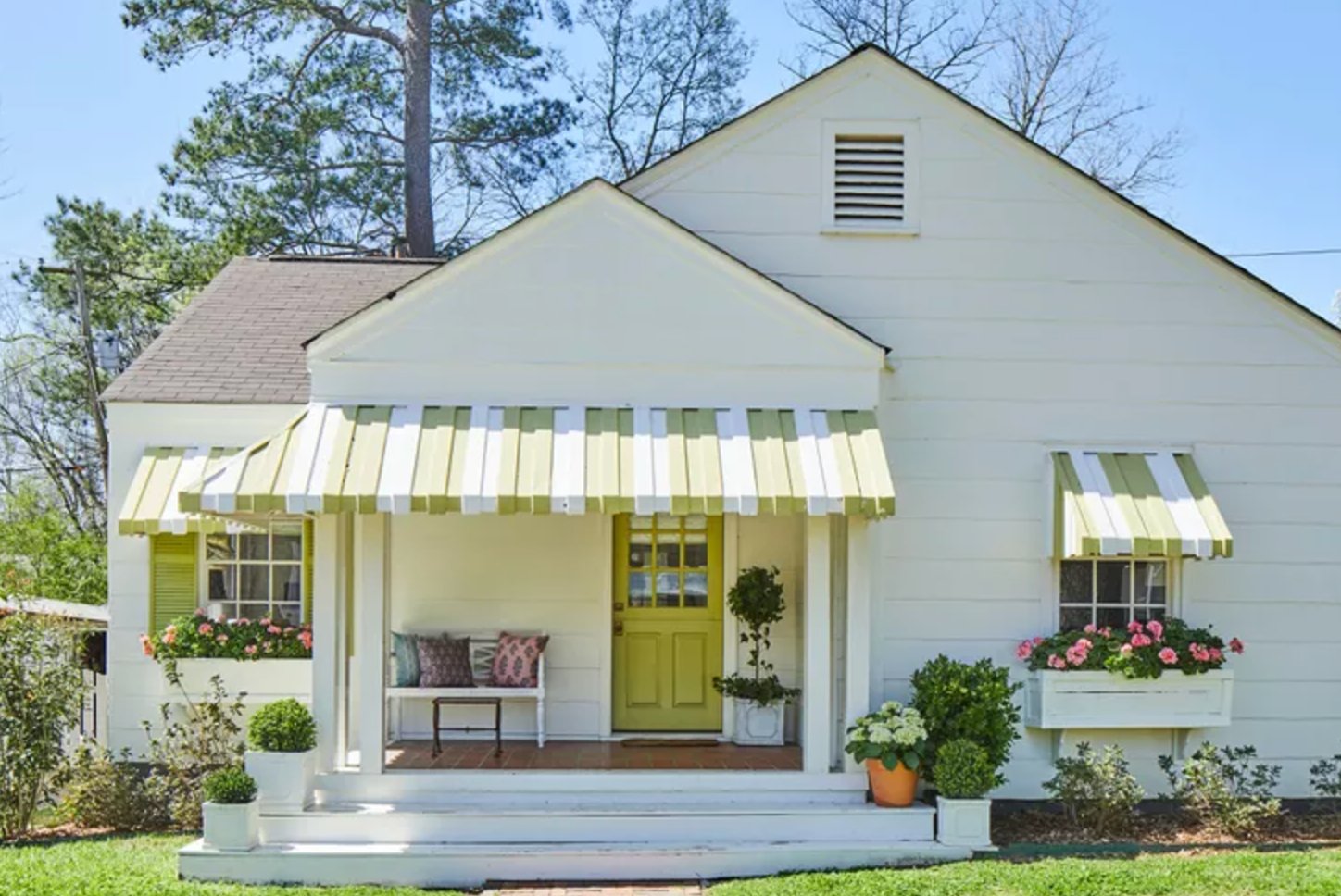
The classic white siding gives the chartreuse front door room to be bold without overwhelming the cottage.
The striped awnings repeat the door color, which is why the accent feels planned. Pink flowers in the window boxes add a second color note and keep the green from feeling sharp.
Paint suggestion: Sherwin Williams Pure White (siding), Benjamin Moore Chartreuse (door and awnings).
26. Neutral Classics

A warm beige exterior can be more flattering than bright white when the roof, porch brick, or walkway has warmth in it.
Here, the siding connects to the brick porch, black shutters add traditional contrast, and white trim outlines the windows without taking over.
Paint suggestion: Sherwin Williams Accessible Beige (siding), Benjamin Moore Simply White (trim).
27. Dark Green Craftsman
This deep green has the earthiness a Craftsman exterior can carry. It works with the beige trim and gray stone base because all three colors have a grounded, muted quality.
The color highlights the gable beams and porch columns without making them look fussy. White windows keep the facade fresh, which matters when the siding and trim are both muted.
Paint suggestion: Sherwin Williams Retreat (siding), Benjamin Moore Swiss Coffee (trim).
28. Pearl + Onyx
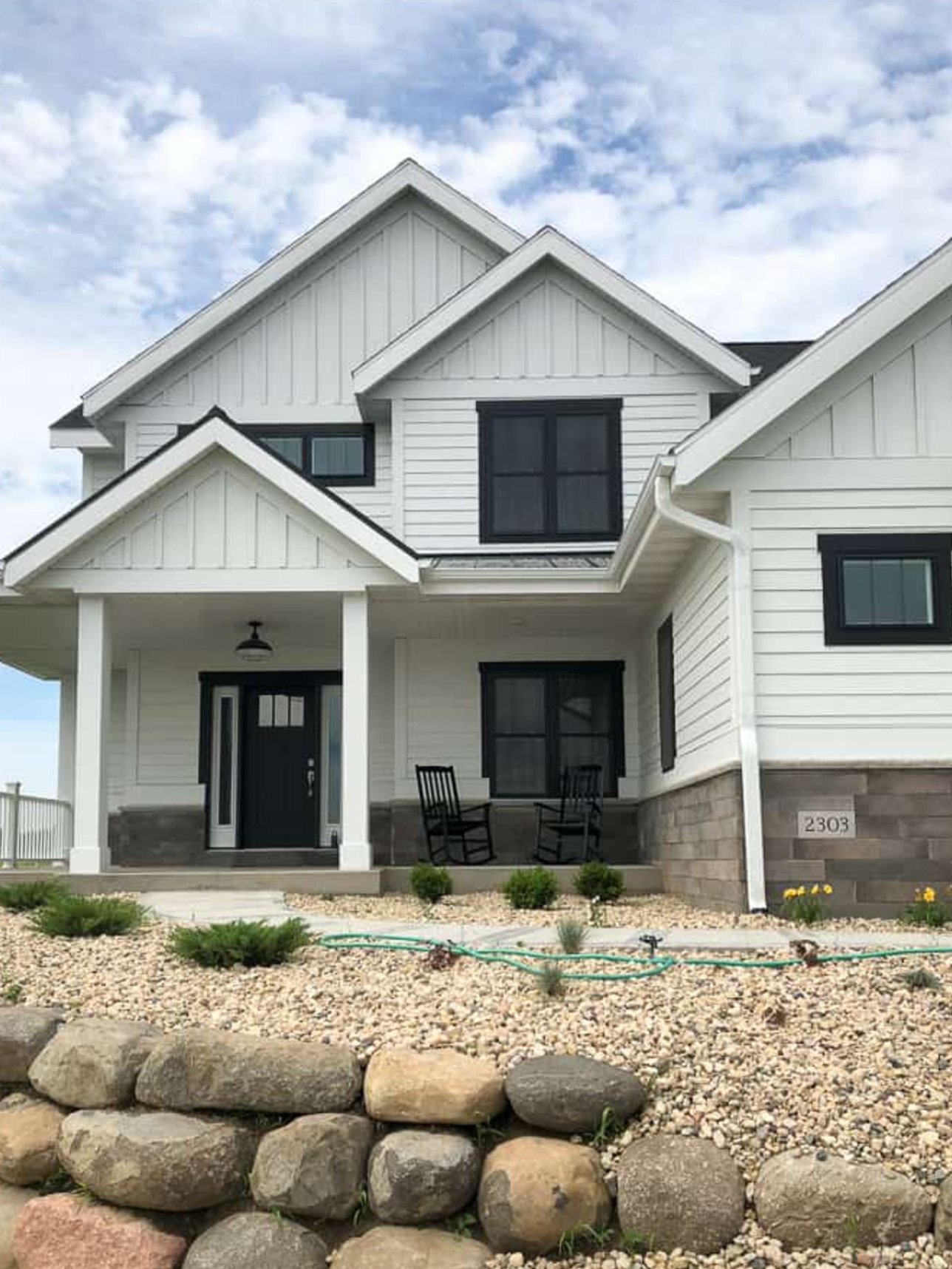
This white exterior works because the house has strong black windows and enough roof detail to hold the contrast. Without those dark lines, the siding could look plain.
The river rock foundation adds texture at the base, which is especially helpful on a simple white facade.
Paint suggestion: Sherwin Williams Pure White (siding), Benjamin Moore Black Iron (windows and doors).
29. Warm Butter Yellow
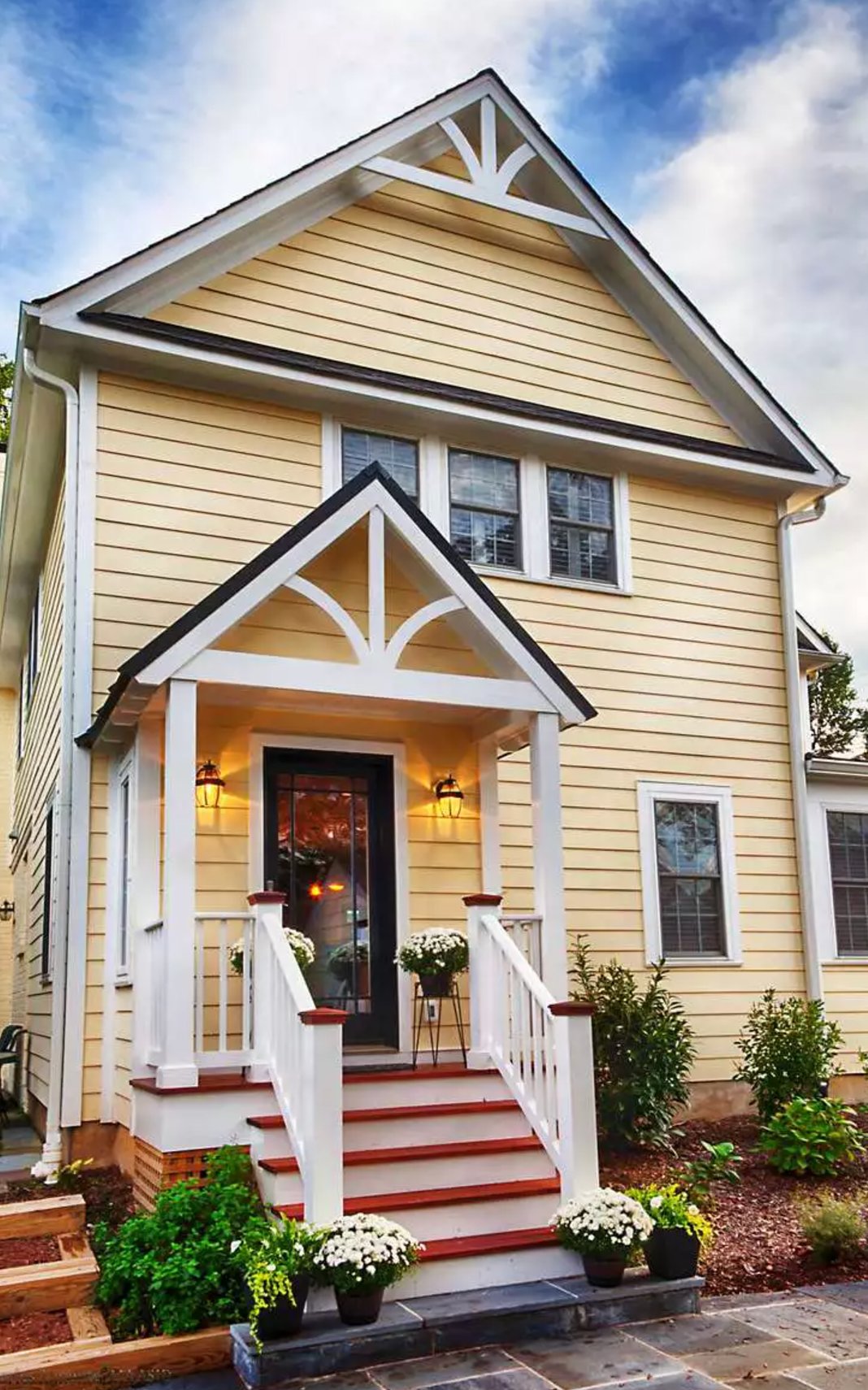
Warm yellow can be cheerful on a country house, but it needs to be buttery rather than electric.
The white trim calls attention to the fan details on the gables, while the black front door and lanterns add needed contrast. The red steps echo the flower pots, so the accent color feels connected to the entry.
Paint suggestion: Benjamin Moore Dunmore Cream (siding), Sherwin Williams Extra White (trim).
30. Sage Modern Victorian
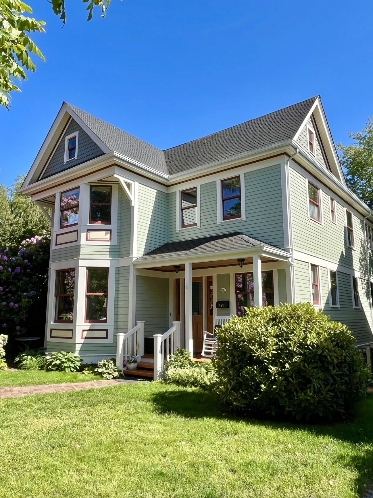
This mint-green shade freshens the Victorian details without flattening them. White trim separates the brackets, windows, and porch work so the historic character still reads.
Paint suggestion: Benjamin Moore Saybrook Sage (siding), Sherwin Williams Pure White (trim).
31. Classic Red Brick Colonial
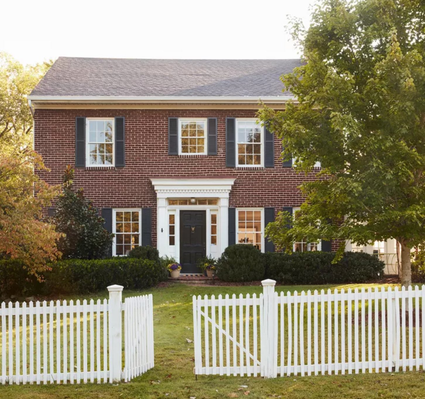
This deep reddish-brown brick has enough color on its own, so black shutters and crisp white trim are the right supporting choices. The brick warms noticeably near sunset.
The white entrance framing gives the doorway presence, and the white fence repeats the trim color out at the property line.
Paint suggestion: Benjamin Moore Heritage Red (brick), Sherwin Williams Tricorn Black (shutters), Benjamin Moore Simply White (trim and fence).
32. Sienna
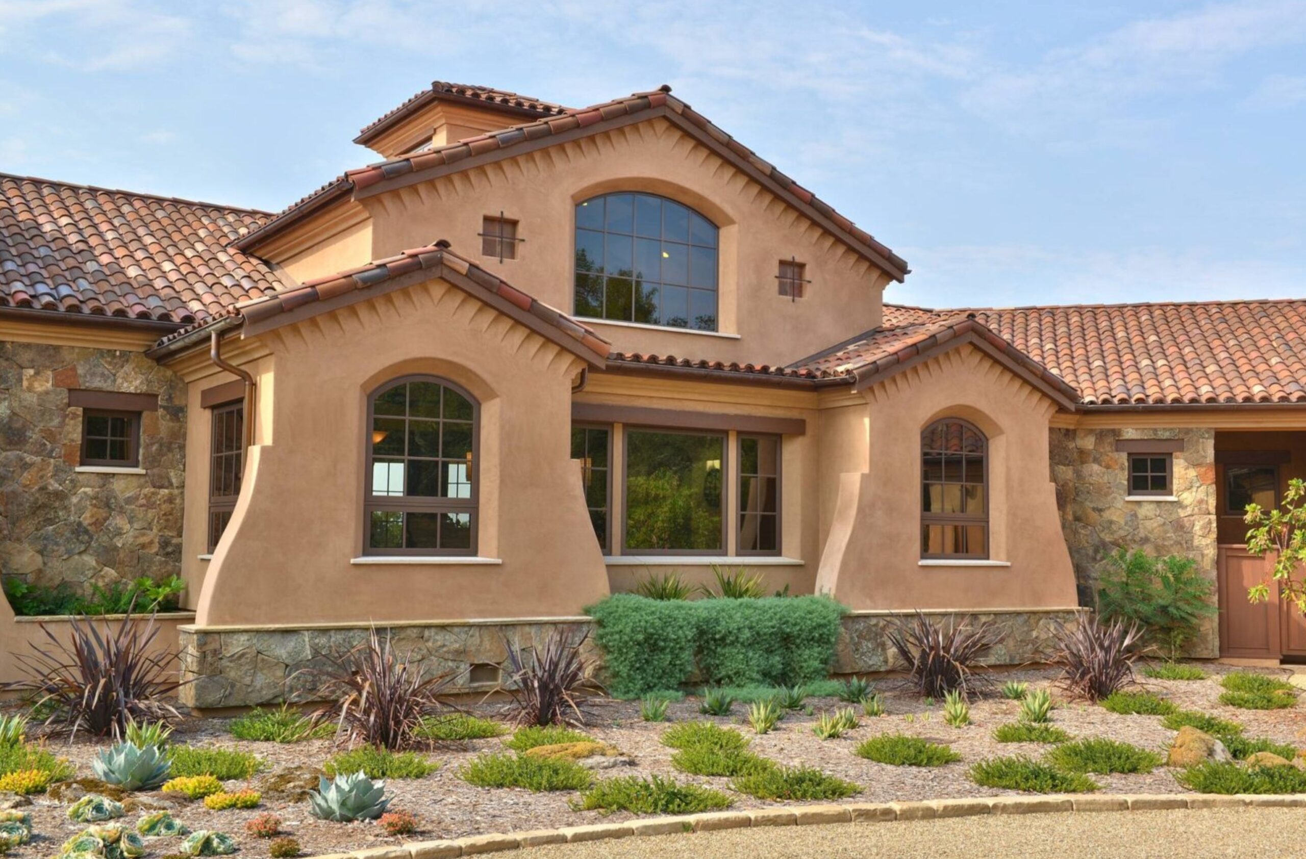
This warm beige exterior is tuned to the terracotta roof tiles and natural stone accents. It also works with drought-resistant landscaping, where cooler grays can look disconnected from gravel, clay, and dry grasses.
Paint suggestion: Sherwin Williams Casa Blanca (main walls), Benjamin Moore Sandy Hook Gray (trim).
33. Green Sanctuary
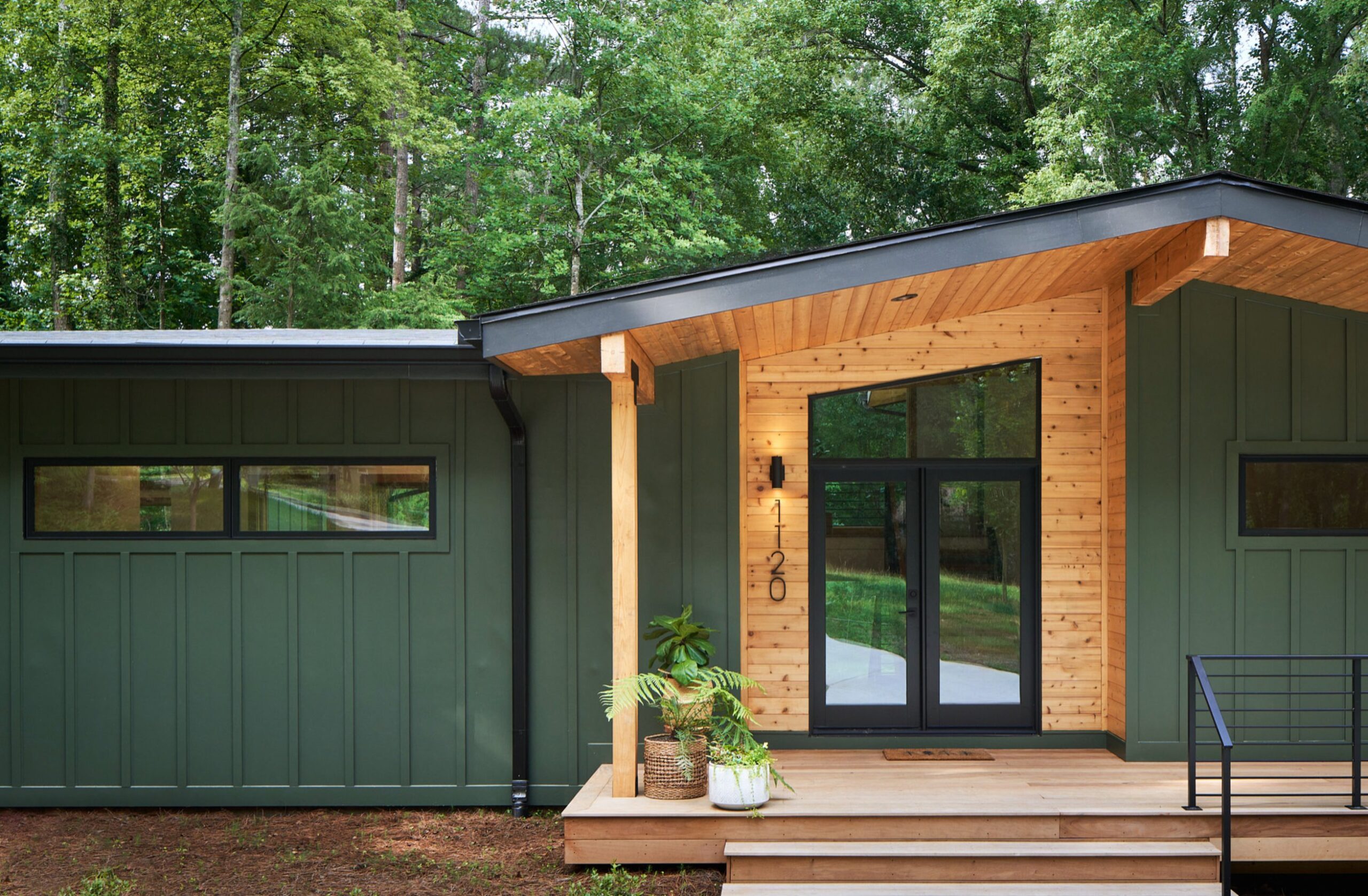
This deep green settles into the surrounding trees instead of trying to stand apart from them. The natural wood porch warms the cooler body color and gives the entry a clear focal point.
Black windows and doors work here because they are close in value to the siding, so the contrast feels refined rather than busy.
Paint suggestion: Sherwin Williams Forest Grove (siding), Benjamin Moore Clear Cedar (wood trim).
34. Dark Moody Modern
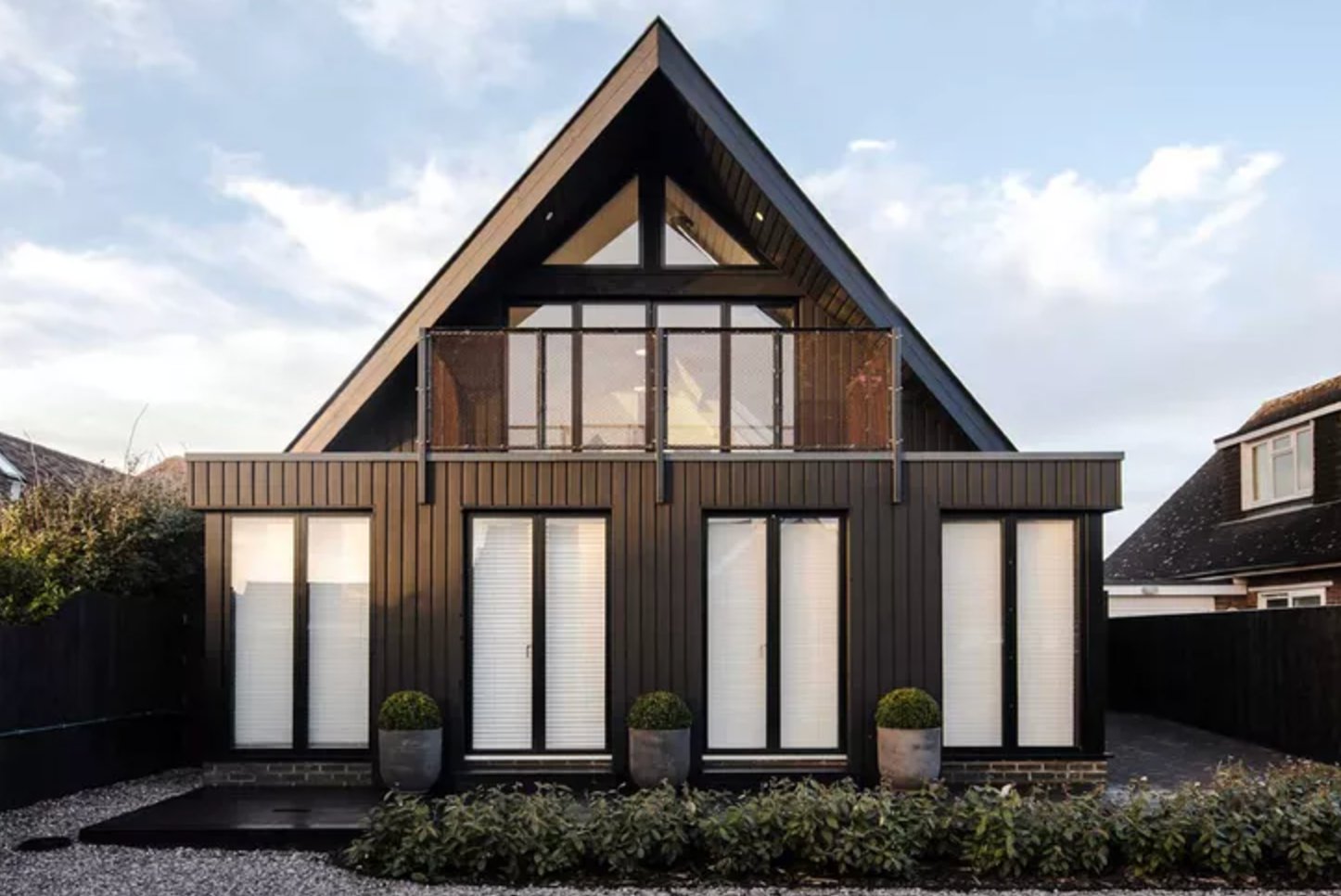
This modern A-frame shows why dark colors suit simple, angular architecture. The vertical cladding in rich brownish tones stretches the facade visually, while the white windows keep the dark shell from closing in.
Paint suggestion: Benjamin Moore Dragon's Breath (siding), Sherwin Williams Pure White (window frames).
35. Classic Blue Colonial
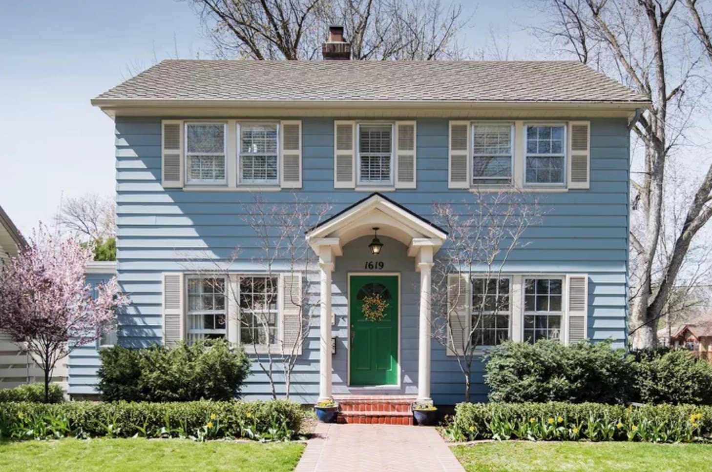
Soft blue siding, white trim, and a green front door make a friendly year-round palette. It has extra life in spring, when blooming trees and tulips add pink and yellow around the facade.
Paint suggestion: Benjamin Moore Van Courtland Blue HC-145 (siding), Sherwin Williams Alabaster SW 7008 (trim).
36. Modern Grey Manor

The gray on this house is deep enough to have presence without overpowering the massing. At dusk, warm interior light gives the cool exterior needed contrast.
The shade suits the modern architecture because it emphasizes the clean lines and proportions instead of decorating them.
Paint suggestion: Sherwin Williams Peppercorn (main facade), Benjamin Moore Iron Mountain (addition).
37. Contemporary Beige
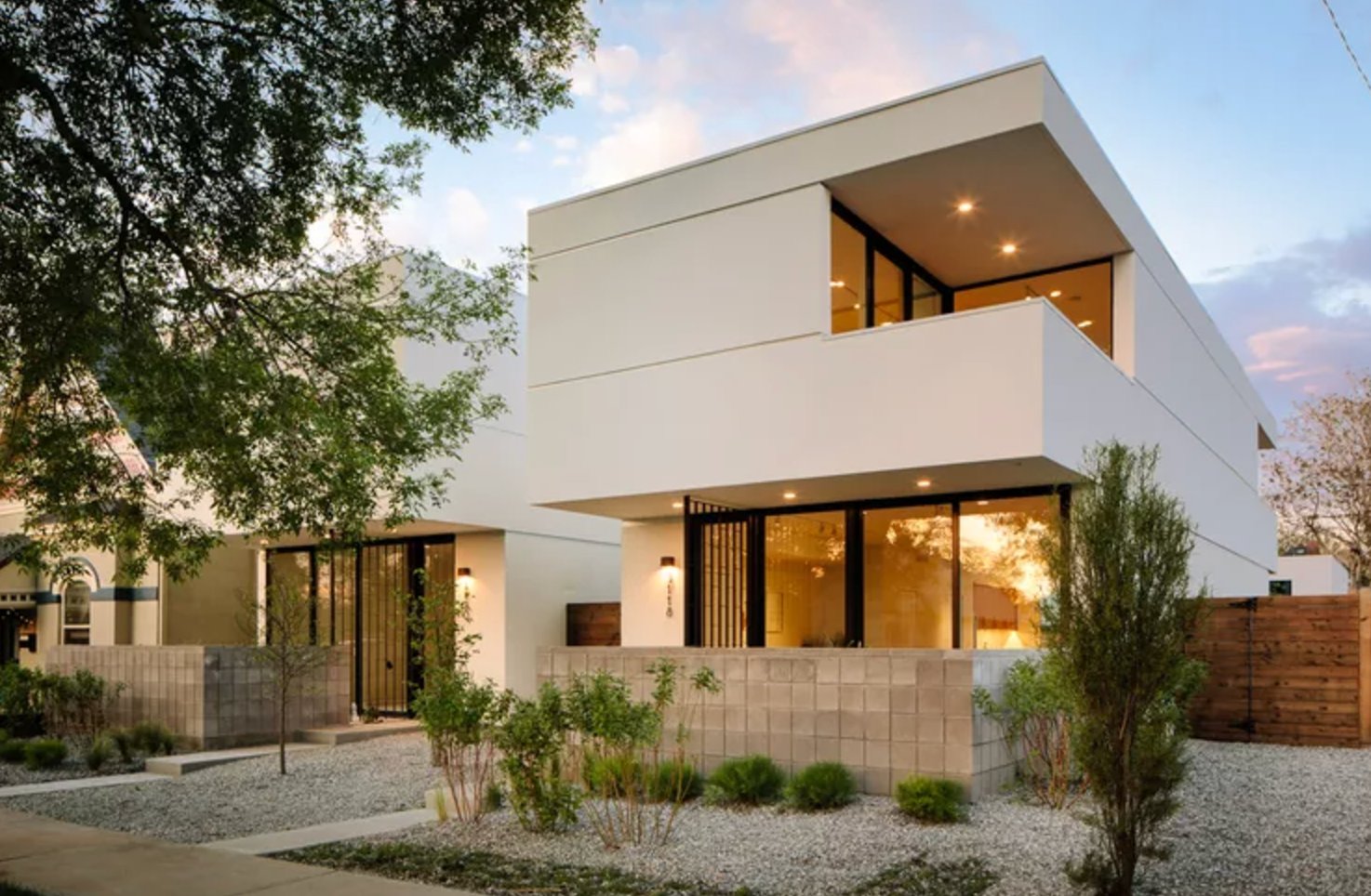
The clean lines and geometric shapes carry this white monochromatic palette. The contrast between the walls and black window frames is the main design move, and warm evening light softens the large glass openings.
Paint suggestion: Sherwin Williams Pure White (walls), Benjamin Moore Black Iron (window frames).
38. Butter Yellow Craftsman
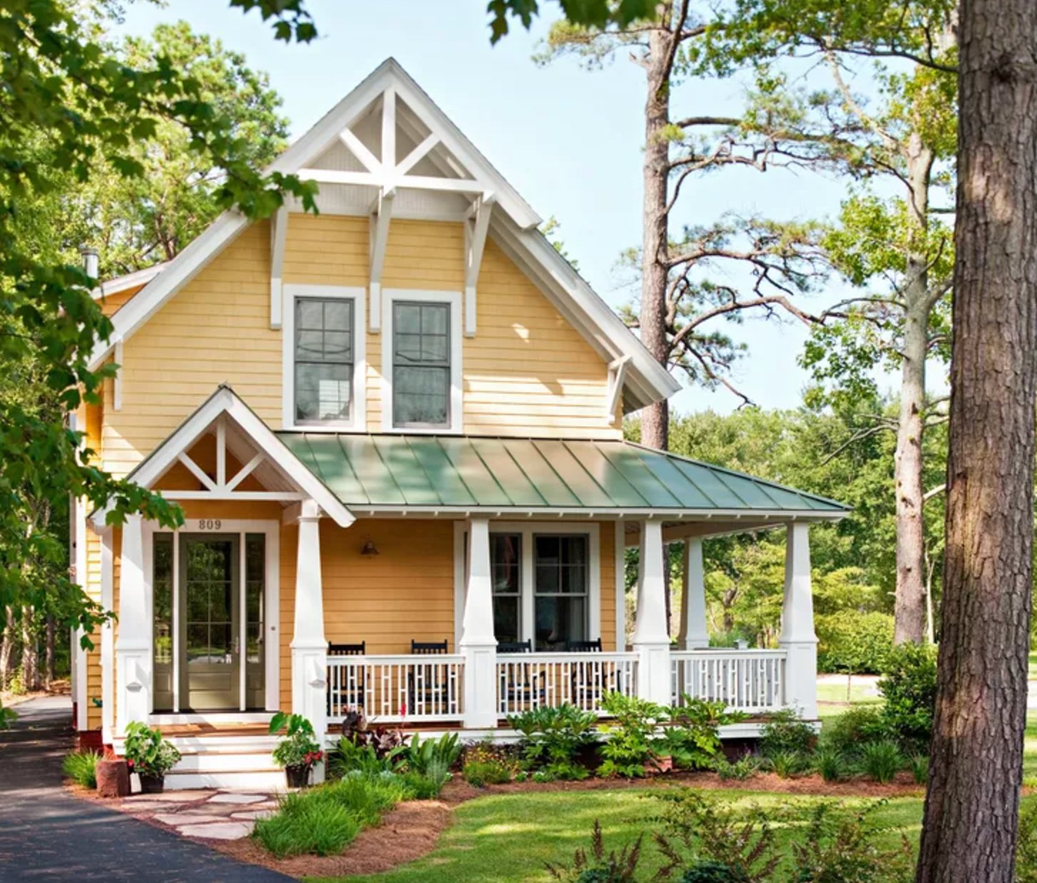
This sunny yellow gives the Craftsman facade warmth without hiding the trim work.
The color is strongest against surrounding greenery, which cools it down and keeps it from reading too sugary.
Paint suggestion: Benjamin Moore Yellow Marigold (siding), Sherwin Williams Pure White (trim).
39. Romantic Mediterranean Paradise
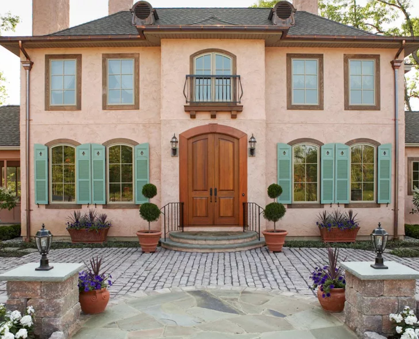
This peachy-pink color works because it is soft enough for a full stucco facade. Mint shutters add contrast, but the muted quality of both colors keeps the palette from looking cartoonish.
At sunset, this kind of warm wall color will intensify, so I would avoid pairing it with a trim white that has a strong yellow undertone.
Paint suggestion: Benjamin Moore First Light (walls), Sherwin Williams Waterfall (shutters).
40. Alpine Lodge
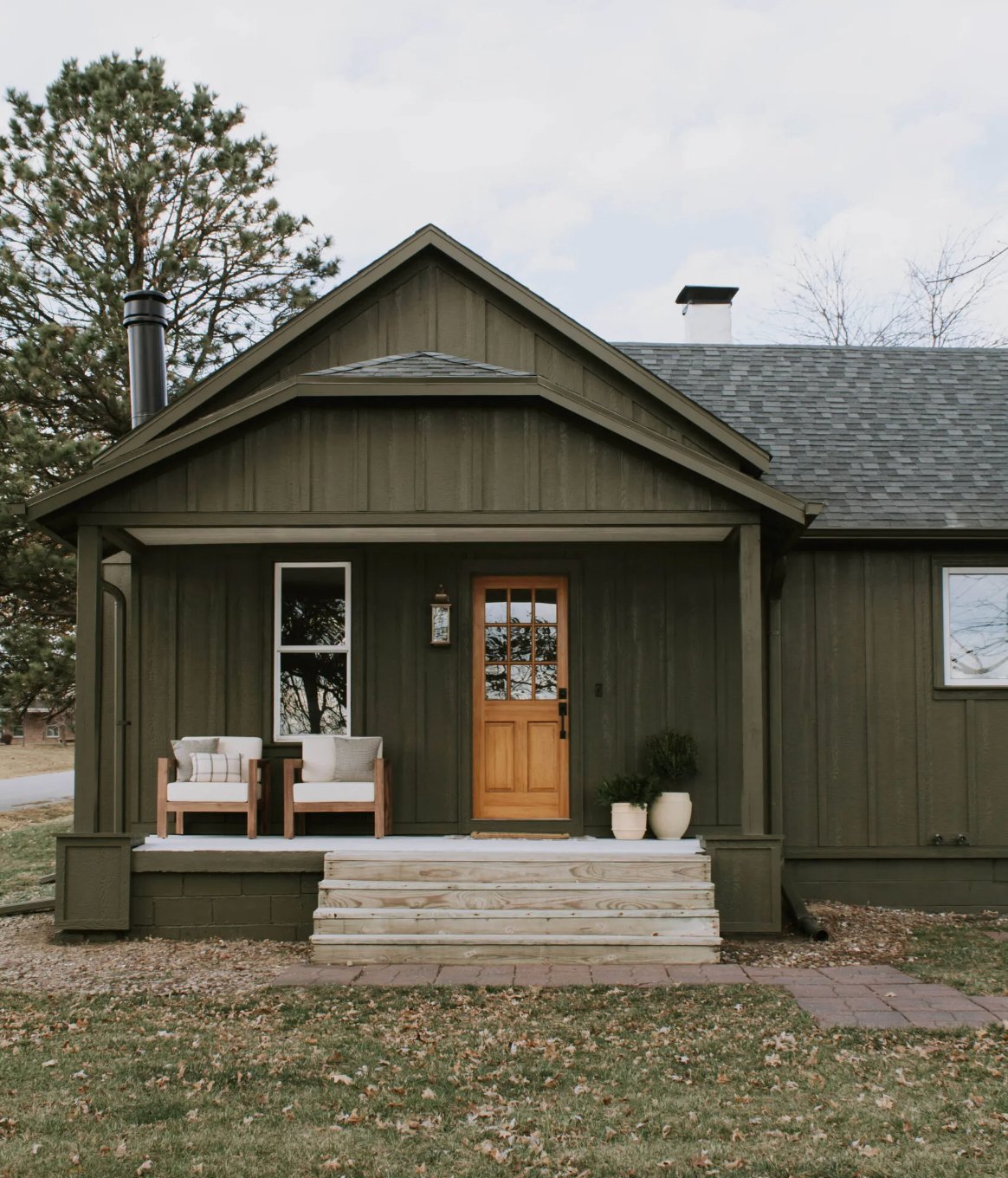
The deep pine-green exterior belongs in mountain or forest settings. A honey-colored front door warms the dark siding, and white window trim keeps the windows visible from a distance.
Paint suggestion: Benjamin Moore Hidden Valley (siding), Sherwin Williams Pure White (trim).
41. Warm Earth Tones Magic
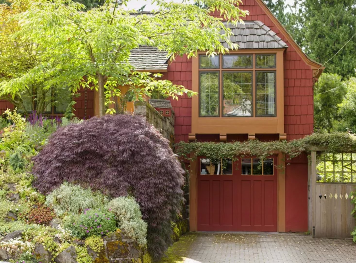
This deep red-orange shade gives the house a modern barn quality without copying a literal barn red.
The sandy window and door trim is a smart choice because stark white would make the siding look harsher. The Japanese maple reinforces the warm palette from the yard.
Paint suggestion: Benjamin Moore Wild Rice Red (siding), Sherwin Williams Biscuit (trim).
42. Warm Neutral Balance
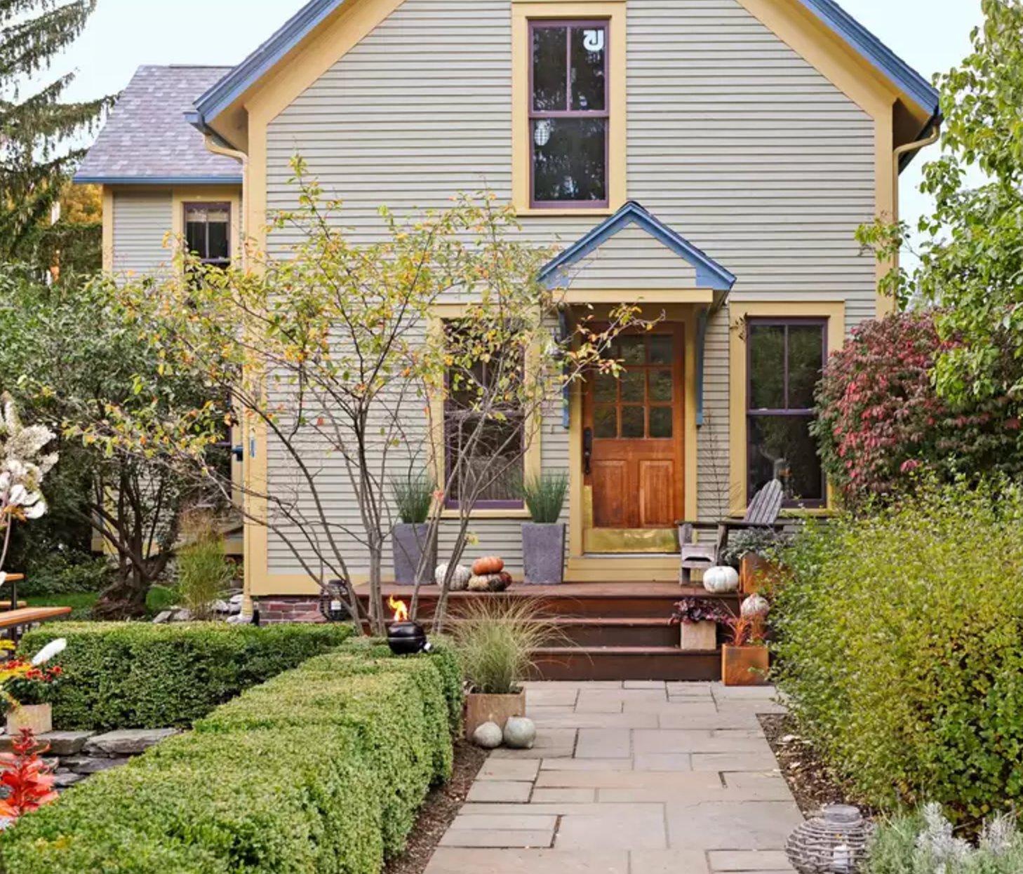
Ordinary neutral colors work harder when the trim and wood accents are chosen carefully.
The gray-sandy body color has a warm undertone that shows in sunlight. Honey-colored accents around the windows and gable connect to the vintage wood door, so the palette feels layered rather than beige by default.
Paint suggestion: Farrow & Ball Skimming Stone (siding), Benjamin Moore Golden Retriever (accents).
43. Coastal Blue Charm
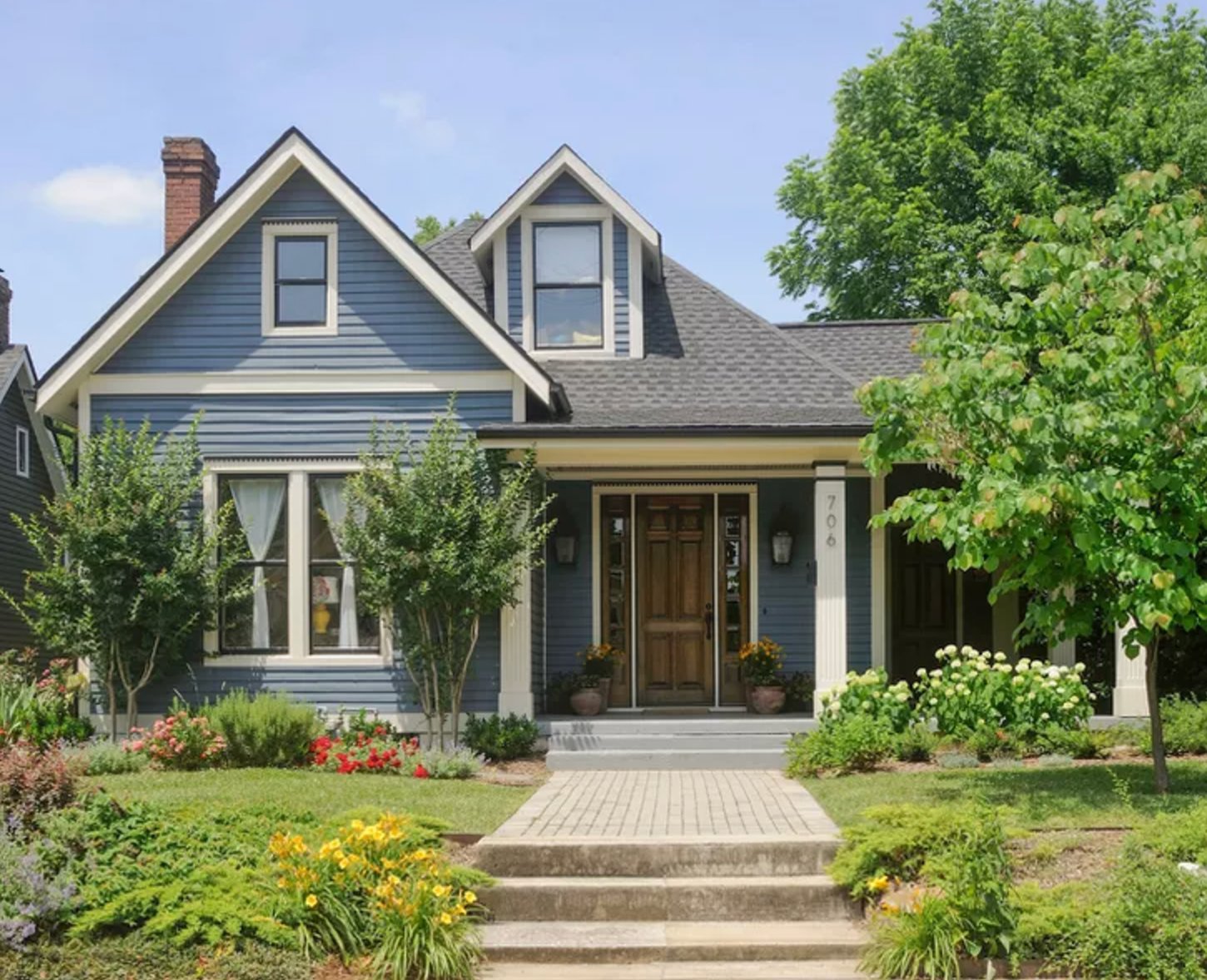
This blue brings a historic home into a more current palette without ignoring its Victorian details. White trim outlines the ornament, the brown front door adds warmth, and the garden colors make the blue feel intentional.
Paint suggestion: Benjamin Moore Van Deusen Blue (siding), Sherwin Williams Pure White (trim).
44. Classic Color Pop
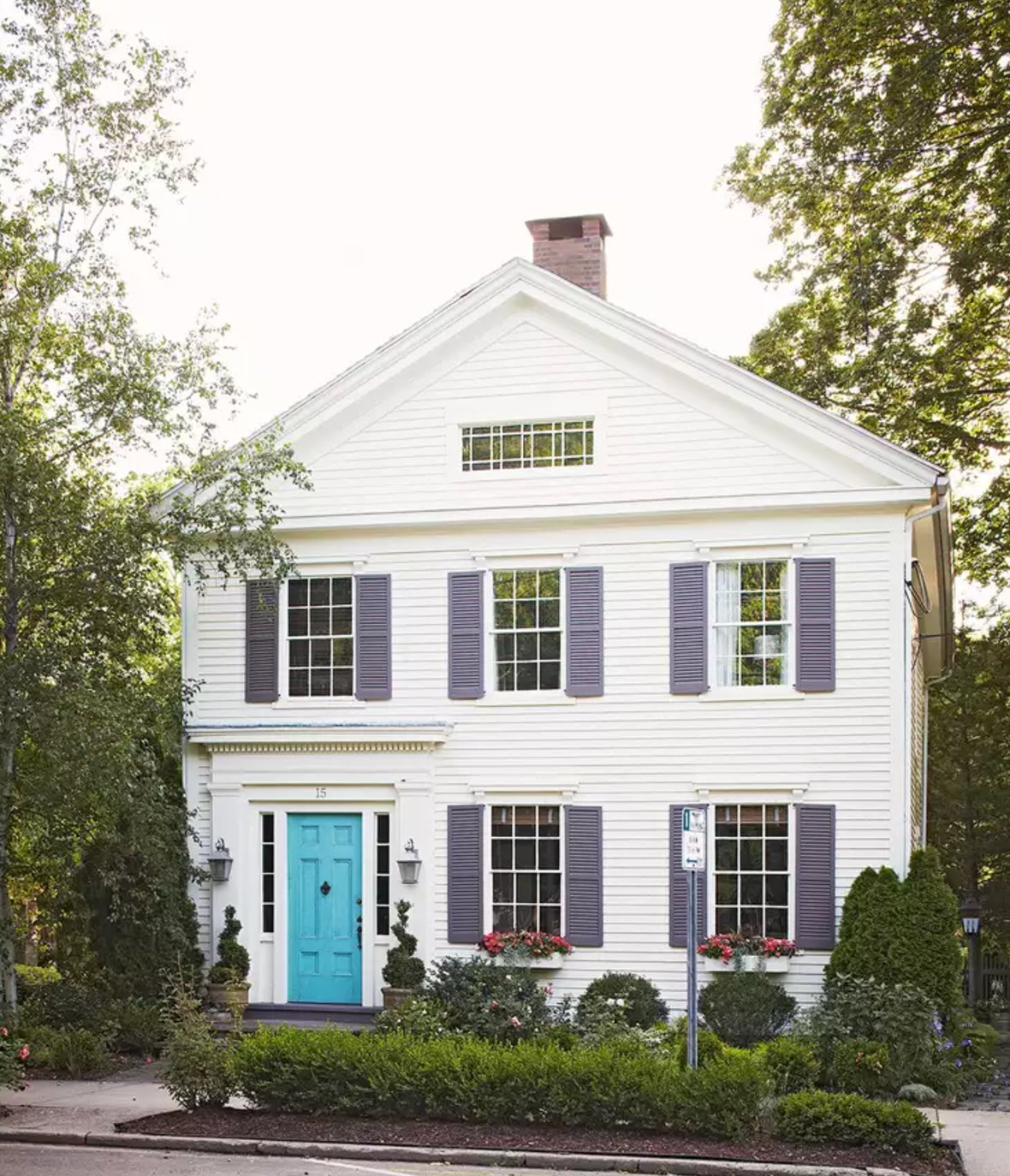
This traditional white house can handle a turquoise door because the body color is quiet and the architecture is symmetrical.
The gray-blue shutters are a softer bridge between white siding and the bright door. Red flowers in the window boxes add a seasonal accent without asking the paint palette to do everything.
Paint suggestion: Benjamin Moore Simply White (primary color), Benjamin Moore Wythe Blue (front door), Sherwin Williams Distance (shutters).
45. Sage & Stone Harmony
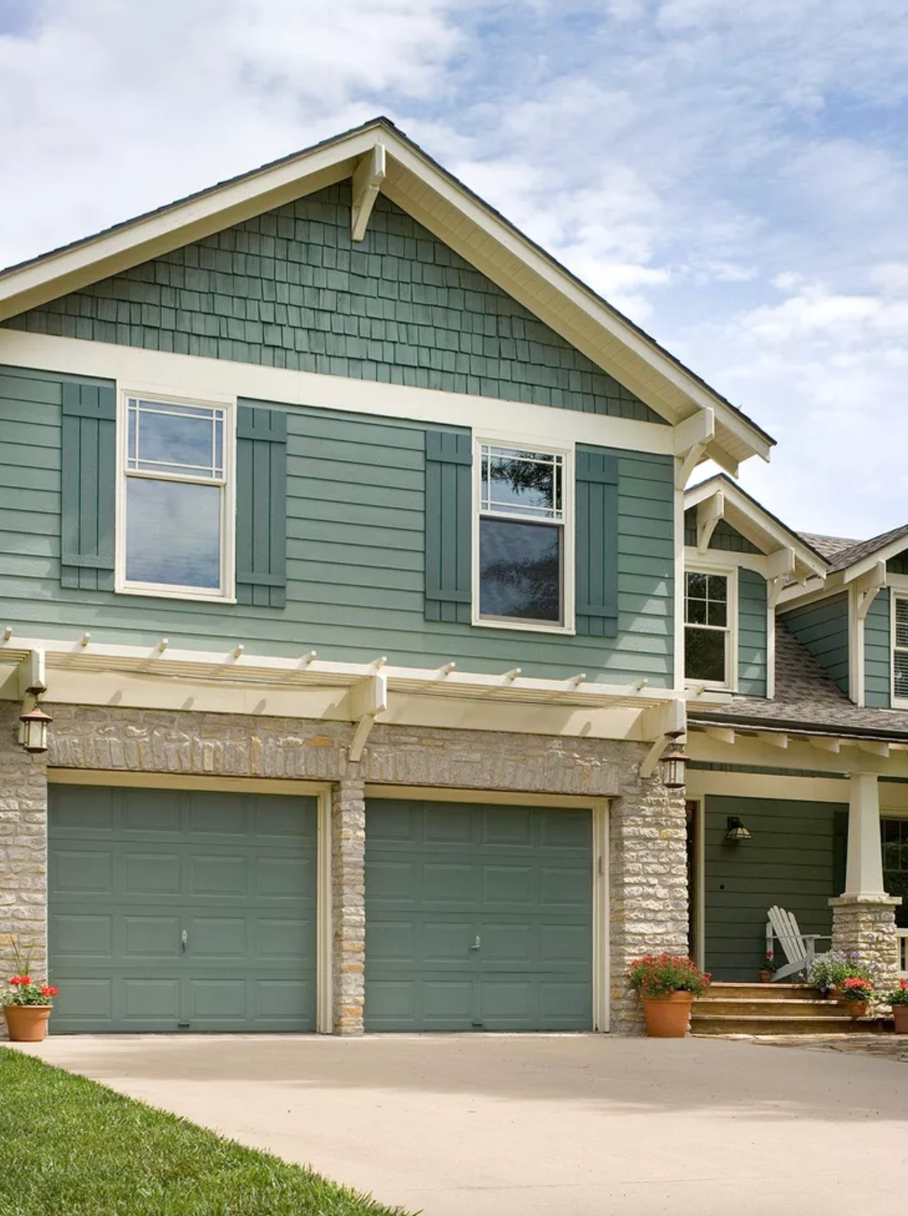
Soft green is becoming a go-to exterior neutral because it works with stone, cream trim, and mature landscaping.
Here, the siding, natural stone, and cream trim share a muted undertone. That makes the palette useful in both city and suburban settings, especially where stark white would look too new.
Paint suggestion: Sherwin Williams Sage Green Light (siding), Benjamin Moore Swiss Coffee (trim).
46. Weathered Gray Elegance
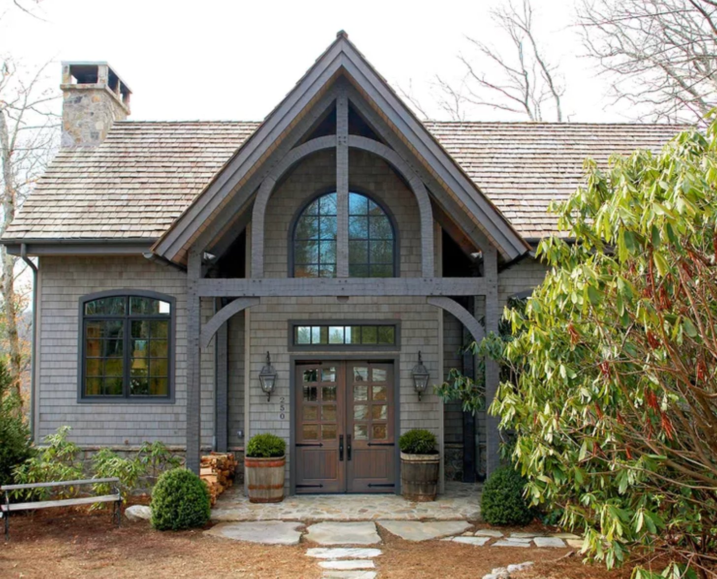
This house uses gray in several depths, which keeps the facade from feeling flat. Gray beams and arches give the cottage shape a modern edge, while weathered wood doors add warmth.
Paint suggestion: Benjamin Moore Storm Cloud Gray (siding), Sherwin Williams Peppercorn (trim).
47. Moody Gray Exterior
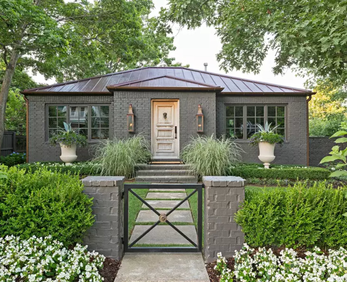
The brick facade in this rich gray holds up well against garden greenery. A light front door and symmetrical windows bring order to the darker exterior.
The gray body color also works with coppery tones in the roof and planting. White flowers and ornamental grasses lighten the base of the house.
Paint suggestion: Benjamin Moore Wrought Iron (primary color), Sherwin Williams Accessible Beige (door).
48. Crisp White & Stone
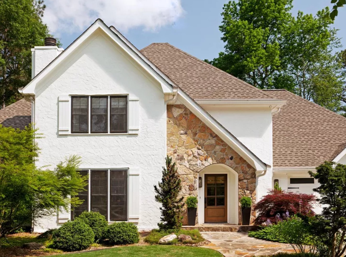
This white stucco reads clean in strong sunlight, while the stone trim adds age and texture. If your stone has beige or gold in it, avoid a blue-white body color and test a softer white first.
Paint suggestion: Sherwin Williams Pure White (walls), Benjamin Moore Swiss Coffee (trim).
49. Coastal White Charm
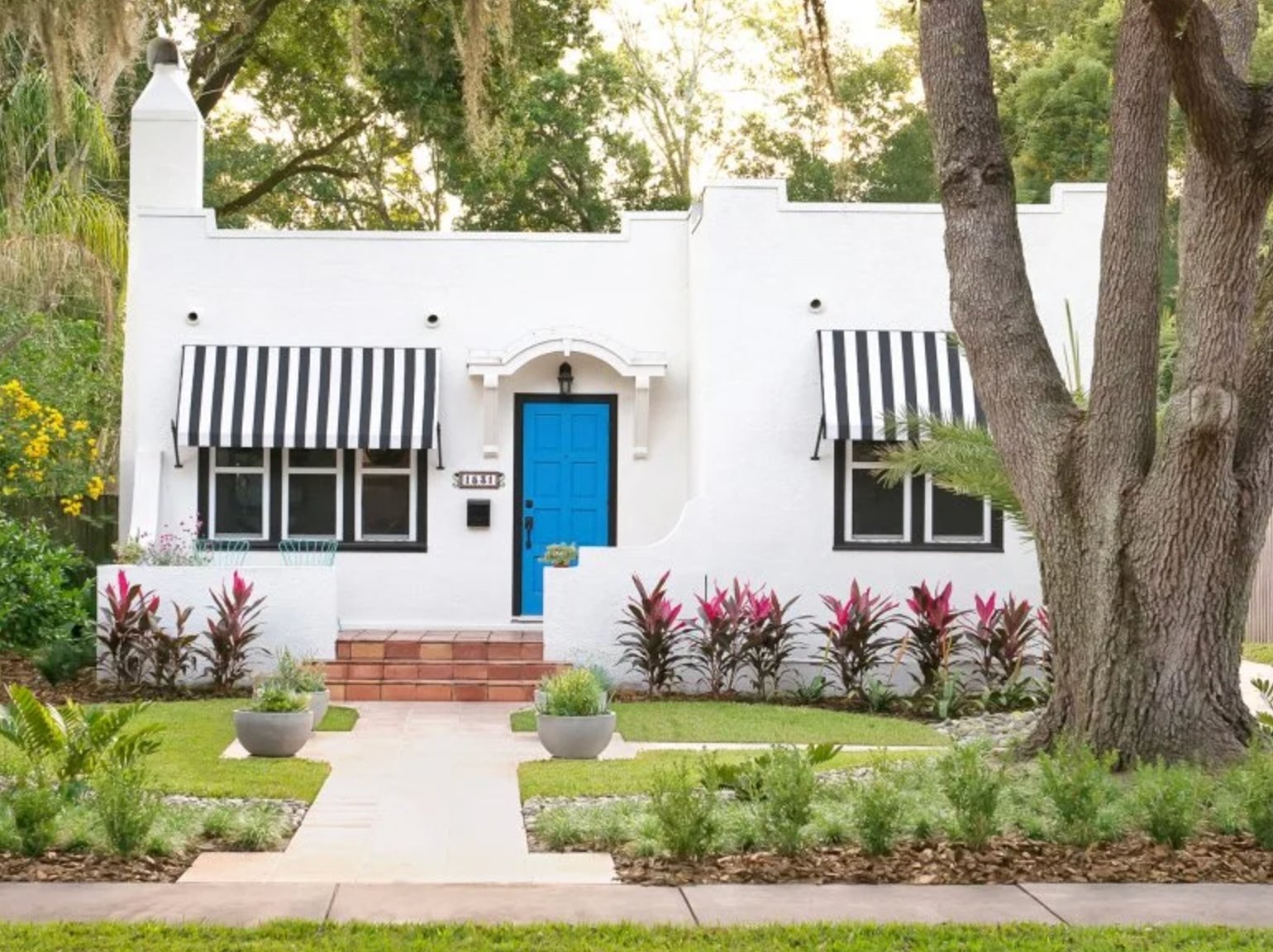
The crisp white exterior gives the black-and-white awnings and turquoise door room to stand out. This high-contrast look is common on Florida's coast and in other southern states because bright sun keeps the white from looking dull.
Paint suggestion: Sherwin Williams Pure White (main walls), Benjamin Moore Caribbean Blue (front door).
50. Classic Colonial White
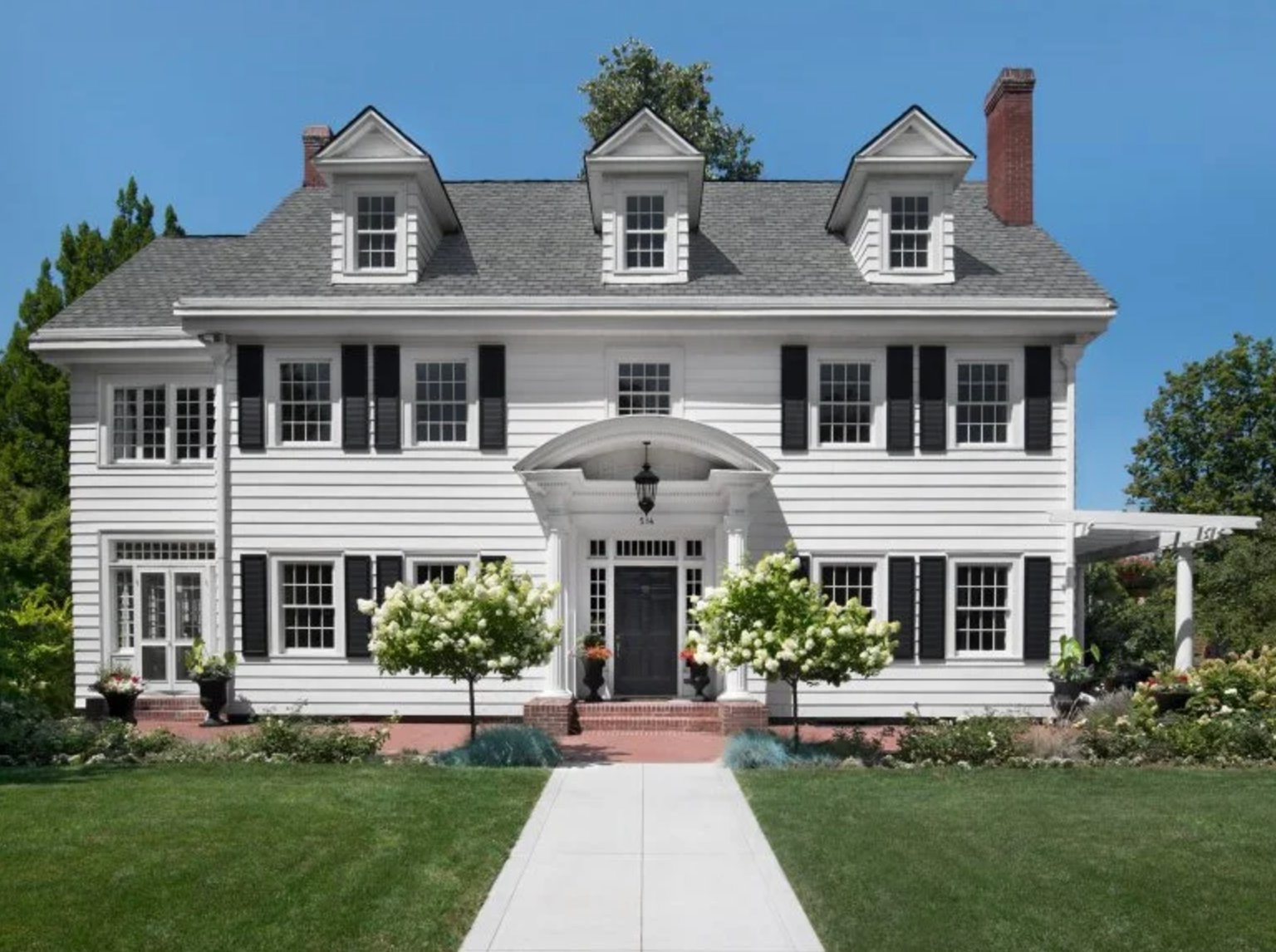
White exterior with black accents is a dependable Colonial palette when the proportions are this orderly. The three dormers and central arched entrance give the dark accents a clear pattern to follow.
Paint suggestion: Sherwin Williams Pure White (siding).
51. Butter Yellow Cottage
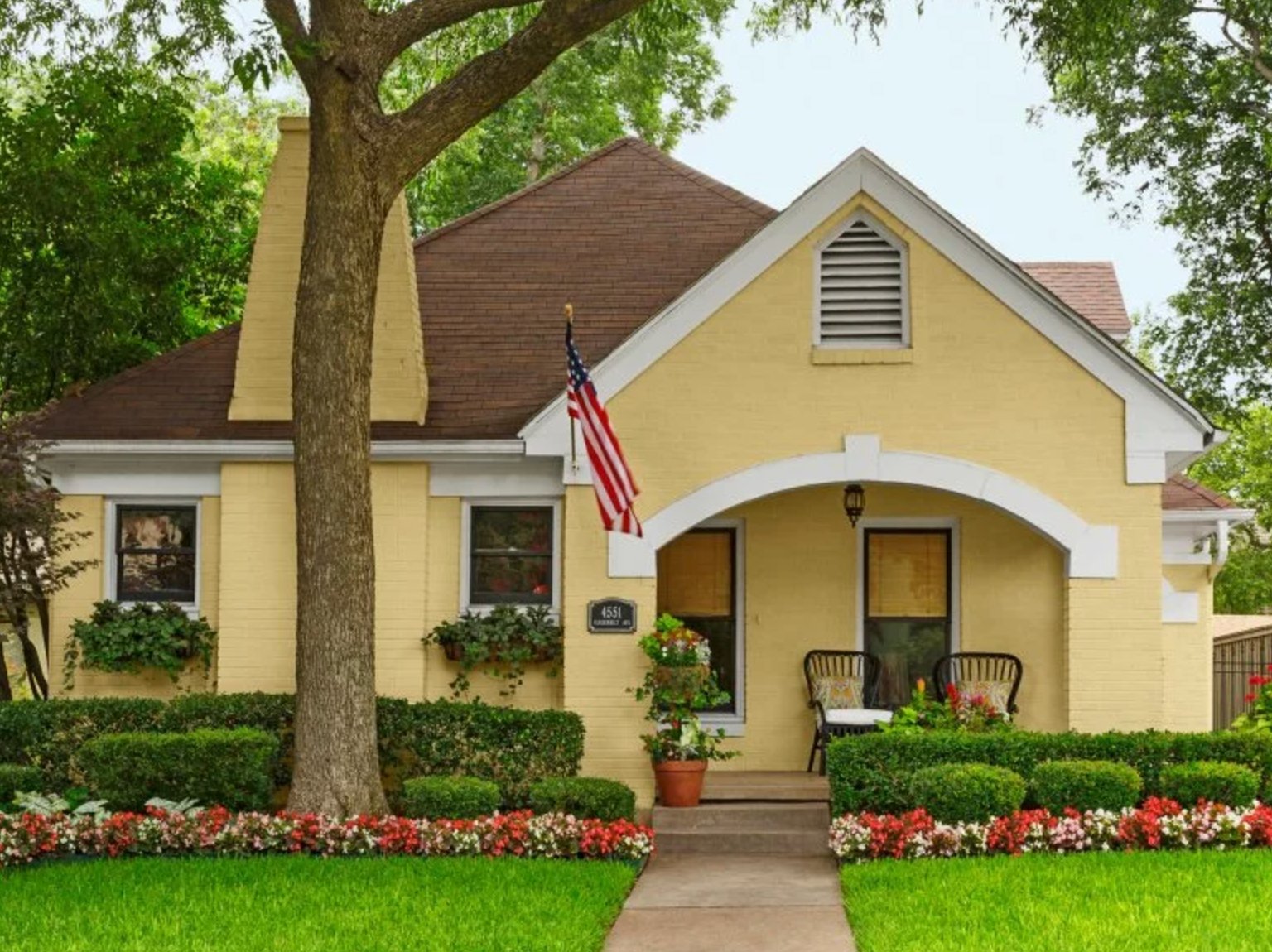
This home shows how a gentle yellow can warm up a classic American exterior. White trim highlights the arched portico and window frames, while the brown roof keeps the yellow grounded.
Paint suggestion: Benjamin Moore Buttermilk (siding), Sherwin Williams Pure White (trim).
52. Classic Gray & Orange
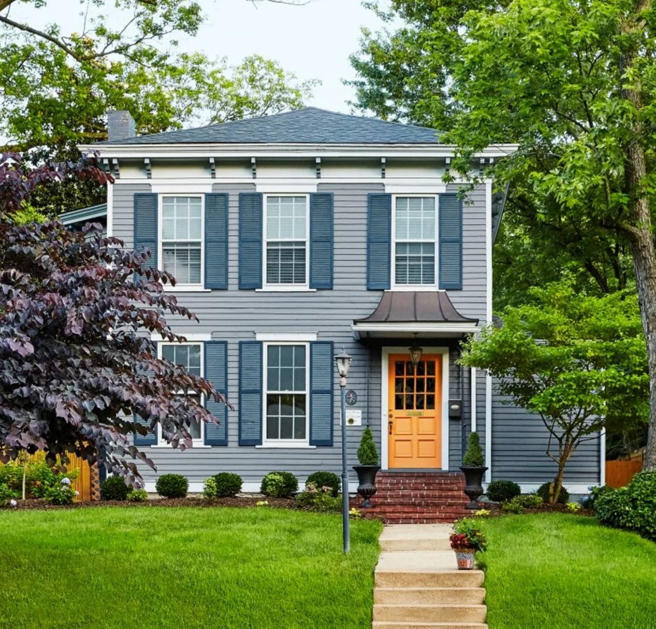
The gray and orange combination works because the orange is limited to the front door. Blue shutters add a traditional note and keep the palette from feeling too industrial.
The dark burgundy Japanese maple on the left adds depth to the color scheme. It is a useful reminder to test exterior colors against your actual landscaping, not just the siding.
Paint suggestion: Sherwin Williams Serious Gray (siding), Benjamin Moore Buttered Yam (door), Sherwin Williams Naval (shutters).
53. Traditional Red Magic
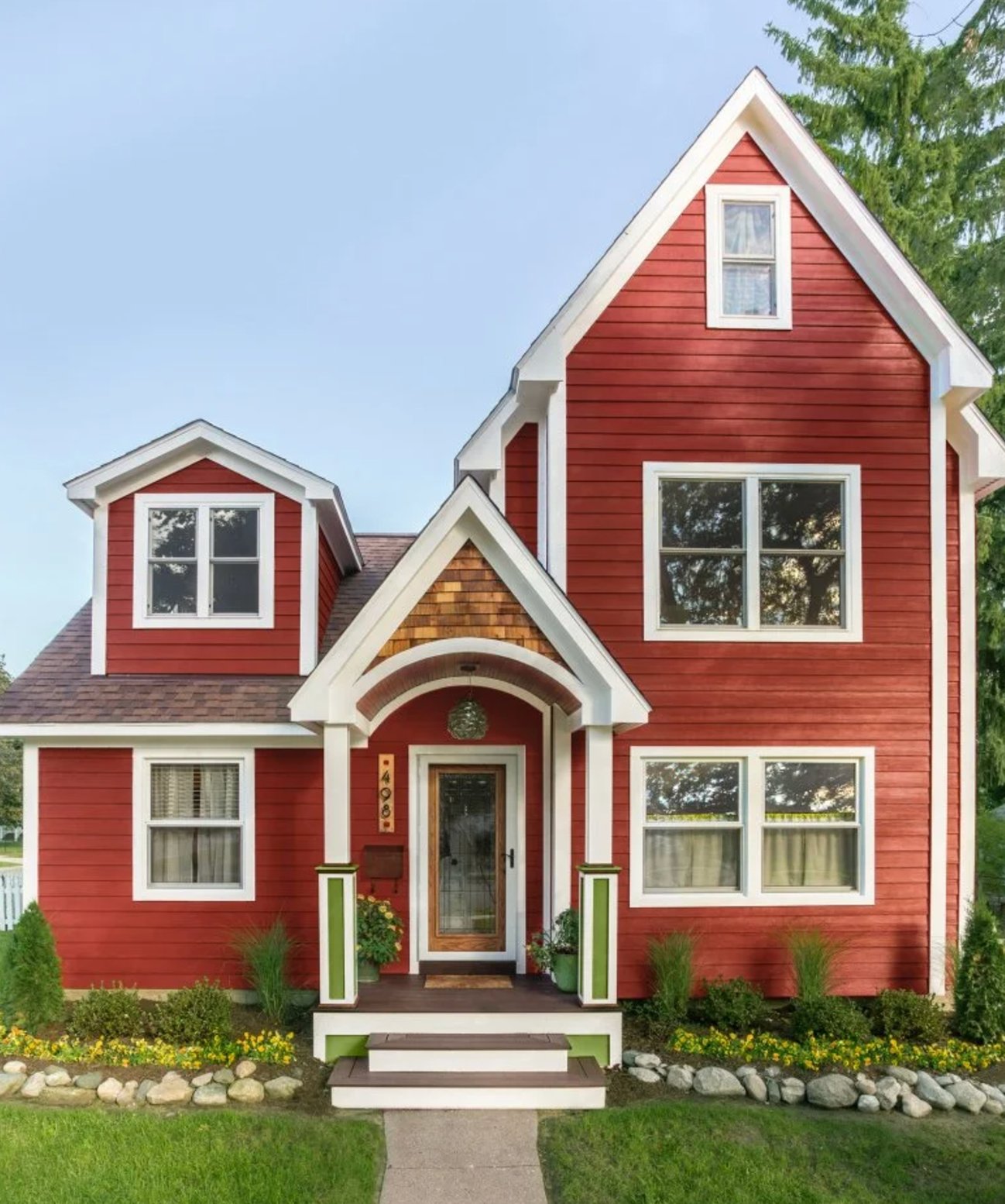
This red is rich and warm, closer to a classic country red than a fire-engine red. White trim gives it enough contrast to feel crisp.
The green porch accents connect the house to the lawn and planting. That small secondary color keeps the red-and-white palette from feeling flat.
Paint suggestion: Benjamin Moore Caliente (siding), Sherwin Williams Extra White (trim), and a splash of Benjamin Moore Garden Patch (for those lovely green touches).
54. Sweet & Crisp
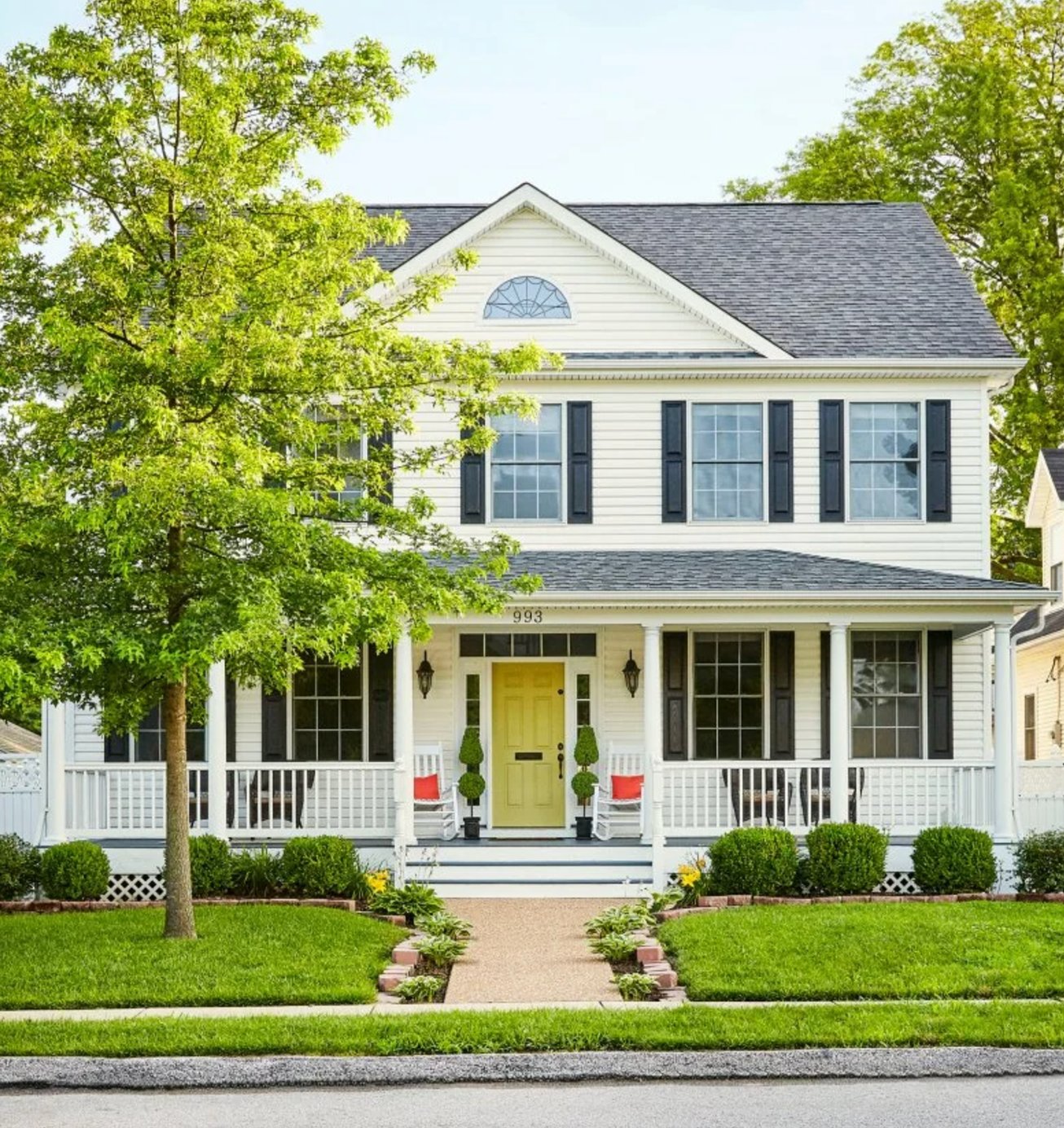
That lemon-pistachio door gives the traditional Colonial facade a fresh twist. Creamy siding adds warmth, and black shutters frame each window with a clean, familiar contrast.
Paint suggestion: Farrow & Ball String (siding), Benjamin Moore Split Pea (front door), Sherwin Williams Tricorn Black (shutters).
55. Navy Tudor Revival
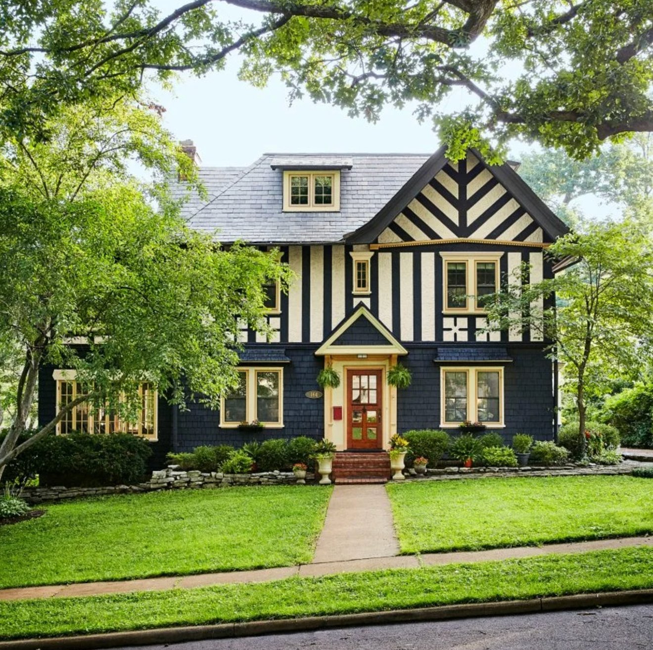
This palette updates Tudor Revival style with navy instead of the expected brown or black. The warm wood front door softens the strong geometric trim pattern.
Paint suggestion: Sherwin Williams Naval (primary color), Benjamin Moore Swiss Coffee (decorative elements).
56. Sage & Terracotta Love Story
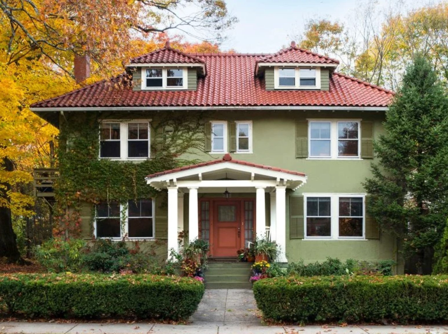
This sage green works with the red tile roof because green and terracotta are natural complements. The ivy softens the wall color further, which helps sage behave like a neutral.
Paint suggestion: Benjamin Moore Saybrook Sage (siding), Sherwin Williams Pure White (trim).
57. Classic White & Blue
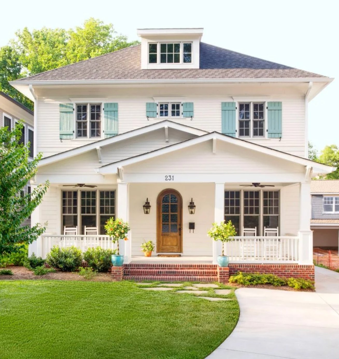
Crisp white with mint-blue shutters gives this house a coastal feel without relying on navy. The warm wood detail at the entry keeps the palette from becoming too cool.
Paint suggestion: Benjamin Moore White Dove (walls), SW Rainwashed (shutters)
58. Gray Sophistication
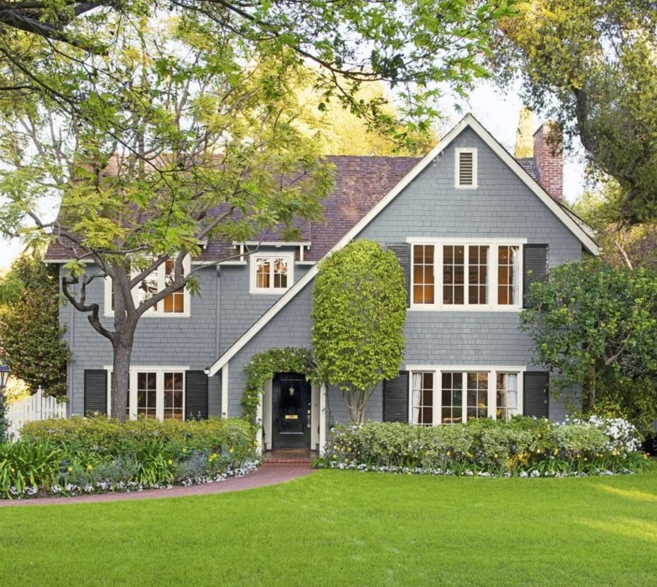
This deep gray facade feels current without being flashy. Black shutters make the windows read stronger, which is helpful when the body color and roof are close in value.
Paint suggestion: SW Gauntlet Gray (facade), BM Black (shutters)
59. Timeless Sage Green
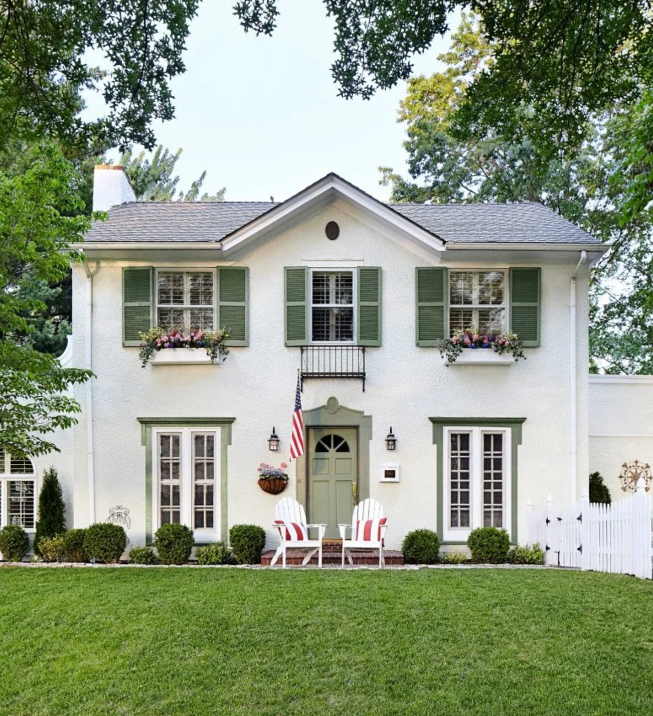
The subtle olive-green trim gives the white facade a softer, garden-connected look. It picks up the landscaping without turning the house green overall.
Paint suggestion: Benjamin Moore White Dove (facade), Farrow & Ball Calke Green (trim)
60. Stone & Navy
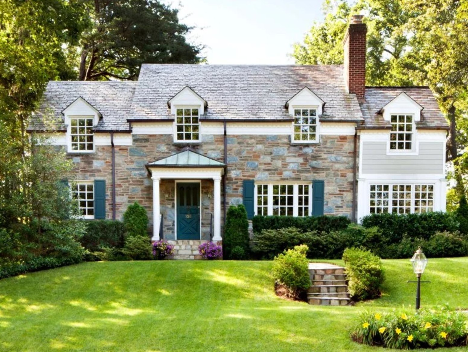
Natural stone and navy shutters create a textured, English-country kind of palette. The stone already has movement, so the shutter color should be steady and deep.
The rough stone texture plays against the smooth painted trim, adding character without another body color.
Paint suggestion: Natural stone (facade), Sherwin Williams Naval (shutters)
61. Feminine Blush

This powder pink works best because it is pale and clean, not saturated. Striped awnings and white trim give the classic house structure, so the pink reads intentional.
Paint suggestion: Benjamin Moore First Light (exterior), Sherwin Williams Pure White (trim).
62. Gray With Attitude
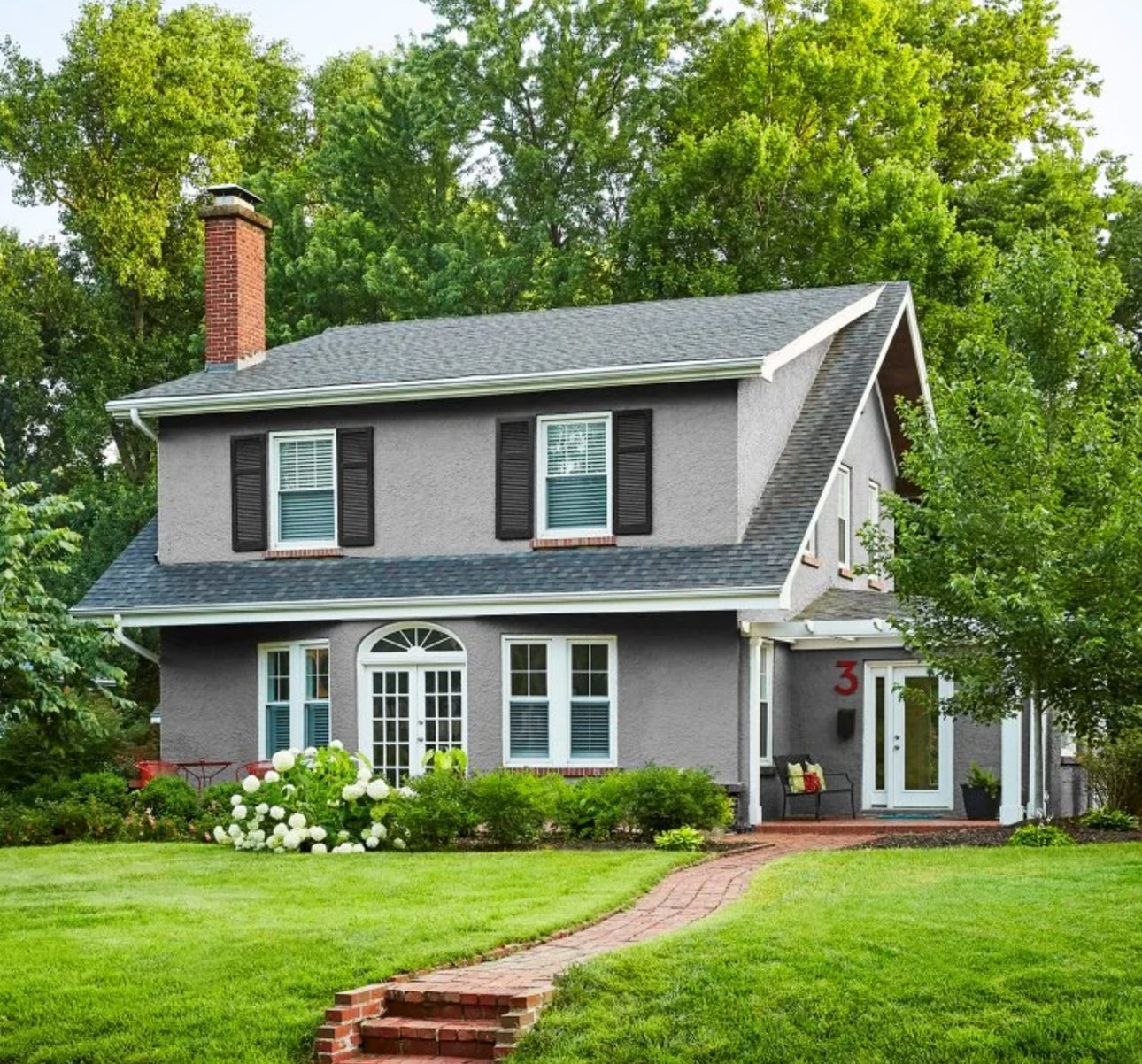
Gray can look dull when it has no contrast around it. Here, black shutters sharpen the windows, and white flowers by the entrance keep the front elevation from feeling too heavy.
Paint suggestion: Sherwin Williams Mindful Gray (main), Benjamin Moore Chantilly Lace (trim).
63. That Perfect Green
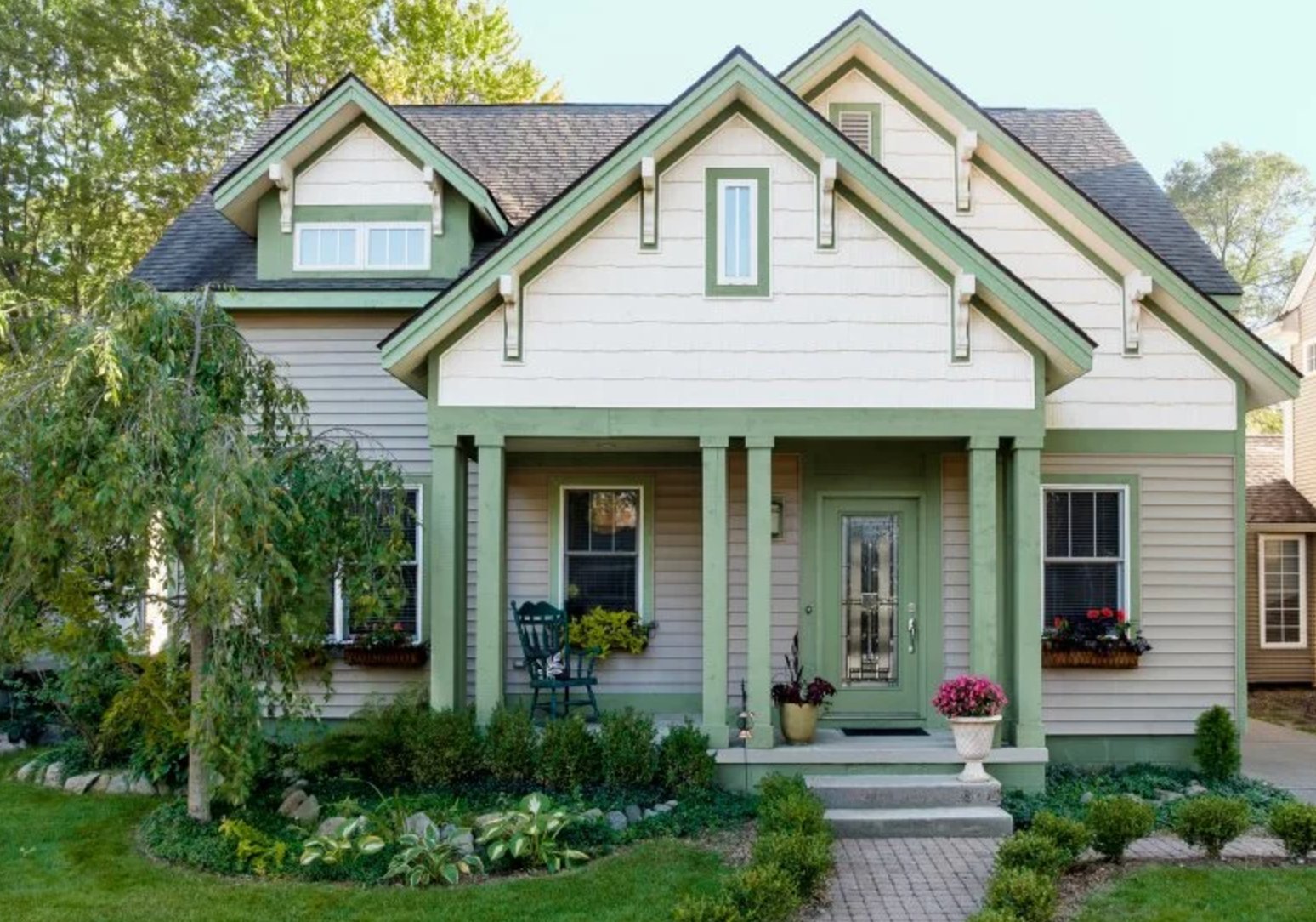
This green feels settled because it is muted enough to work through multiple seasons. It will look fresh with summer planting and still hold up beside bare winter branches.
Paint suggestion: Benjamin Moore October Mist (siding), Farrow & Ball All White (trim).
64. Earthy Vibes
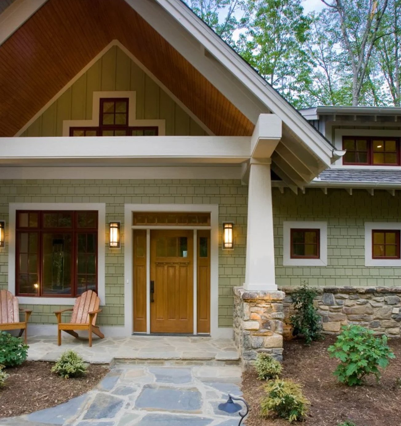
The olive tone pairs naturally with stone and wood because all three have earthy undertones. Modern lanterns keep the classic design from feeling too rustic.
Paint suggestion: Sherwin Williams Adaptive Shade (walls), Benjamin Moore Swiss Coffee (decor).
65. Modern Black
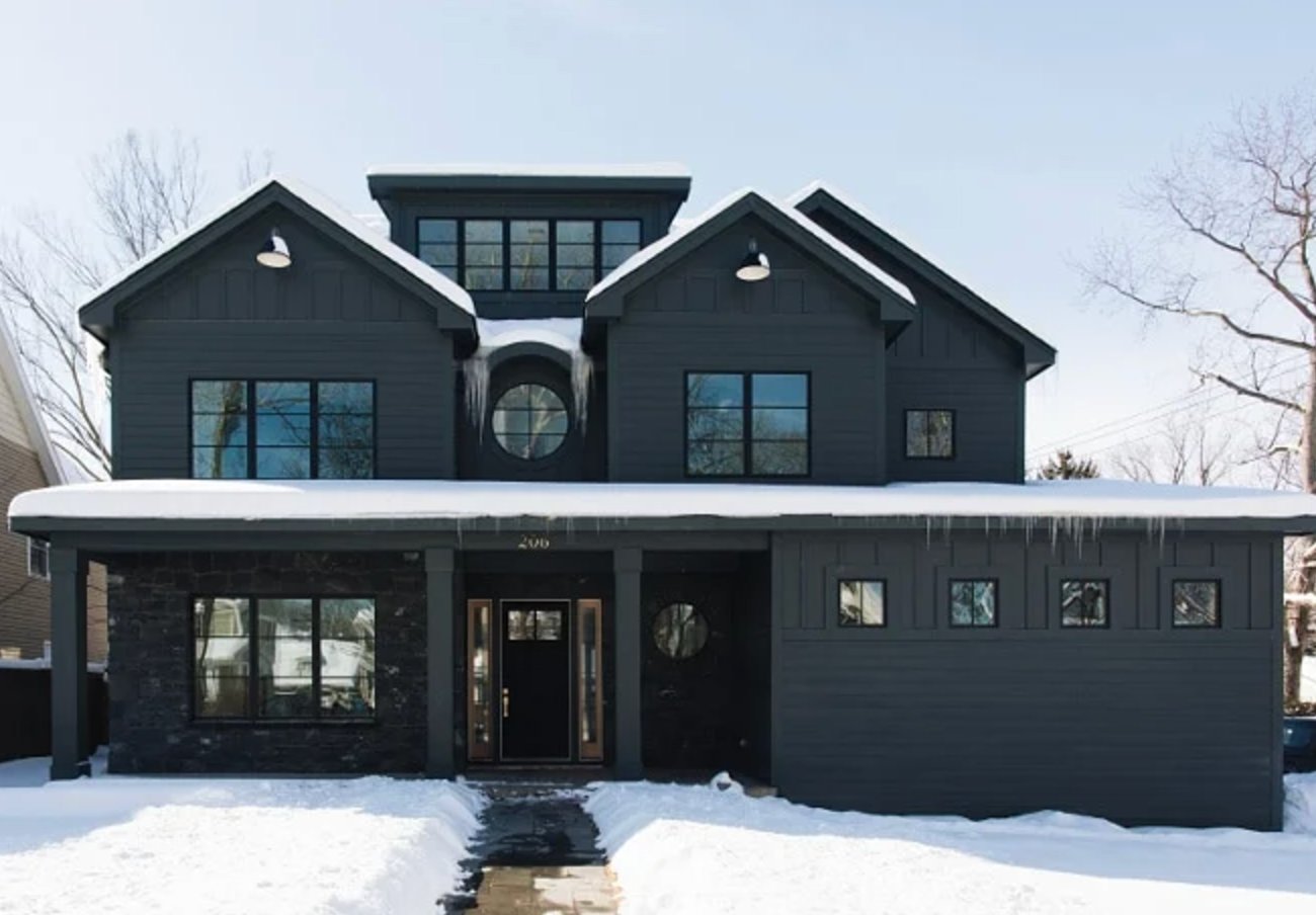
Black works best on contemporary homes with strong shapes, deep overhangs, or enough glass to break up the surface. It is dramatic, but it needs intentional relief so the facade does not read as a flat dark mass.
Paint suggestion: Benjamin Moore Black Beauty (exterior), Sherwin Williams Extra White (accents).
66. Mediterranean White & Blue
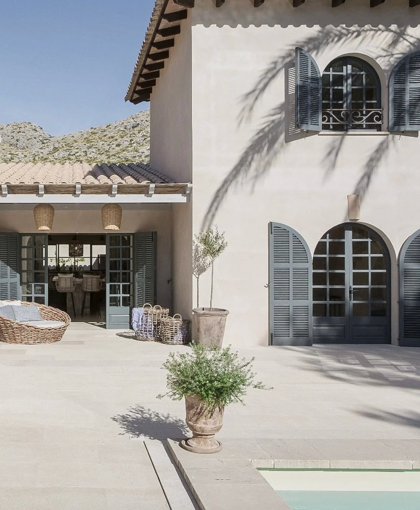
The white Mediterranean facade works with gray-blue shutters because the color cools down the terracotta roof tiles. Arched windows reinforce the style, so the palette does not have to over-explain it.
Paint suggestion: Benjamin Moore Swiss Coffee (walls), Farrow & Ball Pigeon (shutters)
67. Moody Cottage
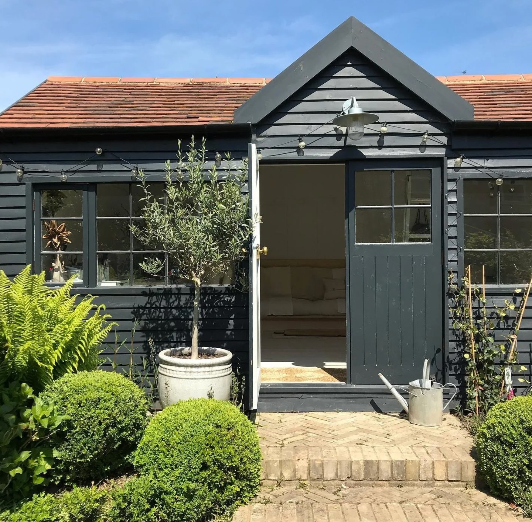
Near heavy greenery, an almost-black cottage can feel surprisingly natural. Warm string lights and pale trim soften the dark siding, which is important for a small garden structure.
Paint suggestion: Sherwin Williams Iron Ore (siding), Benjamin Moore Cloud White (trim)
68. Sweet Pink Victorian
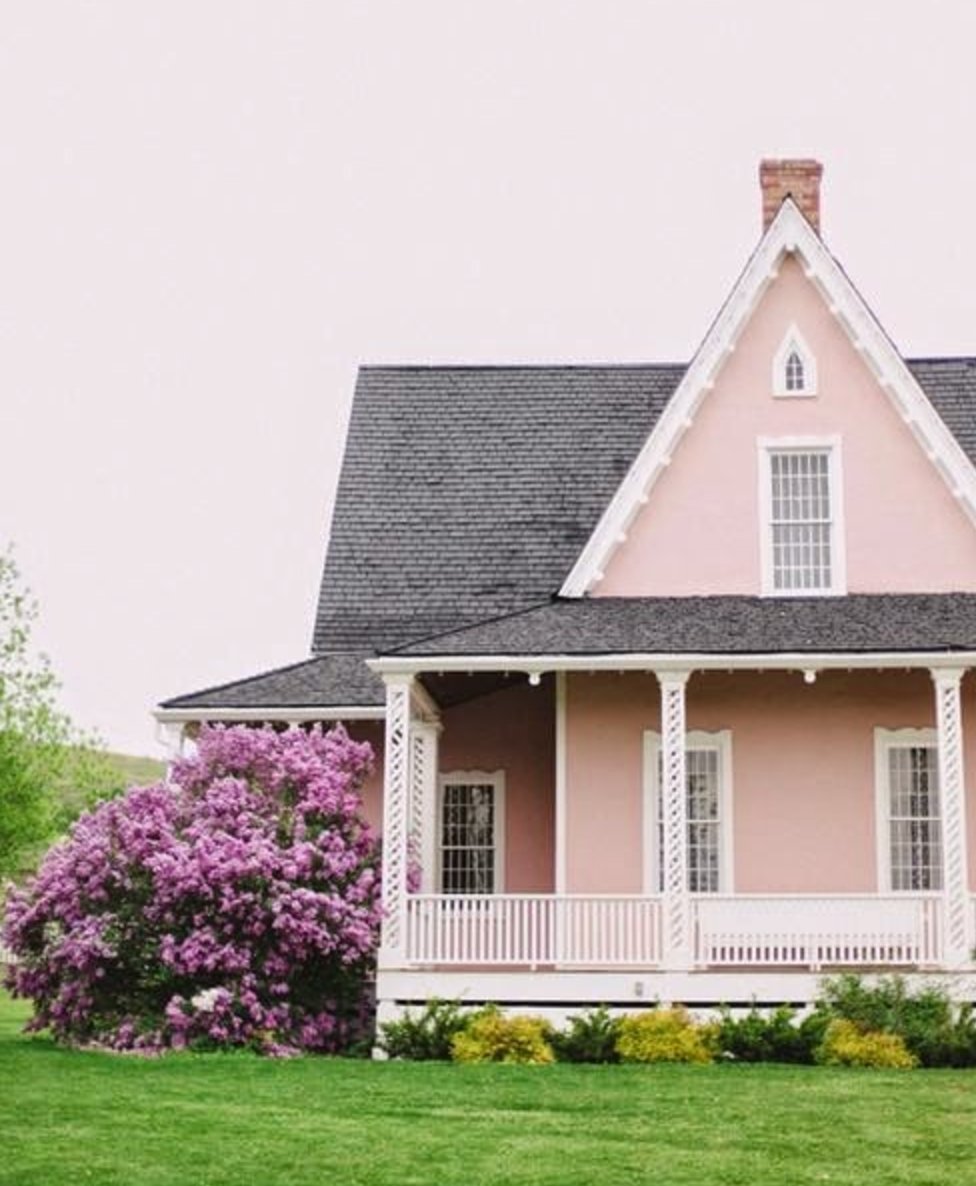
Soft pink suits this Victorian because the white trim protects all the delicate details from getting lost. The gray roof reins in the sweetness, and the rhododendrons make the color feel tied to the yard.
Paint suggestion: Farrow & Ball Pink Ground (walls), Benjamin Moore Chantilly Lace (trim)
69. Cool Coffee Shop Blue
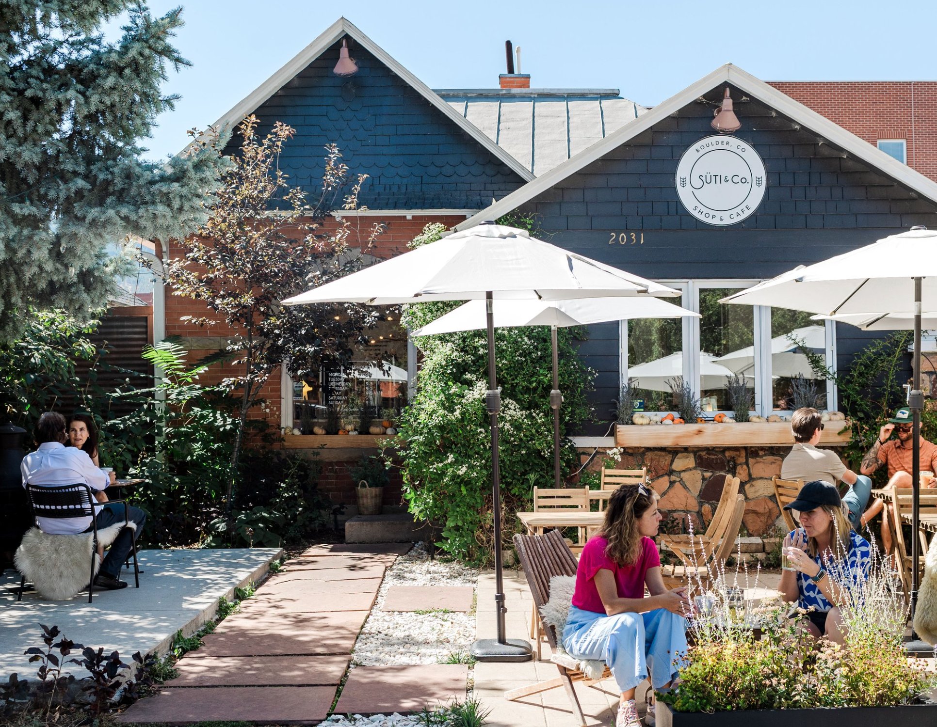
This coffee shop in Boulder, CO, uses blue in a way that feels commercial without shouting. The owner, who spent her childhood in Scandinavia, brought a Nordic influence to Colorado, and the white trim keeps the saturated exterior clean and approachable.
Paint suggestion: Benjamin Moore Gentleman's Gray (exterior), Sherwin Williams Pure White (trim)

I'm Elizabeth, your go-to guide for all things paint and design! My days are filled with color swatches and innovative room makeovers. When I'm not painting the town - literally - I'm soaking up inspiration from my travels. This blog is my way of sharing my passion and making the world a more vibrant place, one color palette at a time.