Best Beige Paint Colors
Beige is back because many homeowners are tired of cool gray walls, but the good beige paints in 2026 are not the heavy builder beiges from twenty years ago. They are cleaner, more balanced, and easier to live with next to white trim, wood floors, stone, and brass or black hardware.
The trick is choosing a beige that matches your light. A color that looks soft in a south-facing room can turn flat in northern light. A creamy beige that looks calm on a sample card can read yellow once it covers four walls.
I see the biggest mistakes happen when people pick beige from a screen, skip large samples, or ignore the fixed finishes in the room. Oak floors, travertine, cream tile, taupe carpet, and bright white trim can all pull a beige in a different direction.
Below are the beige paint colors I would actually sample first, with notes on undertones, lighting, trim pairings, and where each color can go wrong.
Best Beige Paint Colors for 2026

These beige paint colors cover the useful range: pale sand, warm cream, taupe beige, greige, and deeper stone shades. None of them should be chosen from the chip alone. Paint a large sample board, move it around the room, and look at it in morning light, afternoon light, and after dark with your lamps on.
I mainly work with Sherwin-Williams and Benjamin Moore, so that is where most of these picks come from. If you use another brand, match the look only after you have checked a physical sample, because beige shifts a lot when it is reformulated into a different paint line.
1. Shiitake by Sherwin-Williams

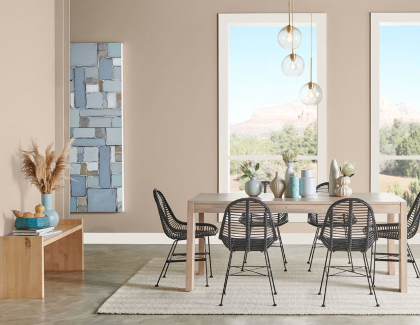
Shiitake is a warm beige gray with a slight rosy undertone. That muted warmth keeps it from feeling cold, but it still reads more current than a yellow tan.
In bright rooms, Shiitake looks soft and grounded. In rooms with less natural light, it can deepen quickly, so I would sample it carefully in hallways, shaded bedrooms, and rooms with small windows.
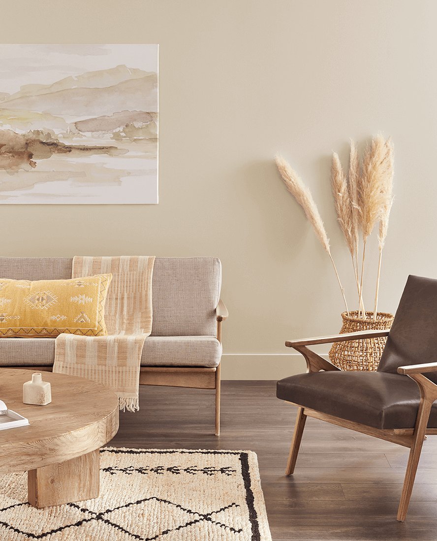
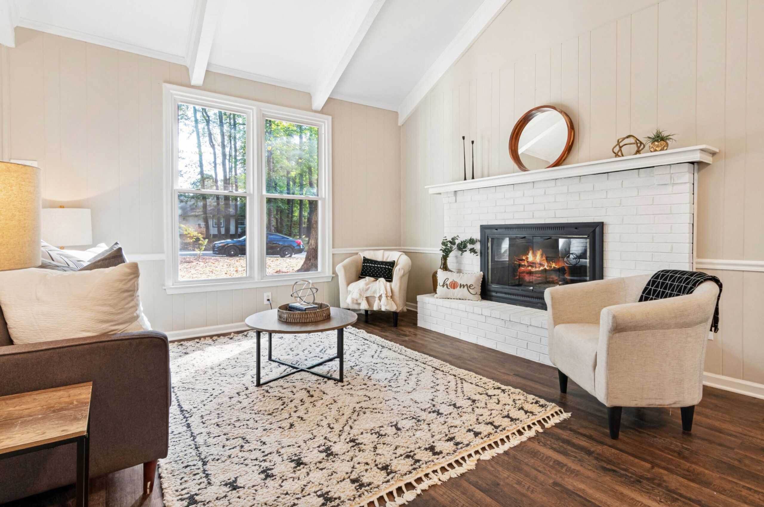
For walls, I like Shiitake with clean white or soft neutral trim. Avoid pairing it with very pink beige tile or carpet unless you want that rosy side to become more obvious.
2. White Sand by Benjamin Moore

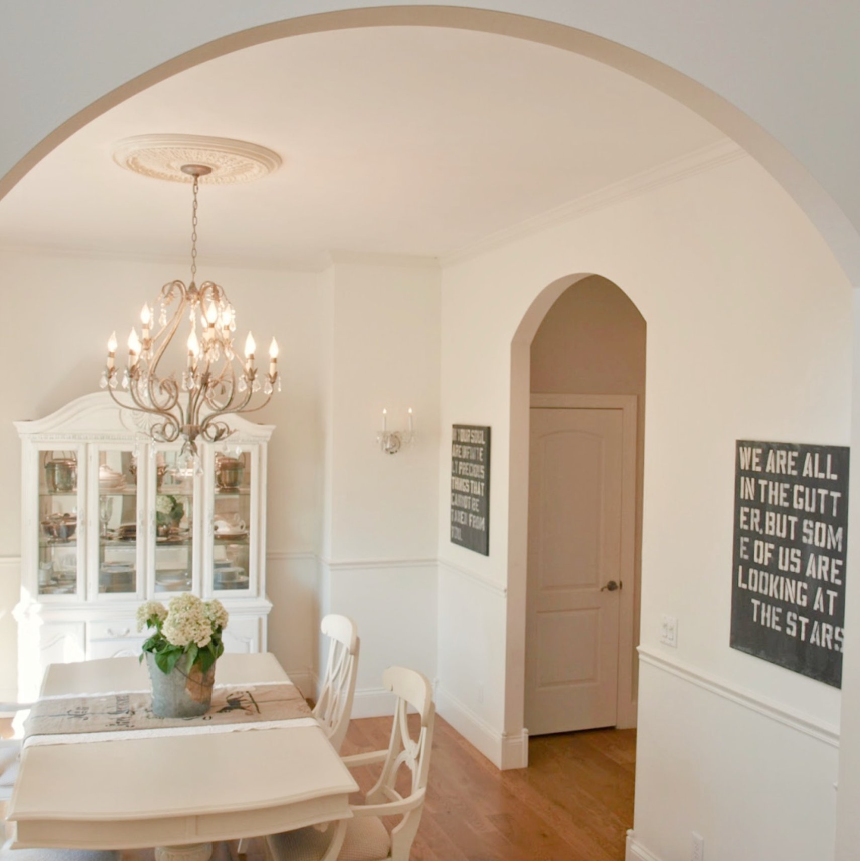
Benjamin Moore White Sand sits between classic beige and greige, with the warmth leading. It is a good option when white walls feel too stark but you do not want a strong tan color.
Natural light brings out its softer side, especially next to lighter white trim. In modern rooms, it gives the walls more body than an off-white. In traditional rooms, it can make millwork and cased openings feel intentional instead of washed out.
It is especially useful with wood, woven textures, limestone, and other natural materials. Check it beside any yellow oak floors first, because too much golden wood can make White Sand look creamier than expected.
3. Crème by Sherwin-Williams

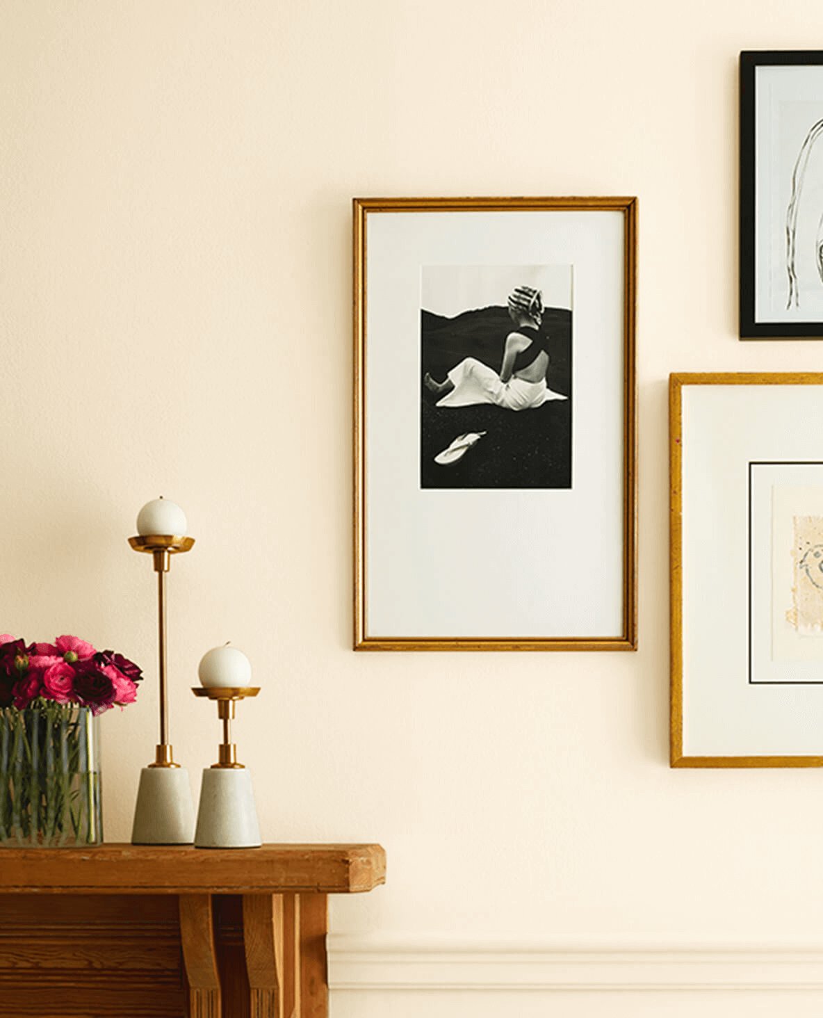
Sherwin-Williams Crème changes a lot with the light. In bright rooms it can read close to a warm white. In darker rooms, the yellow undertone is easier to see.
I would use it in bedrooms and living rooms where plain white feels too sharp. I would be more cautious in kitchens with cool marble, blue gray counters, or very white appliances, because Crème may look more buttery next to them.
4. Sea Salt by Benjamin Moore


Benjamin Moore Sea Salt is a warm beige with gentle brown undertones. It has a sandy quality, which makes it easier to pair with natural fiber rugs, medium wood furniture, and creamy whites.
It can work in a small north-facing nook or a sunny south-facing room, but it will not look identical in both. In cool light it may feel quieter and more taupe. In strong sun, the warmth comes forward.
5. Natural Linen by Sherwin-Williams

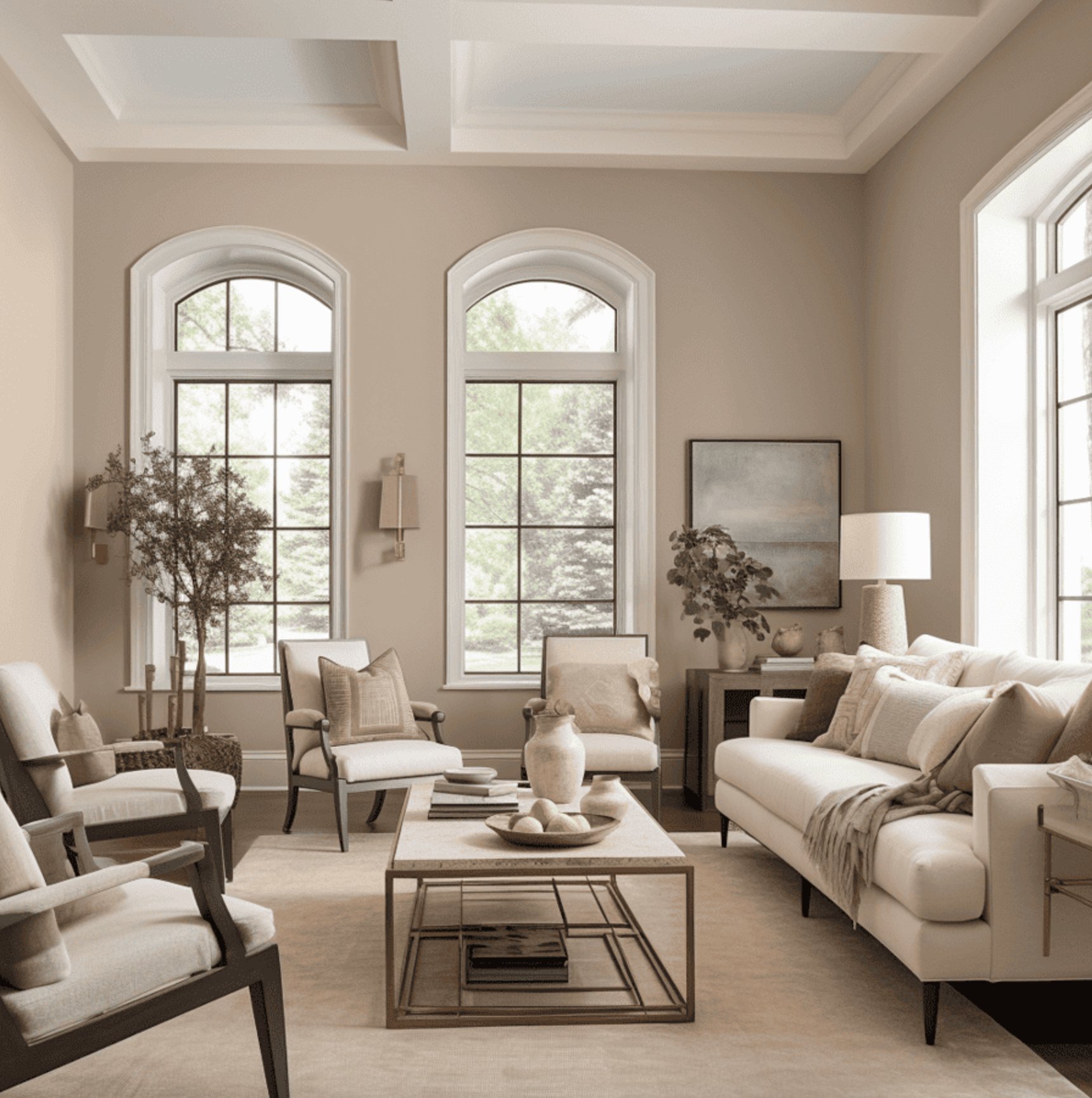
Natural Linen from Sherwin-Williams is one of the safer beiges when you want warmth without a strong gold cast.
Unlike the richer golden tones common in the 90s and 2000s, it has subtle gray undertones that make it easier to use with current finishes. Natural Linen keeps the walls quiet, which is why it works well as a neutral backdrop. If you are comparing it with off-whites and greiges, my guide to neutral paint colors can help you narrow the direction.
In north-facing rooms, you will see gentle warmth. Southern and western light bring out more of its richness, but it usually stays short of looking heavy.
6. Creamy by Sherwin-Williams

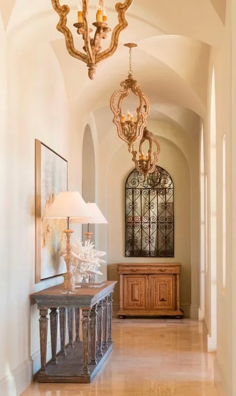
Sherwin-Williams Creamy is for people who want a light beige that still feels warm on the wall.
Its high LRV of 81 sits between white and cream. The color shows warm yellowish undertones depending on the lighting, but they are not as strong as what you would see in many traditional cream colors.
That makes Creamy a strong choice for larger spaces where you want the room bright but not cold. It may be too rich for trim and furniture, especially if the walls are also warm.
7. Manchester Tan by Benjamin Moore

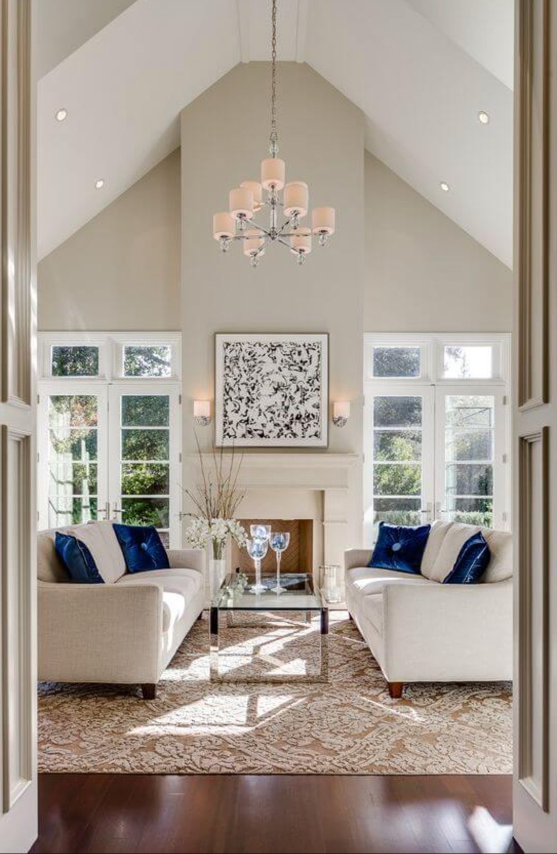
Manchester Tan is a classic sandy beige that stays fairly balanced. It has warmth, but it is not as orange or golden as many older tan paints.
This shade from Benjamin Moore's Historical Collection works well with wood, stone, earthy tile, and natural materials. I would sample it carefully beside gray flooring, because a cool floor can make Manchester Tan look warmer by contrast.
8. Pashmina by Benjamin Moore

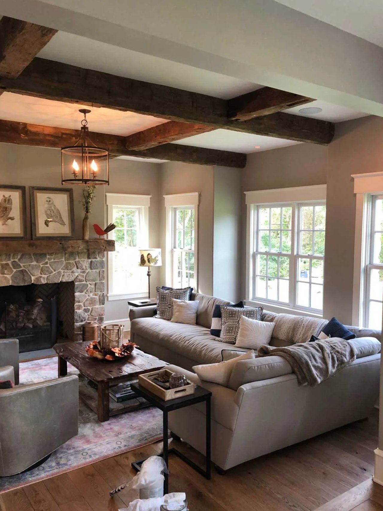
Pashmina by Benjamin Moore is a deeper beige gray, with gray tones that soften the warmth. Use it when you want a room to feel more tailored and grounded, not bright and airy. It can be beautiful on dining room walls, built-ins, or a bedroom, but it needs enough light or contrast so it does not turn muddy.
9. White Dove by Benjamin Moore

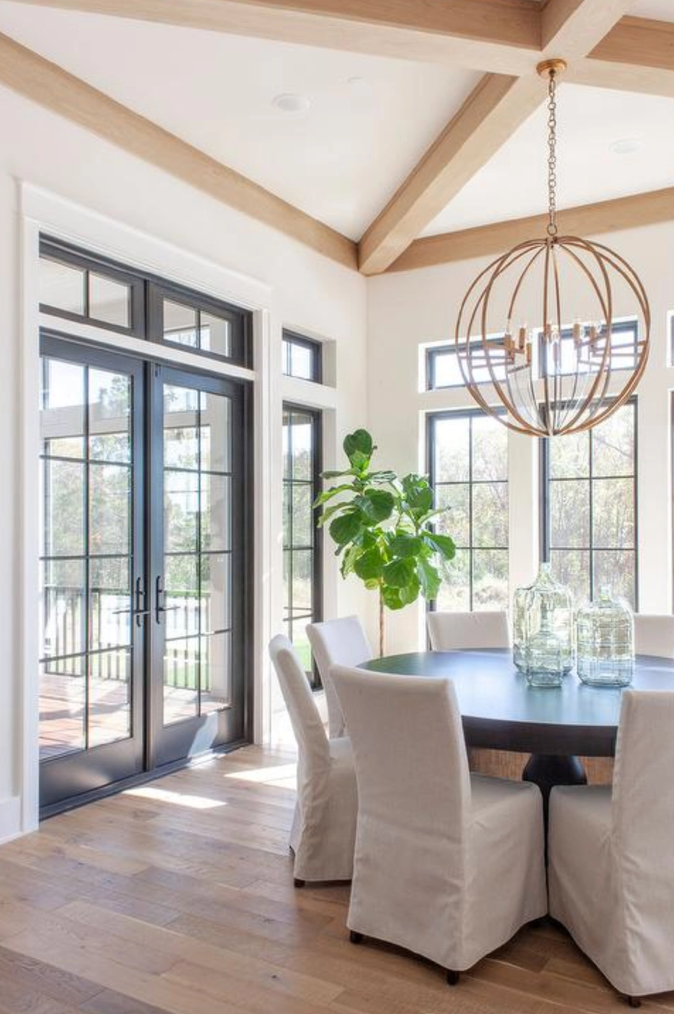
White Dove sounds like a clean white, but it has a warm beige undertone. In southern or western light, that warmth becomes more noticeable.
It works on walls, cabinets, and moldings when you want a soft white rather than a crisp one. It usually avoids looking yellow, but test it next to existing white tile, vinyl windows, or cool countertops before using it on cabinets.
10. Accessible Beige by Sherwin-Williams

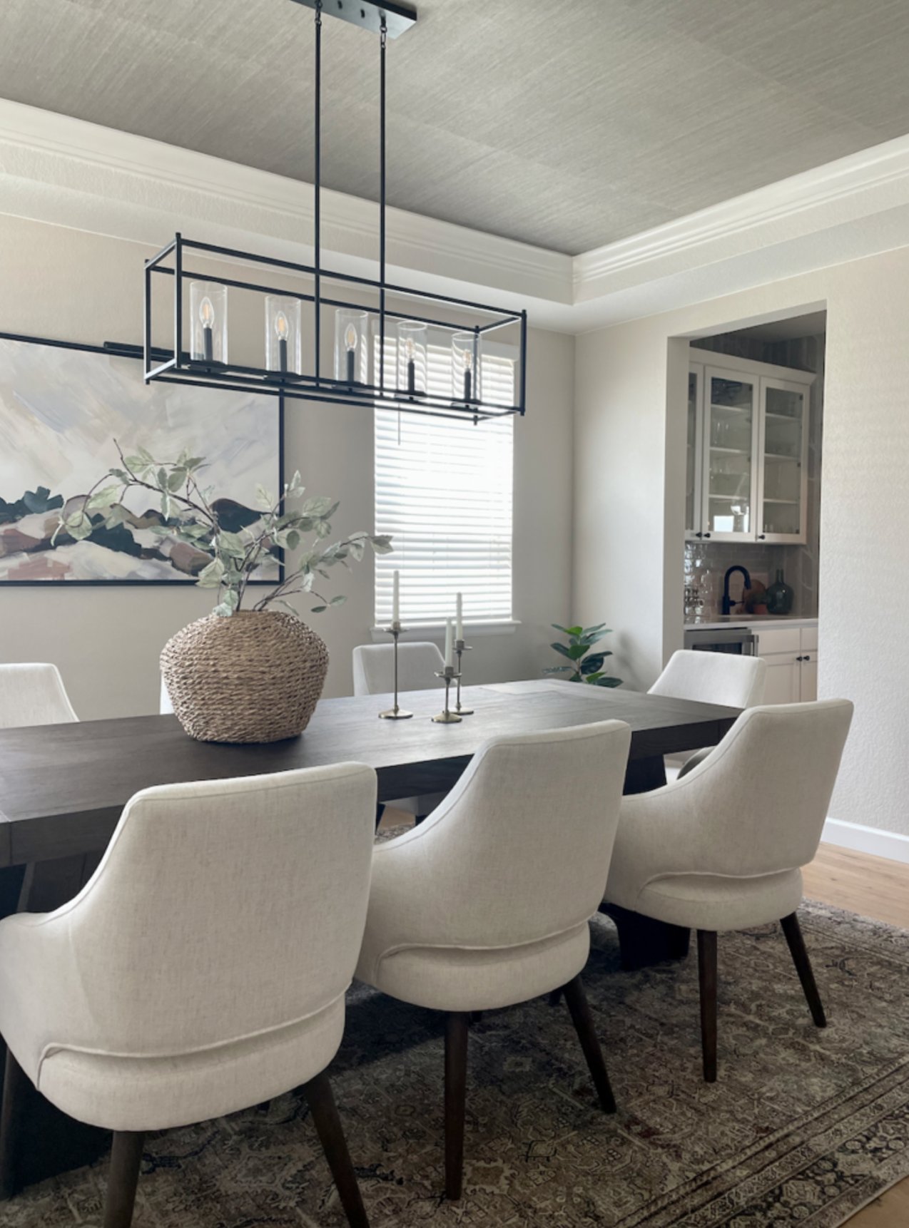
Accessible Beige is a beige with gray notes, which is why it has stayed useful for so long. It connects warm and cool finishes better than most basic tan colors.
On walls, it is softer than many beiges but warmer than typical grays. It does not have the heavy early 2000s look, and it plays well with black, bronze, brass, and brushed nickel finishes.
11. Shoji White by Sherwin-Williams

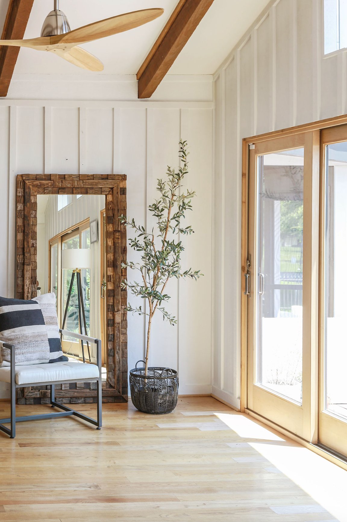
Shoji White SW 7042 is a warm white beige with subtle green and greige undertones. Those undertones are easier to see in natural light, especially beside clean white trim.
It works in both modern and traditional spaces, especially rooms with clean lines and natural textures. If your room already has strong yellow cream finishes, sample Shoji White beside them so the green side does not feel unexpected.
12. Edgecomb Gray by Benjamin Moore

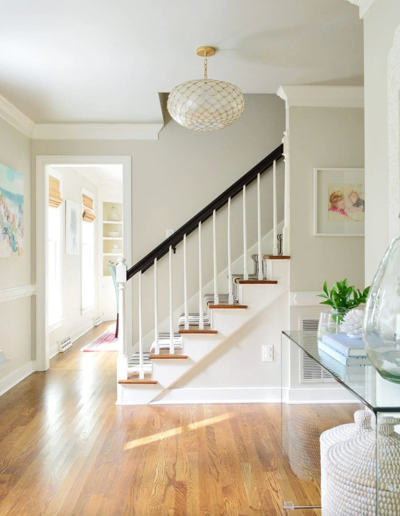
Edgecomb Gray is one of Benjamin Moore's most useful beige gray colors. It reads lighter and softer than many greiges, which makes it easier to use through an open floor plan.
When the sun hits it, you may catch slight greenish notes. I recommend pairing it with white trim, warm wood elements, and quartz countertops. Always check it beside pink beige carpet or tile, because Edgecomb Gray may not be warm enough to bridge that undertone cleanly.
13. Balboa Mist by Benjamin Moore

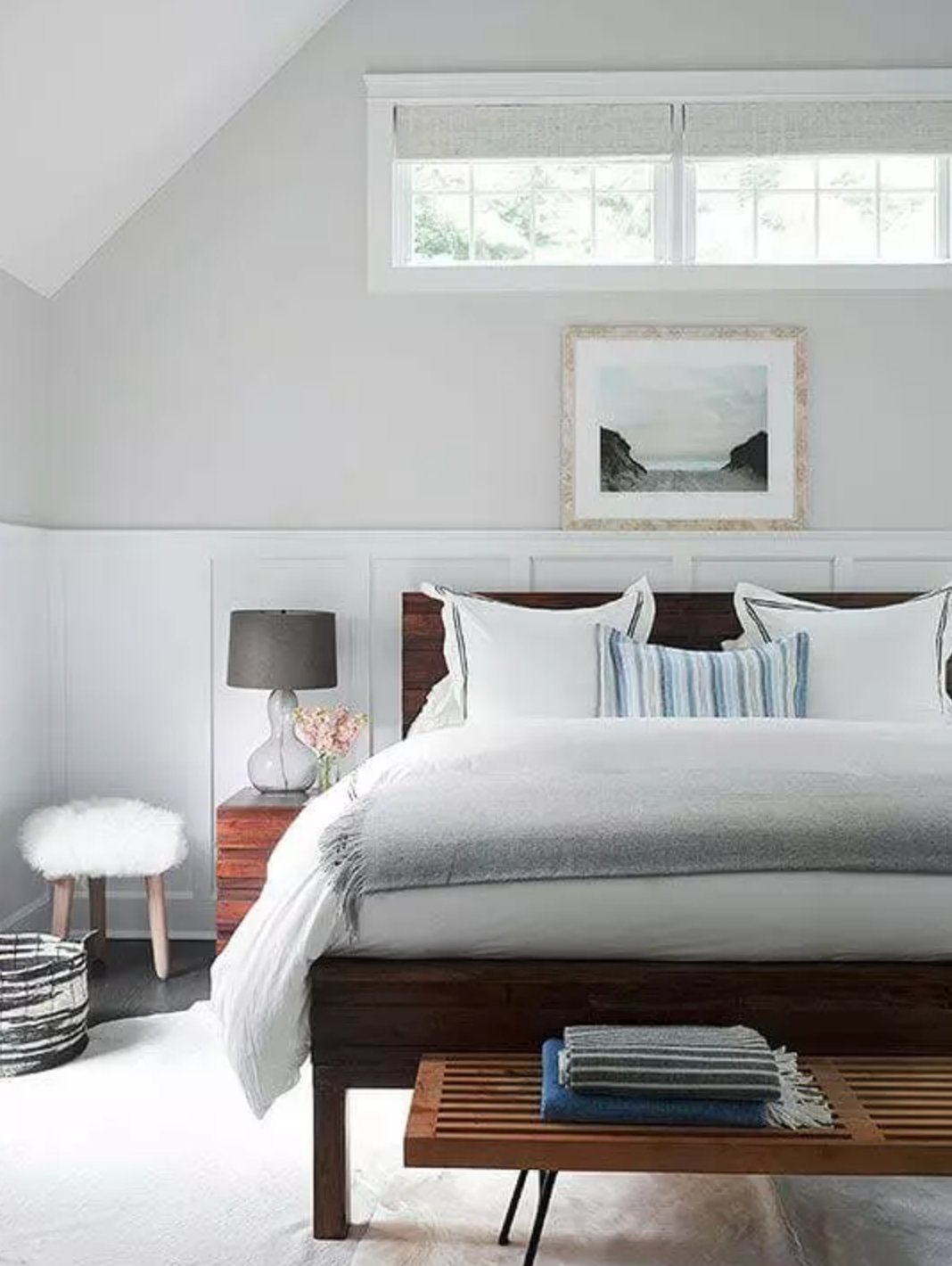
Balboa Mist is a warm gray with beige undertones, and lighting can change it more than people expect. It works well with wood surfaces and bright white trim. In a low-light room, sample it before committing, because it can lean cooler and flatter than it looks on the chip.
14. Aged White by Sherwin-Williams

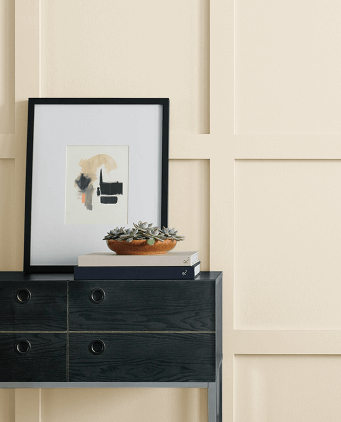
Aged White brings depth while still reading as a white variation. It suits classic kitchens and living rooms where the yellow undertone makes sense with warm floors, cream stone, or traditional wood furniture. I would avoid it beside very cool whites, where it can look older than intended.
15. Analytical Gray by Sherwin-Williams

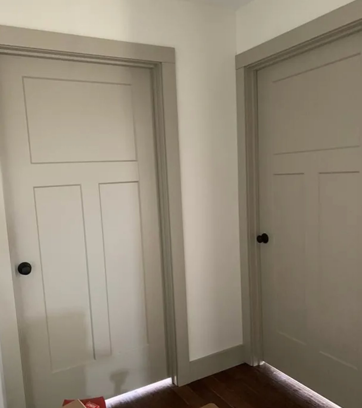
Analytical Gray by Sherwin-Williams walks the line between gray and beige, with warm stone notes that make it a flexible base for layered color schemes. It has enough depth for doors, millwork, and accent cabinetry, but on all four walls it needs good light or a lighter trim color to keep the room from feeling dense.
16. Antique White by Sherwin-Williams

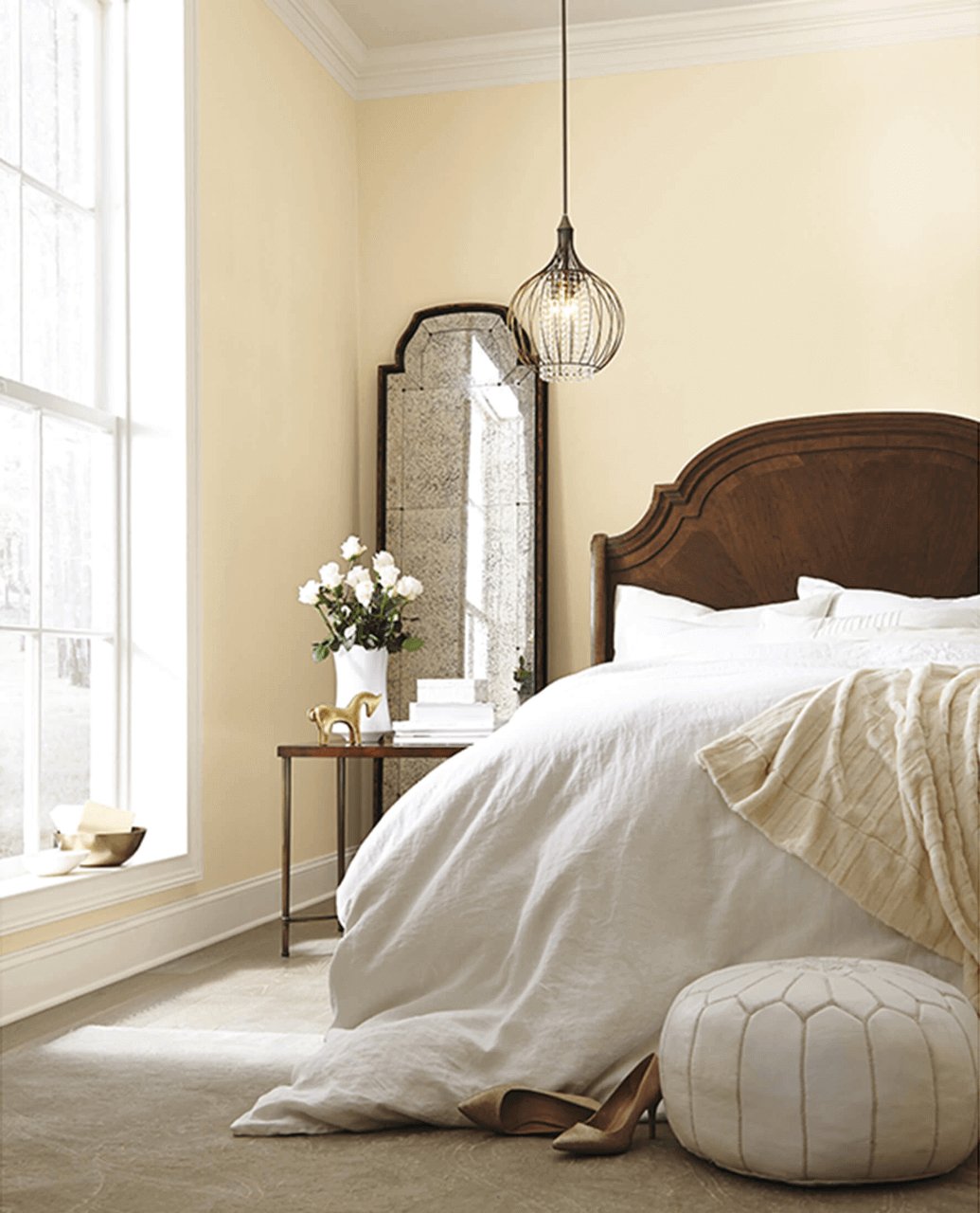
Antique White is a classic warm beige with yellow undertones and an LRV of 72. It works best in traditional spaces where you want warmth without a bright white wall.
It is a bit too rich for moldings and cabinets, where people typically choose lighter shades with an LRV of 82 to 94. For walls, it looks best paired with colors 1 to 2 shades darker, like the dark wood furniture in the photo above.
17. Cumulus Cloud by Benjamin Moore

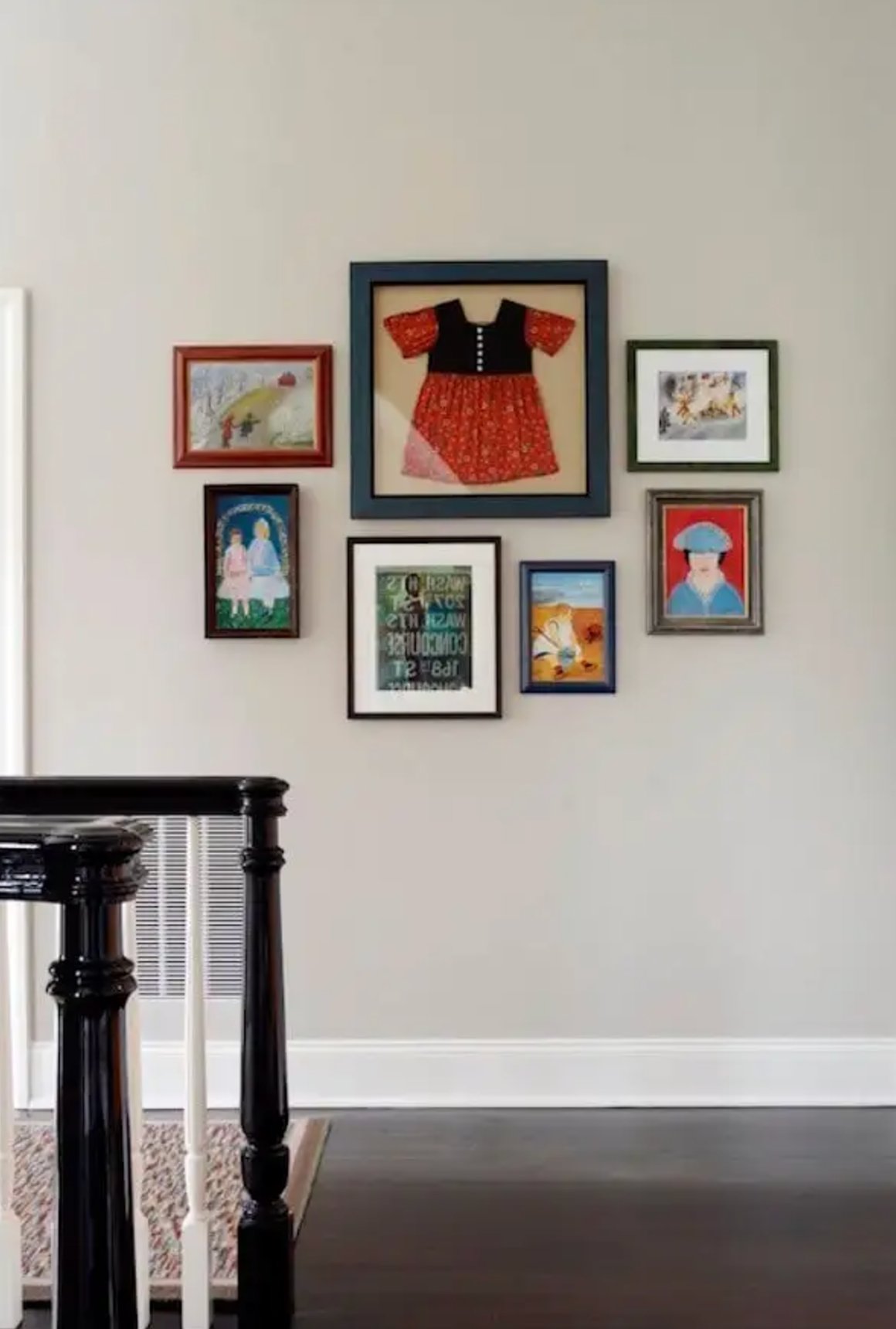
Cumulus Cloud by Benjamin Moore is a greige with cool undertones. It has an overcast quality, so it is calmer and less creamy than many beige paints on this list.
It is especially useful in open-concept spaces because it moves from room to room without calling attention to itself. Pair it with warmer woods or soft white trim so the cool undertone does not leave the space feeling bare.

I'm Elizabeth, your go-to guide for all things paint and design! My days are filled with color swatches and innovative room makeovers. When I'm not painting the town - literally - I'm soaking up inspiration from my travels. This blog is my way of sharing my passion and making the world a more vibrant place, one color palette at a time.