Best Neutral Paint Colors
Over the past 5 to 10 years, neutral paint colors have become the safest starting point for most whole-home palettes, especially if you want rooms that can handle new furniture, changing fabrics, and resale photos without a repaint.
The catch is that neutrals are not automatically easy. A gray with a blue undertone can make oak trim look orange. A beige with too much pink can fight your stone, tile, or carpet. The wrong neutral will not look neutral once it is on all four walls.
Here are the neutral paint colors I would actually sample for a home in 2026, grouped by undertone and room use, with notes on where each type tends to work and where it can go wrong.
Why Neutral Colors Work

Neutral colors work because they let the fixed parts of a room do their job. Flooring, counters, tile, brick, millwork, and furniture usually carry more color than people notice at first. A good neutral connects those pieces instead of competing with them.
Here are the three reasons I reach for neutrals so often in real homes:
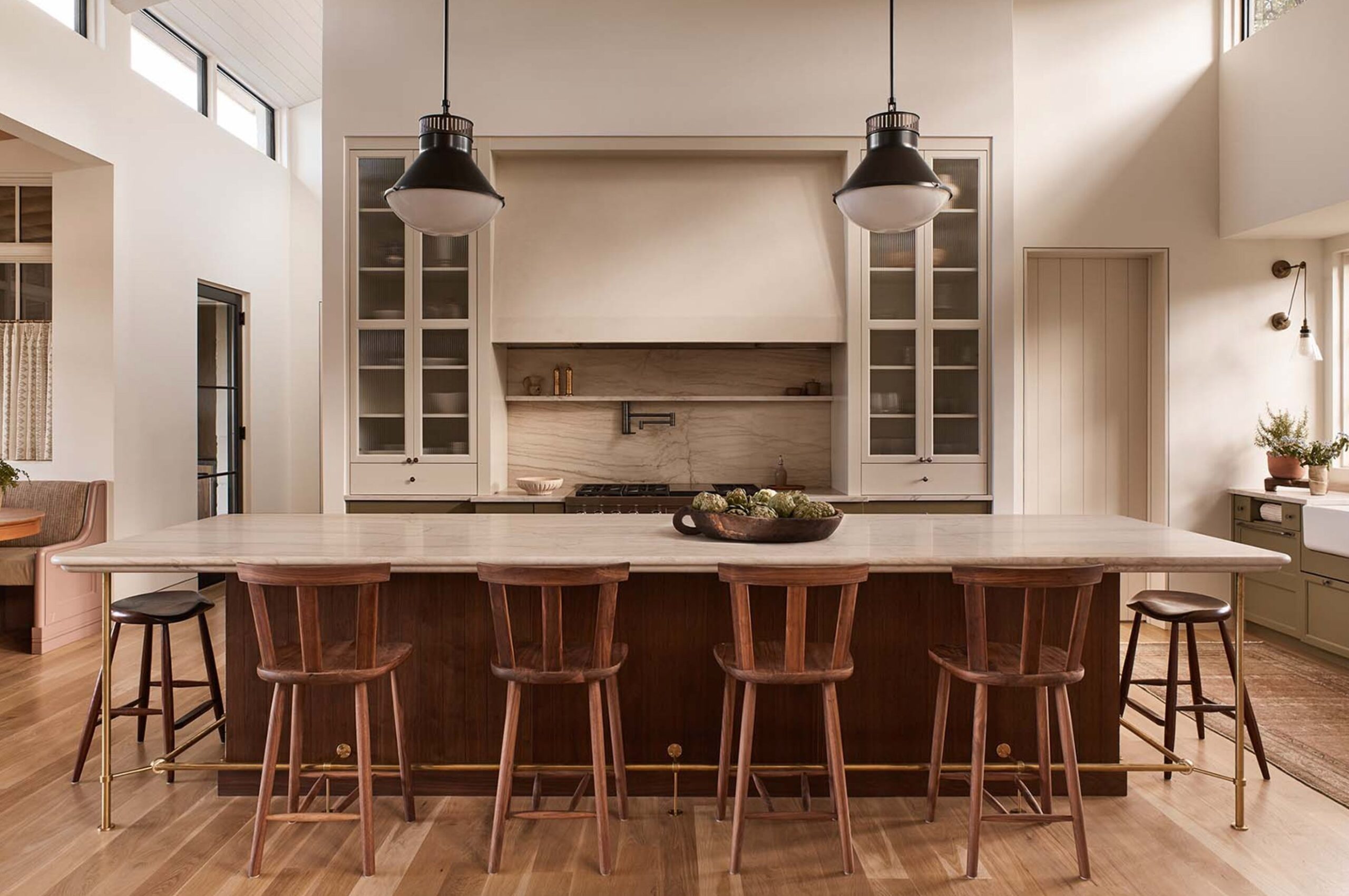
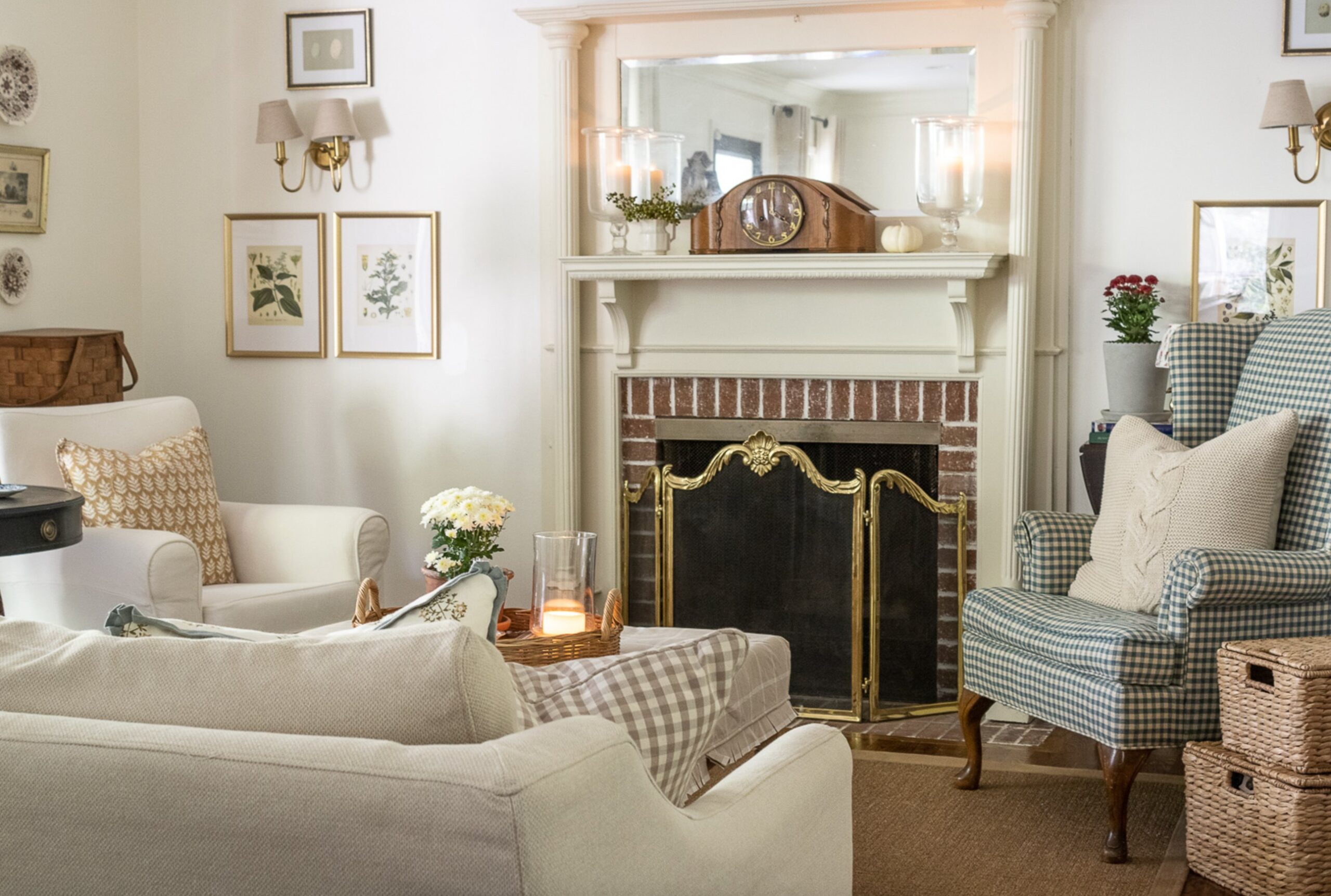
1) Versatility and longevity. Neutral walls let you change pillows, rugs, artwork, and window treatments without starting the room over.
Bold colors can be wonderful, but they usually need a stronger design plan. Neutrals are more forgiving when a room has several wood tones, mixed metals, or furniture collected over time.
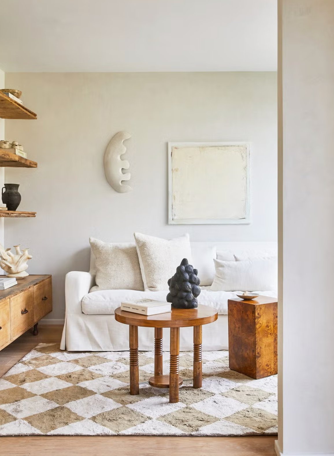
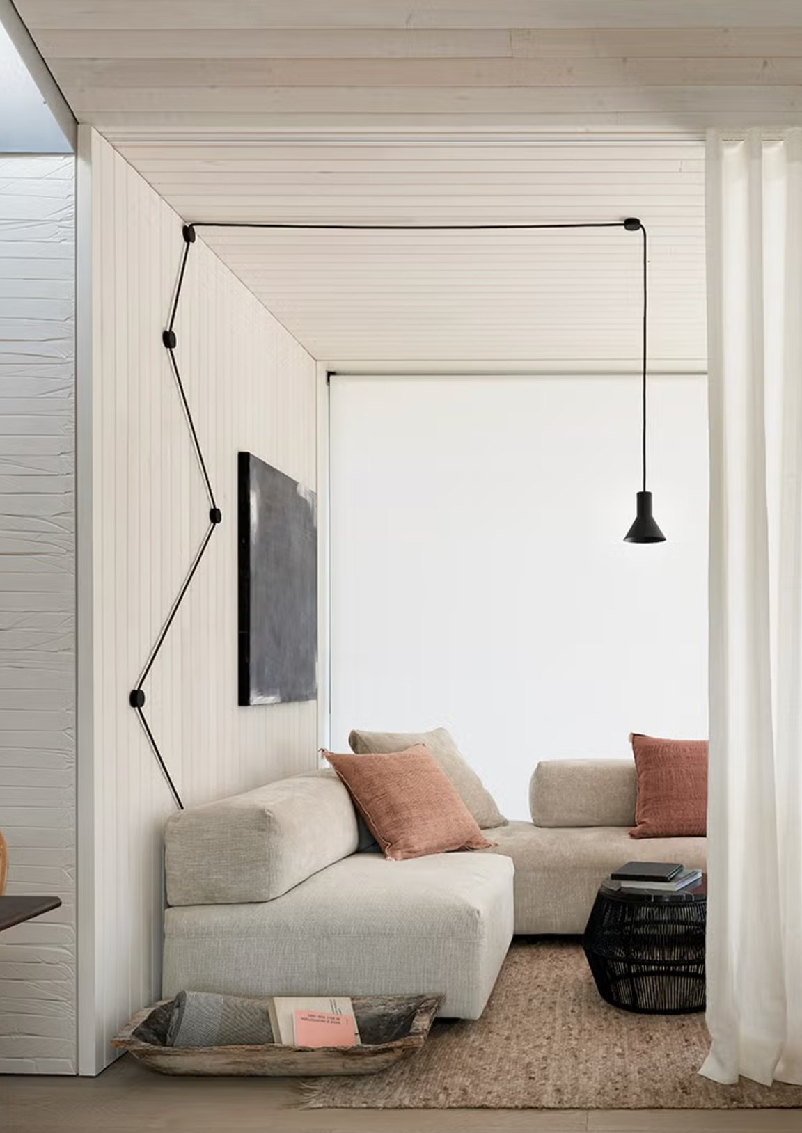
2) Space-enhancing skills. Light neutral shades reflect more light than mid-tone colors, so they can make tight rooms feel less chopped up.
For a small hallway, powder room, or low-ceiling bedroom, I usually start with a lighter neutral and keep the trim color close. Too much contrast at the baseboards and crown can make the walls feel shorter.
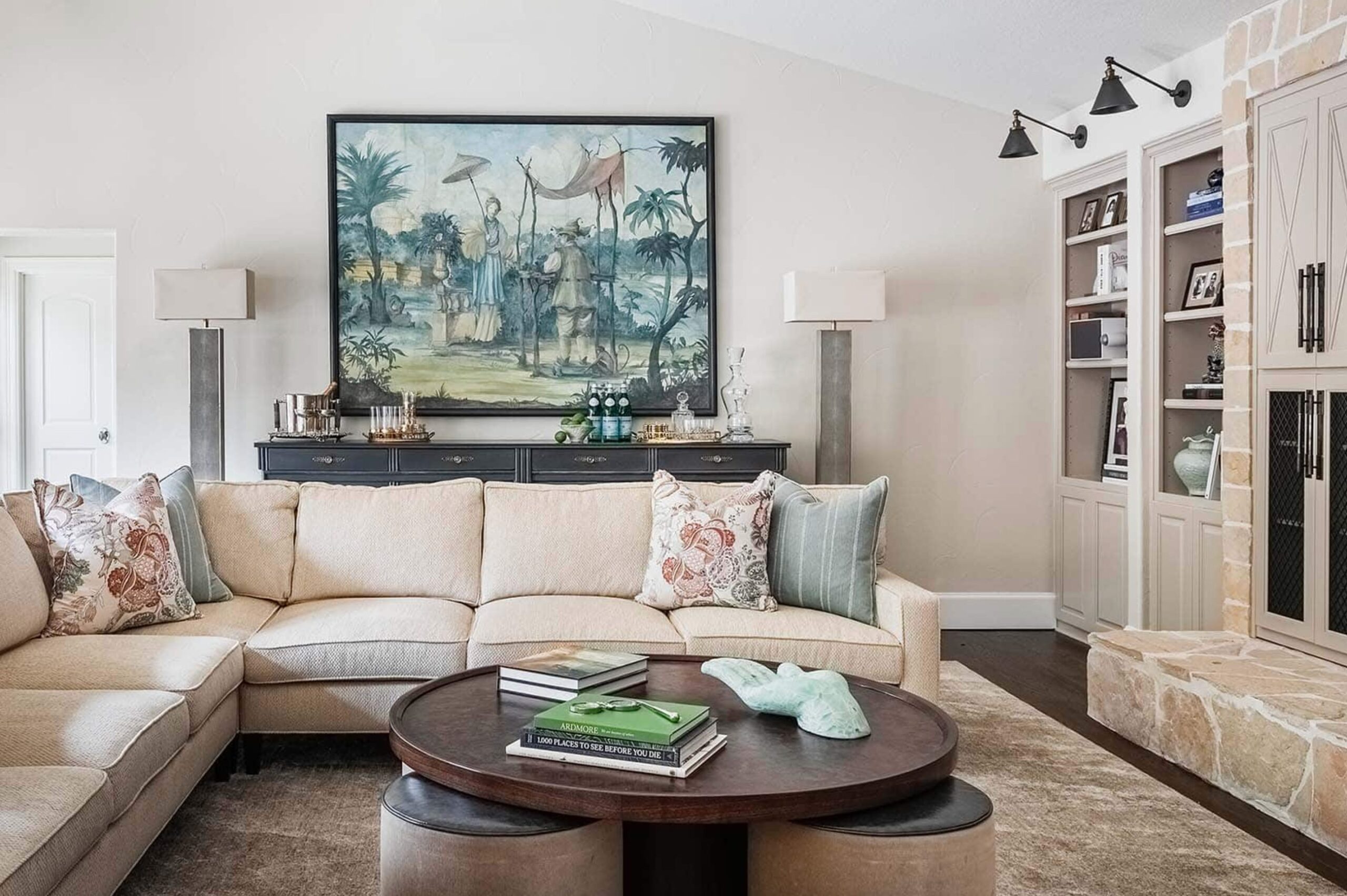
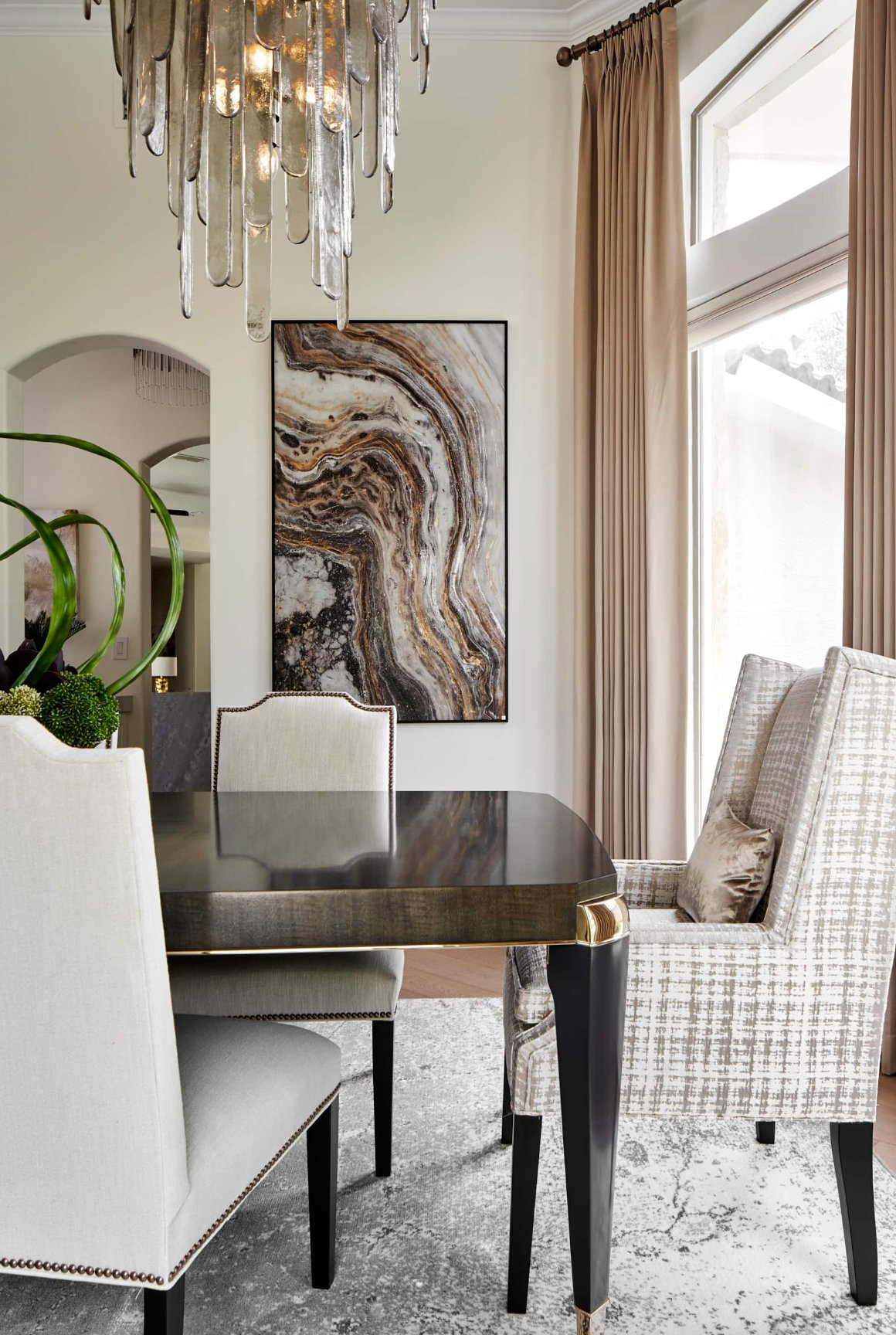
3) Better resale potential. A neutral color palette makes selling your home easier. In fact, 81% of real estate professionals say warm neutrals are the way to go when prepping a home for sale.
Buyers do not need to love your sofa or your art. They need to see the floor plan, light, and condition of the house. Warm neutral walls help them do that without turning the listing photos yellow.
Best Neutral Paint Colors for 2026
I divide neutral colors into five main groups: true, warm, cool, white, and earth-toned neutrals. The group matters more than the paint name, because undertone is what decides whether a color works with your room.
Quick heads up: the same shade can read differently depending on your lighting, flooring, countertop, and trim color. Sample it next to the materials that are staying in the room.
True Neutrals (Pure Grays)
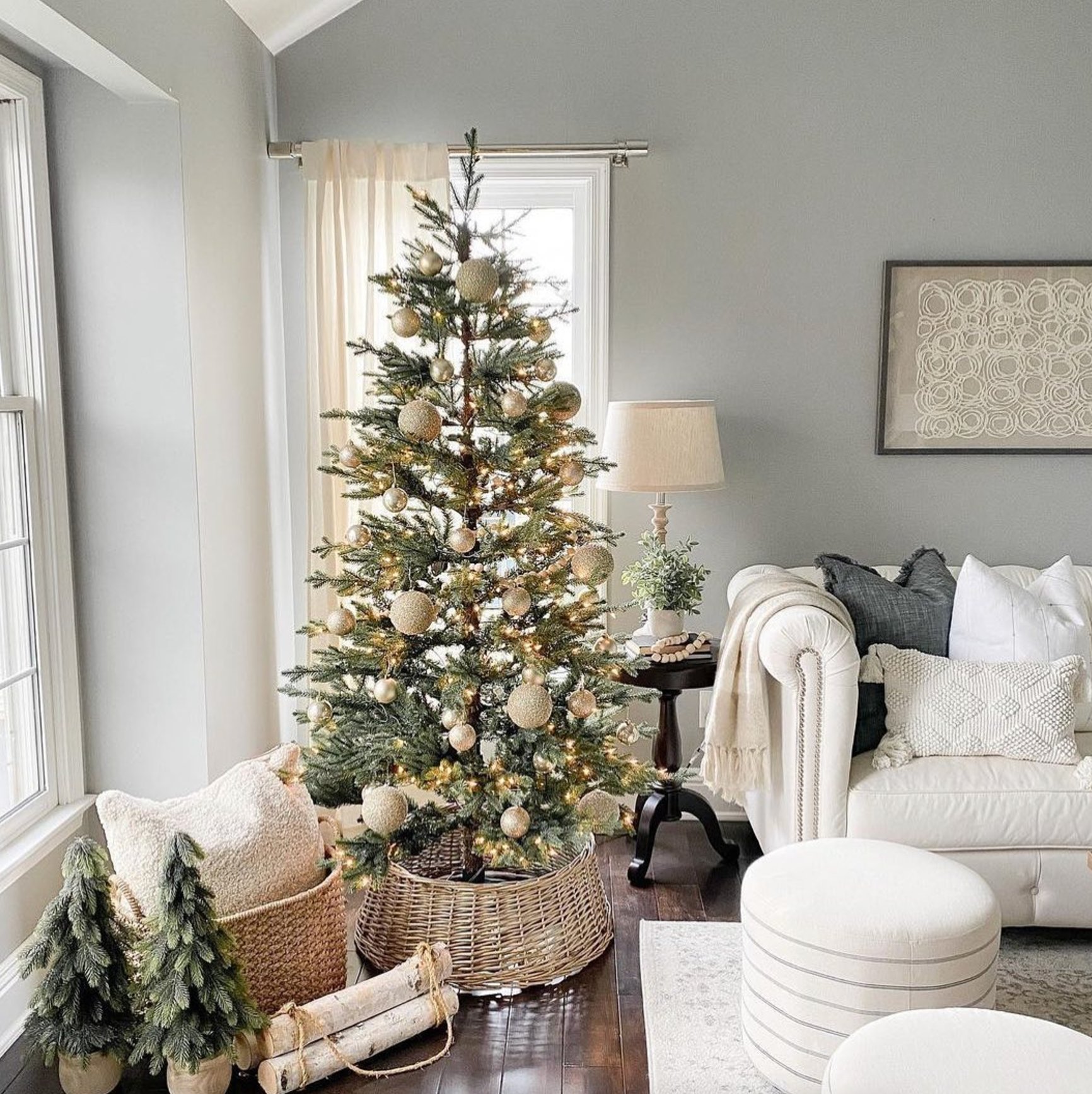
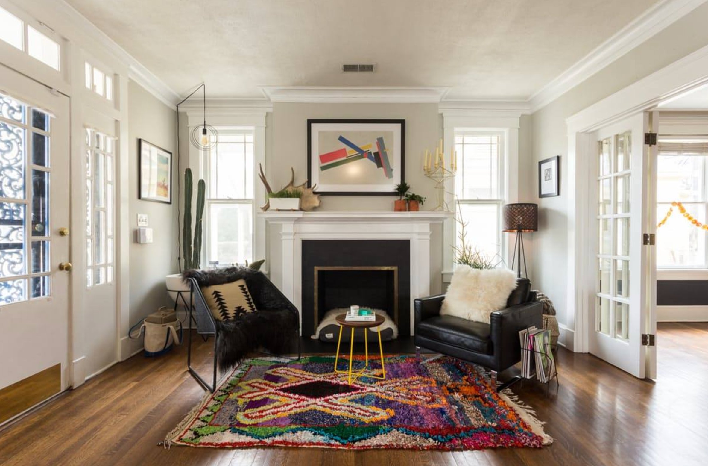
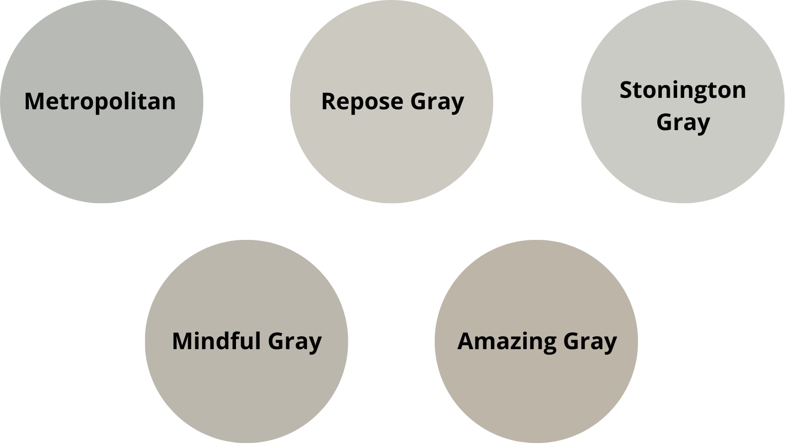
Pure grays are best when the room already has clean, cooler finishes: black windows, white counters, concrete tile, marble, or unstained light wood. They can look crisp in a modern room, but they can turn chilly fast in a shadowy space.
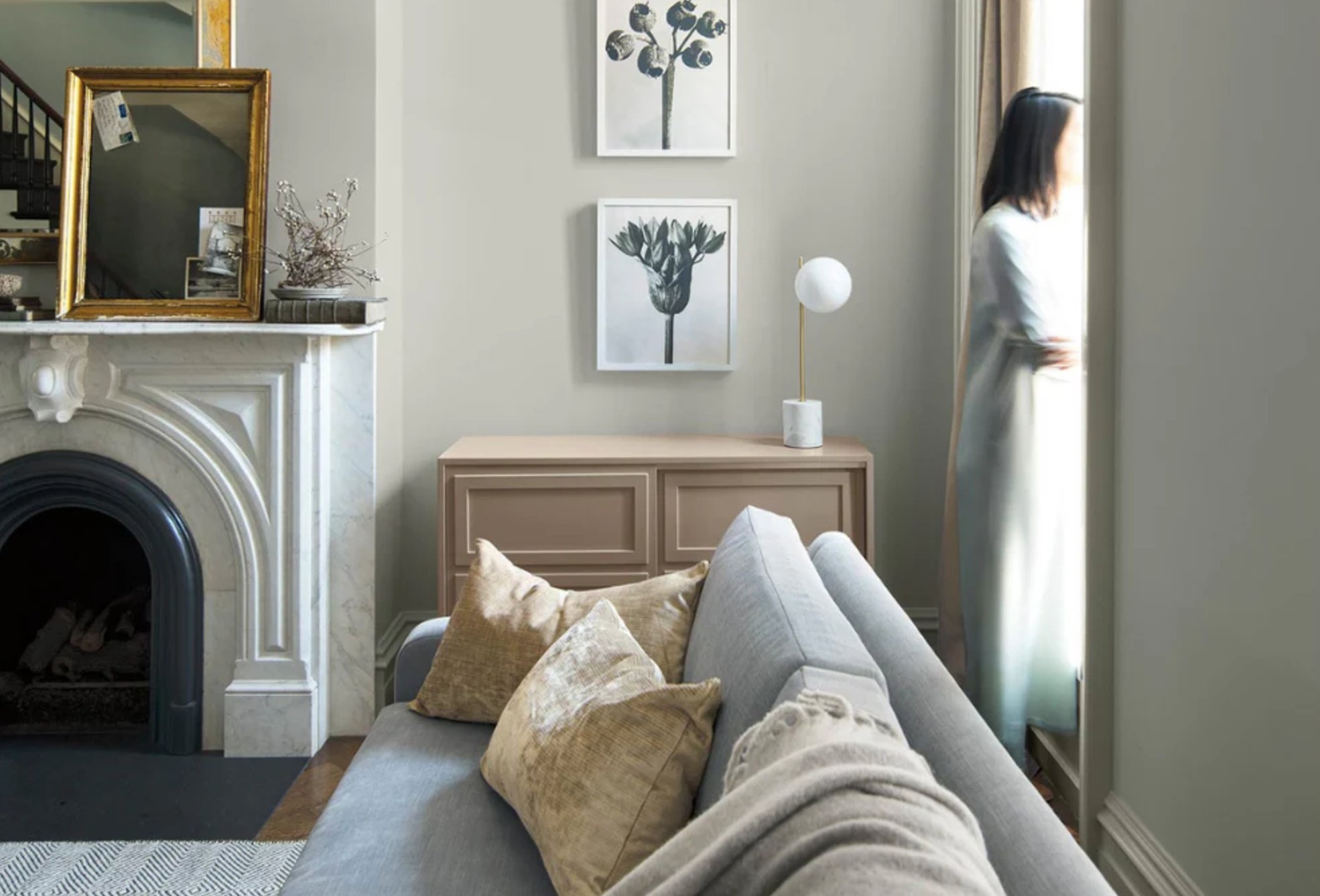
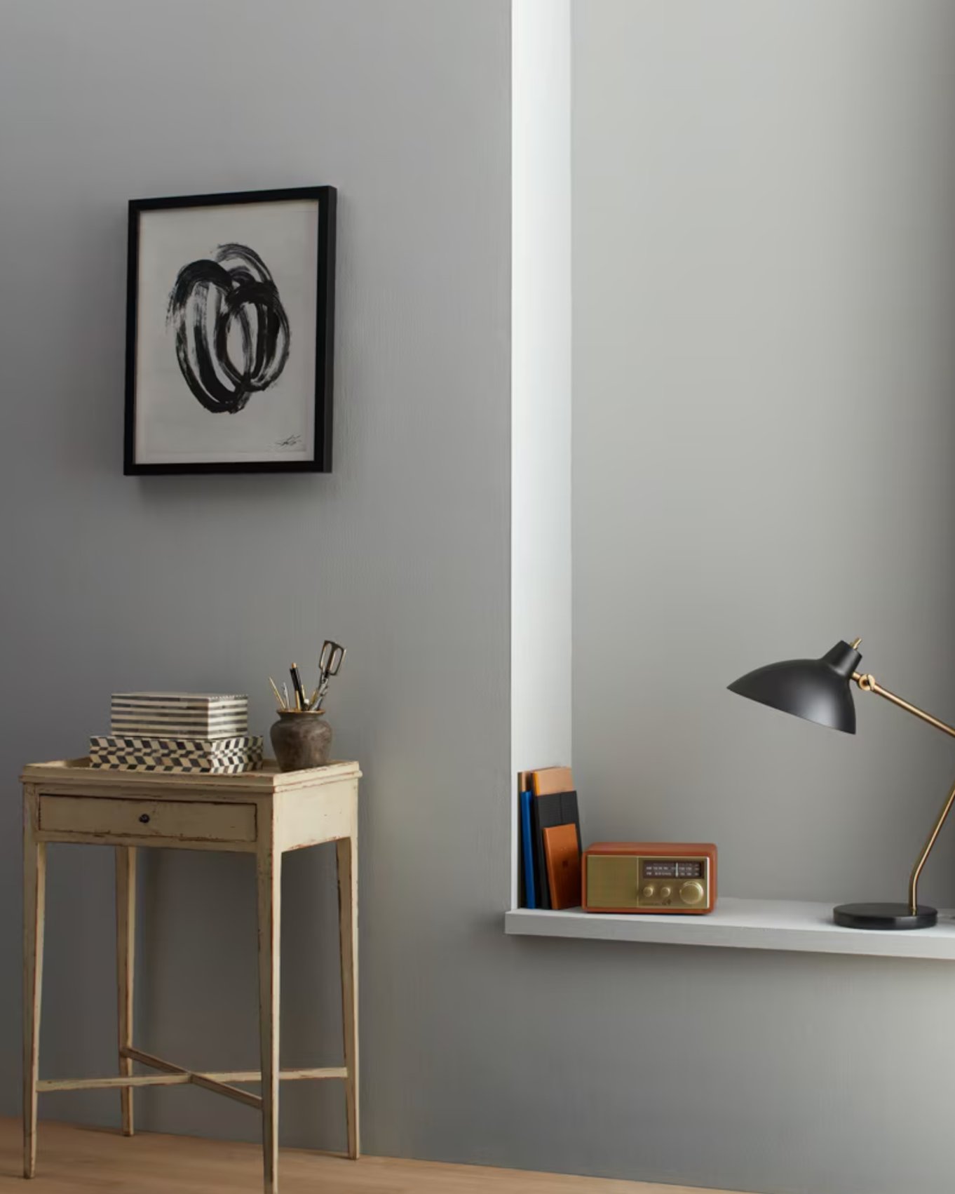
These shades shift through the day. They often look cooler in morning light and a little softer by evening. Pure grays pair well with black metal fixtures, white marble, and natural wood elements.
Before choosing one, check it beside your flooring. Pure gray beside orange oak, cream travertine, or beige carpet can make both colors look more extreme.
Warm Neutrals
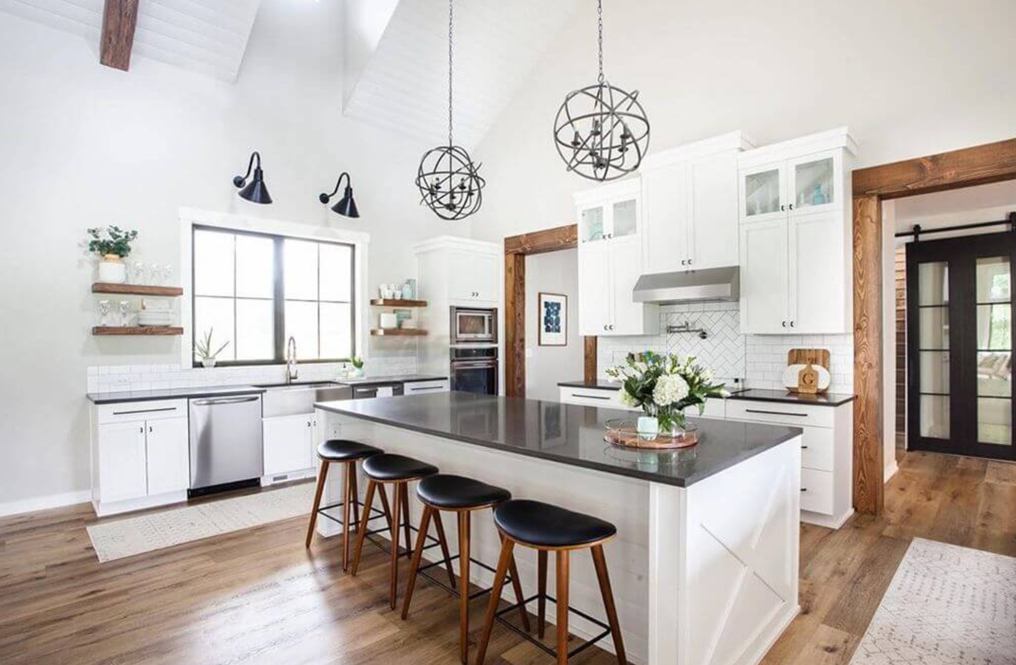
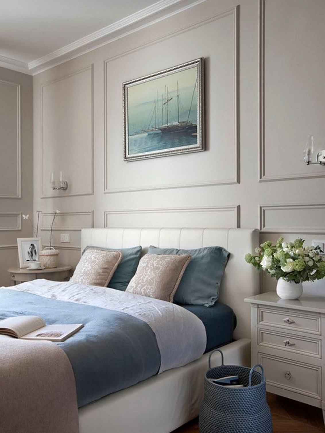
Warm neutrals add softness without going full yellow-beige. Many of these colors blend gray and beige, often called "greige," so they bridge cool countertops and warmer wood floors. If you're choosing a true beige, I have a complete guide on those.
They are especially useful in north-facing rooms, where cool daylight can make a neutral look flat or gray-green.
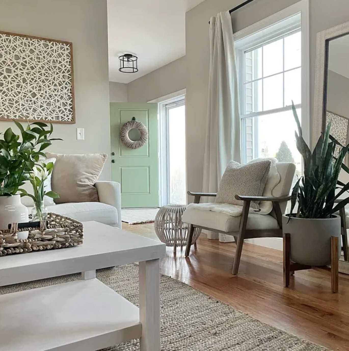
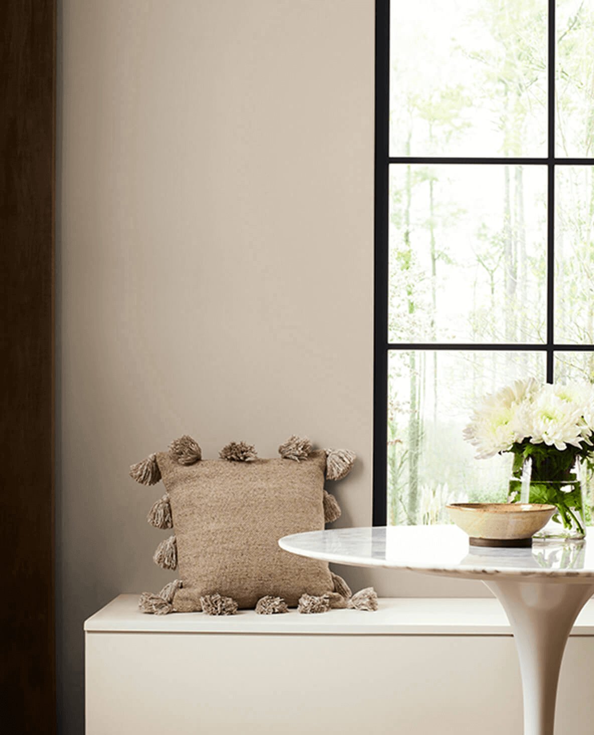
Warm neutrals work well with textured fabrics, woven furniture pieces, matte brass finishes, and oak trim from the 90s.
I like them with deep brown or terracotta accents, but I would sample carefully if the room has pink-beige tile. A warm neutral with the wrong red undertone can make old tile look even pinker.
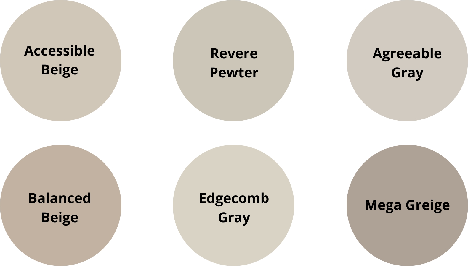
Cool Neutrals


Cool neutrals usually have blue, blue-green, or violet-gray undertones. They are the colors I test first when a room has Carrara-style marble, chrome plumbing, black fixtures, or a lot of clean white.
They are often a good choice for south-facing rooms because warm sunlight can soften them. In a north-facing room, the same color may feel icy unless the furnishings add warmth.
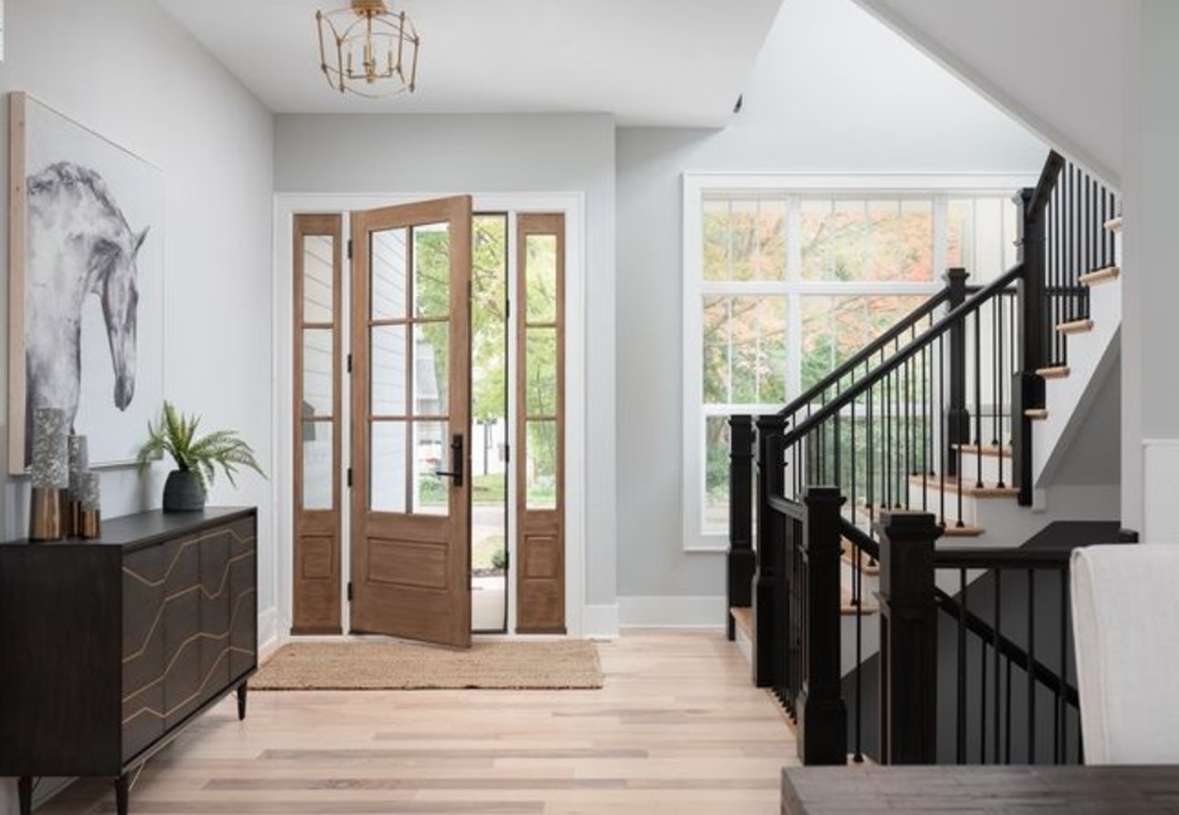
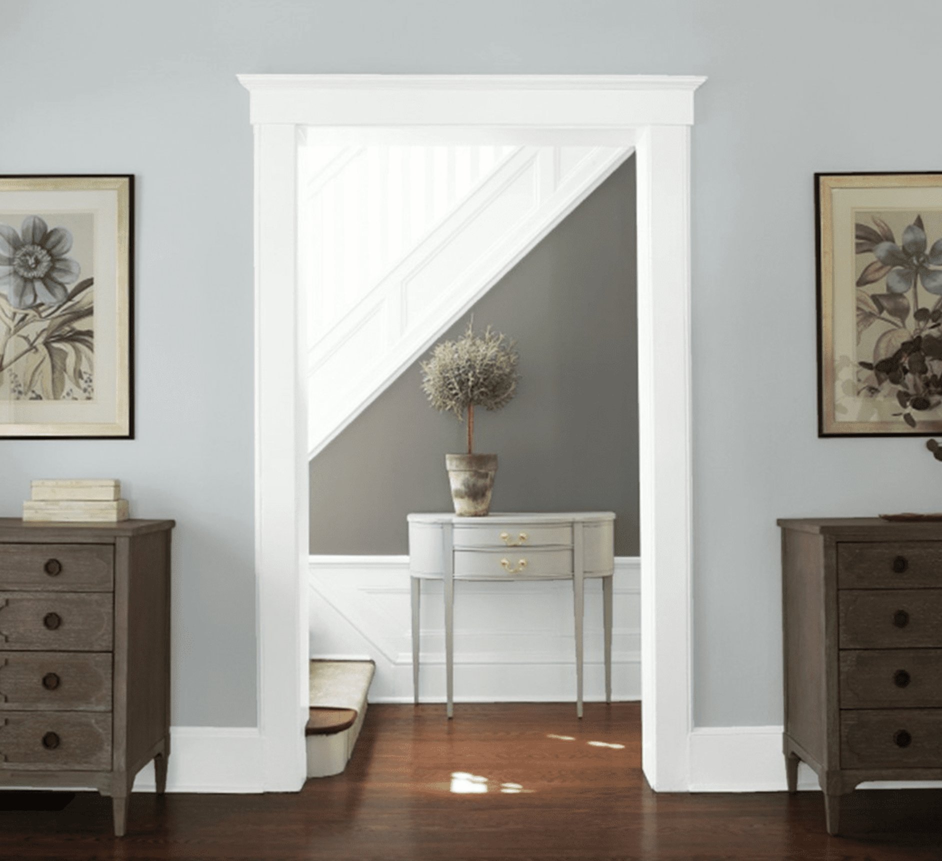
Natural light brings out their blue notes, while warm artificial lighting softens the shades.
Cool neutral colors look clean with chrome details, glass, and light marble. To keep the room from feeling cold, add linen curtains, wood furniture, leather, or a warmer rug.

White Neutrals
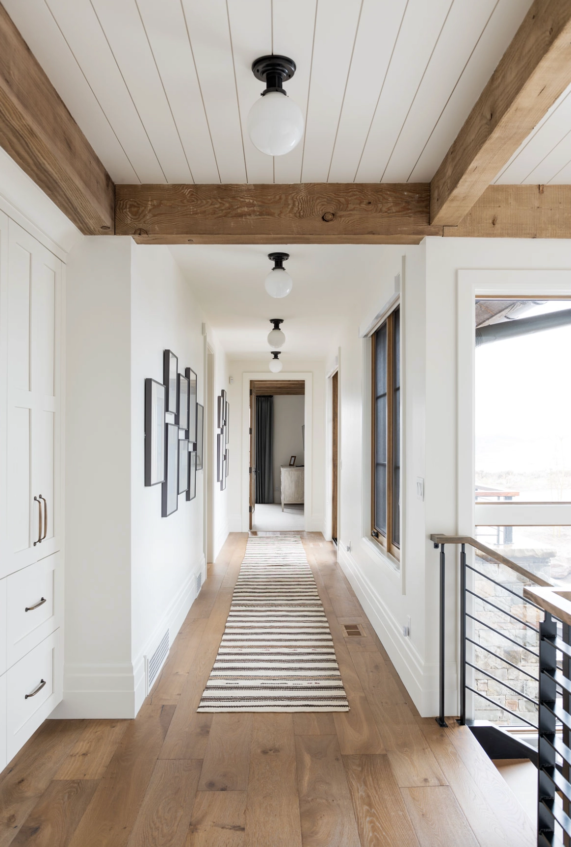
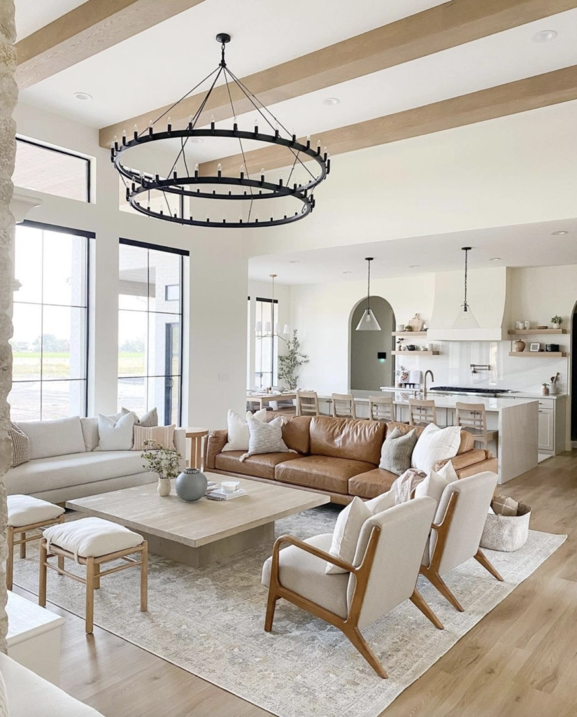
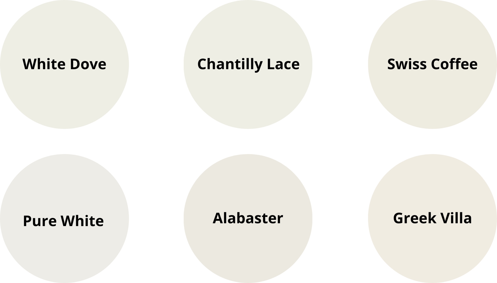
White neutrals are useful when you want brightness but do not want a hard, gallery-white look. They work best when the trim, ceiling, cabinets, and wall color are planned together.
Morning light can pull a gentle warmth from creamy whites, while evening light may expose gray, violet, or yellow undertones. That is why I never choose a white from a tiny paper chip.
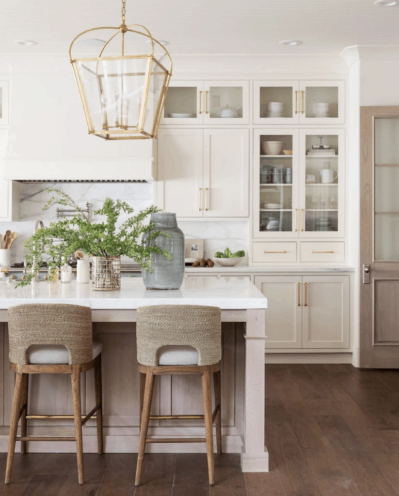
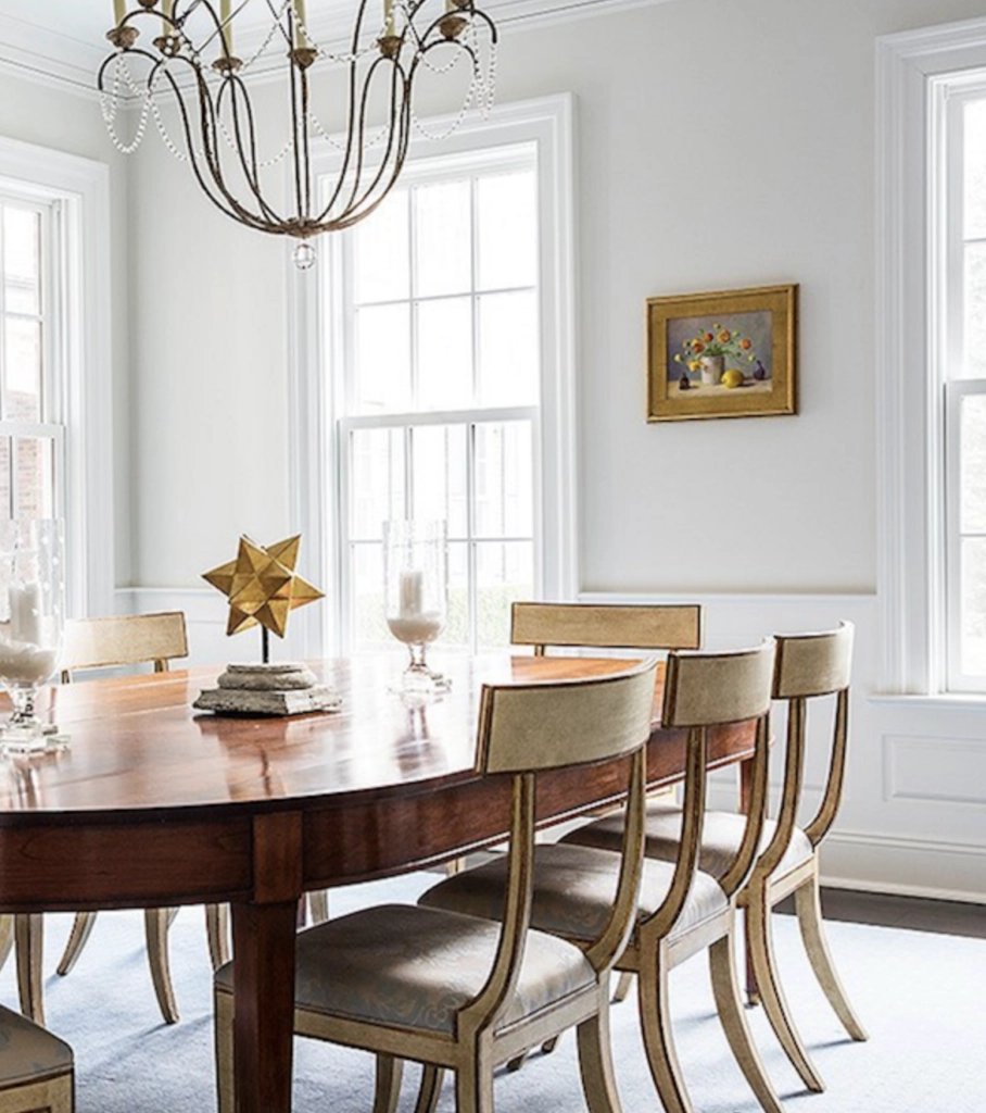
They make artwork and large mirrors easier to place, but the sheen matters. On walls, eggshell or matte usually looks calmer than satin. On trim and cabinets, a slightly higher sheen is easier to wipe clean.
Earth-Toned Neutrals

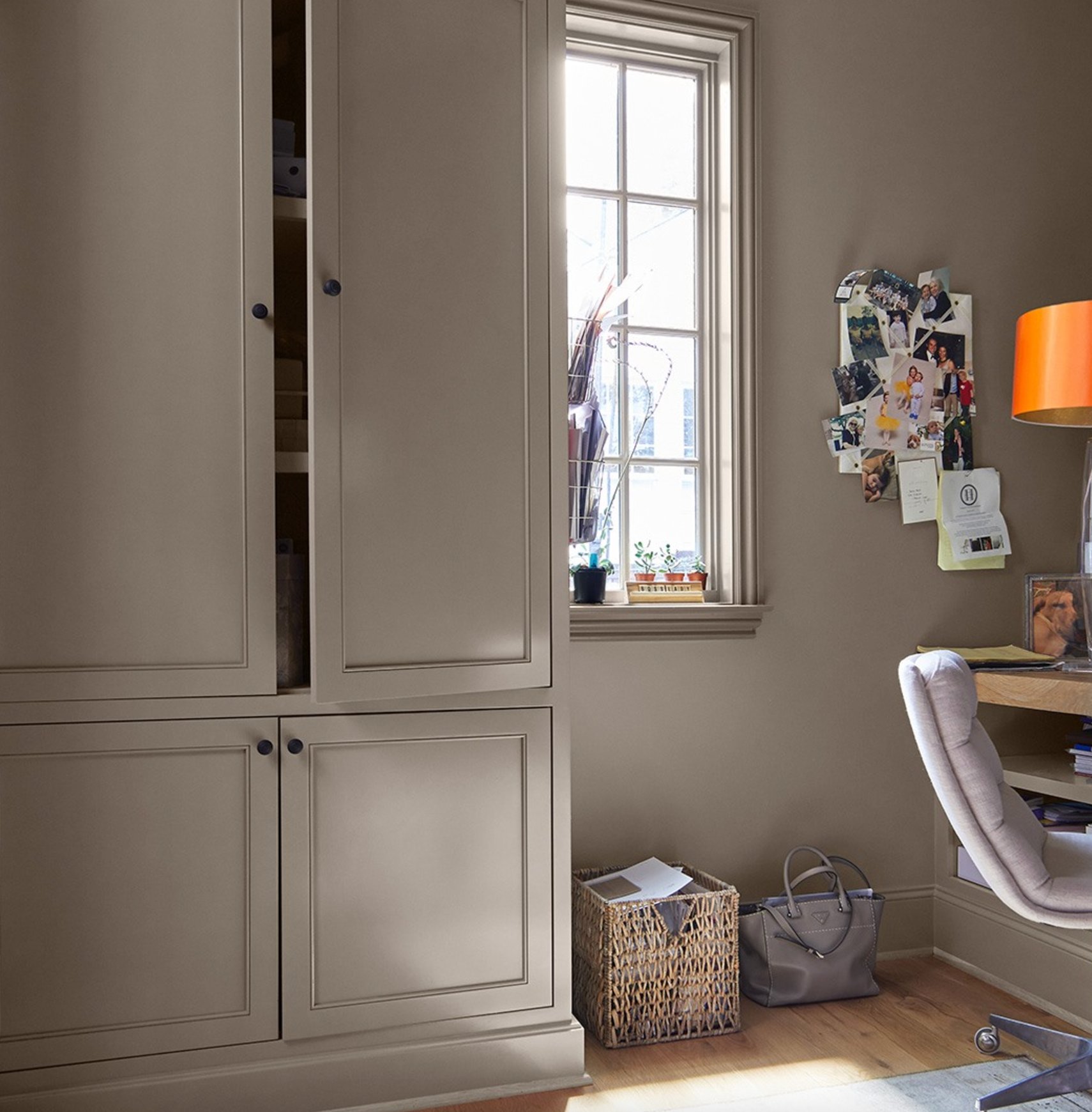
Earth-toned neutrals bring more visible color than a classic gray or white. They are a good fit when the home already has stone, brick, leather, warm wood, or handmade-looking tile.
In natural light, these colors show undertones from gold to terracotta. They keep their depth on cloudy days, which is useful in rooms that feel washed out with pale gray.
If you have a south-facing room, choose lighter shades so the color does not feel heavy when the sun is bright. In low-light rooms, sample these on at least two walls because a taupe that looks rich at noon can look muddy at night.

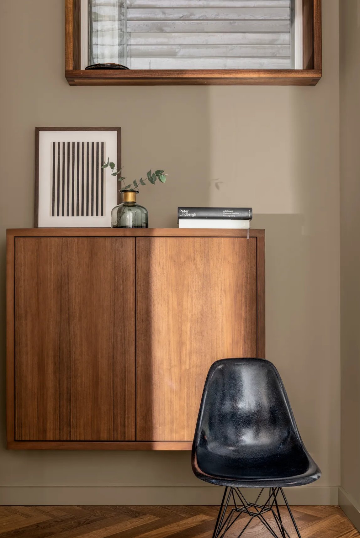
Earth tones look best with natural materials such as woven rugs, linen drapes, pottery, unlacquered brass, and wood that has some grain showing.

Best Neutrals by Room
A neutral that works in one room can fail in the next because the light, tile, and furniture change. Here is how I would narrow the list by room.
Bedrooms
For bedrooms, start with softer neutrals that lower the contrast in the room. Skip bright white on all four walls if you want a restful feel, because it can look sharp once lamps are on at night.

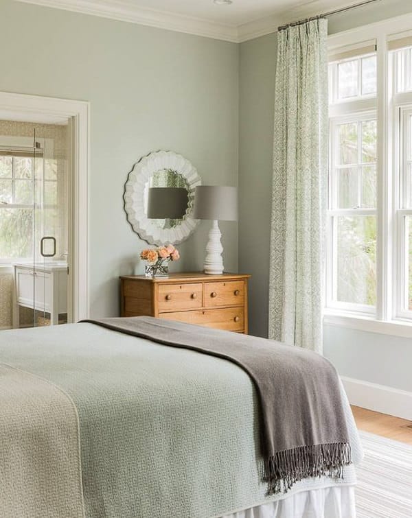
Benjamin Moore's Quiet Moments, a soft blue-gray, is a strong bedroom choice when you have white bedding, light wood, or nickel fixtures.


Sherwin-Williams Agreeable Gray is more flexible if your bedding, rug, or headboard changes often. It has enough warmth to avoid feeling cold, but it still reads as a soft neutral rather than beige in many bedrooms.
Living Rooms
Living rooms need flexible colors because they often connect to the entry, kitchen, hallway, or stairwell. Test the color where one room turns into the next, not just behind the sofa.

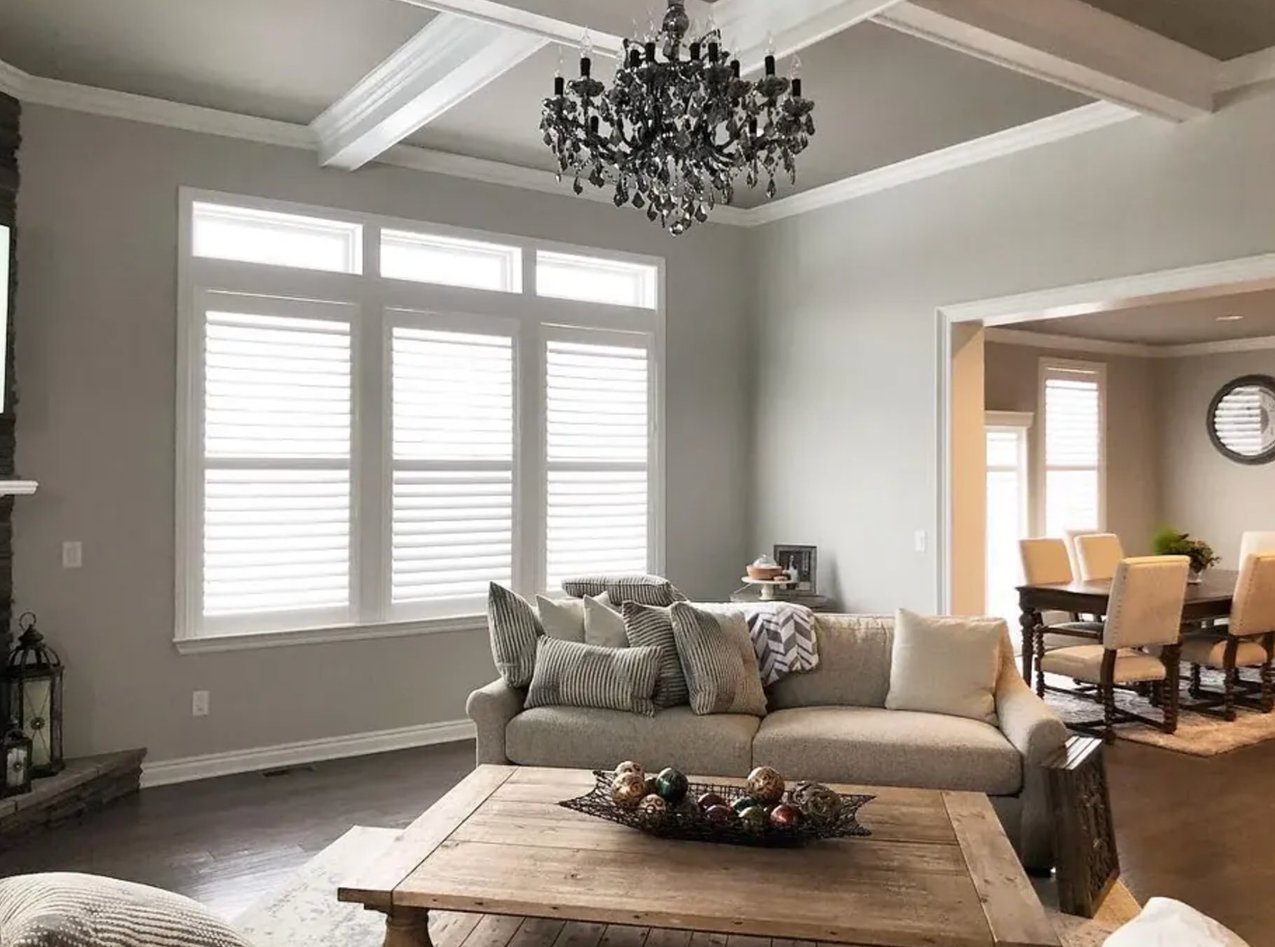
Sherwin-Williams Repose Gray is a warm gray that usually holds up in both natural and artificial light. I would still sample it beside warm floors, because its gray side can make orange wood stand out.


Farrow & Ball's Skimming Stone gives a living room a warmer, quieter look than a straight gray.
Both colors work well with wooden furniture and framed art. If the living room has low natural light, use warm bulbs around 2700K to keep the walls from looking dull after sunset.
Kitchen

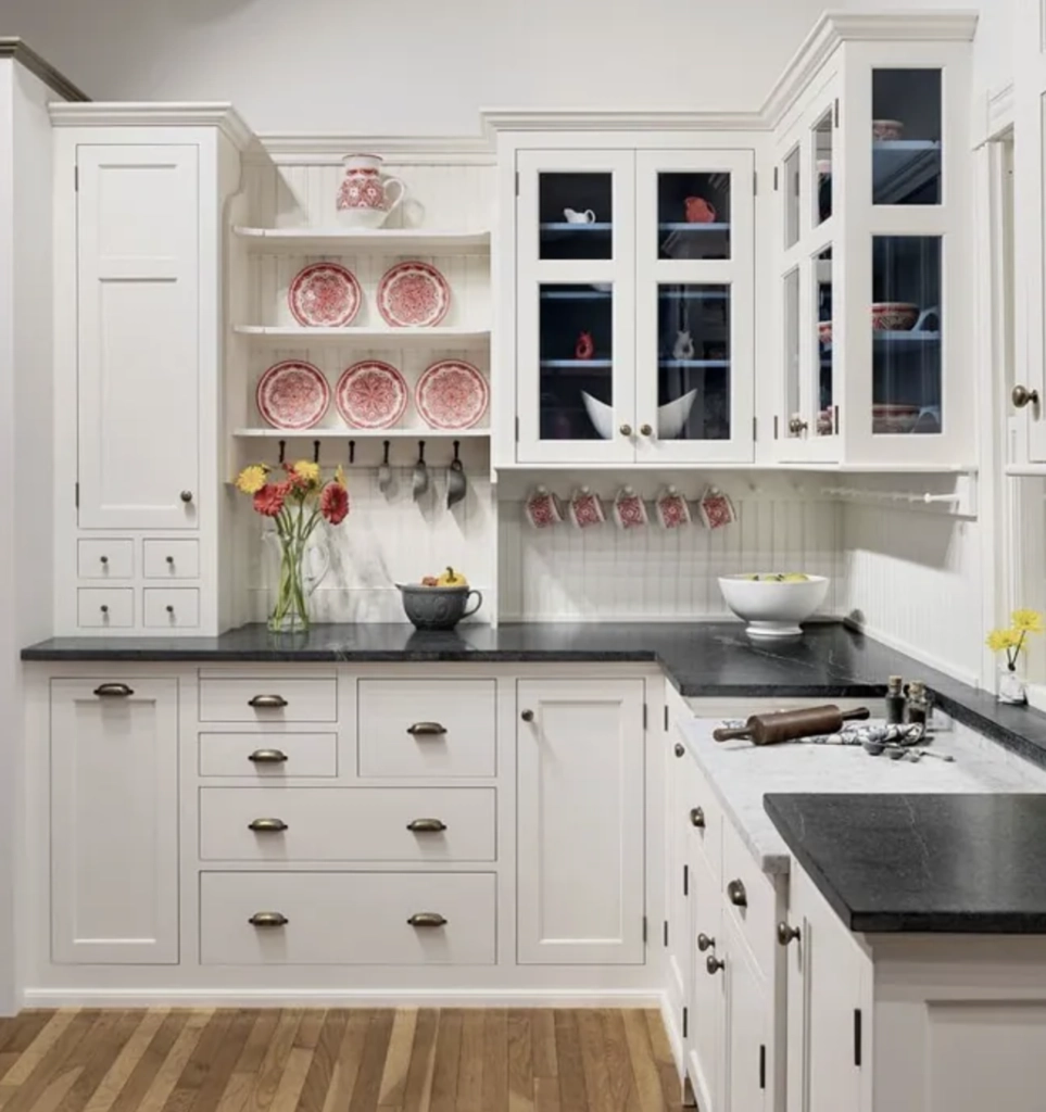
In kitchens, the neutral has to work with countertops, backsplash tile, cabinets, flooring, and appliance finishes. Benjamin Moore White Dove gives brightness without the sterile look of a colder white.

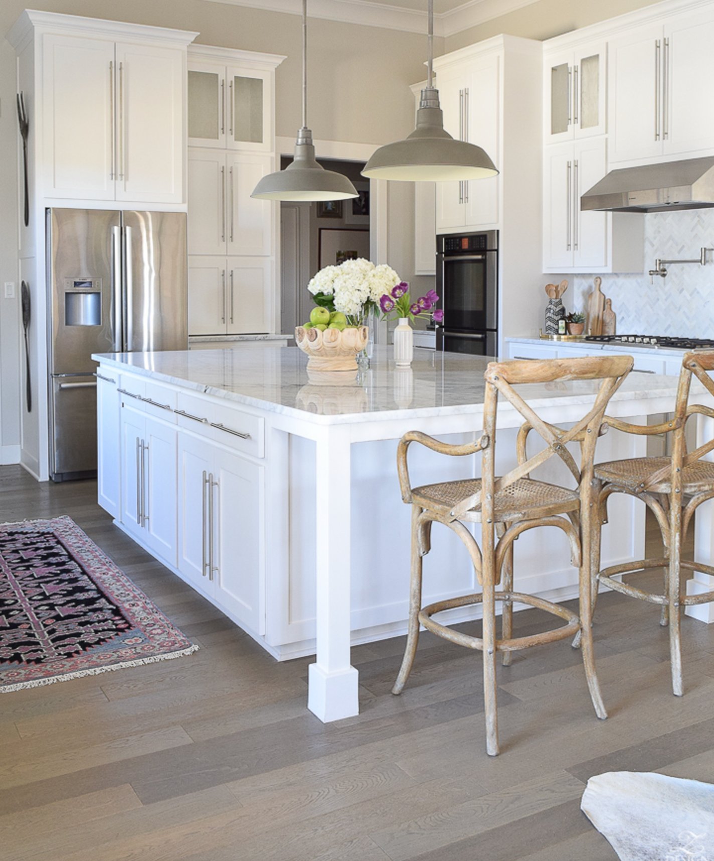
Sherwin-Williams On The Rocks is a light gray that complements wood cabinets while hiding small scuffs better than a crisp white. Use a washable eggshell or satin on kitchen walls, especially near the range and sink.
Bathrooms
Cool neutrals in bathrooms help bounce light around, especially with large mirrors, white tile, and chrome or nickel fixtures. The risk is that a small bathroom can look cold if the bulbs are too blue.

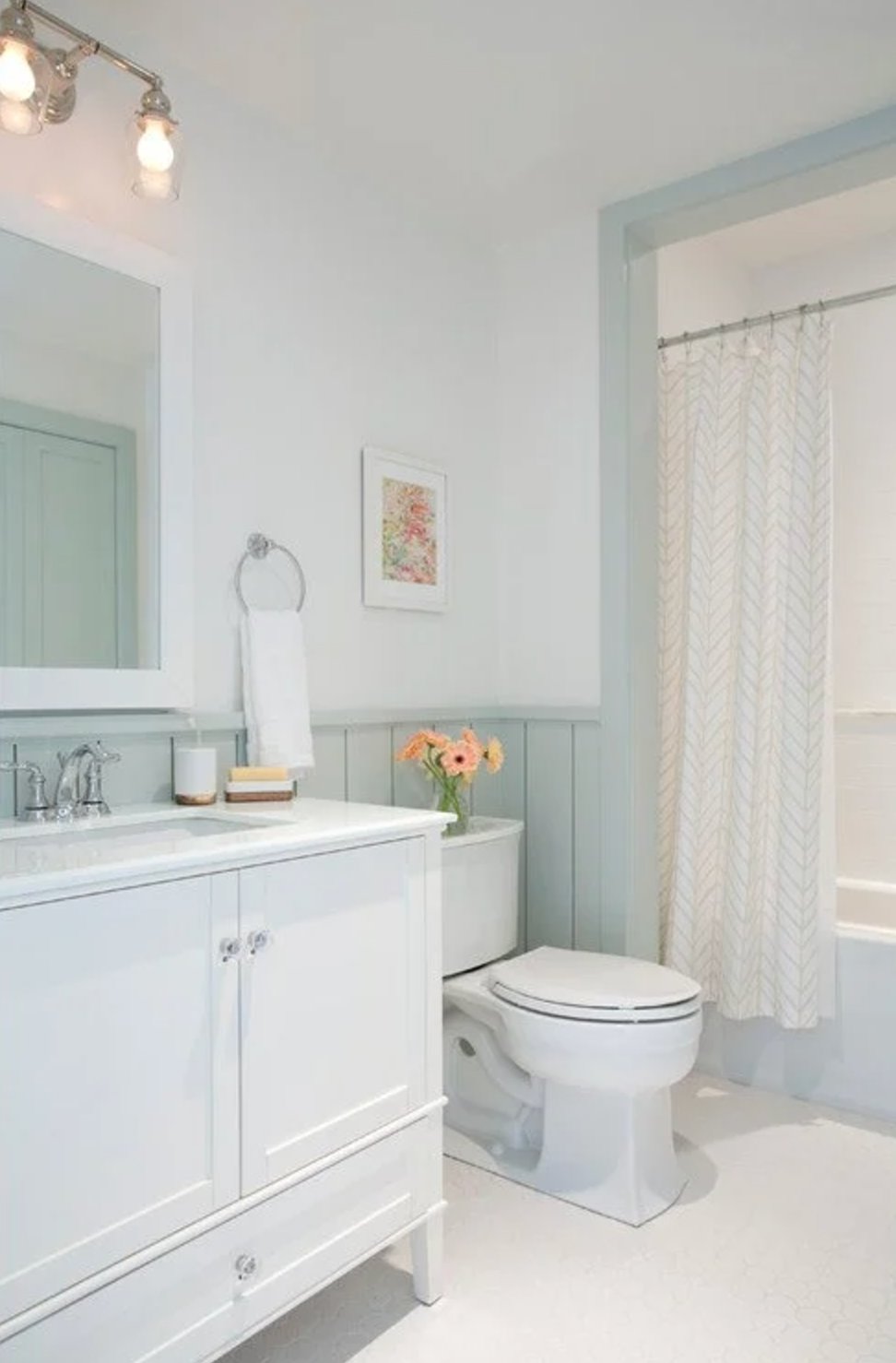
Sherwin-Williams Sea Salt is a strong choice for smaller bathrooms because its green-blue undertone adds color without closing in the walls.

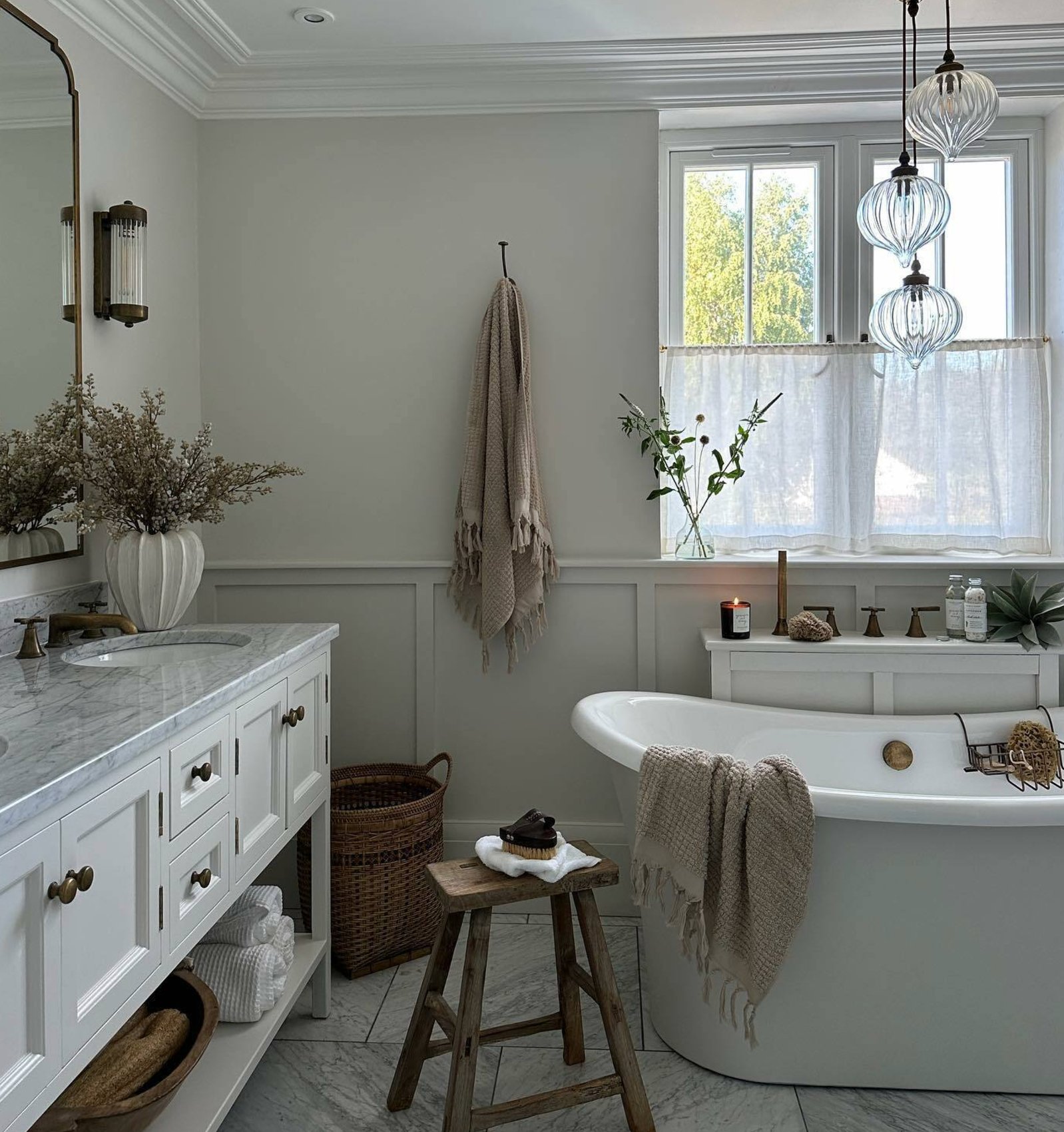
Farrow & Ball's Strong White has subtle gray undertones that keep the space fresh while giving towels, tile, and vanity finishes a quiet base.
Use bathroom-specific paint with mold resistance and moisture protection, especially above showers and around poorly ventilated tubs.
How to Choose Your Neutral
The best neutral is the one that agrees with your fixed finishes, not the one that looks best online. Use these guidelines, then test before you buy gallons.
- Think About Light
- North-facing rooms: start with warmer neutrals
- South-facing rooms: test cooler or more balanced neutrals
- East- and west-facing rooms: check morning and late-afternoon light before deciding
- Consider Size
- Smaller rooms: stick to lighter shades if you want openness
- Bigger rooms: consider mid-tone neutrals if the room feels empty or echoey
- Work With Your Architecture
- Compare samples to trim and moldings
- Check built-ins, doors, and fireplace materials
- Use less contrast on low ceilings and narrow hallways
- Create Flow
- Pick one main neutral for the connected spaces
- Use lighter or darker versions in separate rooms
- Check transitions from room to room with the lights on
- Always Test Your Paint
- Use peel-and-stick samples or paint 12-by-12 inch boards
- Move samples to different walls, including the darkest corner
- Check them in daylight and under your evening bulbs
- Hold them beside furniture, fabrics, flooring, tile, and counters

I'm Elizabeth, your go-to guide for all things paint and design! My days are filled with color swatches and innovative room makeovers. When I'm not painting the town - literally - I'm soaking up inspiration from my travels. This blog is my way of sharing my passion and making the world a more vibrant place, one color palette at a time.