13 Stunning Color Palettes for Red Brick Exteriors (2026)
The best colors for a red brick exterior usually come from the brick itself: its mortar, roof color, and the quiet undertones hiding in the clay.
I see the biggest improvement when homeowners stop treating brick as one flat red. Some bricks lean orange, some lean plum, and older mortar can read cream, gray, or taupe. Once those pieces are identified, the trim and front door choices get much easier.
Here are 13 palettes I would actually consider for red brick, with notes on where each one works, where it can go wrong, and which paint colors can help you test the look on your own exterior.
1. Dark Trim & Iron Accents
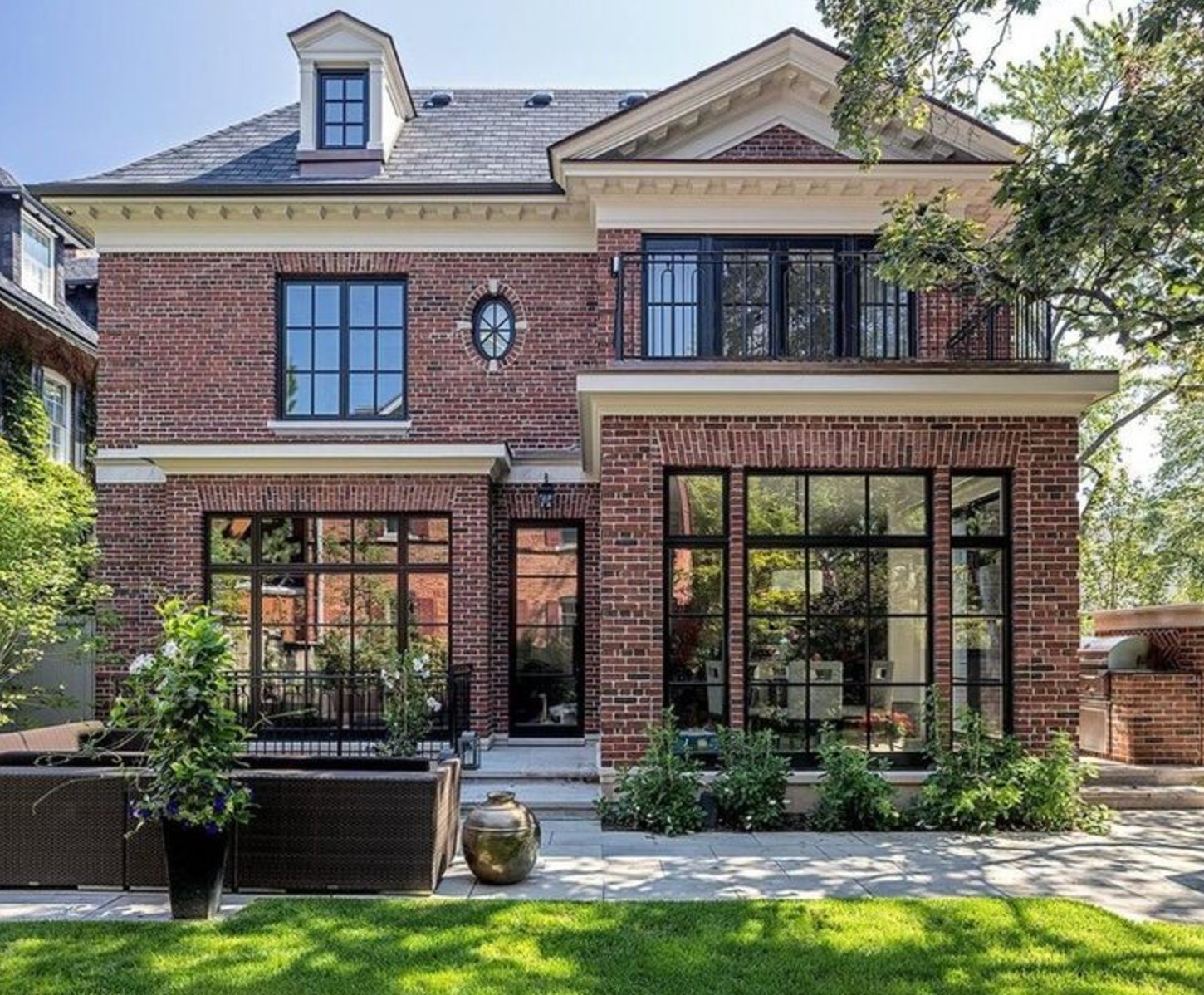
Warm red brick can handle iron-black windows when the house has enough white trim to keep the facade from going heavy. This is a strong choice for brick with orange or russet undertones because the black gives the color a cleaner edge.
The white cornice trim is doing real work here. It separates the dark window frames from the roofline and keeps the architectural details readable from the street. Oversized windows and French doors make this palette feel intentional, not like the windows were simply replaced without a plan.
I would sample the black in full sun before committing. Very dark trim can look sharp on a cloudy day and a little harsh on a south-facing wall.
Paint suggestion: Benjamin Moore Georgian Brick (brick), Sherwin-Williams Iron Ore (windows and doors), Benjamin Moore Simply White (trim).
2. Moody Navy Accents
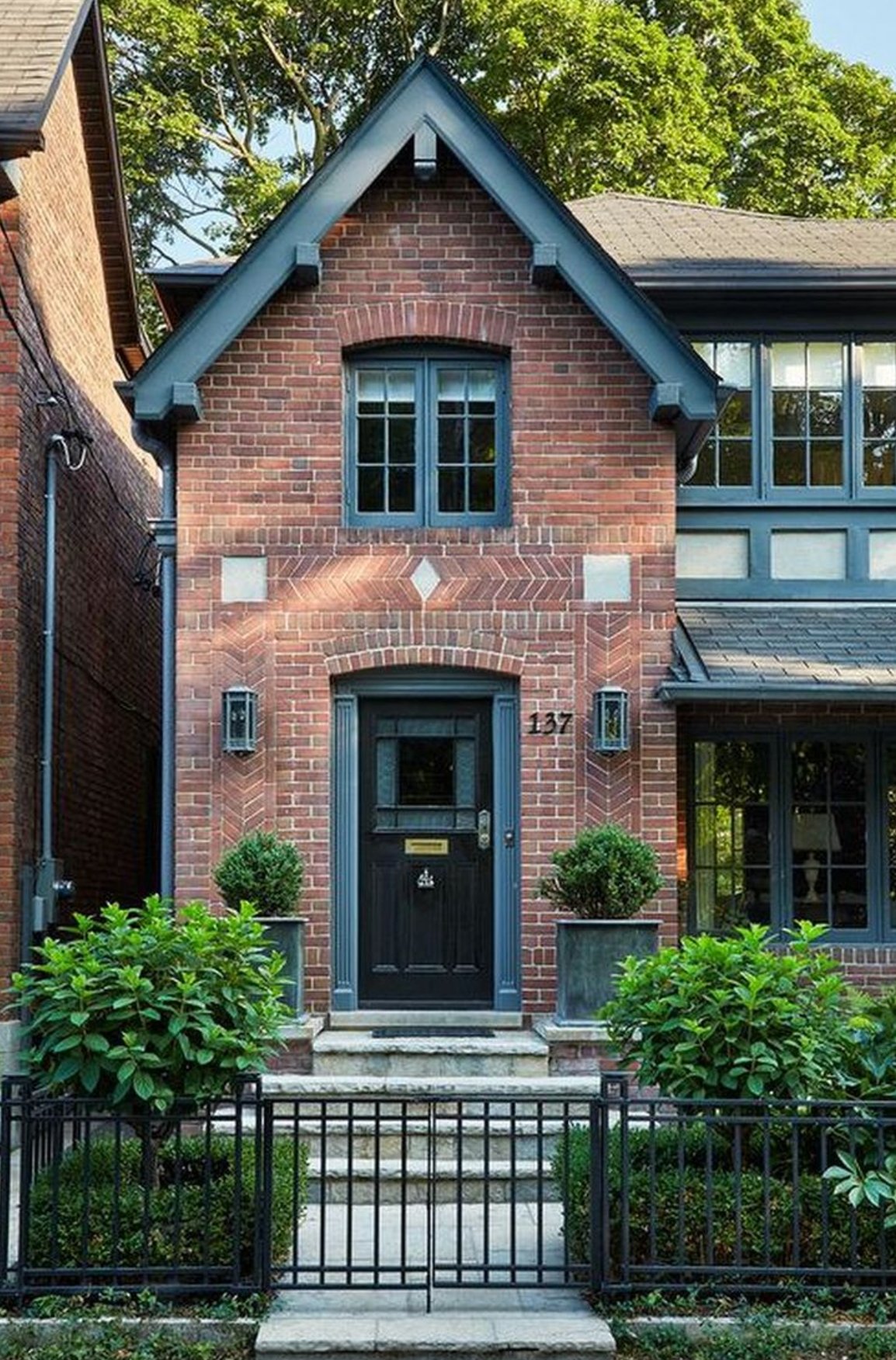
Navy blue works well with red brick when the brick has enough depth to meet it. On this exterior, the blue trim relates to the geometric brick pattern above the entrance, so the color feels tied to the architecture instead of added at the end.
The matching lanterns matter more than they might seem. Repeating that dark note on both sides of the entrance keeps the narrow facade balanced. I like this approach on city homes, where a single trim color can make several small openings read as one composed front.
Paint suggestion: Benjamin Moore Hale Navy (trim), Farrow & Ball Off-Black (front door).
3. Classic White
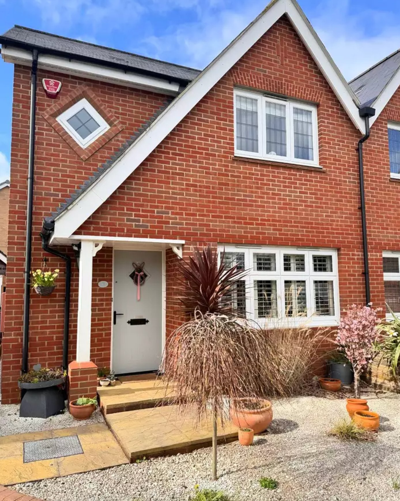
Red brick with white trim is a classic because it solves the contrast problem quickly. The key is choosing a white that looks clean beside the mortar without turning icy. On many brick homes, Benjamin Moore Chantilly Lace is crisp enough for trim, but I would compare it against the actual mortar before painting every window casing.
Paint suggestion: Sherwin-Williams Red Brick (exterior brick), Benjamin Moore Chantilly Lace (trim).
4. Tudor Magic
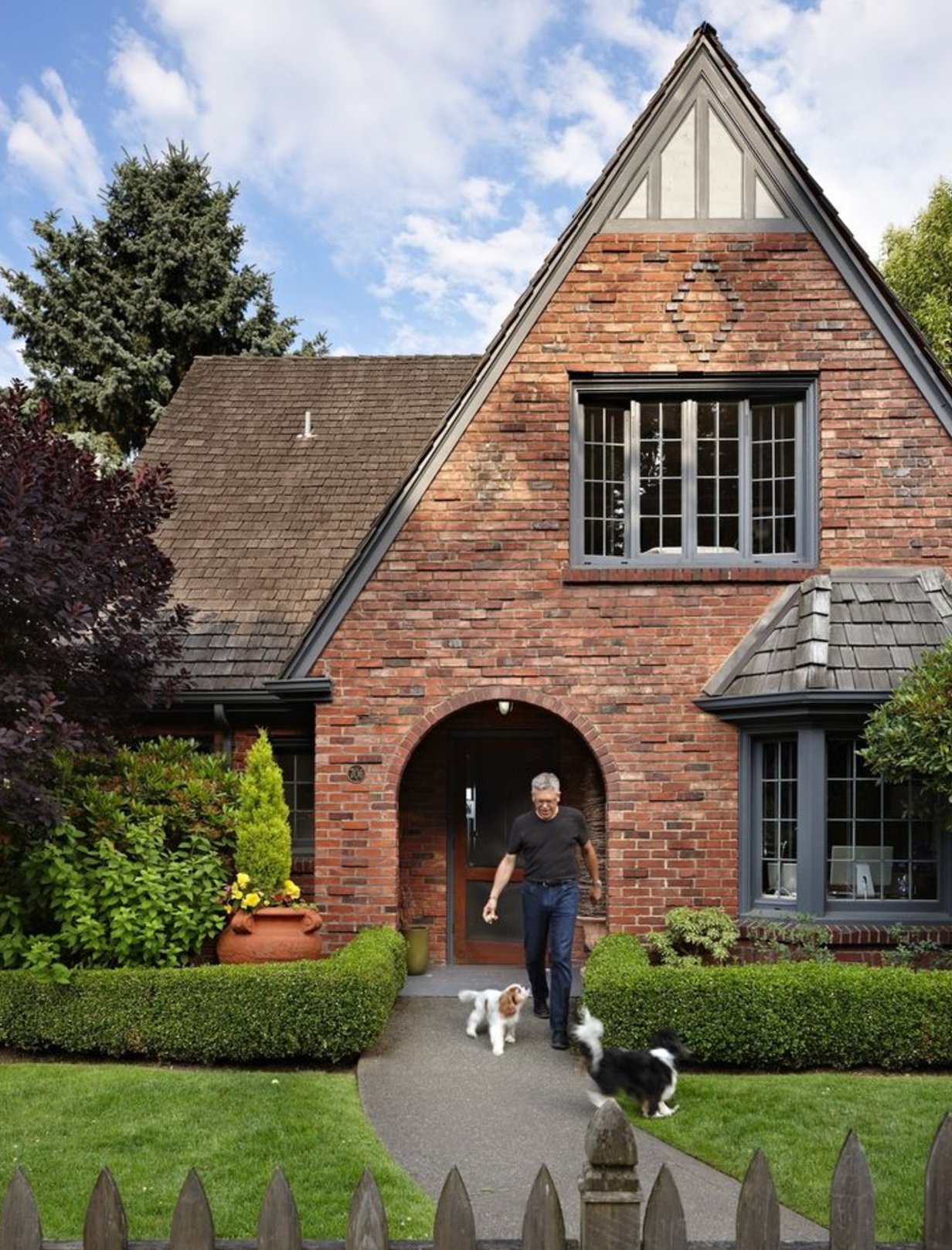
Charcoal gray is one of the better trim choices for Tudor-style brick because it respects the weight of the architecture. A pale gray can look thin on heavy half-timbering, while a deep gray holds its shape against red brick.
Here, the gray also relates to the roof, which is why the palette feels settled. If your roof is brown, red, or very warm, this same trim could look disconnected. Put a sample board near the roofline as well as beside the brick before you decide.
Paint suggestion: Farrow & Ball Down Pipe (trim), Benjamin Moore Essex Green (roof).
5. Yellow Accents

Yellow accents can work with red brick, but the yellow has to be muted. A mustard front door has enough brown in it to sit beside brick, while a clear lemon yellow usually fights the clay tones.
The front door and matching garage window give this house personality without scattering color everywhere. Cream-colored window trim softens the jump between the brick and yellow, especially if the mortar already leans warm.
The metal gate adds a geometric note that suits the palette. I would repaint it in a quiet black or deep bronze so it supports the door color instead of looking like a separate leftover finish.
Paint suggestion: Farrow & Ball Brick Red (brick), Benjamin Moore Prairie Yellow (doors and windows), Sherwin-Williams Creamy (trim).
6. Modern Grey
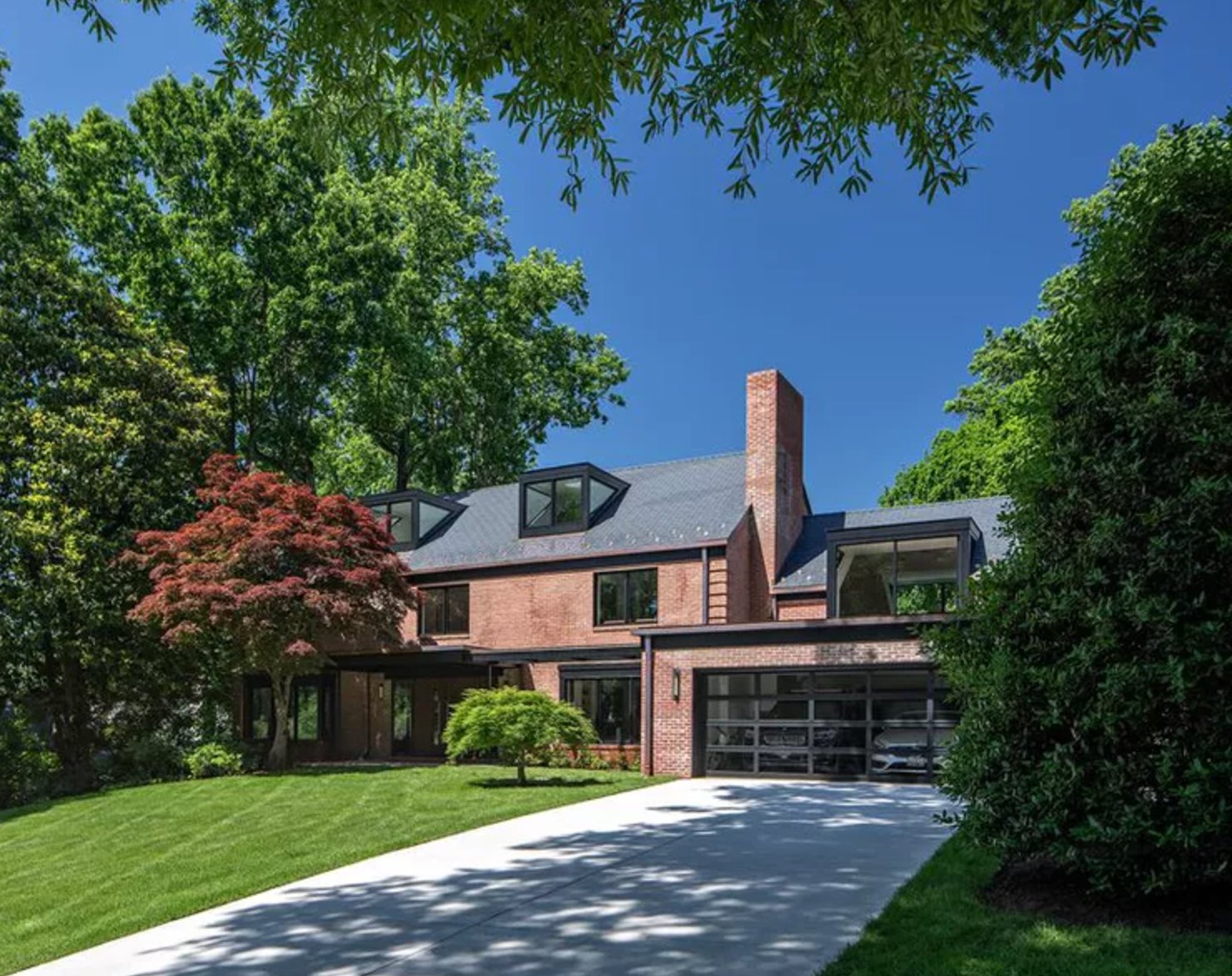
Red brick and gray can look current when the gray is tied to real materials on the house. In this example, the slate gray roof gives the metal elements and window color a reason to be dark.
The glass garage keeps the dark palette from feeling flat, and the Japanese maple helps too. Its burgundy leaves repeat the brick color in the landscape, which is a useful trick for modern brick homes with large hard surfaces.
Paint suggestion: Benjamin Moore Red Brick for brickwork, Sherwin-Williams Iron Ore for metal elements and windows.
7. Navy & Brick Love Story

Navy shutters are a dependable choice for traditional Georgian-style brick homes because they give the windows definition without competing with the brick pattern.
The white window trim and door surround create the clean break this palette needs. The navy shutters add depth, while the white dormers on the mansard roof keep the upper story from reading too dark. If your shutters are purely decorative and undersized, fix the scale before spending money on a premium paint color.
Paint suggestion: Benjamin Moore Hale Navy (shutters), Sherwin-Williams Extra White (trim).
8. Forest Green Magic
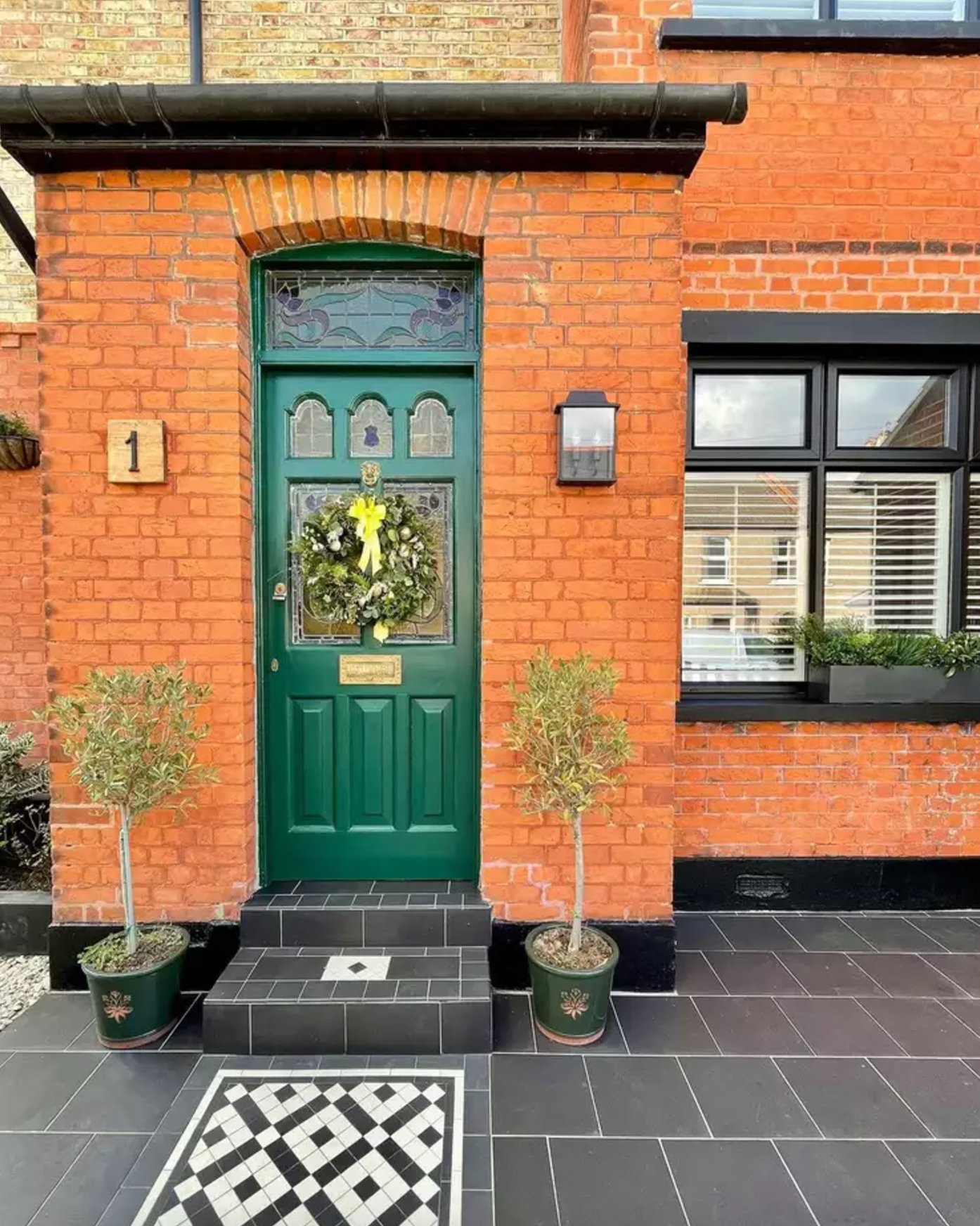
Rich green with red brick is a British architectural classic because green sits opposite red on the color wheel, but the historic versions are usually deep and muted.
The deep green front door gives the warm terracotta facade a clear focal point. It is practical too, since a darker green hides fingerprints and street dust better than a pale front door.
The black and white tile adds pattern without adding another color family. That restraint is why the entrance still feels appropriate for an older building.
Paint suggestion: Farrow & Ball Calke Green (door), Benjamin Moore Georgian Brick (brickwork)
9. Blush & Brick Harmony
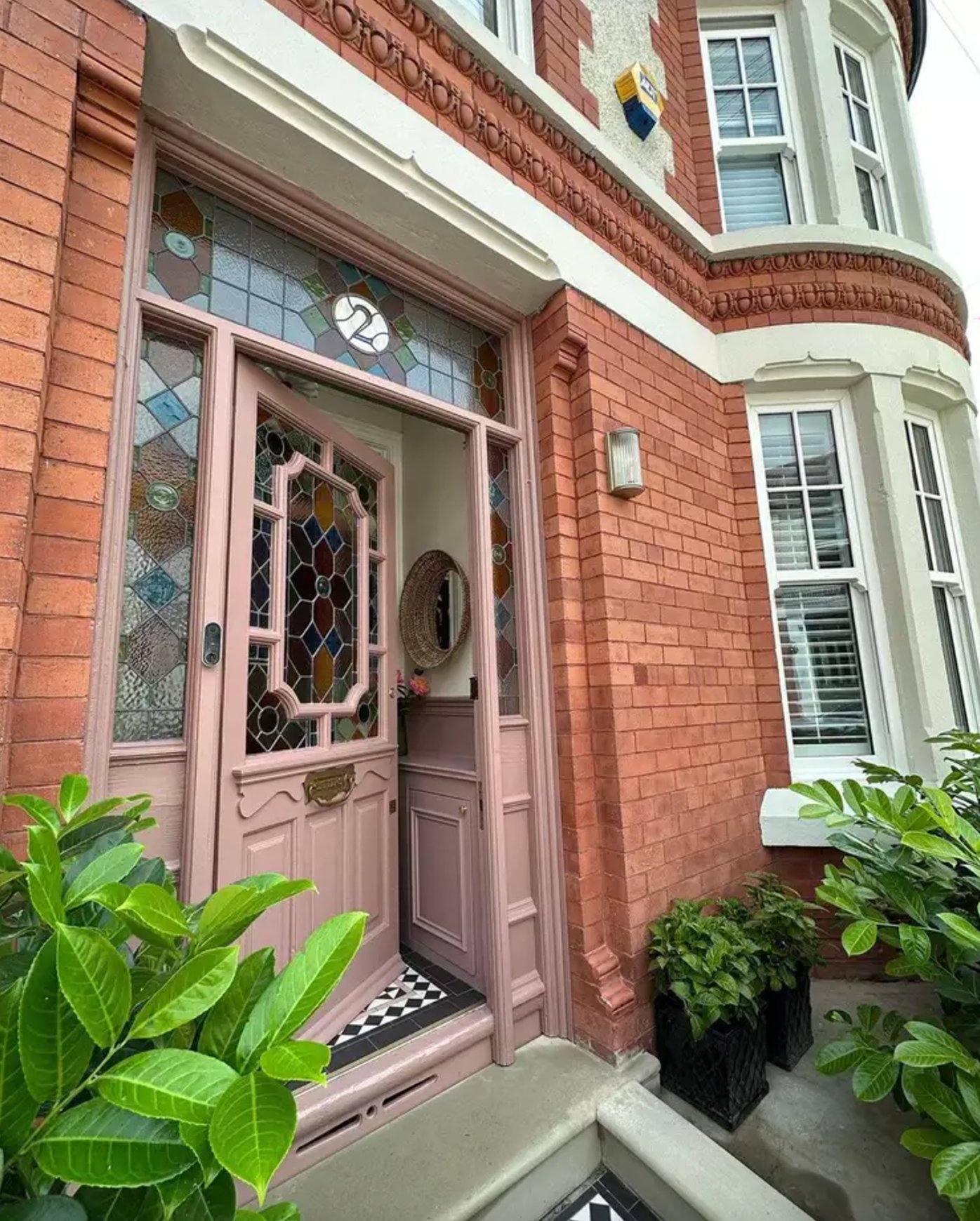
A dusty pink door can be very good with terracotta brick because both colors share a softened red base. The mistake is going too candy-pink. You want a browned or muted pink that looks calm in daylight.
The geometric stained glass gives this palette more range. The blue and amber accents keep the door from feeling isolated, and the white trim gives the eye a resting point between the pink and brick.
Paint suggestion: Farrow & Ball Dead Salmon (door), Benjamin Moore White Dove (trim)
10. Timeless Navy
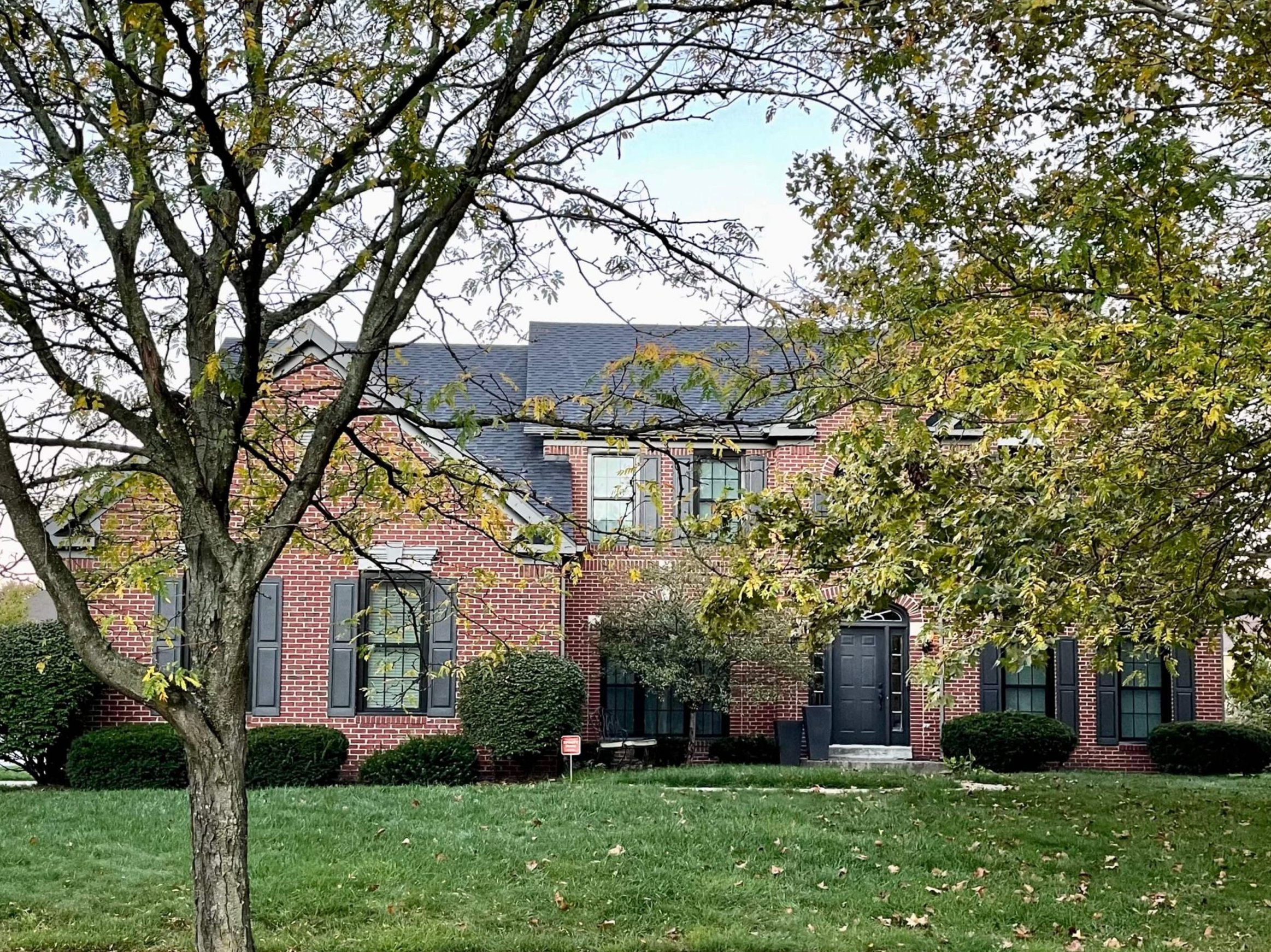
Classic red brick with deep navy shutters and doors is a familiar American exterior palette for good reason. It looks orderly, resale-friendly, and strong enough for a larger facade.
Many homeowners worry that dark shutters will make brick feel heavier. The bigger risk is choosing a blue that is too bright. Naval is successful here because it reads deep blue in daylight without turning into a flat black at the front door.
Paint suggestion: Benjamin Moore Georgian Brick (facade), Sherwin-Williams Naval (shutters and doors)
11. Classic Charcoal
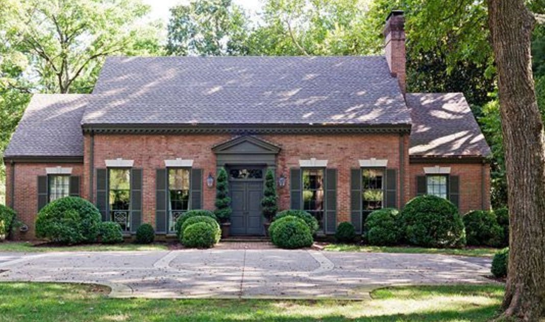
Graphite shutters are a quieter alternative to black. They give red brick structure, but the slight softness in the gray keeps the facade from looking severe.
The symmetrical windows and clipped boxwoods make the color choice feel deliberate. Dark gray also emphasizes the brick texture, so it is best on brickwork you actually like. If the brick is patchy or the mortar repair is obvious, charcoal will draw attention to it.
Paint suggestion: Benjamin Moore Iron Mountain (shutters & door), Farrow & Ball Picture Gallery Red (brick pointing)
12. Warm Taupe
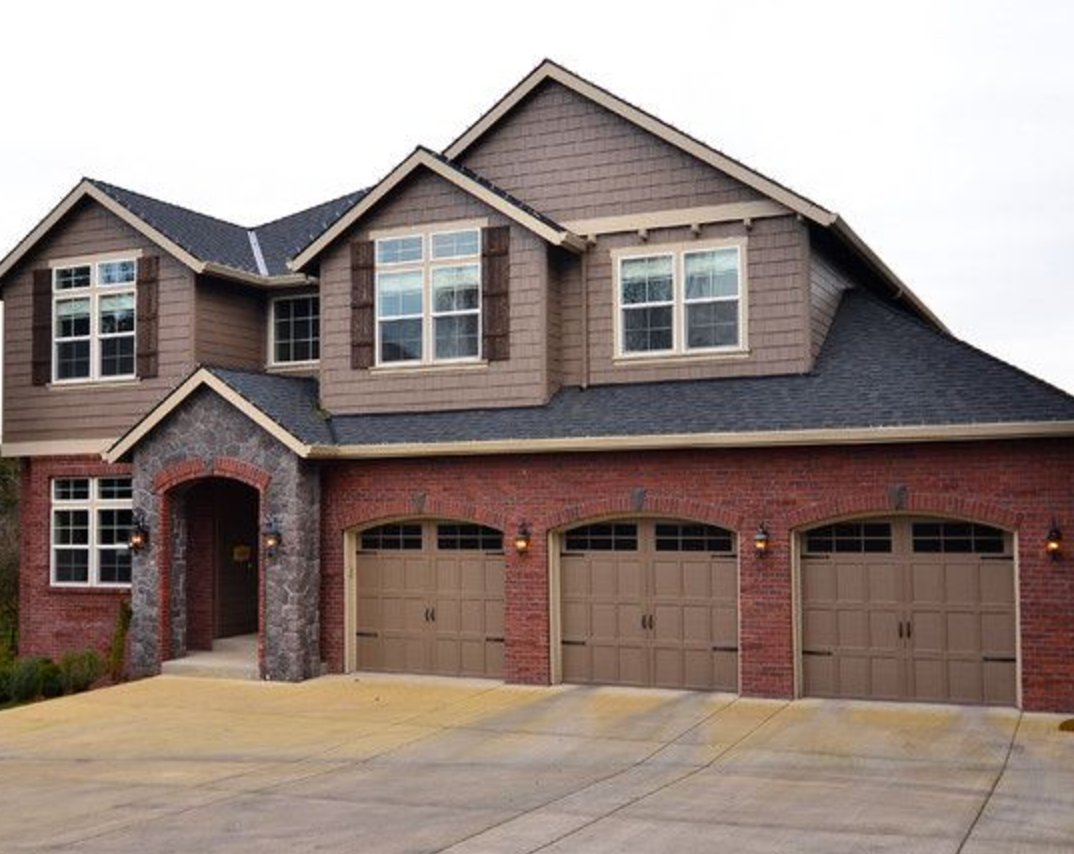
Brown-gray siding is often the easiest way to calm a strong red brick first floor. The warm taupe-brown on the upper story bridges the brick, stone entrance trim, and garage doors without introducing a cold contrast.
The stone entrance trim and beige garage doors are important here because they repeat the taupe family in lighter values. I would avoid a cool greige on this kind of house, especially if the roof or stone already has tan undertones.
Paint suggestion: Benjamin Moore Weimaraner (siding), Sherwin-Williams Mesa Tan (garage doors), Benjamin Moore White Dove (trim)
13. Modern Navy Pop

Dark blue accents suit modern red brick when the same color is repeated on every major opening.
Here, the windows, door, and garage are all handled in one navy shade, so the facade reads as one design. Farrow & Ball Drawing Room Blue has enough color in it to stay visibly blue, which is helpful if your brick is deep red or your entry sits in shade.
Paint suggestion: Farrow & Ball Drawing Room Blue (windows, door, and garage), Benjamin Moore Georgian Brick (brickwork)

I'm Elizabeth, your go-to guide for all things paint and design! My days are filled with color swatches and innovative room makeovers. When I'm not painting the town - literally - I'm soaking up inspiration from my travels. This blog is my way of sharing my passion and making the world a more vibrant place, one color palette at a time.