Best Kitchen Cabinet Colors & Ideas
A few years ago, most cabinet calls I got started with the same request: help me choose the right white. Now clients are bringing me sample doors in navy, mushroom, sage, cream, and even soft pink.
The best cabinet color is not just the one that looks good online. It has to work with your countertop, backsplash, floor, hardware, and the light you actually get at breakfast and dinner.
Here are the kitchen cabinet colors I would actually consider for a 2026 project, plus the practical notes I give clients before they commit to painting every door.
Popular Kitchen Cabinet Colors in 2026
In 2026, kitchen cabinet colors are moving warmer and more personal. Homeowners are still asking for white, but I am seeing more natural shades, muted pastels, and rich colors that make plain cabinet fronts feel intentional.
Before choosing one, tape a painted sample board vertically near your cabinet run. Check it in morning light, at night under your bulbs, and next to the countertop edge. Cabinet color shifts more than wall color because doors have shadows, rails, stiles, and sheen.
1. Navy Blue
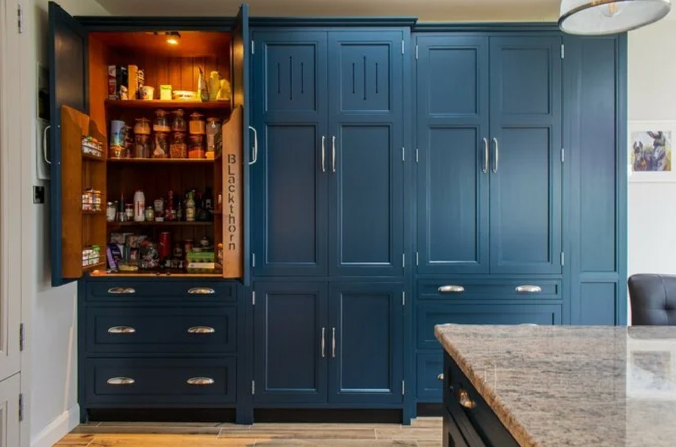
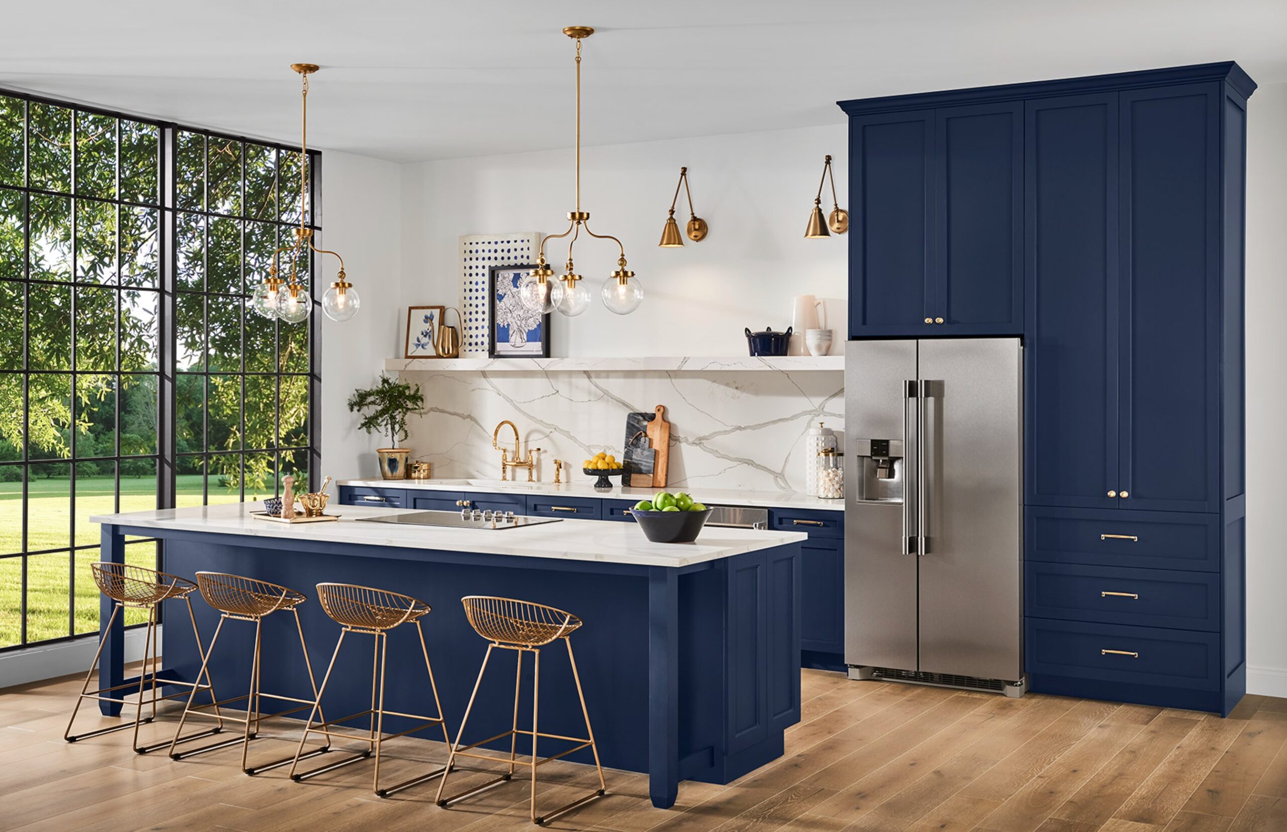
I was cautious about navy cabinets at first because a bad navy can look flat and heavy. A good one reads tailored, especially on shaker doors or simple slab fronts.
Navy is strongest with brass or aged gold hardware because the warmth keeps the blue from feeling cold. It also works with polished nickel if the kitchen has cooler marble, chrome plumbing, or stainless appliances.
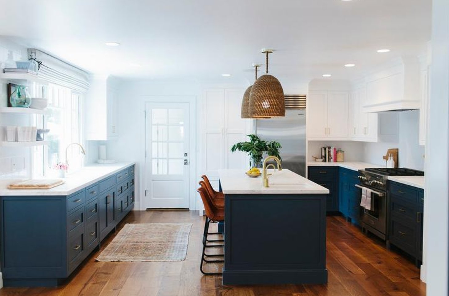
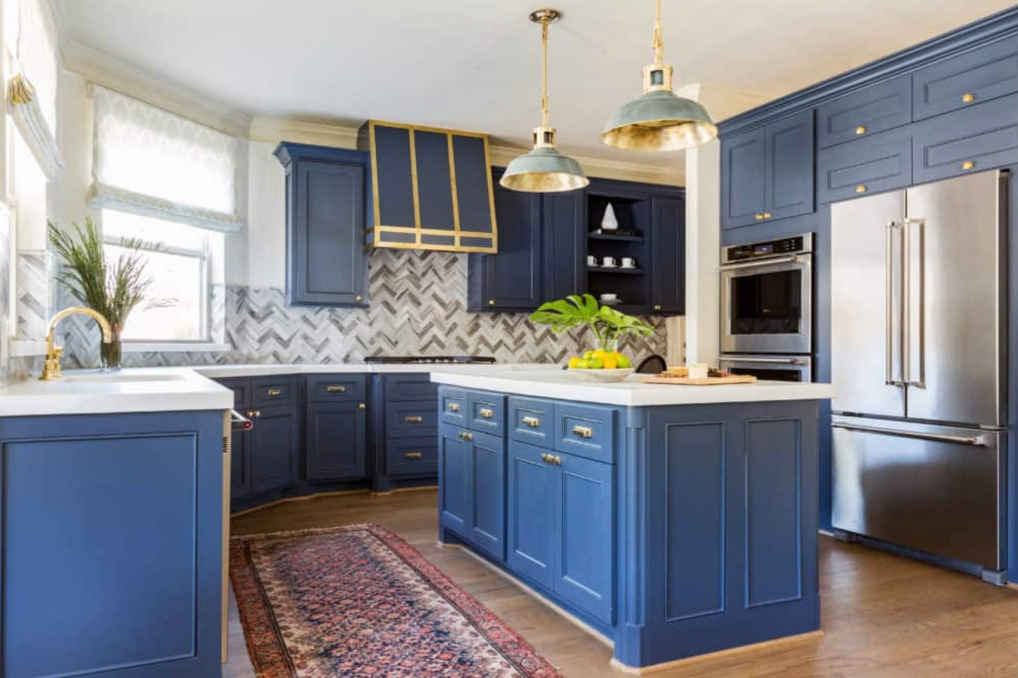
Navy is practical on lower cabinets because fingerprints and cooking splashes are less obvious than they are on white. It will feel too dark only if the kitchen has weak lighting, dark counters, and dark floors all at once.
Use it with white marble, quartz, butcher block, hardwood floors, or a simple white tile backsplash. If your floor is orange oak from the 90s, sample carefully. Some navies make that orange stronger.
If you want color but still care about resale, navy is one of the safer dark choices. It has enough history in interiors to outlast a short trend cycle.
Paint suggestion:
- Benjamin Moore Hale Navy
- Sherwin-Williams Naval
- Farrow & Ball Hague Blue
2. Soft Pink
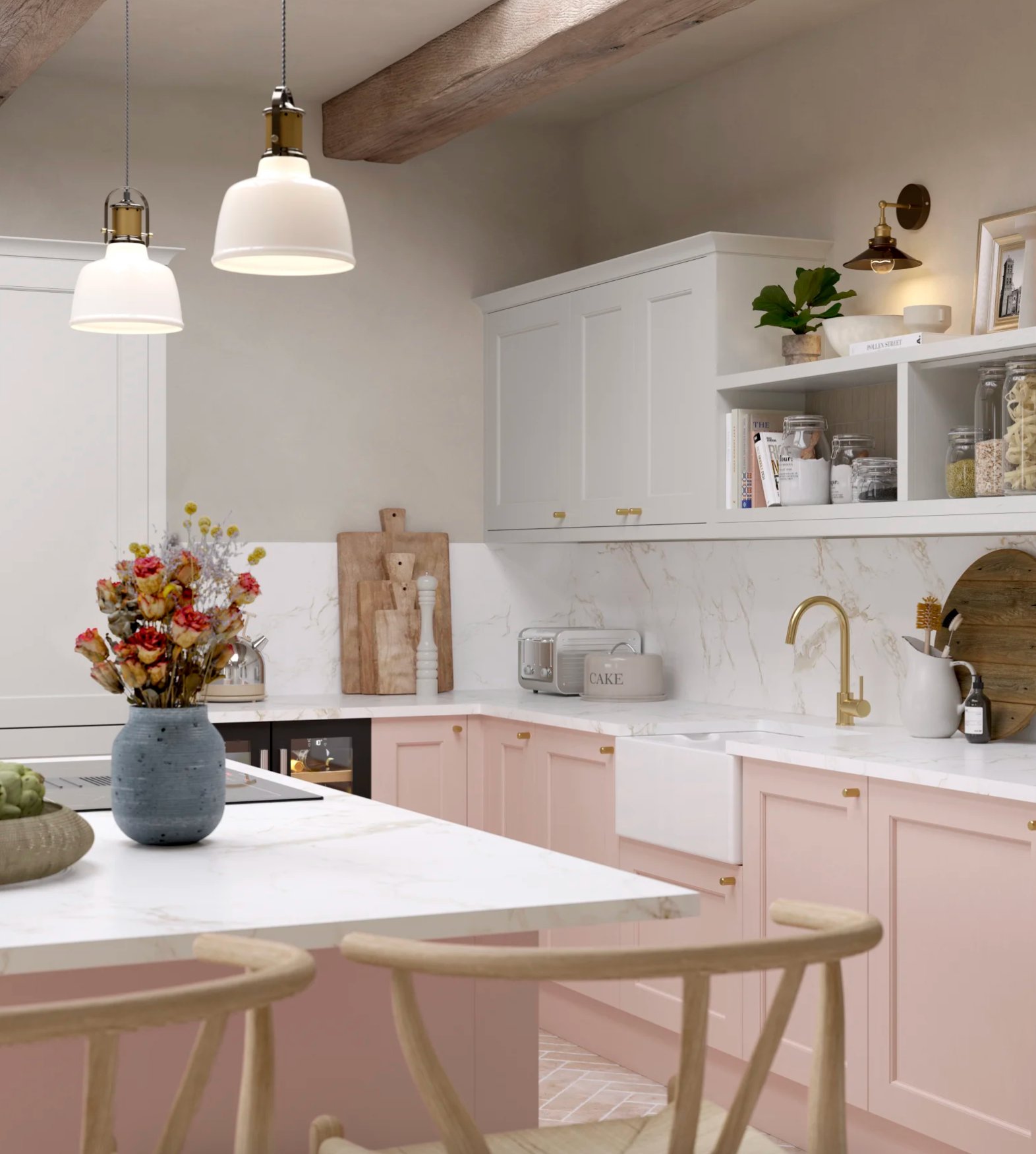
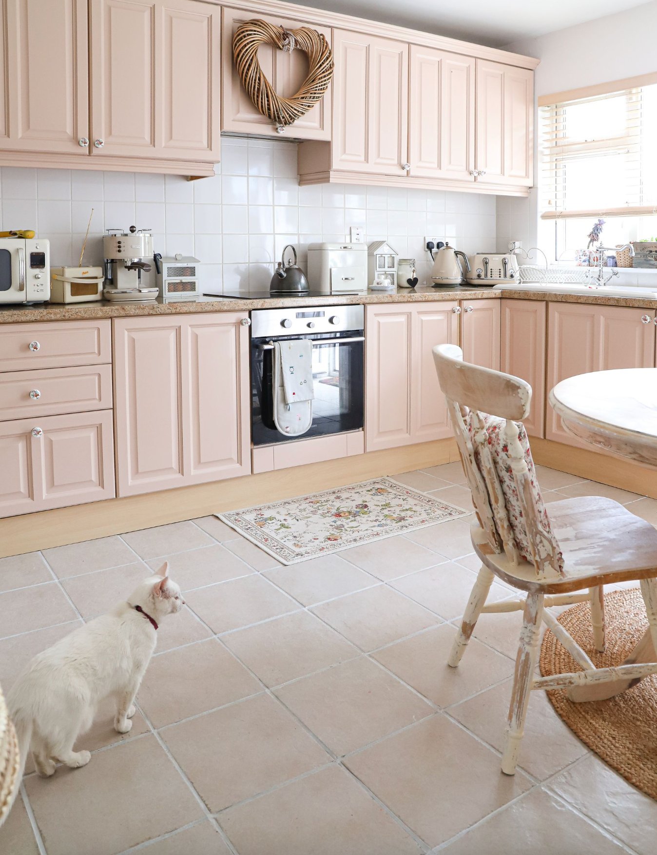
Soft pink cabinets work best when the pink is dusty, chalky, or beige-based. That kind of pink can act as a neutral, especially when the rest of the kitchen is quiet.
With white marble or pale quartz, soft pink looks crisp in morning light and warmer under evening bulbs. Avoid clear bubblegum pinks on cabinets. They date quickly and are harder to balance with stone.
It can work in contemporary kitchens with slab fronts and in traditional kitchens with inset doors, but the hardware matters. Unlacquered brass, aged bronze, or simple black pulls make it feel grown up.
P.S. If you are nervous, paint one loose door or a large sample board first. Pink is very sensitive to bulb temperature.
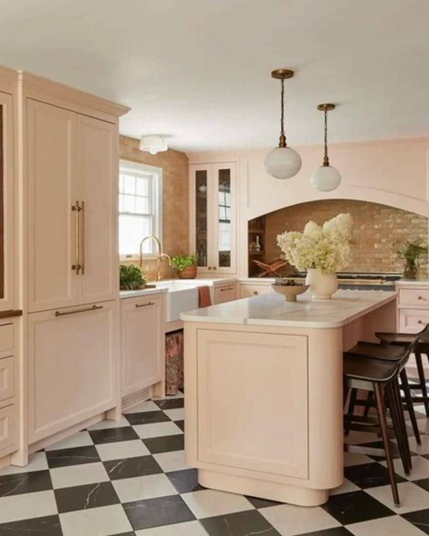
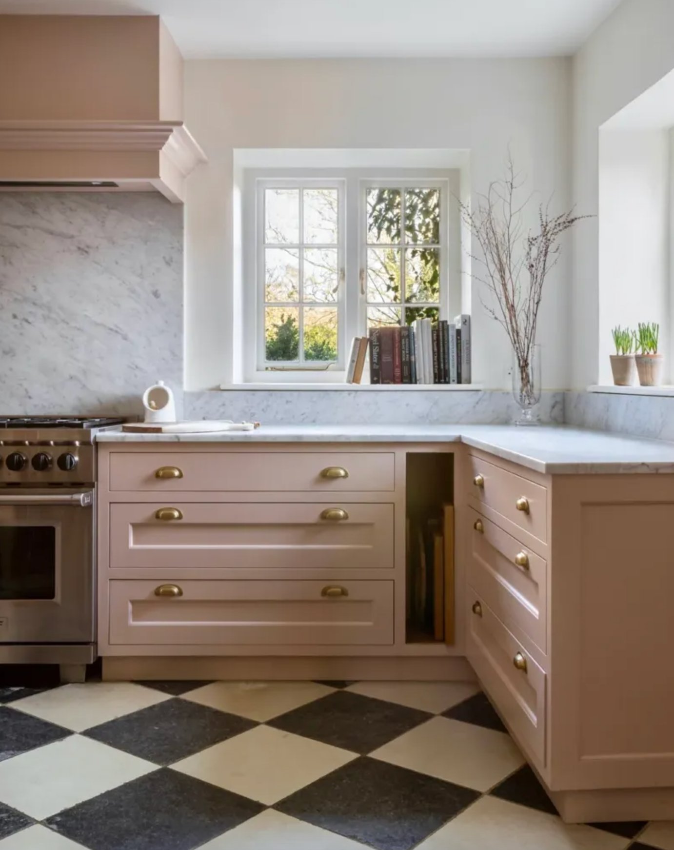
If you are trying pink for the first time, start with the lower cabinets and keep the uppers white or cream. That gives you the color without putting it at eye level on every wall.
Wood beams, marble countertops, and black and white floor tile all give soft pink enough structure. Without contrast, it can read more like a nursery color than a kitchen color.
Light pink also changes easily with styling. Copper accessories will pull it warmer, while greenery, white dishes, and black accents keep it cleaner.
Paint suggestion:
- Farrow & Ball Pink Ground
- Benjamin Moore First Light
- Sherwin-Williams Intimate White
3. Black
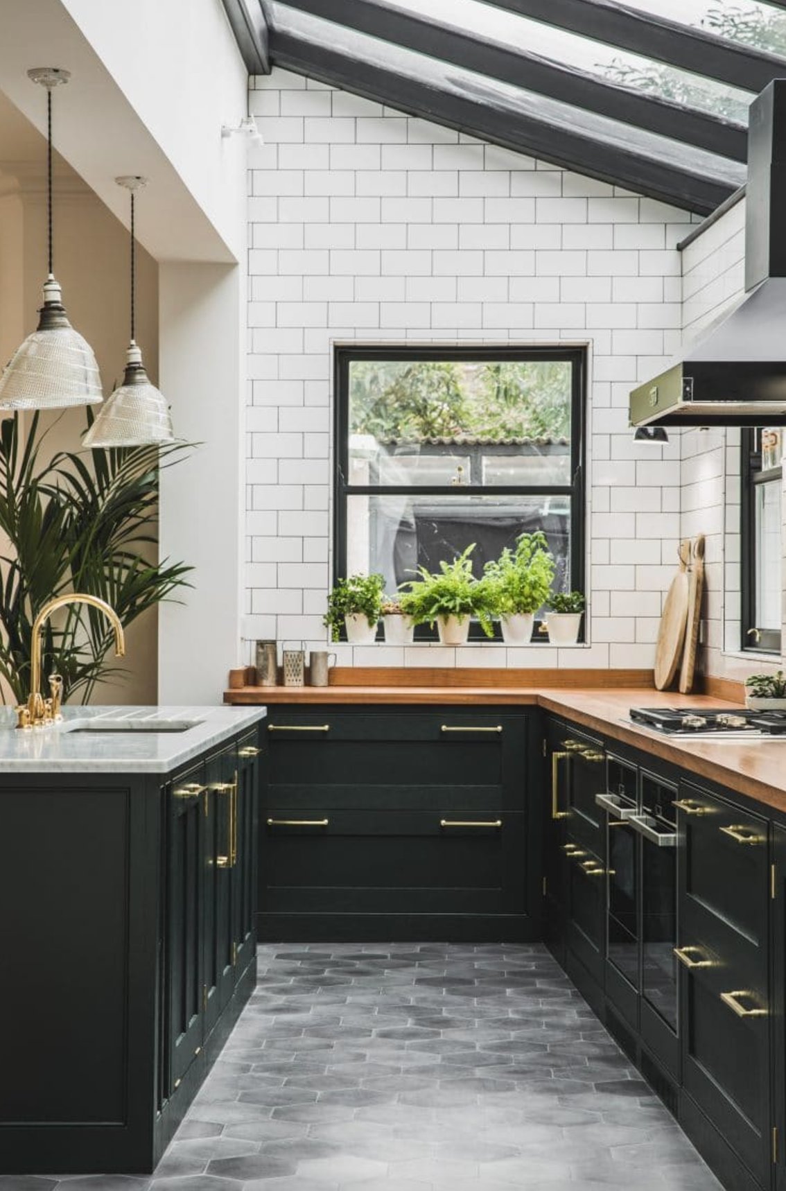
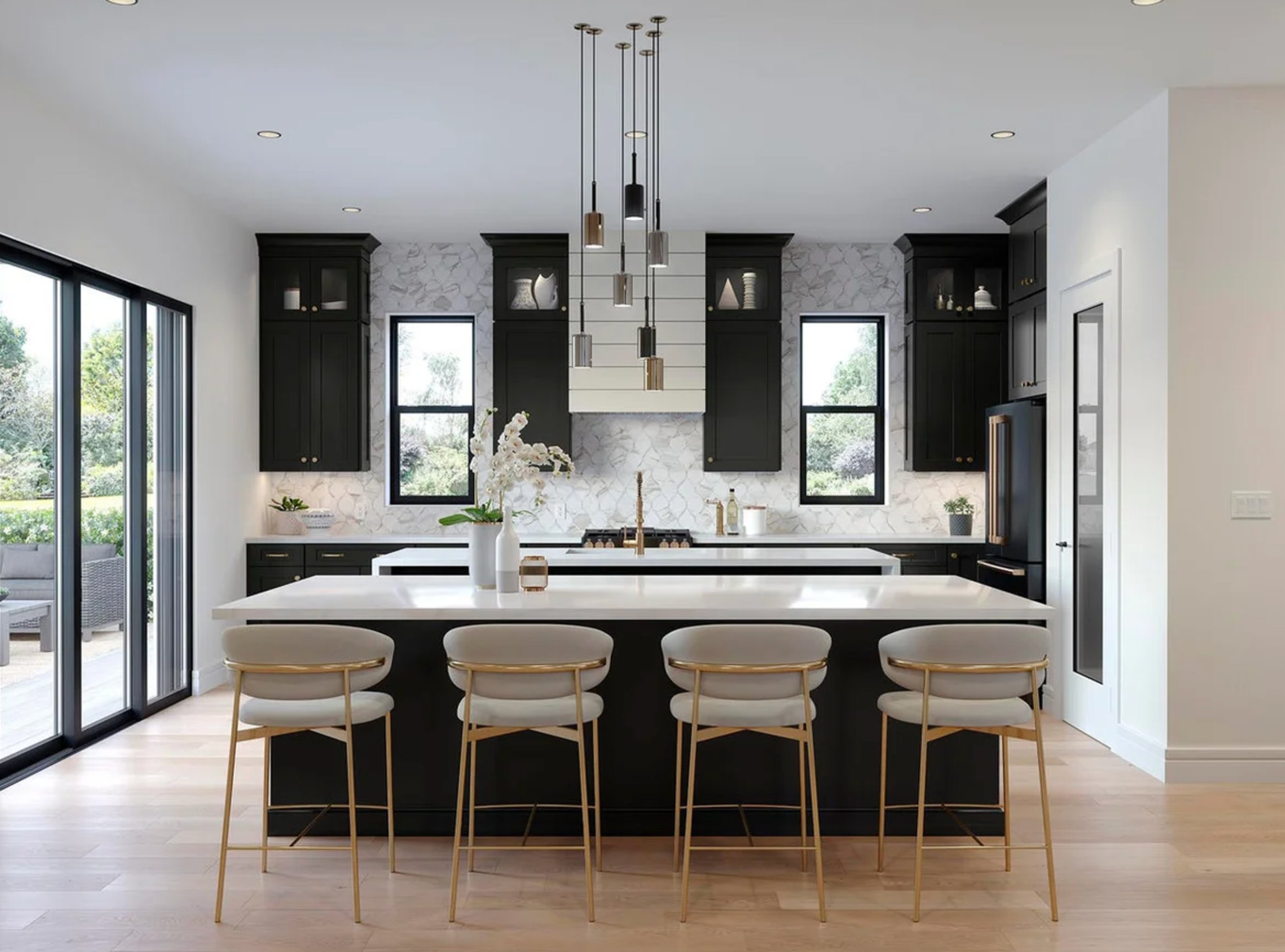
Black cabinets are best when you want contrast and you have enough light to support it. They look sharp against pale quartz, marble, zellige tile, or a simple white backsplash.
Black with brass hardware is a reliable pairing because the metal warms up the cabinet color. Black with black hardware can work too, but it needs texture somewhere else, usually wood, stone movement, or handmade tile.
For most homes, matte graphite or charcoal-black shades are easier to live with than glossy blue-black. Gloss shows every drip mark and every uneven spot in the door prep.
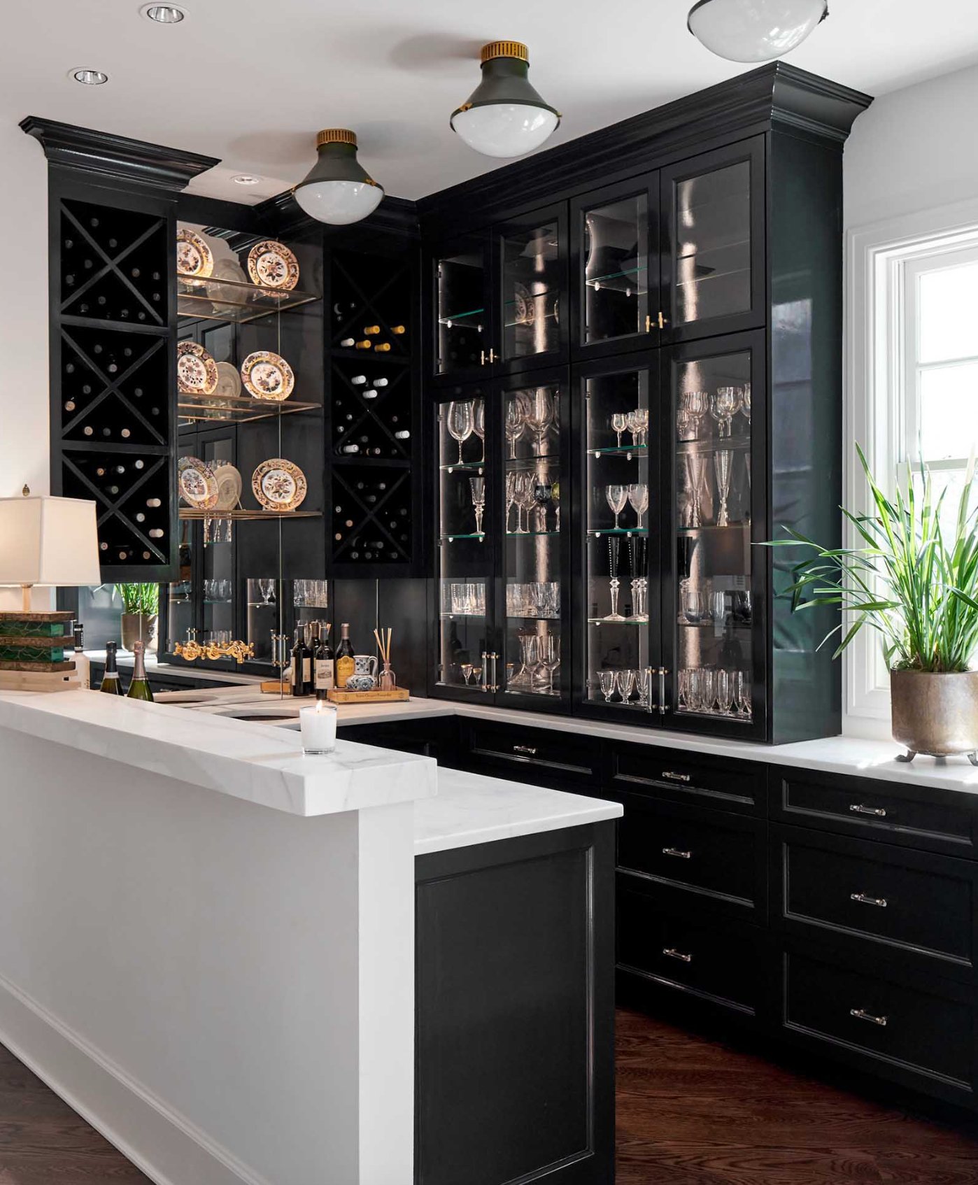

If you are worried black will shrink the room, keep the backsplash light and run tile to the ceiling where possible. Large windows help, but so do under-cabinet lights in the 2700K to 3000K range. Wood countertops or wood shelves can keep the room from feeling severe.
Natural materials help black cabinets feel less harsh. Woven shades, wood cutting boards, linen runners, and stone with visible movement all give the black something to sit against.
If you are painting cabinets black, use a cabinet-grade enamel that cures hard and can handle moisture. A satin or matte-satin finish usually hides fingerprints better than full gloss while still wiping clean.
Paint suggestion:
- Sherwin-Williams Tricorn Black
- Farrow & Ball Off-Black
- Benjamin Moore Black
4. Yellow
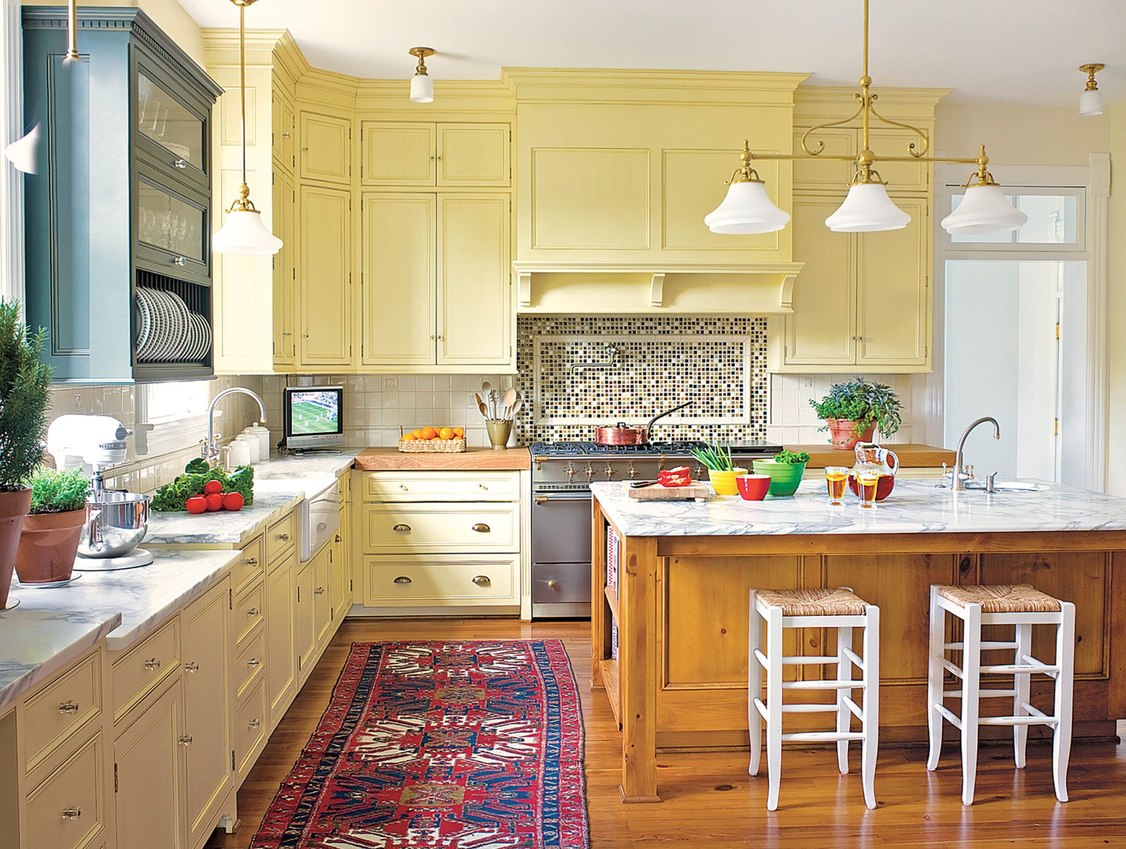
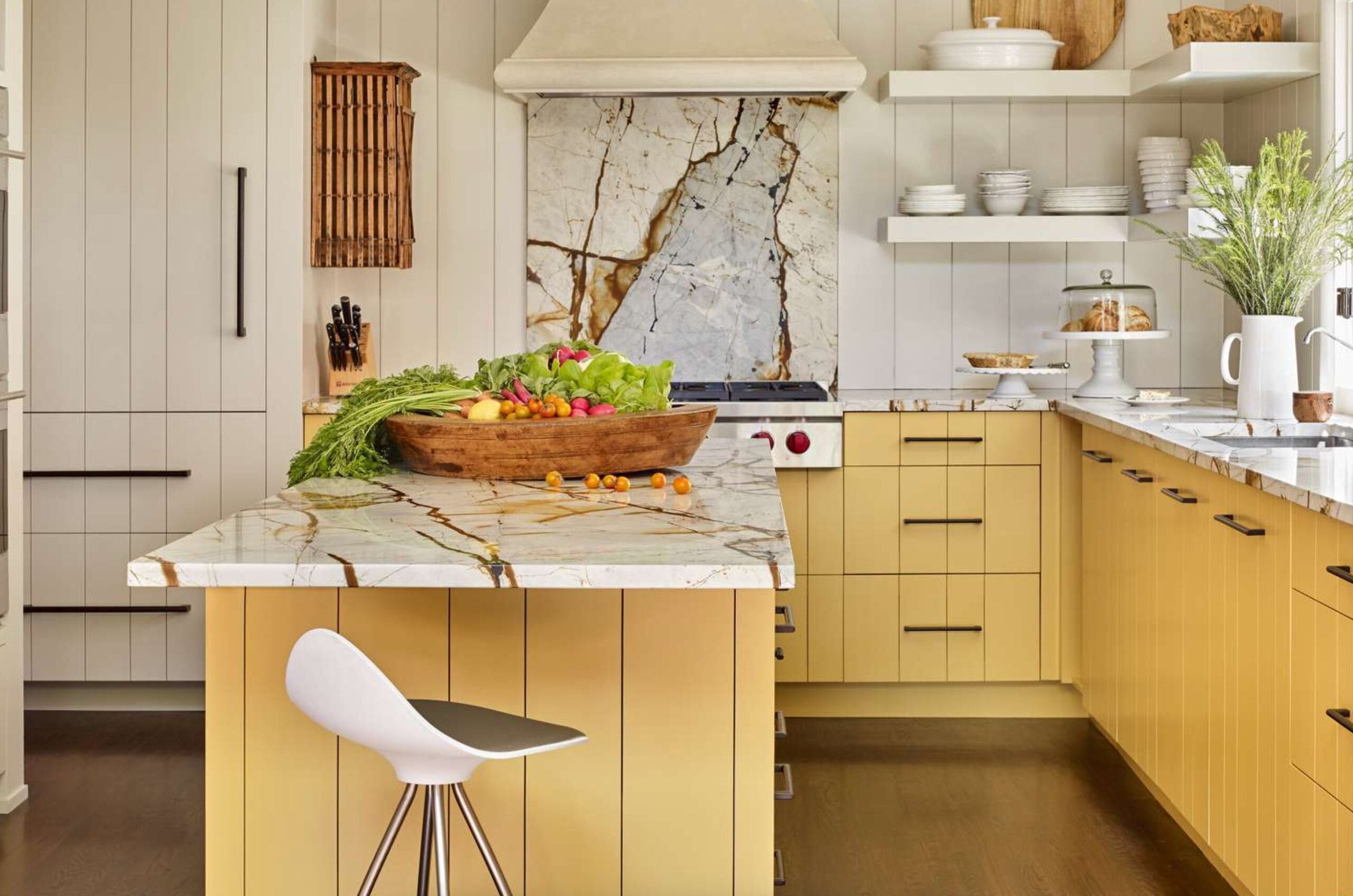
Yellow cabinets can be wonderful, but the shade has to be controlled. Butter yellow, pale lemon, and softened ochre are easier to live with than clear primary yellow.
Yellow pairs well with marble and wood because both materials calm it down. In a modern farmhouse kitchen, I would keep the walls quiet and let the cabinets carry the color.
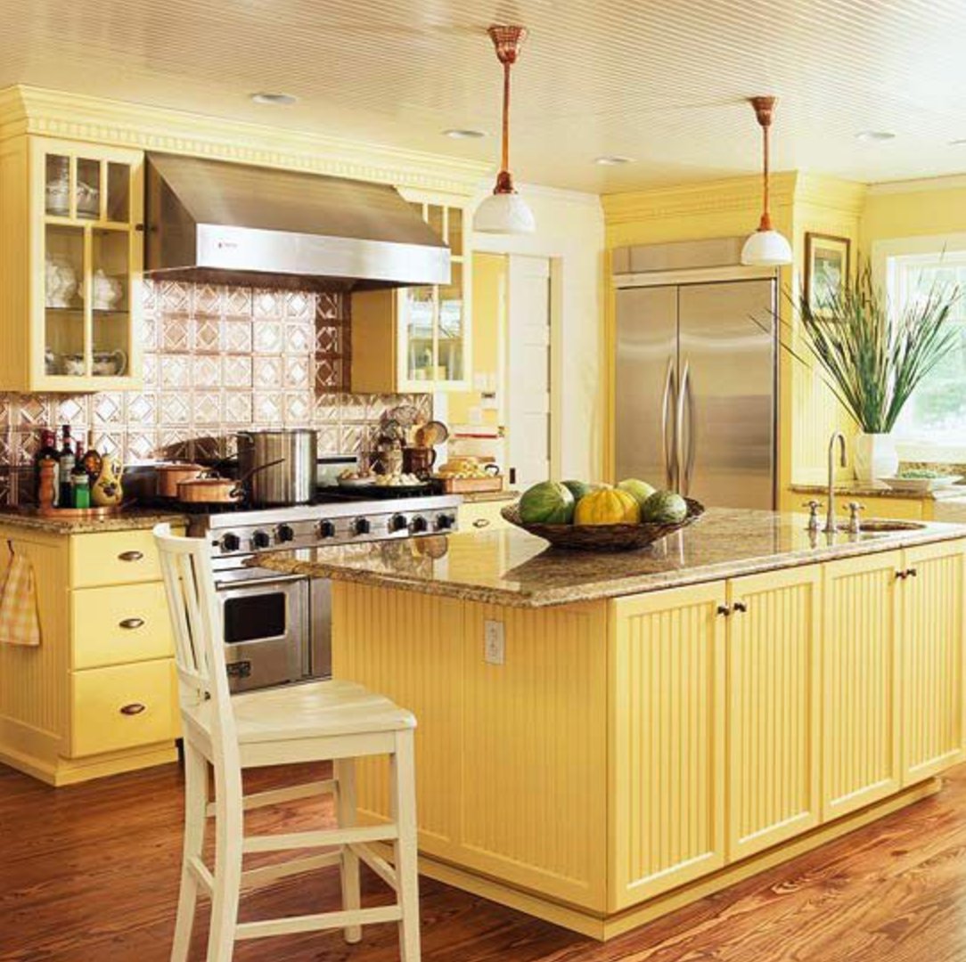
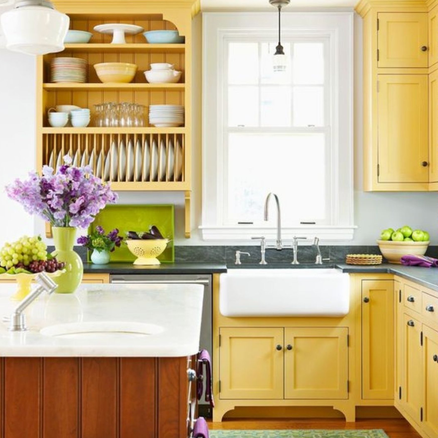
White hardware and light walls make yellow cabinets feel airy. Dark handles give the doors more definition, especially on flat fronts where the color can otherwise look like one large block.
Stick to softer, warmer yellows if this is your whole cabinet run. Paneling, reeded detail, or shaker rails break up the color and give the finish more depth.
If the yellow starts feeling too loud after sampling, lower the contrast around it. Cream walls, natural woven shades, and warm wood stools will soften the effect.
Paint suggestion:
- Benjamin Moore Yellow Highlighter
- Sherwin-Williams Cheerful
- Farrow & Ball Babouche
5. Deep Green
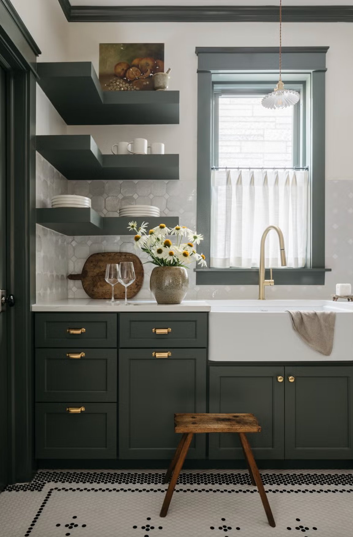
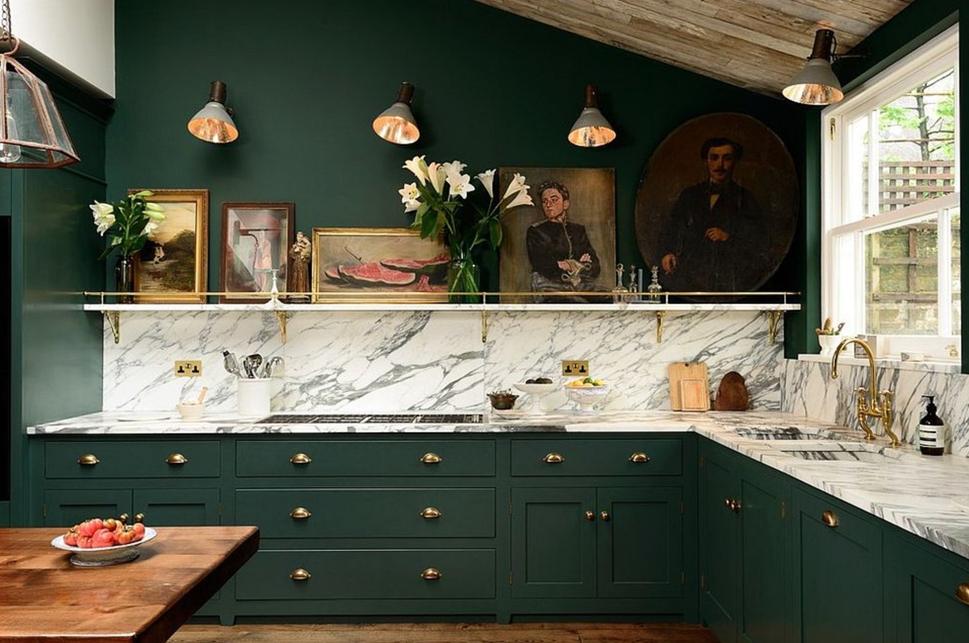
Deep green cabinets add color without feeling playful. Forest, bottle green, and softened emerald tones look especially good against white countertops.
These greens shift a lot through the day. They can look clear in morning light and much moodier by evening, so I always sample them beside the actual backsplash and floor. Wood and marble keep deep green from feeling flat.
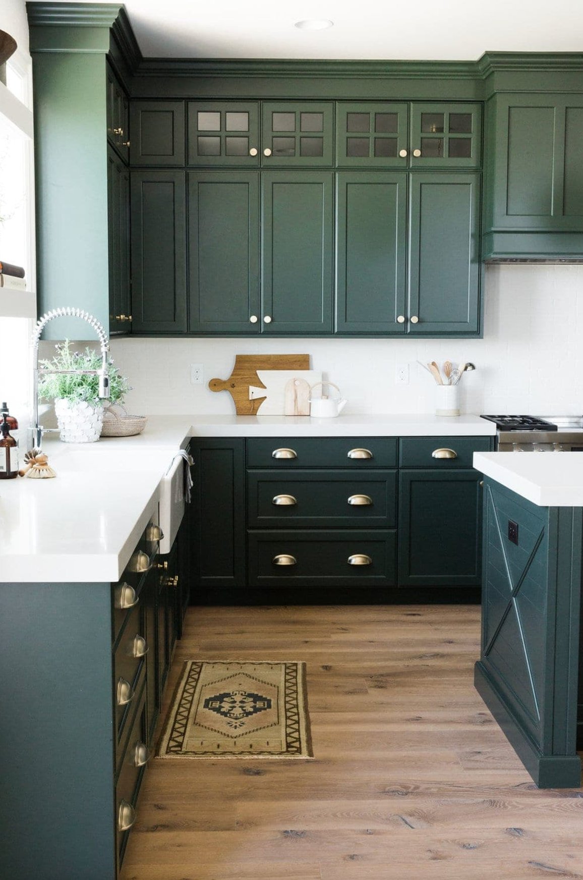
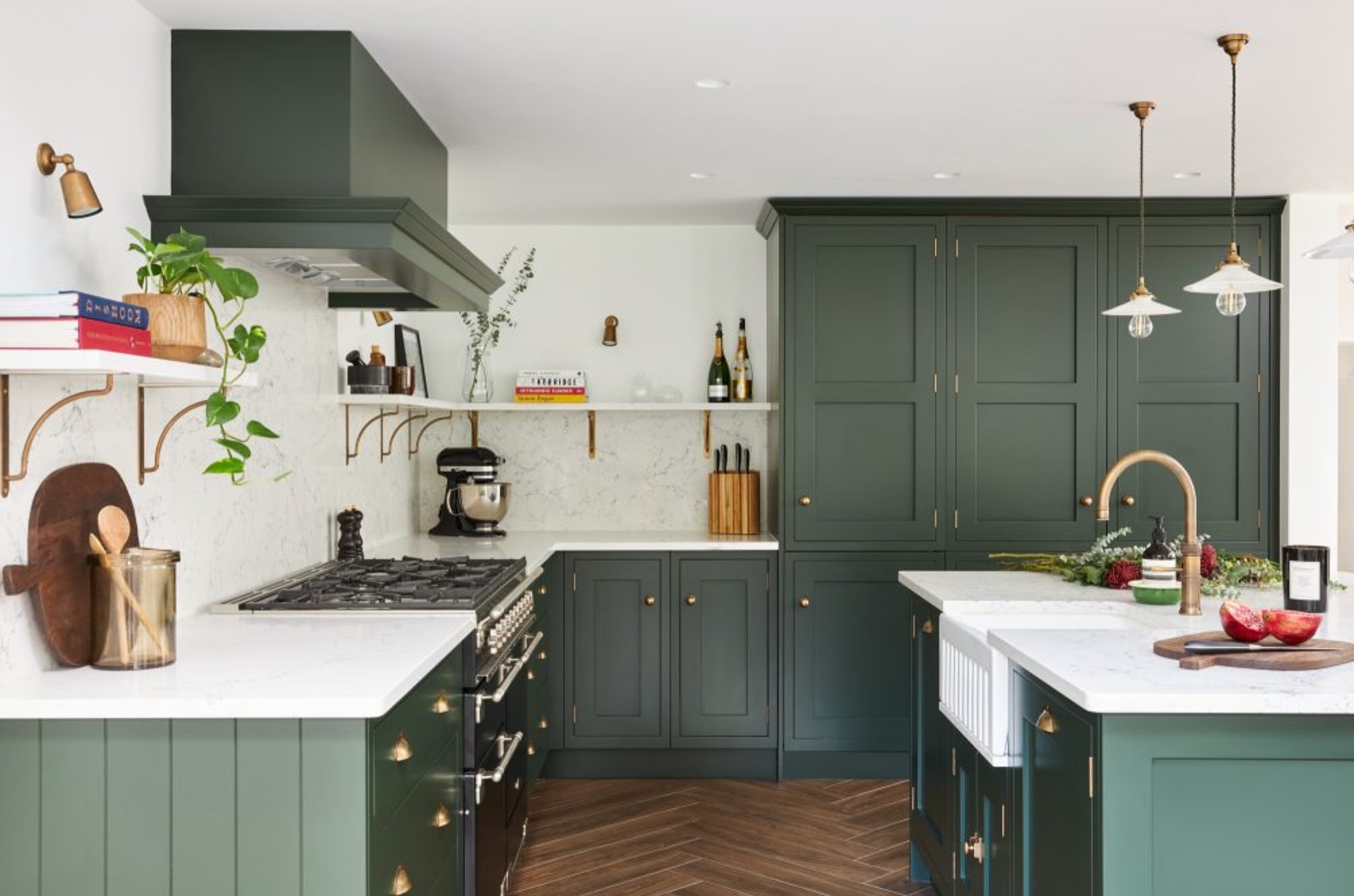
Deep green can work in both large and small kitchens, but lighting decides the outcome. Pair it with white walls if you want contrast, or with warm cream walls if the green feels too formal.
Paint suggestion:
- Sherwin-Williams Rock Garden
- Benjamin Moore Hunter Green
- Farrow & Ball Studio Green
6. White
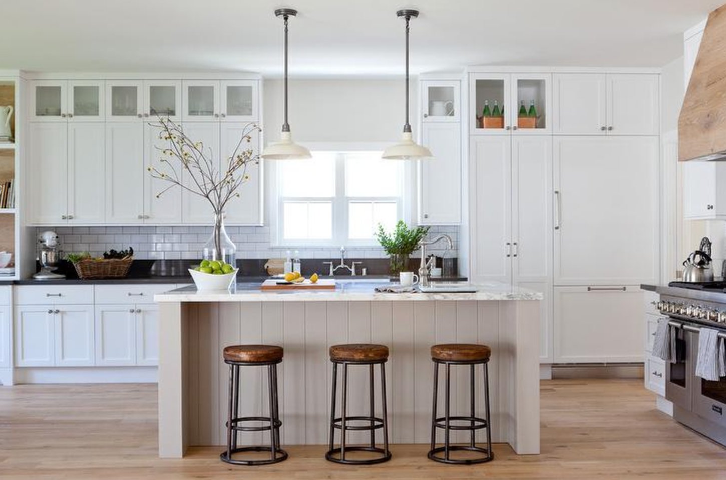
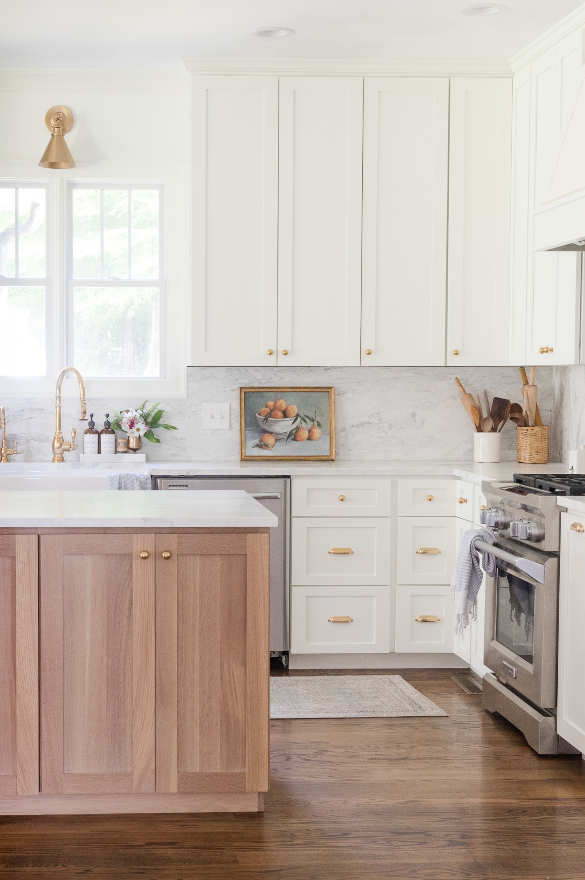
White cabinets are still a top choice because they bounce light and let the countertop, tile, and hardware do more of the design work. Matte white with marble is a classic combination, but the undertone has to match the stone.
White is also forgiving when you want to mix textures. Copper sinks, handmade tile, stone counters, and wood floors all read clearly against it.
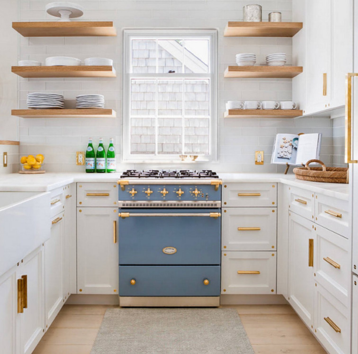
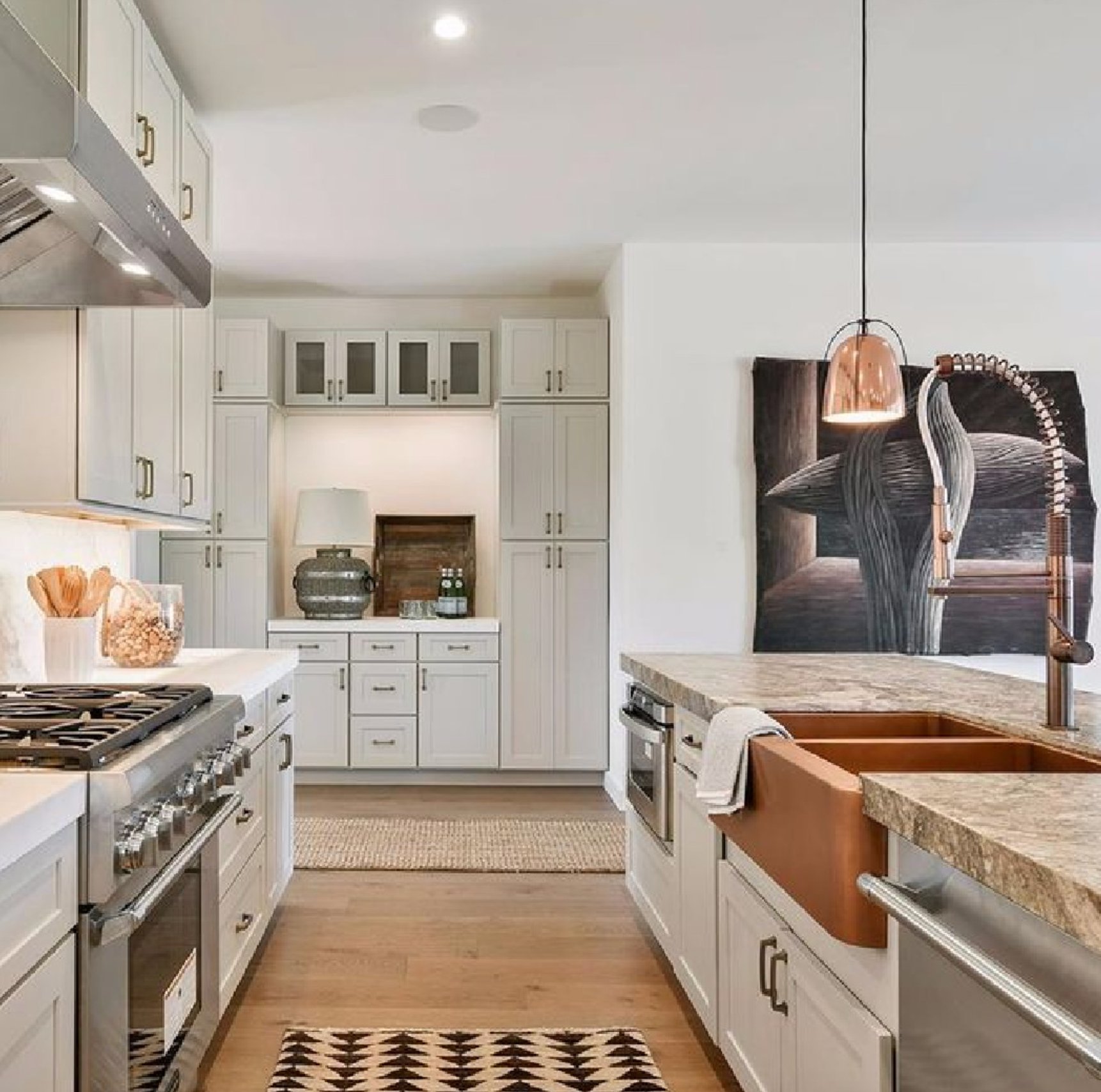
For more depth, try white upper cabinets with wood lowers. Bright whites suit cleaner modern kitchens, while creamy whites are better with warm floors, beige stone, or older trim. Test whites on a door, not just on paper. A white that looks clean on a chip can turn icy across 20 cabinet fronts.
Paint suggestion:
- Farrow & Ball All White
- Sherwin-Williams Pure White
- Benjamin Moore Simply White
7. Bronze
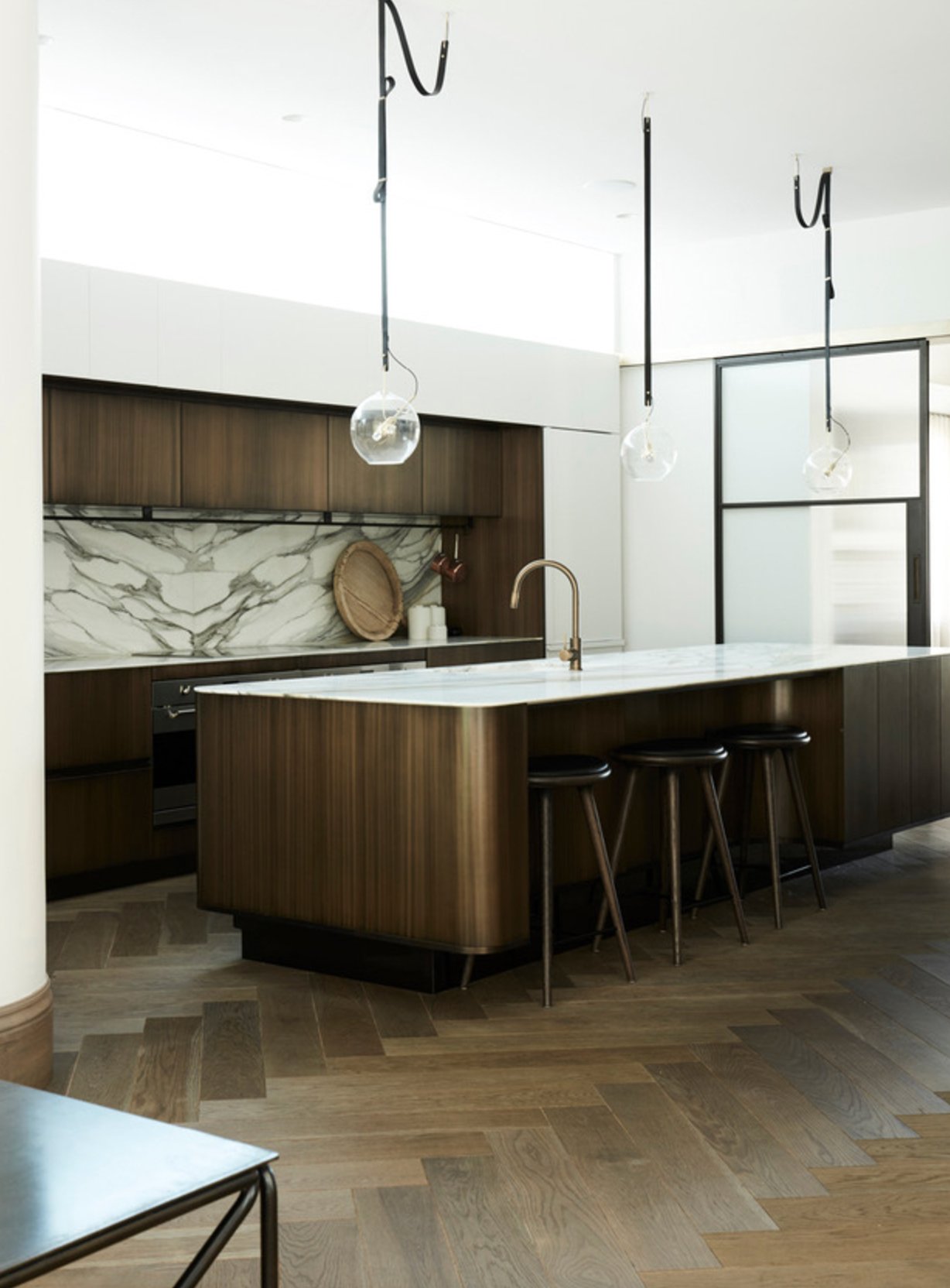
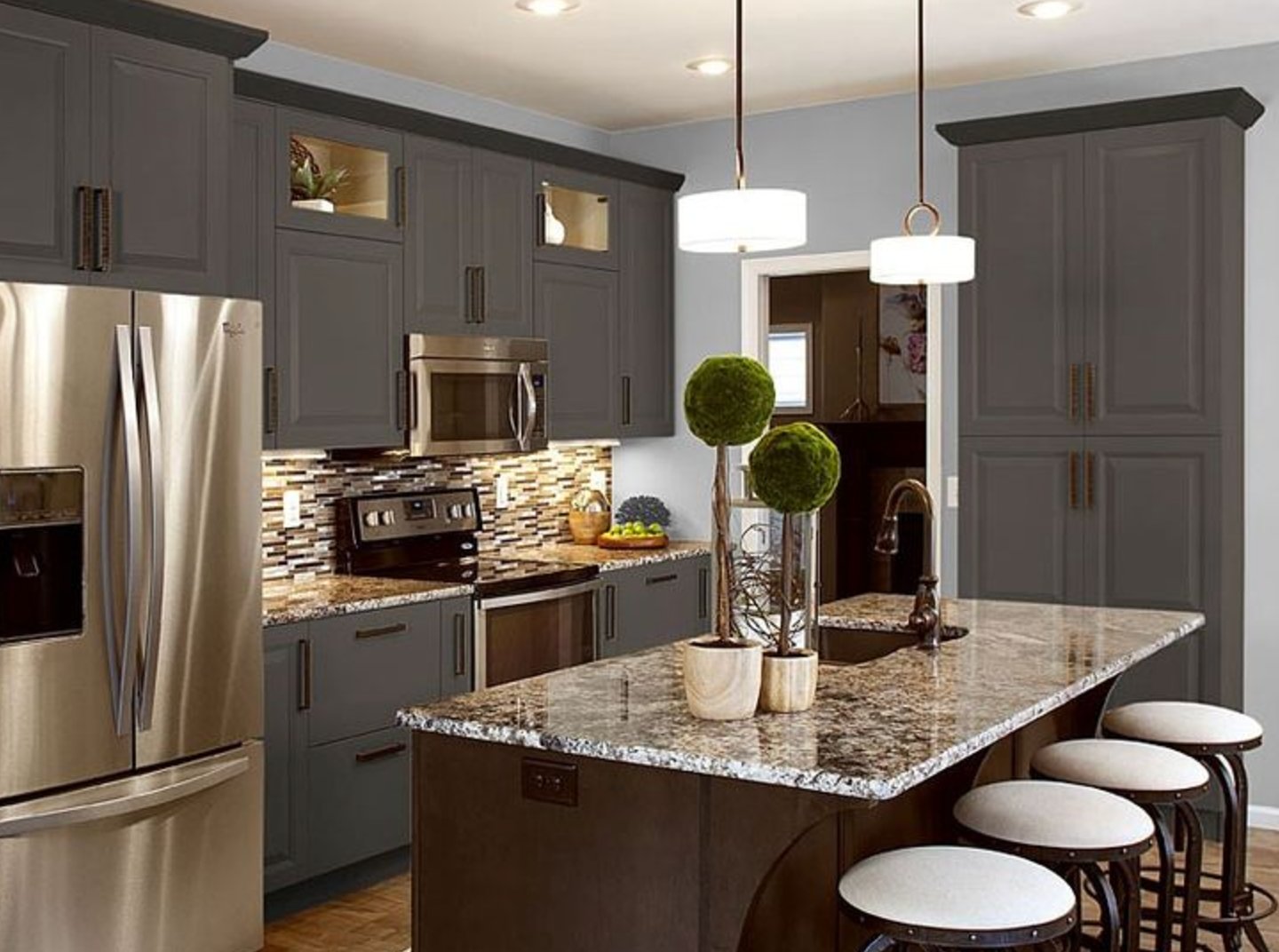
Bronze cabinet colors sit between brown, charcoal, and muted metal. They are a good choice when black feels too hard and beige feels too expected.
Bronze looks strongest against white marble, light walls, and simple cabinet shapes. Brass hardware blends in softly, while matte black faucets and lighting add cleaner contrast.
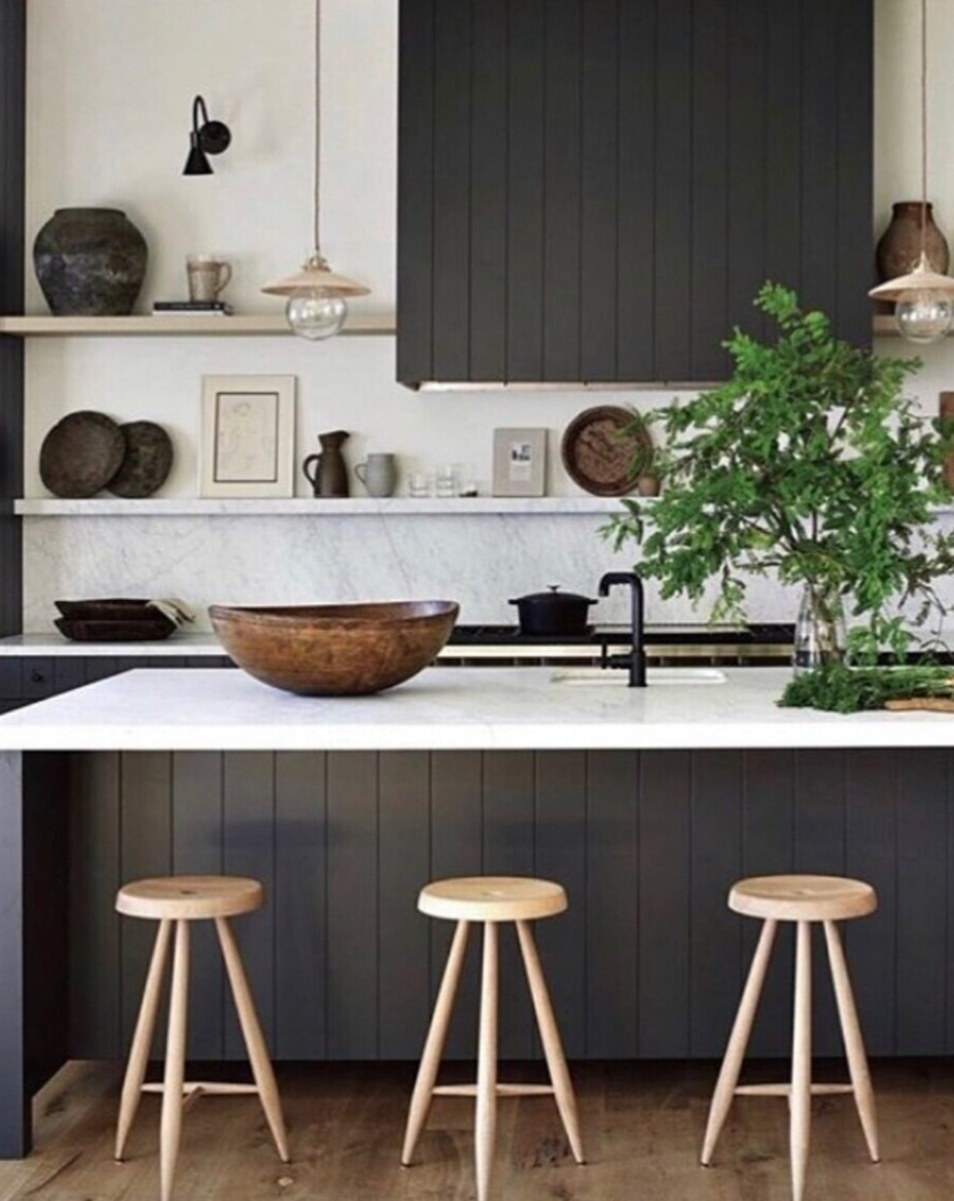
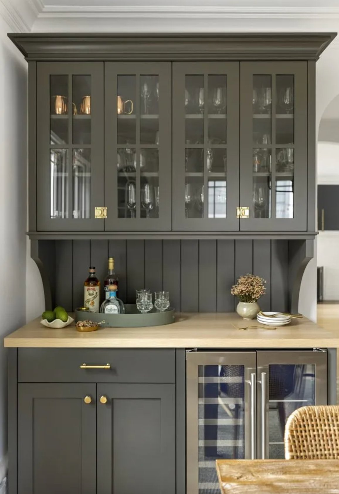
Add natural wood if the bronze starts reading too sleek. Watch the undertone closely. Some bronze paints lean red, and that can fight with pink-beige tile, cherry floors, or red-brown granite.
Paint suggestion:
- Benjamin Moore Metallic Bronze
- Farrow & Ball London Clay
- Sherwin-Williams Bronze Tone
8. Sage Green
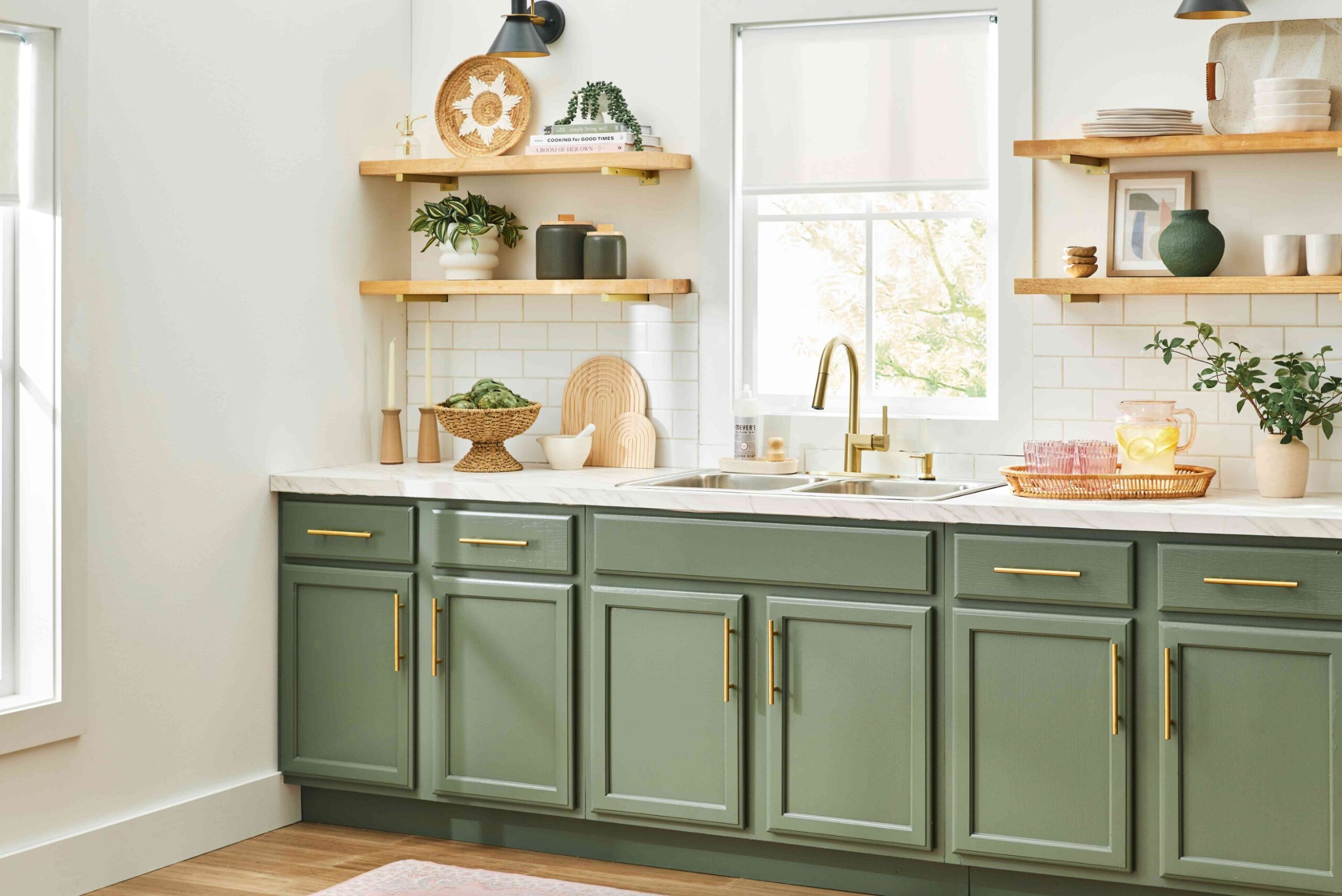
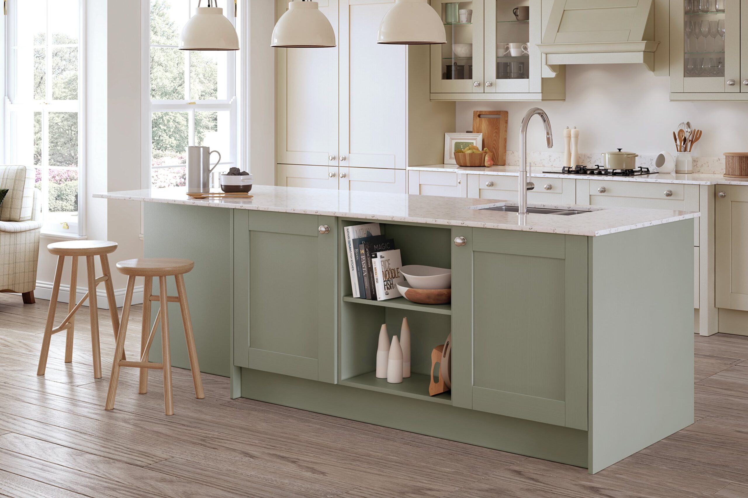
Sage green is a practical color choice when you want cabinets that feel current but not loud. The best versions are muted, slightly gray, and not too minty.
This earthy green pairs well with white quartz, marble countertops, and light oak open shelving. I look for sage shades that stay fresh in low light and do not collapse into muddy gray.
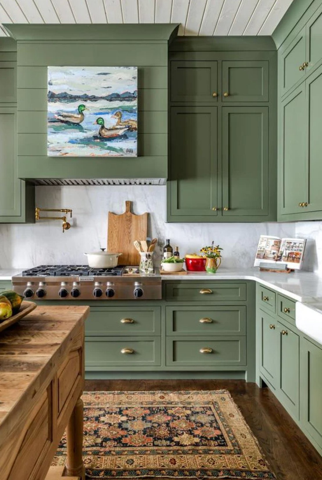
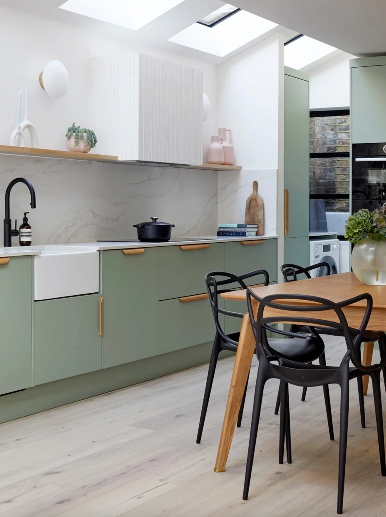
When picking your paint, look for gray undertones if you want a quieter cabinet color. Woven baskets, vintage rugs, pottery, and unlacquered brass all suit sage because they add texture without competing with it.
Paint suggestion:
- Sherwin-Williams Dried Thyme
- Farrow & Ball Mizzle
- Benjamin Moore October Mist
9. Cream
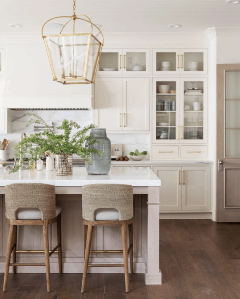
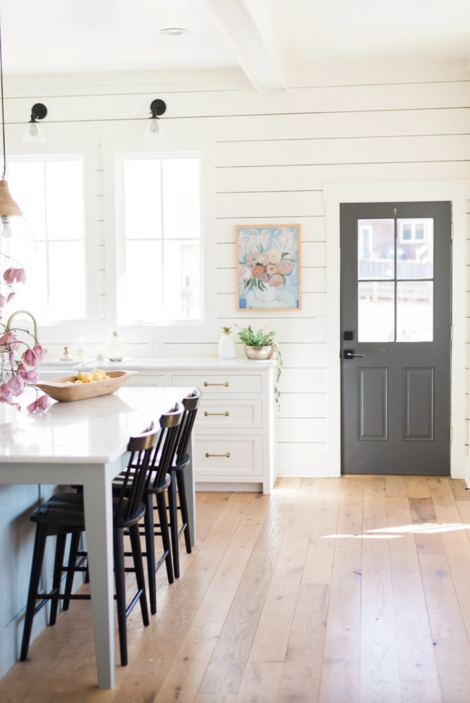
Cream cabinets are a staple in many California kitchens because they look lighter than beige but warmer than stark white. They are especially useful when the countertop has warm veining.
Cream with bronze hardware and marble countertops is a strong combination when the marble has tan, gold, or soft gray movement. If the marble is icy white and blue-gray, choose a cleaner white instead.
When choosing cream, study the undertone. Yellow cream works in warm light. Grayer cream is usually safer if the kitchen opens into cooler wall colors or stainless appliances.

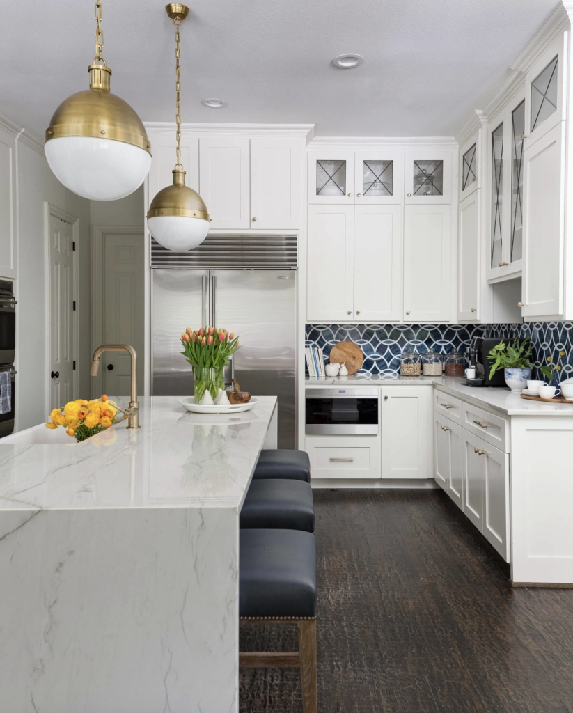
For more contrast, try cream upper cabinets with graphite or navy lowers. That combination keeps the room light at eye level while grounding the island or base cabinets.
In larger kitchens, I often look at Swiss Coffee or Alabaster. They define the cabinet run without making the space feel clinical. Balance cream cabinets with the wall color and backsplash so the whole kitchen does not become one flat warm tone.
Paint suggestion:
- Farrow & Ball Pointing
- Benjamin Moore Swiss Coffee
- Sherwin-Williams Alabaster
10. Warm Beige
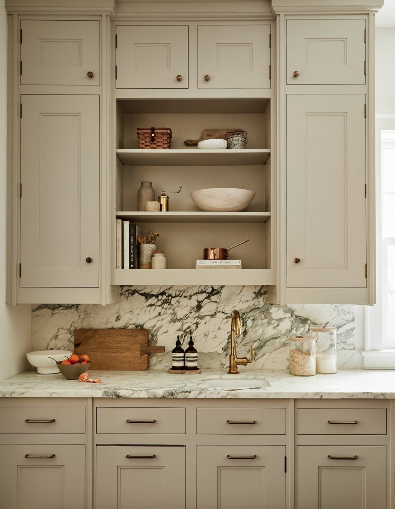
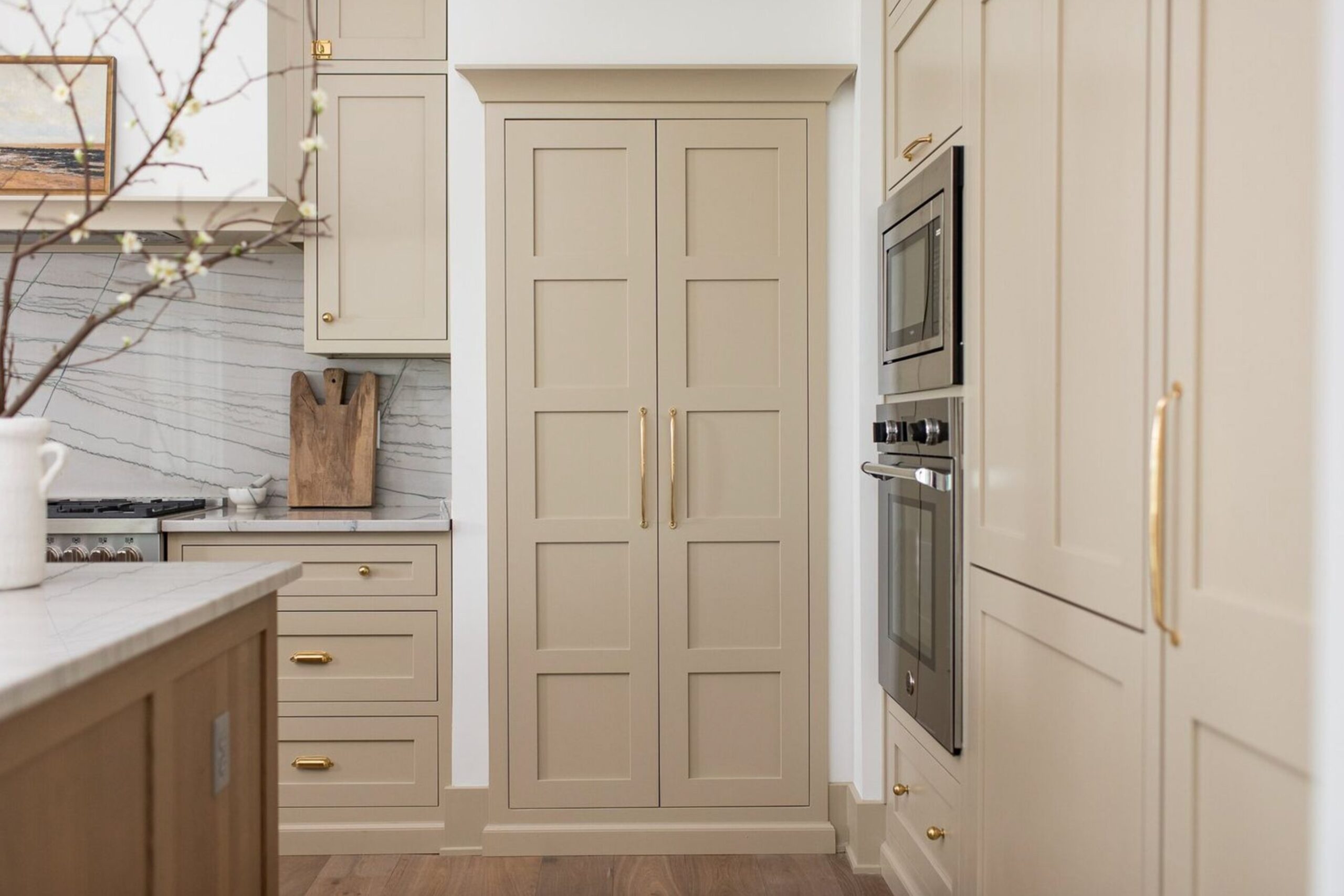
Warm beige is a safer neutral than cool gray for many real kitchens. It works with wood floors, woven textures, brass hardware, and the warm stone counters that are coming back.
Warm beige, sometimes called warm sand, can suit both modern and traditional cabinet styles. It is especially good with natural wood elements, from cutting boards to light oak bar stools.
The risk is choosing a beige that is too pink or too yellow. Put the sample beside the floor and backsplash before you decide, because beige will expose any undertone mismatch quickly.
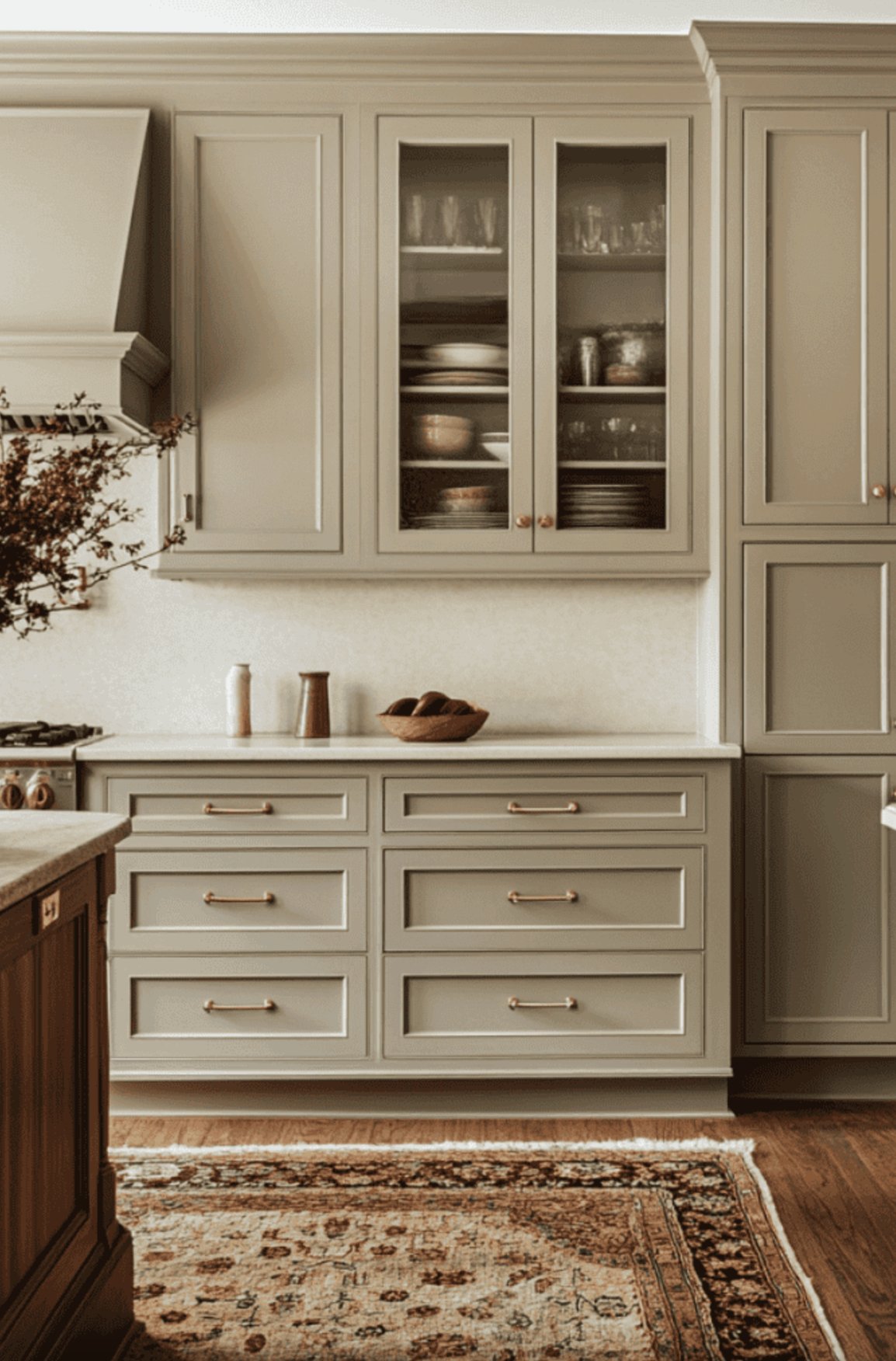
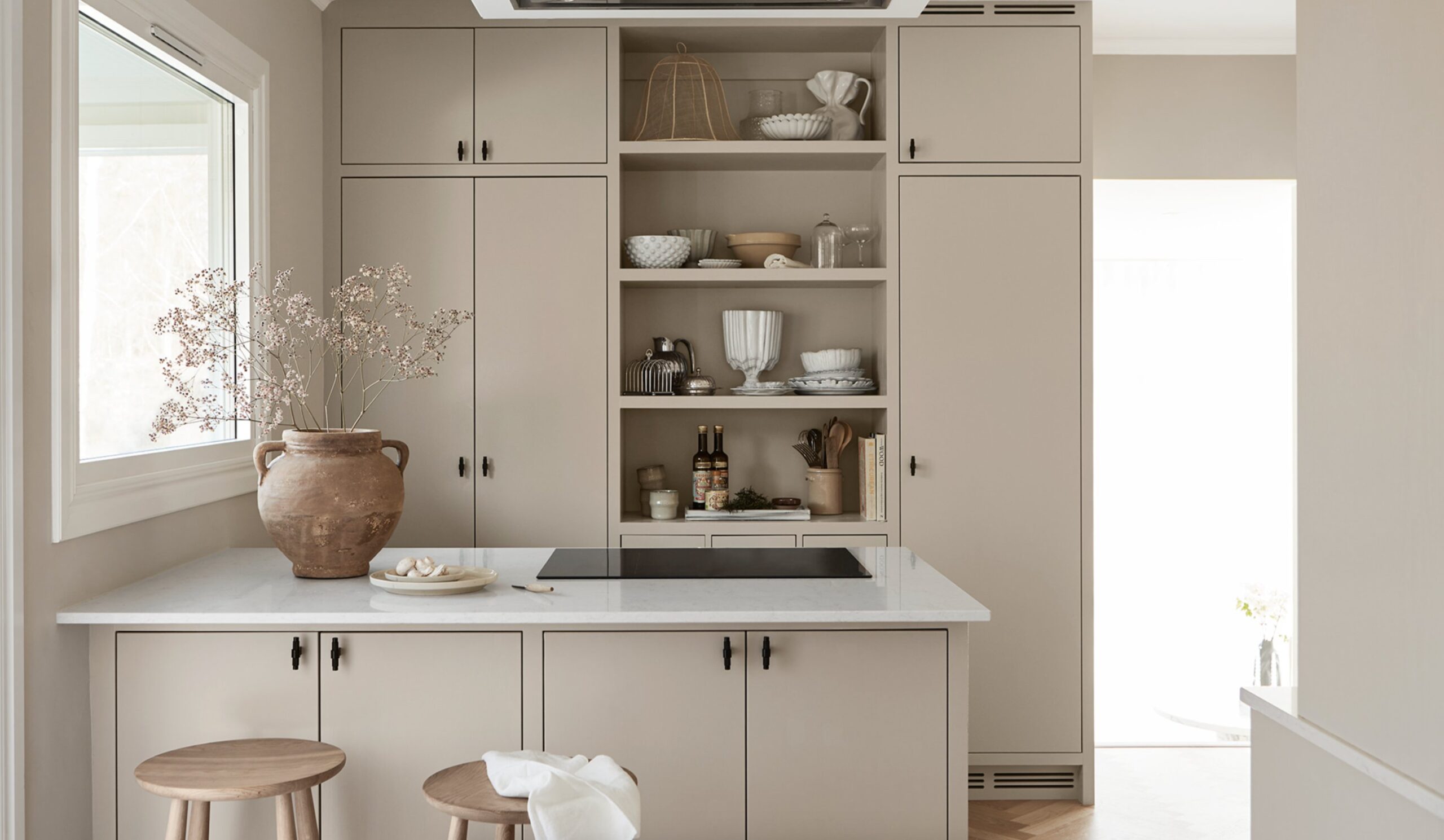
I have noticed more designers choosing warm beige over pure white because it is easier to maintain and feels more grounded. It is especially useful in open-concept spaces where the kitchen needs to connect with a living room, wood furniture, and softer textiles.
Paint suggestion:
- Sherwin-Williams Accessible Beige
- Benjamin Moore Brandon Beige
- Farrow & Ball Stony Ground
11. Light Blue
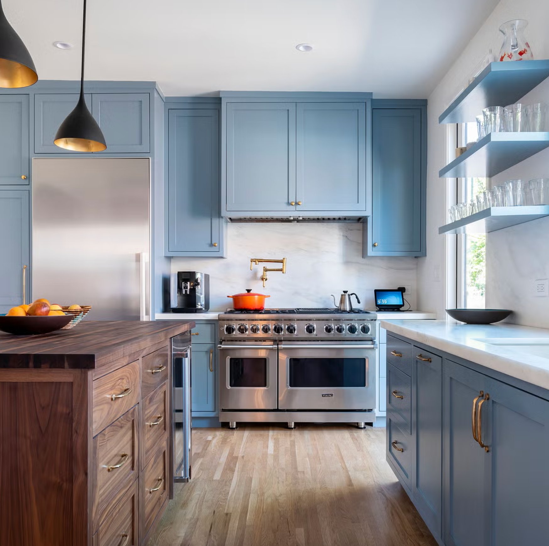
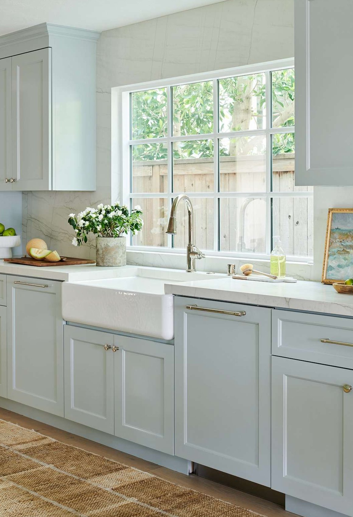
Light blue cabinets are a good move if you are tired of white but still want the kitchen to feel bright. Paired with white countertops, the color feels clean without becoming sterile.
The trick is controlling the temperature. Blue can feel cold with cool LED bulbs and gray floors, so add wood, warm white bulbs, or brass hardware if the room starts looking chilly.
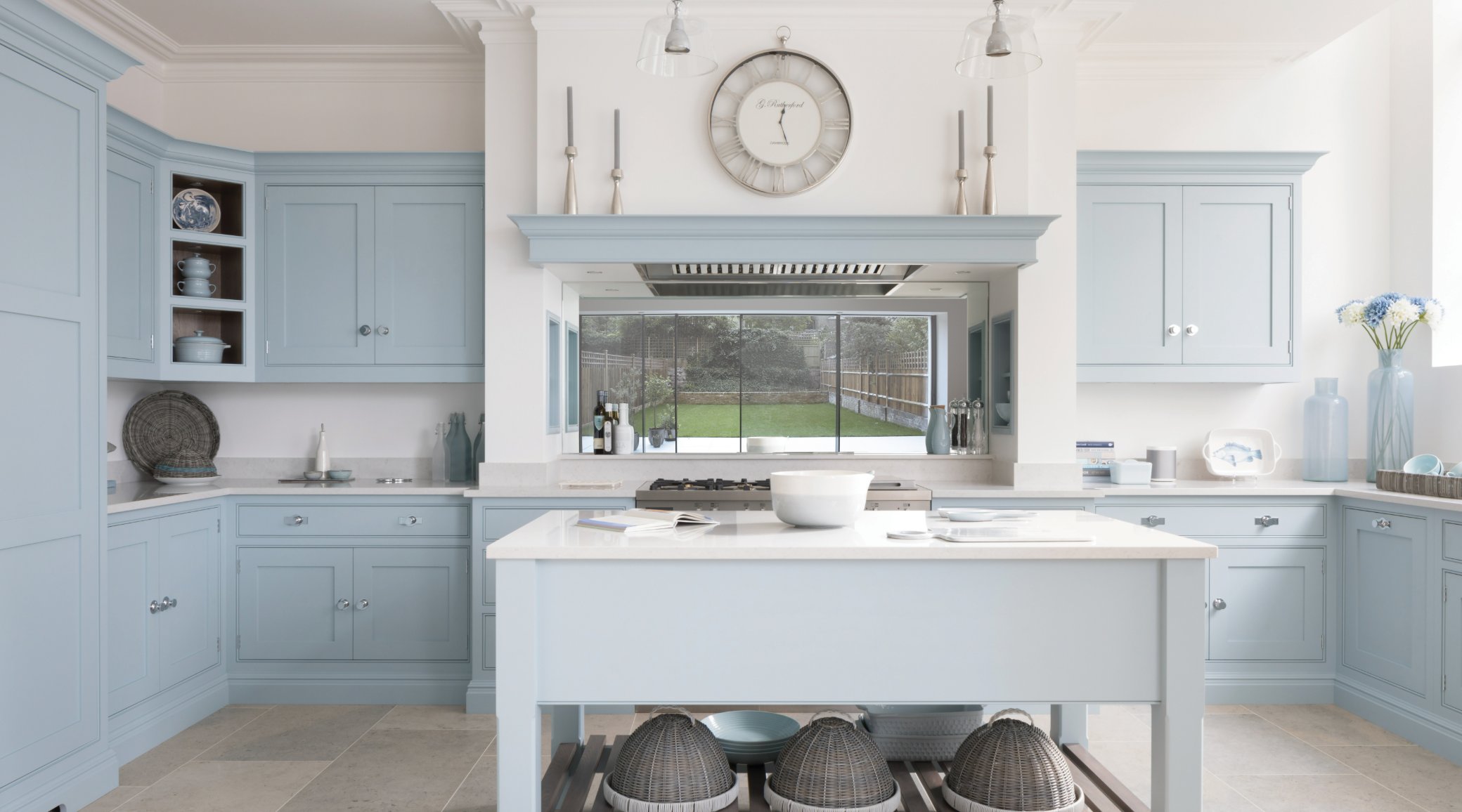
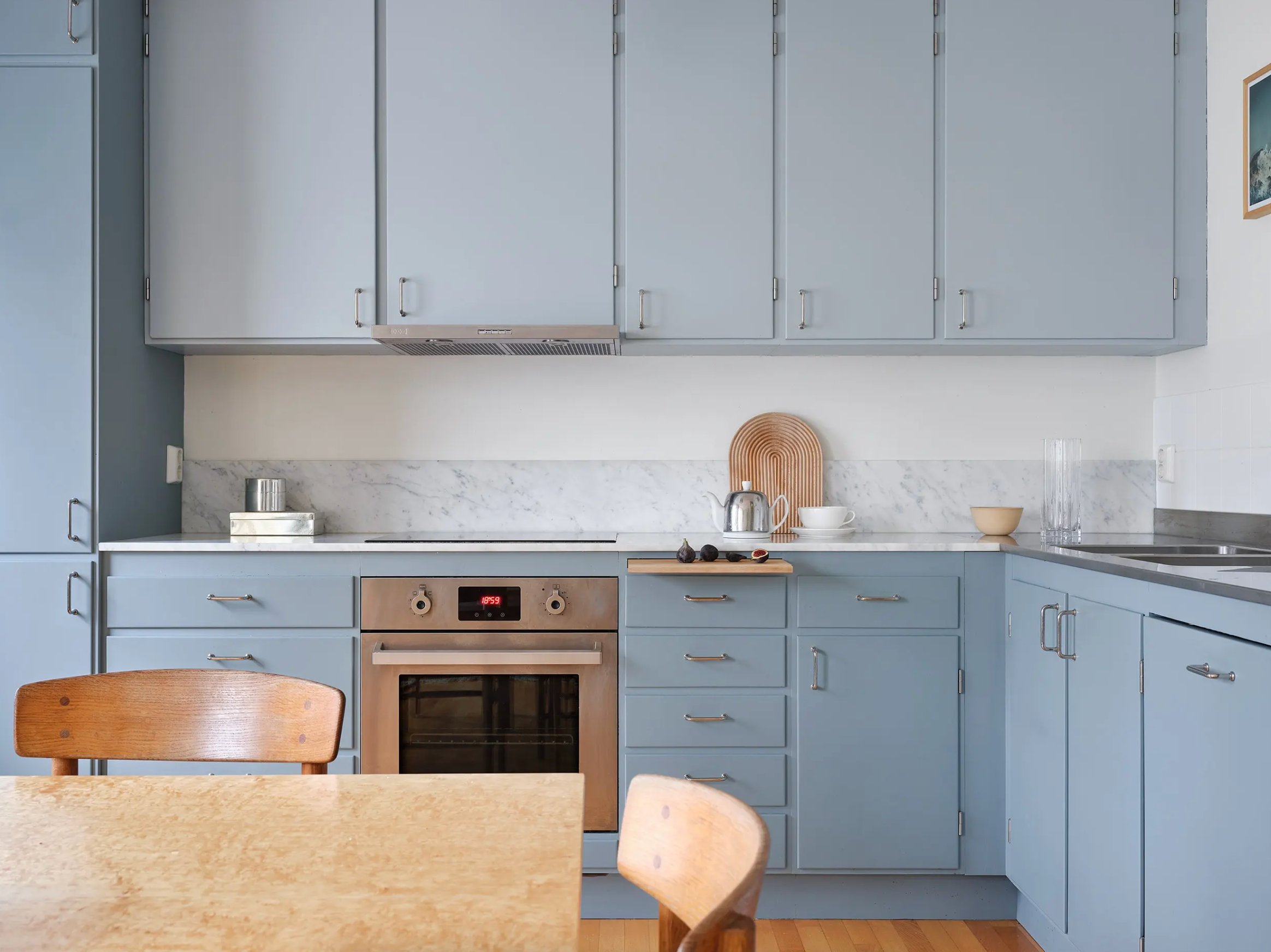
Paint companies offer many light blues, from misty gray-blues to clearer sky blues. Your natural light should guide the choice.
In a sun-filled kitchen, a clearer blue can hold up. With small windows or north-facing light, choose a softer blue with gray in it so the cabinets do not look candy colored.
Paint suggestion:
- Farrow & Ball Light Blue
- Benjamin Moore Blue Veil
- Sherwin-Williams North Star
12. Greige
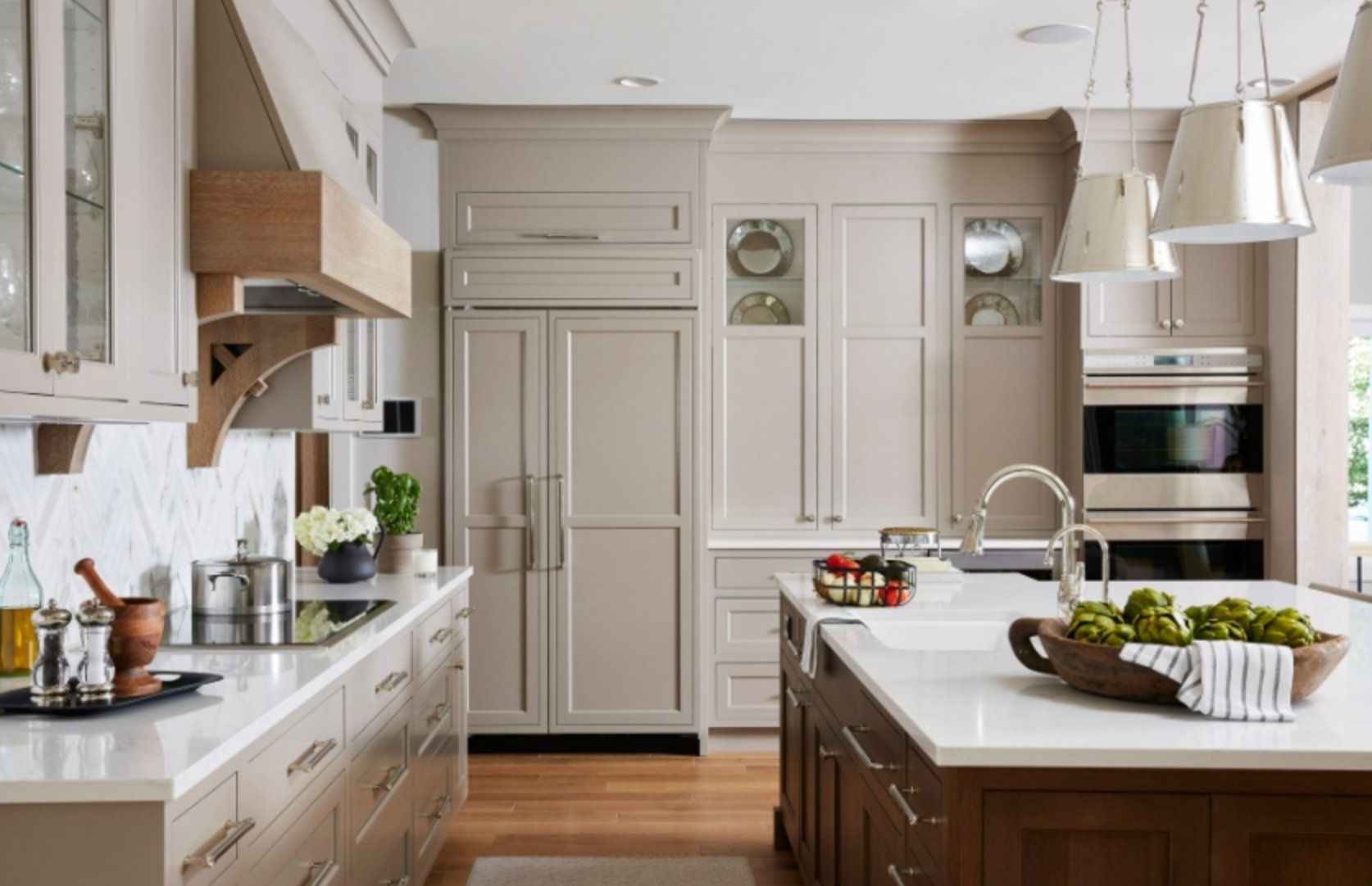
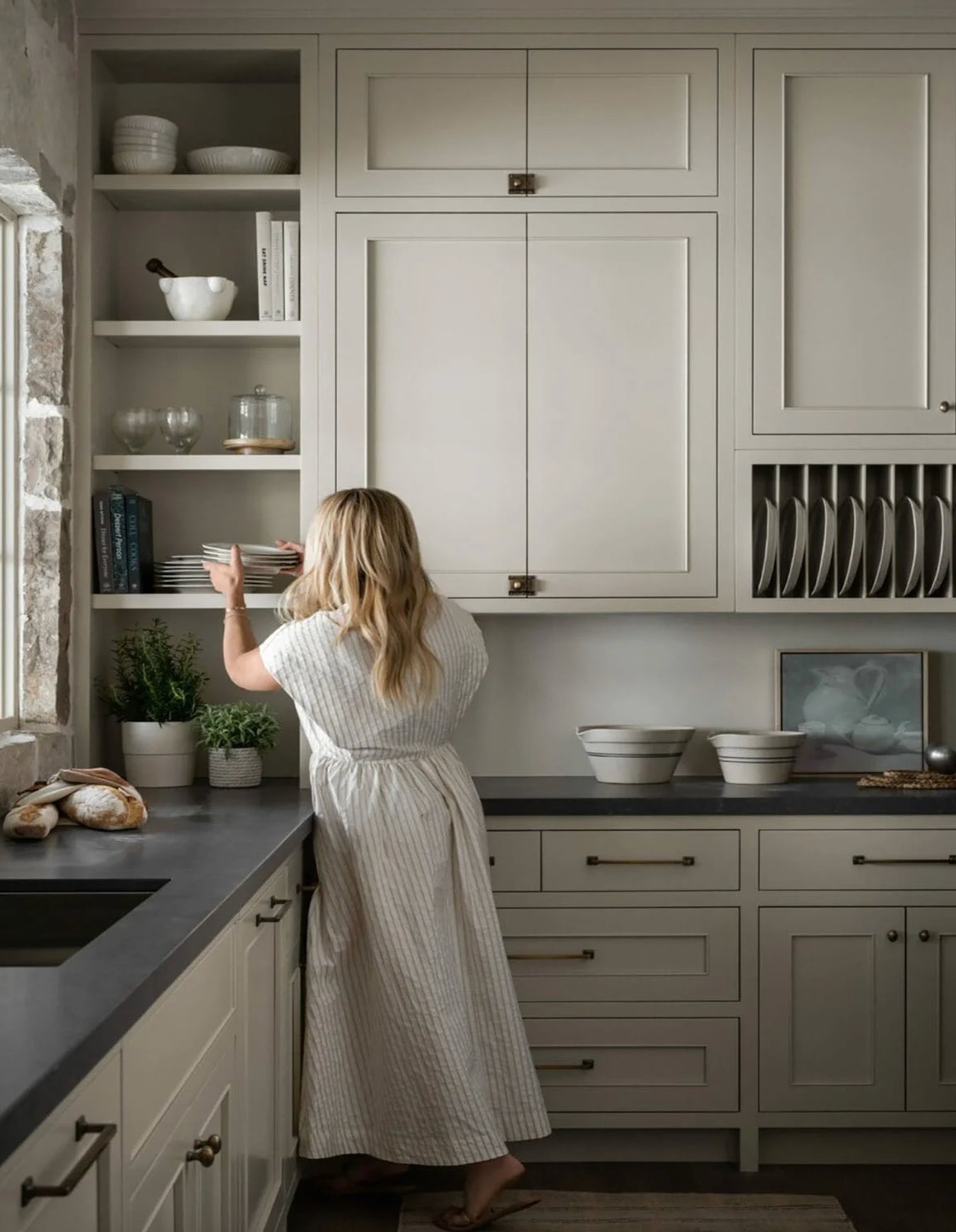
Greige is a mix of gray and beige, and it is one of my most useful cabinet neutrals. It gives more softness than stark white but still reads neutral beside stone and tile.
Pay close attention to undertones. Warm greige suits traditional kitchens with wood floors and cream walls. Cooler greige suits cleaner modern kitchens with white counters and stainless appliances.
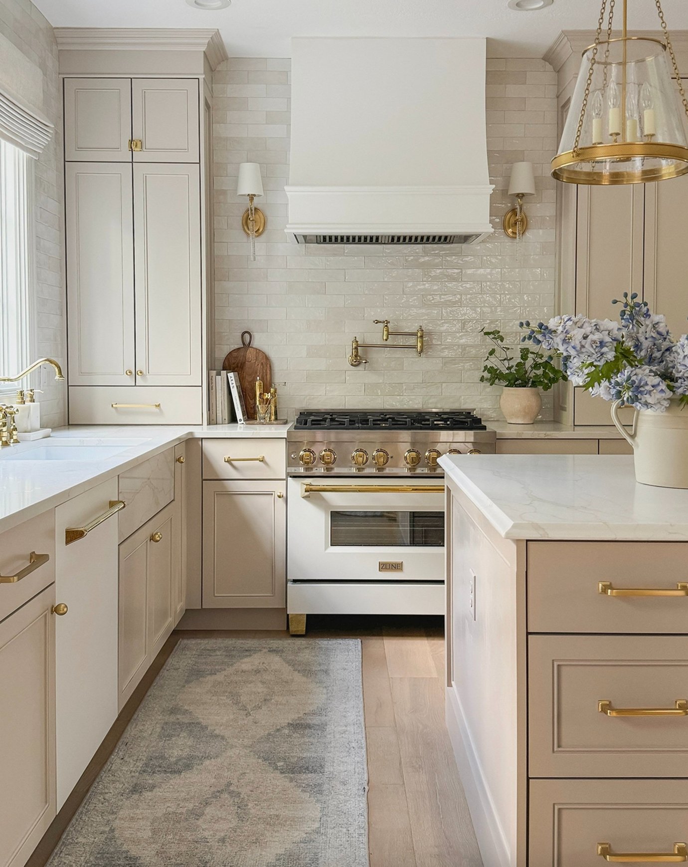
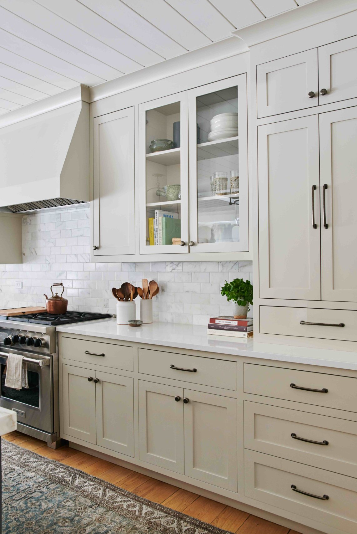
Greige is flexible with decor because it does not lock you into one accent color. It is also more forgiving than white on busy lower cabinets where fingerprints, shoe marks, and drips show first.
Paint suggestion:
- Benjamin Moore Revere Pewter
- Farrow & Ball Purbeck Stone
- Sherwin-Williams Agreeable Gray
13. Taupe
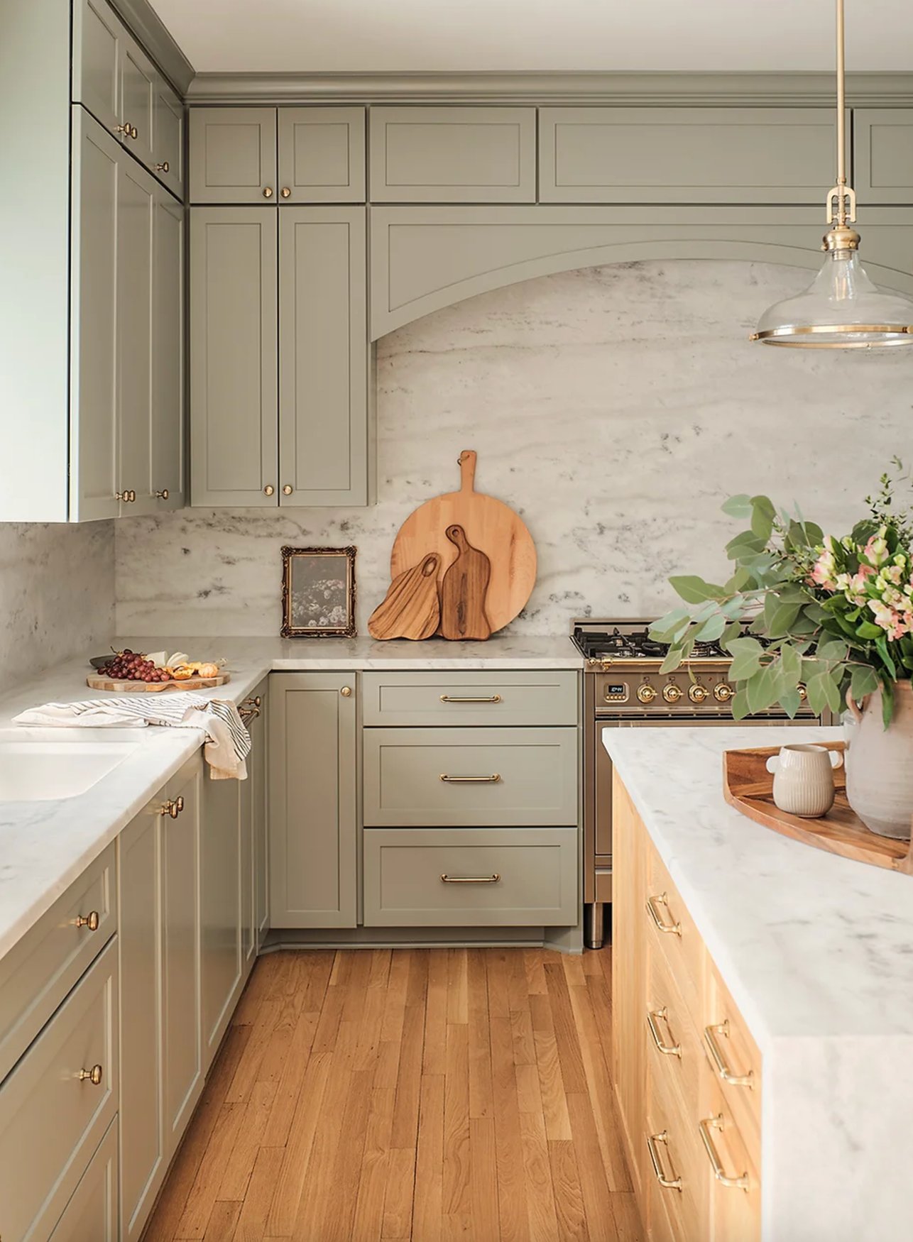
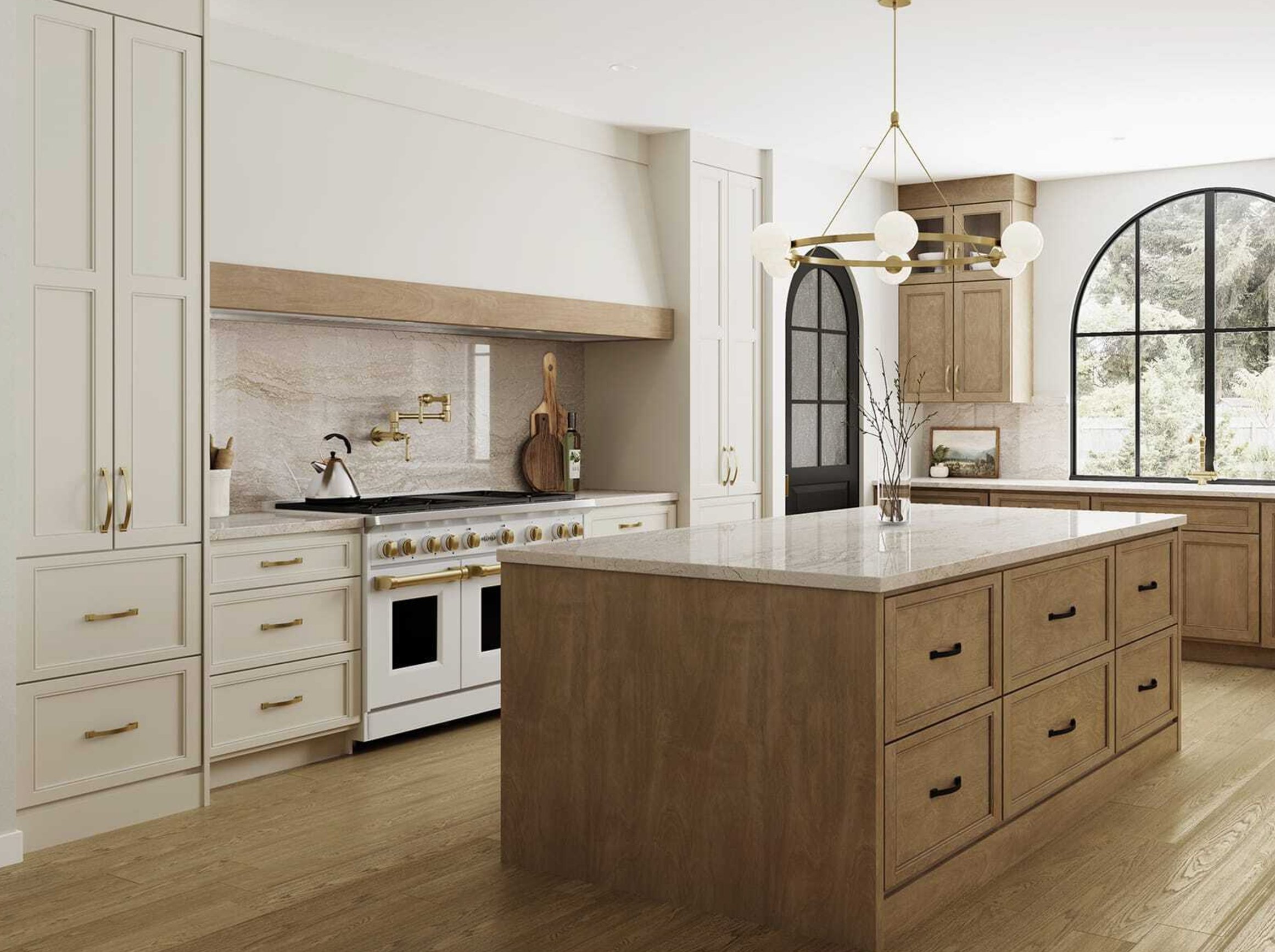
Taupe is the in-between cabinet color I suggest when beige feels too warm and gray feels too cool. It can look quiet, expensive, and lived in without asking for much attention.
In my own kitchen, taupe works because it bridges the wood accessories, light counters, and neutral walls. It gives the room warmth without turning yellow.
Taupe has staying power because it is not tied to one trend. If you are painting cabinets before selling, choose a balanced taupe without a strong purple undertone.
Paint suggestion:
- Sherwin-Williams Mega Greige
- Benjamin Moore Thunder
- Farrow & Ball Elephant's Breath
14. Gray
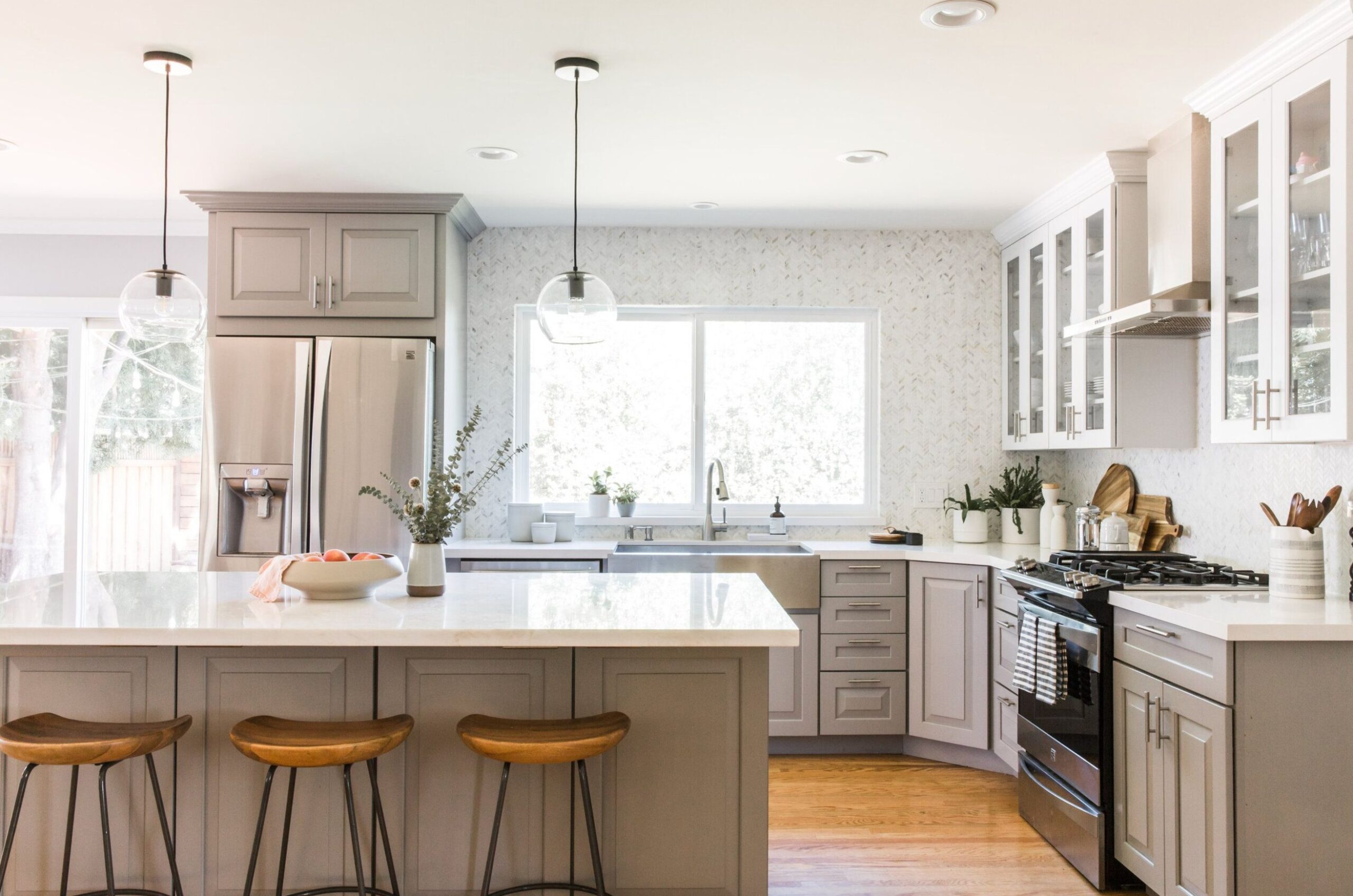
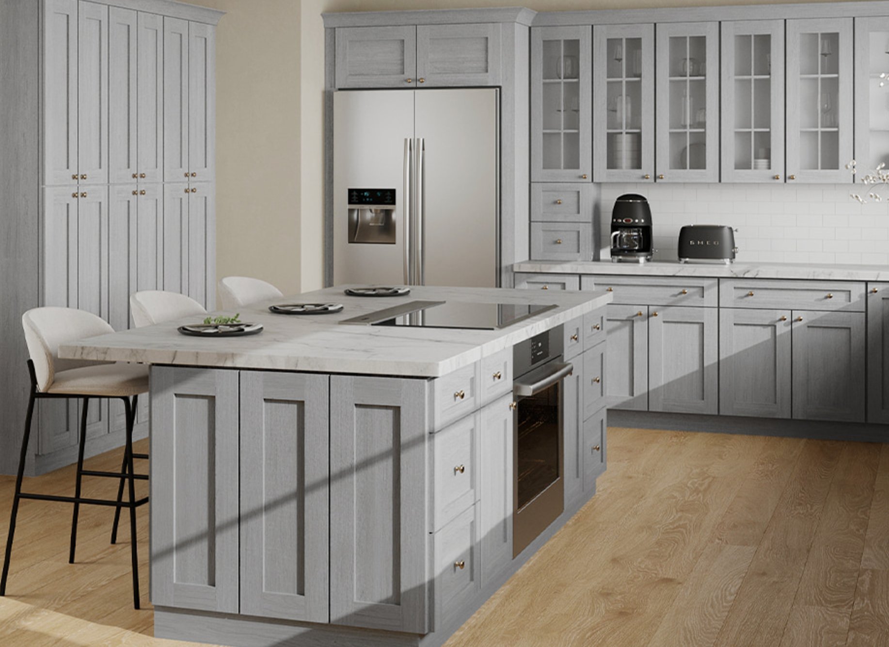
Gray cabinets still work when the gray is chosen for the room, not copied from an old trend board. Light gray can look clean in a kitchen with white counters, pale wood, and simple lines.
Next to a white countertop, gray gives you contrast without the weight of navy or black. Wood flooring is important here because it keeps the palette from going cold.
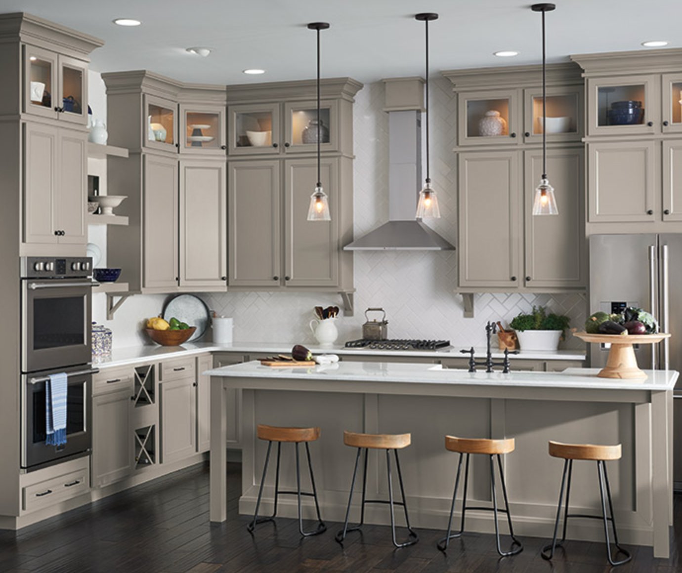
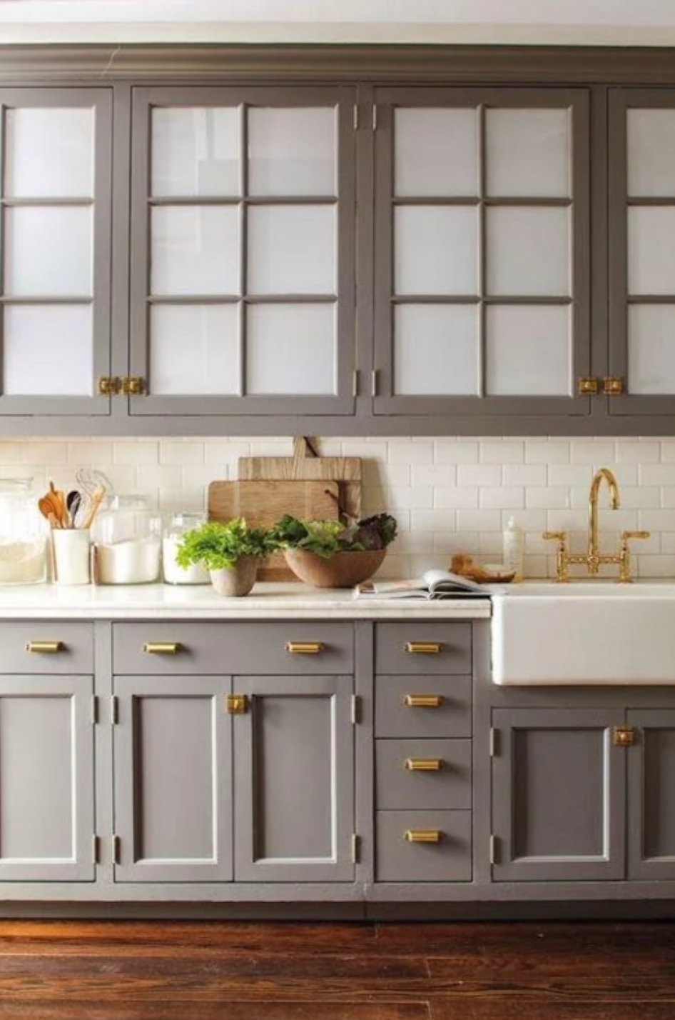
Gray is easiest to live with when it has a little warmth. If the kitchen already has gray floors, gray walls, and stainless appliances, do not add another cool gray to the cabinets. Glass-front uppers can lighten the look and break up a long run of painted doors.
Paint suggestion:
- Farrow & Ball Ammonite
- Sherwin-Williams Repose Gray
- Benjamin Moore Gray Owl
15. Two-Tone Combinations
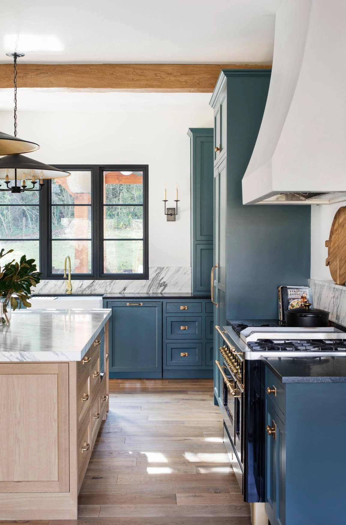
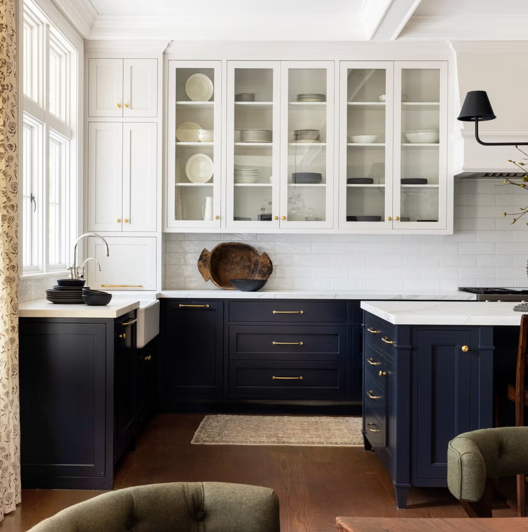
Two-tone cabinet combinations are useful when one color across every cabinet would feel too heavy or too plain.
Darker lower cabinets ground the room, while lighter uppers keep the wall cabinets from feeling bulky. This is especially helpful in kitchens with average ceiling height or limited natural light.
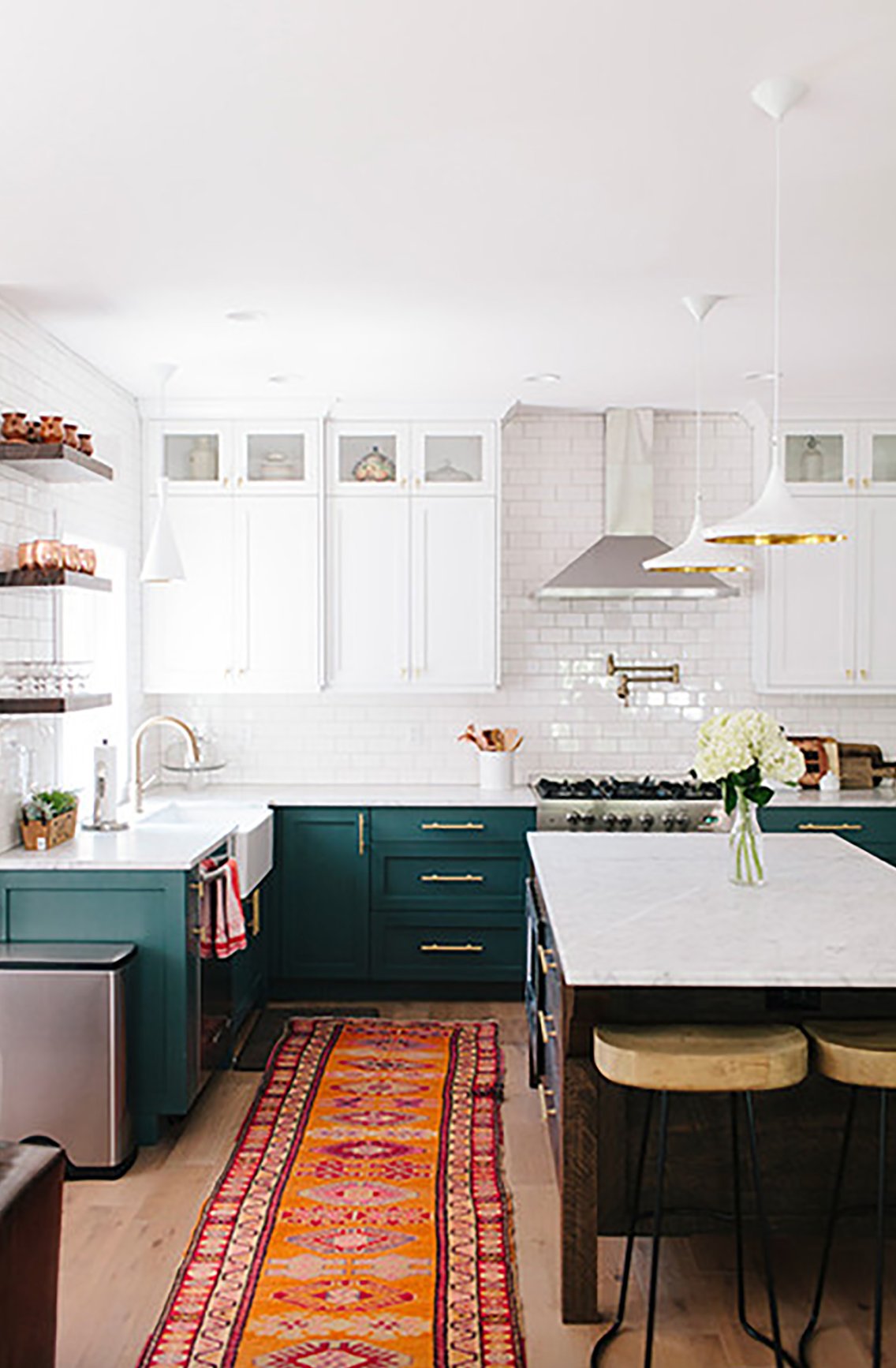
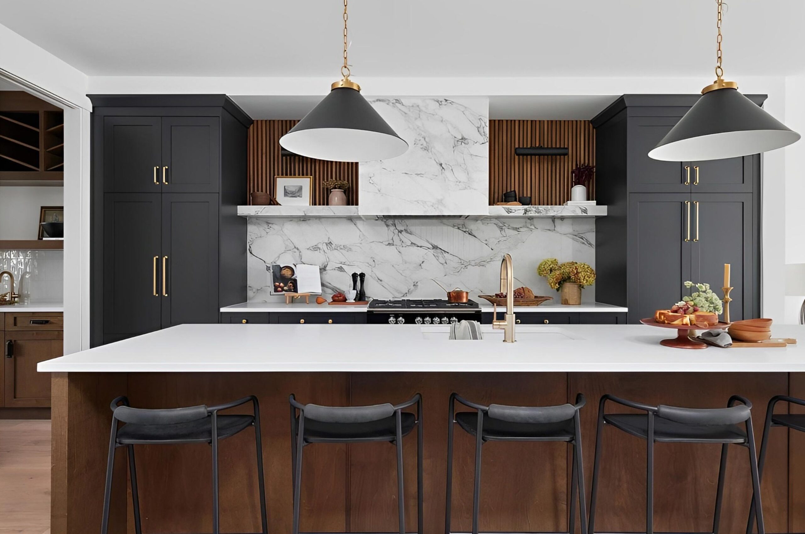
Two-tone kitchens can work in both small and large rooms if the split is clear. A 60/40 balance usually looks best, with the main color taking the larger share. Repeat the darker color at least once, such as on the island, range hood, window trim, or hardware, so it feels deliberate.

I'm Elizabeth, your go-to guide for all things paint and design! My days are filled with color swatches and innovative room makeovers. When I'm not painting the town - literally - I'm soaking up inspiration from my travels. This blog is my way of sharing my passion and making the world a more vibrant place, one color palette at a time.