Best Gray Paint Colors for Kitchen Cabinets
Gray is still one of the safest cabinet color families when you want a kitchen that feels current but not trendy. The right gray can soften stainless appliances, make white counters look cleaner, and hide small smudges better than a true white cabinet.
The hard part is choosing the right gray for your light, counters, backsplash, flooring, and hardware. A cabinet color sits vertically, gets hit by under-cabinet lighting, and shows every undertone next to stone or tile. A gray that looks calm on a wall can turn blue, green, violet, or muddy once it is painted on doors.
These are the gray cabinet colors I would actually consider for a real kitchen project. Some are deep charcoals for contrast, some are soft greiges for a lighter look, and each one needs to be sampled on a primed board next to your fixed finishes before you commit.
1. Wrought Iron by Benjamin Moore

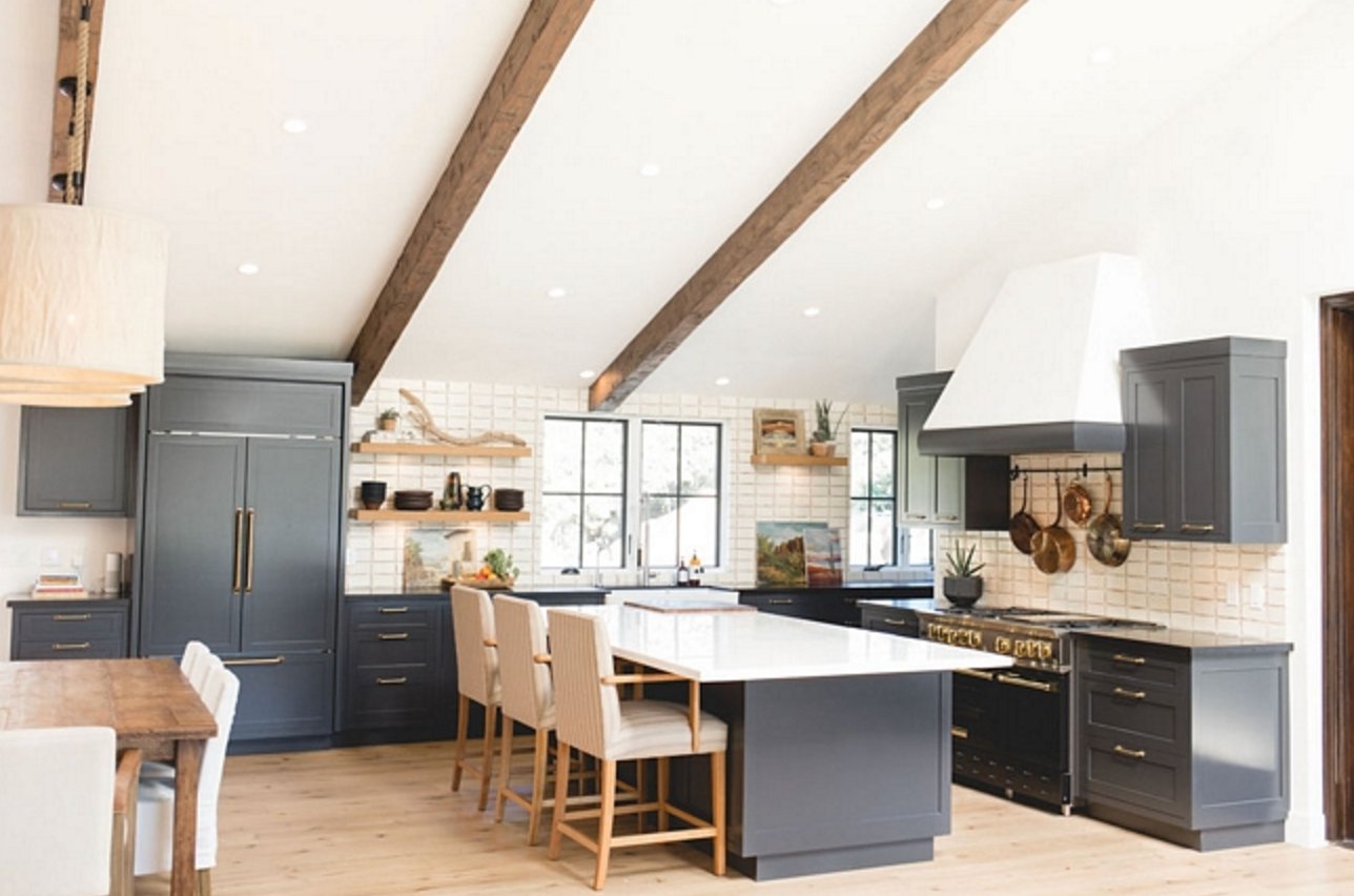
Benjamin Moore's Wrought Iron is a deep charcoal with an LRV of 8.17. It is dark enough to read dramatic on cabinets, but it stops short of a flat black.
On kitchen cabinets, Wrought Iron works best when the room has light walls, a light countertop, or enough daylight to keep the lower cabinets from looking like a black block. I like it most on islands, lower cabinets, and kitchens with simple door profiles. Beyond cabinets, this color is also a strong choice for interior doors, moldings, and accent walls.
The undertones are fairly neutral, so it can handle warm finishes better than many blue-black charcoals. It pairs especially well with beige walls, terracotta accents, unlacquered brass, and natural wood.
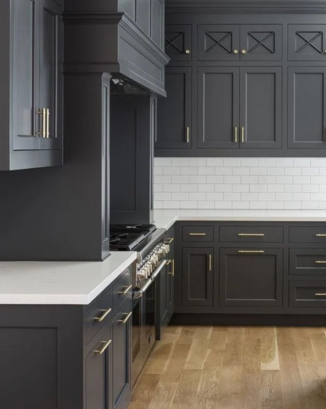

The designers at Benjamin Moore suggest pairing it with White Ice, White Cloud, and Wedgewood Gray. In a kitchen, I would test those whites directly against your countertop before choosing trim or wall paint, because a clean white quartz and a creamy stone will pull this color in different directions.
Good lighting matters with a color this dark. If your kitchen has one small window, plan on warm under-cabinet lighting and a washable cabinet finish, usually satin or semi-gloss, so the color has some life instead of looking chalky.
2. Kendall Charcoal by Benjamin Moore

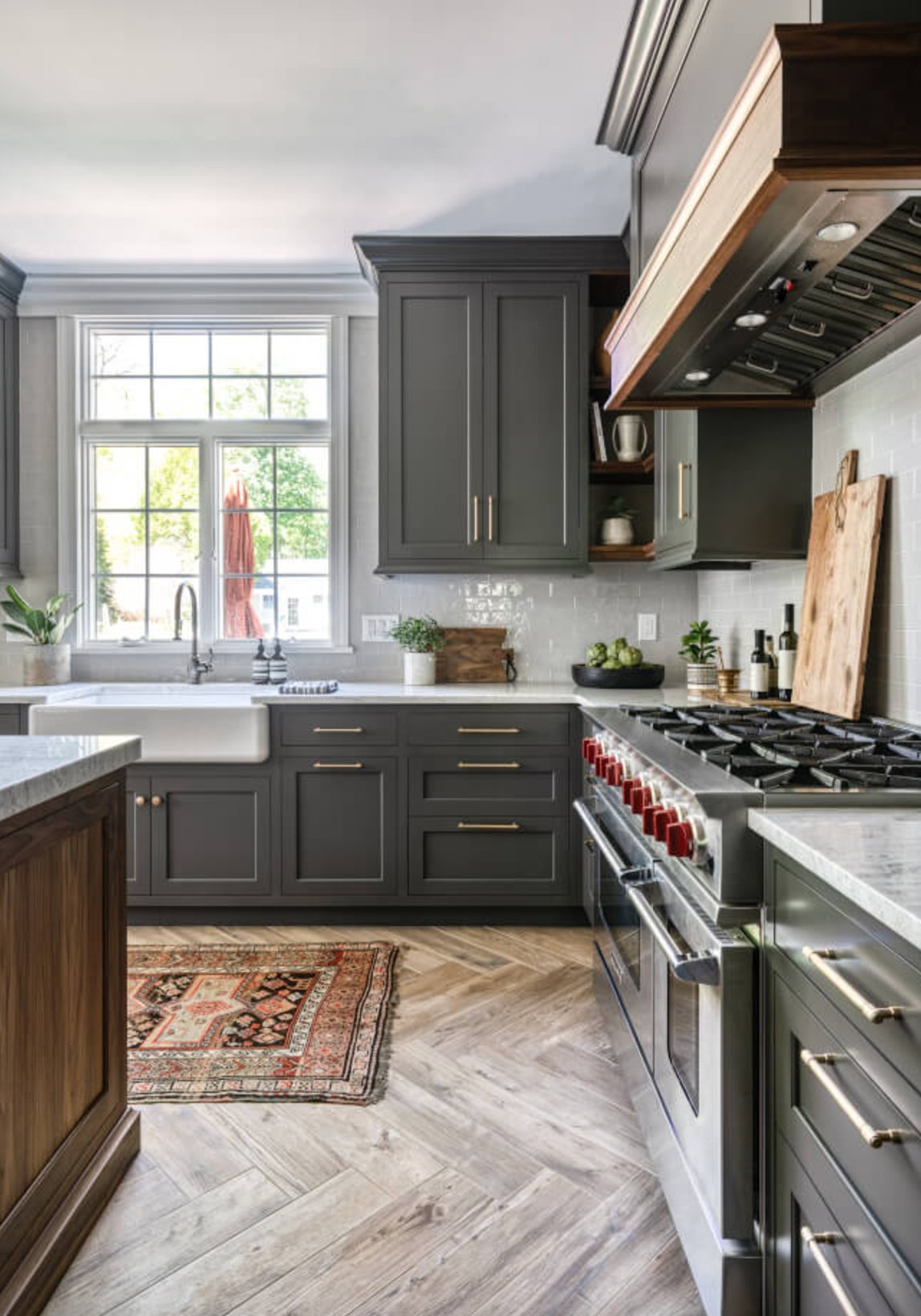
Kendall Charcoal is a deep gray that earns its cabinet reputation. It has more body than a basic charcoal, and the slight green undertone gives it a warmer read than many cool grays.
You may see more of that green undertone in strong southern light, especially beside creamy tile or oak floors. In darker kitchens or north-facing rooms, it settles into a graphite look.
Its LRV is 12.9, so it is still a dark cabinet color. It looks best with some natural light, open shelving, glass fronts, or a lighter backsplash to break up the mass of color.
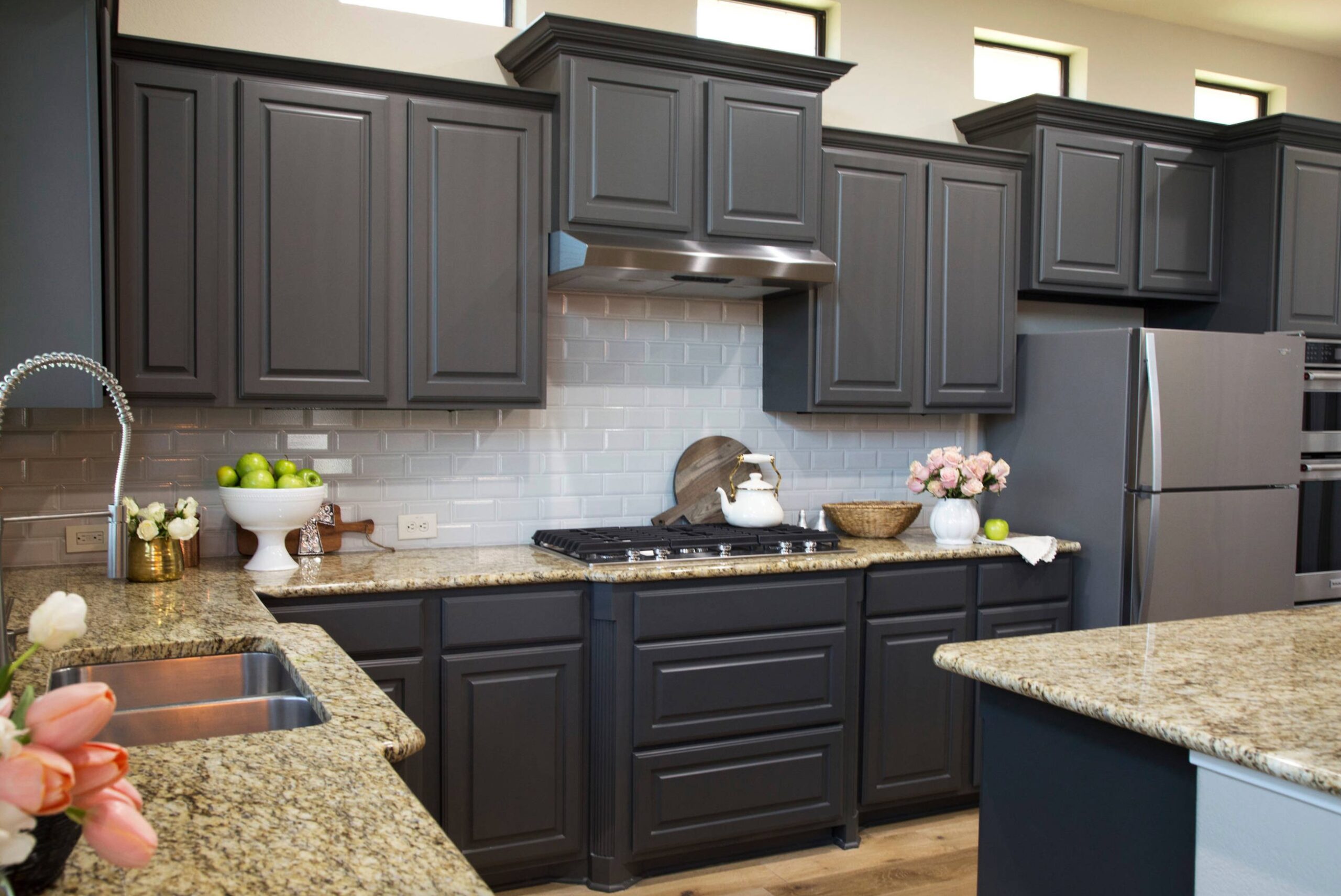
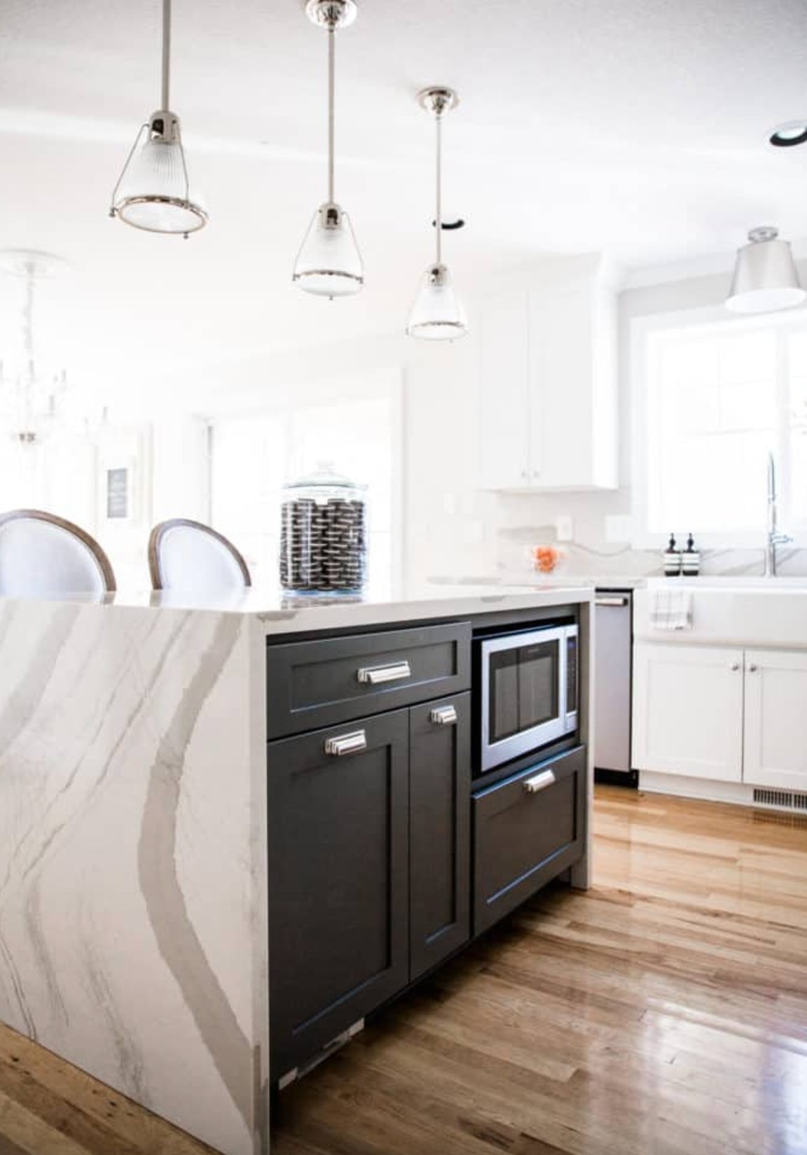
Kendall Charcoal works with both warm and cool finishes. Try it with warm whites like Benjamin Moore White Dove or Sherwin-Williams Pure White, then check the sample against your counter, not just the wall. It is especially good next to natural wood and stone.
If you use it beyond the cabinets as an accent wall, keep the surrounding walls light and warm. Without that contrast, Kendall Charcoal can make a small kitchen feel closed in.
3. Pavestone by Sherwin-Williams

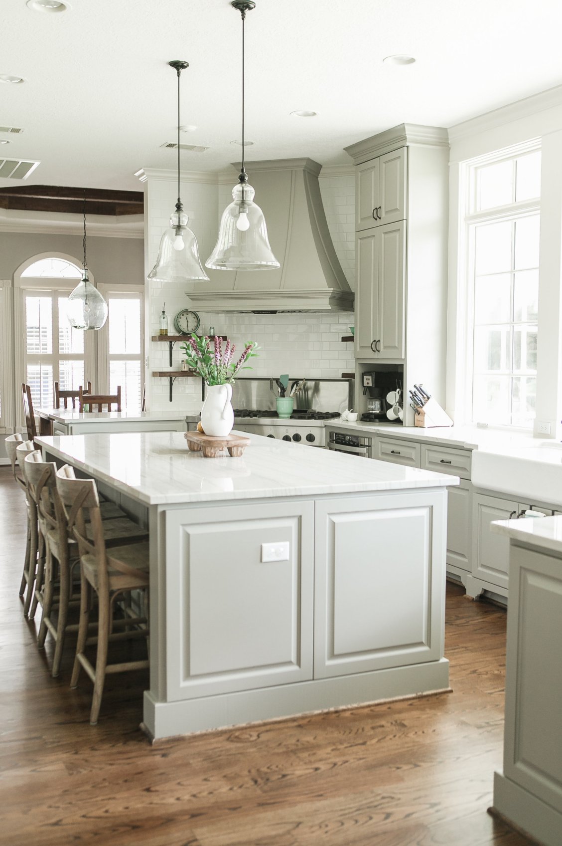
In kitchens, Pavestone is an adaptable mid-tone gray. Northern light brings out its cooler side, while southern exposure makes the warm notes easier to see.
What I like about Pavestone for cabinets is that it avoids the tricky purple undertone that can show up in some mid-tone grays. It has a hint of green instead, so sample it carefully if your kitchen has green outdoor reflections or a green-gray countertop. It pairs cleanly with white trim, especially Sherwin-Williams' Pure White and Extra White.

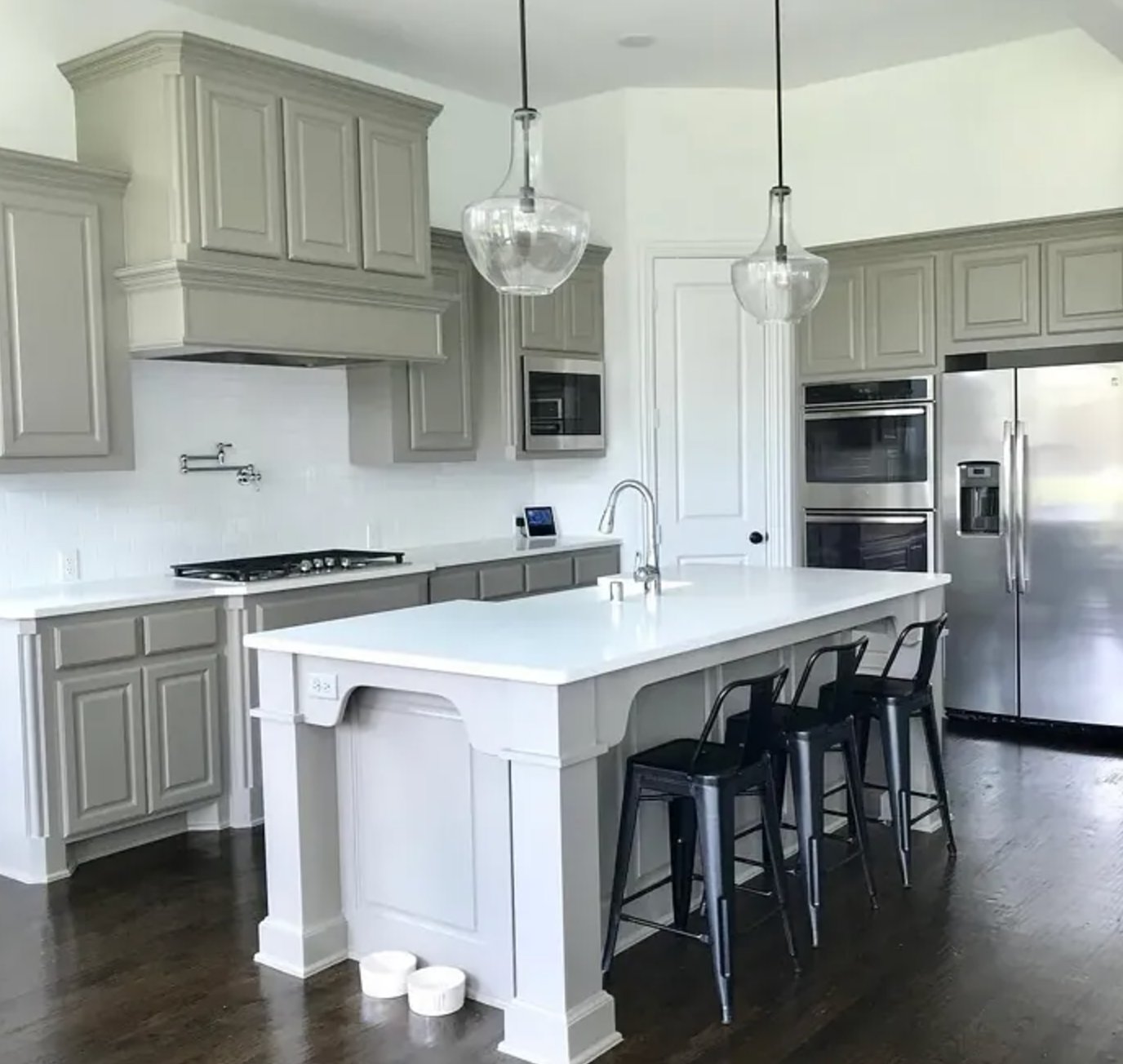
Pavestone looks its best in a kitchen with decent natural light. In a dim room, it can read heavier and flatter, so test it on at least two cabinet doors or large sample boards before painting the whole run.
4. Whale Gray by Benjamin Moore

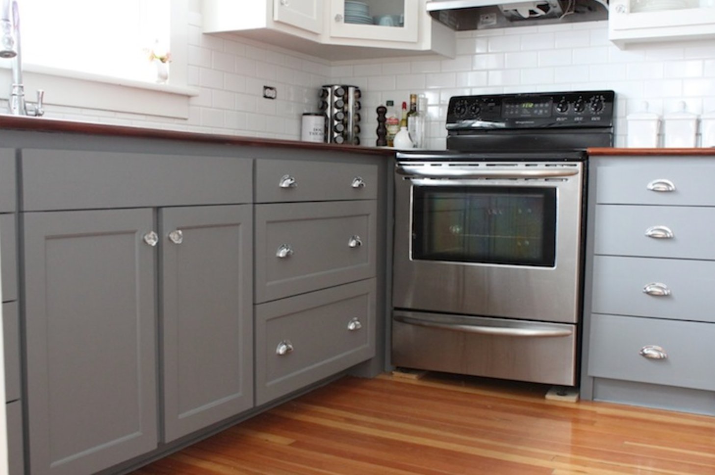
Whale Gray has a cool, bluish undertone that is easy to see on cabinet doors. It is a good fit for modern kitchens with chrome hardware, glass details, and cooler white surfaces.
It works well with white marble counters, especially marble with gray or blue-gray veining. I would be more cautious with creamy quartz, travertine floors, or warm beige backsplash tile, because those finishes can make Whale Gray look colder than intended. In small kitchens, use it with light walls and a simple backsplash so the cabinet color feels intentional, not cramped.
5. Dorian Gray by Sherwin-Williams


Dorian Gray gives kitchen cabinets a warm gray look without going too dark. Its LRV is 39, so it has enough depth to show against white counters and trim, but it will not feel as heavy as the charcoal options in this list.
Unlike cool blue grays, this one has a warm base with a small amount of purple and green. South-facing rooms bring out the warmth. North-facing spaces show more of its gray side, but it usually stays soft.
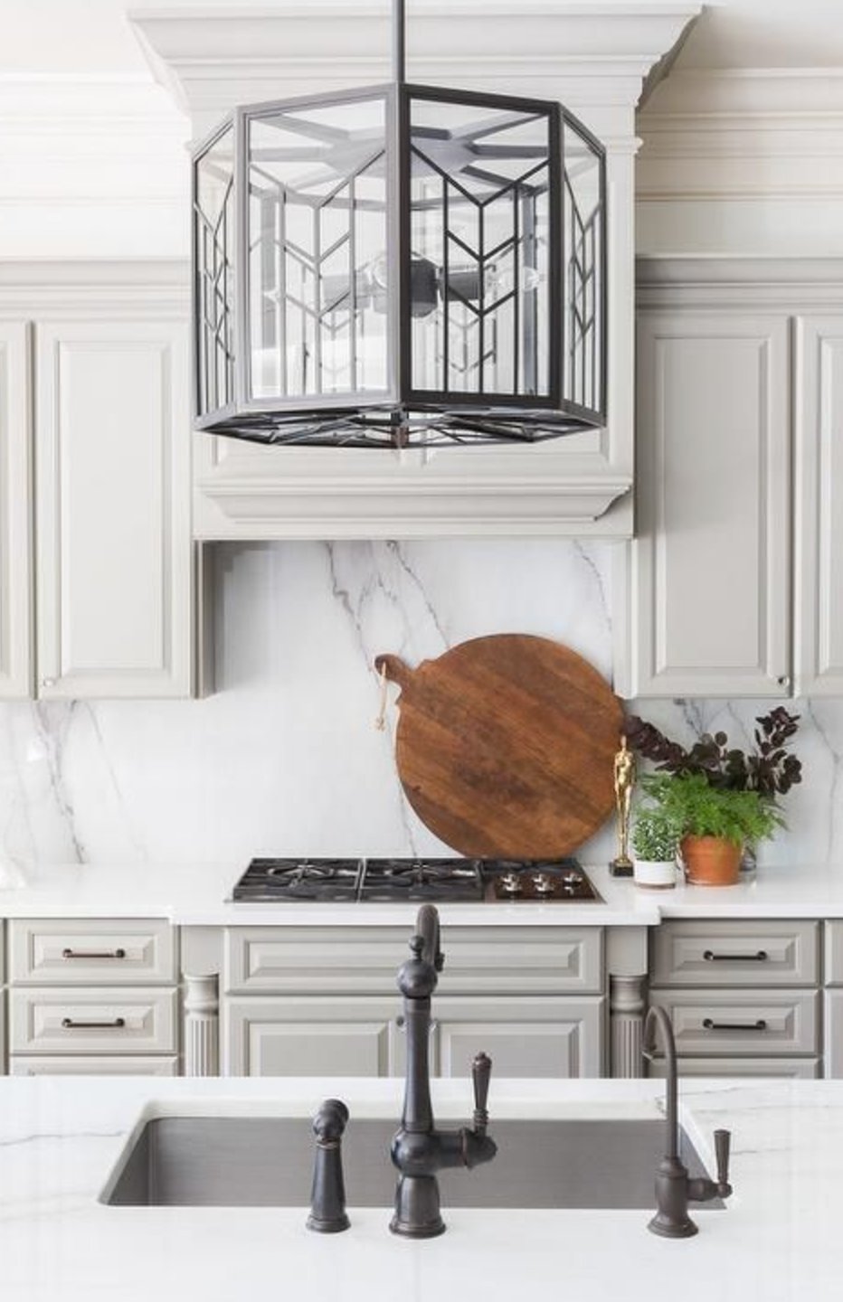

Dorian Gray is a practical choice for traditional shaker cabinets, painted islands, and kitchens where the fixed finishes are not all the same temperature. It can bridge warm wood floors, white counters, and brushed nickel hardware without looking disconnected.
6. Edgecomb Gray by Benjamin Moore

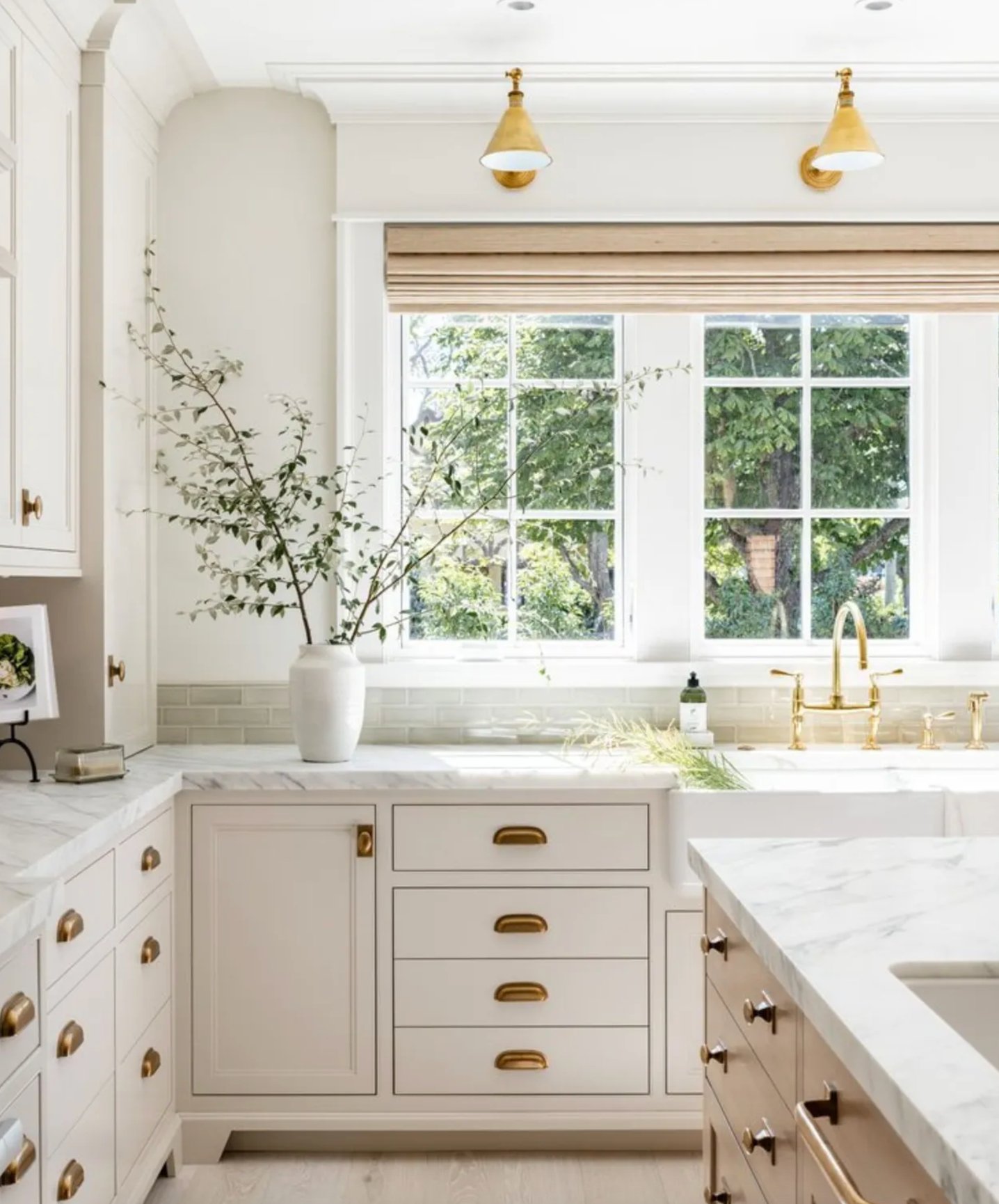
Benjamin Moore's Edgecomb Gray is one of the lightest, warmest cabinet choices here. On cabinets, it reads more like a soft greige than a true gray, which is useful when white feels too stark.
Natural light can bring out subtle green notes. That can be helpful next to warm wood, but it is also why I would test it near windows if you have a lot of trees or lawn reflecting into the kitchen. With white countertops, Edgecomb Gray gives a softer contrast than charcoal or medium gray cabinets.
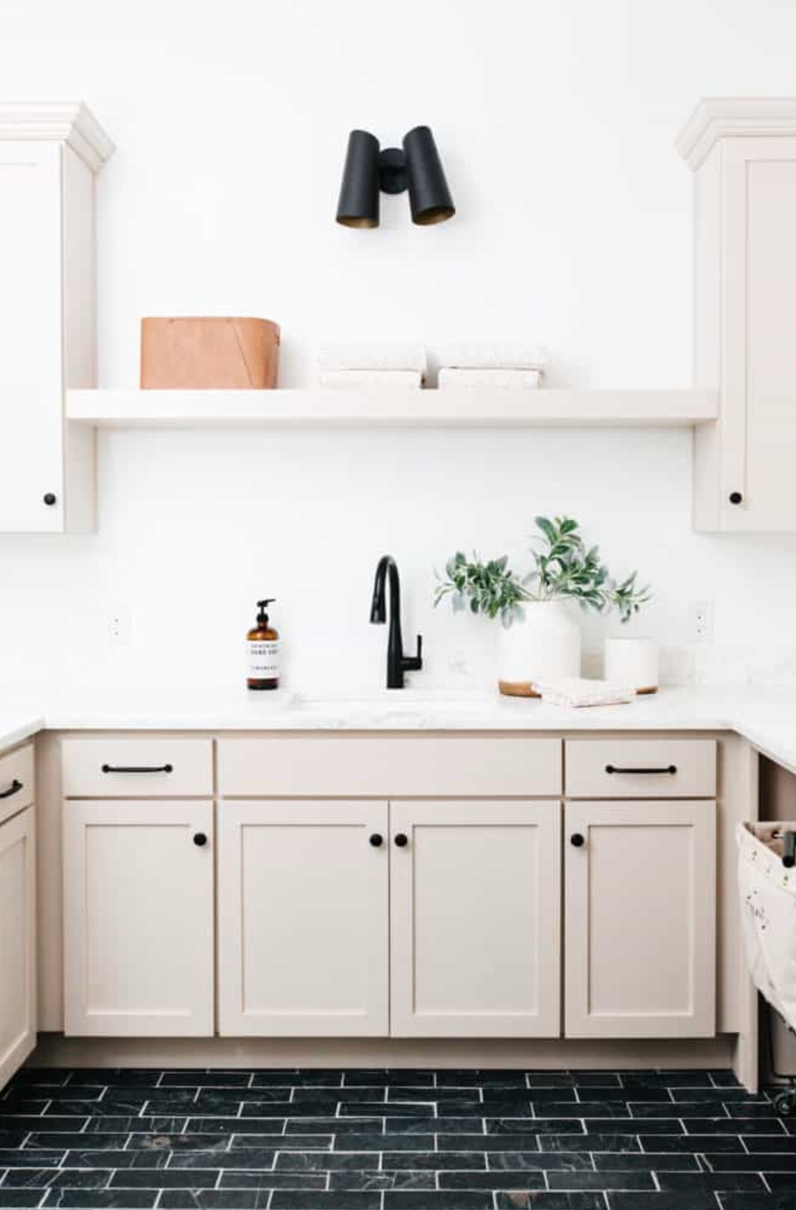
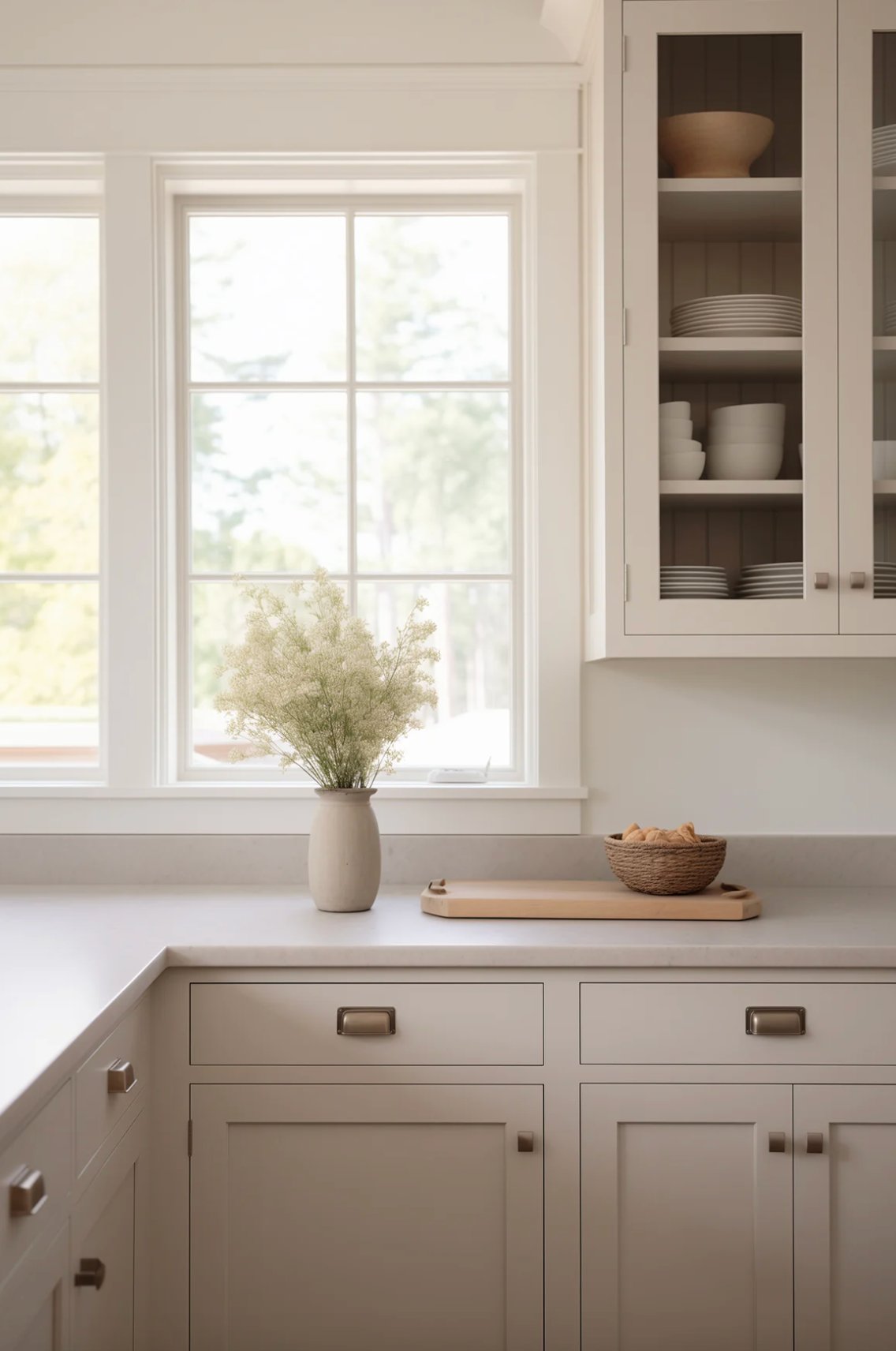
Edgecomb Gray works across many kitchen styles because it does not demand a high-contrast palette. In darker spaces, it keeps more warmth than many grays, but it can look beige if the bulbs are too warm. Around 3000K lighting is usually a safer starting point than very yellow 2700K bulbs.
7. Chelsea Gray by Benjamin Moore

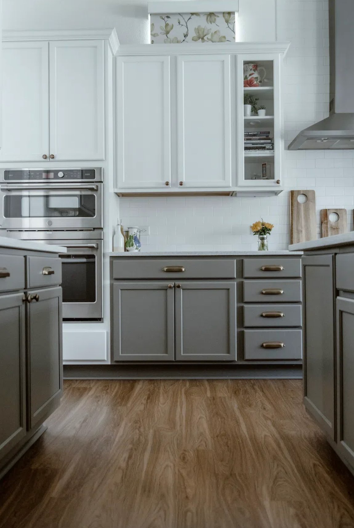
Chelsea Gray by Benjamin Moore is a rich gray with enough warmth for cabinets that need more presence than a soft greige. It has subtle green and purple undertones, which give it depth without making it read obviously colorful.
This color sits between warm and cool, so it works with natural wood, warm whites, and many stone counters. On kitchen cabinets, Chelsea Gray is a good middle ground when black feels too severe but light gray feels too washed out.
Do not confuse it with Sherwin-Williams' Chelsea Gray, which is lighter and cooler in tone.
8. Agreeable Gray by Sherwin-Williams


Sherwin-Williams' Agreeable Gray is a warm gray with an LRV of 60. On cabinets, it gives you a light greige look rather than a strong gray statement.
The color has hints of green and barely-there purple that shift as the light changes throughout the day. It is flexible, but it is not magic. Next to very cool marble, it can look warmer than expected, and next to beige tile, it may read more tan than gray.
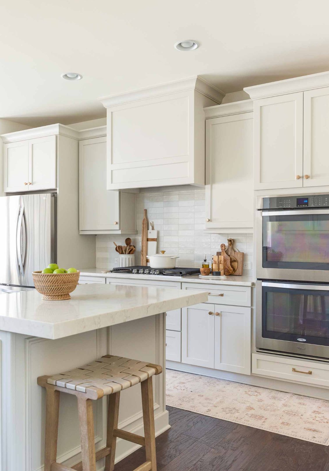
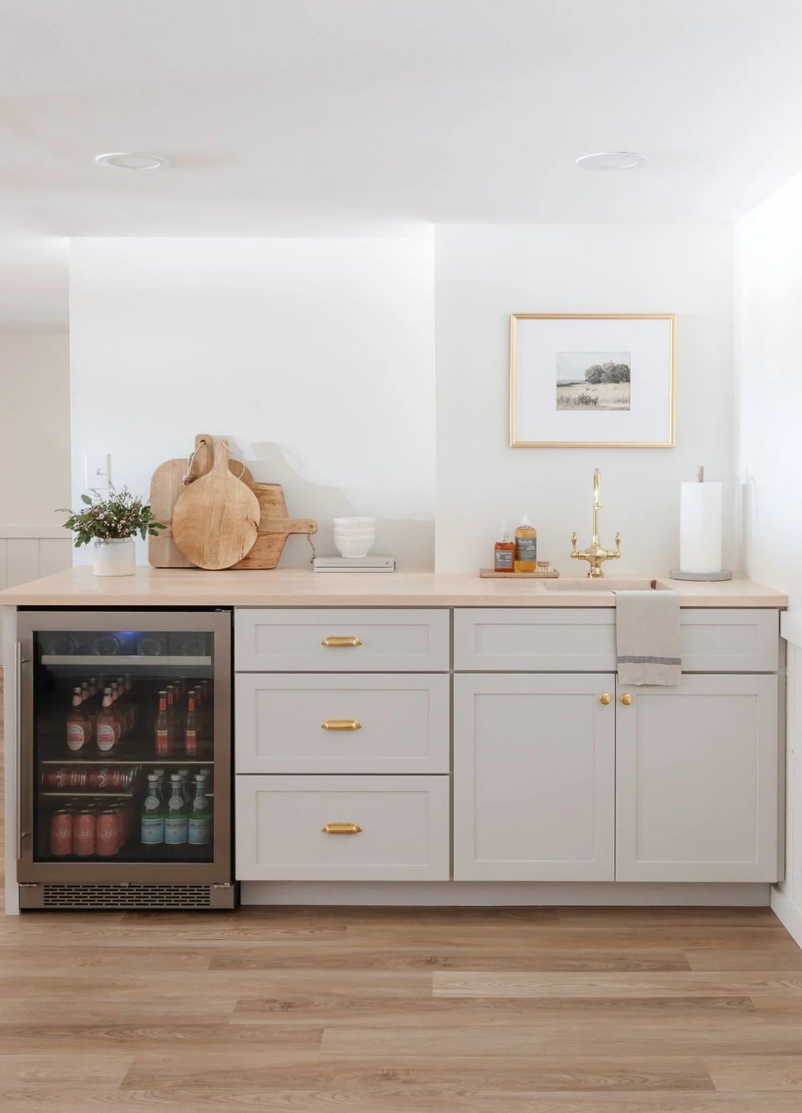
Agreeable Gray is useful in kitchens where you want painted cabinets to stay quiet and let the counters, backsplash, or range hood do more of the visual work. Natural light helps it read cleaner, while warm bulbs will push it toward greige.
9. Galveston Gray by Benjamin Moore


Galveston Gray's earthy tones bring warmth to kitchen cabinets. It is especially good on cabinet fronts where you want the color to feel grounded instead of crisp or cool.
Pair it with white countertops and metal hardware for a kitchen that feels updated without losing warmth. In natural light, it shows gray-brown tones, so check it carefully with flooring. It can be a smart choice with wood, but it may look too earthy beside pink beige tile.
This color is part of the 42 neutral shades inspired by natural landscapes in the America's Colors collection.

I'm Elizabeth, your go-to guide for all things paint and design! My days are filled with color swatches and innovative room makeovers. When I'm not painting the town - literally - I'm soaking up inspiration from my travels. This blog is my way of sharing my passion and making the world a more vibrant place, one color palette at a time.