Best White Paint Colors for Kitchen Cabinets
The best white paint color for kitchen cabinets is the one that works with your light, counters, backsplash, flooring, and appliances. White cabinets are still the safest long-term choice for most kitchens, even while gray and black cabinets get more attention online.
I know how overwhelming this choice gets once you hold real samples against cabinet doors. A white that looks clean on the chip can turn yellow beside a quartz counter, blue beside stainless appliances, or flat in a north-facing kitchen.
These are the whites I would actually put on a cabinet shortlist. I included the easy favorites, the brighter whites that need careful prep, and the softer shades that save kitchens with older finishes.
1. White Dove by Benjamin Moore

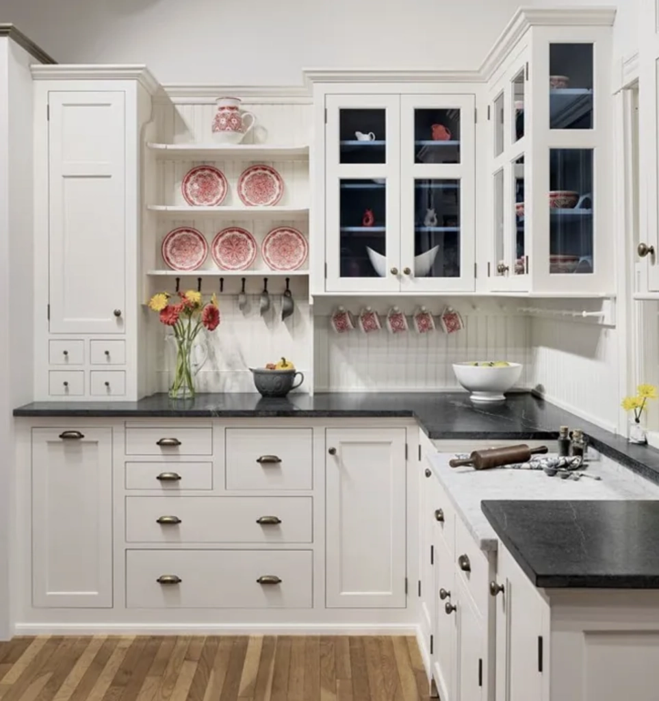
White Dove is the white I reach for when a kitchen needs softness without looking cream. It sits between warm and cool, which is why it works in so many real homes instead of only in photos.
With an LRV of 83.16, White Dove is bright enough for cabinets but not glaring. It doesn't feel as sterile as some cleaner whites, and it doesn't lean as yellow as many creamy whites. A small gray influence keeps the warmth controlled.
This shade is especially useful in late 90s and early 2000s Tuscan-style kitchens with travertine, tan tile, oil-rubbed bronze, or busy granite. It can also look current in a cleaner kitchen if the walls, trim, and counters are not icy white.
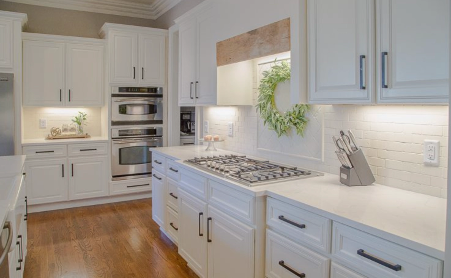
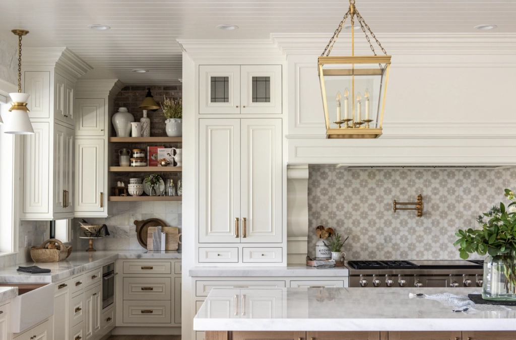
One of White Dove's biggest perks is flexibility. You can use it on walls, ceilings, doors, and cabinets for a continuous look without sharp color breaks.
That matters in a smaller kitchen because every contrast line makes the room feel busier. If you use White Dove on cabinets and trim, sample the same color in your cabinet sheen and wall sheen because the cabinet finish will usually read a little brighter.
2. Paper White by Benjamin Moore

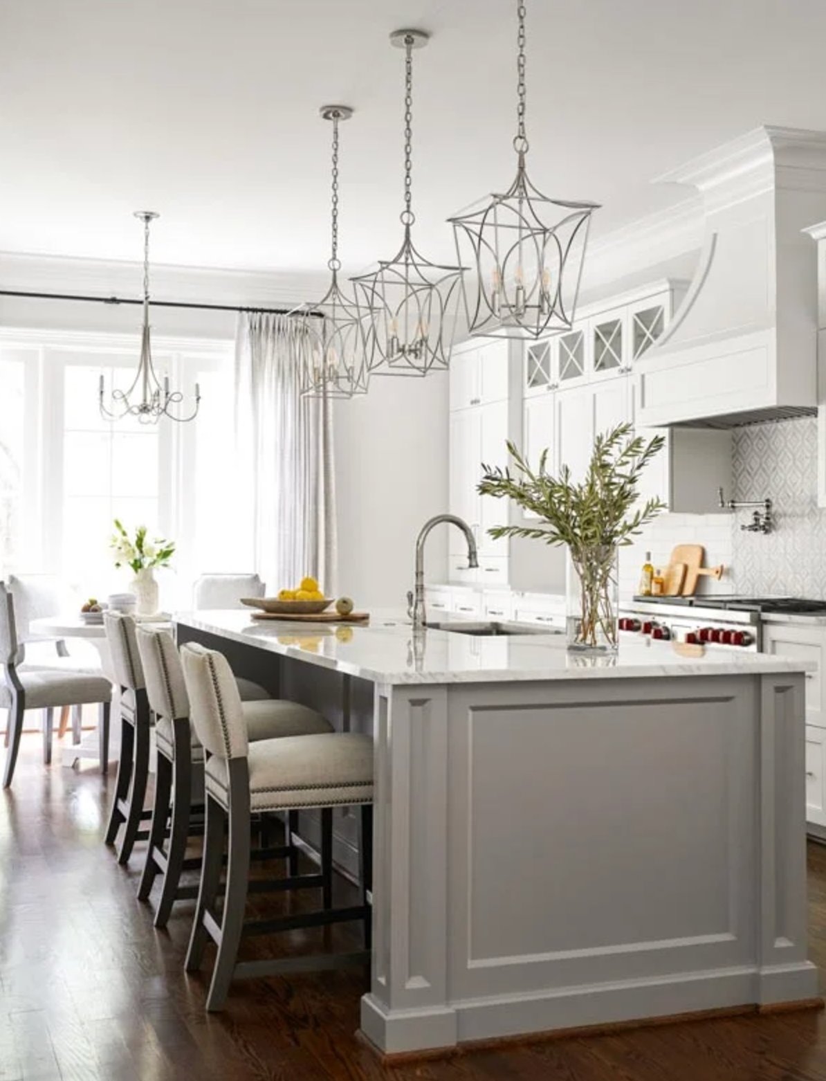
Paper White is a good cabinet choice when plain white feels too sharp and light gray feels too heavy. With an LRV of 74, it is darker than the bright whites that usually sit around 80 to 90.
Paper White can show blue or gray during the day, but it does not automatically read cold. In strong natural light it looks more like a soft white. In dimmer kitchens, the gray side becomes much easier to see.
A crisp white wall beside Paper White cabinets is a useful test. If the cabinets suddenly look dingy, the room probably needs a cleaner white. If they look calm and intentional, you have enough contrast for the color to make sense.
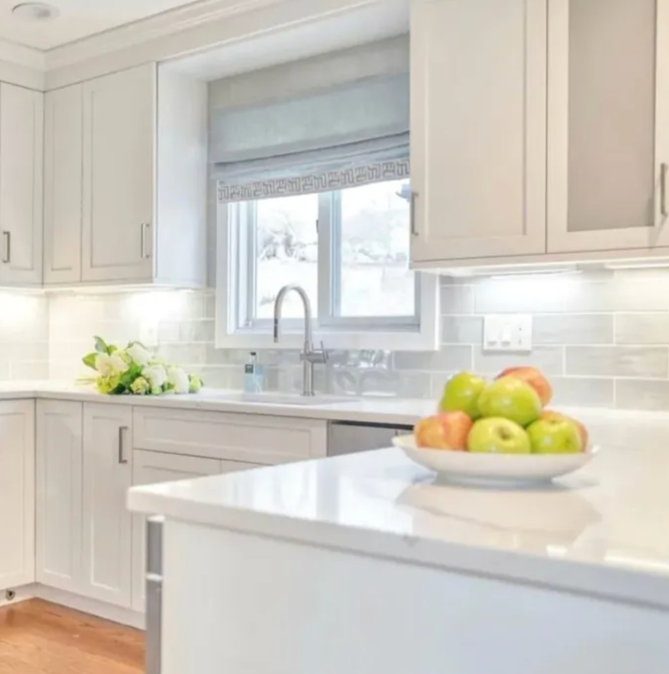
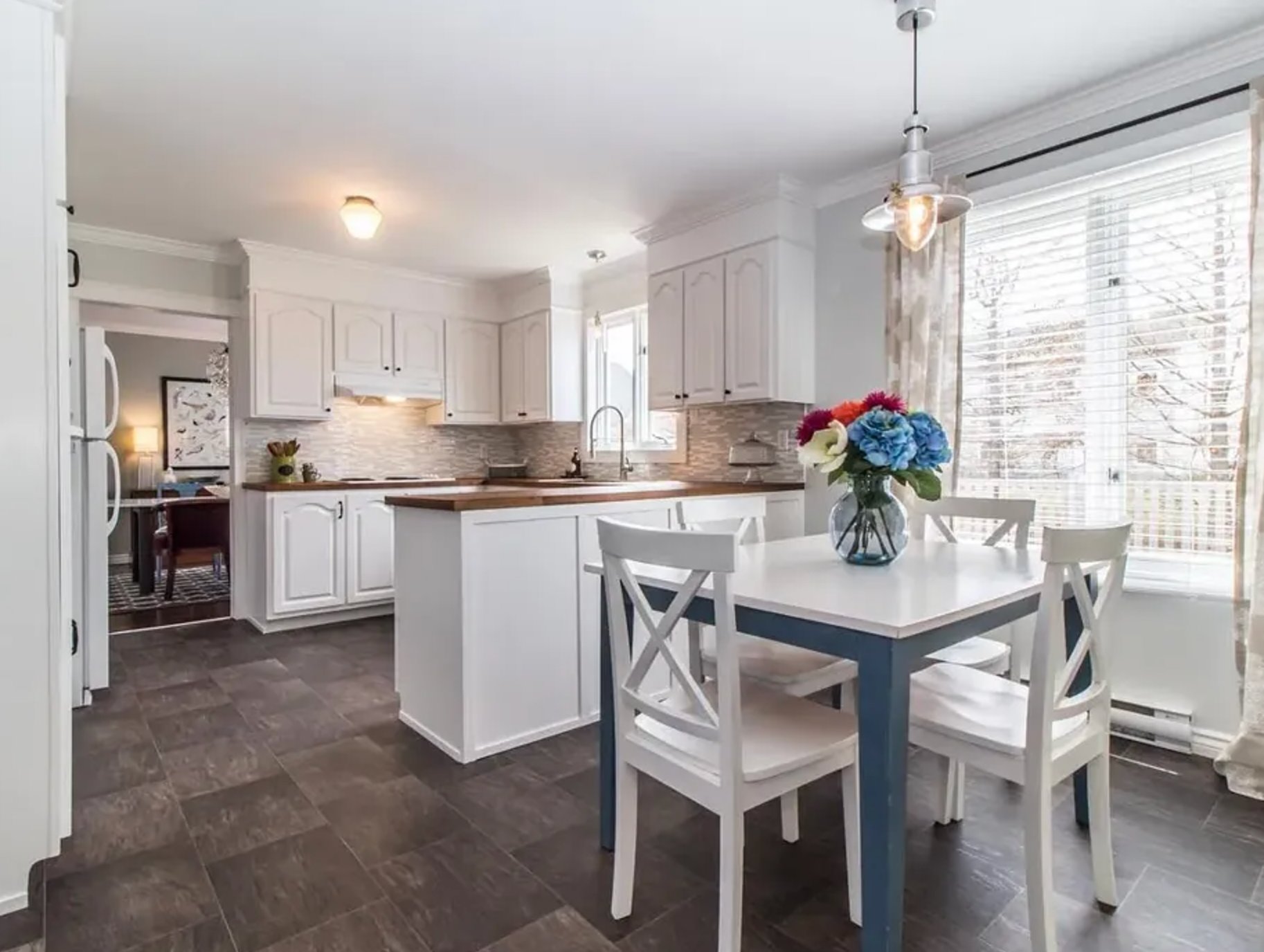
Pay close attention to the natural light before choosing this color. North-facing kitchens may need better bulbs or under-cabinet lighting so Paper White does not flatten out.
Paper White works in both contemporary and traditional kitchens. I especially like it with marble, pale quartz, nickel finishes, and coastal interiors where a bright yellow-white would feel out of place.
3. Pure White by Sherwin Williams


Pure White by Sherwin-Williams is a reliable cabinet white when you want bright, clean doors without a blue-white edge. Its LRV of 84 keeps it light, but it still has enough body to avoid looking paper thin.
It has a slight yellow undertone, just enough to keep it from looking clinical. That matters on cabinets because you see the color at eye level, under task lighting, and against shiny hardware all day.
Pure White behaves well in different exposures. In south-facing rooms, it stays soft under warm light. In many north-facing kitchens, it avoids the cold cast that makes some whites look harsh.
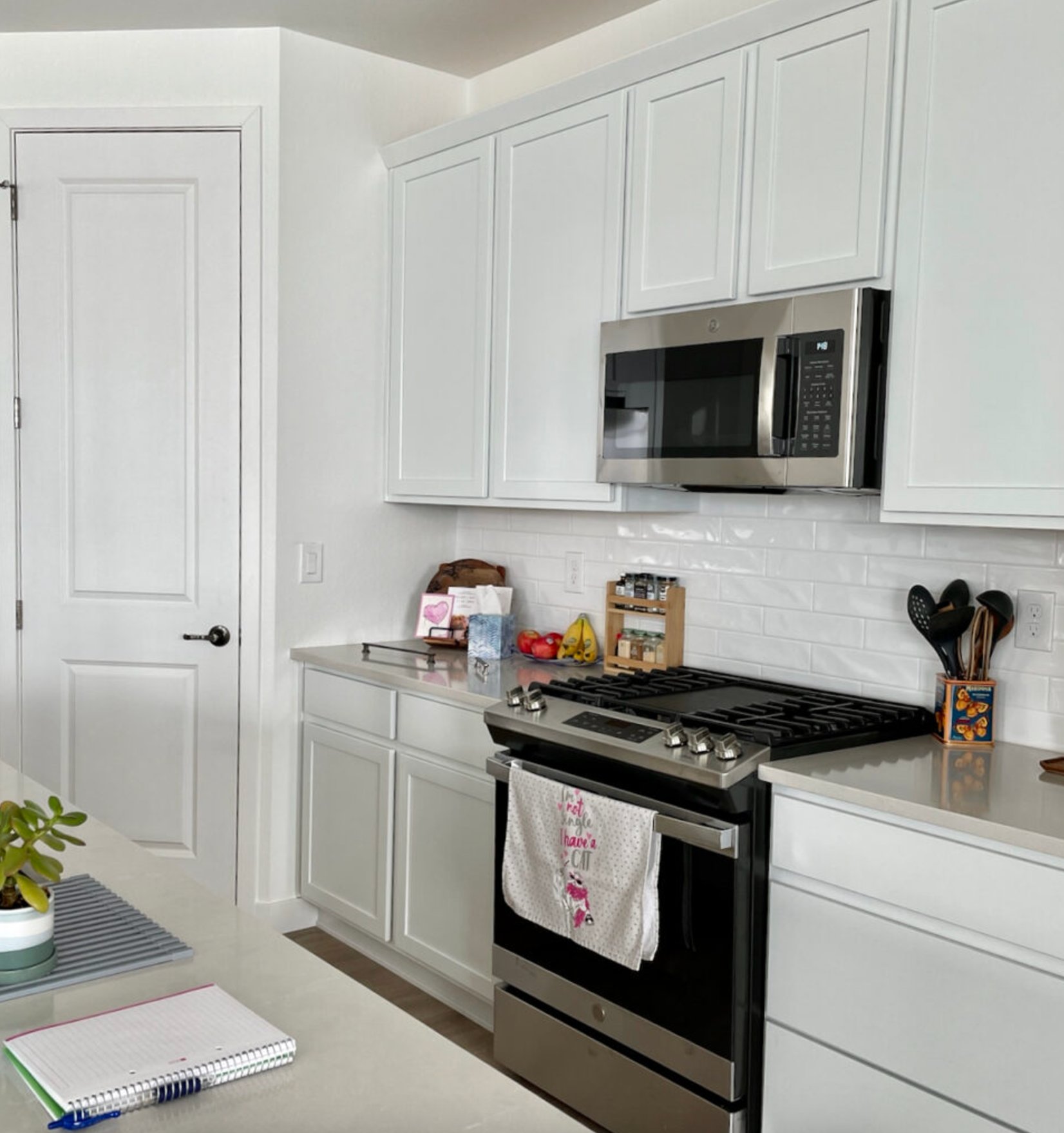
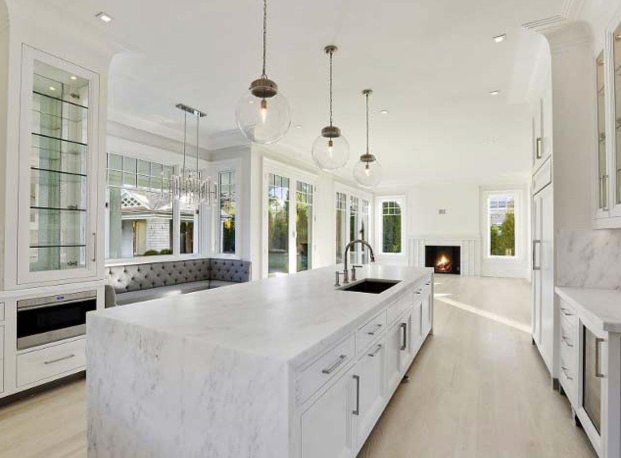
Pure White is easy to pair. It works with cool tones like blue, green, and gray, and it can handle warmer beige or sand-colored walls. That gives you room to change the wall color later without repainting the cabinets.
In new builds, I often see Pure White used across trim and cabinetry, with the interest coming from sheen instead of a second white. For cabinets, a satin or semi-gloss finish will make it read cleaner than the same color in matte on the wall.
4. Chantilly Lace by Benjamin Moore

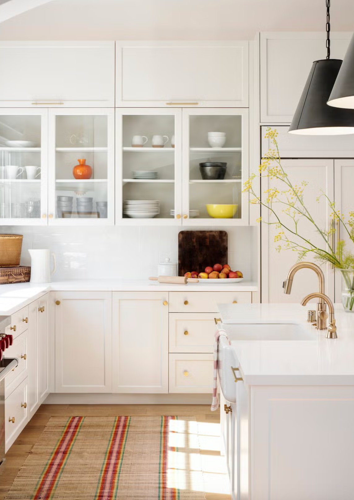
Chantilly Lace is one of the cleanest whites I would consider for kitchen cabinets. With an LRV of 90, it gives you a very bright cabinet finish without much visible undertone.
It is still a high-contrast white, so the surrounding finishes matter. It looks best when the counters, backsplash, appliances, and trim can stand up to a cleaner white.
Chantilly Lace can work with both warm and cool colors, but I am pickier with it than I am with White Dove. It is strongest in kitchens with good natural light, clean stone, and simple surfaces. In bright sun, it usually stays clear instead of turning creamy.
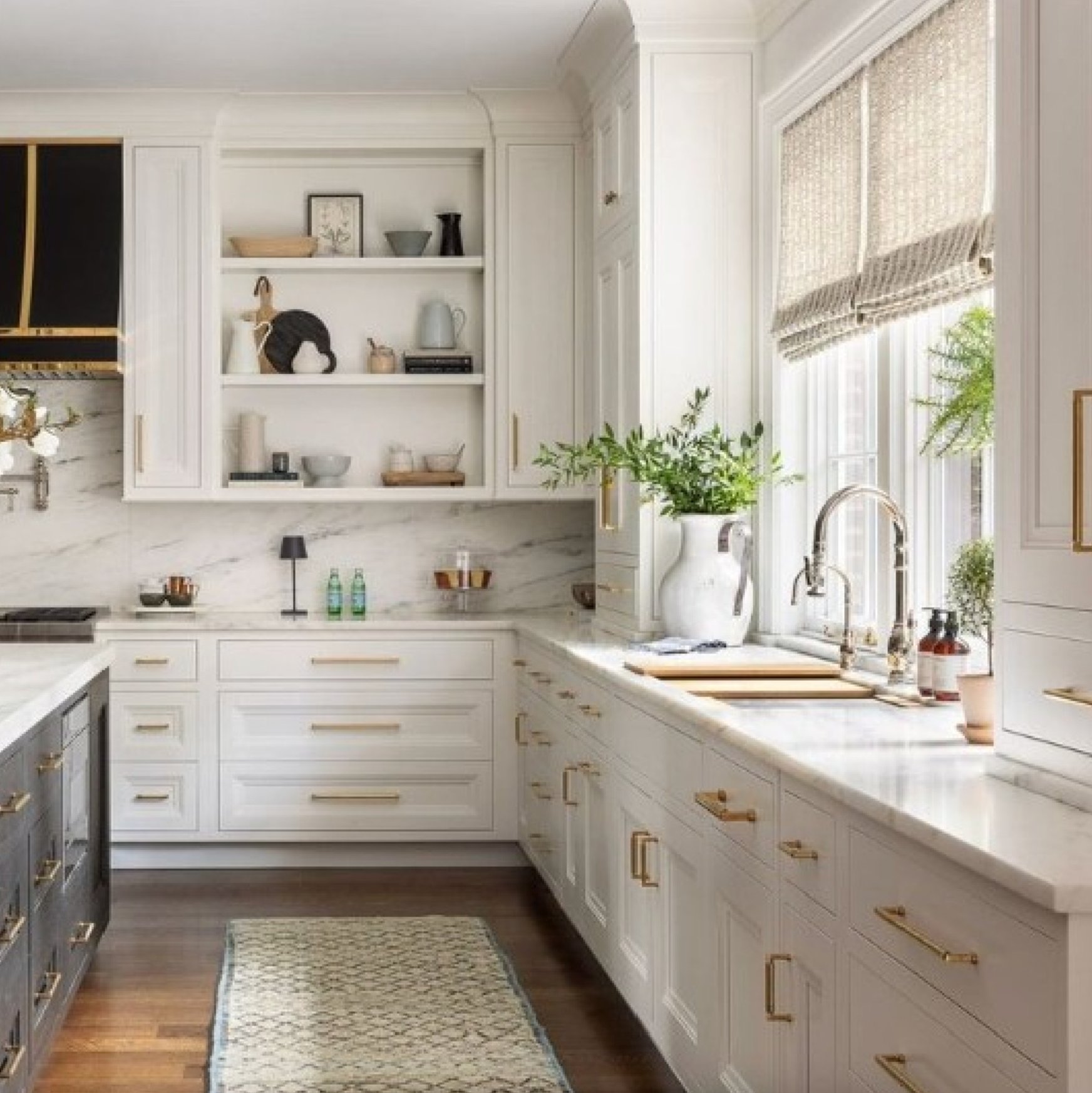
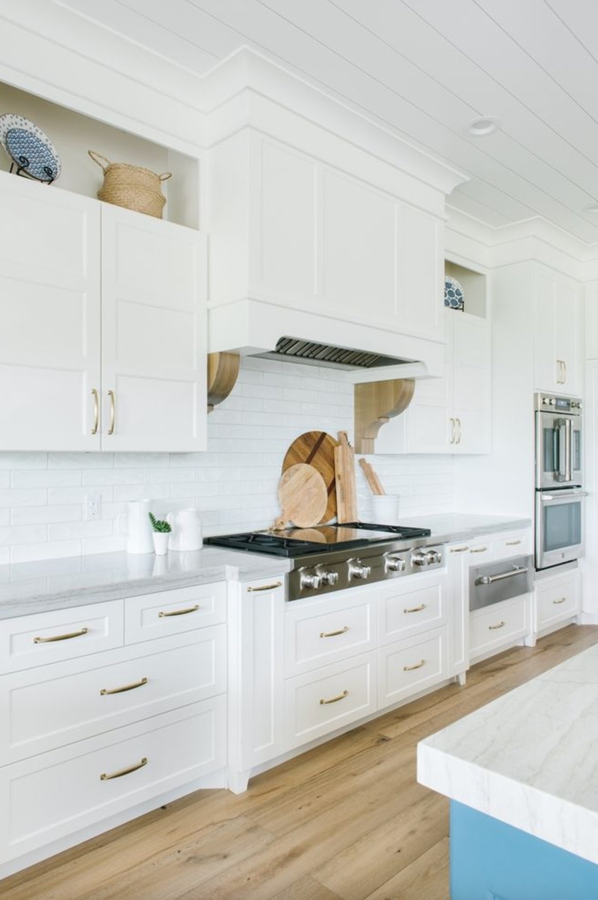
Chantilly Lace gives countertops and backsplashes a crisp edge. That can be exactly right with white quartz, black counters, marble, or a graphic tile.
It is also one of the easier cabinet whites to use with white appliances. Softer whites can make white appliances look slightly blue or gray by comparison.
Warm bulbs will soften Chantilly Lace, but they usually will not push it yellow. If your kitchen lighting is very warm, test the sample at night before committing.
Chantilly Lace needs careful cabinet prep. Degrease, sand smooth, fill dings, and prime properly because a pure white will show bumps, brush marks, and old grain faster than a softer off-white.
5. Alabaster by Sherwin Williams

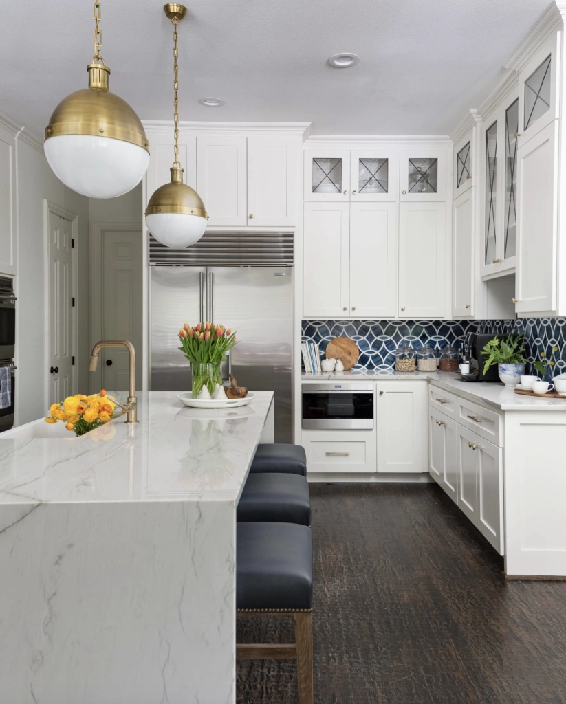
Alabaster by Sherwin-Williams is a soft warm white with an LRV of 82. It is still white, but it has more cream in it than Pure White or Chantilly Lace.
Watch this color in different light and you will see why people use it so often. Unlike many warm whites, it usually does not go obviously yellow unless the surrounding finishes are already yellow or orange.
On cabinets, Alabaster is helpful when a bright white would fight with cream tile, warm wood floors, beige walls, or older granite.
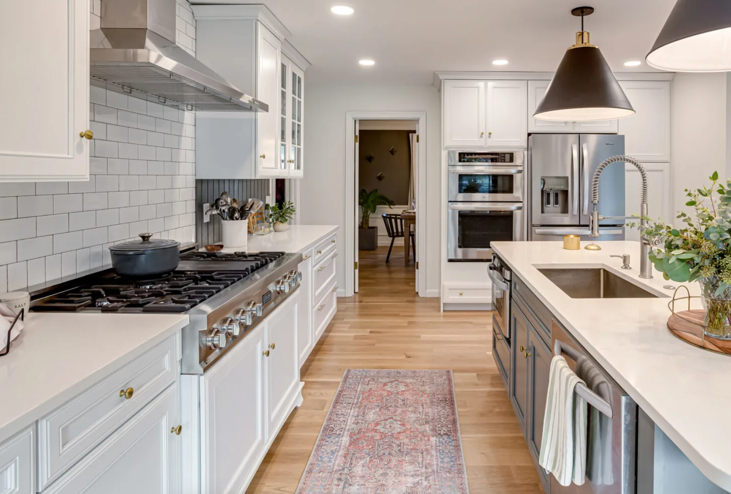

On sunny days, Alabaster can read like a clean white. On cloudy days or under warm bulbs, the creamy side becomes more obvious.
While it is white, it's intentionally soft and warm. If you want a crisp modern cabinet color, look at Pure White, Chantilly Lace, or High Reflective White instead. Alabaster is better when the kitchen needs warmth and forgiveness.
6. Cloud White by Benjamin Moore

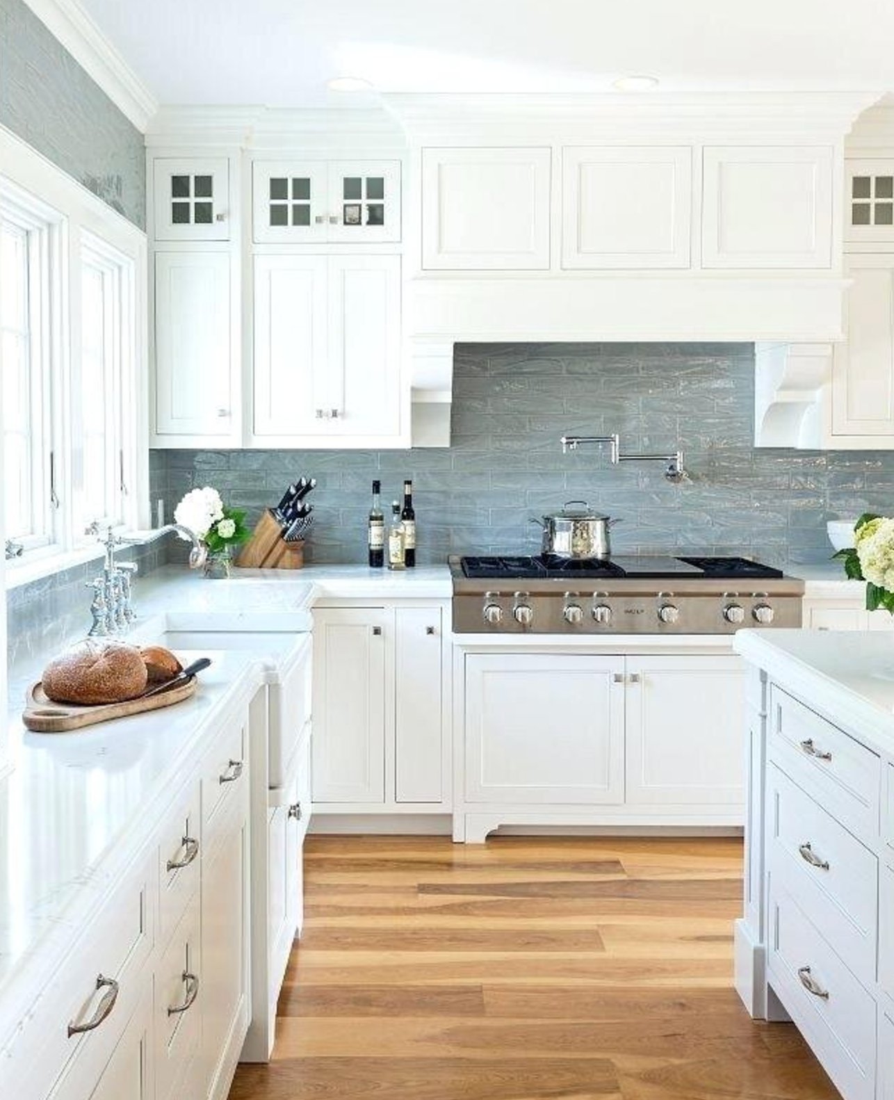
Cloud White is a classic warm white, and paint code 967 has been used in a lot of real kitchens for good reason. It gives cabinets a soft look without reading beige.
The key is its warm undertone. It reduces harsh contrast, which helps when a kitchen has wood floors, brass hardware, cream backsplash tile, or warm stone.
Although it has a creamy tint on the palette, it does not always read creamy once painted on cabinets. The cabinet sheen and nearby whites will decide how warm it looks.
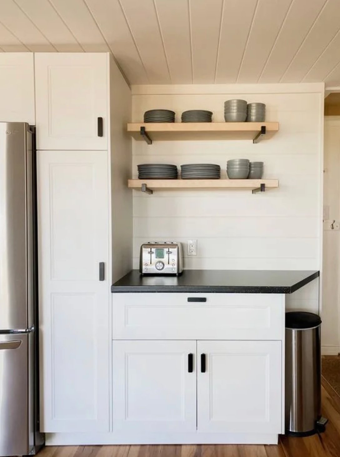
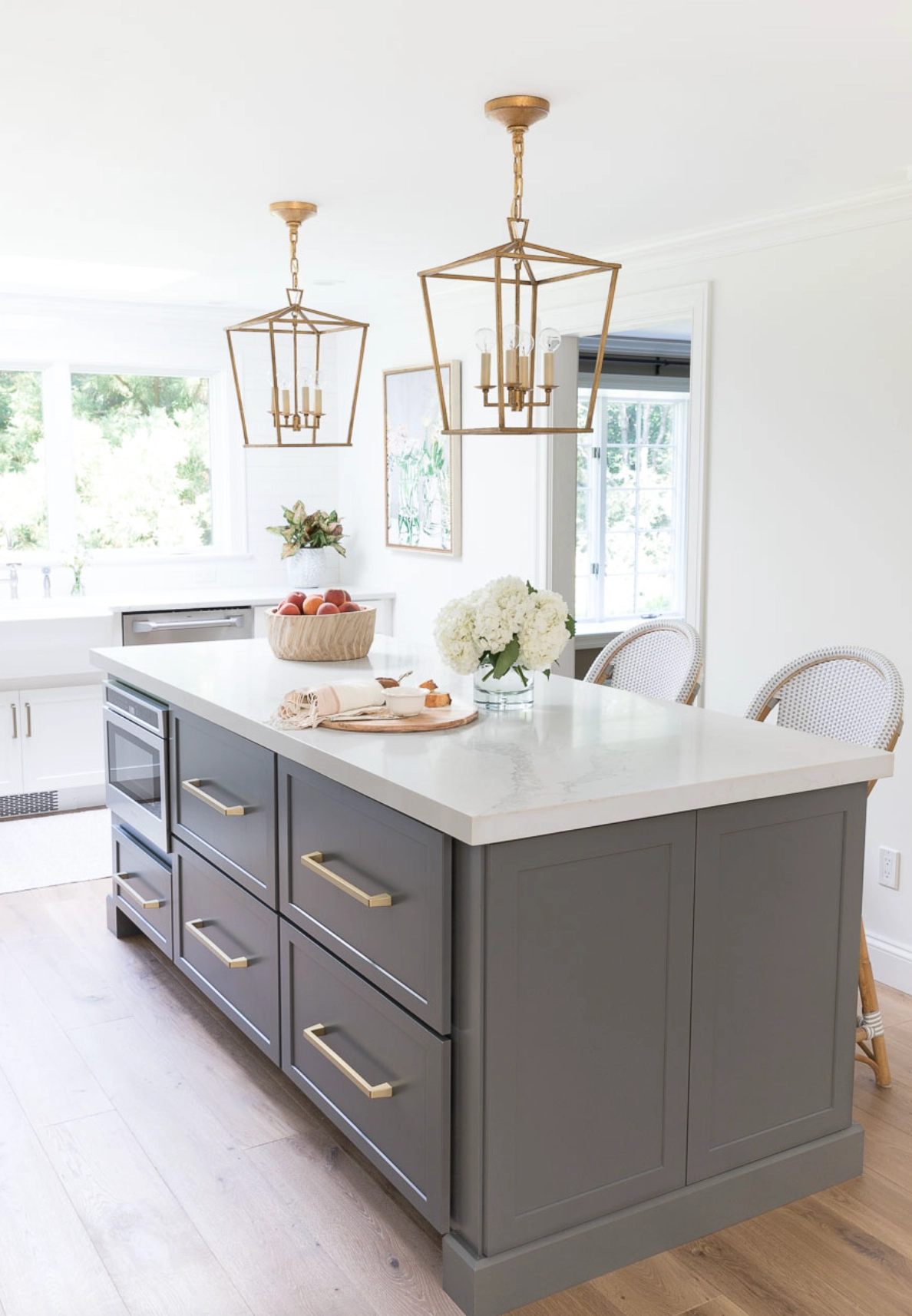
Cloud White is especially good with wood elements and brass hardware. It is bright enough to keep the kitchen open, but it will not make older warm finishes look dirty by comparison.
7. Extra White by Sherwin Williams

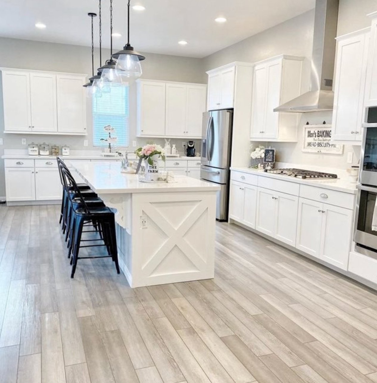
Sherwin-Williams' Extra White is a crisp cabinet white with an LRV of 86. Despite the name, it is softer than High Reflective White. The subtle blue-gray undertone is quiet, but it can matter in low light.
This shade can look flat in rooms that do not get much light. If your kitchen is dark, shaded by trees, or has mostly warm surfaces, test warmer whites before settling on Extra White.
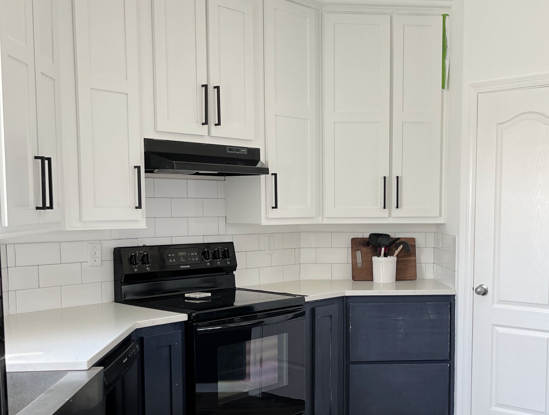
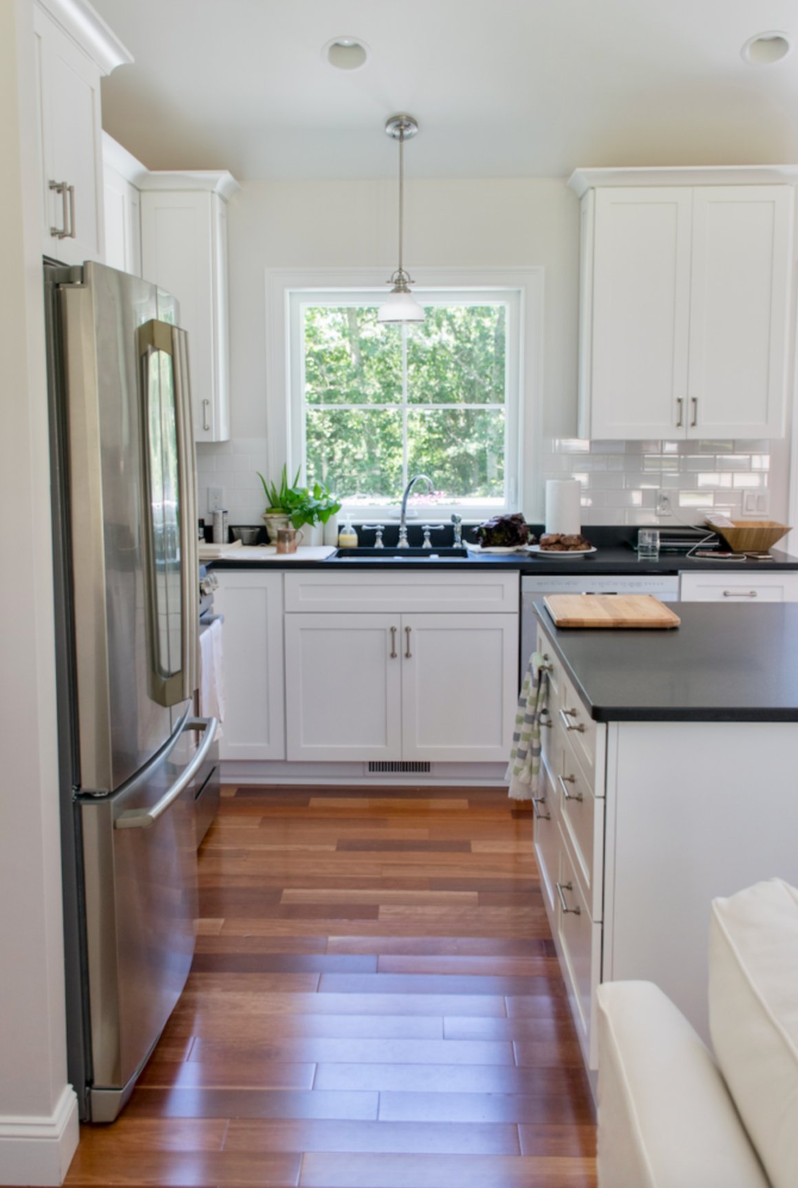
Extra White is sharp against dark blue accents and deep painted islands. The contrast makes cabinet rails and door profiles look more defined.
It is also neutral enough for many wall colors, but I would still check it against beige tile and creamy counters. Cool whites can make those finishes look older than they are.
One thing to watch with Extra White: like most whites, it reflects nearby color from furniture, flooring, the ceiling, and even the view outside. It can pick up beige, green, or blue tints depending on what surrounds it.
Test it on an actual cabinet door or a large sample board, then check it morning, afternoon, and evening before ordering paint.
8. Snow Bound by Sherwin Williams

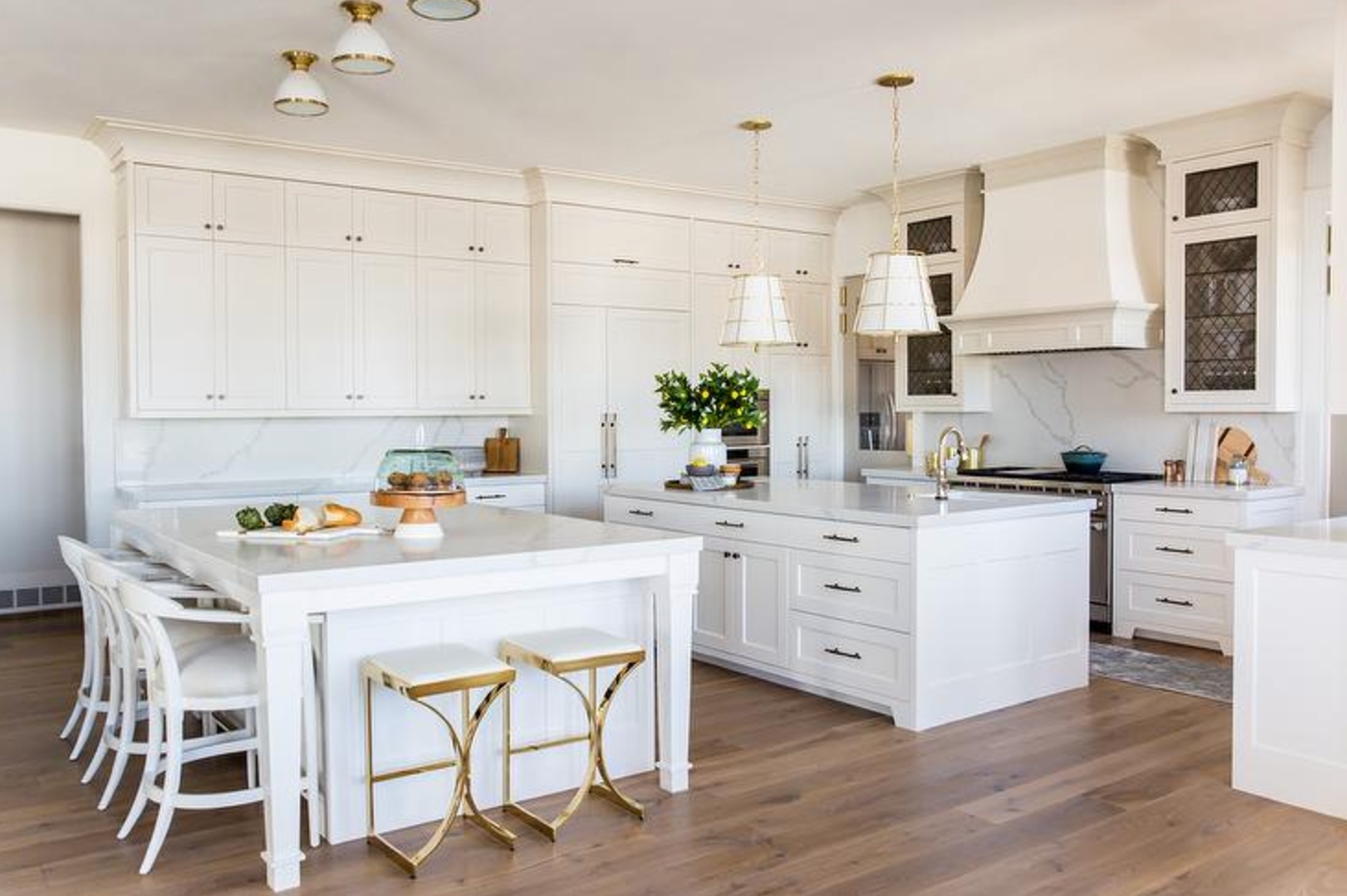
Snowbound reads like a soft white with a small gray influence. That gray gives it depth, which is useful on large cabinet runs where a flat white can look unfinished.
At first look, Snowbound reads white. Put it next to plain white paper, and you will catch the subtle creamy-gray undertone.
That is what makes it useful for kitchen cabinets. You get a bright look without the hard, clinical effect that can happen with cleaner whites.
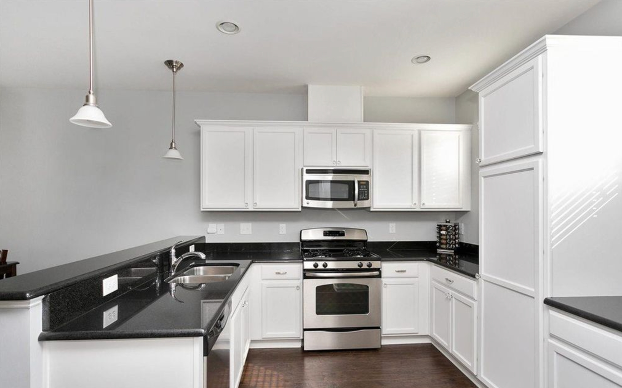
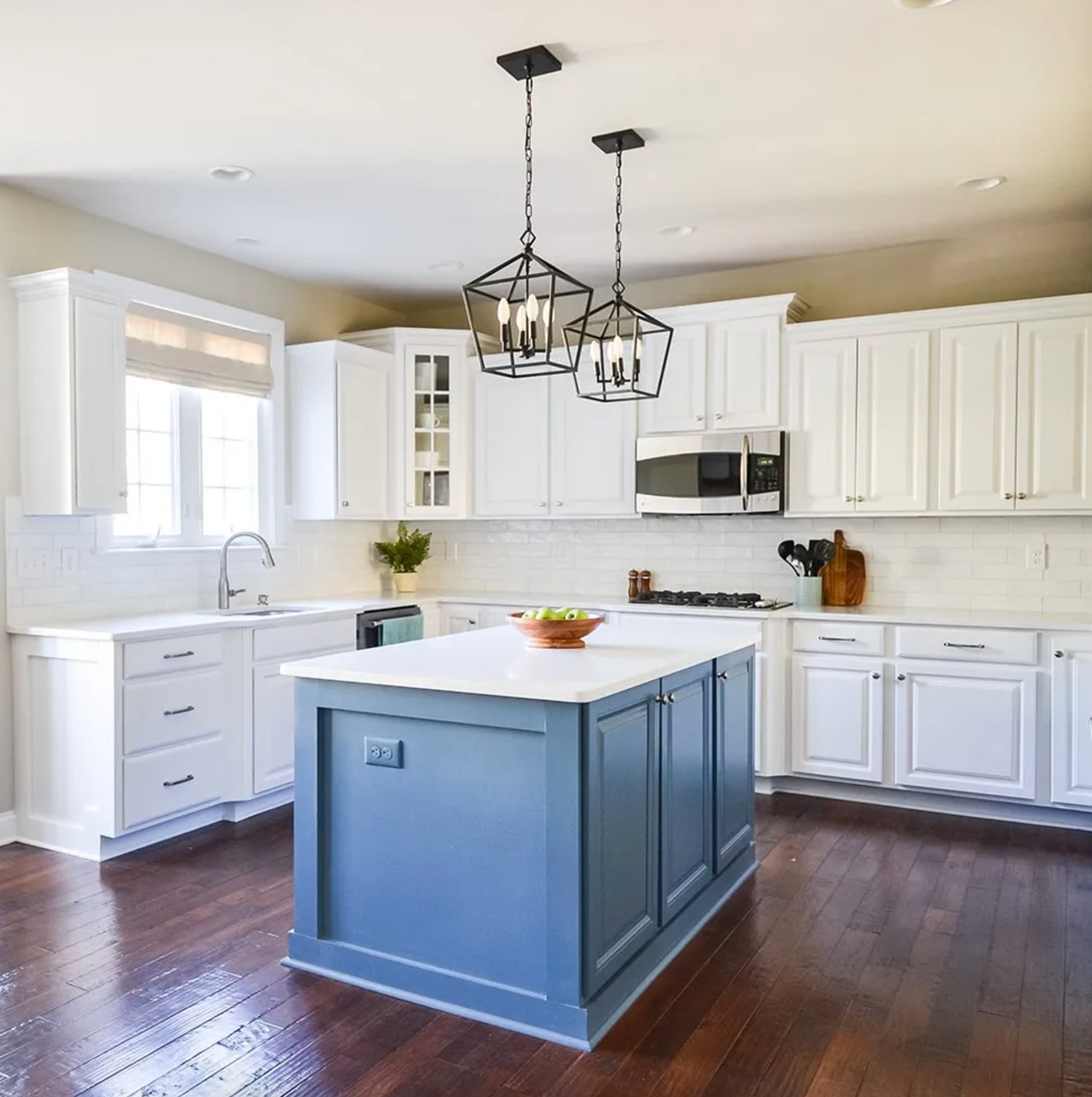
Snow Bound changes as the day moves. In morning light, it can look close to pure white. By evening, the warmer gray notes tend to show more.
It pairs especially well with gray counters, gray-veined stone, and soft charcoal accents. If your backsplash is cream or your floor is orange-toned wood, sample carefully because Snow Bound may look cooler than expected.
9. Simply White by Benjamin Moore

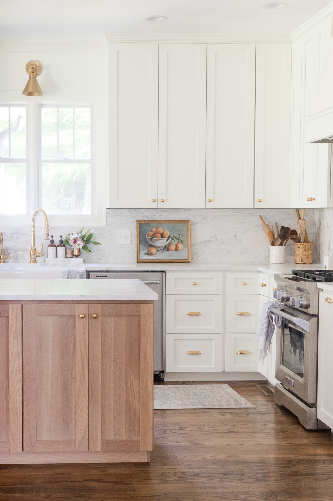
Benjamin Moore's Simply White is a bright warm white for kitchen cabinets. With an LRV of 89.52, it reflects a lot of light. Unlike some high-LRV whites, its yellow undertone keeps it from feeling sterile.
Benjamin Moore named Simply White Color of the Year in 2016, which tracks with how often it still shows up in cabinet projects.
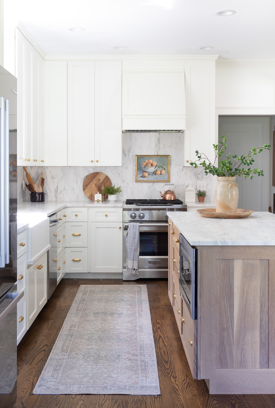
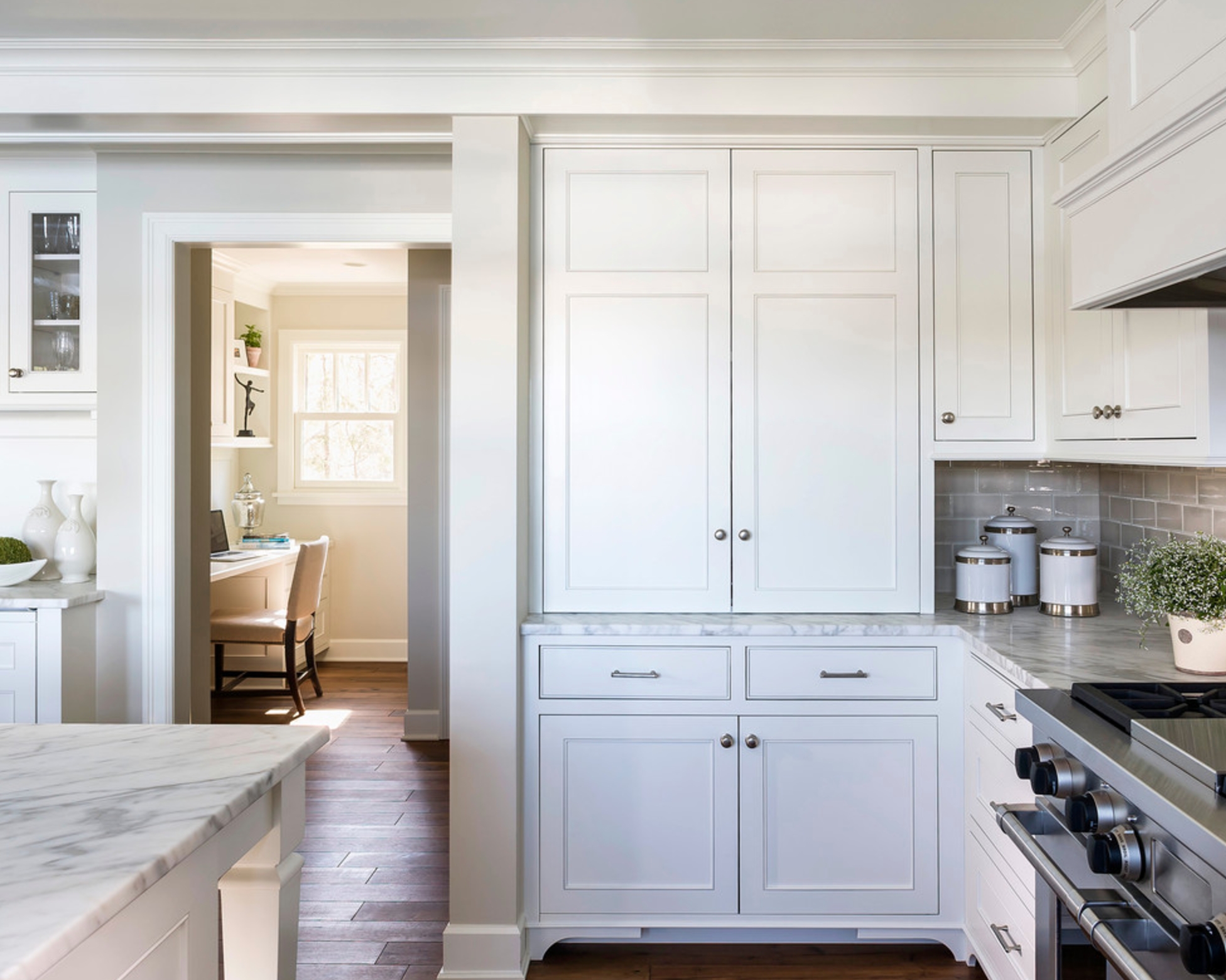
Simply White can work in a sleek kitchen or a traditional one with classic door profiles. It is clean enough for modern hardware, but warm enough for wood floors and softer wall colors.
In the kitchen, it pairs well with greige walls. Edgecomb Gray is a favorite match because it has enough warmth to meet Simply White without making the cabinets look yellow.
10. Origami White by Sherwin Williams

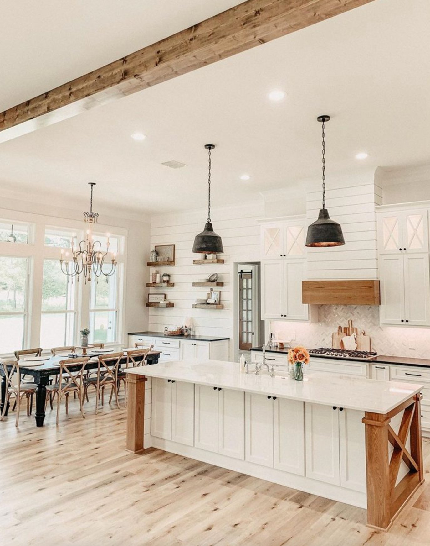
At first glance, Origami White can look like a crisp white with subtle purple notes. In real kitchens, I more often see a yellowish undertone come forward.
It works best in spaces with plenty of natural light. In kitchens that do not get much sun, or in rooms with mostly cool finishes, it can look flat.
I recently saw this happen in a north-facing kitchen. Origami White lost its clarity and looked a little dingy beside cool counters and stainless appliances.
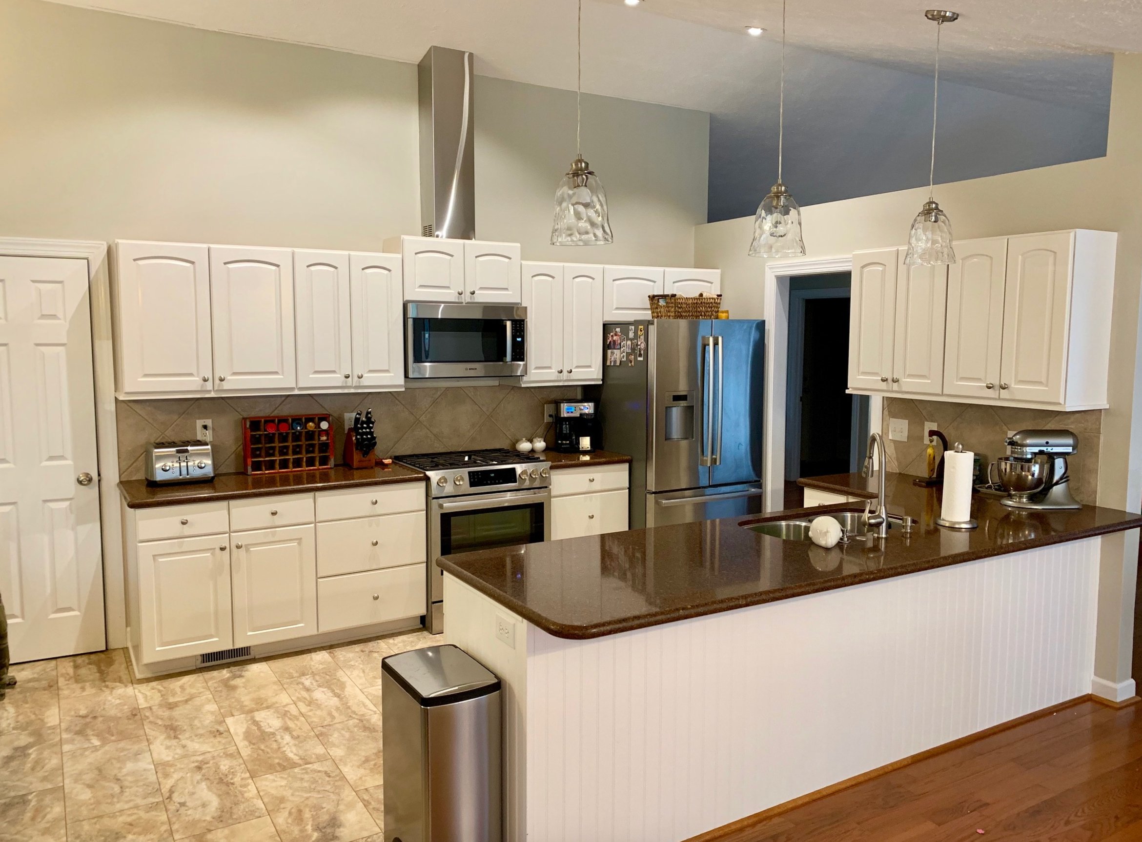
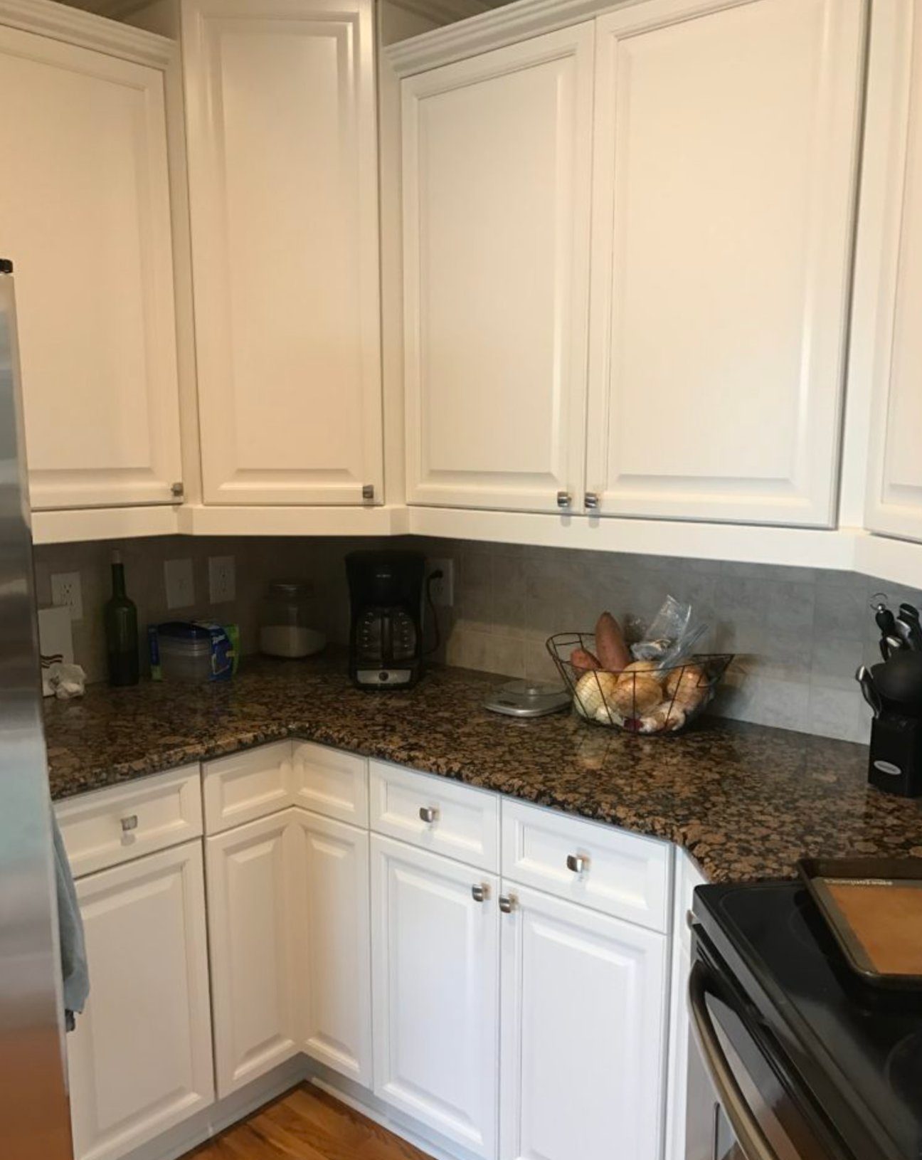
The trick with this shade is to test it on a large sample board or a spare cabinet door. A tiny chip will not show how the undertone behaves across a whole cabinet run.
Check Origami White directly against the countertop, backsplash, appliance finish, and floor. If any one of those surfaces makes it look muddy, choose a cleaner or warmer white instead.
11. Decorator's White by Benjamin Moore

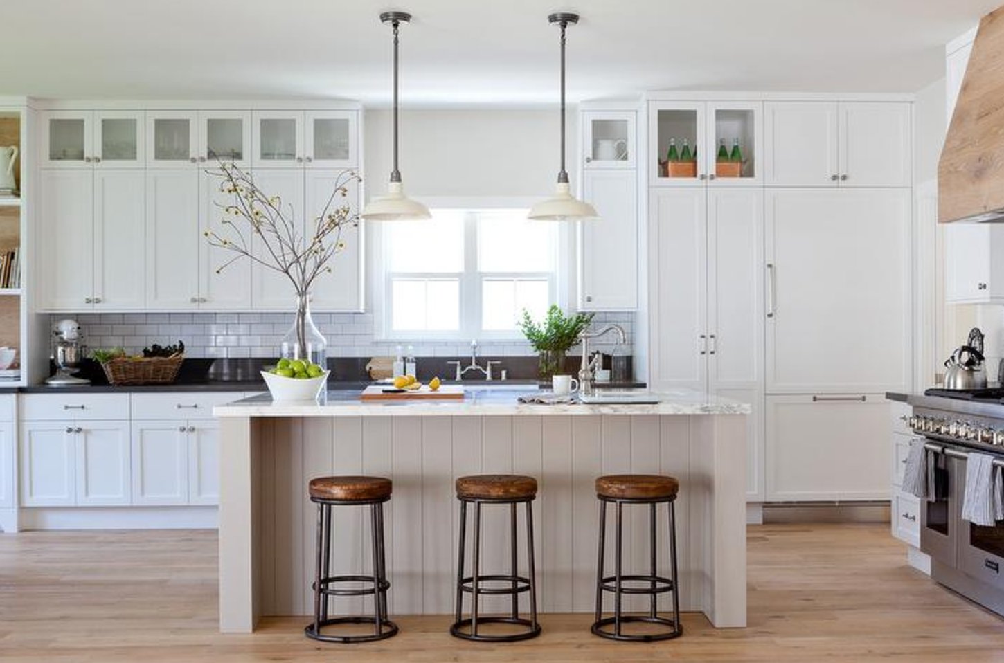
Benjamin Moore's Decorator's White is a cool, clean cabinet white. With an LRV of 84.6, it is bright but not as stark as Chantilly Lace, which comes in at 92.
The gray undertone gives it softness and depth. It also makes the color less forgiving around cream tile, warm granite, or yellowed trim.
I have found this shade useful in both east- and west-facing rooms. In east-facing spaces, the cool tones are most noticeable in the morning and mellow by midday.
On the western side, it does the opposite. The soft white gradually picks up bluish undertones after noon.
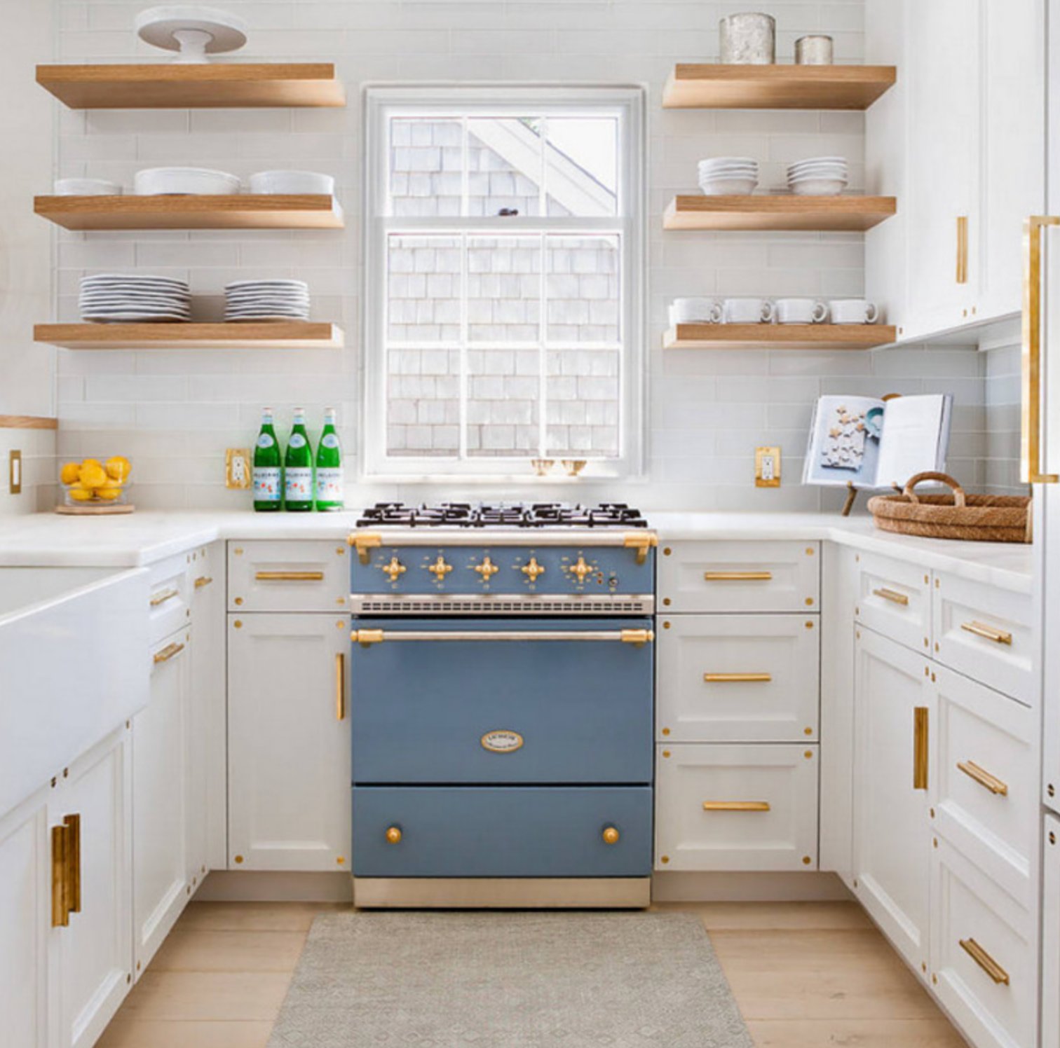
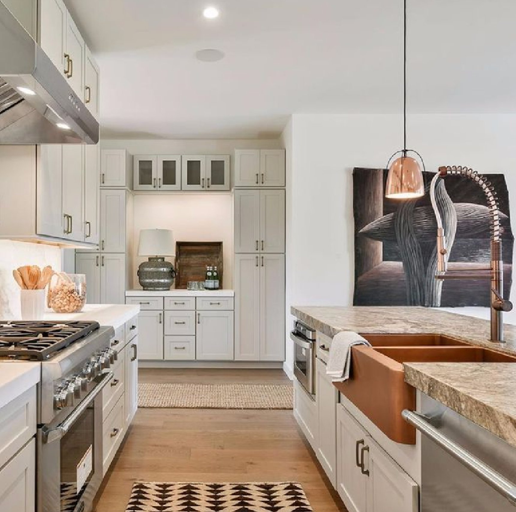
Decorator's White pairs well with natural wood and bold accent colors. The gray undertone can be limiting if you plan to use it on both cabinets and walls, so test it in both sheens before painting everything the same color.
12. High Reflective White by Sherwin Williams


High Reflective White is the cabinet color to test if you want the purest Sherwin-Williams white possible. Unlike softer Pure White or warmer Alabaster, it gives you a crisp look with an LRV of 93, one of the highest you will find.
Coverage is the catch. It does not hide as easily as other whites, so use a high-quality cabinet paint or a premium line like Emerald, where it is called Ultra White.
Spending more on better paint can save money and time if it gets you to coverage in 1 to 2 coats instead of 4 to 5. That assumes the doors are cleaned, sanded, primed, and not bleeding through from old stain.
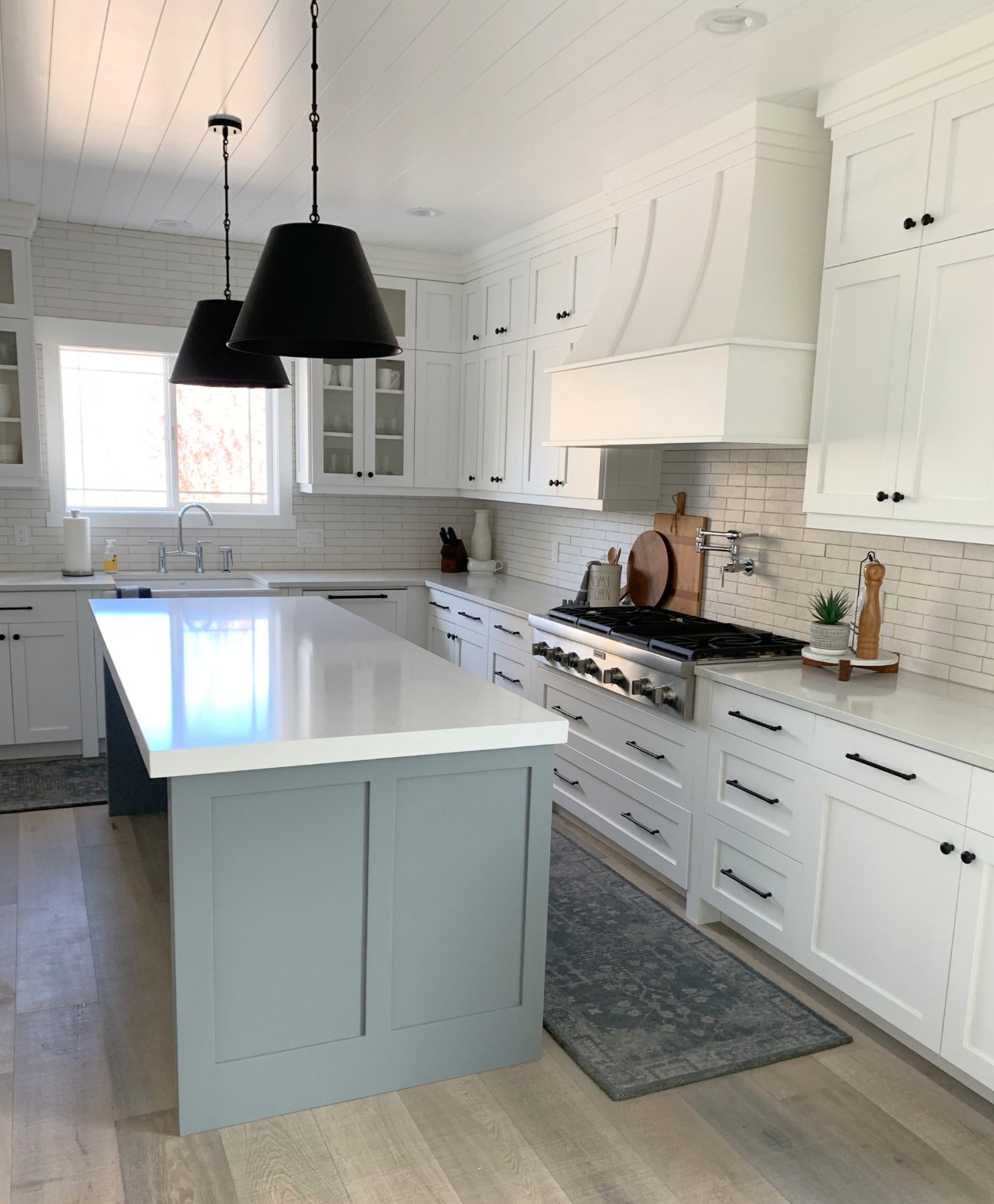
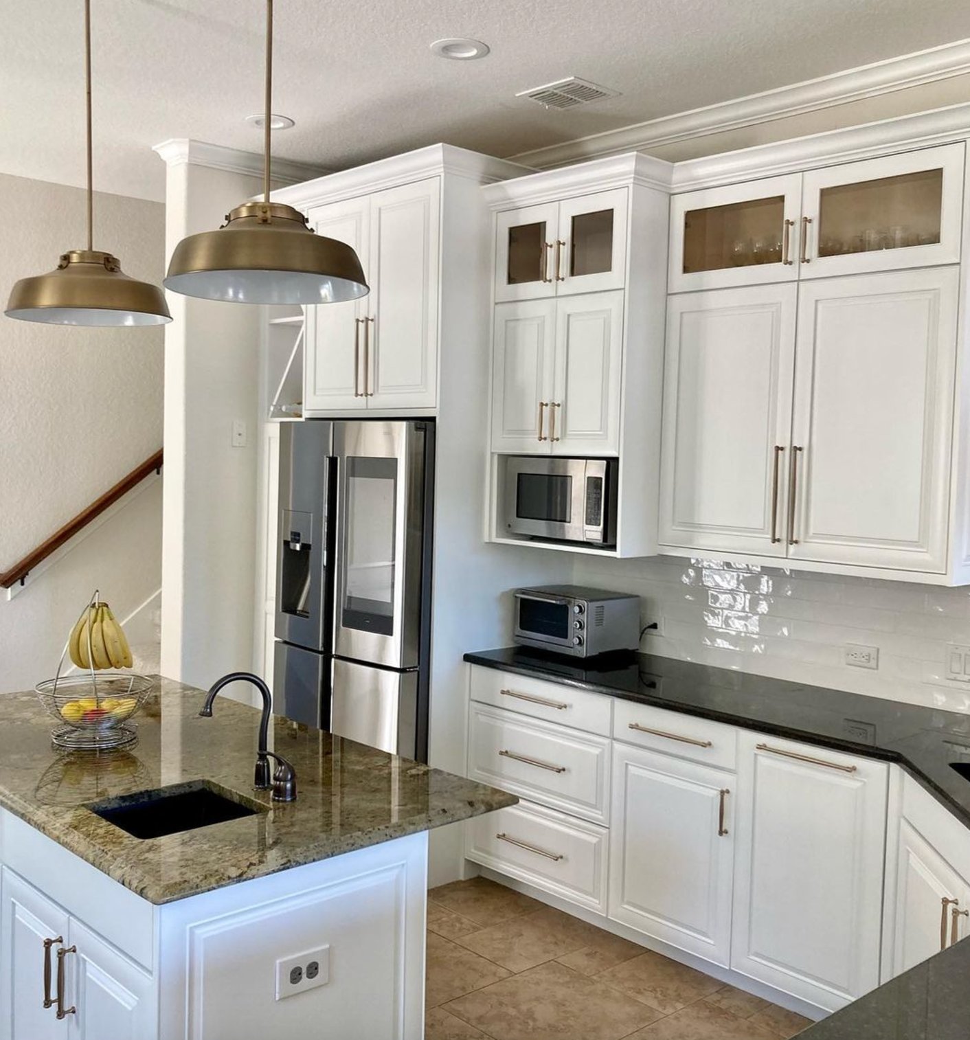
If a store tries to swap in "enhanced" Extra White for High Reflective White, do not treat it as the same color. Extra White has an LRV of 86 and gives a softer look.
13. Natural Cream by Benjamin Moore

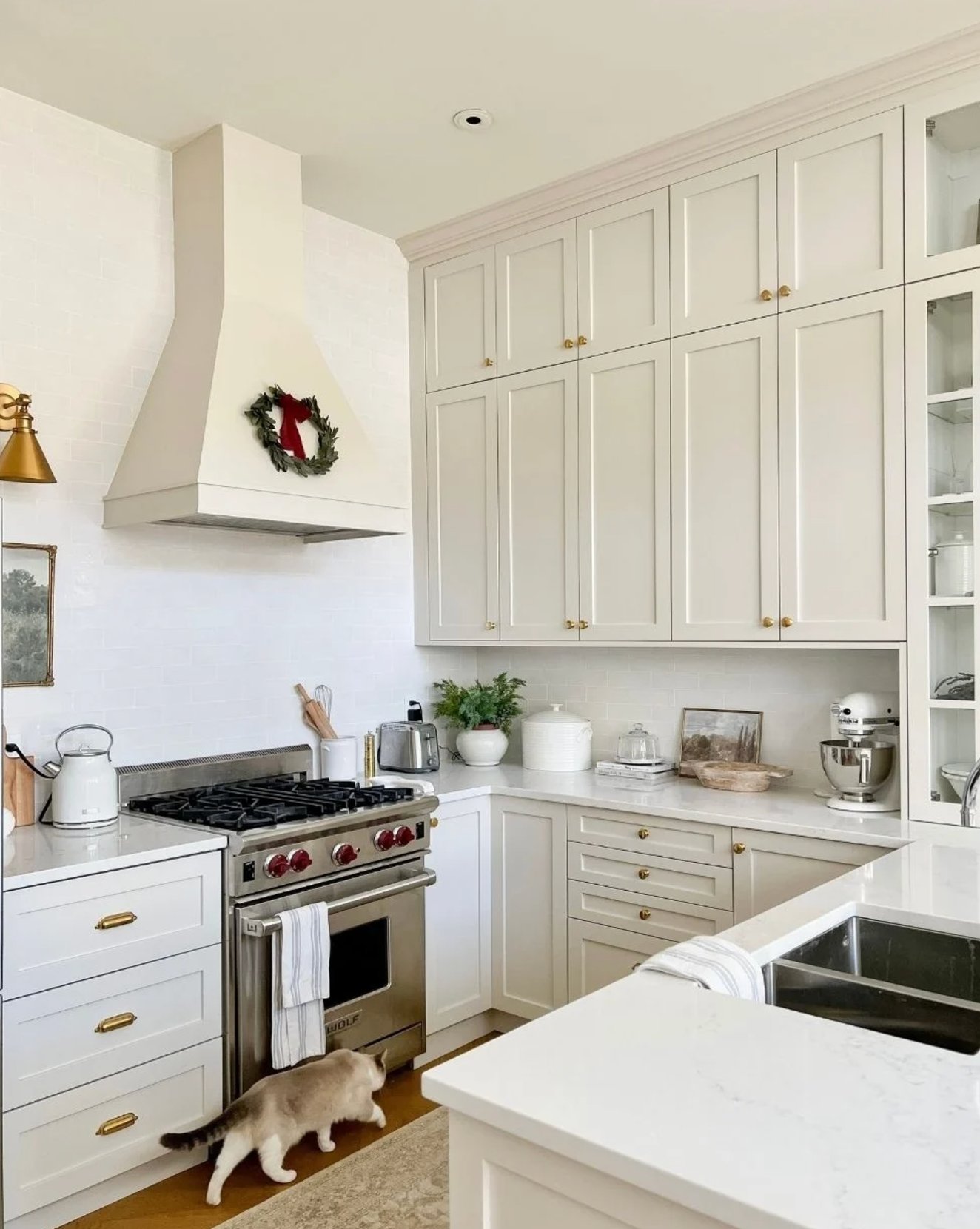
Natural Cream is the outlier on this list because it is not a true white. With an LRV of 64.78, it sits between white and beige with a warm greige undertone.
Unlike Revere Pewter and Edgecomb Gray, it tends to stay steadier without going purple. It is light enough to keep a kitchen open, but it has enough depth to hold up in bright rooms without washing out.
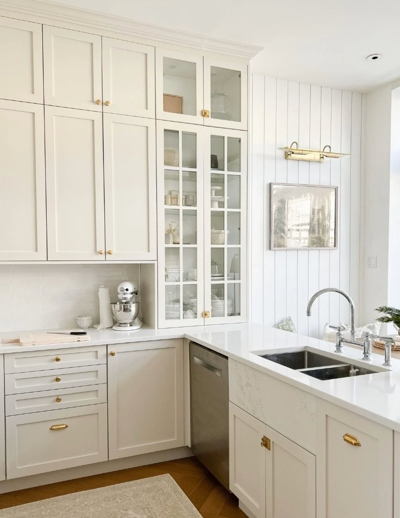
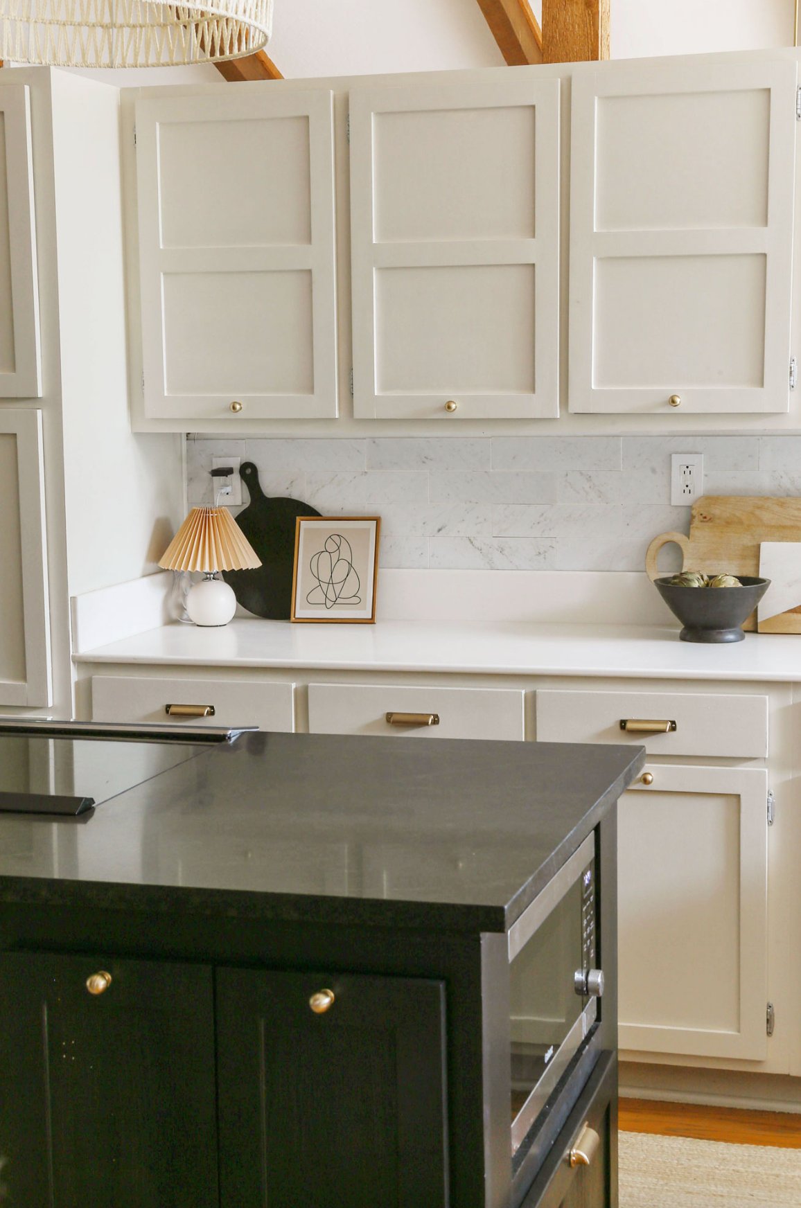
In a finished room, Natural Cream often reads like a lighter cream, especially next to stronger contrast colors. It is a smart cabinet choice when true white makes the countertop or floor look too warm. Pairing it with pure white walls like Chantilly Lace can make the cabinets look intentional instead of merely off-white.
How to Choose the Right White Paint for Cabinets?
1. Consider Natural Light Direction:
- South-facing kitchens: use grayish whites like Benjamin Moore Decorator's White to balance warm afternoon light
- North-facing kitchens: choose warm whites like Benjamin Moore White Dove so the cabinets do not look cold
- Mixed lighting spaces: test pure whites like Benjamin Moore Chantilly Lace because they shift less between exposures
- LED lighting considerations: avoid very warm whites under warm LEDs because they can yellow, and test slightly gray undertones instead
2. Factor in Kitchen Size:
- Large kitchens: mix warm whites with dark countertops so long cabinet runs do not look blank
- Small kitchens: use pure whites in a monochromatic scheme to reduce visual breaks and make the room feel more open
3. Match Your Style:
- Modern kitchens with metal hardware: test cool white shades first
- Classic or country style with wood elements: start with creamy whites
4. Test Your Samples:
- Consider reflections from surrounding surfaces, especially flooring, counters, ceiling color, and greenery outside the window
- Apply Peel-and-Stick samples on cabinet doors, not just on the wall
- Check in morning, afternoon, and evening light with the kitchen lights on and off
- Test on different walls and cabinet faces because uppers, lowers, and island panels receive different light
- Observe for 2 to 3 days minimum before buying cabinet paint
For the actual cabinet finish, choose a durable cabinet-grade paint in satin or semi-gloss. Clean grease first, scuff sand glossy doors, prime slick or stained surfaces, and let each coat cure as directed. The right white will still fail if old cooking residue, tannin bleed, or rushed dry time sits under it.

I'm Elizabeth, your go-to guide for all things paint and design! My days are filled with color swatches and innovative room makeovers. When I'm not painting the town - literally - I'm soaking up inspiration from my travels. This blog is my way of sharing my passion and making the world a more vibrant place, one color palette at a time.