Repose Gray vs Agreeable Gray
If you are choosing between Repose Gray and Agreeable Gray, the safer answer for most homes is Agreeable Gray. Repose Gray is the better pick when you want a cleaner, more defined gray and you are trying to avoid a beige room.
Both Sherwin-Williams colors are top 10 bestsellers because they solve the same problem: they give you a soft neutral that does not feel icy. The difference is in the undertone balance. Agreeable Gray reads warmer and more flexible, while Repose Gray reads a little cooler, quieter, and more architectural.
I pulled together more than 20 photos from real rooms so you can see the part a paint chip cannot show, how each color behaves with daylight, cabinetry, flooring, trim, and exterior light.
Undertones & Character
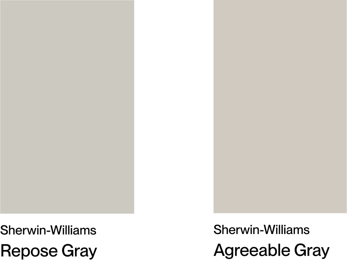
Repose Gray by Sherwin-Williams sits right between gray and beige, with an LRV of 58. It has a quiet green undertone, and in some shadowed corners you may catch a little pink or violet.
In real houses, Repose Gray is the more predictable of the two. It works in bright living rooms, interior hallways, and spaces with black hardware or simple white trim because it keeps a clearer gray identity. Use it when beige walls would fight the look you are trying to build.
Agreeable Gray, another Sherwin-Williams shade, comes in slightly lighter, with an LRV of 60, and it definitely leans warmer. It has a green undertone too, but the beige in the mix softens it and makes the color easier to pair with common flooring and furniture.
The caution with Agreeable Gray is low light. In dark corners, or beside cool north light, it can show a muted violet cast. In bright open rooms, it usually looks its best because the warmth has enough light to read as intentional instead of dull.
Putting these two head to head? Agreeable Gray works with more existing materials, especially wood floors, cream fabrics, and warmer stone. It needs more testing because its undertones shift more.
Repose Gray is closer to a "what you see is what you get" color. It handles changing light well, but it can feel a little more tailored and less cozy.
I use Agreeable Gray when the room needs warmth without going tan. I use Repose Gray when the room needs a cleaner neutral that still has enough softness for everyday living.
| SW Repose Gray | SW Agreeable Gray | |
|---|---|---|
| Color Code | SW 7015 | SW 7029 |
| Light Reflectance Value (LRV) | 58 | 60 |
| Color Family | Neutral | Neutral |
| Undertones | Beige/taupe, green; Can show purple/pink in shadows | Warm green, violet (subtle), beige |
Room-by-Room Comparison
The right choice changes by room. Wall color has to answer to fixed finishes first, then daylight, then the mood you want from the space.
Living Rooms
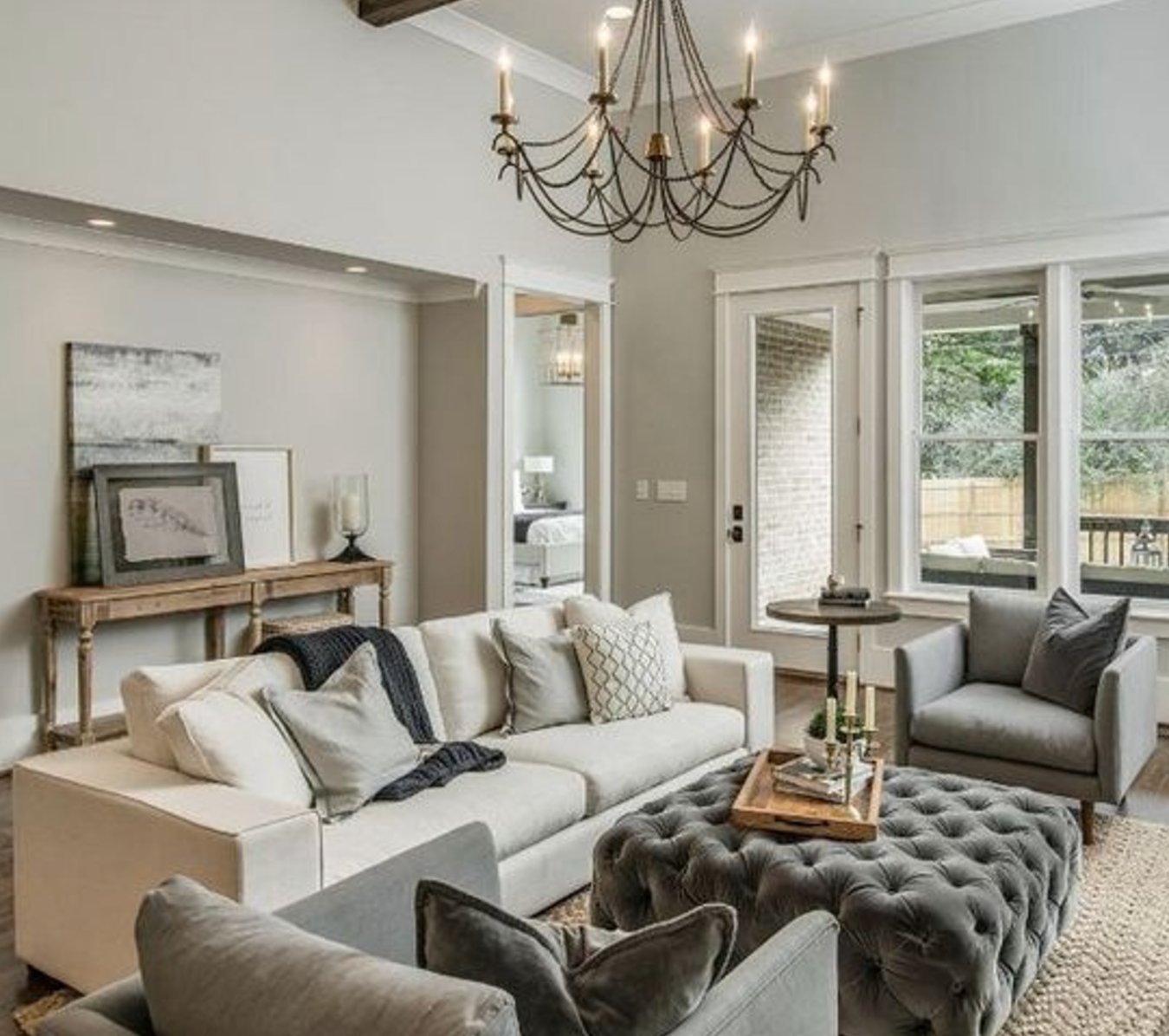

Repose Gray is strongest in living rooms with good window light and clean-lined furniture. On sunny days it reads as a true soft gray. On cloudy days the beige undertone shows more, which keeps it from turning cold. It is a good partner for wood furniture, black accents, matte nickel, and aged bronze.
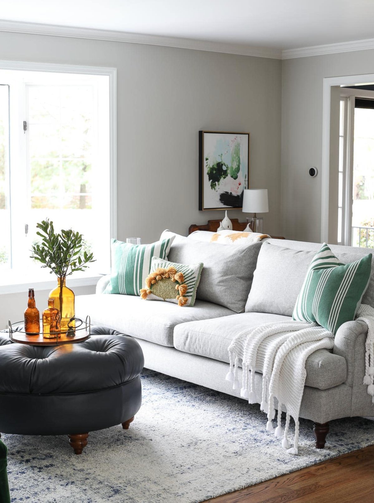
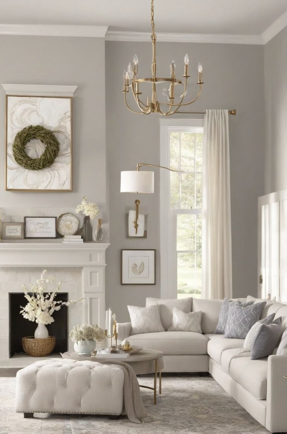
Agreeable Gray is the better living room choice when the room connects to a kitchen, entry, or hallway and you need one color to cooperate with several finishes. Its LRV of 60 gives it a bit more lift than Repose Gray, and the warmer base makes sofas, rugs, and wood tones easier to blend.
For open concept spaces, I would usually test Agreeable Gray first. Repose Gray can still win if the room has cooler stone, crisp white trim, or a more modern palette.
Kitchens


Repose Gray stays more controlled in kitchens than Agreeable Gray. It has enough depth to stand next to white cabinets, and it keeps marble or quartz counters looking crisp instead of creamy. I like it best with cooler counters, stainless appliances, and simple cabinet profiles.
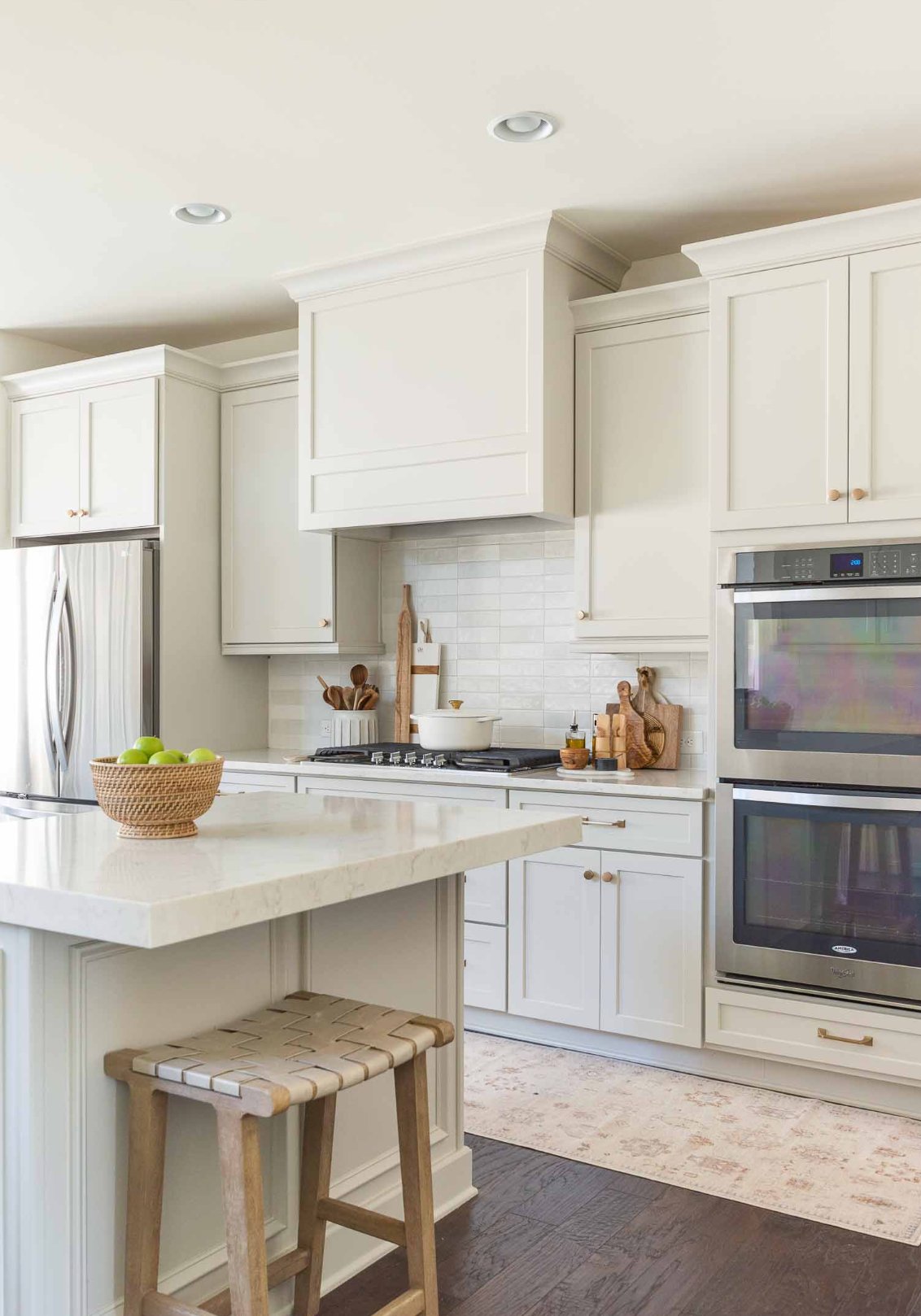

Agreeable Gray gives kitchens a softer read. Because its LRV is 60 versus Repose Gray at 58, it can make a small or chopped-up kitchen feel a little more open.
It is also more forgiving with the small smudges and cooking marks that show up on light walls. Choose it over Repose Gray if your kitchen has warm wood cabinets, beige tile, travertine, or creamier counters.
Bedrooms
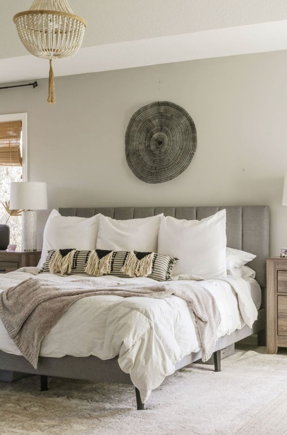
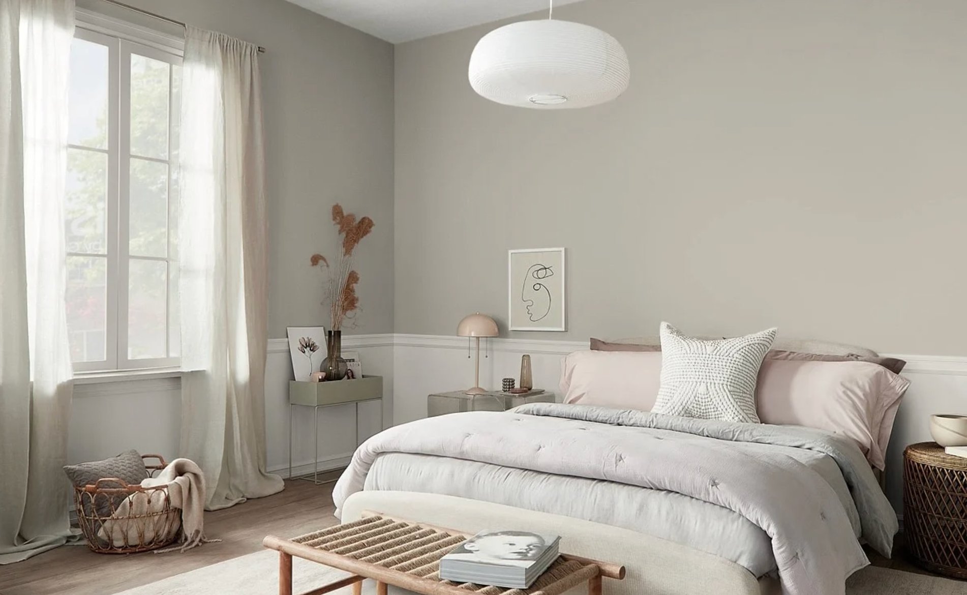
Repose Gray works well in bedrooms when you want calm without the room feeling heavy. It looks crisper in morning light, then the beige side comes forward at night. In a north-facing bedroom, sample it carefully because the green undertone can become more obvious.
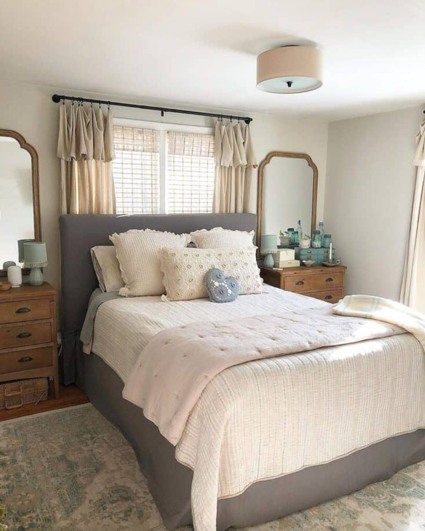
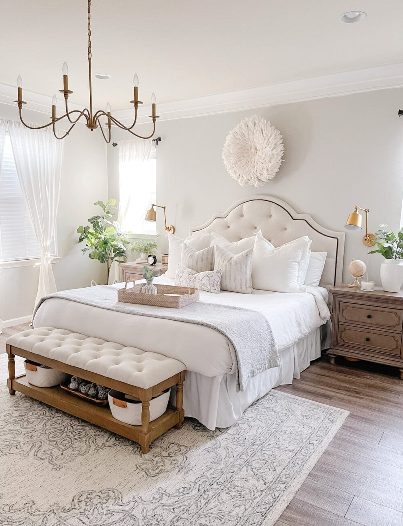
Agreeable Gray is the softer bedroom color. It is especially good for rooms used mostly in the evening, where lamp light brings out the warmth. It also pairs well with pastel bedding, cream upholstery, and medium wood furniture.
Exteriors
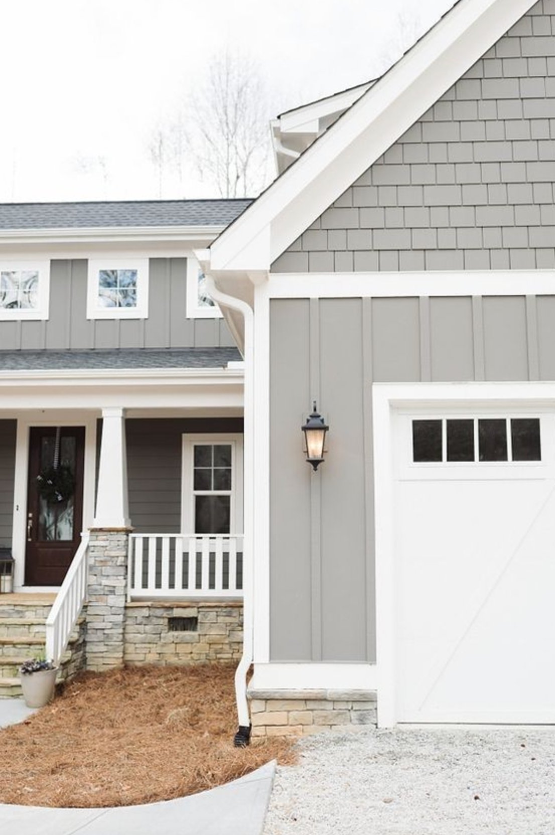
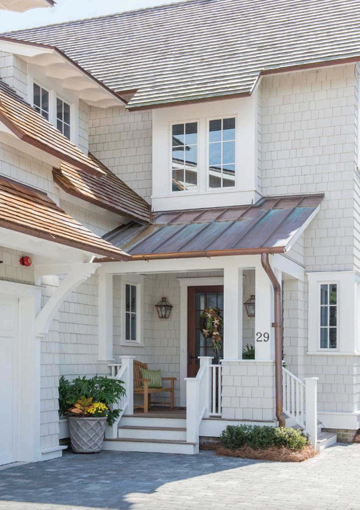
On exteriors, Repose Gray gives a modern gray look without going stark. Direct sun makes it read cleaner and lighter. In shade, the beige side warms it up. It is a strong choice with white trim, charcoal shutters, black windows, and darker rooflines.
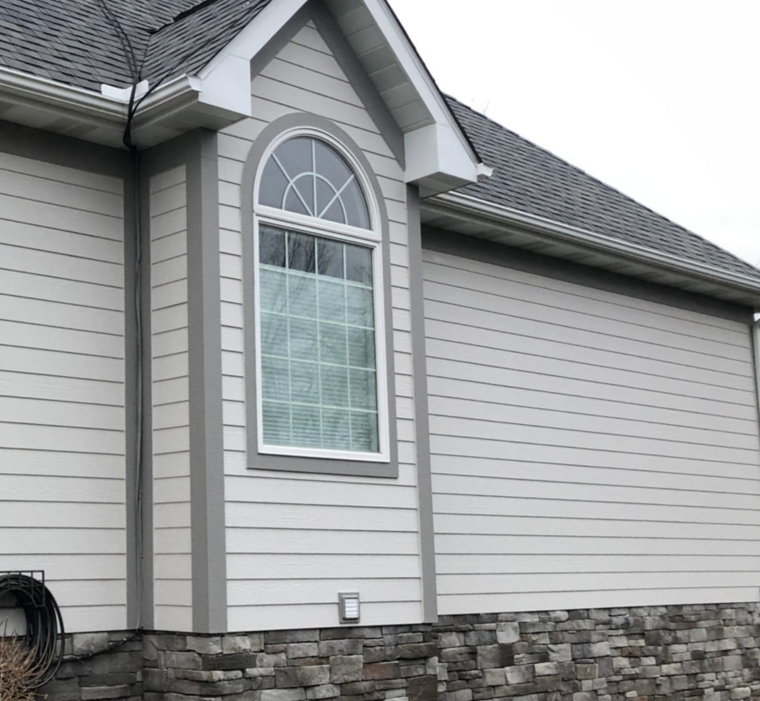
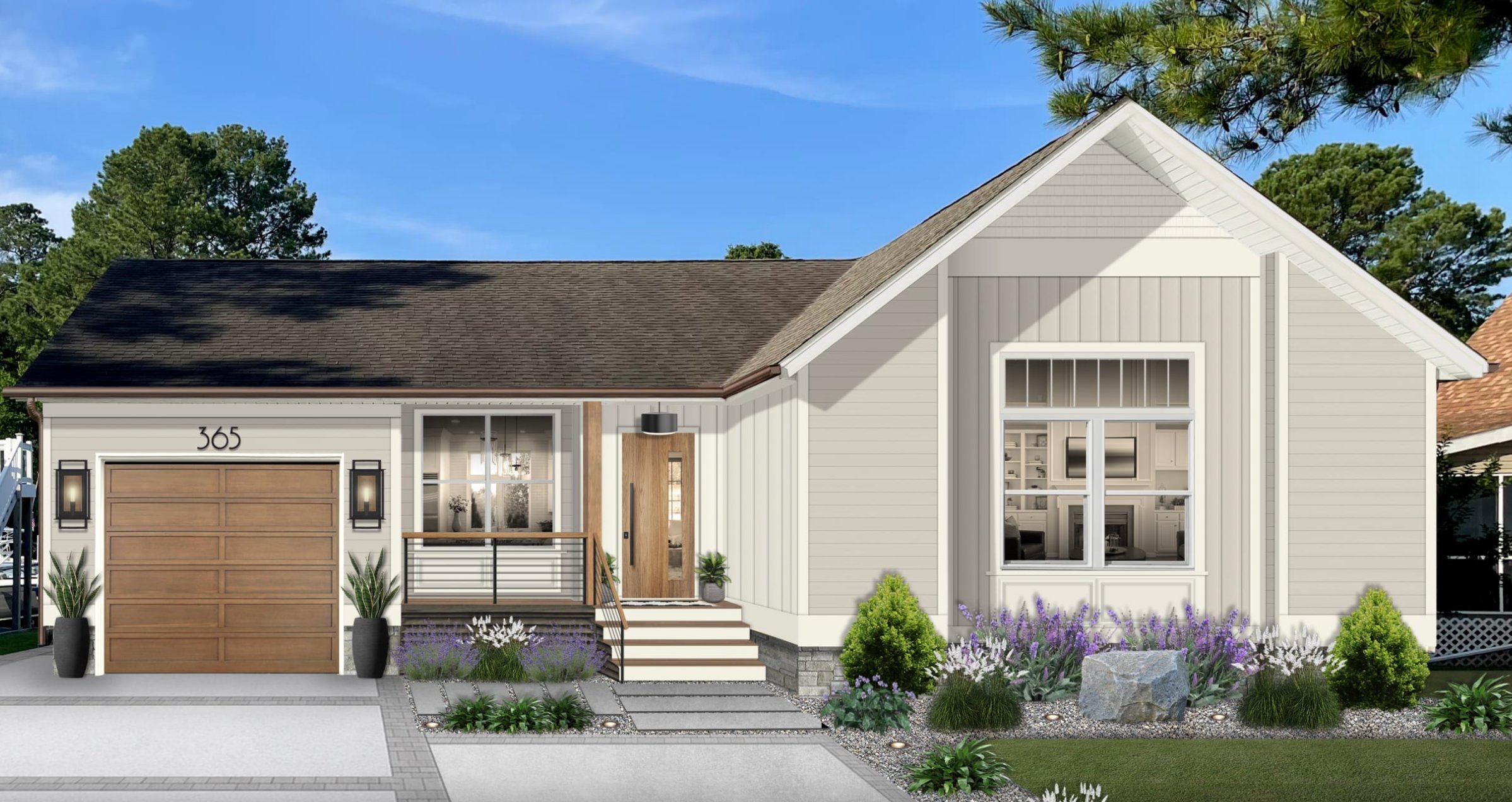
Agreeable Gray changes more outside than Repose Gray. Morning sun, afternoon shade, brick, stone, and roof color can all pull it warmer or cooler, which gives the facade more movement.
It reads warmer on large surfaces, so it can be excellent on traditional homes, brick homes, and houses with warmer stone. Be pickier with trim. A too-yellow white can make Agreeable Gray look beige, while a clean white usually sharpens it.
Lighting Impact
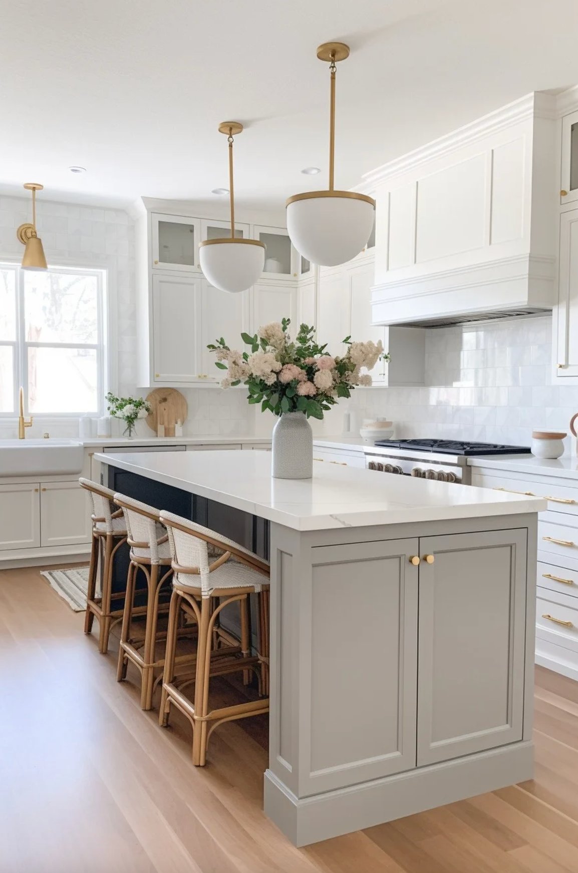
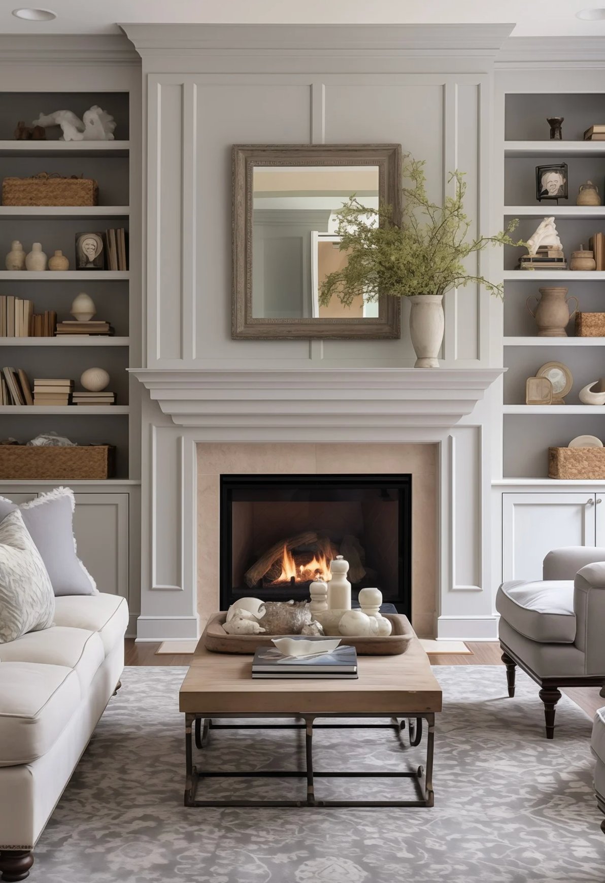
Repose Gray reads most like a classic gray in sunny spaces, which is why I like it in bright living rooms and kitchens. It still has warmth, but the first impression is gray.
In shadow, its beige side shows more, and sometimes the green undertone appears. Under evening bulbs, especially warmer bulbs, it can lean slightly green, but it usually avoids the hard blue look that makes many grays feel cold.
It handles warm and cool lighting better than many grays. The main risk is a dark room with little natural light, where the beige undertone can take over and make the color feel flatter.
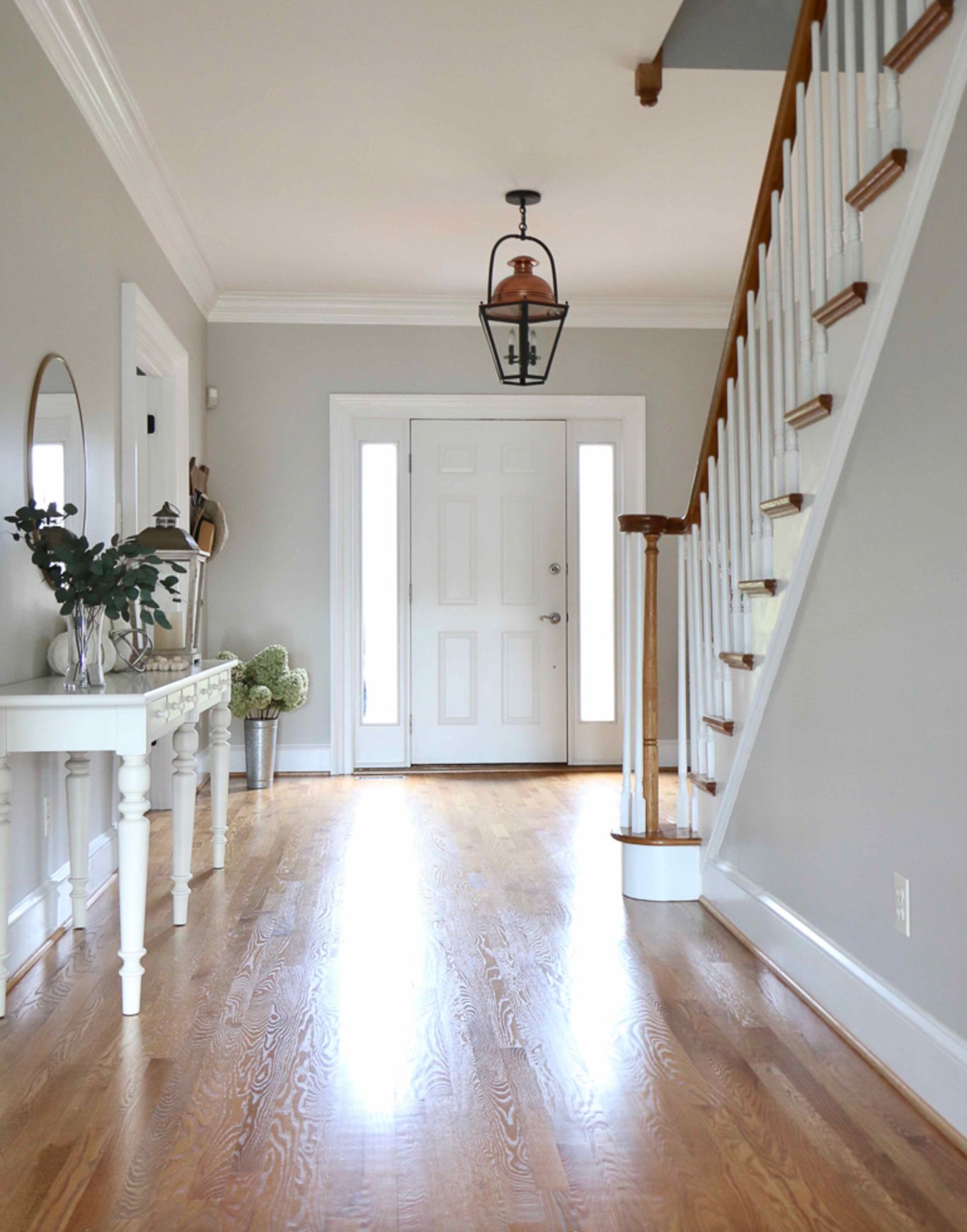

Agreeable Gray is a touch lighter than Repose Gray, so it feels airier in bright spaces. The difference between LRV 60 and LRV 58 is not dramatic, but you can see it on full walls.
Its undertones are softer and more blended, so it often looks easier with furniture than Repose Gray. It is particularly useful in rooms with steady artificial lighting because the color stays gentle instead of sharp.
In rooms where the light changes all day, Agreeable Gray can surprise you. Test it on the wall where you plan to use it, next to flooring and trim, not on a loose card across the room. Overall, it is warmer and easiergoing than Repose Gray.
Coordinating Colors
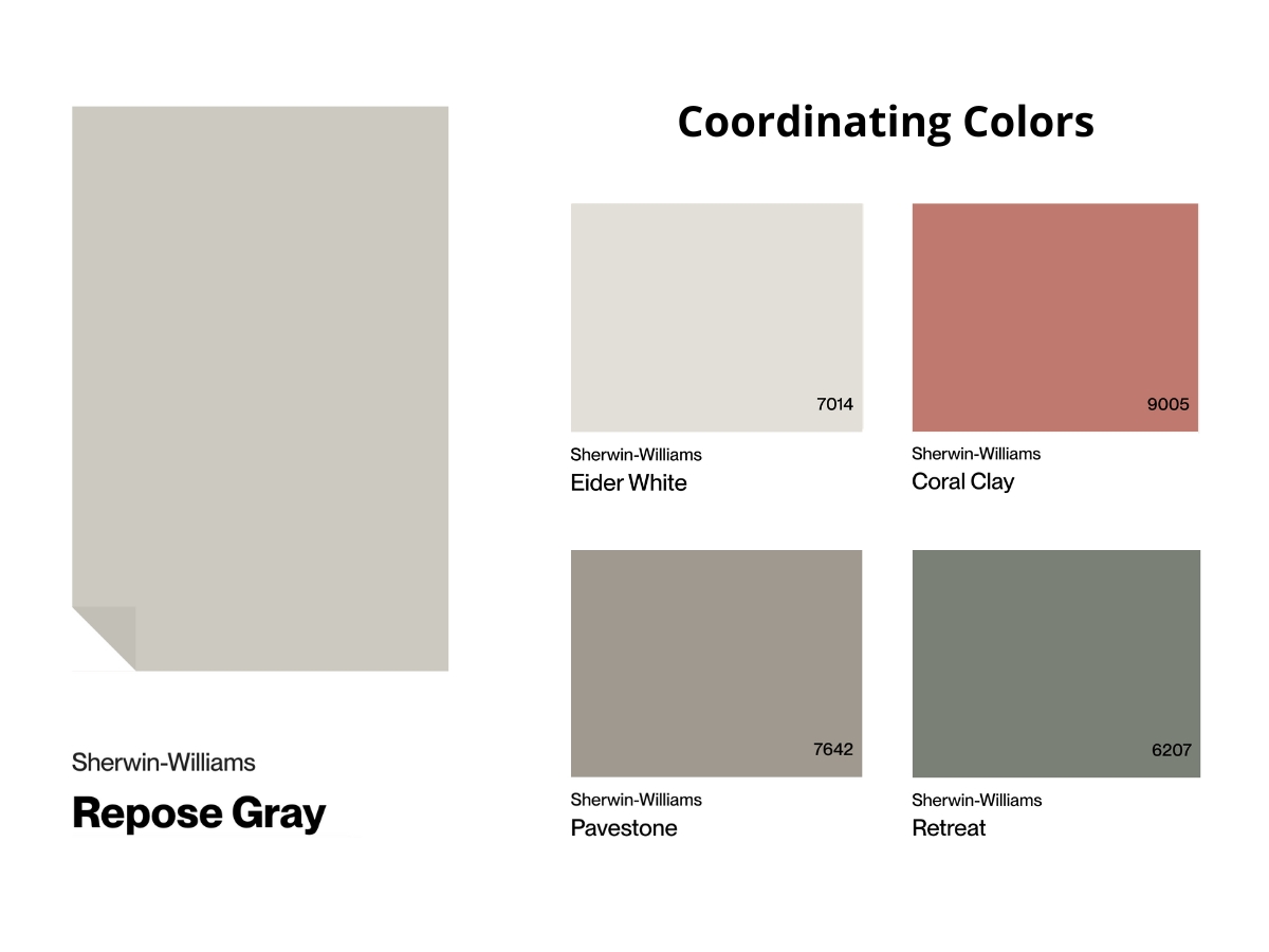
Repose Gray is a natural fit with dark wood, leather, white fabrics, matte nickel, and aged bronze. It also works well with deep blues and earthy greens because those colors give its cooler gray side something intentional to relate to.
It is a good backdrop for artwork and large plants because it does not compete with strong color or texture. If your accents are mostly black, white, wood, and metal, Repose Gray will usually look cleaner than Agreeable Gray.
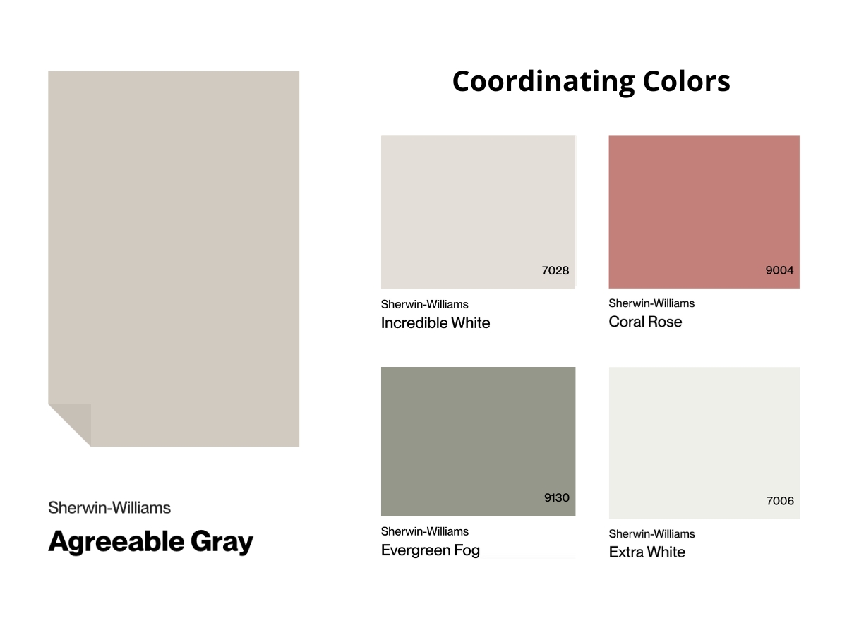
Agreeable Gray is the easier color to coordinate when a room already has several undertones. It can work with warm and cool accents, from soft pink to muted green. I like it with woven baskets, linen curtains, ceramics, and lighter wood because those textures bring out its warmth.
Be careful with yellow accessories. Too much yellow can push the whole room into beige territory, especially if the flooring or bulbs are already warm.
Making Your Decision
Here is my honest verdict: Agreeable Gray wins for more homes, but Repose Gray is the better color when the design needs discipline.
I reach for Repose Gray when I want a more defined, structured gray. It keeps its character in different lights and makes a strong backdrop for modern spaces.
Choose Repose Gray if you are trying to avoid an obvious beige look but do not want a cold gray. It is the better bet with cooler counters, white trim, black accents, simple furnishings, and rooms that already get good natural light.
Agreeable Gray is my first sample for clients who want something softer. Its higher LRV helps rooms feel a little bigger, and the warm undertone makes well-lit spaces feel comfortable without looking yellow.
Choose Agreeable Gray if you have warm wood floors, beige tile, cream fabrics, or an open layout where one neutral has to connect several rooms. If your room is dark or north-facing, sample it beside the trim before committing because that violet note can appear.
Sample both colors in your actual space under morning, afternoon, and evening light. Put the samples beside trim, flooring, and counters. That small test is cheaper than repainting a room after the undertone shows up on every wall.

I'm Elizabeth, your go-to guide for all things paint and design! My days are filled with color swatches and innovative room makeovers. When I'm not painting the town - literally - I'm soaking up inspiration from my travels. This blog is my way of sharing my passion and making the world a more vibrant place, one color palette at a time.