Best White Paint Colors for Trim
White trim paint looks simple until you hold five white chips against your actual baseboards. Then you see the yellow, gray, blue, and cream that never showed up on the tiny store card.
Those small undertone shifts matter because trim sits next to everything: walls, floors, doors, cabinets, tile, and daylight. A clean white can make old casing look sharper, while the wrong white can make fresh paint look dingy before the second coat dries.
Below are the white paint colors I would actually consider for baseboards, door frames, crown molding, stair rails, and ceiling details, plus where each one can go wrong.
Why White Paint is a Great Choice for Trim
White paint is useful on trim because it gives the eye a clean stopping point. It outlines doors, windows, baseboards, and crown molding so the room looks finished instead of patched together.
The undertone matters more than the paint name. Cool whites can look sharp with gray, blue, black, and modern finishes. Warm whites usually sit better with oak floors, cream walls, brass, limestone, and older homes. For light walls, choose trim that is a little lighter or a little cleaner so the edge still reads. With dark walls, a brighter white gives you the crisp line most people are picturing.
White trim can also make a room feel taller because the baseboards and crown create a visible outline. The effect is strongest with taller baseboards, thicker casing, or rooms where the wall color has enough contrast to show the shape of the trim.
Before you commit, brush two coats on a scrap board or directly on primed trim in a hidden spot. Check it in morning light, evening light, and with your bulbs on. Satin and semi-gloss reflect more light than eggshell wall paint, so the same white can look brighter and cooler once it is on trim.
For most trim, I use satin or semi-gloss. Semi-gloss is easier to wipe on baseboards and door casing, while satin is a little softer on older trim with dents, heavy brush marks, or uneven caulk lines.
1. White Dove by Benjamin Moore

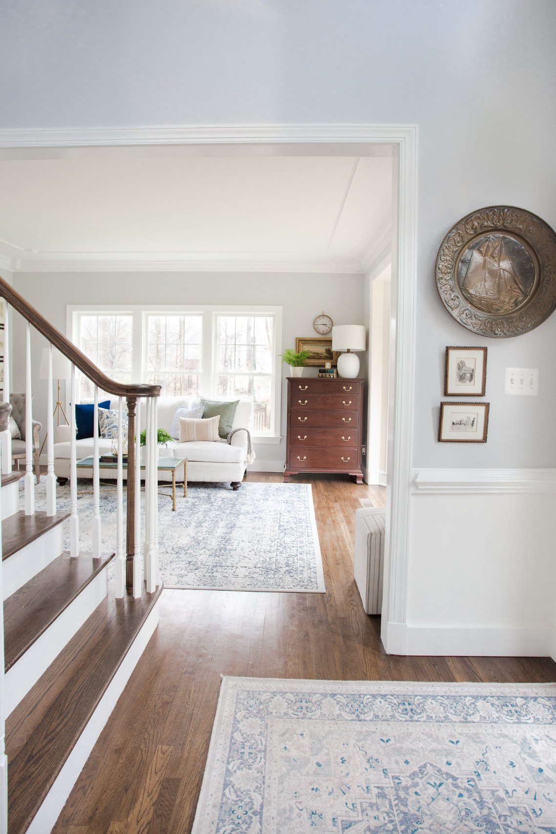
White Dove is one of the safest trim whites when the room already has warmth in it. In the interior photo, it gives the door frames and stair railings a clear outline without looking chalky against the lighter walls.
It has a soft creamy undertone, which helps when your walls are off-white, greige, taupe, or a warm neutral. Where the trim meets the wall, the edge looks intentional instead of icy.
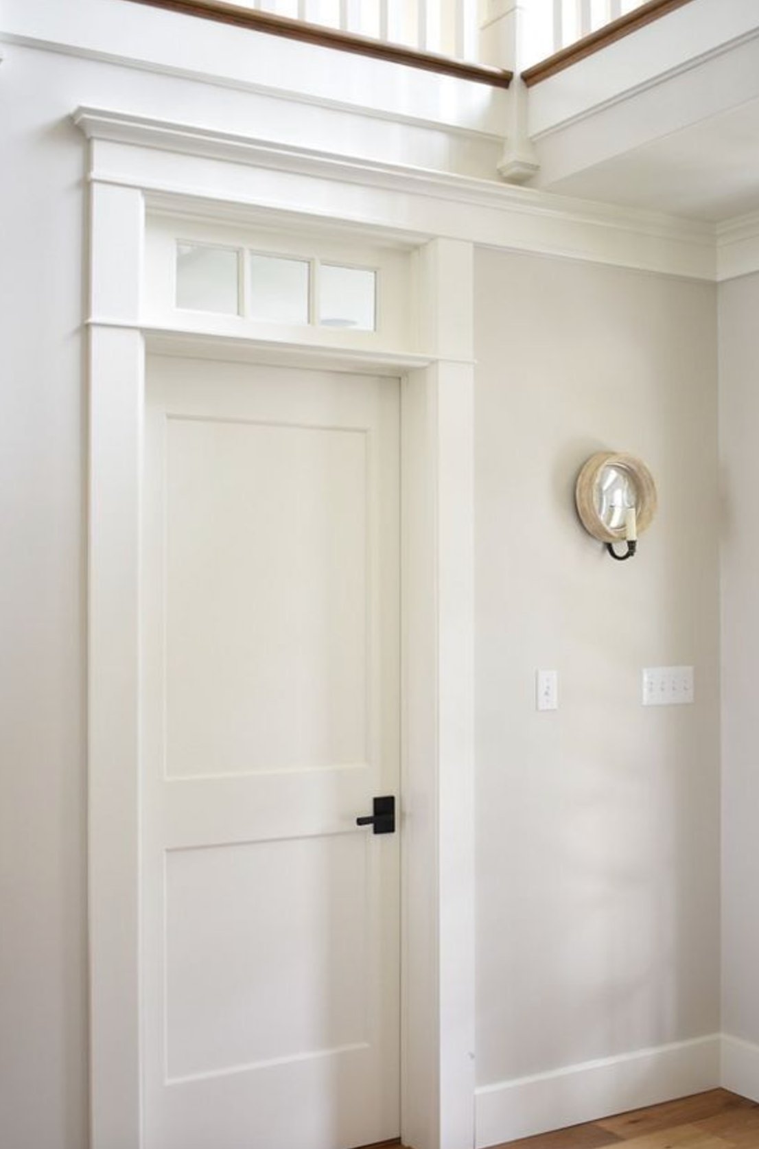
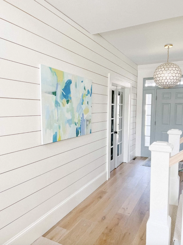
This is also a practical choice if you do not want trim that reads yellow after a few years. Paint color does not stop wood tannins, old oil paint, or nicotine from bleeding through, so prime stained or older trim with the right bonding or stain-blocking primer before you blame the white.
White Dove can handle more modern pieces too, including abstract art, black accents, and geometric lighting. It stays quiet enough that the trim looks maintained, not like the loudest thing in the room.
2. Simply White by Benjamin Moore

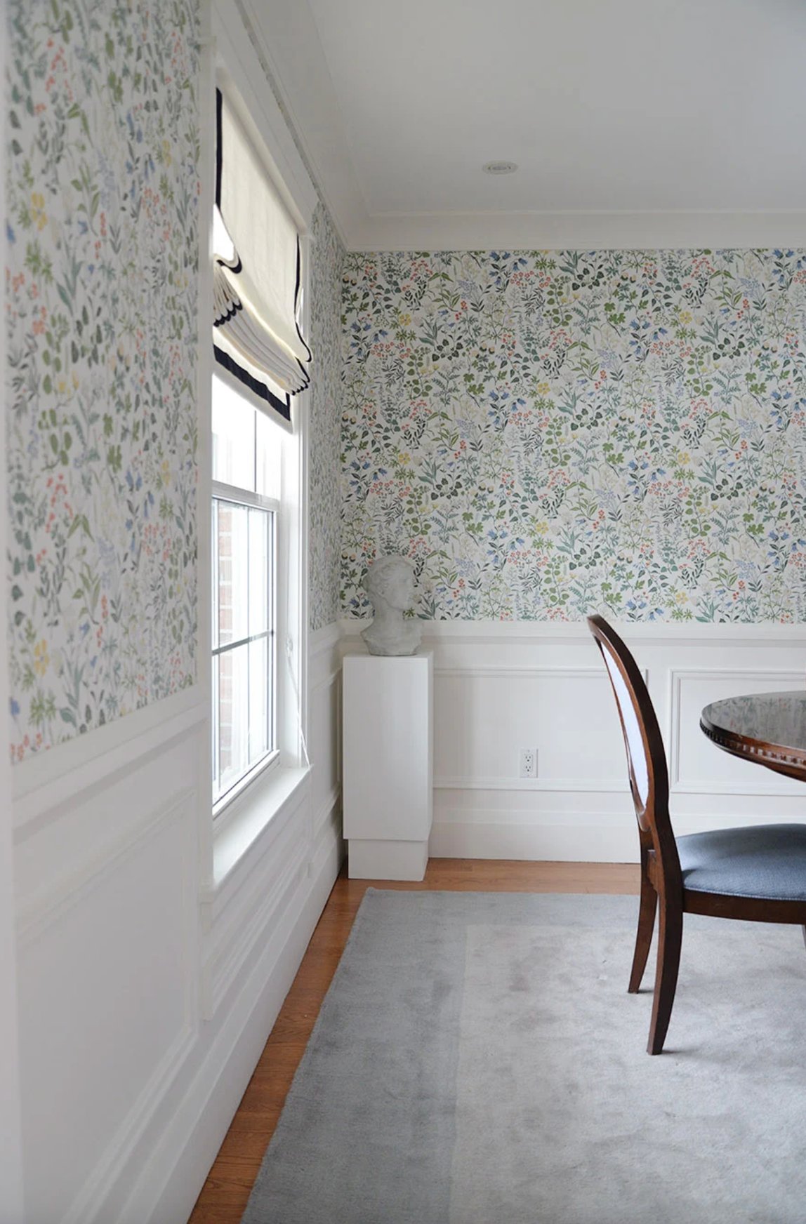
Simply White by Benjamin Moore is a strong trim color when you want bright white without the hard edge of a gallery white. With patterned wallpaper, it frames the pattern cleanly and gives your eye a place to rest.
The paint has an LRV (Light Reflectance Value) of 91.7, so it is bright enough to stand out on trim but not so bright that it fights darker walls. That balance matters with bold wallpaper, navy walls, deep green rooms, and saturated dining rooms.
Its slight warmth is the reason it works in so many homes. It can sit beside warm wood floors and still look clean next to cooler fabrics or stone. I would sample it carefully in very sunny rooms, where that warmth can become more noticeable.
3. Extra White by Sherwin Williams

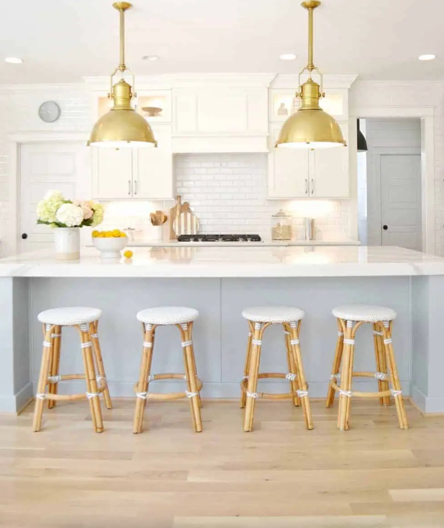
Extra White by Sherwin-Williams is the choice I reach for when the project needs a clean true white. It has very little yellow or gray in it, which is why the trim and cabinets in this modern kitchen read fresh without looking fluorescent.
Extra White works well with gray, beige, black, and cooler wall colors because it gives the architecture a sharp edge. The tradeoff is that it can look too stark next to creamy walls, travertine, honey oak, or warm beige carpet. If your room has those finishes, compare it against White Dove or Alabaster before painting every baseboard.
4. Decorators White by Benjamin Moore

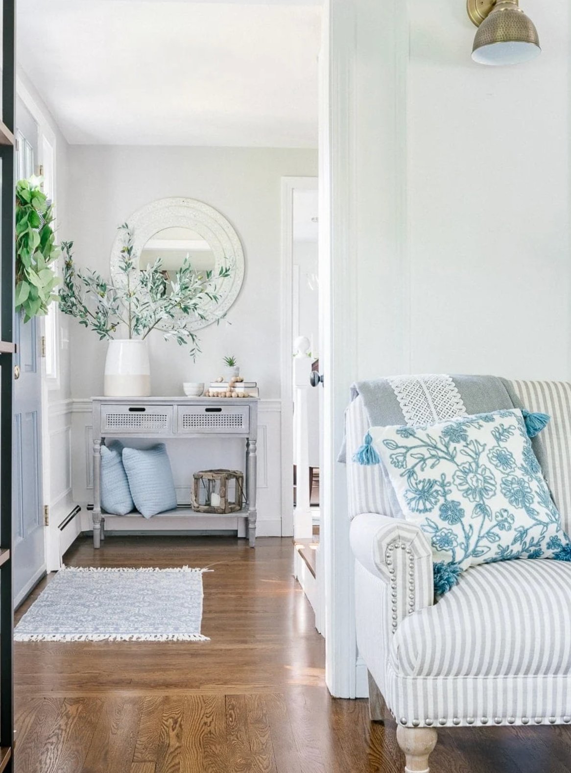
Decorator's White by Benjamin Moore is a crisp trim white with a cooler personality than White Dove or Simply White.
In this bright hallway, it defines the door frames and baseboards without weighing down the space. The color keeps a clean neutral tone and does not lean creamy, which is helpful if your walls, fabrics, or countertops already have blue, gray, or charcoal notes.
It pairs especially well with cool grays and blues like the ones in the pillows and decor. I would be more cautious using it beside warm ivory walls or yellowed oil-based trim, because the contrast can make the old warmth look dirtier.
5. Alabaster by Sherwin Williams

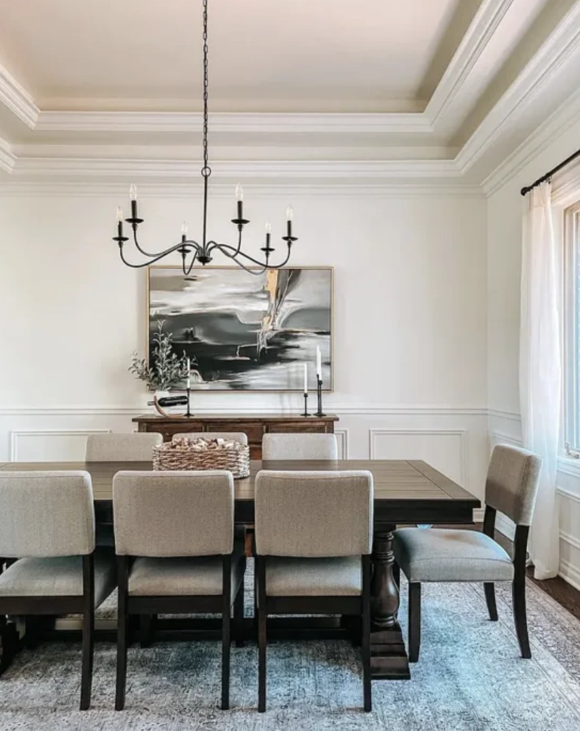
Sherwin-Williams Alabaster is a good trim choice when bright white would feel too sharp. In this dining room, painted completely in Alabaster, the trim still reads finished, but it does not shout against the walls.
Its subtle yellow undertone gives it more warmth than stark white options. With an LRV of 82, it brightens a room without creating that high-contrast white stripe effect.
Alabaster works well with neutral walls, dark furniture, aged brass, woven shades, and warm wood floors. In rooms with strong southern or western light, it will show more warmth. If your wall color is already creamy, sample first so the trim does not disappear.
6. Cotton Balls by Benjamin Moore

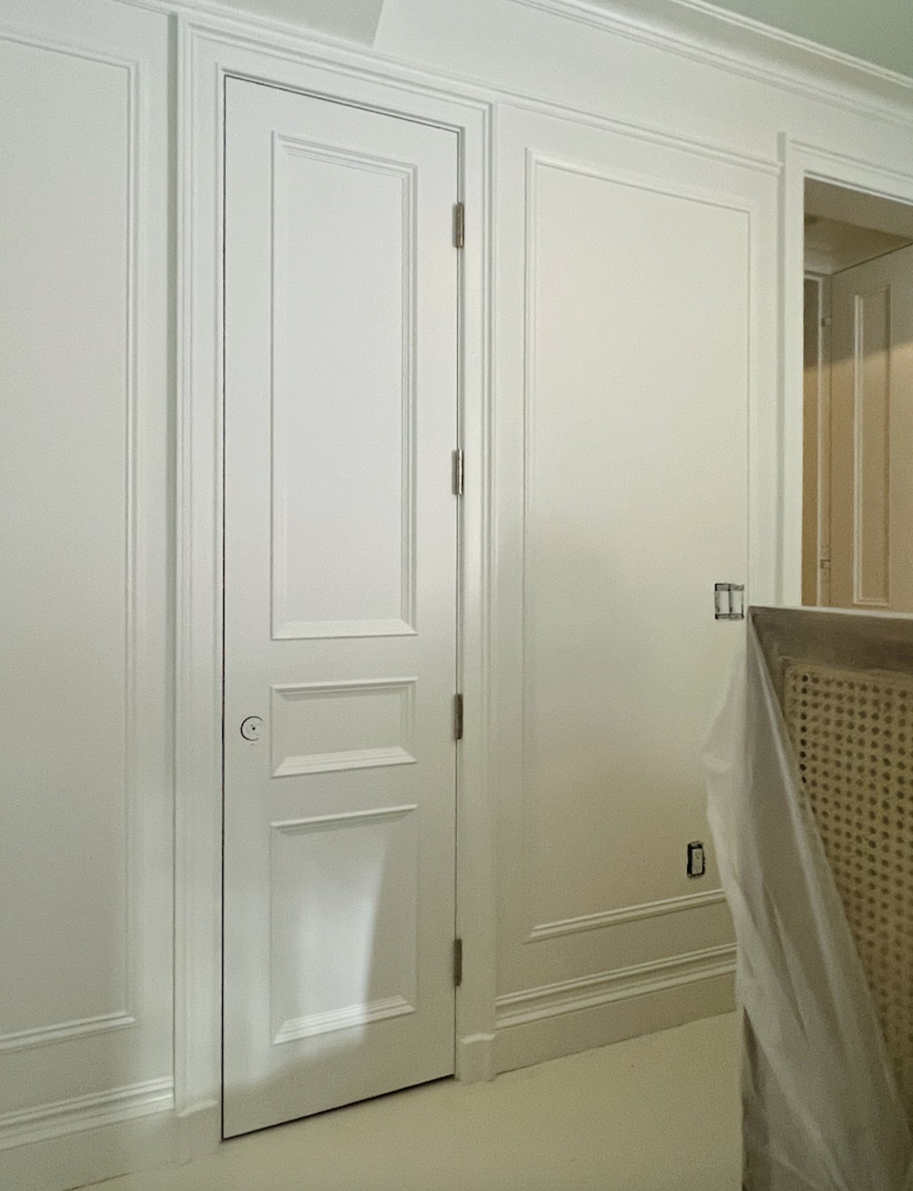
Cotton Balls is a classic white with a soft creamy undertone, so it is useful on trim when you want brightness without a blue cast.
In this interior, Cotton Balls creates a smooth transition with the light walls instead of a harsh outline. It is especially good in rooms that get southern or western light, where that hint of warmth looks intentional.
Use it when your trim needs to look clean but not brand-new bright. I would avoid it as the only white in a room with very cool marble, blue-gray walls, or chrome-heavy finishes unless the sample still looks balanced in your light.
7. Atrium White by Benjamin Moore


Atrium White from Benjamin Moore is a clean white with a small amount of warmth, which keeps moldings and trim details from looking sterile.
In this tall room with classic details, it lets the casing, crown, and tall windows read clearly without pulling attention away from the furniture.
I like it with warm touches such as soft pink curtains, natural fabrics, and gray furniture that has a warmer undertone. In direct sunlight, it can look brighter than expected, so check it on vertical trim and horizontal ledges before ordering paint.
8. Linen White by Benjamin Moore


Linen White is one of the warmer whites on this list. It has a creamy quality that can make older trim, paneled doors, and traditional rooms feel more settled.
In this dining room, it works with the hardwood floors and wood furniture instead of making them look orange by comparison. That is the main reason I consider it for homes with a lot of natural wood.
The caution is that Linen White is not a crisp white. If your walls are cool gray, pure white, or very bright, Linen White trim may look creamier than you intended. It is usually better in traditional rooms, cottages, and spaces with warmer finishes.
9. Chantilly Lace by Benjamin Moore

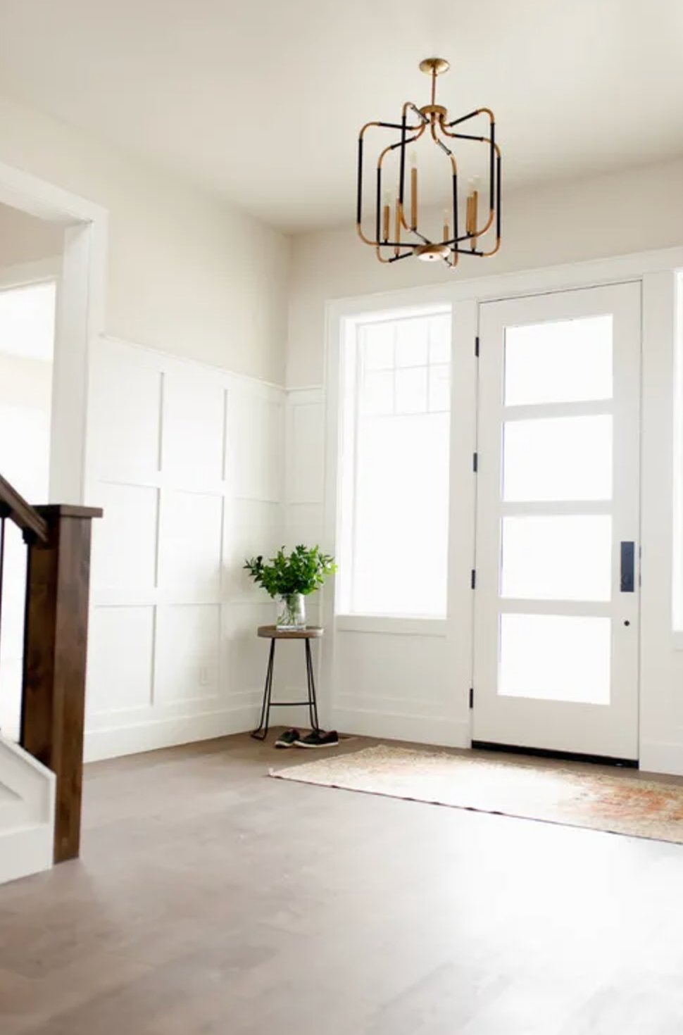
Chantilly Lace is the cleanest, brightest option here if you want an almost pure white for trim. It looks especially sharp against dark railings, black hardware, cool wall colors, and modern millwork. Because it has so little warmth, it can make cream walls or yellowed trim nearby look dingy, so I only use it when the surrounding finishes can handle that level of contrast.

I'm Elizabeth, your go-to guide for all things paint and design! My days are filled with color swatches and innovative room makeovers. When I'm not painting the town - literally - I'm soaking up inspiration from my travels. This blog is my way of sharing my passion and making the world a more vibrant place, one color palette at a time.