Game Room Color Ideas
The best game room color depends on how you play: dark, low-glare colors work well for screen-heavy rooms, while lighter neutrals suit billiards, ping-pong, and family spaces that need more visibility.
Start with the room's light. Basements and north-facing rooms can make charcoal, navy, and forest green read heavier, so sample them with the LEDs and lamps you'll actually use.
Paint looks different beside a black monitor, a green pool table, warm wood, or bright arcade art. That is where many game rooms go wrong.
Below are 25 game room color ideas from real rooms, with paint directions I would consider when matching the same mood.
1. Moody Bar Meets Gaming Lounge

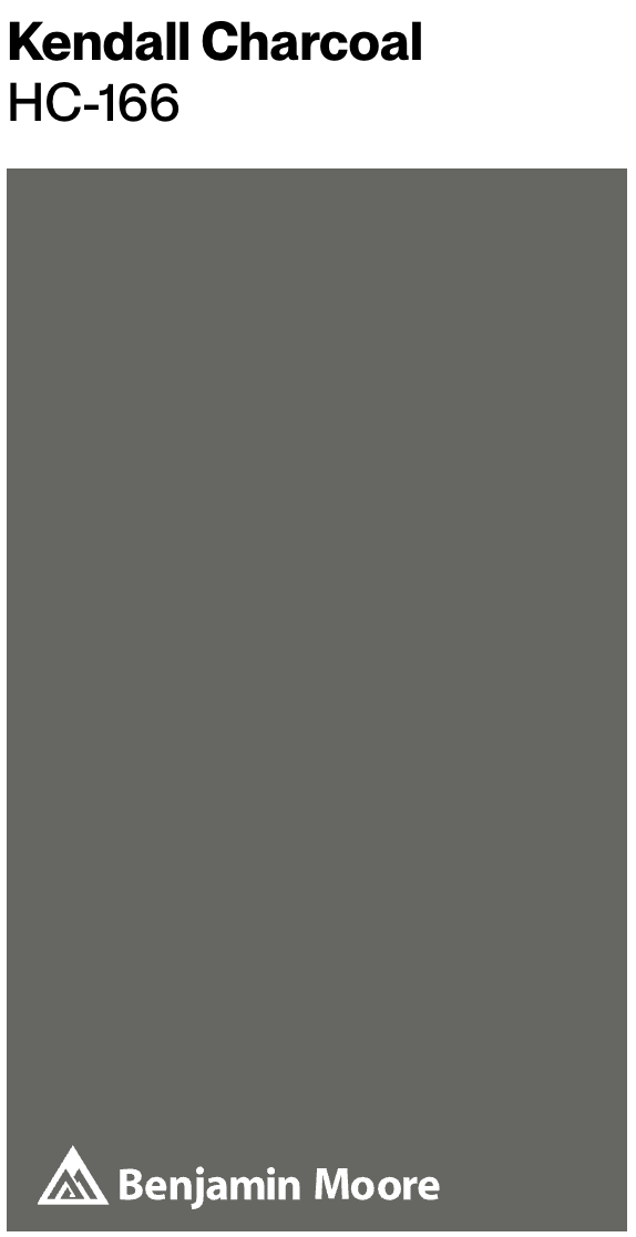
This game room by Carla Bast works because the bar wall carries the weight. The charcoal accent wall, similar to BM Kendall Charcoal or SW Urbane Bronze, gives the lounge depth while the rest of the room stays light enough for conversation and movement.
The warm white pendants matter as much as the paint. I would keep bulbs around 2700K to 3000K here so the charcoal reads brown-black instead of flat gray.
Light flooring keeps the darker wall from swallowing the room. In a basement, sample this type of color on two walls before committing because it can close in quickly without enough lamps.

2. Rebel Gamer's Paradise
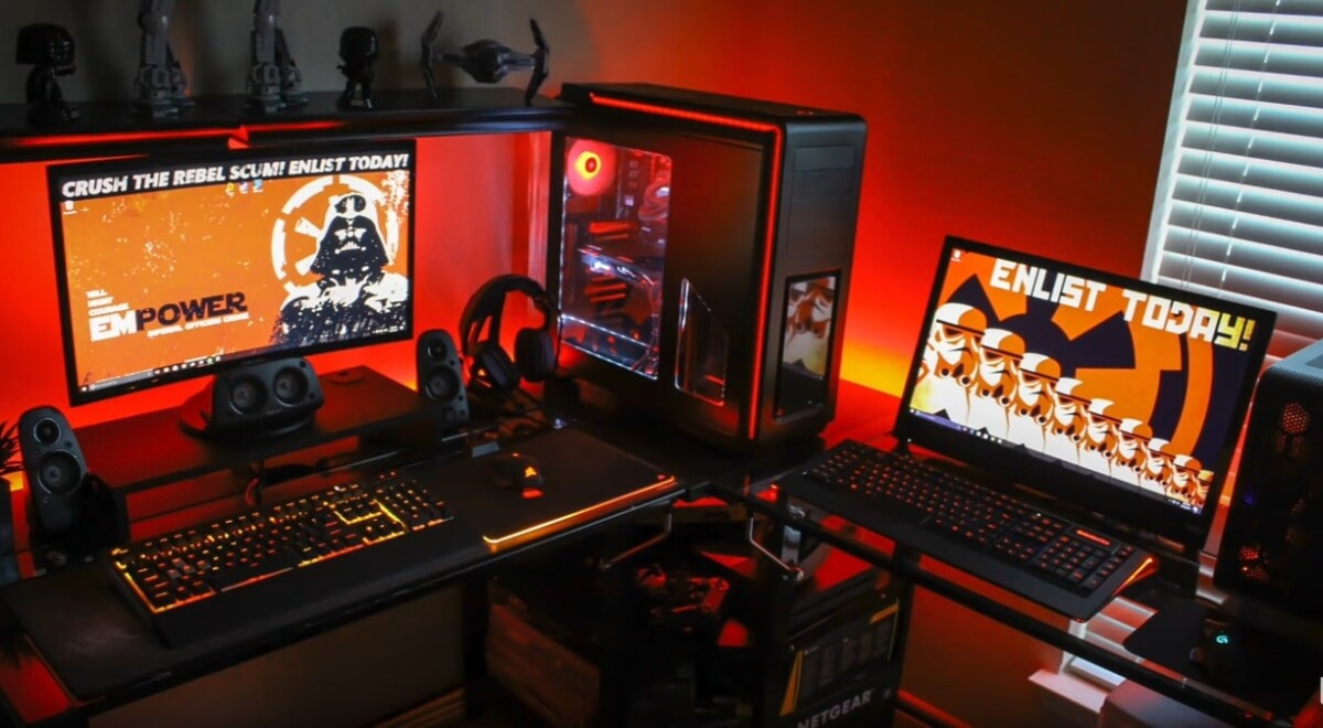
This Star Wars-inspired setup uses color like stage lighting: hot orange-red against black, with the collectibles doing the storytelling.
The orange and black color scheme brings a lot of energy, which is fun for late-night console or PC gaming, but I would not wrap every wall in red unless the room is large.
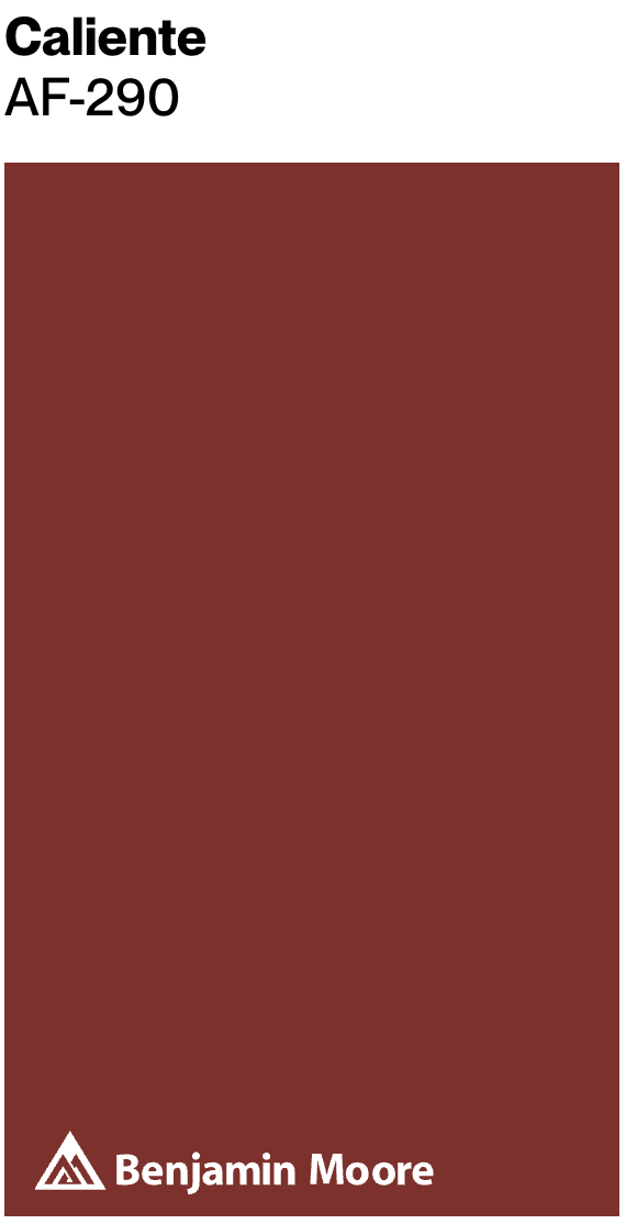
For a similar palette, try Benjamin Moore's Caliente AF-290 with a deep black such as Sherwin-Williams' Caviar SW 6990 or PPG's Black Magic PPG1001-7. Use the red on one wall, panels, or trim if you want the room to stay usable during the day.
Star Wars-themed accessories and collectibles finish the look, but keep the largest pieces on the black wall so the room does not turn visually noisy.

3. Teal Dreams and Purple Billiards Room

This billiards room by Hudson Construction Group gets its polish from the mix of teal walls, a wood pool table, and a gray rug.
A deep teal similar to SW Oceanside or BM Galapagos Turquoise gives the room weight without going as severe as black. The purple pool table and colorful artwork work because teal already has enough blue in it to sit comfortably beside violet.
These hues are best in a room with decent artificial light. In a dim basement, choose a satin or eggshell wall finish and add table lighting so the felt color still looks intentional.


4. Light and Airy Game Room

This Toll Brothers room is a good model if you want a game room that still feels connected to the rest of an open-plan house.
The reclaimed wood accent walls bring texture, while the dark patterned rug anchors the pool table. The light wall color keeps the wood from making the room feel like a cabin.
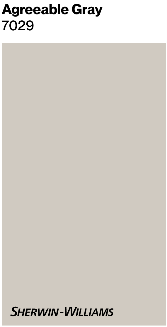
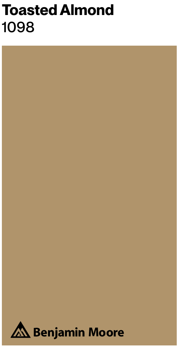
Large windows are doing real work here. If your room has less daylight, White Dove OC-17, Agreeable Gray SW 7029, or Toasted Almond PPG1024-3 will need stronger layered lighting to keep the same open feel.
Paint color suggestions:
- Benjamin Moore's White Dove OC-17
- Sherwin-Williams' Agreeable Gray SW 7029
- PPG's Toasted Almond PPG1024-3
5. Skate-Inspired Room

This setup works as a desk, gaming station, and movie corner because the palette is limited and high contrast.
The black-and-orange color scheme borrows from skate graphics without needing a mural. Black handles the backdrop, while orange can come from lighting, art, chair details, or shelving.
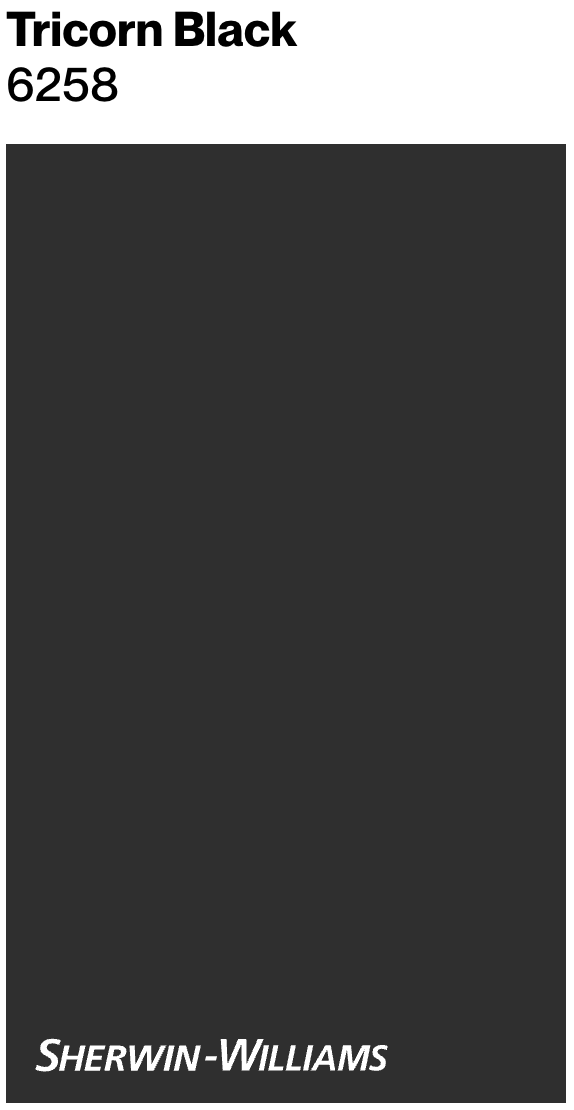
Use Tricorn Black SW 6258 or Black Beauty 2128-10 when you want the monitors and LED strips to stand out. Choose matte or eggshell paint behind screens to cut glare.
Paint color suggestions:
- Sherwin-Williams' Tricorn Black SW 6258
- Benjamin Moore's Black Beauty 2128-10

6. Purple Gamer Paradise

A purple PC setup can go soft without looking washed out if the wall color has enough gray in it.
The lavender walls create a calmer base for pink and purple LEDs. That matters in a streaming corner because RGB lighting changes the color of everything on camera.
A simple tip: use hexagonal wall panels, or another geometric shape, to add shadow lines and break up a large pastel wall.
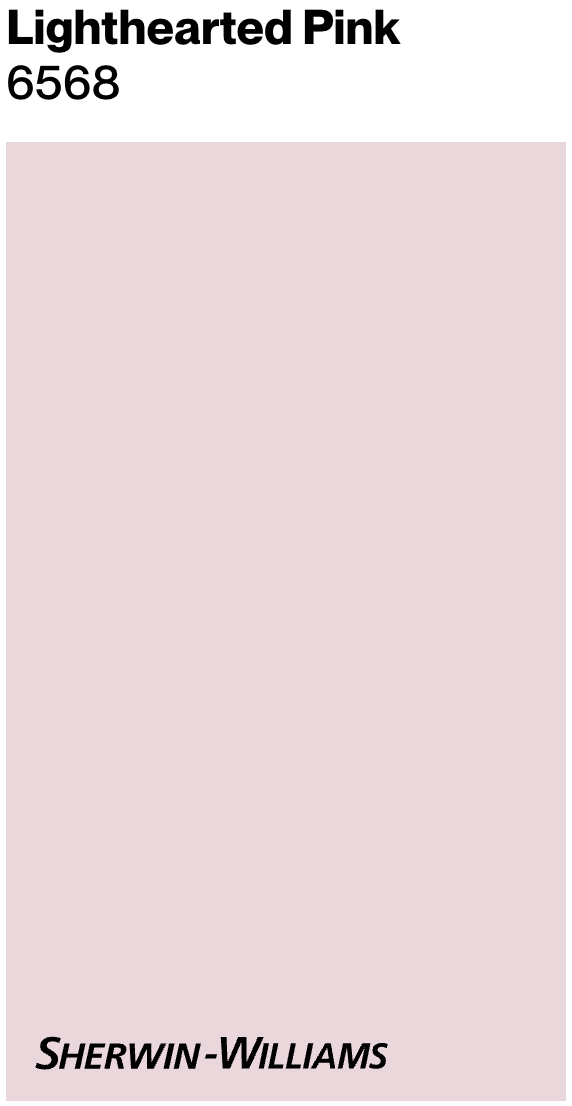
The chair, dual monitors, and plush accessories make the room feel personal. For paint, Misty Memories 2118-60 is the quieter route, while Lighthearted Pink SW 6568 reads sweeter and more playful.
Paint color suggestions:
- Benjamin Moore's Misty Memories 2118-60
- Sherwin-Williams' Lighthearted Pink SW 6568

7. Rustic Charm and Modern Fun

Tracy Lynn Studio makes rustic and modern finishes feel compatible by letting the beams be the warmest element in the room.
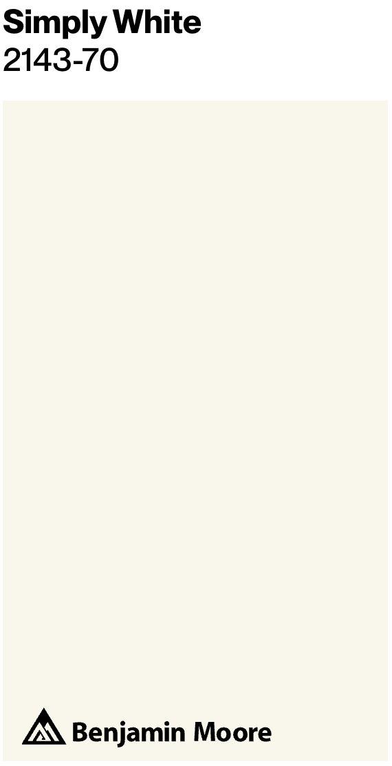
The white walls and ceiling give the natural wood room to breathe. I would choose a clean white like Simply White OC-117 when the beams have yellow or honey tones, because a murky white can make that wood look dull.
Dark charcoal on the furniture and window frames adds structure. Tricorn Black SW 6258 works for that kind of contrast, especially when the floor already has gray undertones.
The lesson here is restraint: warm wood, clean white, and one dark accent are enough.
- Benjamin Moore's Simply White OC-117
- Sherwin-Williams' Tricorn Black SW 6258
8. Retro Game Room

This 90s-style room works because the nostalgia is concentrated overhead and in the art, not smeared across every surface.
The Pac-Man ghosts can be bright because the black walls and furniture give the eye somewhere to rest. Electric Blue 2061-40 is useful for small accents, while Tricorn Black SW 6258 can handle the backdrop.
For a family game room, I would keep seating fabric and flooring practical. The color is memorable, but the room still needs to survive snacks, controllers, and foot traffic.
Color suggestions:
- Benjamin Moore's Electric Blue 2061-40
- Sherwin-Williams' Tricorn Black SW 6258

9. Gentleman's Club Style
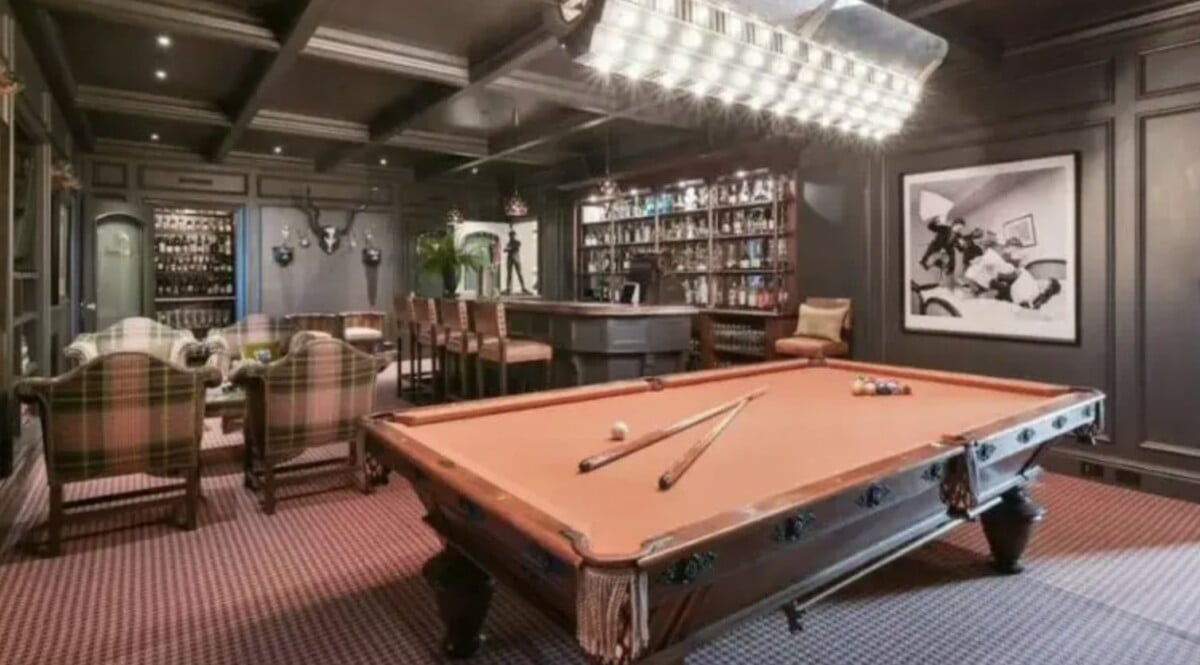
If you want a private-club feeling, this Ken Fulk room is the stronger reference than a generic sports bar palette.
Interior designer Ken Fulk used rich wood paneling, plush red carpet, and layered art to create the old-school richness. Vintage Wine 2116-20 belongs here because it has depth, not candy brightness.
Bronze Green SW 2846 would be a strong partner for cabinetry, doors, or a ceiling. The caution is light: without sconces, table lamps, or picture lights, this palette can turn muddy.
Color suggestions:
- Benjamin Moore's Vintage Wine 2116-20
- Sherwin-Williams' Bronze Green SW 2846


10. Pretty in Pink

This pink gaming setup is very sweet, but the reason it works is discipline: most of the permanent surfaces stay pink, white, mint, or lavender.
The Hello Kitty desk area, plush shelves, and figures add the kawaii layer. Crisp white shelving keeps the collection readable instead of cluttered.
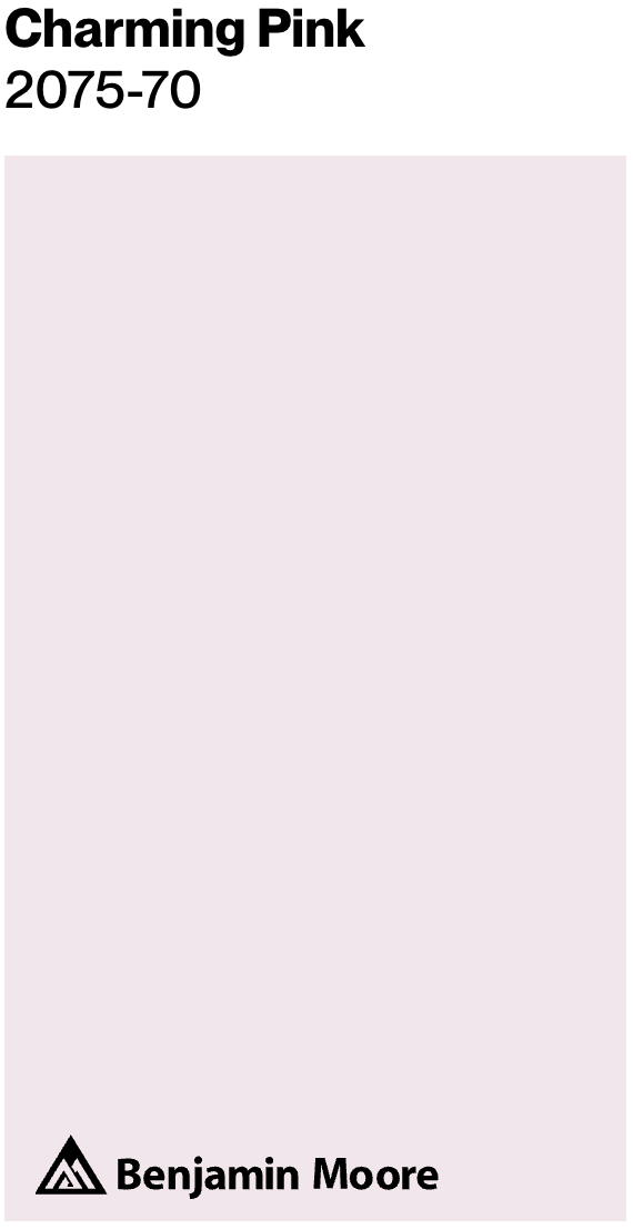
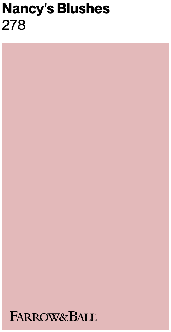
Rheanna, a gamer and streamer, uses pink as the base and lets mint green and lavender act as relief colors. Mellow Pink 2094-70 is softer, Charming Pink SW 6309 has more presence, and Nancy's Blushes No.278 is the boldest of the three.
Color suggestions:
- Benjamin Moore's Mellow Pink 2094-70
- Sherwin-Williams' Charming Pink SW 6309
- Farrow & Ball's Nancy's Blushes No.278
11. Dynamic Contrast and Mosaics

This room is a simple lesson in warm and cool balance.
Dark floors visually ground the room, while light walls reflect more light across the pool table. A clean white like Chantilly Lace OC-65 only works this well if the trim, ceiling, and lighting are also crisp.
The Clint Eastwood mosaic is the one loud note. Charlotte's Locks No. 268 makes sense as an accent because orange sits well against black and warm wood, but I would keep it limited to art, a door, or a small built-in.
Color suggestions:
- Benjamin Moore's Chantilly Lace OC-65
- Sherwin-Williams' Tricorn Black SW 6258
- Farrow & Ball's Charlotte's Locks No. 268
12. Playful Practicality
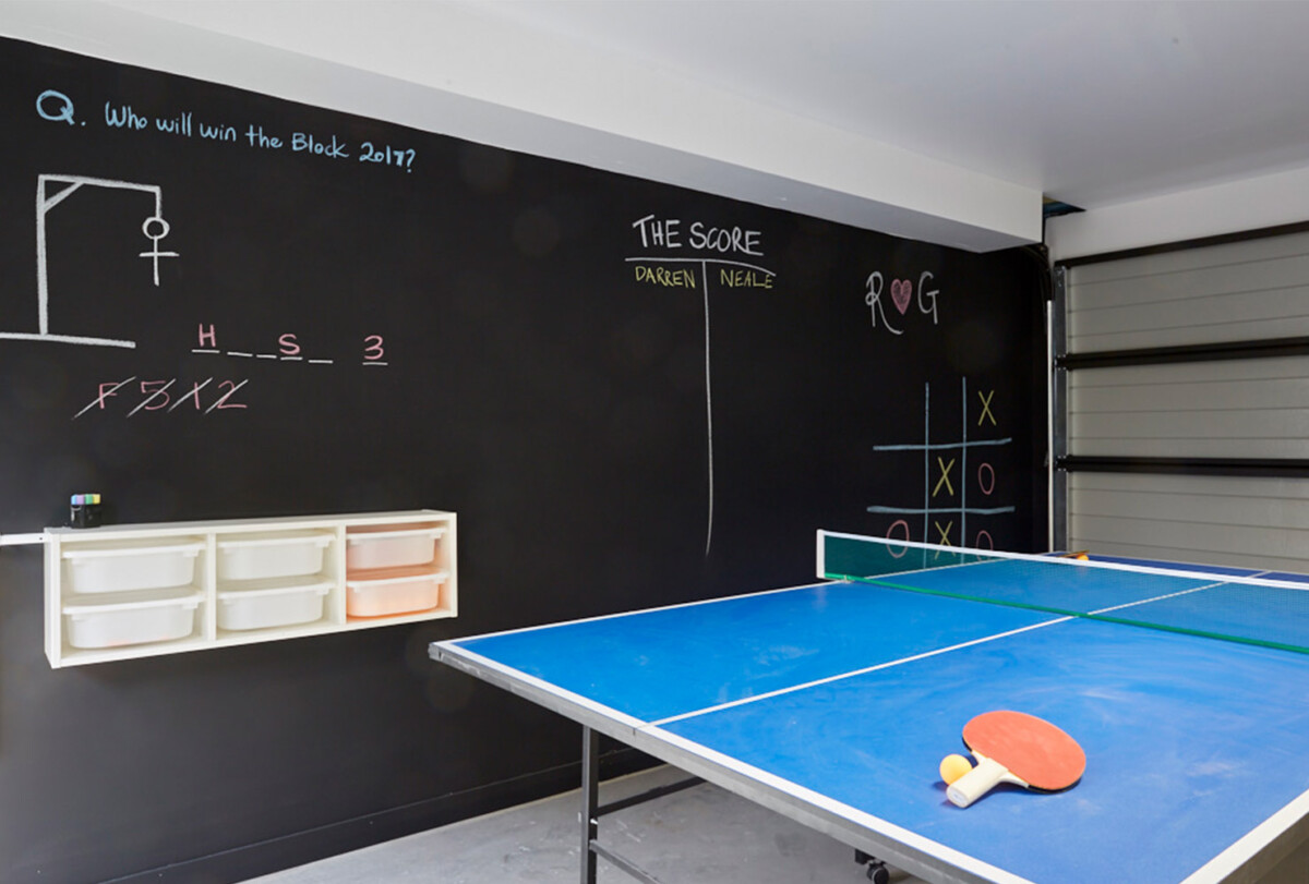
This garage game room uses the chalkboard wall for function, not decoration. Ronnie and Georgia won a contest back in 2017 with this room makeover, and the idea still holds up.
The charcoal wall gives you a place for scoring, notes, and doodles. It also hides garage-wall wear better than a pale color would.
The white storage bins and blue ping-pong table keep the dark wall from feeling heavy. If you use true chalkboard paint, expect more visible dust and wipe marks than standard matte black.
13. Cosmic Vibe with Electric Hues

A cosmic game room needs a dark ceiling or deep wall color to make the star effect believable.
The electric blue wrapped around the room brings arcade energy. It is strong, so I would use it where you want attention: soffits, one wall, trim, or the game zone itself.
The star ceiling adds height because the darkest color recedes overhead. Blue Danube 2062-30 gives the room the brighter blue note, while Naval SW 6244 is better when you want the ceiling or walls to fall back.
Consider these colors:
- Benjamin Moore's Blue Danube 2062-30
- Sherwin-Williams' Naval SW 6244


14. Sportiness with a Bold Edge
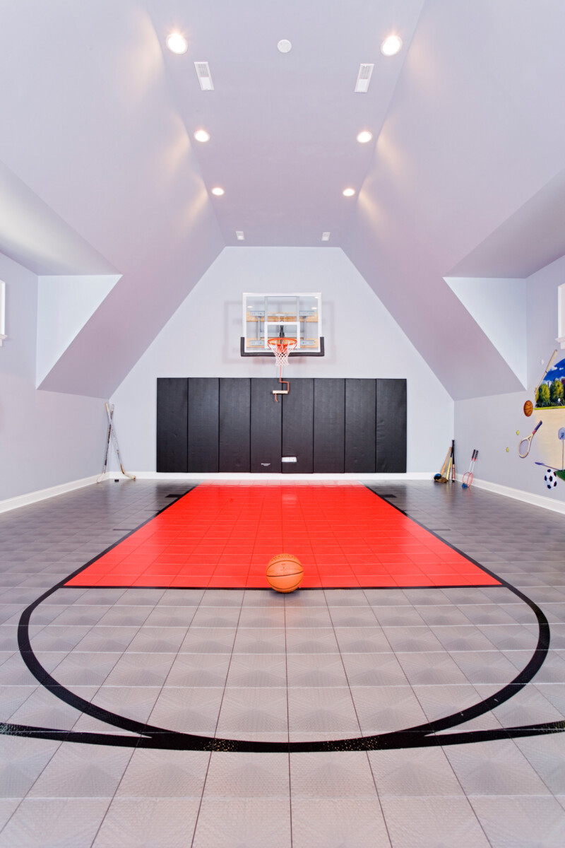
Siena Custom Builders uses white, gray, black, and red to make the basketball area read clearly.
The red floor defines the play zone in a way wall paint cannot. Incarnadine No. 248 gives you that same red direction if you are painting a stripe, door, or feature panel instead of flooring.
The black lower-wall accent is practical in a high-activity room because ball marks and scuffs show less. Decorator's White CC-20 and Agreeable Gray SW 7029 keep the upper walls bright enough for safe movement.
- Benjamin Moore's Decorator's White CC-20
- Sherwin-Williams' Agreeable Gray SW 7029
- Farrow & Ball's Incarnadine No. 248

15. Moody Modern with a Tech Twist
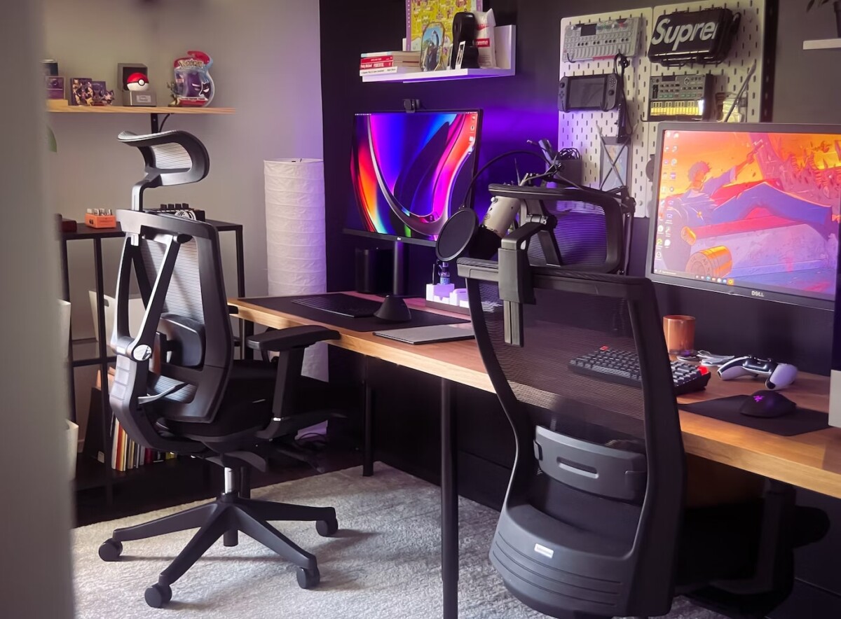
This gaming room by Dennis Cortés uses deep gray for the right reason: it cuts screen glare and makes monitor color look cleaner.
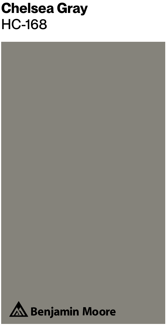
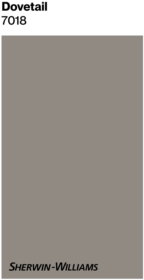
The wood desk keeps the gray from feeling like office carpet. If the room has only cool LEDs, add one warmer lamp so Chelsea Gray HC-168 or Dovetail SW 7018 does not skew cold.
I like gray for hybrid gaming and work rooms because it stays focused during the day and disappears at night. Test it behind the main monitor before painting all four walls.
For a similar look, consider these colors:
- Benjamin Moore's Chelsea Gray HC-168
- Sherwin-Williams' Dovetail SW 7018
16. Interstellar Playroom

This room relies on contrast: saturated reds, yellows, and oranges against a nearly black backdrop.
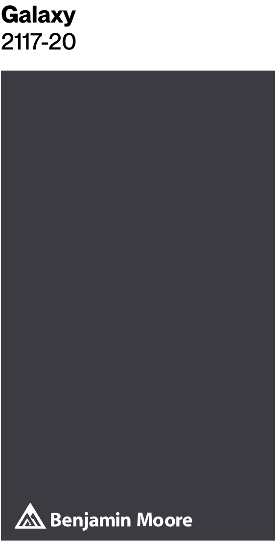
The dark shell lets the bright furniture and graphics look as if they are floating. Galaxy 2117-20 is the kind of deep color that makes that effect possible.
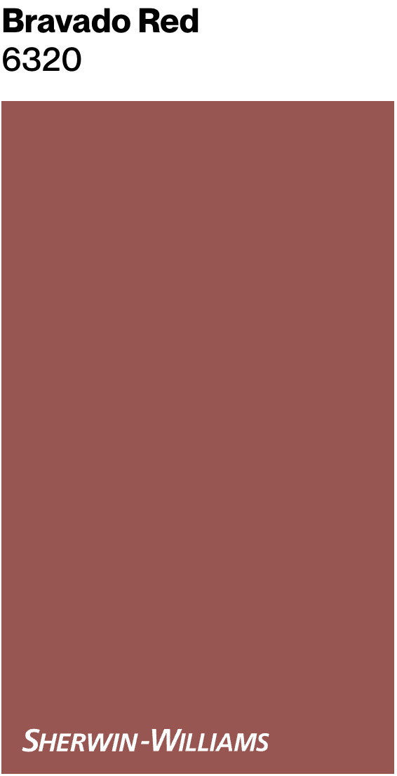
Bravado Red SW 6871 works well on a feature, game table, or built-in, but too much red can make a playroom feel restless.
- Benjamin Moore's Galaxy 2117-20
- Sherwin-Williams' Bravado Red SW 6871
17. Sophisticated Simplicity

This room proves a neutral game room does not have to feel plain. The palette is built from cool and warm neutral tones, from creamy limestone walls to polished concrete floors and a rich wood ceiling.
That quiet base lets the art do the color work. I use this approach when a client owns bold art, vintage posters, or collectibles they actually want people to notice.
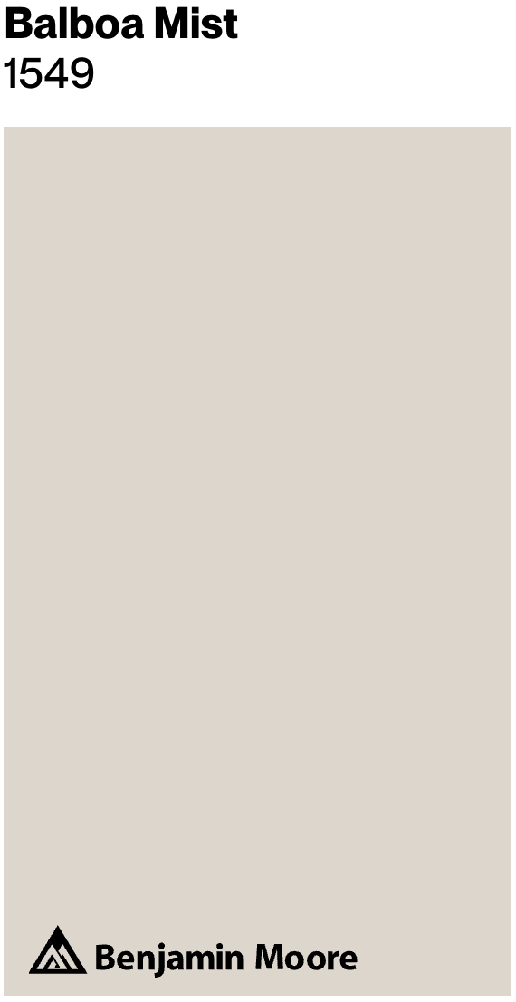
Muted walls and floors also give you flexibility if the game room changes later. Alabaster SW 7008 is softer and warmer, while Balboa Mist OC-27 is a cooler greige.
These gaming room paint colors would be a good start:
- Sherwin-Williams' Alabaster SW 7008
- Benjamin Moore's Balboa Mist OC-27

18. Classic Casino Elegance

This palette borrows from early 20th-century private clubs: honey-toned wood, warm cream, and low golden light.
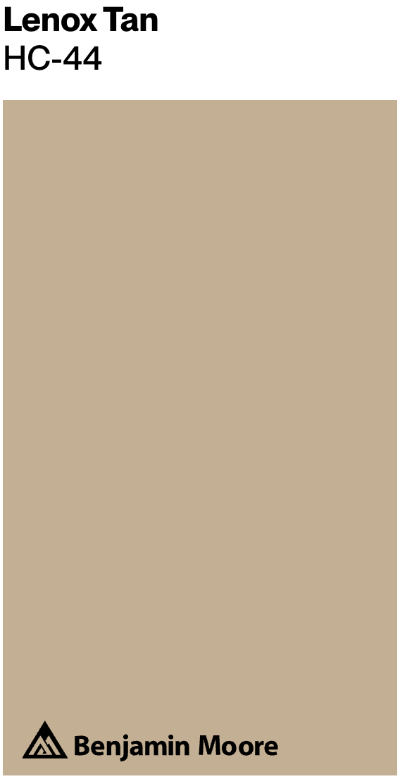
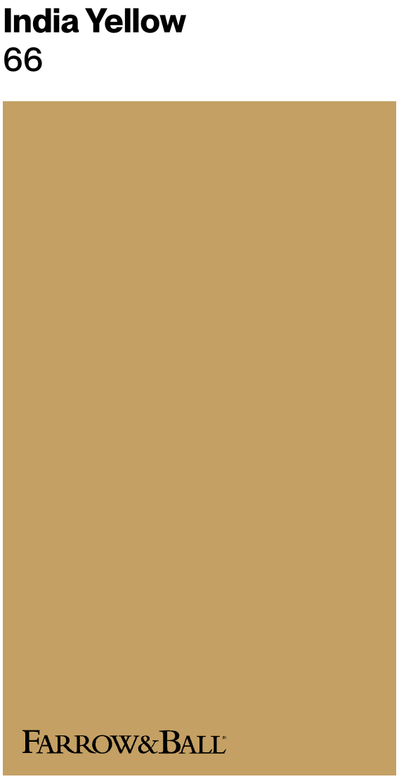
Lenox Tan HC-44 and India Yellow No. 66 fit because they echo the wood instead of fighting it. They work best with warm bulbs, around 2700K, and shaded fixtures.
The risk is going too yellow. Test large samples next to the wood paneling, because amber light can push tan paint into mustard.
- Benjamin Moore's Lenox Tan HC-44
- Farrow & Ball's India Yellow No. 66
24. Gaming Room with a Splash of Color
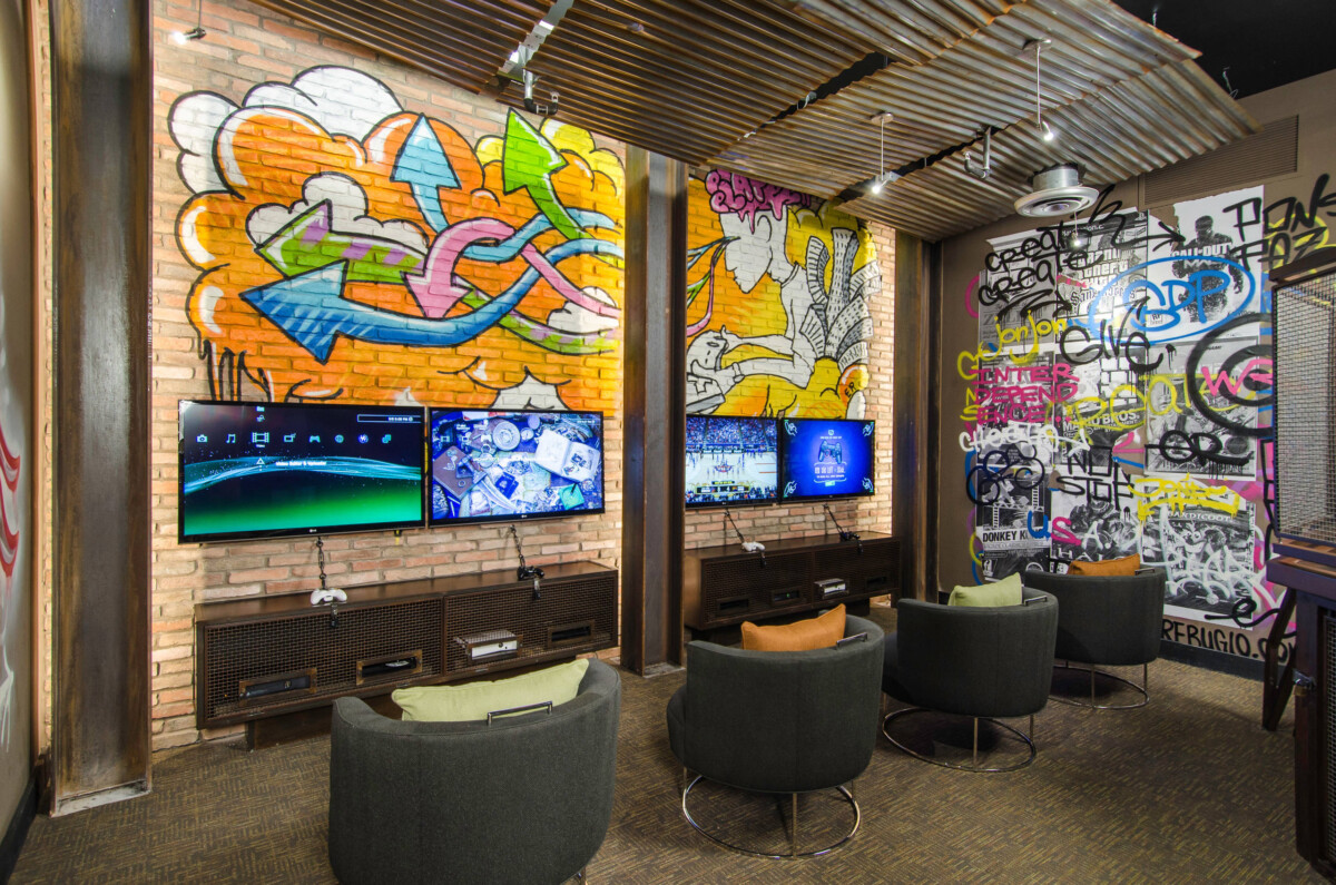
For tournament nights or console sessions with friends, this room needs color that can handle movement, noise, and a crowd.
The graffiti wall brings the energy, so the supporting colors should stay grounded. Exposed brick, beams, and darker neutrals keep the room from feeling like a themed bedroom.
Urbane Bronze and Toasted Almond are useful directions here: one gives the industrial weight, the other ties back to brick and wood. I would avoid adding a third loud wall color unless the graffiti is very restrained.
25. Exclusive Speakeasy Vibes
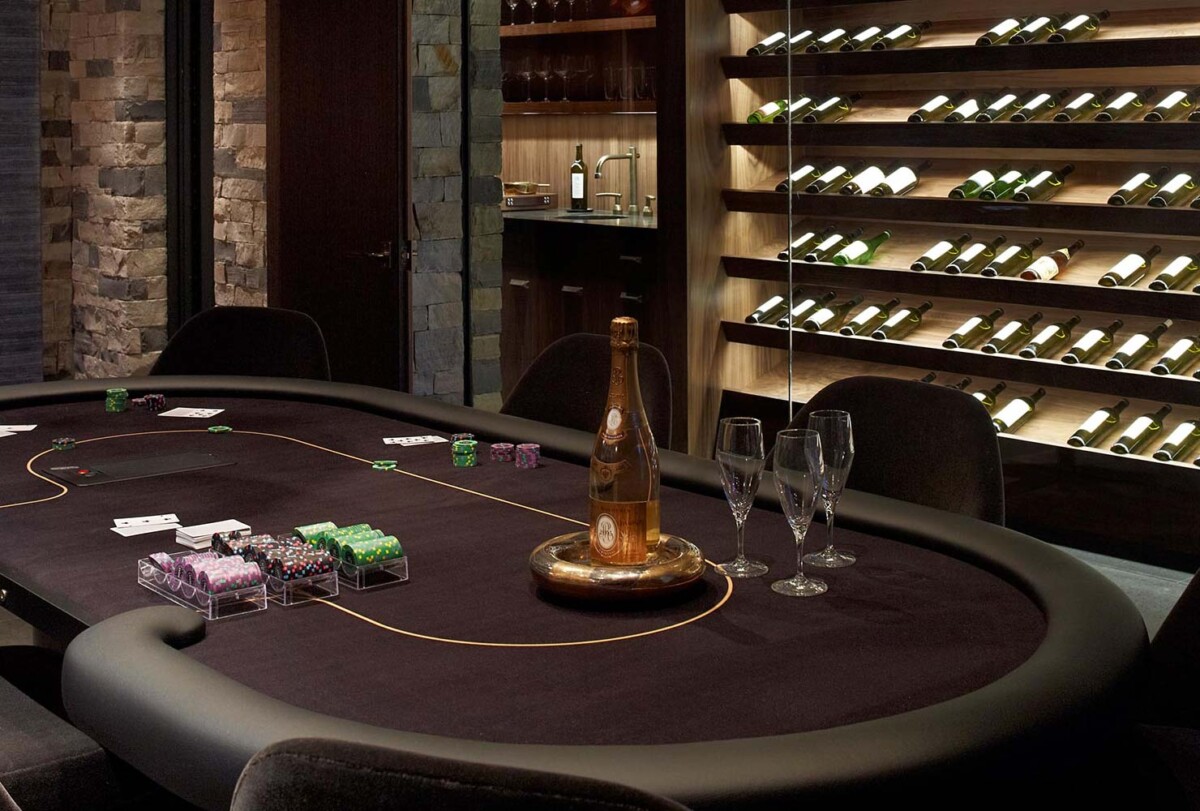
This Jamie Bush room uses darkness as atmosphere, not just drama. The textured stone walls, low lighting, and blackened palette create the private speakeasy feeling.
A color like Caviar can work on walls, millwork, or a ceiling when the room has enough lamps. Toasted Almond gives you a warmer companion for stone, leather, or wood.
The practical note: dark rooms show dust and fingerprints on satin trim, so reserve higher sheen for surfaces that need wiping and keep walls matte.
How to Choose the Best Paint Color for a Gaming Room?
When choosing a gaming room paint color, start with the games you play most. Screen-heavy rooms need low glare and controlled light, while billiards, darts, foosball, ping-pong, and cards need enough visibility to keep the room comfortable.
Here are five decisions I would make before buying a gallon:


1. Lighting Interactions: Paint shifts under LEDs, neon strips, daylight, and projector light. Sample your color on at least 12-inch boards and check it at night with the bulbs you plan to use. For most gaming rooms, 2700K to 3000K feels warmer and lounge-like, while 3500K to 4000K reads cleaner for active play.

2. Color Psychology: Cool blues and greens usually support focus better than hot reds or oranges. Use high-energy colors where the action happens, not necessarily on every wall. If a room is used by kids and adults, a calmer main color with changeable LED accents ages better.

3. Reflectivity and Finish: Matte or flat finishes reduce glare behind screens, but they mark more easily. In busy rooms, I usually prefer washable matte or eggshell on walls and satin only on trim, doors, and built-ins.
4. Contrasting and Complementary Colors: Contrast helps define zones, such as a bar wall, arcade corner, or table area. Pick one main wall color, one trim or ceiling direction, and one accent color so the room does not fight with screens, jerseys, posters, and game equipment.
5. Theme and Brand Consistency: If the room is also a streaming space or meeting room, repeat the same accent color in paint, lighting, and shelving. The background should support your camera view, not compete with your face, logo, or collectibles.
The best game room color is the one that works in your actual light, with your equipment turned on. Paint a sample first, check it beside the flooring and furniture, then decide how much color the room can take.

I'm Elizabeth, your go-to guide for all things paint and design! My days are filled with color swatches and innovative room makeovers. When I'm not painting the town - literally - I'm soaking up inspiration from my travels. This blog is my way of sharing my passion and making the world a more vibrant place, one color palette at a time.