Best Basement Paint Colors
The best basement paint colors usually have one job: make low natural light feel intentional instead of forgotten. Basements ask more from paint than upstairs rooms because the light is weaker, the ceilings are often lower, and humidity can make the wrong finish look tired faster.
The mistake I see most often is choosing a basement color from a bright kitchen or living room photo. Downstairs, that same color may turn muddy, blue, or flat because it is mostly being lit by bulbs instead of daylight.
Here are the basement paint colors I would actually consider, plus the lighting and room-use notes that decide whether each one works.
How to Choose a Basement Paint Color
For a basement, choose the paint color after you know the room's light source, ceiling height, flooring, and job. A family room, home gym, bedroom, and home theater should not all get the same safe white.
I usually start by turning on the lights the room will use every day. A color that looks clean under 3000K bulbs can look cold under 4000K recessed lights, and a low-LRV shade needs more lamps than people expect.
Basic Principles
- Warm light shades, such as ivory, sand, and light beige, can offset cool concrete, gray flooring, and small basement windows
- For low ceilings, use the lightest value on the ceiling and trim, then let the walls carry a little more depth
- To make a chopped-up basement feel larger, repeat one color family in lighter and darker values so the eye does not stop at every doorway
- If the basement has moisture issues, solve those first. Paint color cannot hide mildew, and a higher-sheen finish will only make uneven drywall more obvious
By Room Purpose
- Home theater: deep blues, charcoal grays, and dark browns control screen glare better than bright whites
- Kids' room/playroom: soft mint, peach, or lavender can work if the bulbs are warm enough to keep the colors from looking chalky
- Guest bedroom: choose neutrals like warm gray or light taupe, then use a stronger version of that same color on one wall if the room needs definition
1. White Dove by Benjamin Moore

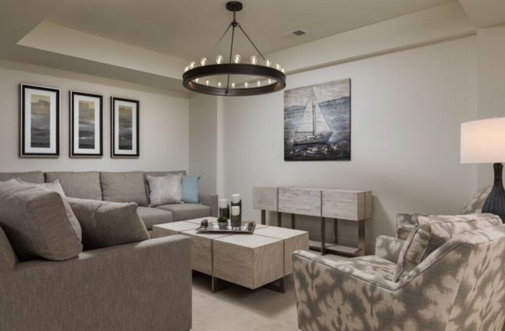
White Dove by Benjamin Moore is one of the safer whites for a basement because it has enough warmth to avoid the sterile look that pure whites can get under recessed lighting.
Its yellow undertone is soft, not buttery. With an LRV of 83.16, it reflects plenty of light, but it does not have the sharp glare I see with cleaner whites on drywall ceilings and bulkheads.
In a basement with one small window or a glass door, White Dove holds its color better than many whites that collapse into gray shadow. That makes it useful for open rec rooms where the walls, ceiling, and trim all need to feel connected.
I like matte on ceilings and satin on trim and doors. White Dove also gives you room to add bolder accents, wood furniture, or a quiet neutral palette without the walls fighting for attention.
2. Agreeable Gray by Sherwin Williams

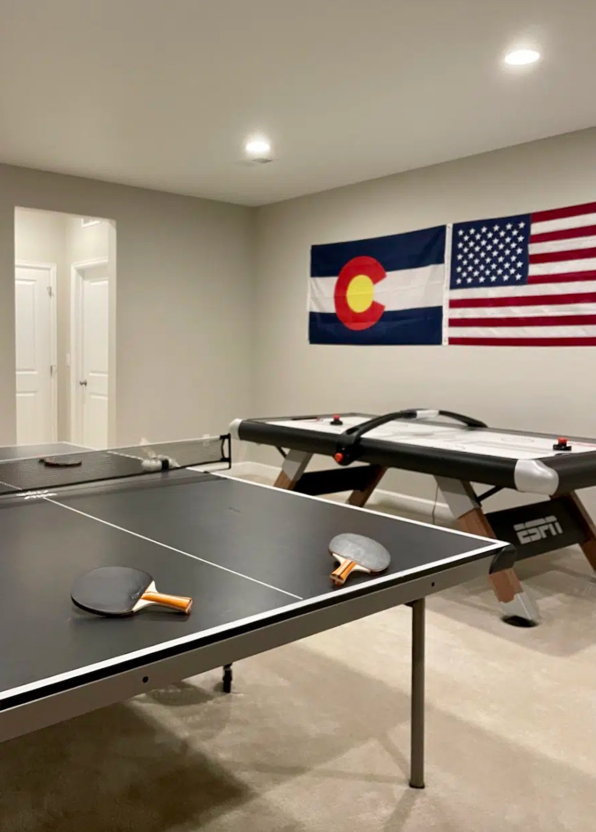
Agreeable Gray is a greige, gray mixed with beige, and that balance is why homeowners keep asking for it. In a basement, it works best when you want a neutral that feels warmer than a basic gray.
Use warm bulbs with this one. Cool lighting can pull it dull and muddy, especially in rooms that already have gray carpet, concrete-look tile, or little daylight.
On paper, its LRV of 60 looks fairly reflective. In a windowless basement, it can still read medium-dark, so do not choose it as your "brighten the room" color unless you have layered lighting.
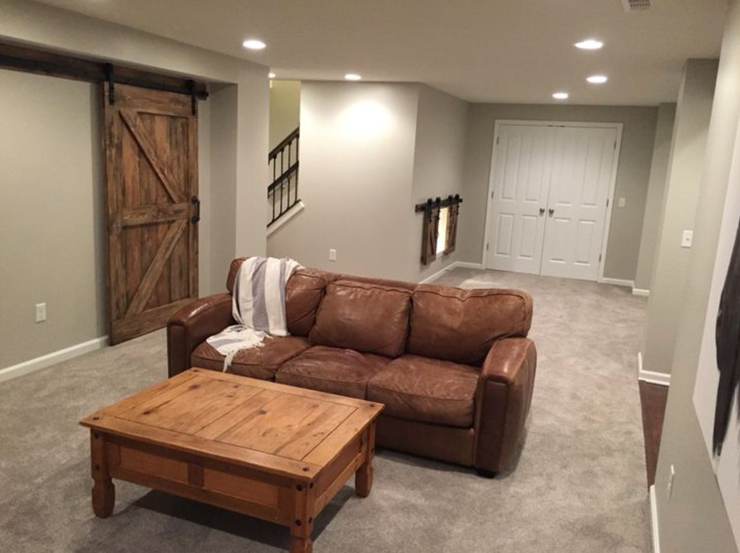
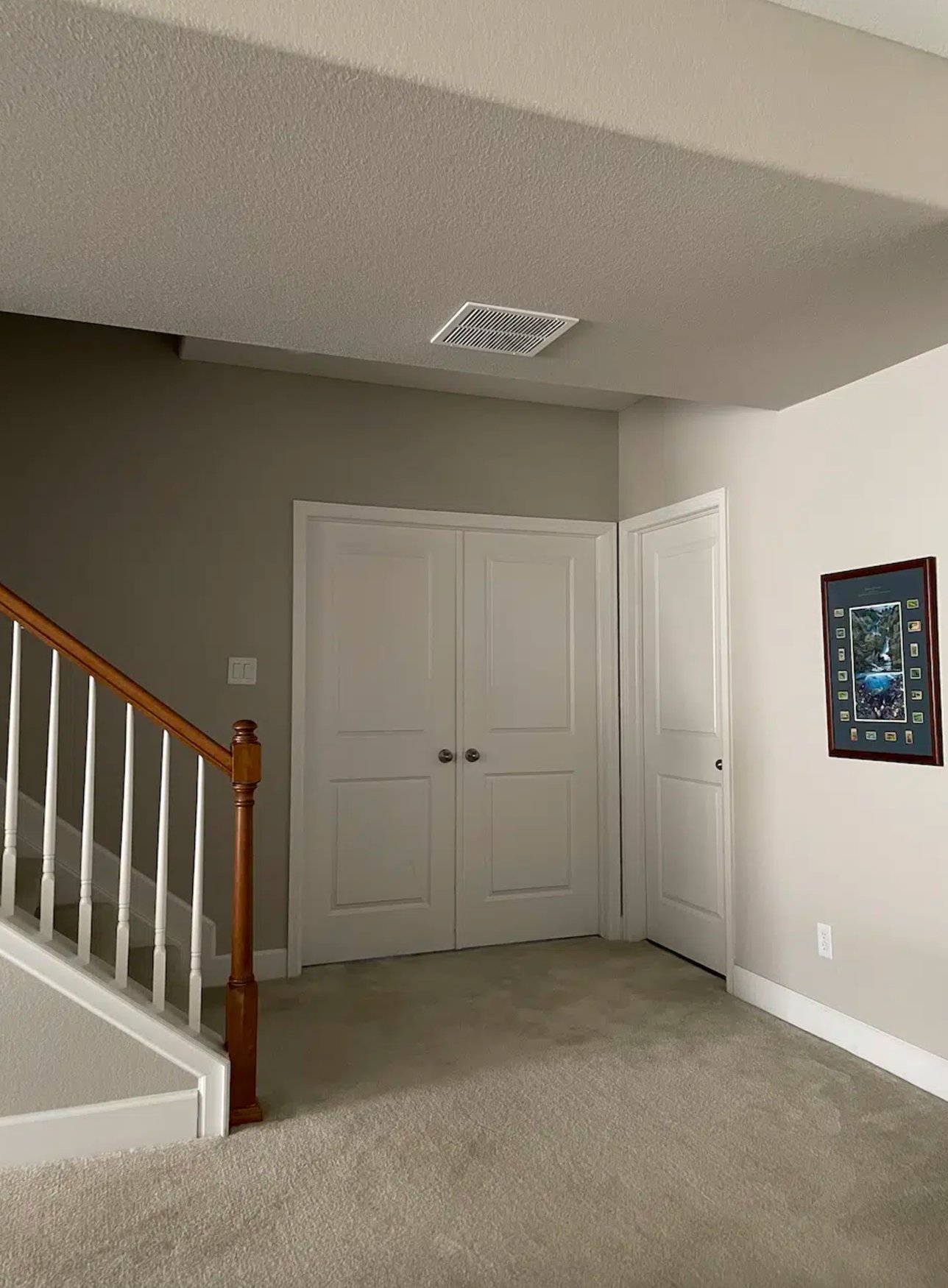
Agreeable Gray also has a green undertone that can show up beside certain woods, stone fireplaces, and cooler LED bulbs. Sample it on two walls, one near the main light source and one in the darkest corner, before you commit.
Its advantage is flexibility. Because it is warmer than a typical gray, it softens basement materials that already feel hard, such as concrete floors, black metal railings, and white vinyl windows.
3. Sea Salt by Sherwin Williams

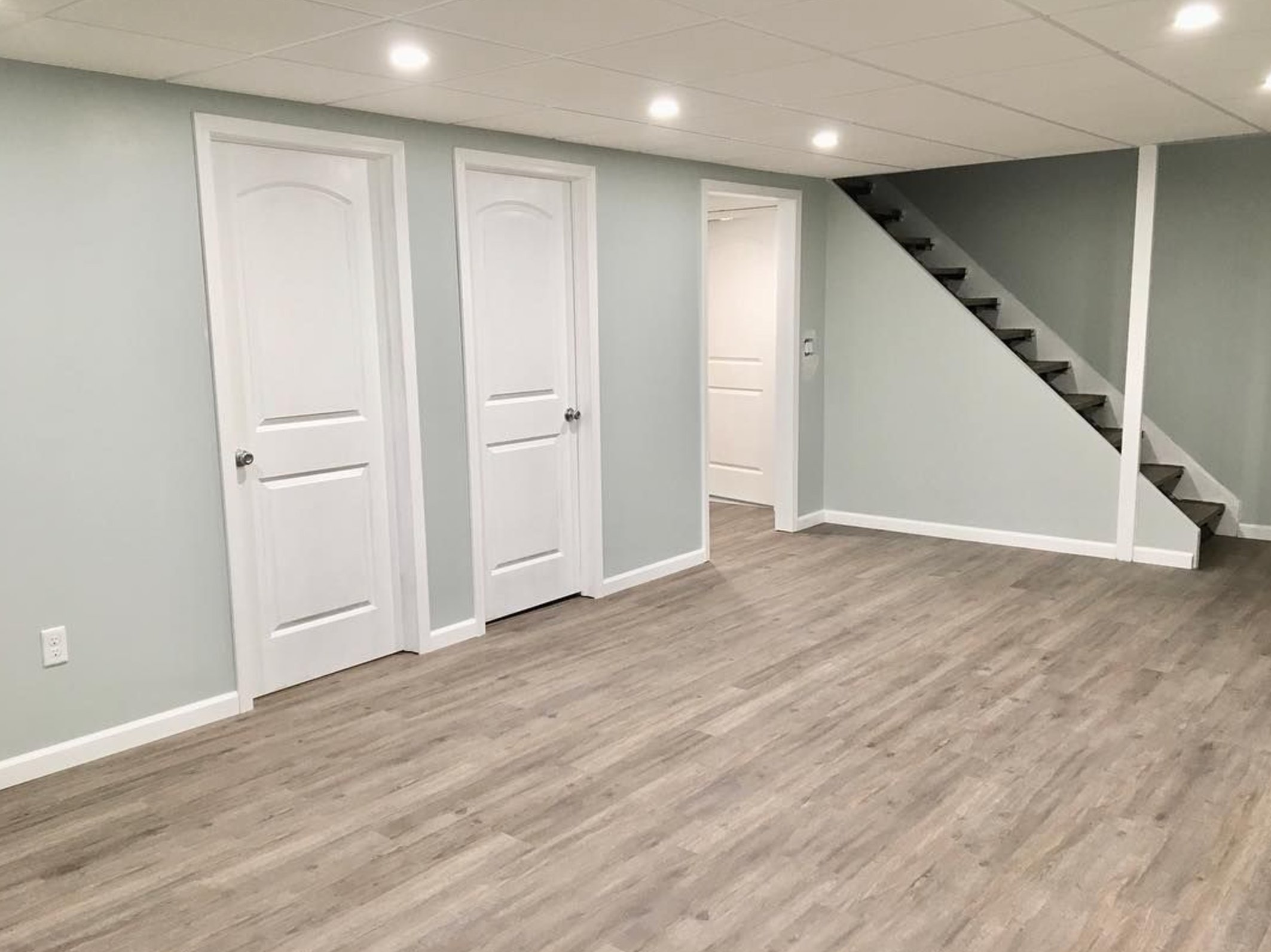
Sea Salt is not a simple gray-green. In basement light it can lean blue, then shift greener under warmer lamps, because the bluish-black pigment reacts strongly to the light around it.
It has an LRV of 64, so it is light enough for many basements but not so pale that it disappears under bright recessed lights.
Use this color where the basement has decent lighting and a purpose that suits softness, such as a guest room, office, laundry room, or casual sitting area. In darker corners, the gray base comes forward and the color feels quieter.
The reason I still like Sea Salt downstairs is that it rarely turns flat gray. It keeps a clear color note, although north-facing basement windows can make it read noticeably blue.
4. Peppercorn by Sherwin Williams

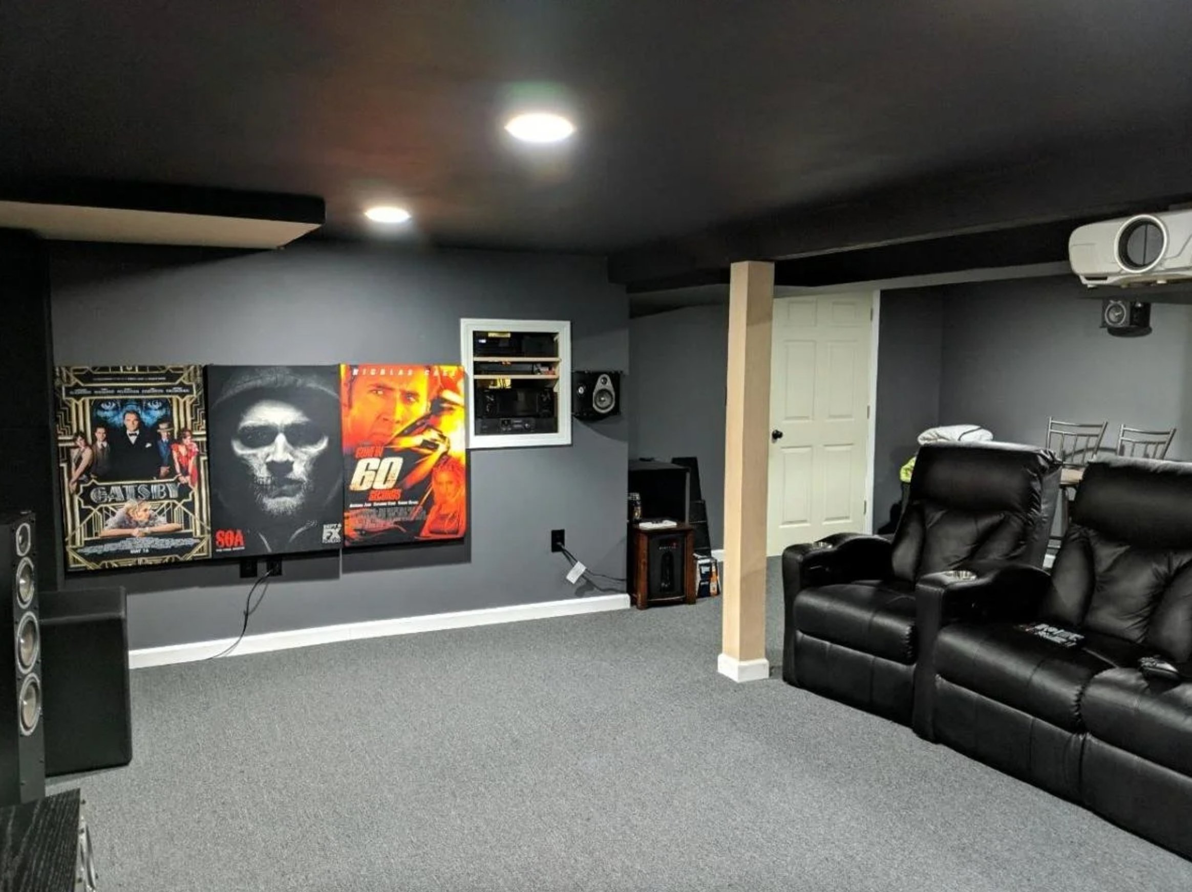
Peppercorn is a deep gray I would use on purpose, not as a default wall color. With an LRV of 10, it needs planned lighting, but that depth is exactly what makes it useful for a basement theater, bar, lounge, or gaming room.
It can show a touch of warmth in south-facing rooms and stay closer to true gray in north-facing spaces. Depending on the bulbs, flooring, and furniture, you may also catch hints of green, purple, or blue.
In stronger light, Peppercorn gives crisp contrast against white trim. In the darkest part of a basement, it softens toward black, so I would not use it in a workroom that needs visual clarity.
Plan the lighting before you paint Peppercorn. In a home theater setup like the photo, or in a lounge area, it reduces glare and makes the space feel finished instead of dim.
5. Mindful Gray by Sherwin Williams

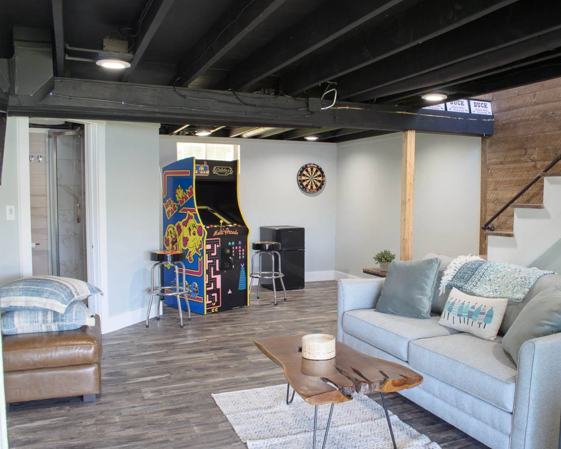
Sherwin-Williams Mindful Gray is a true middle-value gray with an LRV of 48. That number matters in a basement because it will not brighten a room by itself.
Mindful Gray changes with what sits beside it. Dark furniture can bring out subtle green and purple undertones, while lighter upholstery makes it read more neutral. It is especially good in east-facing rooms that get morning light, and it looks clean with white trim such as Pearly White.
I would pick Mindful Gray for a finished basement that already has enough lamps, sconces, or recessed lighting. If the room has one ceiling fixture and no windows, choose a lighter gray instead.
6. Manchester Tan by Benjamin Moore

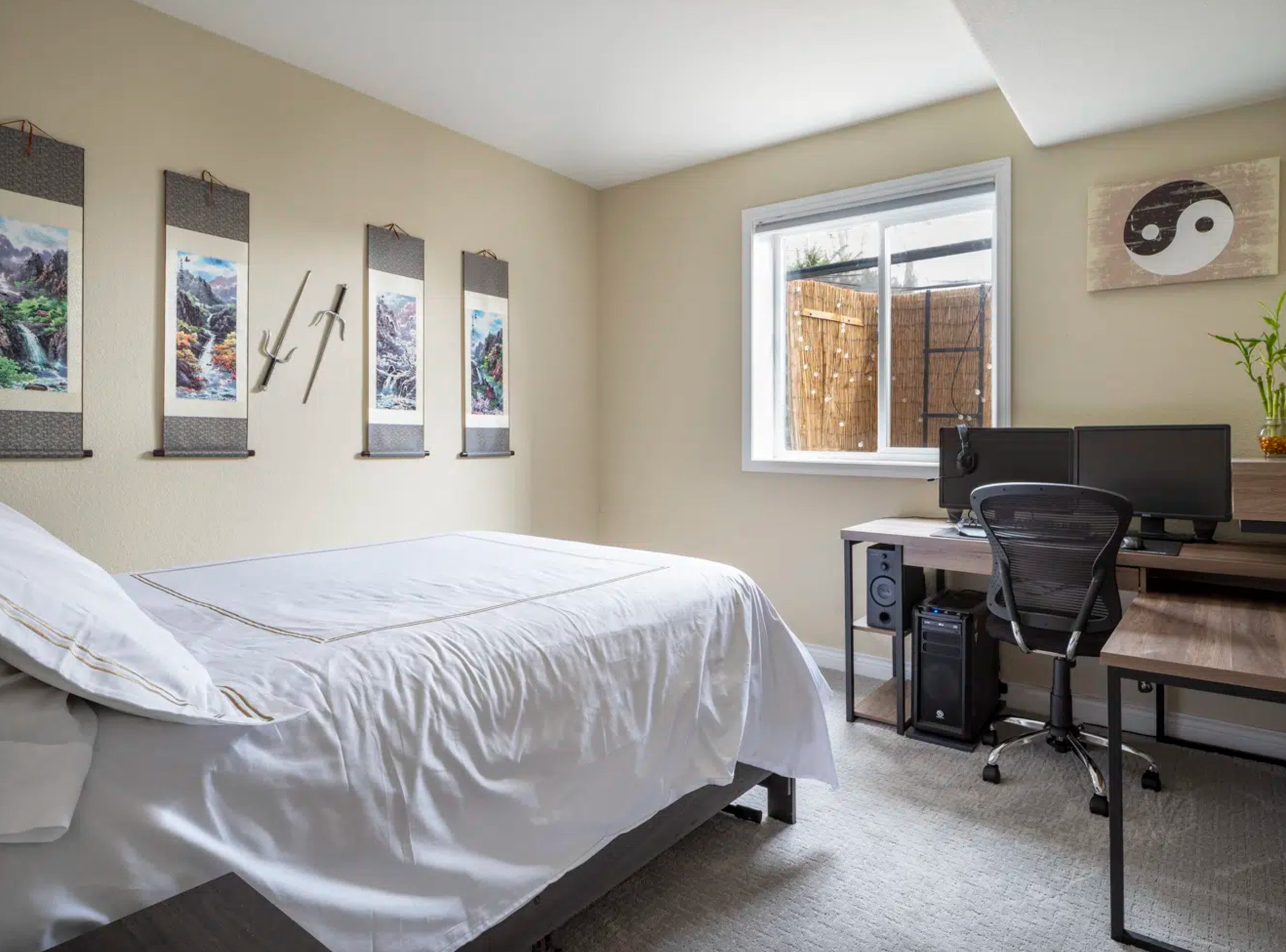
Manchester Tan is a basement beige with restraint. It is warm, but the slight green undertone keeps it from looking peachy or dated.
An LRV of 63.24 gives it enough reflectance for most finished basements, especially when the flooring is medium or dark.
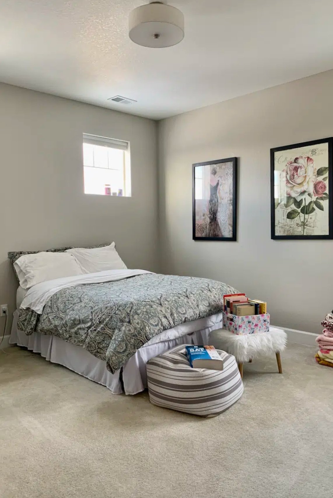
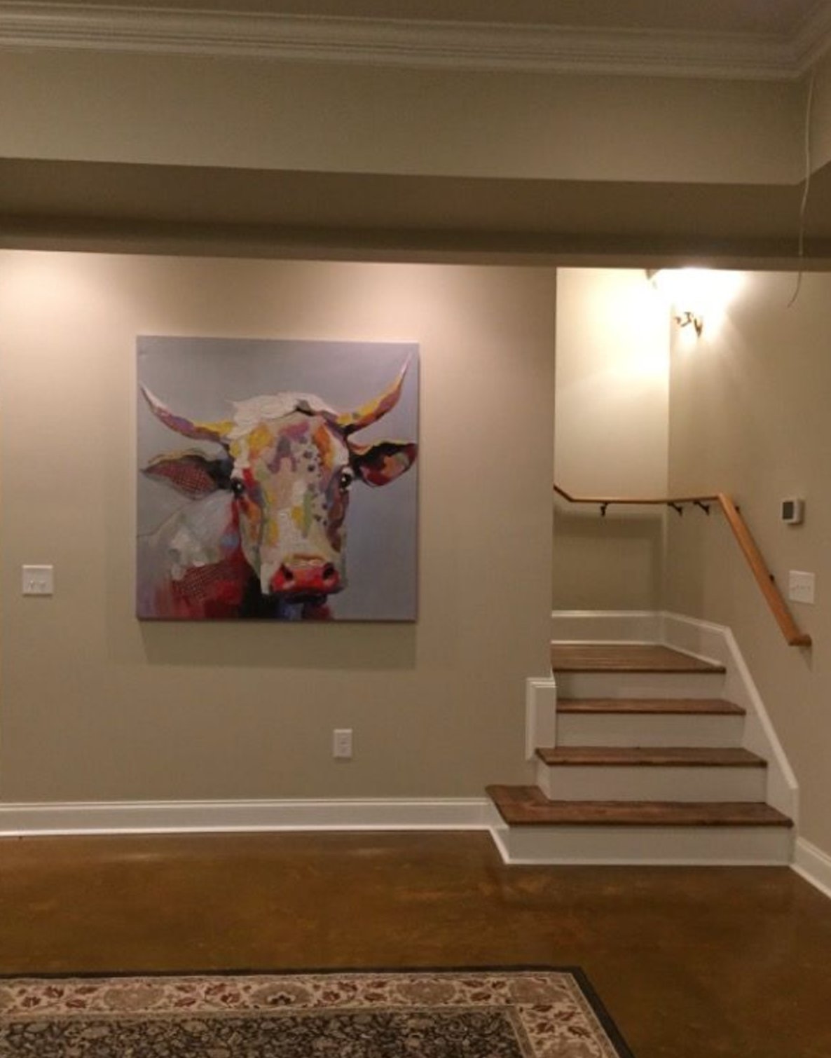
Good lighting brings out the best in Manchester Tan, but it also holds together in darker areas. The yellow is controlled, so you do not get the "banana wall" problem that makes many beige rooms feel wrong.
Use it with warm trim, wood furniture, woven textures, and cream upholstery. I would be more cautious if the basement has cool gray floors, because the undertone contrast can make the floor look colder.
7. Stonington Gray by Benjamin Moore

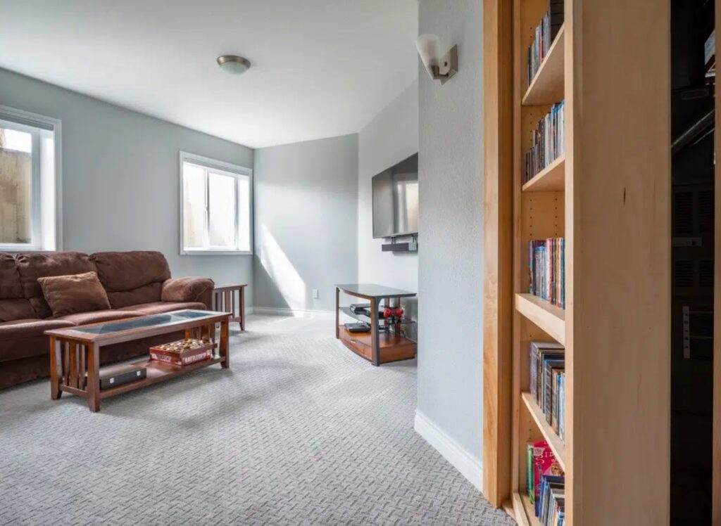
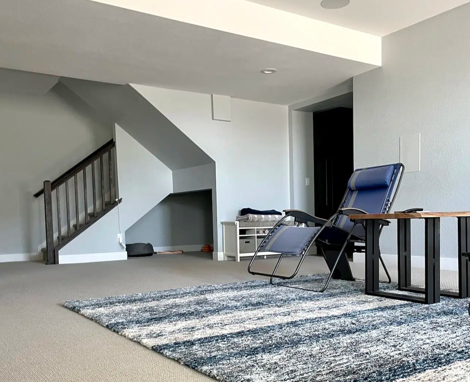
Stonington Gray usually reads as a classic medium gray. Under cool basement lighting, it can reveal a stormy blue undertone.
It works well with dark wood, as shown in the basement photo above, and it pairs naturally with deep blues. I would use it when the room needs a cleaner gray than Agreeable Gray or Mindful Gray, but not a cold silver. In north-facing rooms, especially next to bright white trim, you may see a slight purple cast.
8. Pebble Beach by Benjamin Moore

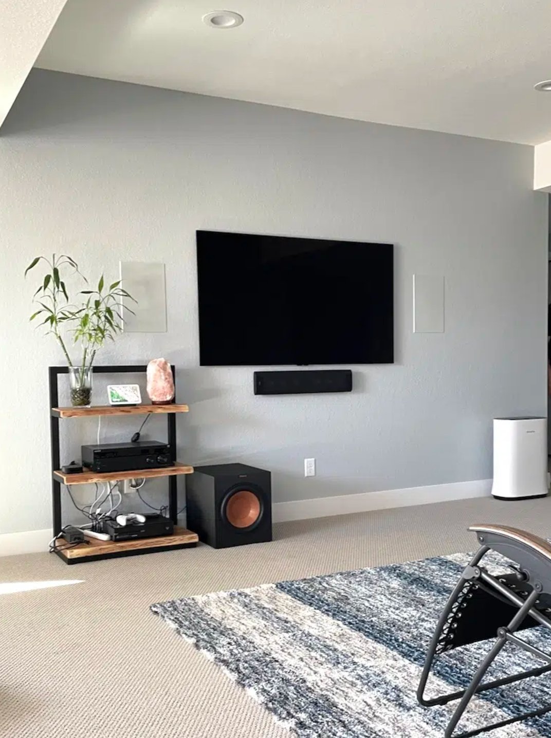
Pebble Beach by Benjamin Moore is a cool gray-blue that earns its place in basements because it has visible color without feeling loud. It reads bluer in brighter light and grayer in shadow.
It is light enough to keep the walls from closing in, but it has enough depth to handle darker corners. I particularly like it in western light, where warm afternoon sun balances the cool blue notes.
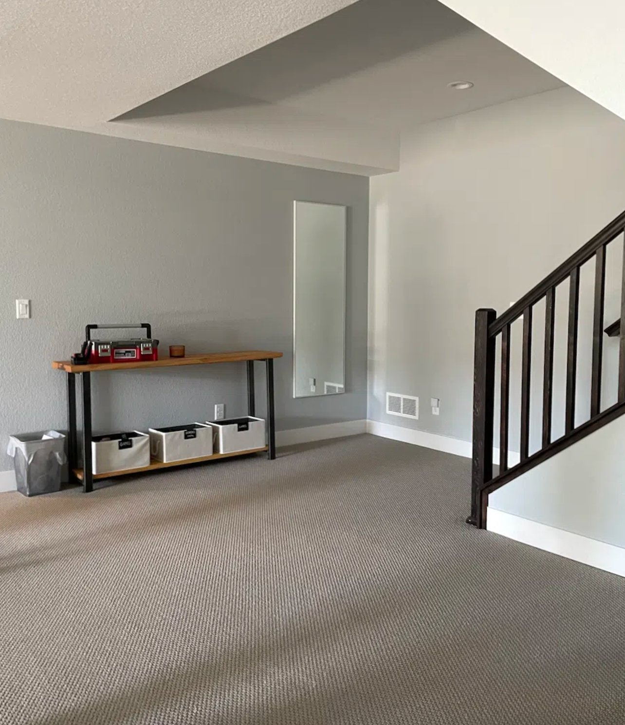
If you want to explore similar options, look at Passive by Sherwin-Williams or Silver Lake by Benjamin Moore. Both sit in the same cool, airy lane, but sample them against your flooring because gray-blue colors can turn icy near cool tile.
9. Abalone by Benjamin Moore

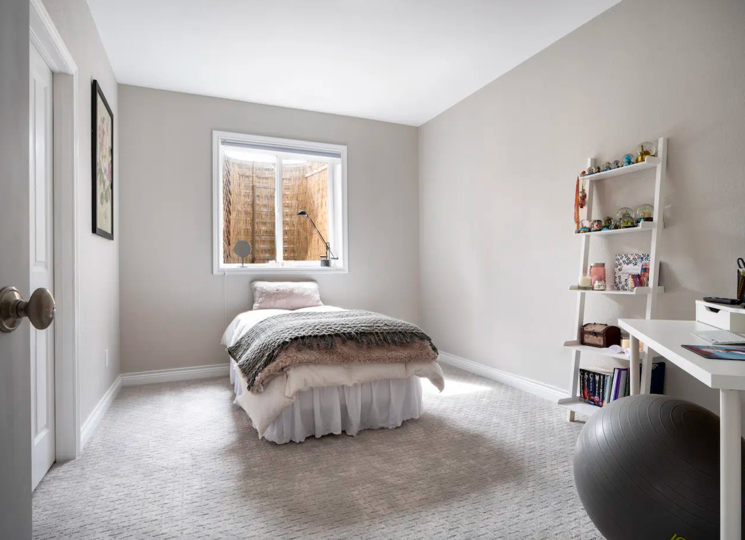
Abalone by Benjamin Moore is a light gray with a quiet mauve undertone. It belongs in basements with good natural light, not in the darkest room downstairs.
It shifts throughout the day. In northern light, it leans more gray while keeping softness. In south-facing rooms, the taupe side becomes more noticeable.
I would avoid it in a windowless basement because the mauve can turn dull. In a basement bedroom or office with large south-facing windows, Abalone gives you softness without reading pink.
10. Slate Teal by Benjamin Moore

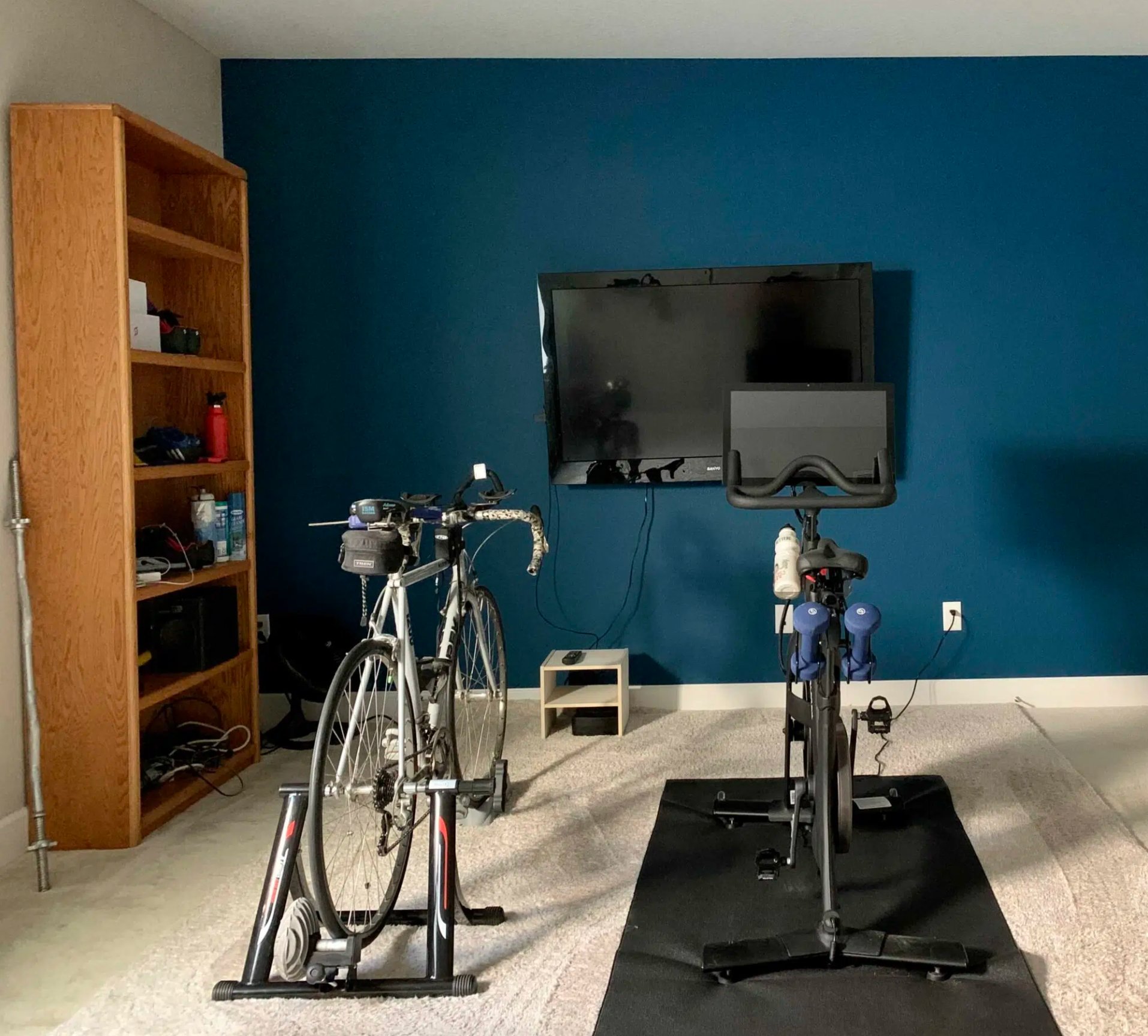
Slate Teal is a blue-green for basements where the goal is mood, not brightness. It is very dark with an LRV of 7, but in rooms with decent lighting it still reads teal instead of black.
Matte is the better finish if the walls are smooth enough, because it gives the color depth and avoids the glare that eggshell can create on dark paint. Put it beside lighter neutrals and the green undertone becomes more apparent.
Slate Teal can work on every wall in a theater, bar, powder room, or small lounge because the color has character, not just darkness. I would not use it for a basement craft room or gym unless the lighting plan is strong.
11. Cloud White by Benjamin Moore

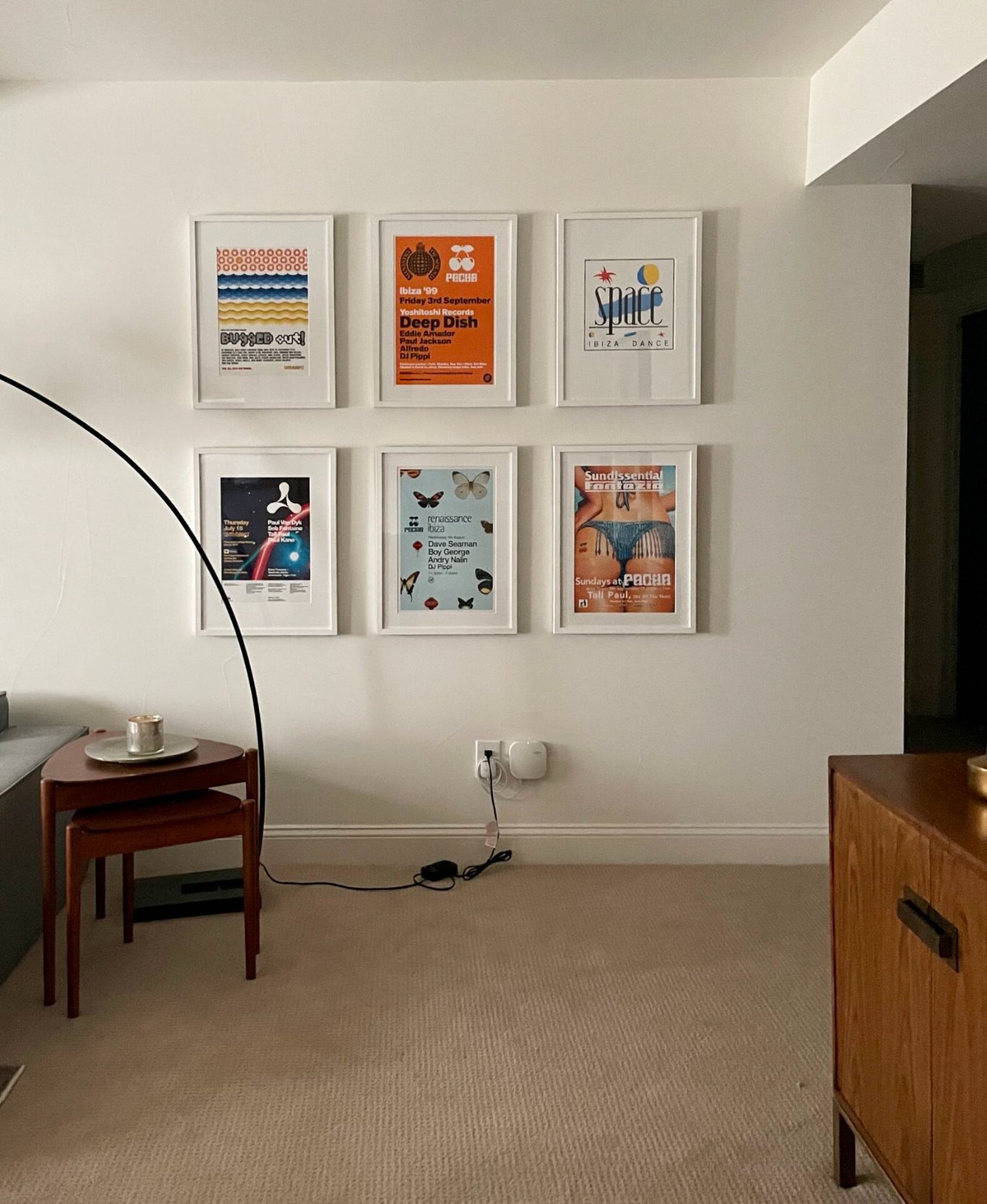
Cloud White is one of the warm whites I come back to often for basements because it has more body than a crisp gallery white.
Many whites fail downstairs because they look thin under artificial light. Cloud White has warm taupe-beige notes, so it feels richer without tipping yellow or overly creamy.
It holds up in low-light basement situations and looks especially good with brick and wood. If your basement has orange-toned brick or older oak trim, sample Cloud White before choosing a cooler white.
12. Muslin by Benjamin Moore

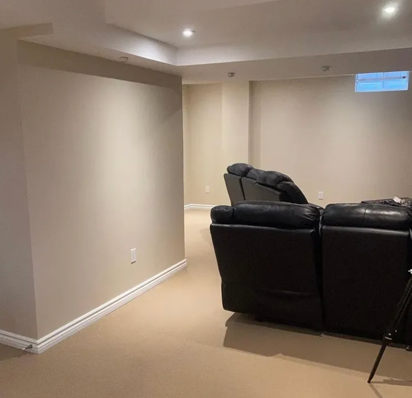
Muslin by Benjamin Moore is not the flat beige many people remember from the 2000s. Its subtle pink undertone gives basement walls warmth without going gold.
With an LRV of 66.54, it reflects light well while keeping its personality. It is useful in rooms with cool northern light because the pink undertone counters the chill. If it looks washed out in brighter areas, white baseboard trim usually gives it enough edge.
13. Cultured Pearl by Sherwin Williams

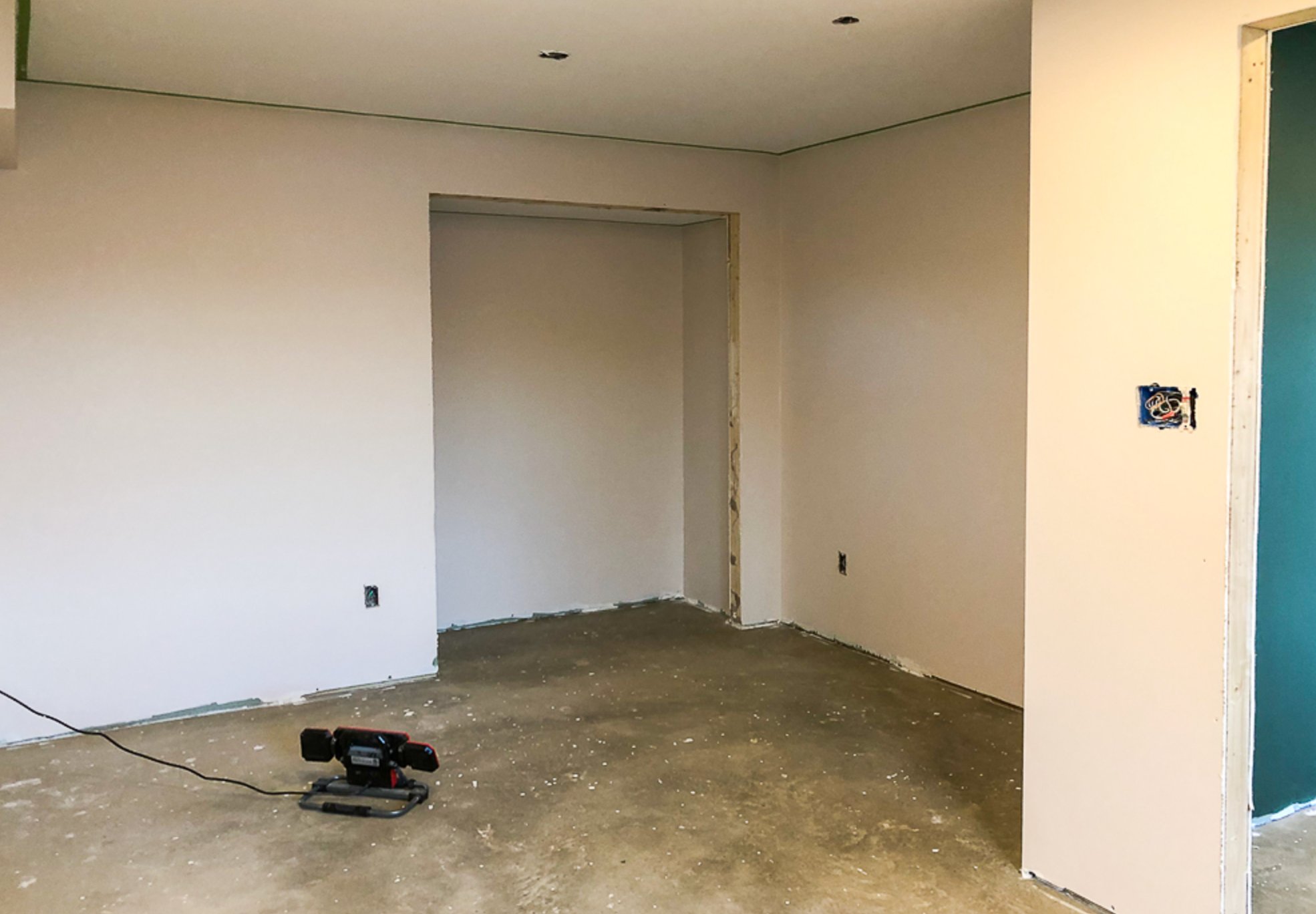
Cultured Pearl is a white with hidden red and purple notes. Instead of reading like a cool white, it has a soft creamy undertone with a slight pink-purple cast.
That mix of warmth and brightness is useful downstairs because it keeps the room from feeling clinical while still helping the walls recede. It stays neutral enough for most furniture, but I would sample it beside red-toned woods and pink-beige carpet because those surfaces can exaggerate the undertone.

I'm Elizabeth, your go-to guide for all things paint and design! My days are filled with color swatches and innovative room makeovers. When I'm not painting the town - literally - I'm soaking up inspiration from my travels. This blog is my way of sharing my passion and making the world a more vibrant place, one color palette at a time.