Best Dark Green Paint Colors
The first time I painted my own bedroom deep malachite green, I learned why dark paint scares people and why it is worth sampling anyway.
Dark green can behave more like a neutral than people expect. It gives white trim a clean edge, makes wood tones look richer, and usually feels softer than black or navy on a full wall.
The catch is light. The same chip can look mossy in a sunny room, nearly black in a hallway, or muddy beside the wrong beige. These are the dark green paints I would actually sample first, with notes on where each one works best.
1. Rookwood Shutter Green by Sherwin-Williams

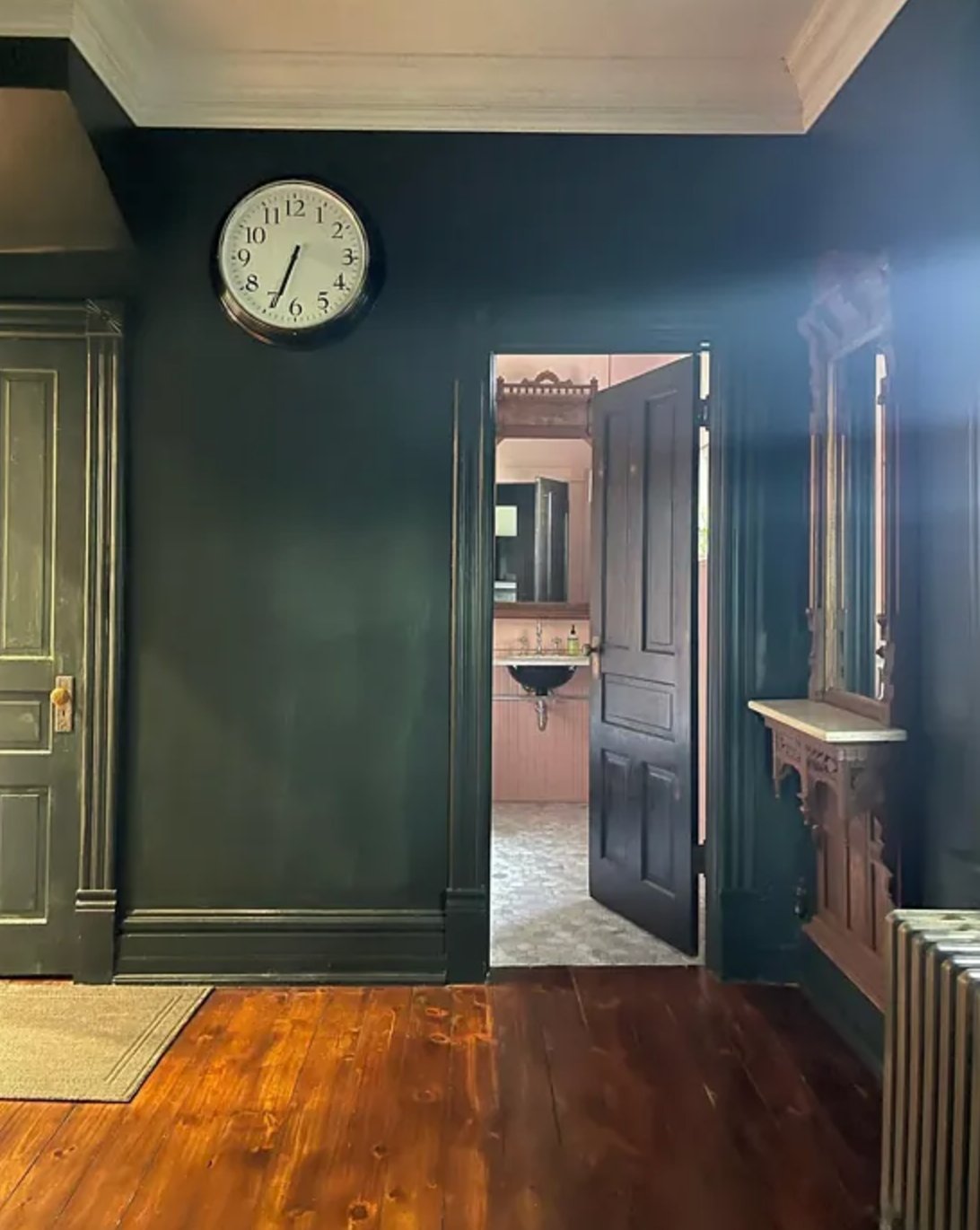
Rookwood Shutter Green is a deep green with cool undertones and just a hint of black. This shade comes from Sherwin-Williams' historic collection and was traditionally used on window shutters.
On interior walls, Rookwood Shutter Green reads tailored rather than loud. It suits older homes with real millwork, but it also works in a simpler room because the black in the formula keeps it from going bright.
I like it most with crisp white trim, walnut, medium oak, and unlacquered brass. If your trim is creamy or yellowed, sample it first because the cool undertone can make old paint look dingy.
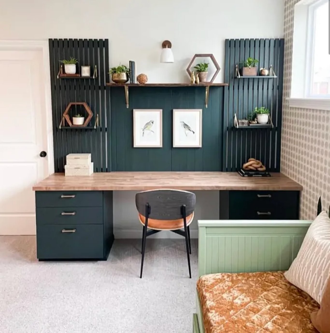
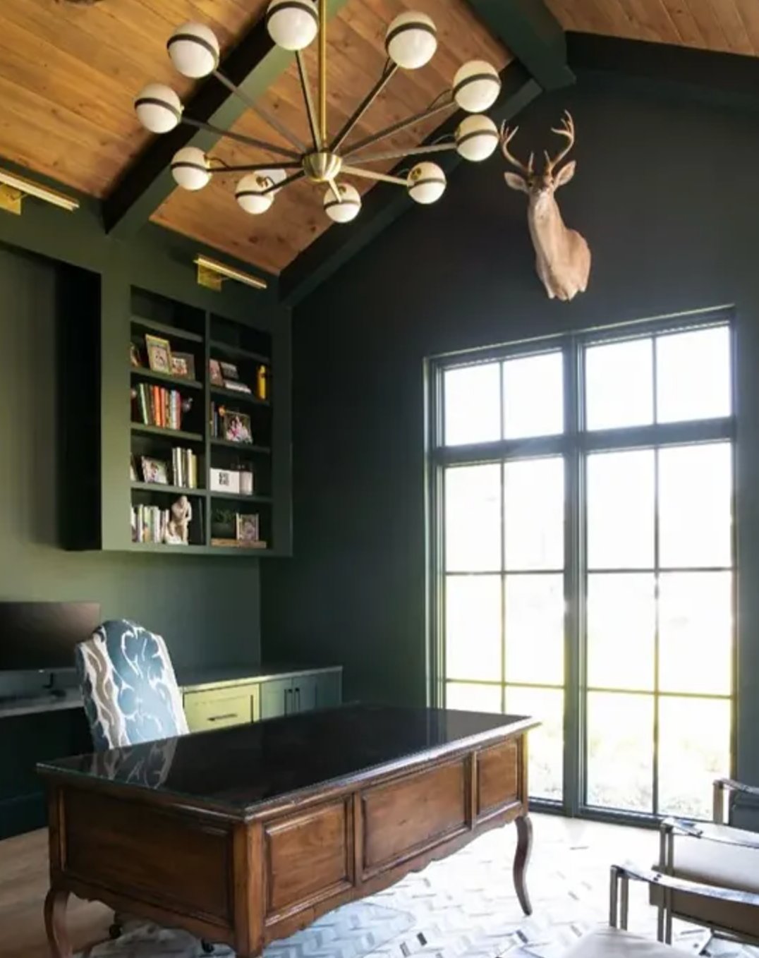
You can use Rookwood Shutter Green on all four walls if the room has decent light, or keep it to one wall when the ceiling is low. Outside, it is a natural fit for doors, shutters, and architectural details that need contrast without a black-green look.
In depth and temperature, it sits close to Benjamin Moore's Black Forest Green, though I find Rookwood Shutter Green a little easier with wood furniture.
2. Oakmoss by Sherwin-Williams
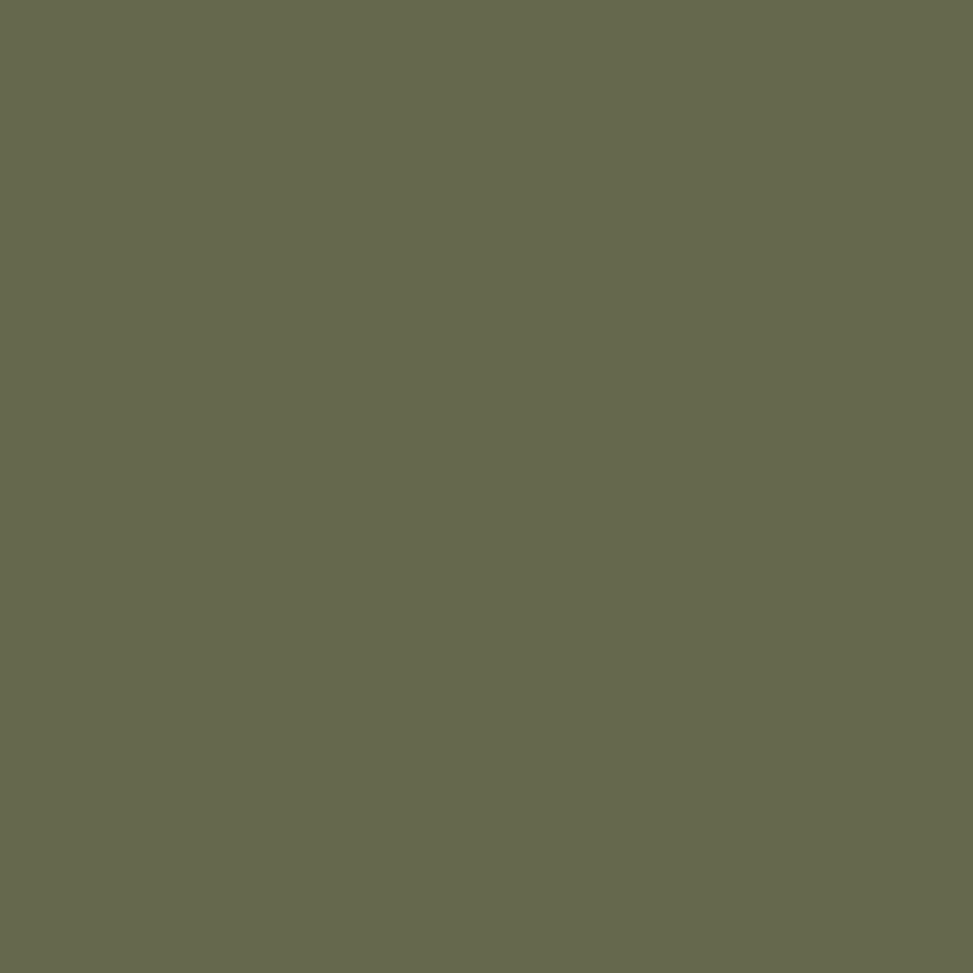
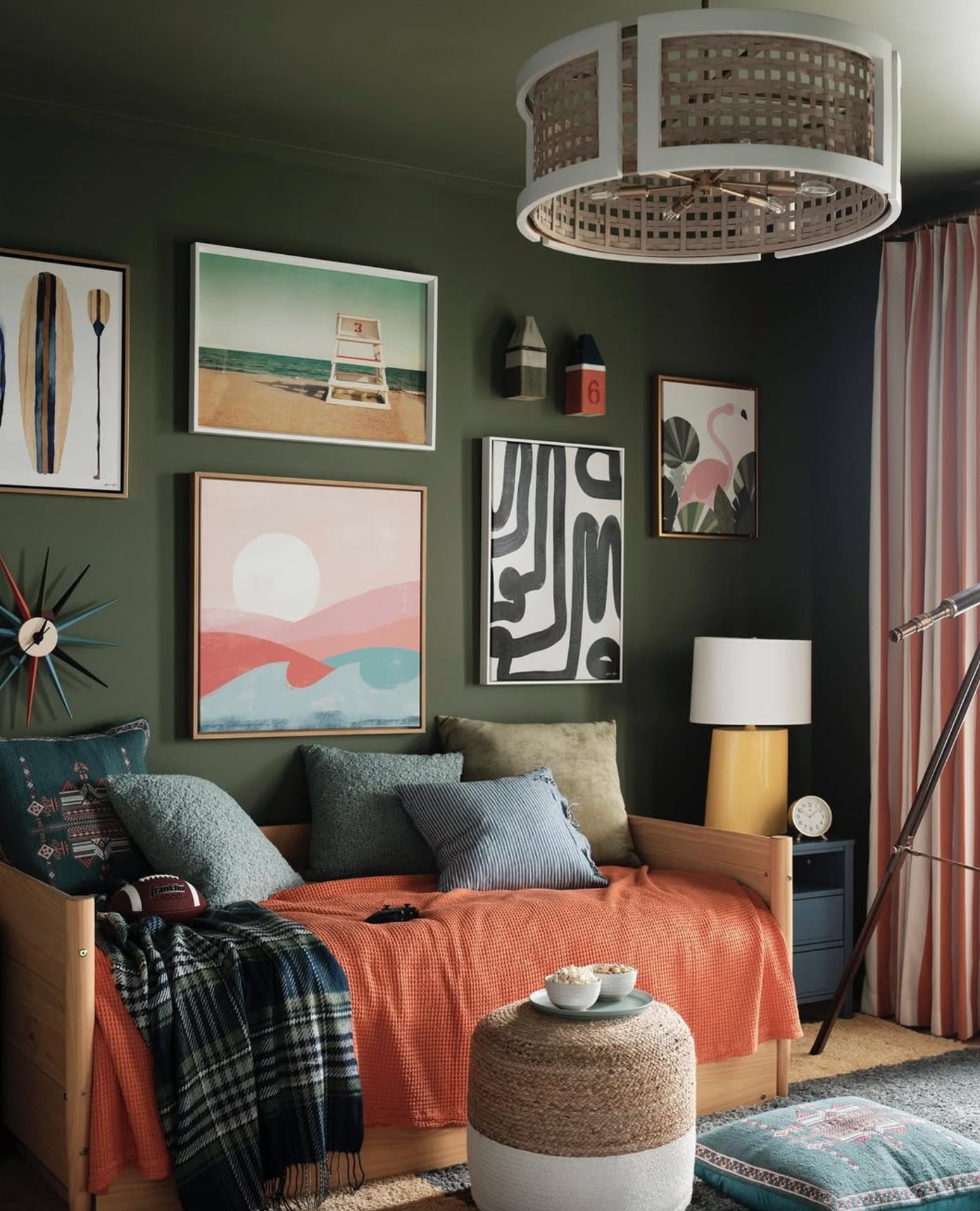
Oakmoss is a rich green with warm yellow-gray undertones. It has that leafy, shaded quality people often want from green, but it is muted enough for real furniture and real flooring.
The yellow-gray undertone softens the depth, so Oakmoss is less severe than the near-black greens on this list. It can also work as a neutral backdrop for stronger accent colors, especially rust, ochre, cream, and warm wood.
Choose the finish based on the surface, not just the look. Gloss will bounce more light and feel more formal, but it shows every bump, patch, and drywall ripple. For most traditional rooms, eggshell is the safer wall finish because it hides minor flaws and still wipes clean.
3. Backwoods by Benjamin Moore

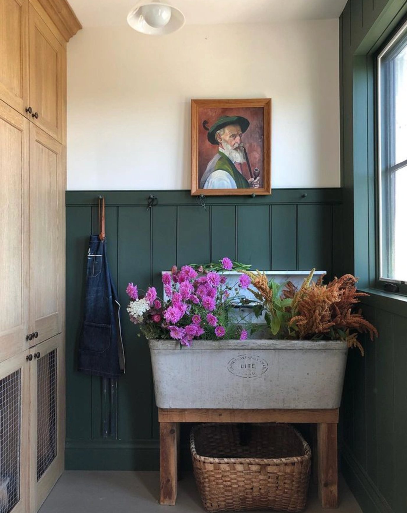
Backwoods takes me back to the forests near my first childhood home. It is a warm dark green with a little black in the mix, so it stays grounded instead of turning grassy.
It plays well with white, soft gray, natural wood, and brass fixtures. I would use Backwoods in a library, bedroom, mudroom, or kitchen with warm counters, but I would be cautious pairing it with very cool marble because the undertones can fight.
4. Jasper by Sherwin-Williams

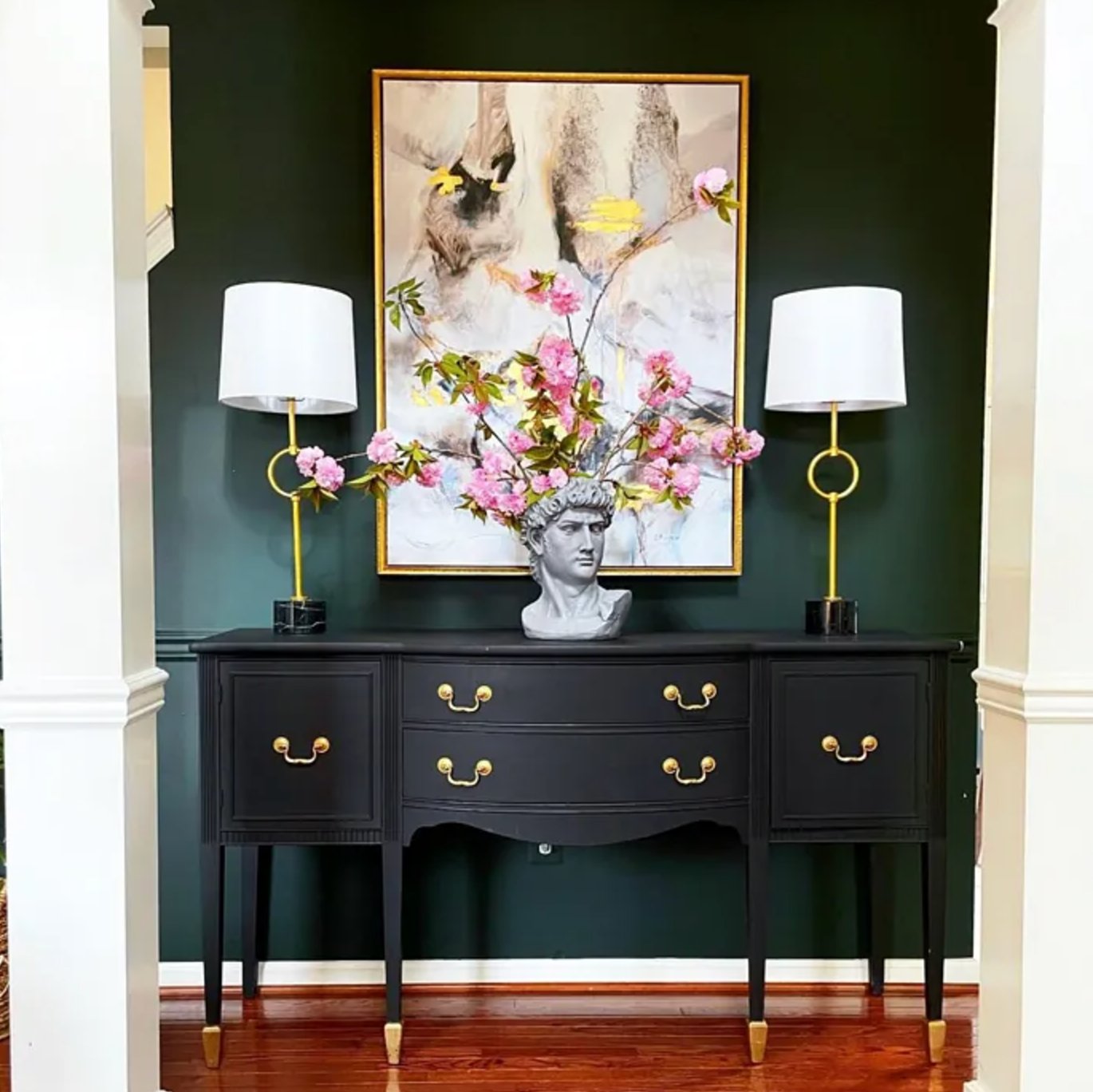
Jasper by Sherwin-Williams is one of the deepest greens here. It reads like dense forest foliage, especially once it is on a vertical surface instead of a tiny chip.
With an LRV of 4, it is firmly in the very dark category. In dim rooms, Jasper can look almost black, which is useful on accent walls or furniture, but risky if you are hoping for an obvious green all day.
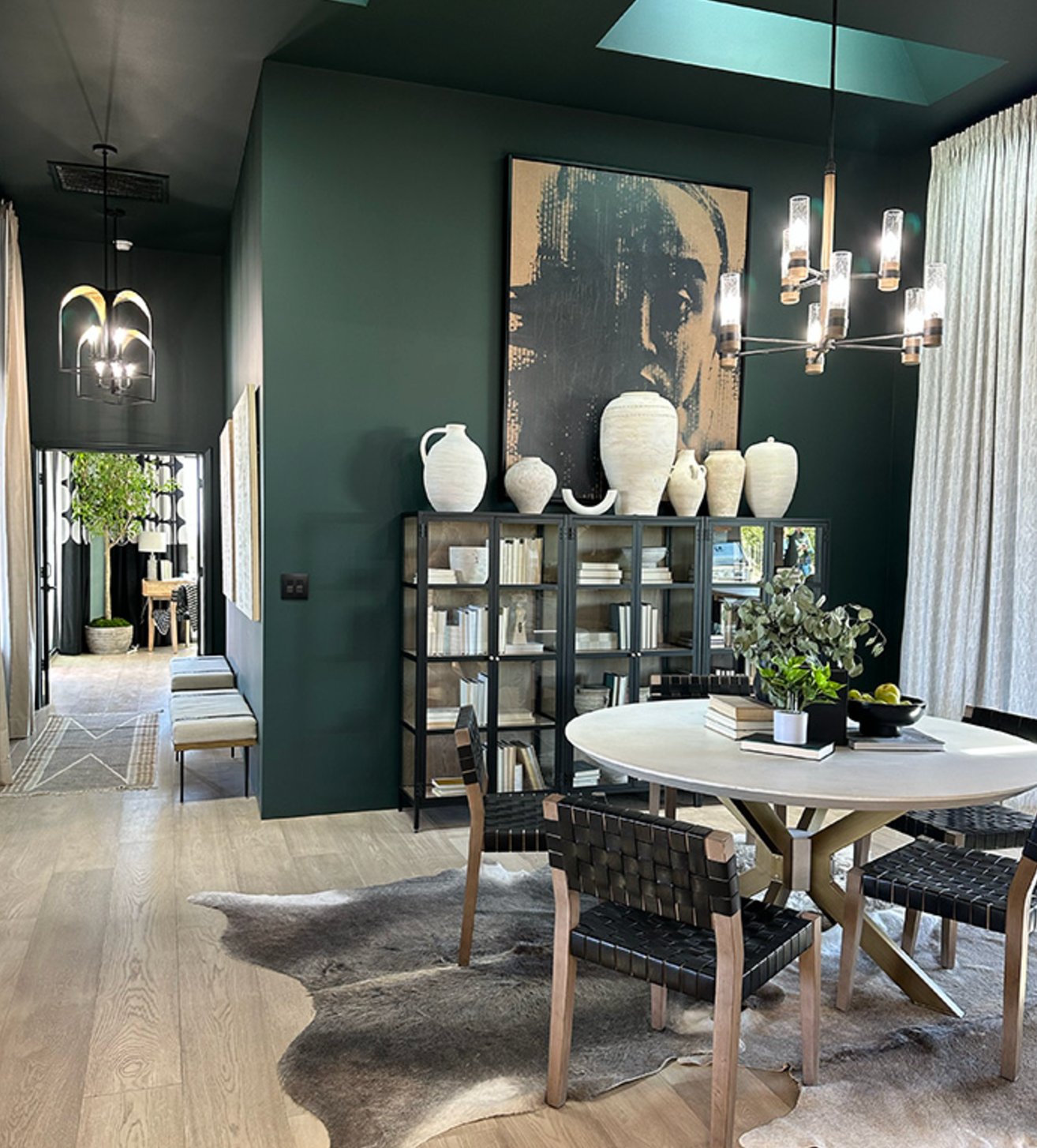

Jasper is excellent in a glossier finish on doors and cabinets, especially with aged brass hardware. On walls, I would sample it beside your largest fixed finishes first, because this much depth magnifies undertone clashes.
5. Alligator Alley by Benjamin Moore

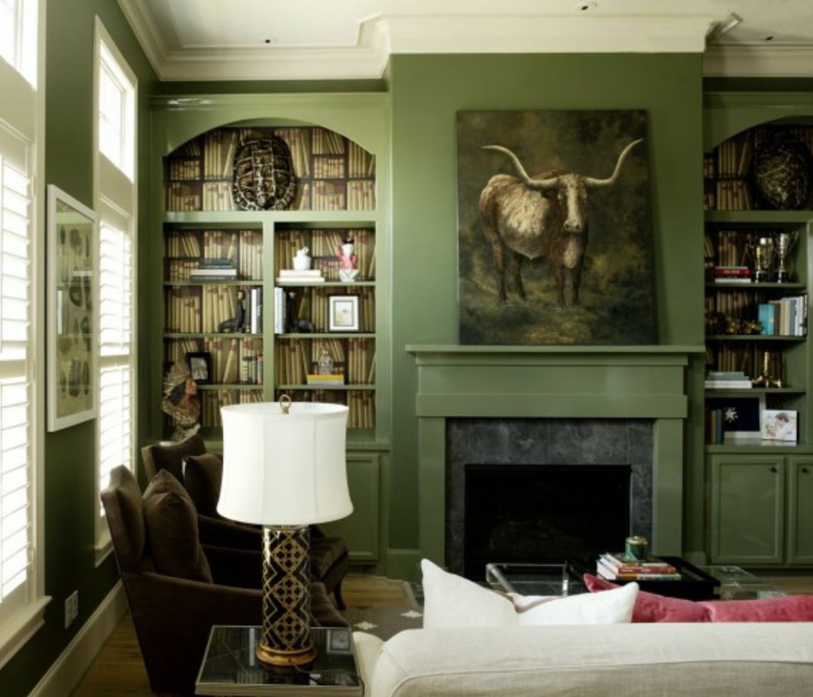
Florida alligators' natural coloring inspired Alligator Alley's dark green. It is a deep forest color that works especially well in tone-on-tone rooms, where the walls, upholstery, and trim all stay in the same green family. In changing light, it can move from soft moss to a richer emerald.
Using it across a full room, as shown above, lets the walls and furniture blend together instead of chopping the room into separate pieces. I like it for home offices and workspaces because it feels focused without the harshness of charcoal.
6. Vogue Green by Sherwin-Williams

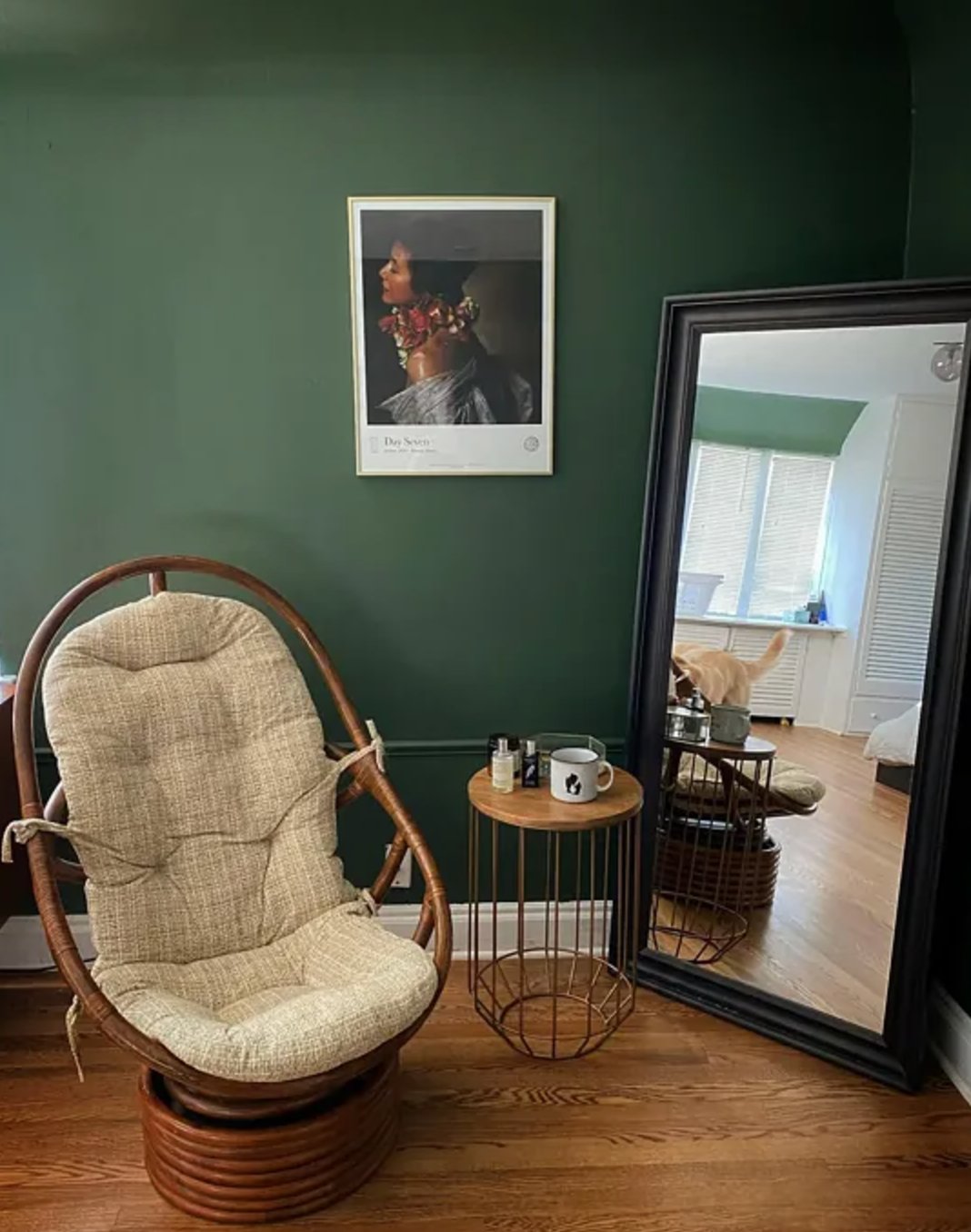
Vogue Green by Sherwin-Williams is a historic dark green that you might have seen in period homes built before the First World War.
Its warm undertones help it stay recognizably green in most lighting. It will look flatter in a dark room, but it does not usually swing blue or read as a black paint.
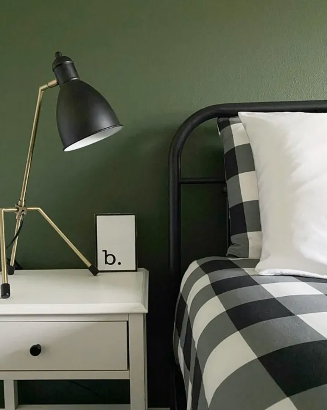
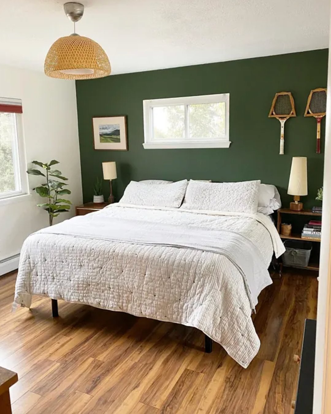
If you are choosing paint for a room that does not get much daylight, Vogue Green is a good sample to include because it keeps more green character than many darker options. Pair it with warm white lamps in the 2700K to 3000K range so it does not feel flat at night.
7. Hunter Green by Benjamin Moore

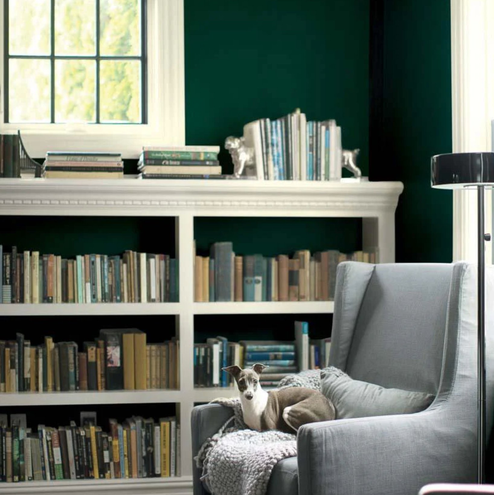
Hunter Green is the classic version of this color family. It has a polished, traditional feel, especially with white trim and tailored furniture.
It has a blue base that gives it a slight coolness. With an LRV of 6.39, this color absorbs a lot of light, so you need good natural lighting if you want it to read green instead of nearly black in corners.
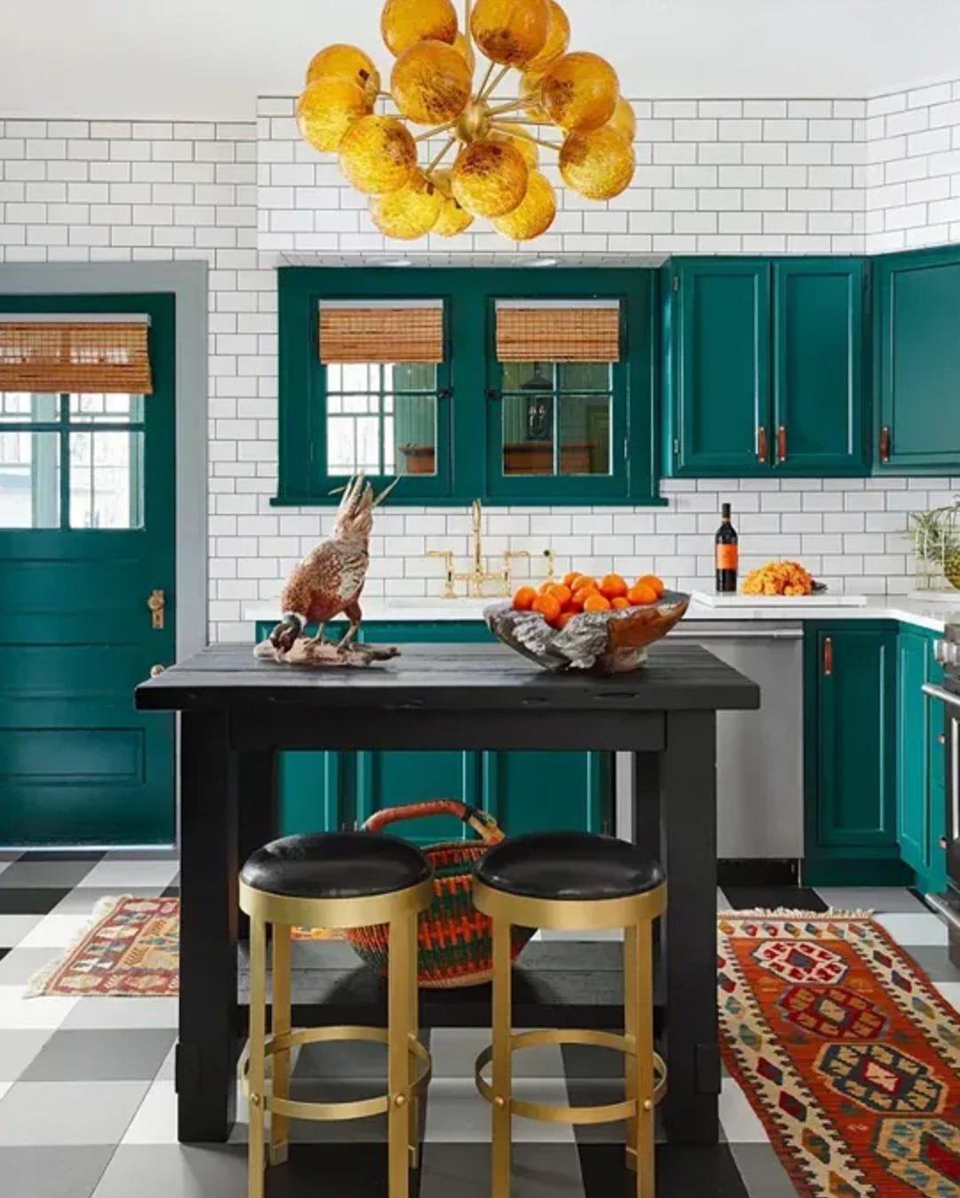
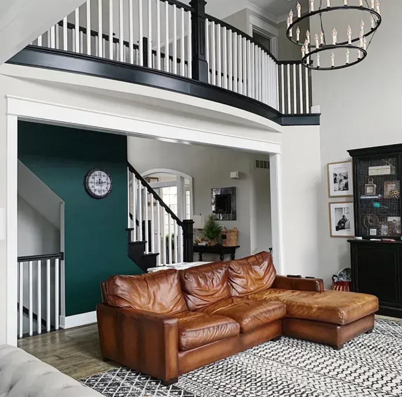
Hunter Green is strongest in larger, well-lit spaces like living rooms, home offices, and dining rooms. It is no surprise that it has become one of Benjamin Moore's top sellers, but I would still sample it on at least two walls before committing.
8. Chrome Green by Benjamin Moore

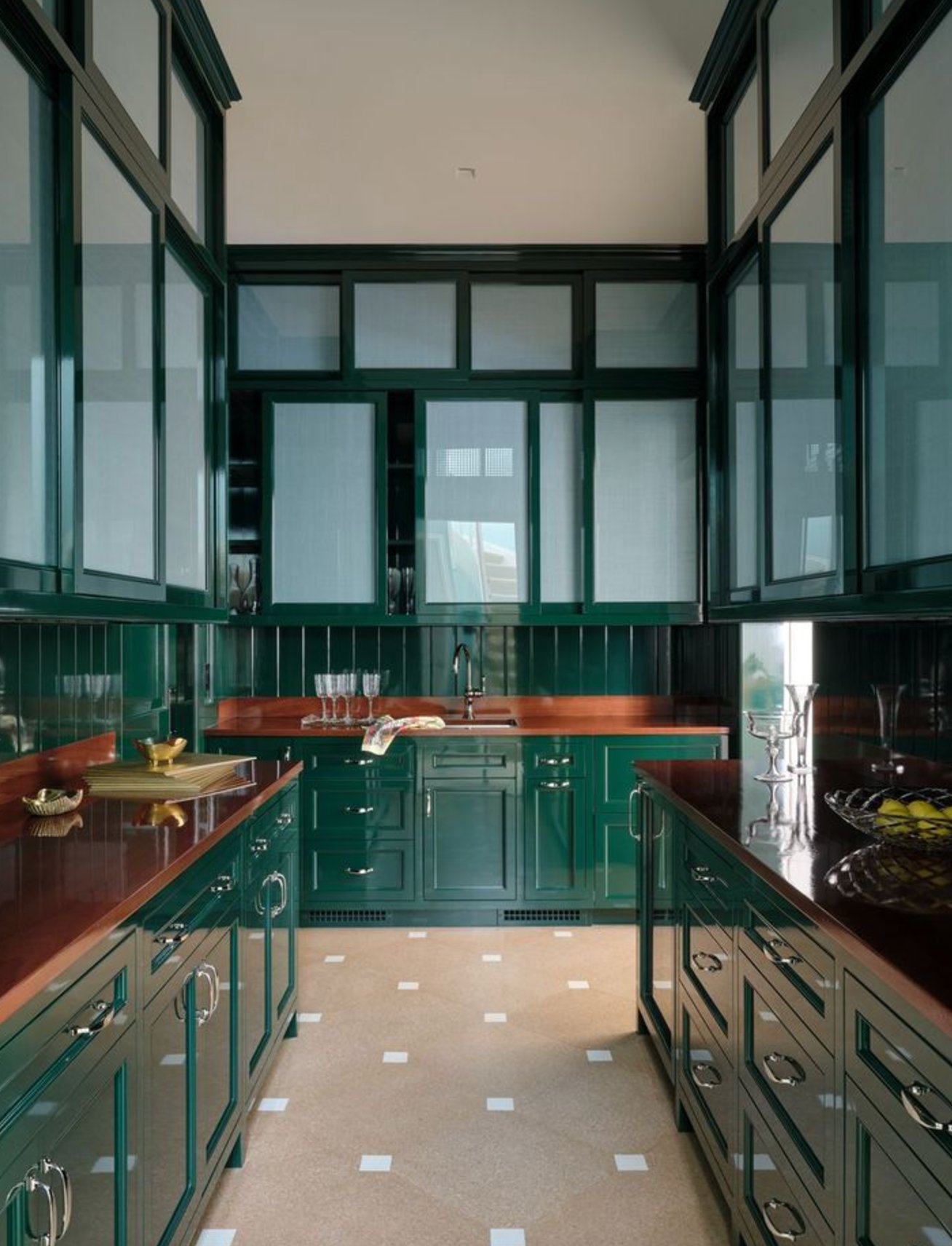
Chrome Green, part of Benjamin Moore's historical collection, is a rich green tied to early American architecture. It is a strong choice for accent pieces, kitchen cabinets, built-ins, and rooms with simple furniture where the paint can do more of the visual work.
9. Black Forest Green by Benjamin Moore

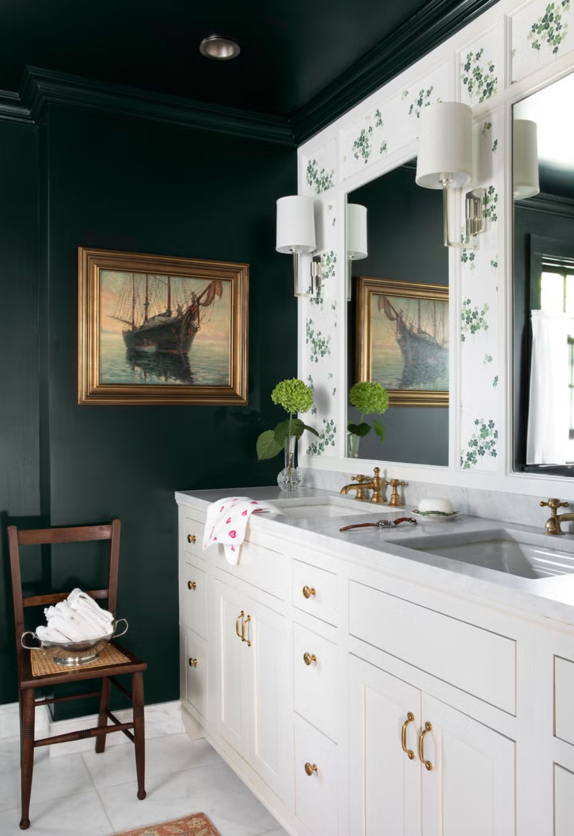
Benjamin Moore's Black Forest Green is a very deep green with black undertones. It is moody in the true sense, not bright, not leafy, and not forgiving in poor light.
In a room with good natural light, you can see the green and blue tones shift through the day. Without enough light, it can look almost entirely black, so do not choose it from a chip at the store.
Designers often use it for accent walls in bathrooms and home offices, particularly in a glossy finish. It pairs well with patterned wallpaper and mirrors, just like in the M. Lavender Interiors project shown above.
10. Vintage Vogue by Benjamin Moore

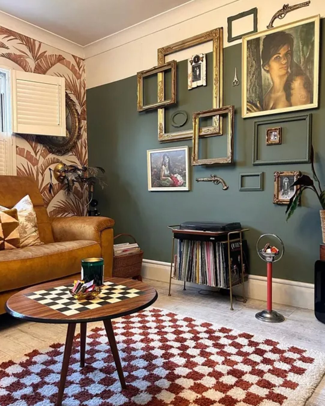
Vintage Vogue is a deep, smoky green that can stand in for black or brown when you want something softer. It feels grounded without making the room feel closed in as quickly as a true black can.
In daylight, Vintage Vogue shows its layered green undertones. In the evening, it can shift darker and almost graphite-like, so test it under the bulbs you use at night.
11. Studio Green by Farrow & Ball

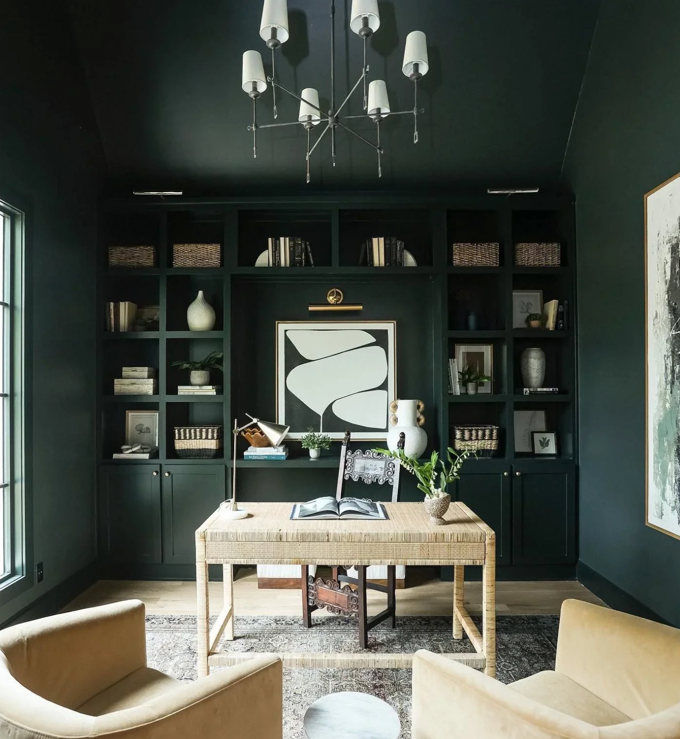
Studio Green changes dramatically with the lighting. In a dim room, it can look almost black. In natural light, especially on exterior walls, the green becomes much easier to see.
The shade also has real history. It was first created in Farrow & Ball's original studio, where the company developed its first paints.
12. Calke Green by Farrow & Ball

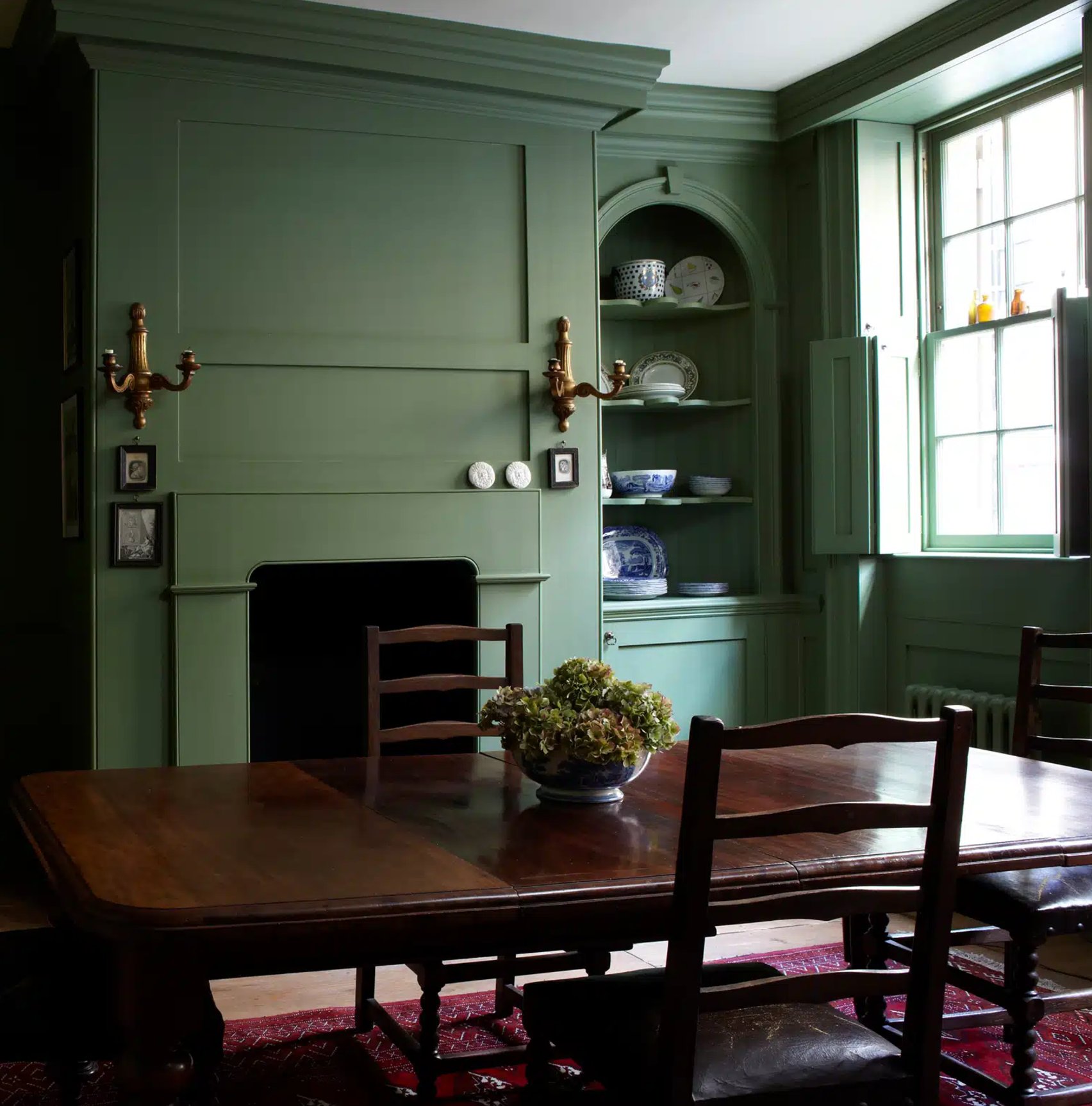
Calke Green by Farrow & Ball is another refined dark green, inspired by the Calke Abbey estate in England. Its rich green base has sage notes, so it works in single-color rooms and with neutrals, particularly Old White. If you are comparing trim and wall pairings, my neutral paint color guide is a useful next read.
You will often see this color in contemporary libraries and music rooms because it gives books, wood instruments, and art a rich background. To lighten the scheme, use Slipper Satin as the pale accent; it brings out Calke Green's depth without turning the room stark.
13. Cedar Path by Benjamin Moore

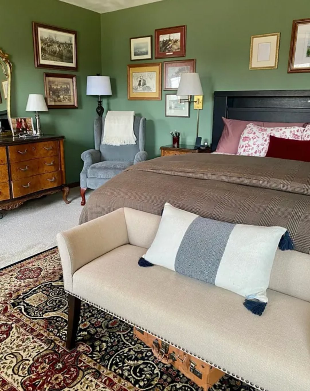
Benjamin Moore's Cedar Path reminds me of a shaded walk through pine forest. It is a soft, woodsy green, and in good natural light you can see several green notes instead of one flat color.
Designers often use Cedar Path across an entire room for a wrapped-in-green effect. It is a good candidate for bedrooms because it has enough gray and earthiness to feel calm, but I would avoid pairing it with pink-beige carpet or tile.
14. Peale Green by Benjamin Moore

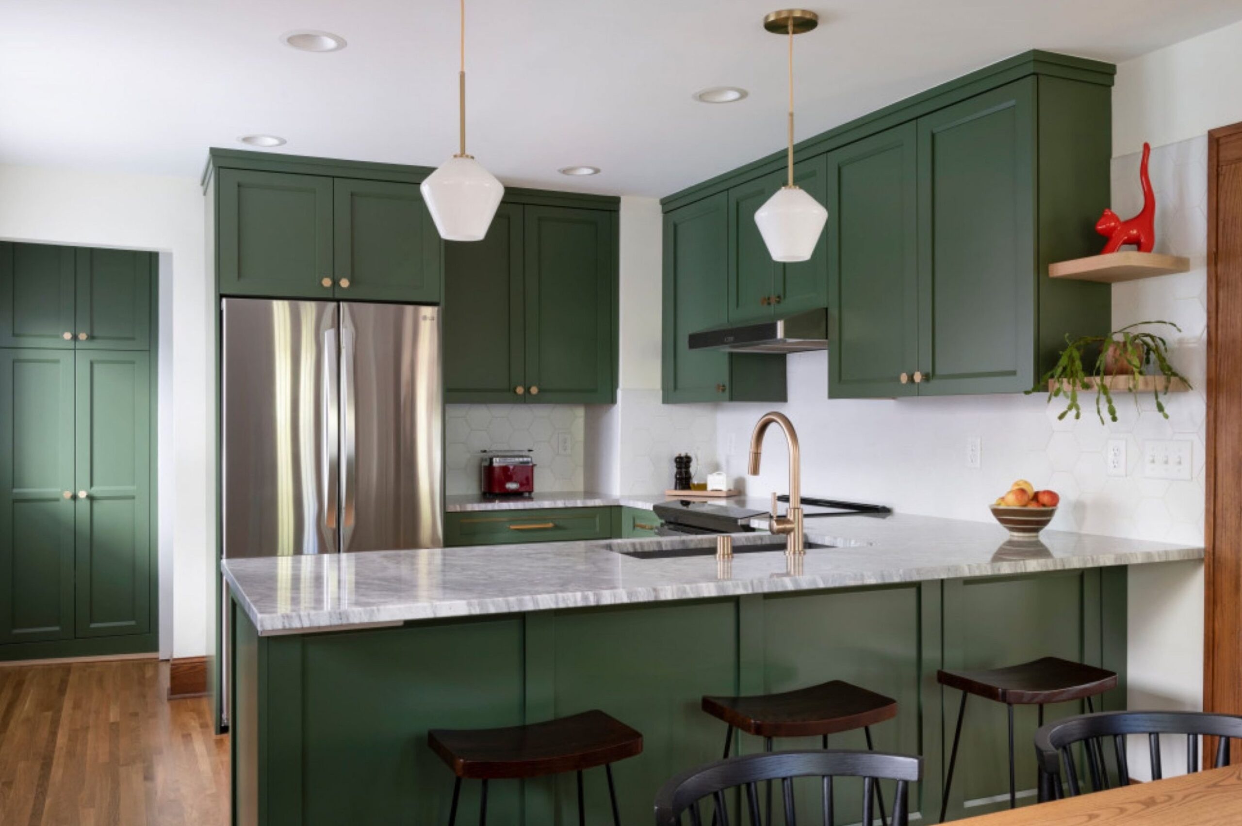
When people ask for a deep forest color that still feels livable, I often point them to Peale Green. It has a useful balance of earthy and green tones. The color is rich, but the muted undertones keep it from shouting in a kitchen or dining room.
15. Pewter Green by Sherwin-Williams

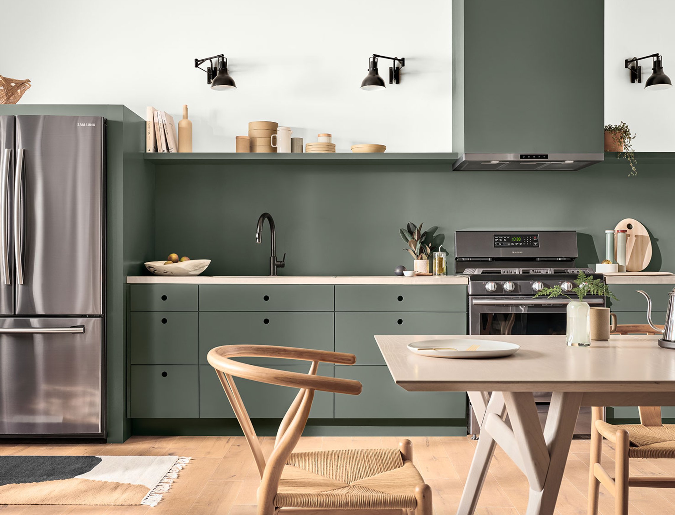
Pewter Green blends deep green with cool gray undertones, which makes it one of the easier dark greens to use.
On cloudy days, it leans more gray. In natural light, the green depth is clearer. It works on built-in cabinets, wall paneling, interior walls, and exterior siding because the gray keeps it restrained.
Like most greens, it pairs well with wood and metal finishes. It is especially good with black hardware, brushed nickel, medium oak, and off-white walls.
16. Shade-Grown by Sherwin-Williams

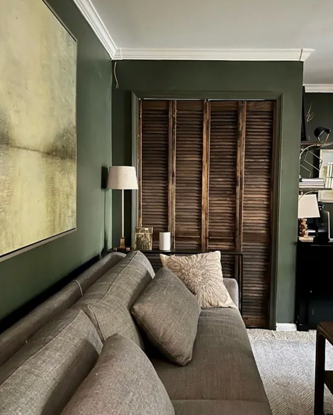
Shade-Grown is a rich olive with gray undertones that temper its intensity. The gray keeps it from looking too bold, so it does not have the bright olive cast many people remember from 1970s interiors.
This paint changes noticeably with the light. Sometimes it reads as a rich green, and other times it looks more earthy and subdued. If you want a cooler version of this idea, Ripe Olive is worth sampling beside it.

I'm Elizabeth, your go-to guide for all things paint and design! My days are filled with color swatches and innovative room makeovers. When I'm not painting the town - literally - I'm soaking up inspiration from my travels. This blog is my way of sharing my passion and making the world a more vibrant place, one color palette at a time.