Best Wall Colors for Gray Floors
Gray flooring gives you a clean base, but the wall color has to answer the floor's undertone first.
Choose the wrong white, beige, blue, or green, and gray floors can start to look cold, flat, or oddly purple by afternoon.
These are the wall color families I reach for most often with gray floors, along with the places where each one can go wrong. Some are quiet and traditional. Some are bolder. None of them should be chosen from a tiny paint chip alone.
White is not your only safe option. In many rooms, it is not even the best one.
How to Match Your Walls to Gray Floors
Gray floors usually fall into two undertone camps, and that undertone should drive the wall color. Cool grays show blue, green, or violet notes, especially in many laminates and porcelain tiles. Warm grays lean brown, taupe, or beige, which is common in gray-washed wood, concrete-look tile, and some natural stone.
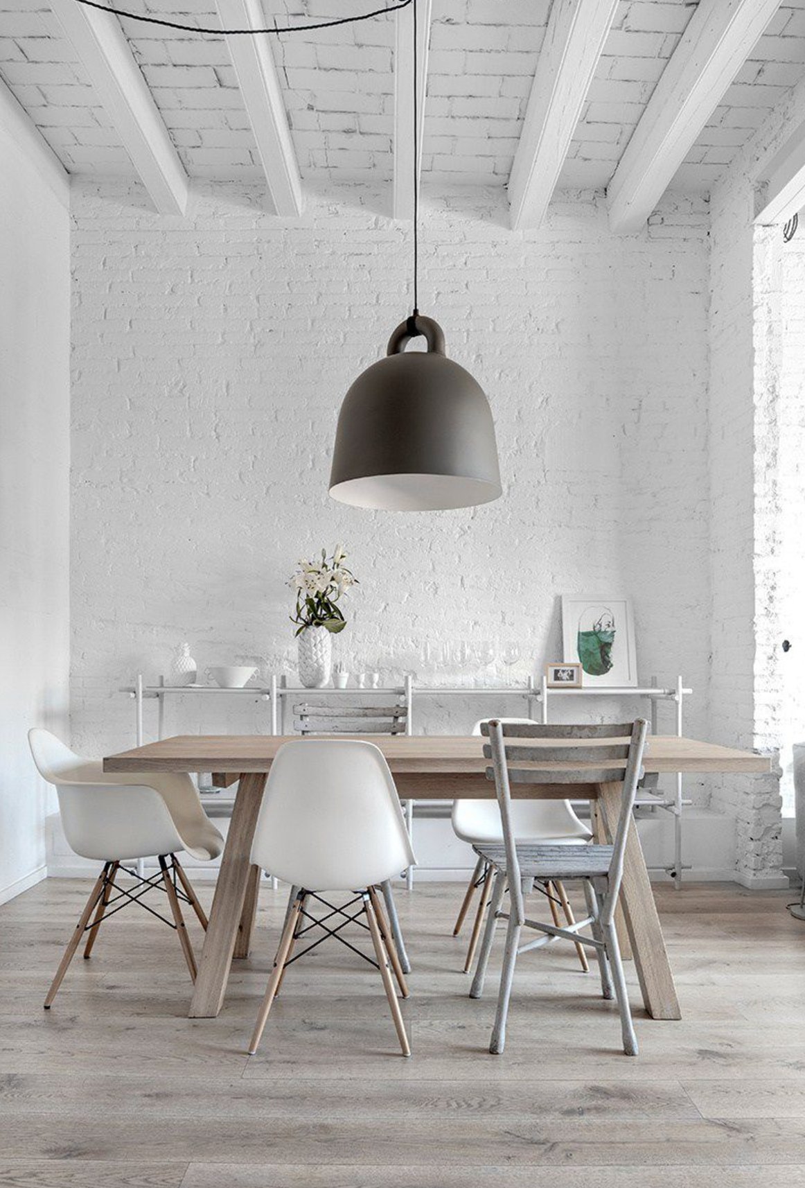
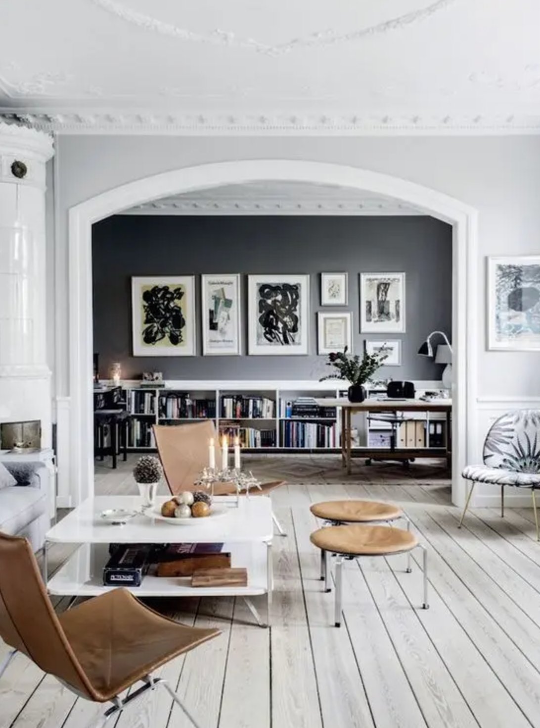
Cool gray floors read clean and modern, but they can turn sterile fast. They usually pair best with controlled cool colors, such as crisp white, softened blue, slate, or a green with enough gray in it.
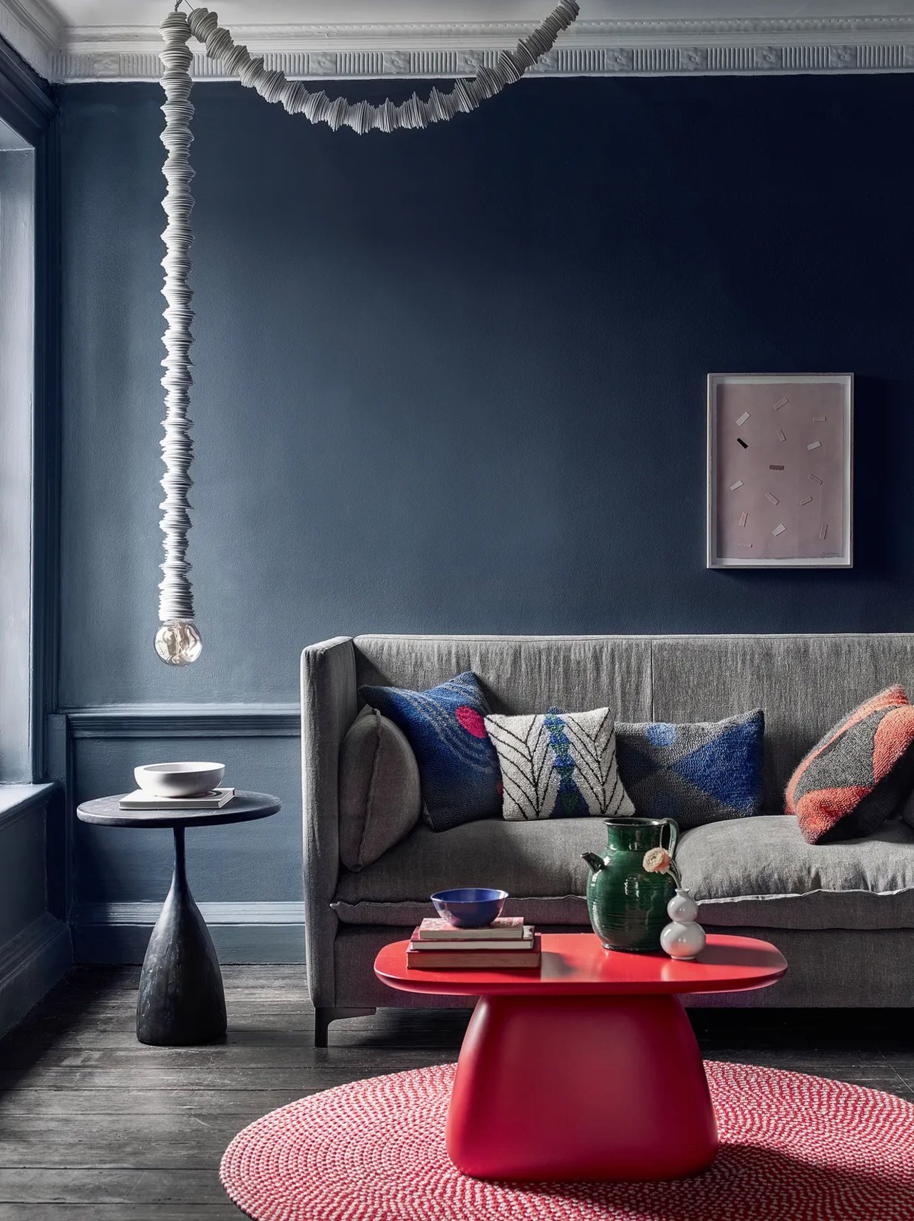
Dark walls can also work with cool gray floors, especially if the room has good daylight, white trim, and enough fabric or wood to keep the room from feeling hard.
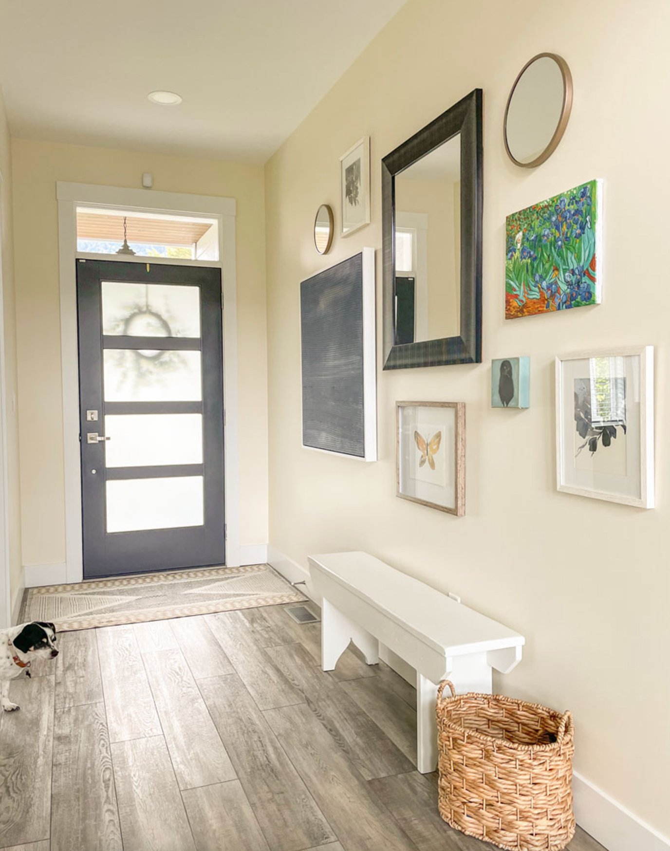
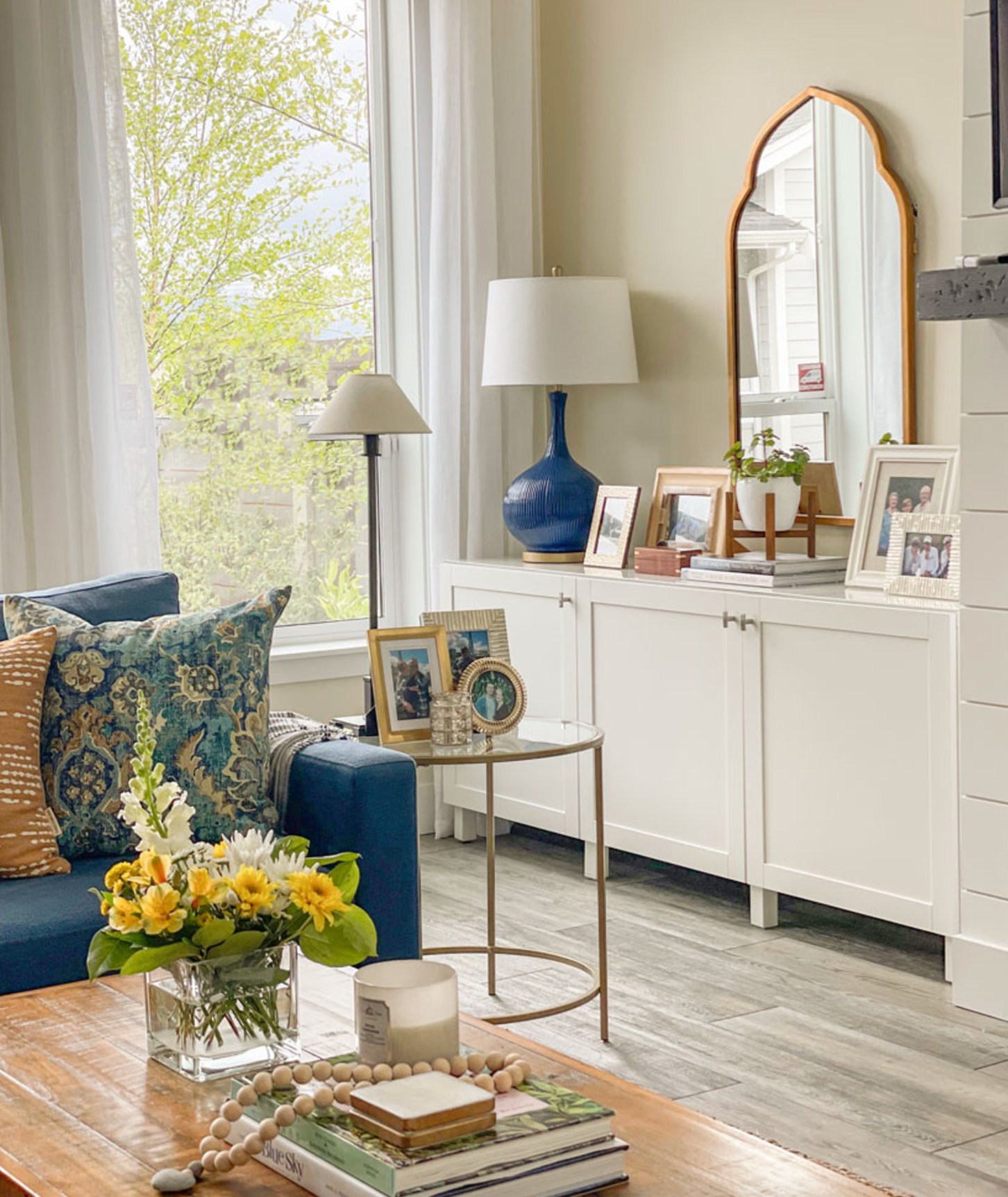
Warm gray floors are more forgiving because the brown or beige undertone softens the gray. They handle cream, greige, muted green, and medium warm colors better than a blue-gray floor would.
Use light walls when the room is small, narrow, or short on natural light. Use darker walls when you want the floor to recede and the room already has enough light, contrast, and pale surfaces to balance the weight.
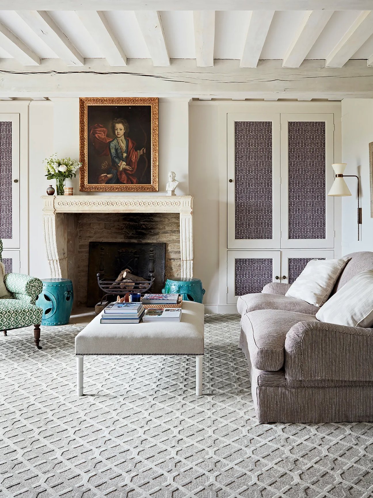
The value of the floor matters too. Light gray floors give you more range because they can support pale colors or deeper contrast. Dark gray floors usually need lighter walls, lighter rugs, or a pale ceiling so the room does not feel bottom-heavy.
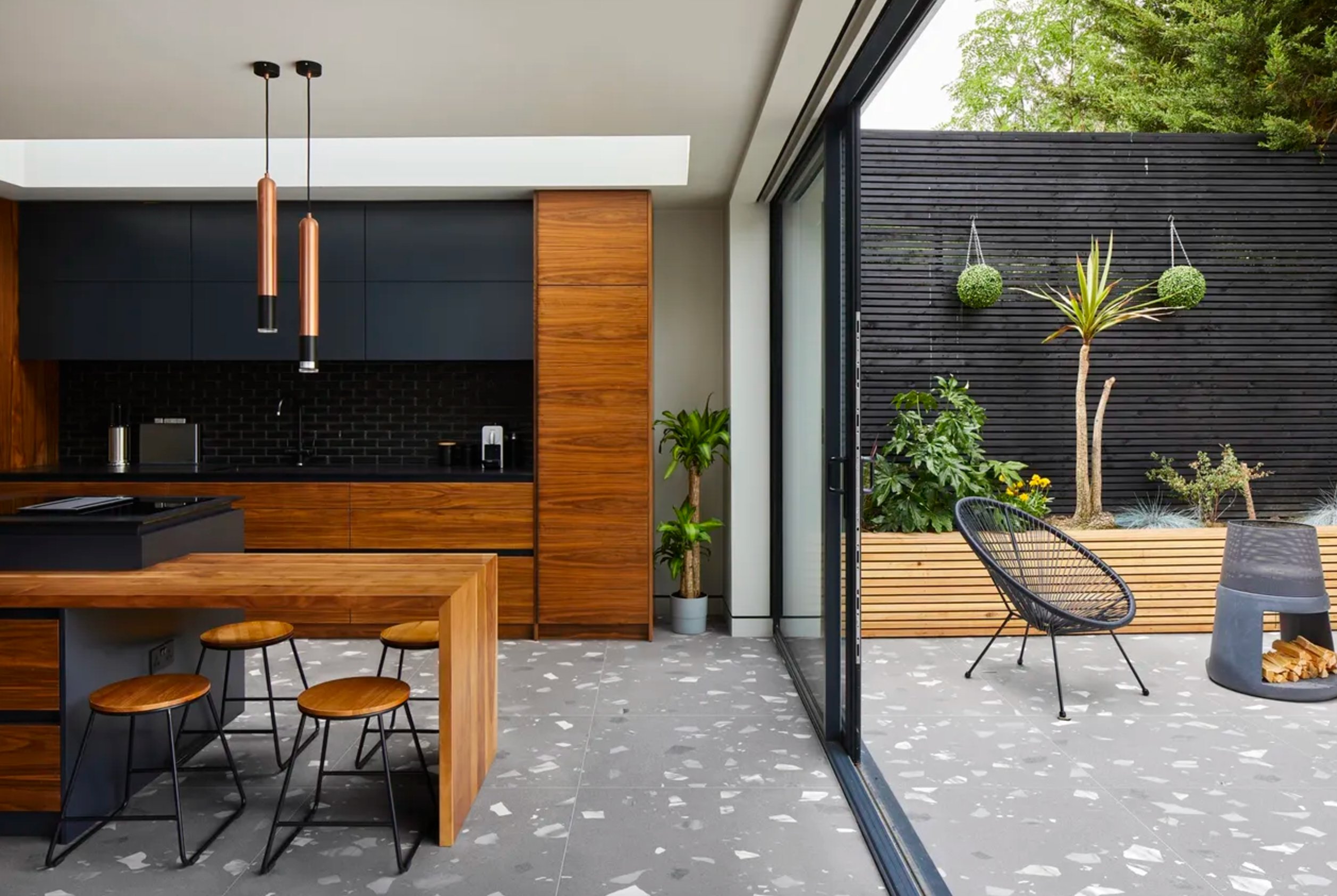
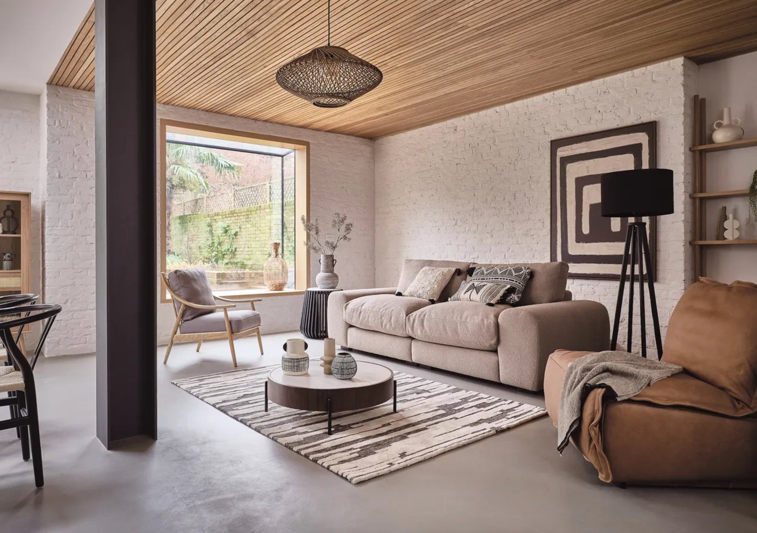
Texture changes the answer. If the floor has heavy grain, veining, or a busy tile pattern, keep the walls simple and solid so the room has one clear focus.
Smoother floors can take more color on the wall. Before you commit, paint two sample boards and stand them upright where the wall meets the floor. Check them in morning light, afternoon light, and at night with your lamps on.
1. Off-White
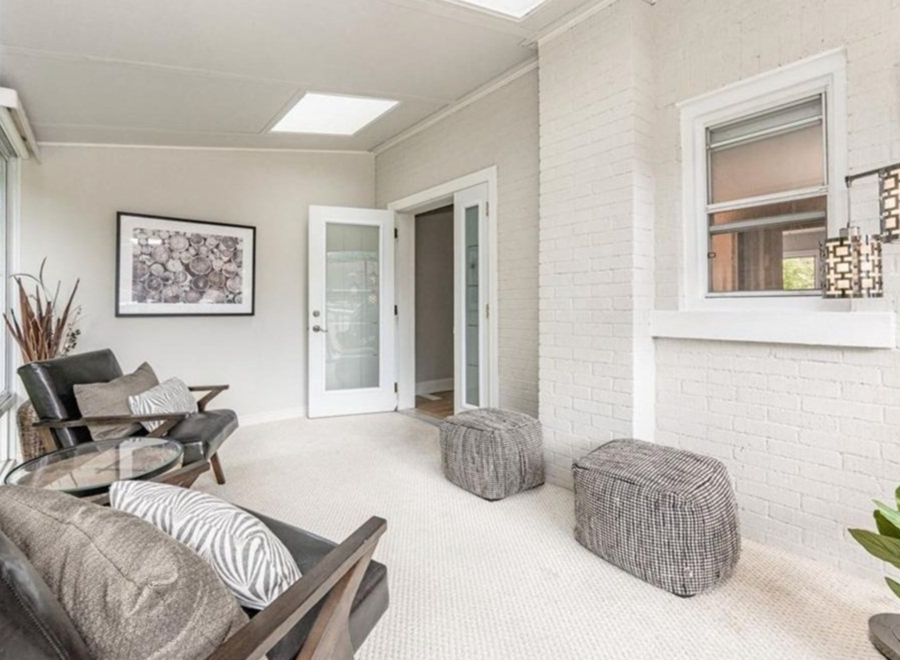
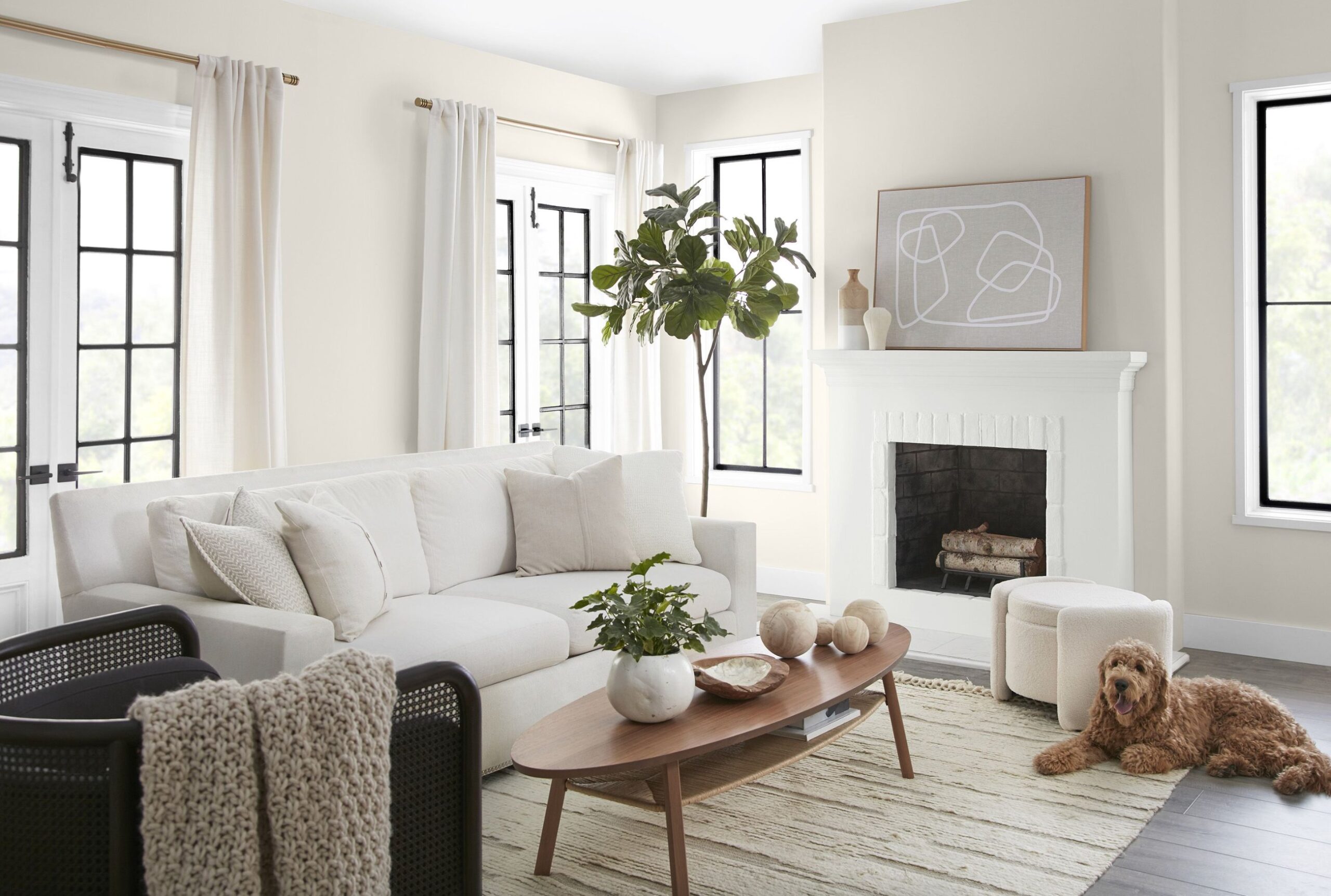
Off-white is the safest wall color for many gray floors, but it needs the right undertone. Pure white can make gray flooring look colder, while a creamier white softens the edge without turning the room yellow.
Off-white walls also give you flexibility with rugs, sofas, art, and wood finishes. That matters if the floor is already fixed and you are slowly changing the rest of the room.
Match the white to the floor. If the floor leans warm or taupe, I would sample Swiss Coffee by Benjamin Moore because its beige note sits comfortably against warmer gray. For a cooler gray floor, Strong White by Farrow & Ball is often cleaner because it carries a soft gray undertone instead of a creamy one.
2. Greige
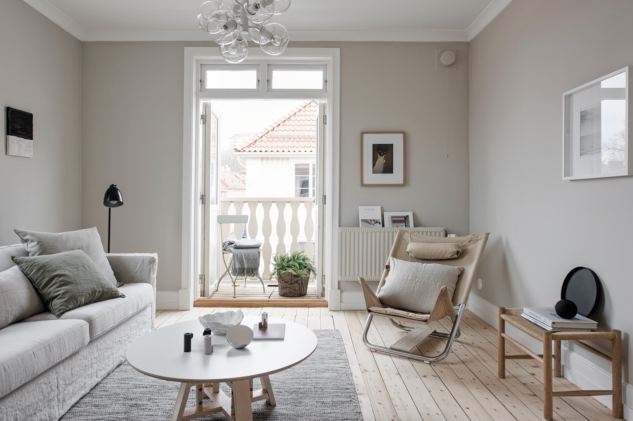
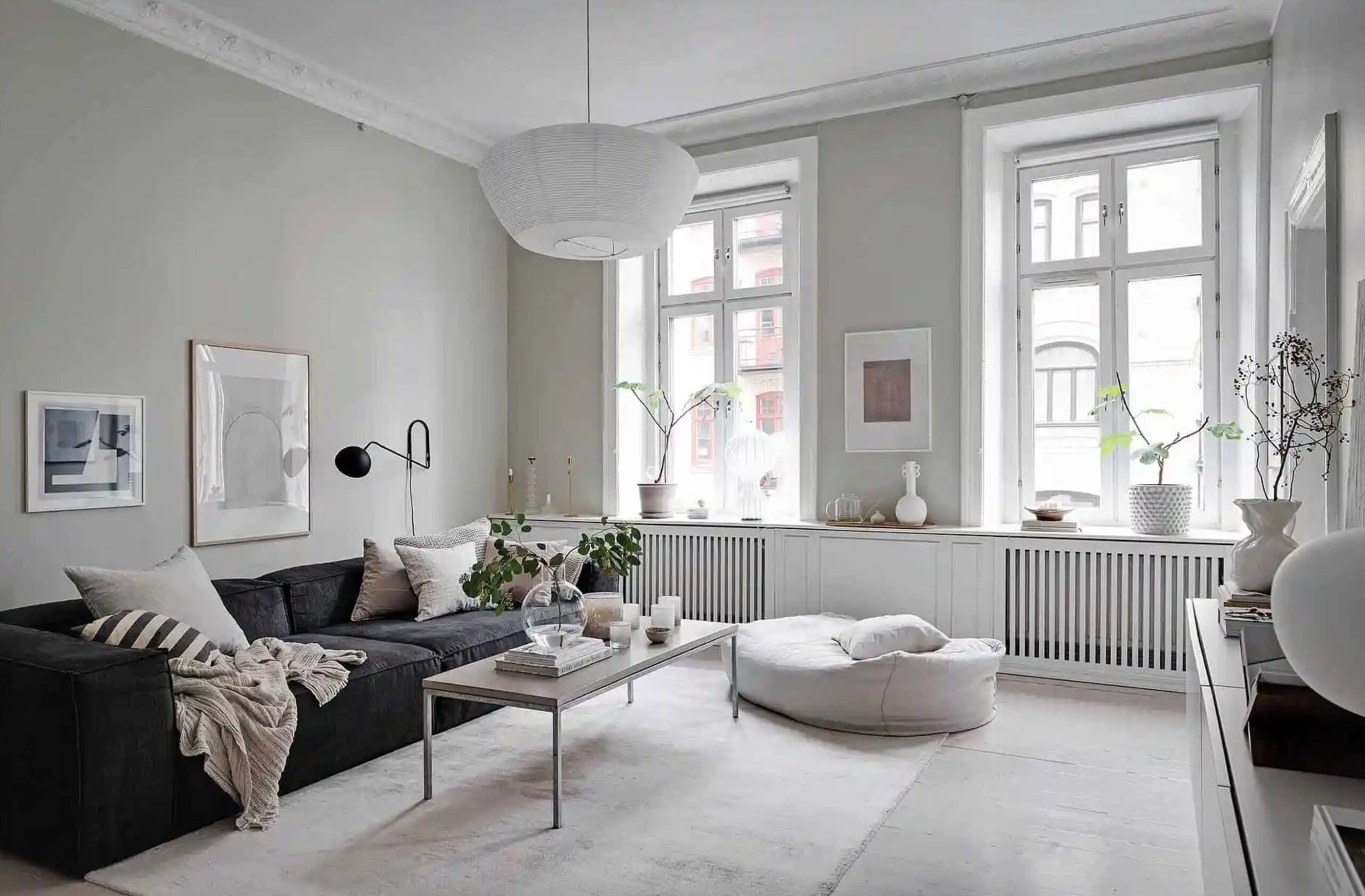
Greige works with gray floors because it bridges gray and beige. It is especially useful when the floor looks gray in some light and taupe in other light.
A good greige takes the office feeling out of gray flooring without fighting it. Go cooler if your floor has blue or green in it. Go warmer if your floor has brown, tan, or driftwood notes.
My personal favorite is Revere Pewter HC-172 for warm gray floors and rooms with decent light. If you need something lighter, sample Agreeable Gray SW 7029. It has enough warmth to soften gray flooring without reading beige on most walls.
Sunny rooms can handle deeper greige because daylight keeps the color open. If the room has one small window or faces north, go lighter than you think. Mid-tone greige can look muddy fast on a large wall.
3. Sage Green
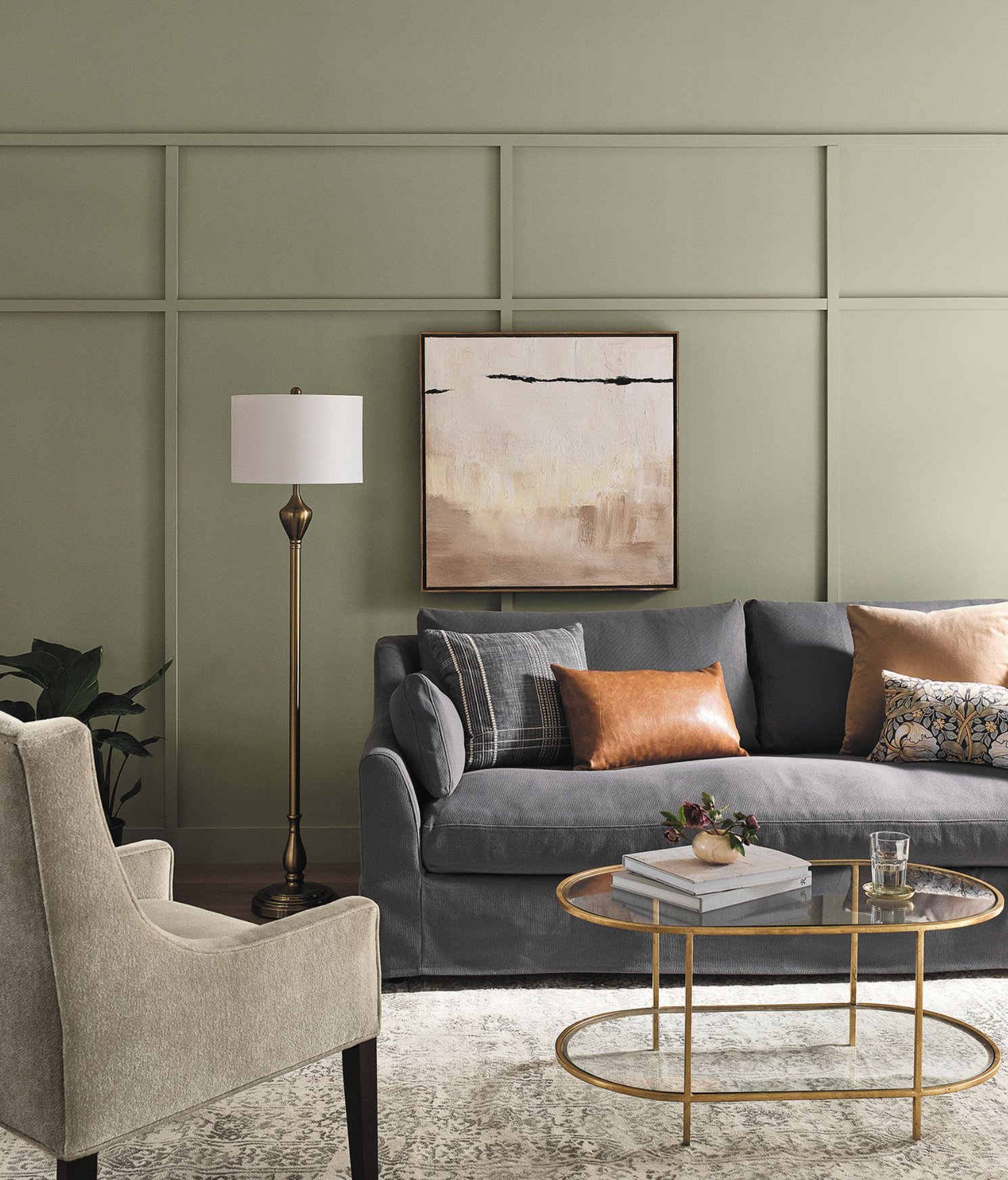
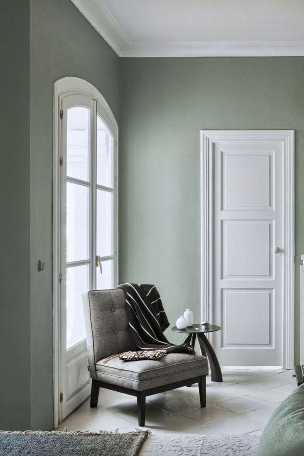
Sage green is one of the easiest real colors to use with gray floors. The gray in sage keeps it calm, while the green brings back some life that gray flooring can take out of a room.
I like this combination in living rooms, bedrooms, and home offices, especially when there is wood furniture in the room. Oak, walnut, rattan, and leather all help sage green feel intentional instead of pastel.
Saybrook Sage by Benjamin Moore is a dependable choice because it has enough green depth to show up, but not so much yellow that it clashes with cool gray floors. If your floor has a purple cast, sample carefully. Some green paints can make that violet undertone more obvious.
4. Pale Blue
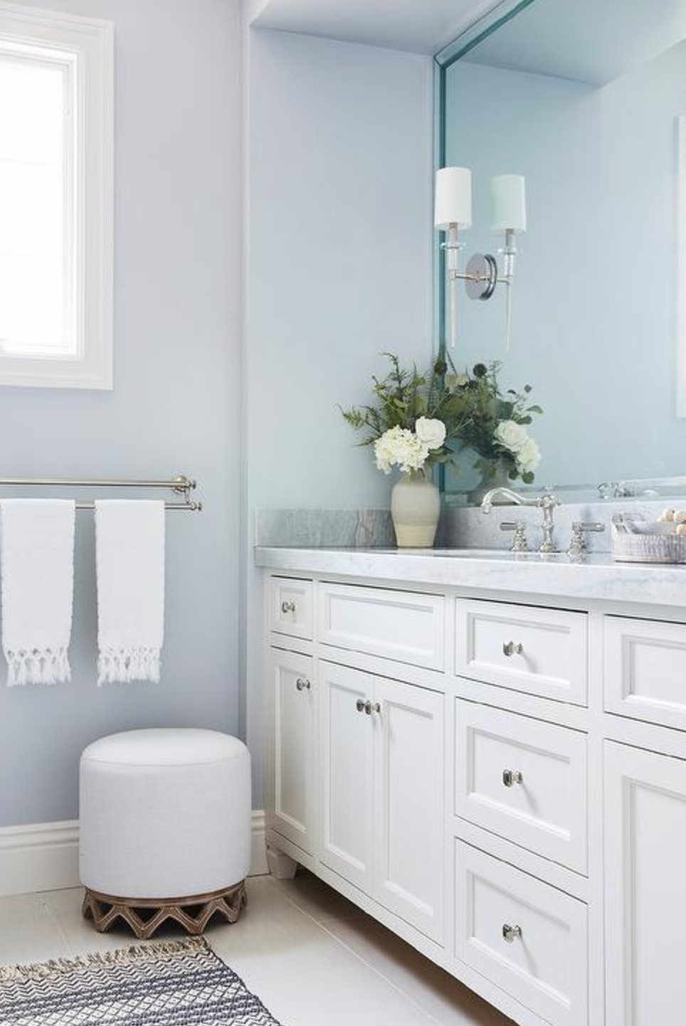
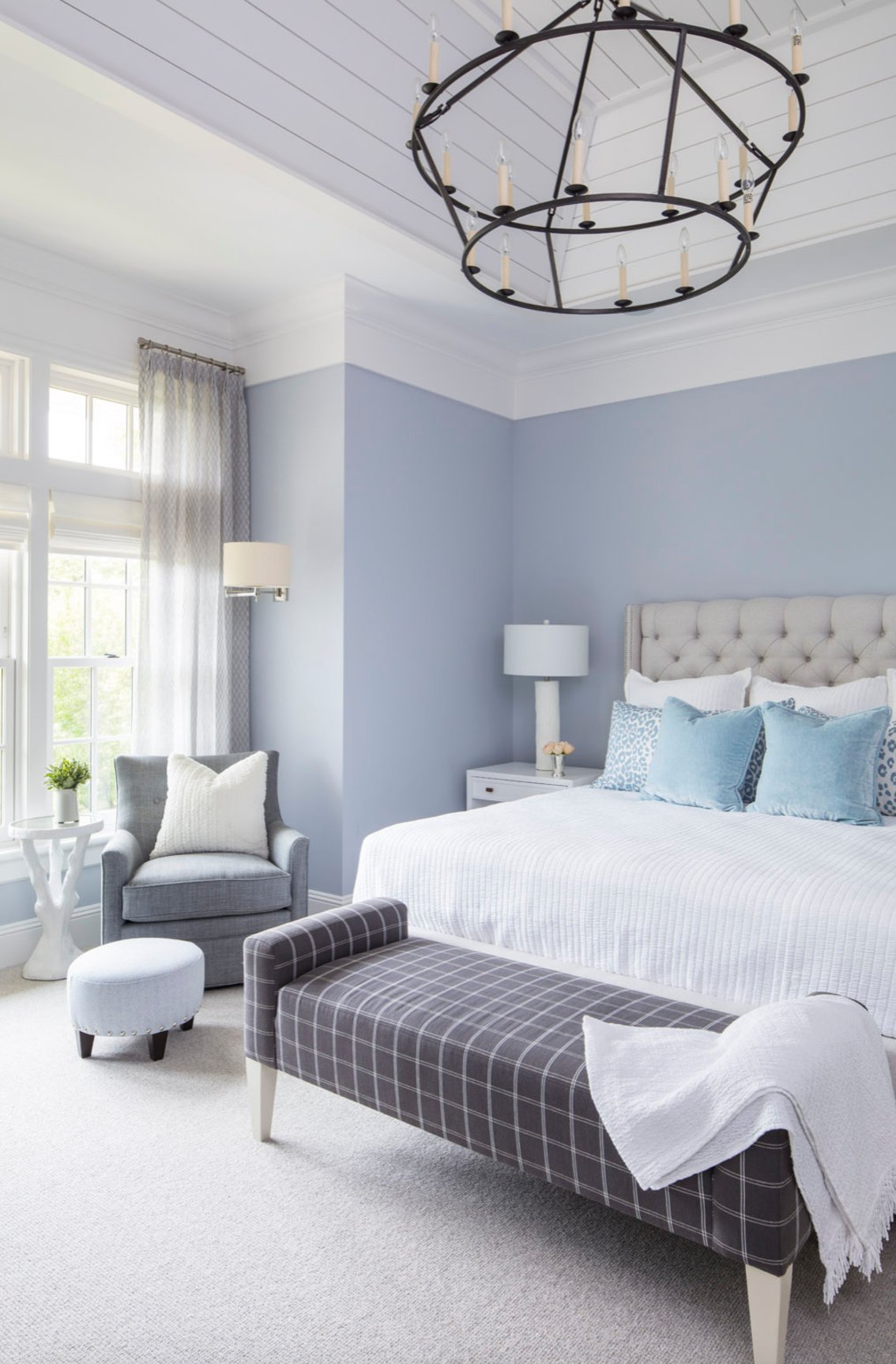
Pale blue works best with cool gray floors and rooms that can handle a little extra coolness. It can make a low ceiling feel lighter because the wall color visually recedes.
For specific shades, look at Borrowed Light by Farrow & Ball. Its silvery undertone connects well with gray flooring. Benjamin Moore's Breath of Fresh Air is a touch warmer than a typical pale blue, which helps if your room has cream upholstery or warmer bulbs.
Pale blue needs testing under your actual bulbs. In a dim room with cool LED lighting, it can look icy. If that happens, try a blue with a little gray or green in it, or warm the room with 2700K to 3000K lamps.
5. Deep Charcoal
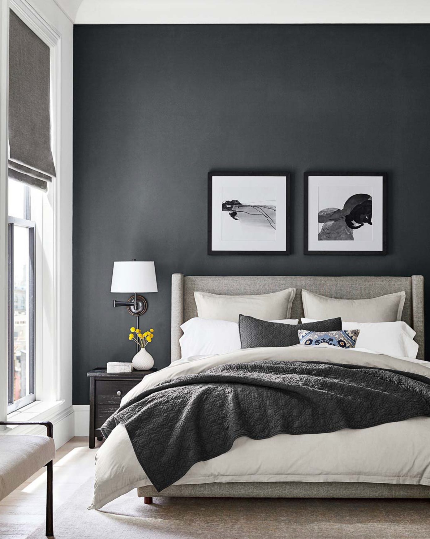
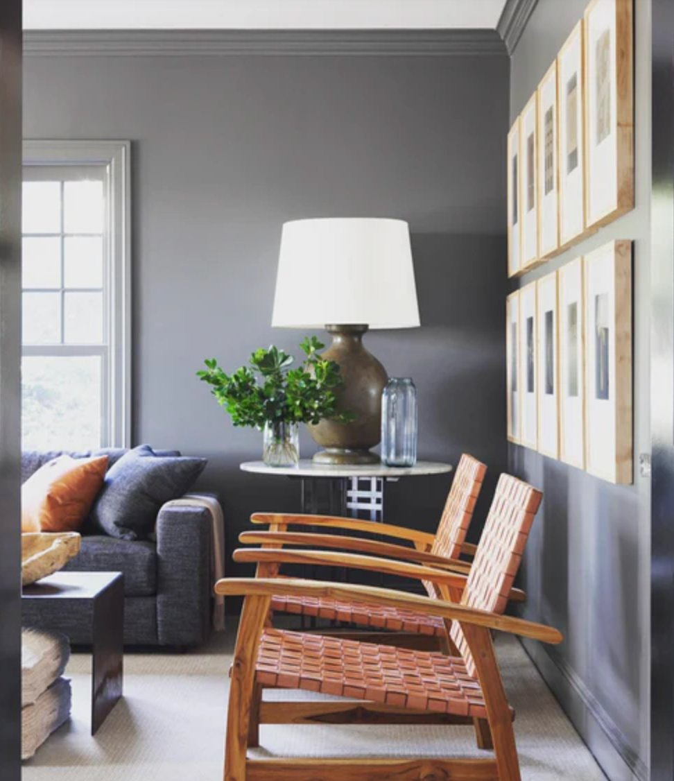
Deep charcoal works with gray floors when you want contrast without bringing in a new color family. I use it most often in rooms that already have pale trim, good lighting, and enough soft furnishings to absorb the darkness.
Because charcoal sits close to gray flooring, the contrast feels controlled. The risk is that the floor and wall can blur together if their values are too close, so check your sample against the floor in the darkest corner of the room.
With deep tones, balance matters. One accent wall, built-ins, a fireplace wall, or a powder room is often enough. Four charcoal walls can work, but only when the ceiling, trim, art, and textiles are planned with it.
For specific recommendations, I like Benjamin Moore's Wrought Iron for a deep gray-black and Sherwin-Williams' Iron Ore if you want something slightly softer. Use an eggshell or matte wall finish if the wall is not taking abuse. Extra sheen can make dark paint flash and show roller marks.
6. Warm Cognac
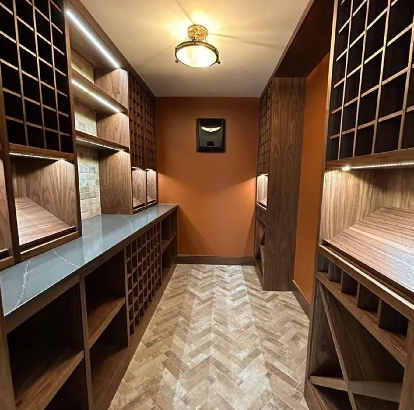
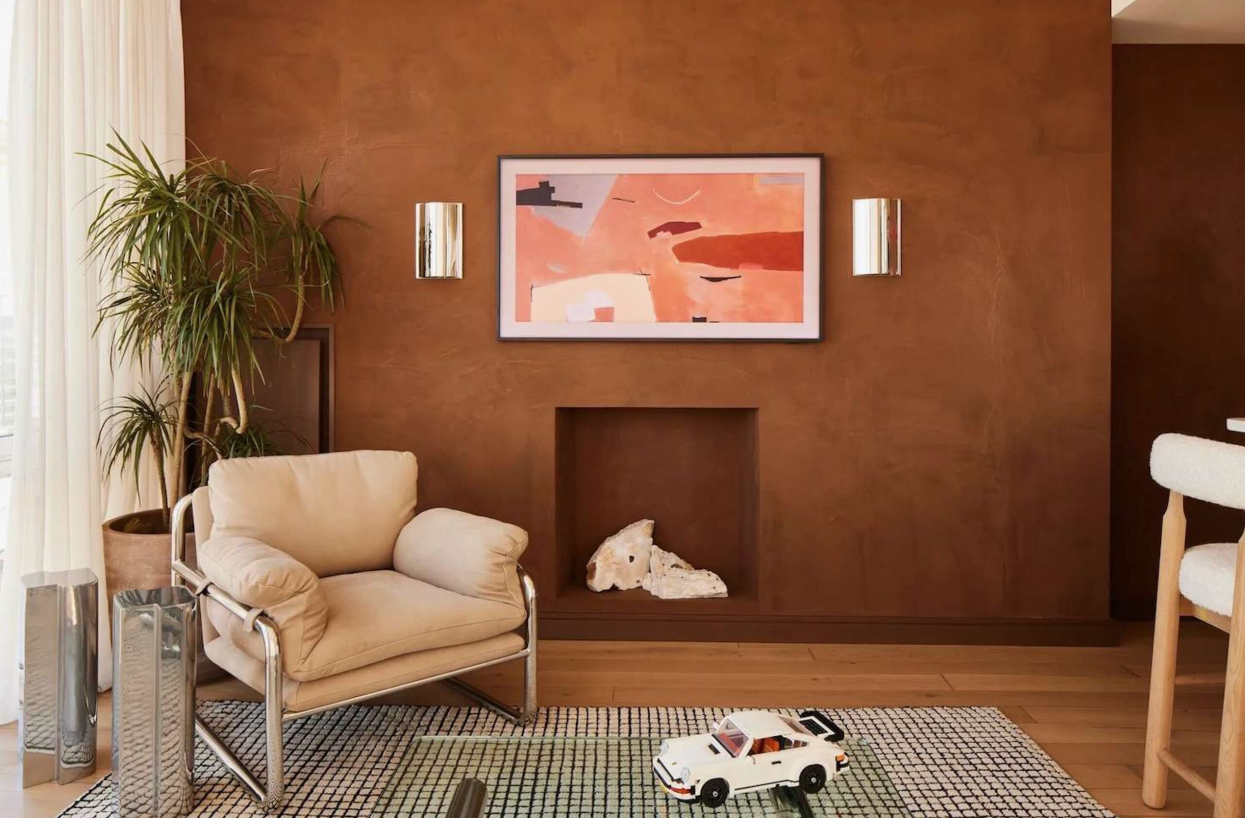
Warm cognac tones are useful when gray floors make the room feel too cool. They bring in brown, rust, or golden warmth, which works especially well with leather, brass, woven shades, and terracotta-colored accents.
Benjamin Moore's Alexandria Beige stands out in this category because its golden undertone warms the gray base without going full orange. Sherwin-Williams' Determined Orange is much bolder, so I would reserve it for a dining room, entry, or large bright room where you want the wall color to lead.
7. Slate Blue
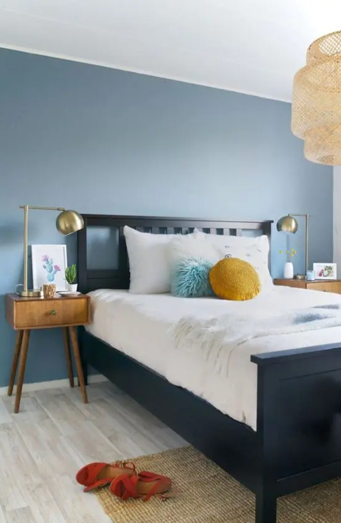
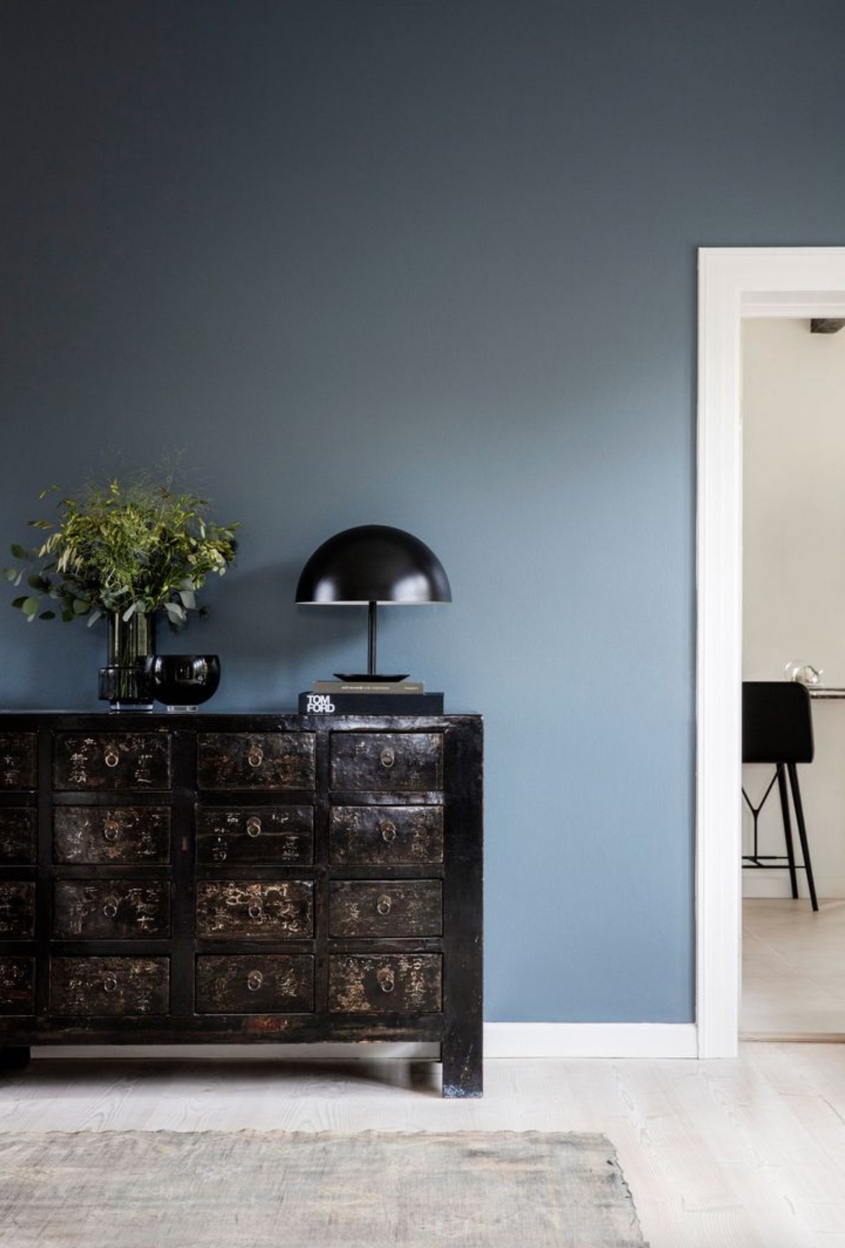
Slate blue is a stronger choice than pale blue, and it usually looks best with medium to dark gray floors. The gray in the blue keeps it from feeling coastal unless you add whitewashed furniture or nautical accents.
Benjamin Moore's Slate Blue is my go-to here because it reads like a color but still behaves like a near-neutral. For more depth, sample Farrow & Ball's De Nimes. In a north-facing bedroom or office, pair slate blue with warm white trim and 2700K bulbs so the room does not go chilly.
8. Soft Black
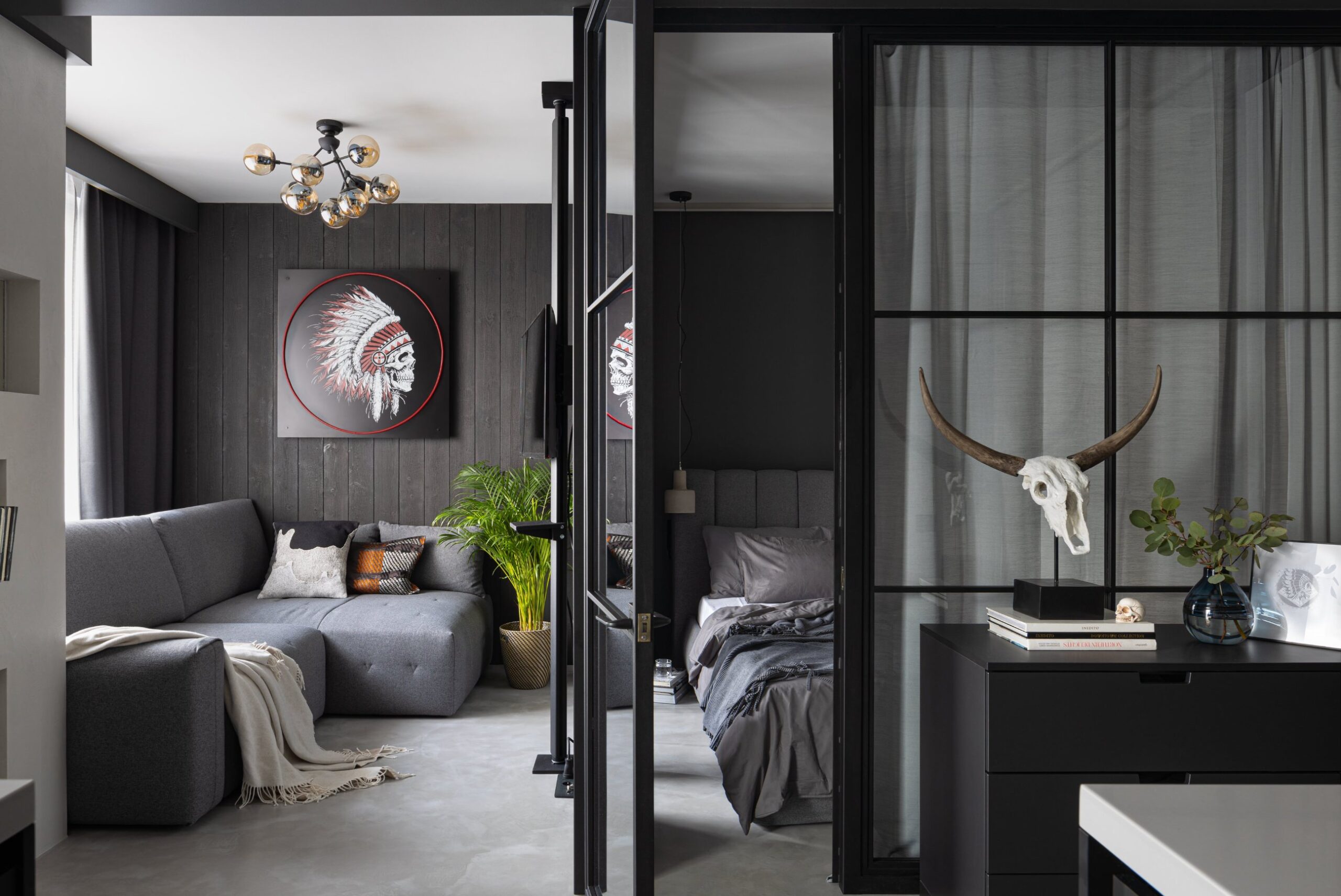
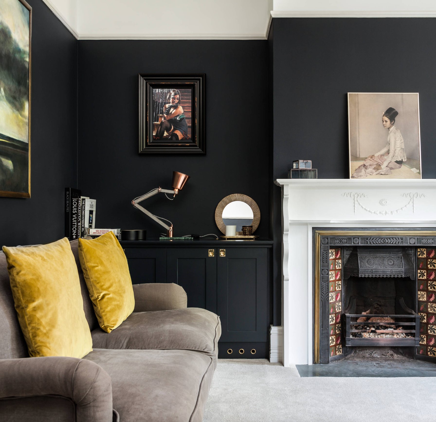
Soft black can look excellent with gray floors, but it is a deliberate choice. It works best when the room has strong natural light, high ceilings, or plenty of pale contrast from trim, bedding, counters, or upholstery.
Unlike a hard blue-black, softer black reads closer to charcoal and sits more naturally beside gray flooring. I like it most on an accent wall, a paneled wall, or built-ins where the dark color has a clear stopping point.
For a clean black, sample Sherwin-Williams' Tricorn Black. It is very dark, so do not judge it from a chip. Paint a large board, hold it against the gray floor, and make sure the ceiling or several furniture pieces stay light enough to keep the room usable.

I'm Elizabeth, your go-to guide for all things paint and design! My days are filled with color swatches and innovative room makeovers. When I'm not painting the town - literally - I'm soaking up inspiration from my travels. This blog is my way of sharing my passion and making the world a more vibrant place, one color palette at a time.