Worldly Gray vs Agreeable Gray
The real choice is this: Worldly Gray is the steadier whole-house greige, while Agreeable Gray is lighter, warmer, and a little more changeable.
On a fan deck, these Sherwin-Williams colors sit close together. On walls, Worldly Gray usually reads more grounded because of its green-taupe undertone. Agreeable Gray has an LRV of 60, so it reflects a touch more light and can pull beige or violet in certain rooms.
The photos below are helpful context, but the best answer depends on your light, flooring, trim, and fixed finishes. If you need a quick short list, start with Worldly Gray for balanced open spaces and Agreeable Gray for rooms that need extra warmth.
Undertones & Character
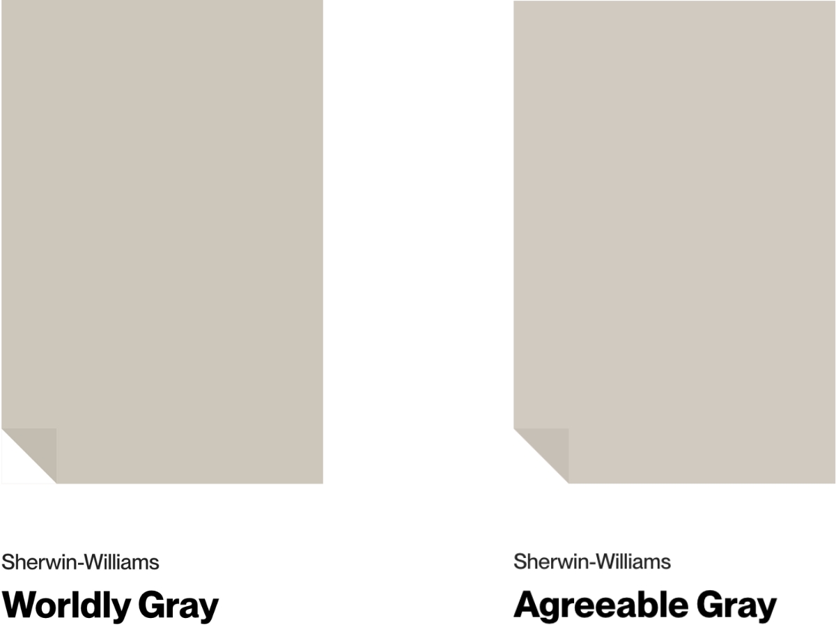
Sherwin-Williams Worldly Gray is a warm gray with a subtle green undertone and an LRV of 57.
It warms up in south-facing rooms and turns more reserved in north-facing spaces. I like it most in spacious, well-lit rooms, especially living rooms and bedrooms. Morning light can bring the green forward, so sample it on more than one wall.
The catch is low light. In a dark hallway or shaded bedroom, Worldly Gray can lose dimension and read like a dull gray-beige.
Agreeable Gray from Sherwin-Williams is slightly lighter (LRV 60) and more changeable from room to room.
It shares that warm green undertone but brings in beige and even purple notes depending on the light. When I painted my own living room with it, the shift from morning to evening was much stronger than the paper chip suggested.
It is strongest in bright spaces. In rooms without good natural light, it needs careful testing because the beige or violet side can take over.
Comparing the two: Worldly Gray is the more controlled color. It stays closer to greige, handles adjoining rooms better, and is easier to repeat through a main floor.
If you want one color throughout the house, I would choose Worldly Gray first. If the room needs a softer, warmer wall color and you are willing to sample carefully, Agreeable Gray is the better risk.
| Property | SW Worldly Gray | SW Agreeable Gray |
|---|---|---|
| Color Code | SW 7043 | SW 7029 |
| Light Reflectance Value (LRV) | 57 | 60 |
| Color Family | Neutral | Neutral |
| Undertones | warm greige, subtle green, faint taupe (violet) | warm green, violet, beige |
Room-by-Room Comparison
These grays do not fail in the same places. Worldly Gray usually needs enough light to keep its depth, while Agreeable Gray needs the right surrounding finishes so its beige and violet notes do not fight the room.
Living Rooms
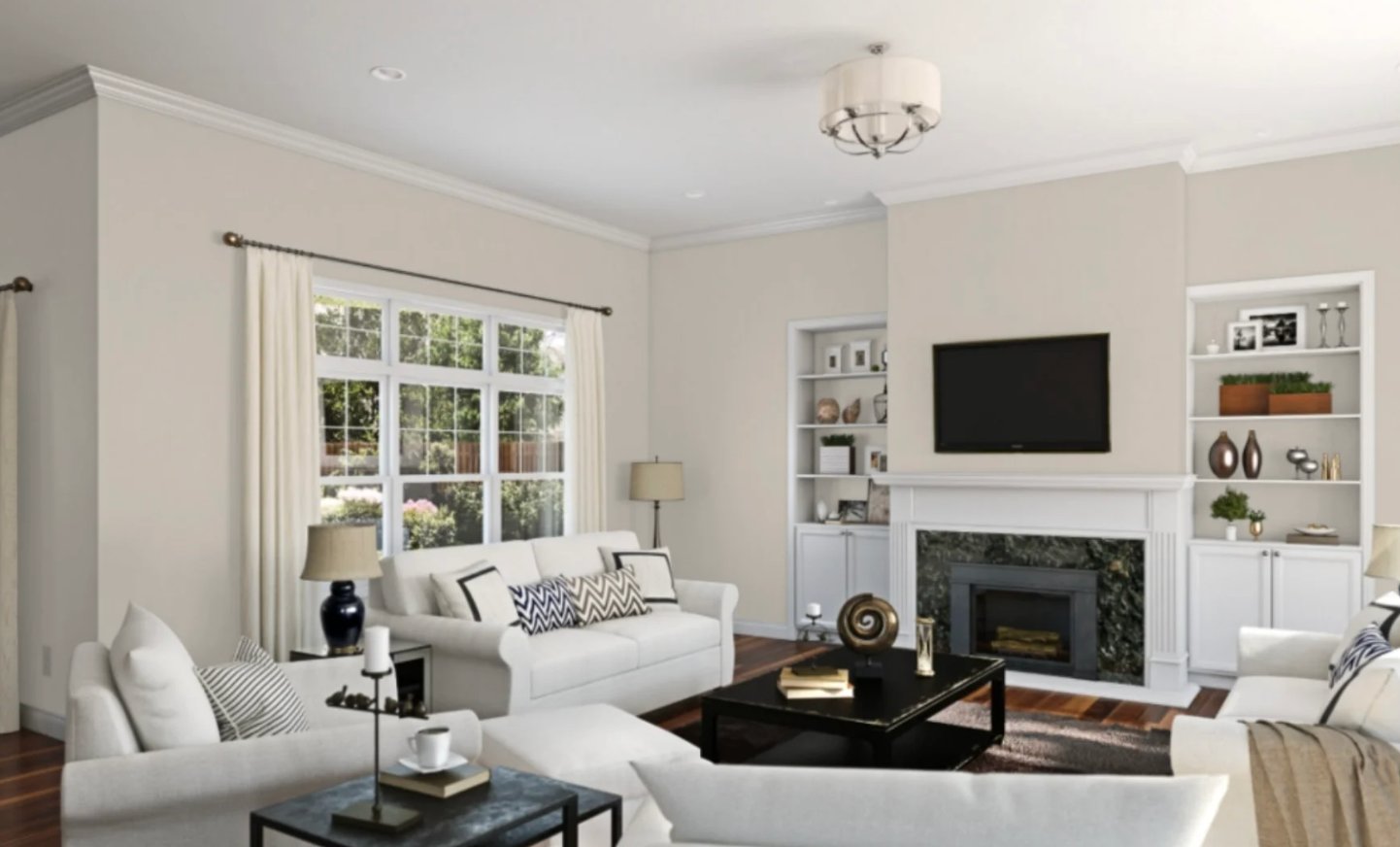
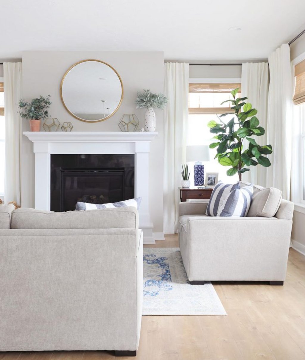
Worldly Gray is my pick for living rooms with good daylight, white trim, and mixed furniture finishes. In open-concept spaces, it gives you enough body to connect the room without making the walls feel heavy.
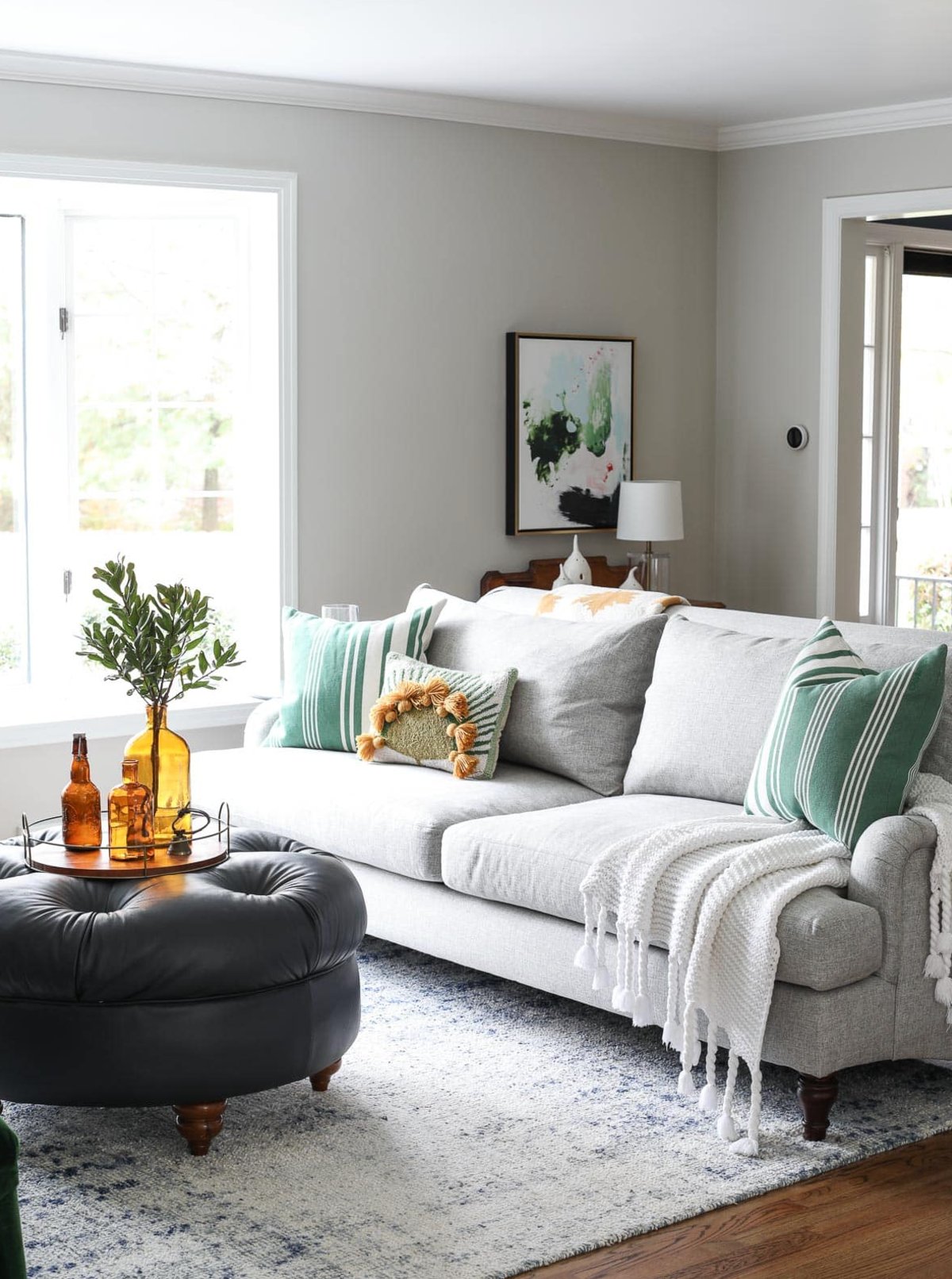
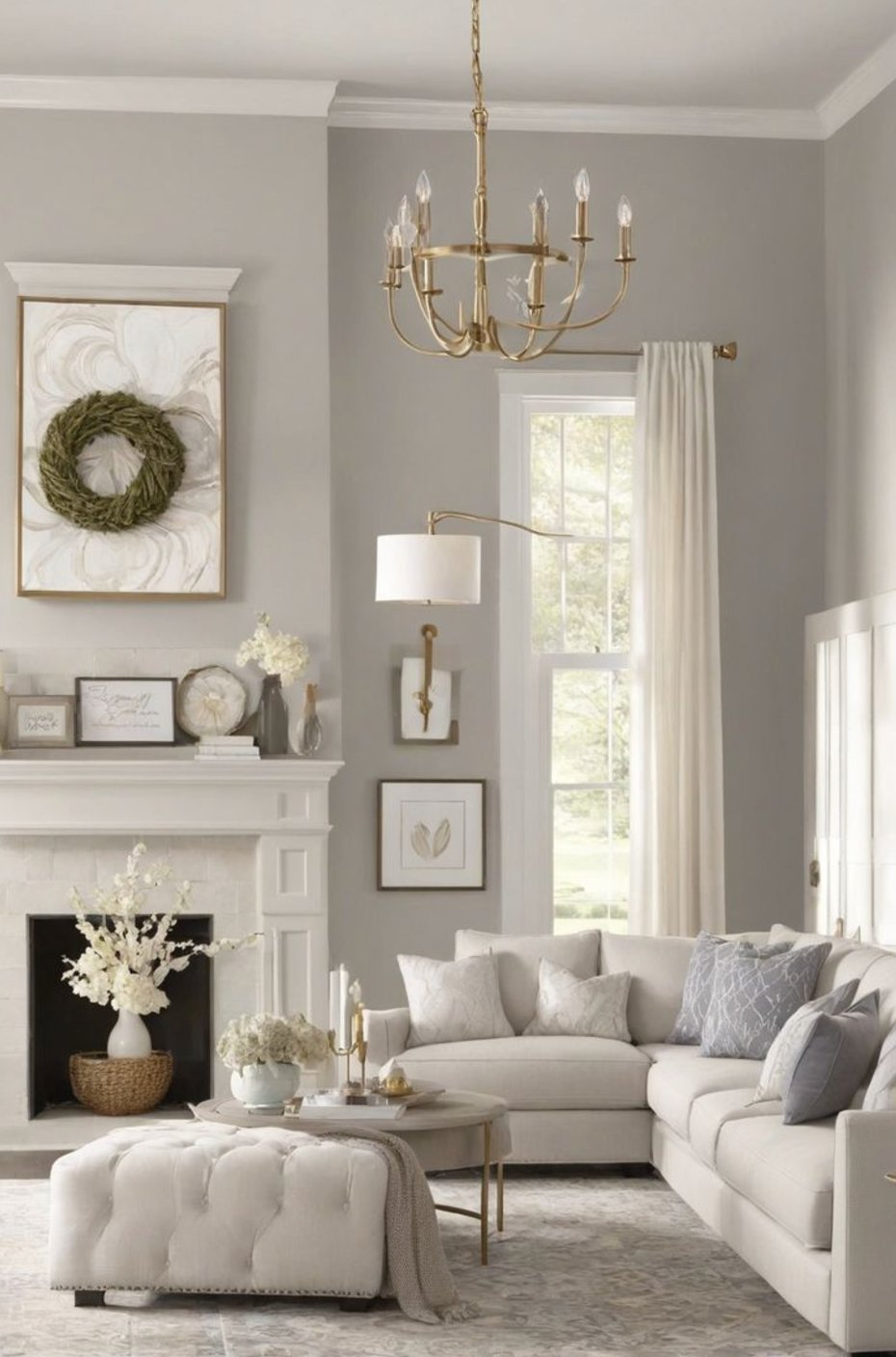
Agreeable Gray runs a touch lighter and warmer. Use it when the living room needs softness, especially with wood furniture, natural fabrics, and a casual family-room layout.
Kitchens
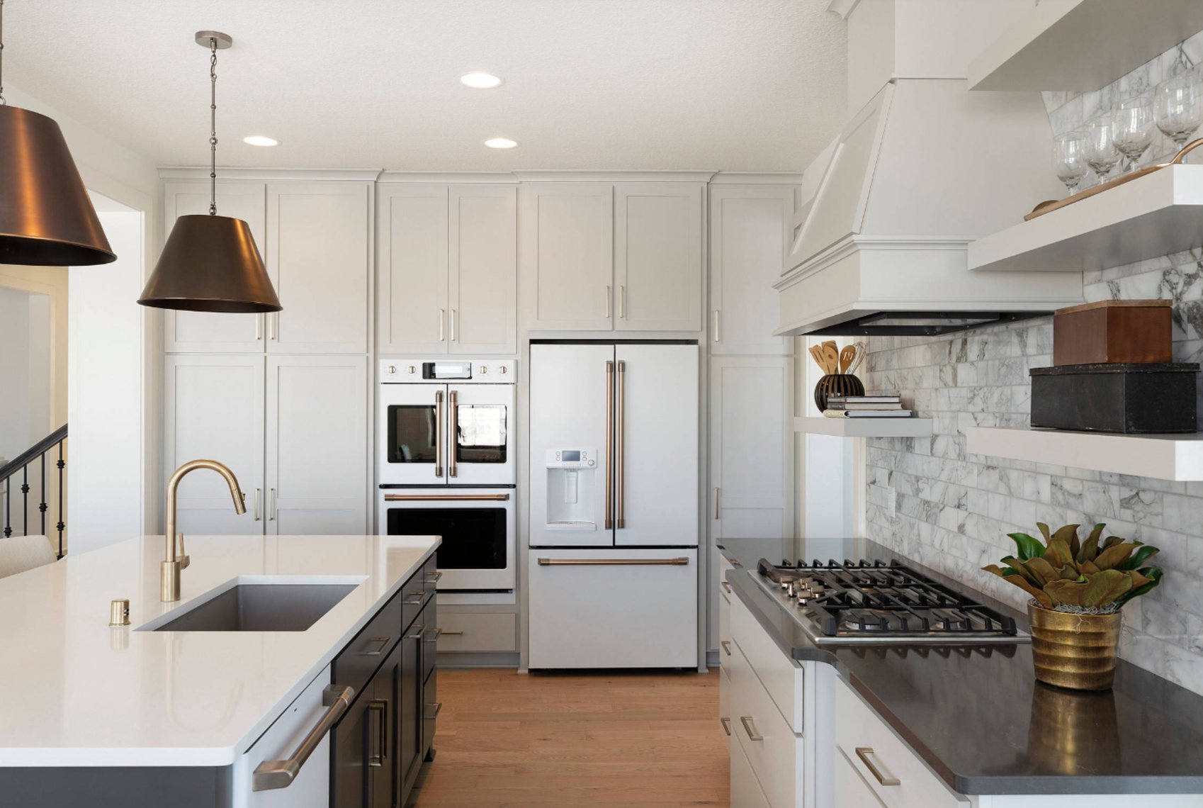
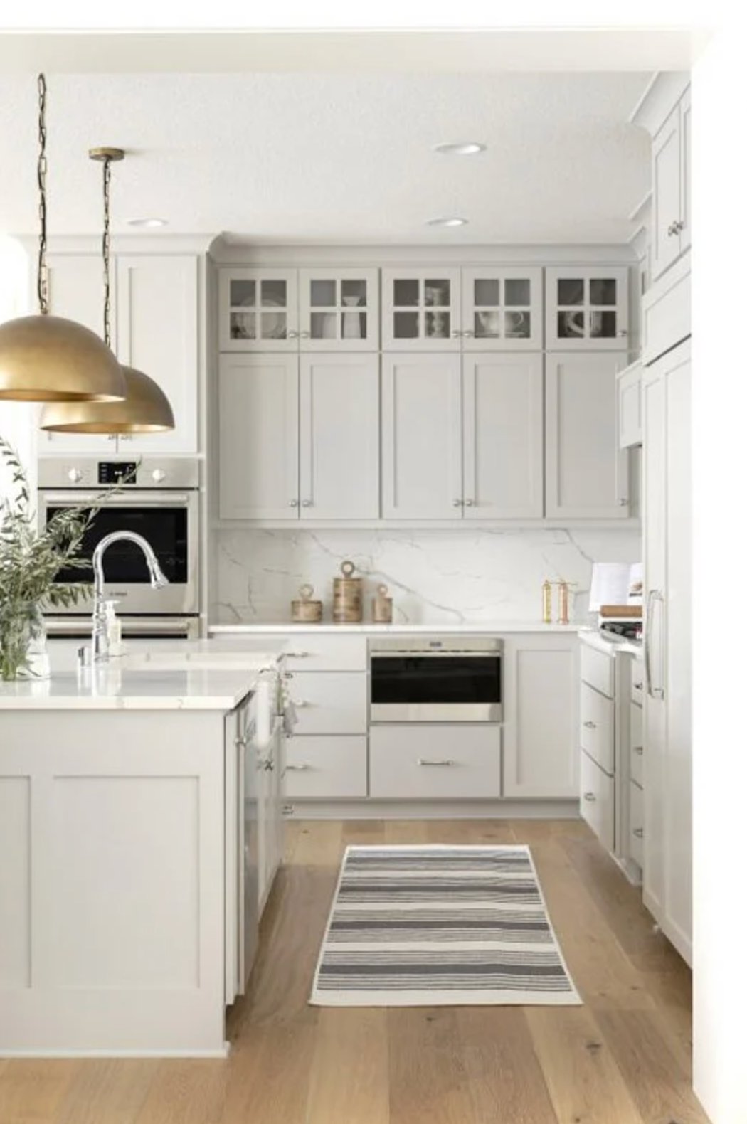
Worldly Gray works well in kitchens with white cabinets, marble, and warm wood accents. Its green undertone can make white finishes feel less stark, which is useful in kitchens that get bright afternoon sun.
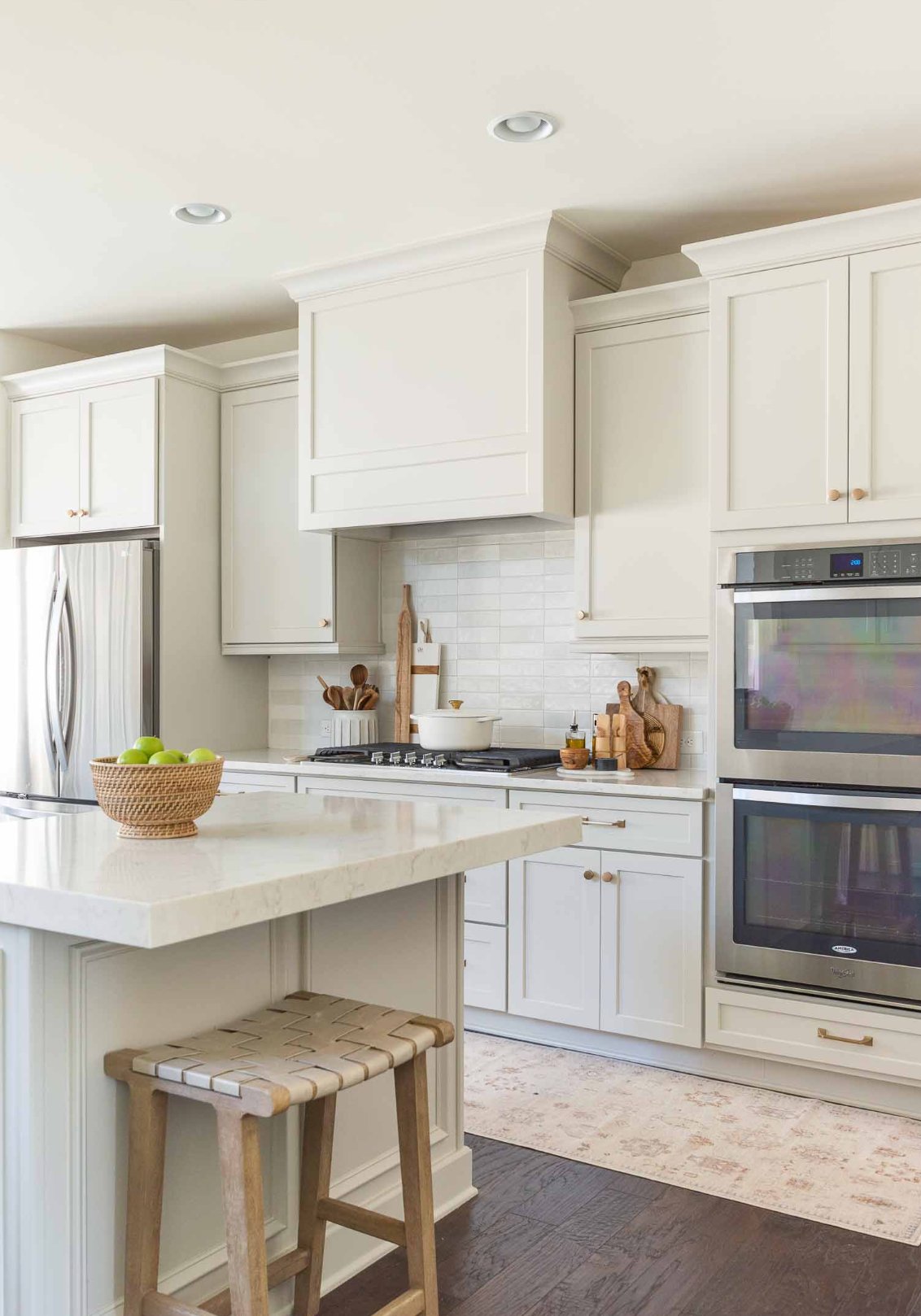

Agreeable Gray brings extra warmth to kitchens. In smaller spaces, its LRV of 60 can help the room read lighter, and metallic touches keep it from feeling too soft. Test it beside countertops first, especially if the stone or tile already has pink-beige undertones.
Bedrooms
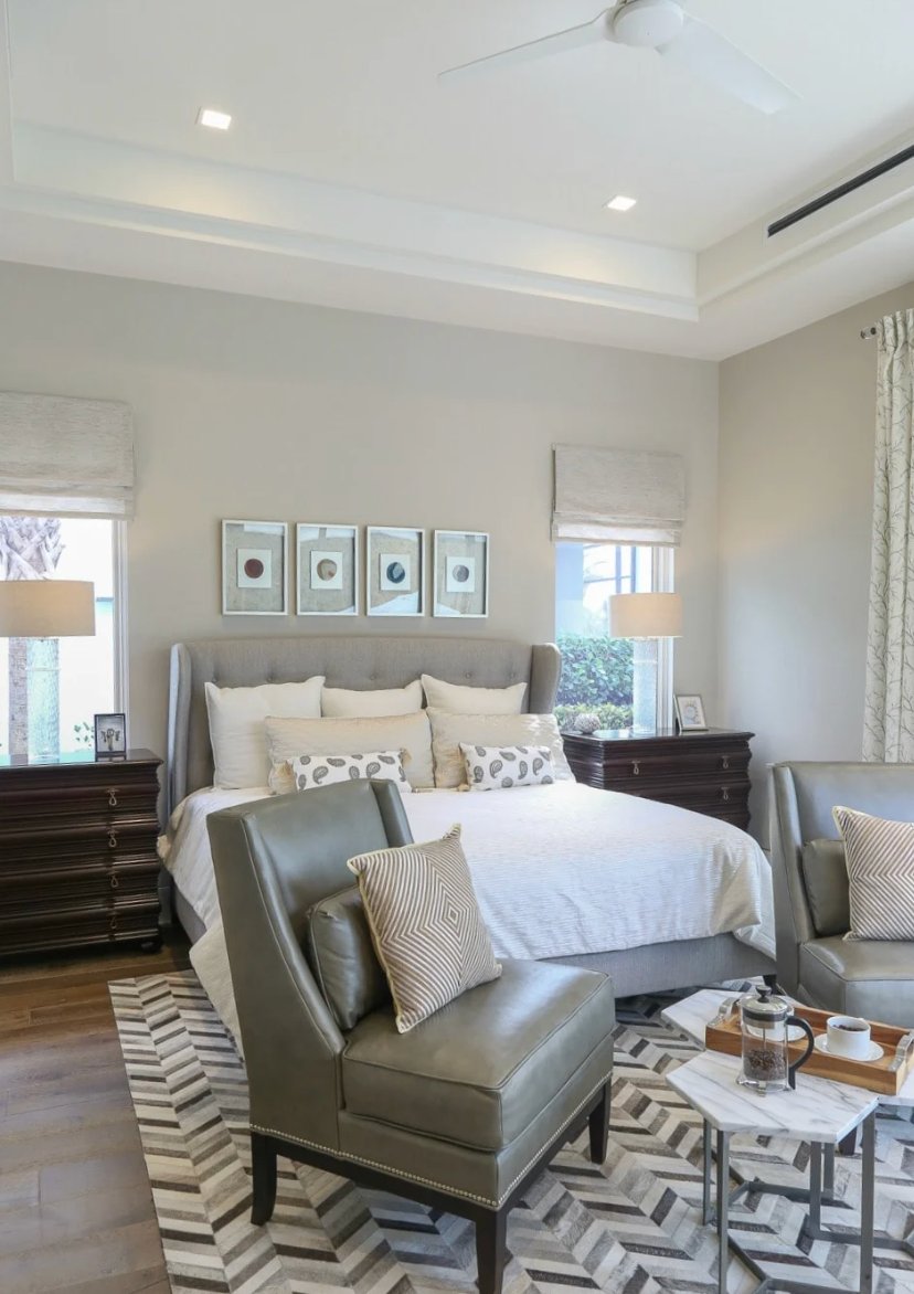
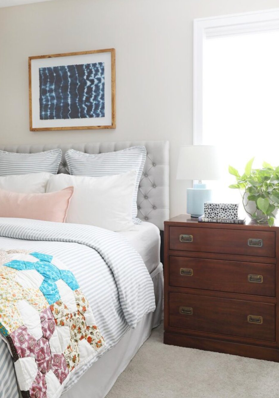
Worldly Gray is a strong bedroom choice when you want quiet walls that still have character. It works with modern furniture and traditional wood pieces, and it does not turn as creamy as many lighter greiges.
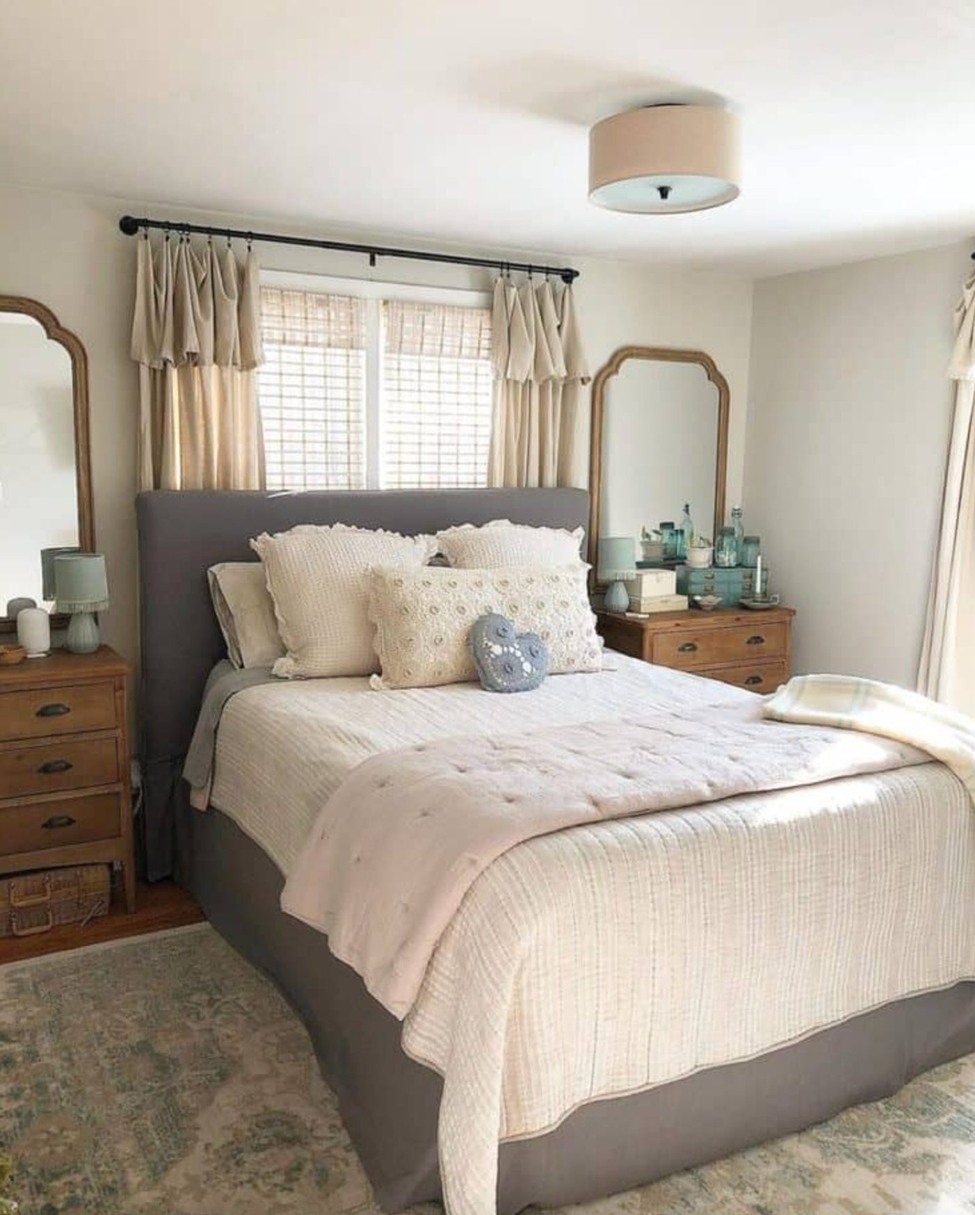
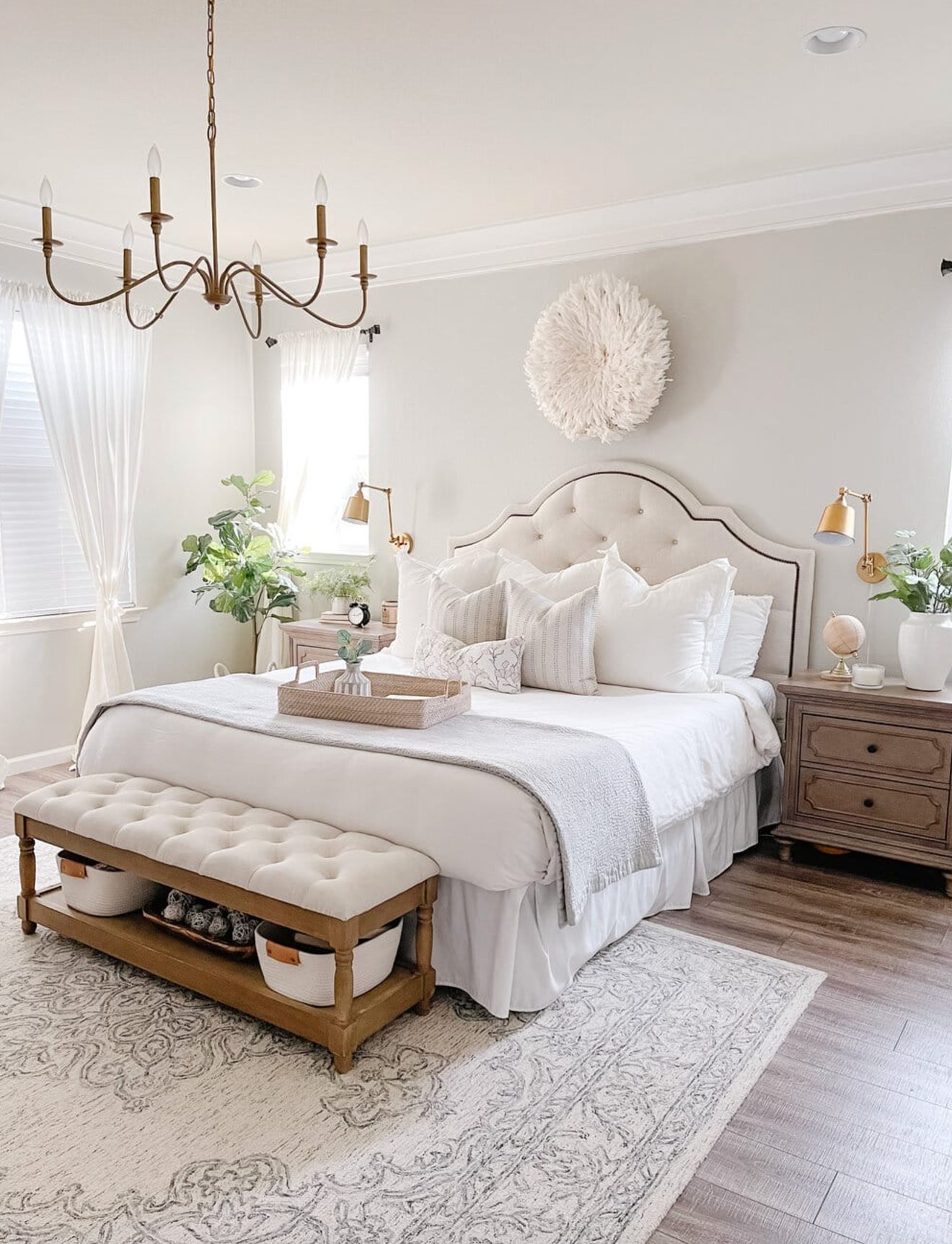
Agreeable Gray is the softer bedroom option. Pair it with layered textiles and warm lamps in a primary bedroom, then check the sample at night so the violet note does not surprise you.
Exteriors
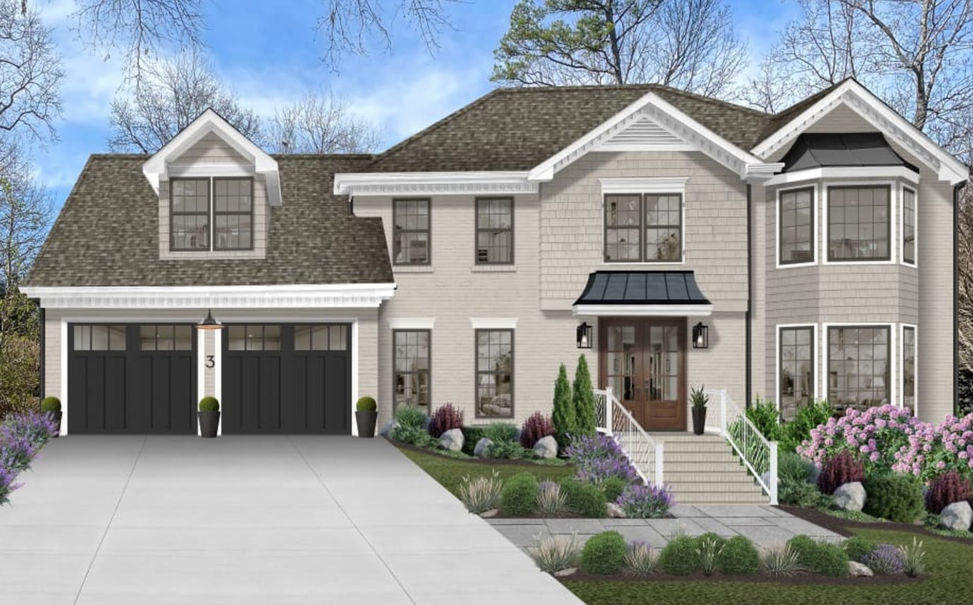
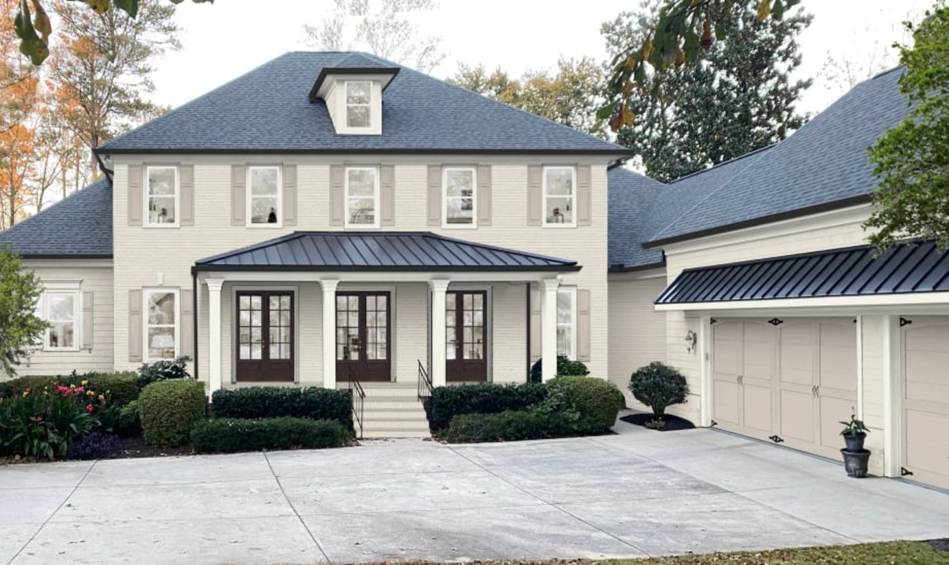
Worldly Gray can look clean and settled on exteriors, especially with white trim and a dark roof. Check it against fixed materials first: brick, stone, roofing, gutters, and concrete will decide whether the green undertone helps or hurts.
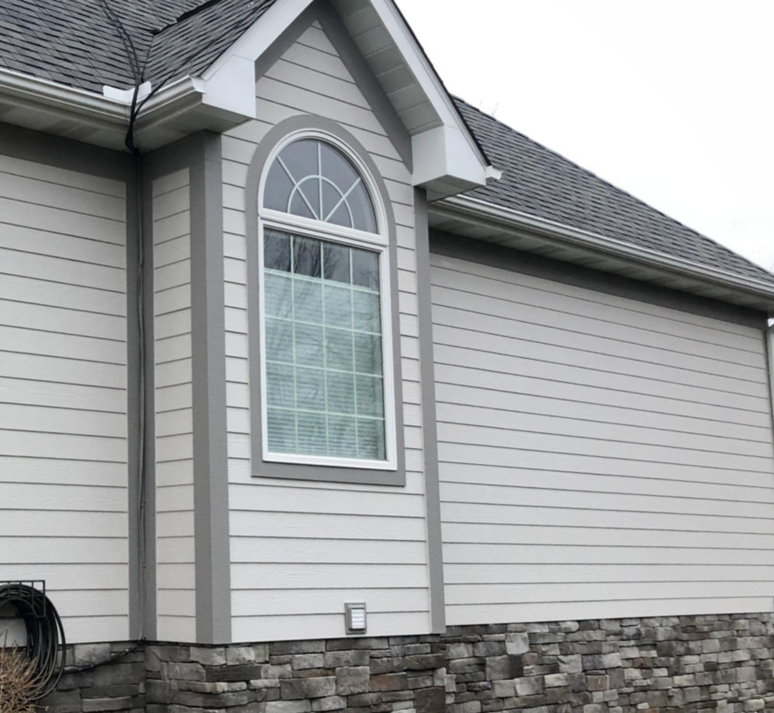
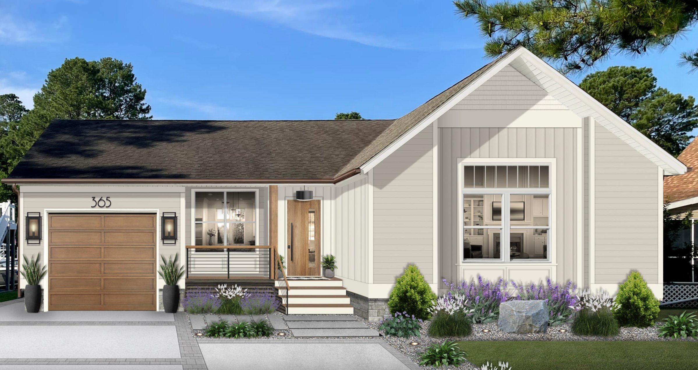
Agreeable Gray has a softer, warmer exterior presence than Worldly Gray, and it can look especially good against greenery. Its beige undertones mean the trim has to be deliberate. Too creamy can make the house look muddy, while very stark white can make the body color look dingy.
Lighting Impact
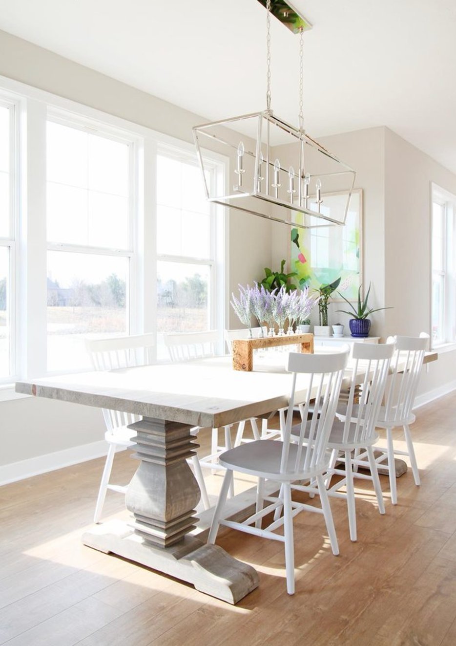
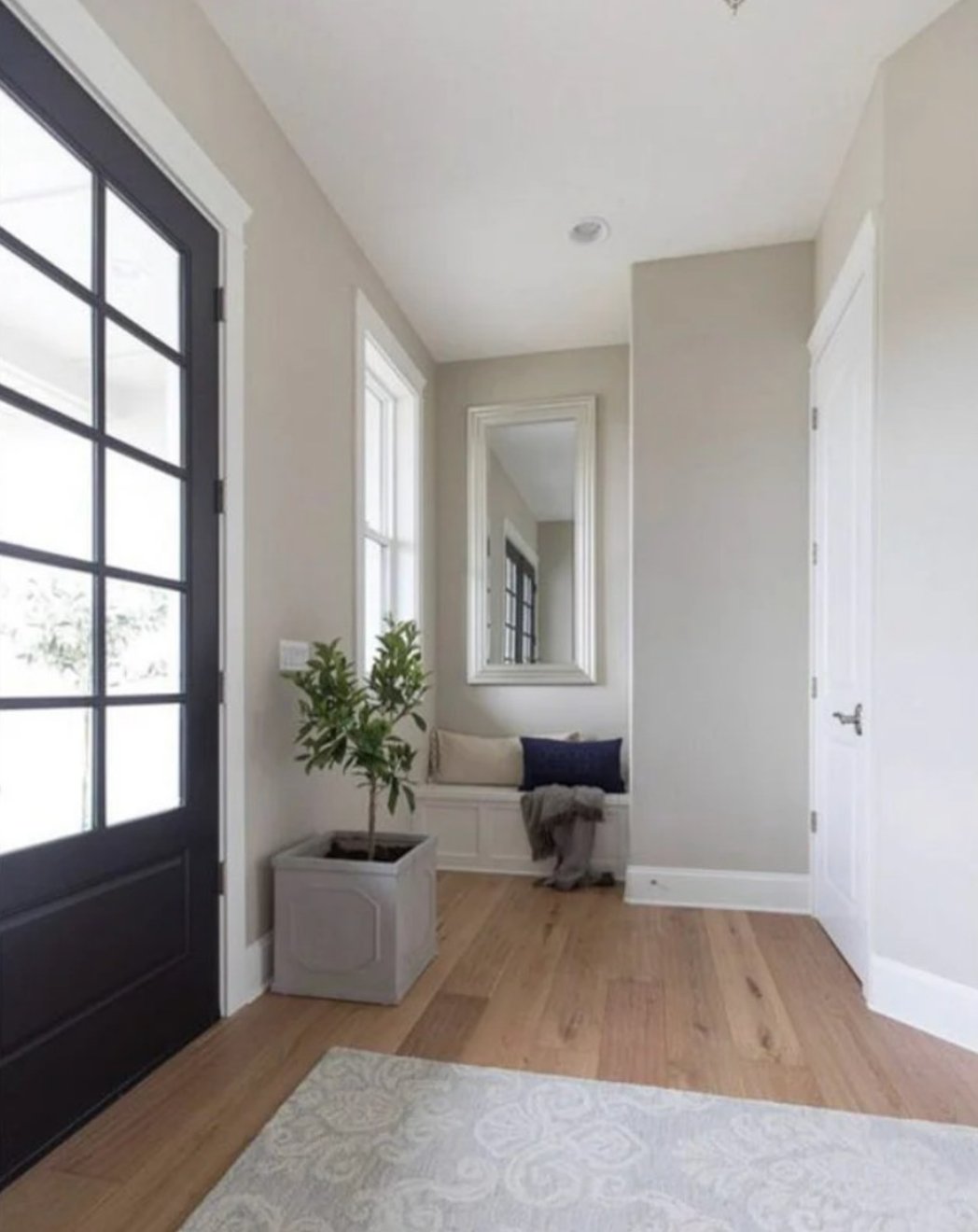
Worldly Gray is most dependable when the room has enough daylight to show its greige depth.
In north-facing rooms, it leans cooler, while southern sunlight brings out its warmth. You may catch a hint of green in the morning, particularly on larger walls.
Without good lighting, it can look flat. With plenty of natural light, the color has more movement and reads less like a plain builder greige.
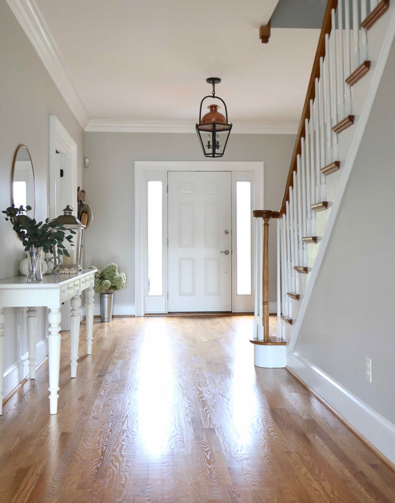

Agreeable Gray plays with light differently. It is slightly lighter than Worldly Gray (LRV of 60 vs 57) and shows more of its warm green undertone. In some rooms, you may also see a touch of purple.
It can look patchy in dim spaces. It handles artificial lighting well, but it needs more planning than Worldly Gray because the undertones shift more noticeably.
Coordinating Colors
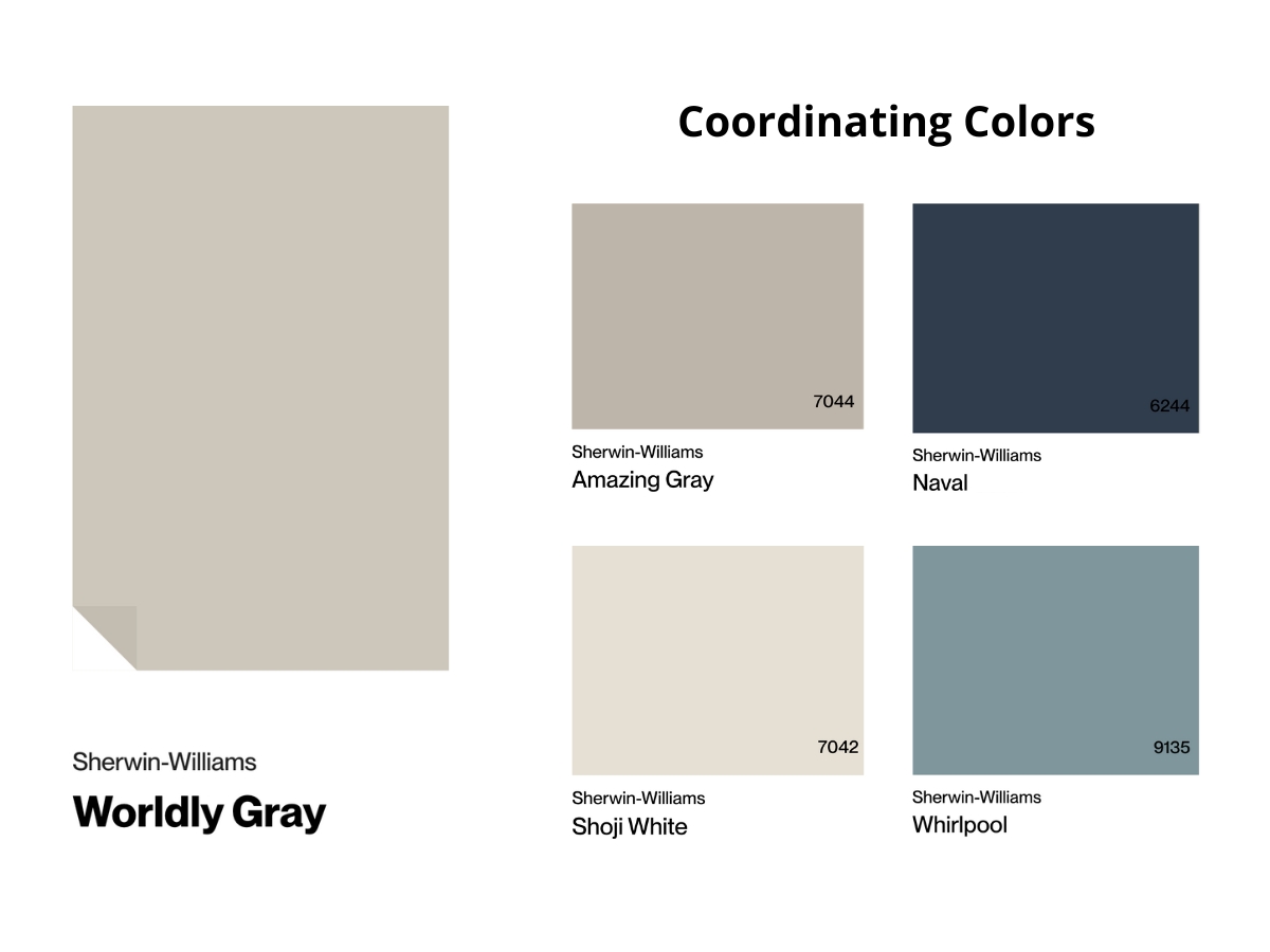
Worldly Gray is a natural partner for warm woods, from light oak to rich walnut. I like adding texture with cream and beige elements, such as woven baskets or linen drapes.
Deep greens and terracotta make strong accent colors because they play up the warmth. Be careful with cool metallic pieces, since they can clash with Worldly Gray's earthy side.
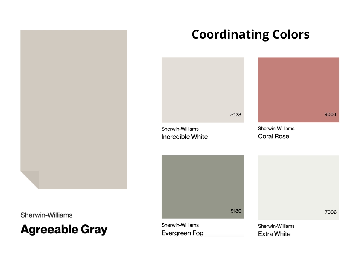
Agreeable Gray accepts more color families than Worldly Gray. Its neutral base works with both warm and cool accents, from deep blues to sandy beiges.
It works especially well with matte black details and dark wood. Unlike Worldly Gray, it is friendly with metallic finishes, especially aged brass.
Do not overdo the decorative pieces. Agreeable Gray already has movement, so a crowded room can make the walls look busier than they are.
Making Your Decision
Choose Worldly Gray if you want the more reliable whole-house color, especially for a well-lit main floor, living room, or bedroom.
Choose Agreeable Gray if the room needs a lighter, warmer greige and your fixed finishes can handle beige and violet undertones.
My verdict: Worldly Gray is the safer recommendation for most clients. Agreeable Gray can be prettier in the right room, but I would not use it without sample boards in the actual space.
Paint sample boards and move them around the room before making the final call. Check morning light, afternoon light, and lamps at night.

I'm Elizabeth, your go-to guide for all things paint and design! My days are filled with color swatches and innovative room makeovers. When I'm not painting the town - literally - I'm soaking up inspiration from my travels. This blog is my way of sharing my passion and making the world a more vibrant place, one color palette at a time.