Sherwin Williams Comfort Gray vs. Sherwin Williams Sea Salt
This page compares Comfort Gray and Sea Salt by Sherwin Williams using side-by-side technical data, undertones, light reflectance, and real-world usage. Select different shades below to compare other paint colors across major brands.
Sherwin Williams
Comfort Gray
SW 6205
Sherwin Williams
Sea Salt
SW 6204
HuePosition on the color wheel (0–360°). Determines the base color family.
98
98
SaturationHow vivid or muted the color appears (0–100%). Lower values are more gray.
6
less saturated8
more saturatedLightnessHow light or dark the color is in HSL space (0–100%).
75
81
lighter toneLRVLight Reflectance Value. How much light a color reflects (0–100). Higher means brighter in a room.
54.0%
63.0%
appears brighterCIE L*Perceptual lightness from CIE Lab color space (0–100). More closely matches human brightness perception.
78.2
83.6
looks lighterTemperatureWhether the color leans warm (reds, yellows) or cool (blues, greens) based on hue and saturation.
Neutral
Neutral
ΔE*₀₀CIEDE2000 color difference. <1 imperceptible; 1–2 barely noticeable; 2–5 noticeable; 5–10 clear; >10 very different.
3.71
Real Photos
No photos available yet 😞
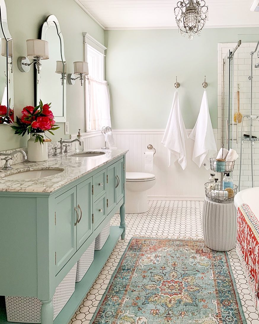
Colors may appear differently depending on screen calibration, lighting conditions, and surrounding materials. For the most accurate evaluation, always test paint samples directly in your space before making a final decision.
Explore Complementary Color Palettes
Color Palettes for Comfort Gray
Darker Shades
Monochromatic dark
Lighter Shades
Monochromatic light
Complementary
Opposite on color wheel
Analogous
Adjacent colors
Color Palettes for Sea Salt
Darker Shades
Monochromatic dark
Lighter Shades
Monochromatic light
Complementary
Opposite on color wheel
Analogous
Adjacent colors
Closest Paint Matches
Similar to Comfort Gray
Visualize Before You Decide
Preview how paint colors and design ideas may look in a real space before committing. Visual comparisons can help narrow options and reduce costly mistakes.


Refine Your Choice with Free Tools
Use technical color tools to narrow options before visualizing your final design.
Color Matcher
Match paint colors across brands by name, photo, or code.
Global Color Database
Explore 12,500+ paint colors with technical values.
Color Visualizer
Preview paint colors on room scenes or your own photos.
Match From Photo
Extract colors from photos to refine your choices.
Compare Colors
Compare undertones and lightness side by side.
RGB to Paint
Convert digital colors into paint options.
HEX to Paint
Match web colors to real paints.
Image Color Picker
Pick colors from any image with a magnifier.
Color Wheel
Explore color harmonies interactively.
Color Chart
Browse 140+ named CSS colors.
Palette Generator
Generate harmonious color schemes.
Palette from Image
Extract palettes from any photo.
Gradient Generator
Create CSS gradients visually.
Contrast Checker
Check WCAG accessibility compliance.