Benjamin Moore Tranquility vs. Benjamin Moore Quiet Moments
This page compares Tranquility and Quiet Moments by Benjamin Moore using side-by-side technical data, undertones, light reflectance, and real-world usage. Select different shades below to compare other paint colors across major brands.
Benjamin Moore
Tranquility
AF-490
Benjamin Moore
Quiet Moments
1563 / CC-700
HuePosition on the color wheel (0-360°). Determines the base color family.
120
128
SaturationHow vivid or muted the color appears (0-100%). Lower values are more gray.
6
less saturated8
more saturatedLightnessHow light or dark the color is in HSL space (0-100%).
75
80
lighter toneLRVLight Reflectance Value. How much light a color reflects (0-100). Higher means brighter in a room.
53.3%
60.7%
appears brighterCIE L*Perceptual lightness from CIE Lab color space (0-100). More closely matches human brightness perception.
78.0
82.3
looks lighterTemperatureWhether the color leans warm (reds, yellows) or cool (blues, greens) based on hue and saturation.
Neutral
Neutral
ΔE*₀₀CIEDE2000 color difference. <1 imperceptible; 1-2 barely noticeable; 2-5 noticeable; 5-10 clear; >10 very different.
3.06
How to read this comparison
Delta E measures how far two colors sit apart to the eye. Under 2, most people can't tell them apart on a wall. Over 5, they read as clearly different colors. LRV tells you how much light a color reflects. In weak light, an LRV gap usually changes the room more than a small hue shift.
Real Photos
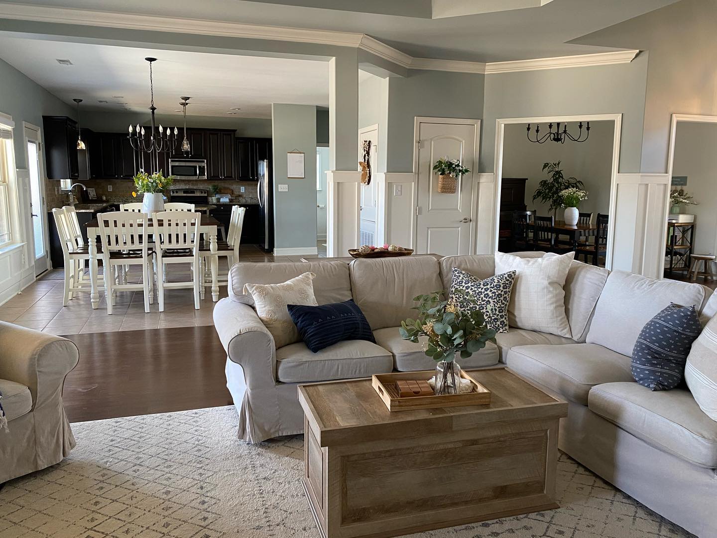
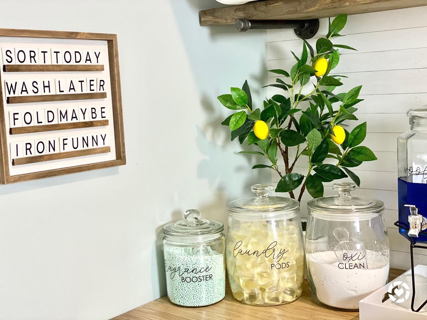
Colors may appear differently depending on screen calibration, lighting conditions, and surrounding materials. For the most accurate evaluation, always test paint samples directly in your space before making a final decision.
Explore Complementary Color Palettes
Color Palettes for Tranquility
Darker Shades
Monochromatic dark
Lighter Shades
Monochromatic light
Complementary
Opposite on color wheel
Analogous
Adjacent colors
Color Palettes for Quiet Moments
Darker Shades
Monochromatic dark
Lighter Shades
Monochromatic light
Complementary
Opposite on color wheel
Analogous
Adjacent colors