Pure White vs Extra White
If you are choosing a white for walls, Pure White is usually the safer whole-room choice. Extra White is cleaner and sharper, but it asks more from the room, especially the light.
Clients often ask for "just white," then bring home two samples that look identical on the chip. On the wall, the difference shows up fast. Pure White has a small amount of warmth. Extra White is brighter, cooler, and more likely to show blue or gray in weak light.
Use this comparison the way I would use sample boards with a client: check the undertone, then check the room exposure, then decide whether you need a forgiving wall white or a crisp architectural white. The photos below show how both colors behave in real rooms and different lighting conditions.
Undertones & Character

Pure White by Sherwin-Williams is a soft white with subtle warm undertones. With an LRV of 84, it is bright enough for walls but not so sharp that it feels clinical.
The first time I used it in my living room, what stood out was how normal it looked at every hour. In north-facing rooms, its slight warmth helps balance cool light. In west-facing spaces, it warms up in the evening without turning yellow.
It is a strong fit for modern spaces with wood, stone, linen, and other natural materials. I also like it as a whole-house white because it does not demand one specific exposure to look right.
Extra White, another Sherwin-Williams color, is a bright white with cool blue undertones and an LRV of 86. You will not see yellow or cream in this one.
In my work, it is strongest on ceilings and moldings because the higher light reflection gives trim a clean edge. In sunny rooms, Extra White reads fresh and modern. The tradeoff is that it can look flat in darker spaces and make corner shadows more obvious.
The main difference between these two? Pure White has a slight warm undertone, so it reads softer and more flexible. Extra White leans cooler and more technical because of its blue cast.
Think of Pure White as Extra White with a small drop of warmth added to take the edge off. Put them side by side in a room, and the difference is easier to see: Pure White feels more natural on large wall areas, while Extra White looks crisper and more contemporary.
For walls in average or low light, choose Pure White first. Choose Extra White when the room has strong natural light, clean-lined finishes, or a deliberate need for a cooler white.
| SW Pure White | SW Extra White | |
|---|---|---|
| Color Code | SW 7005 | SW 7006 |
| Light Reflectance Value (LRV) | 84 | 86 |
| Color Family | White | White |
| Undertones | Minimal yellow and black, soft warm white | Cool blue with slight green notes, bright clean white |
Room-by-Room Comparison
These shades change by room because white reflects everything around it: daylight, flooring, counters, trees outside, and even bulbs. Put peel-and-stick samples on at least two walls and check them in morning light, afternoon light, and after dark.
Living Rooms
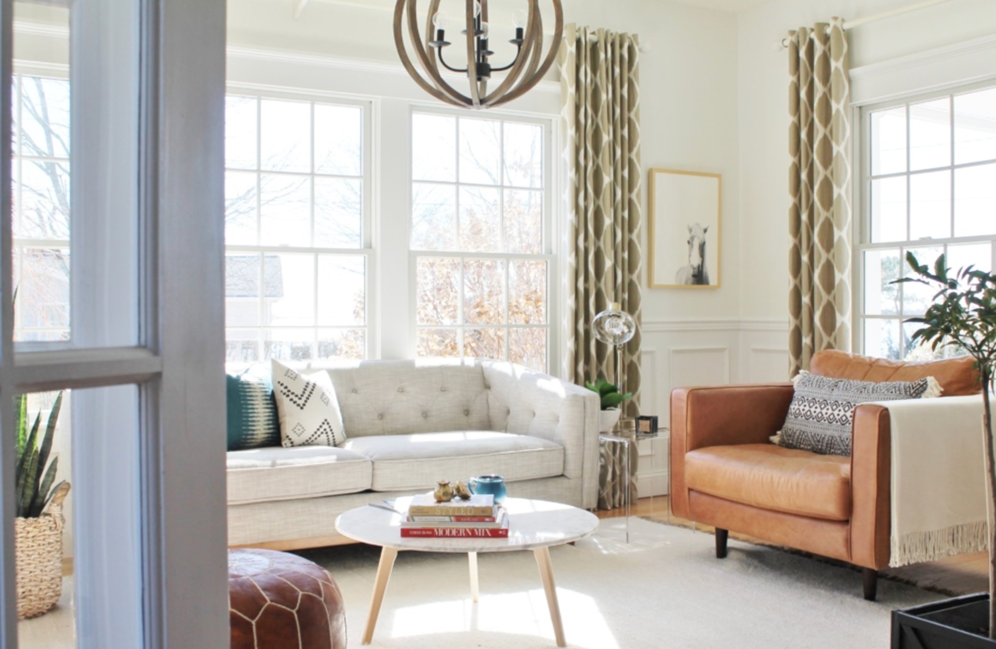
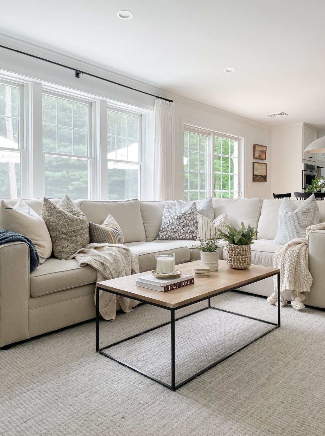
For most living room walls, I would start with Pure White. Its soft yellow undertone keeps the room comfortable in the evening, and it is less likely to turn gray under lamps. Artwork and decor still read clearly because the white is quiet rather than attention-grabbing.
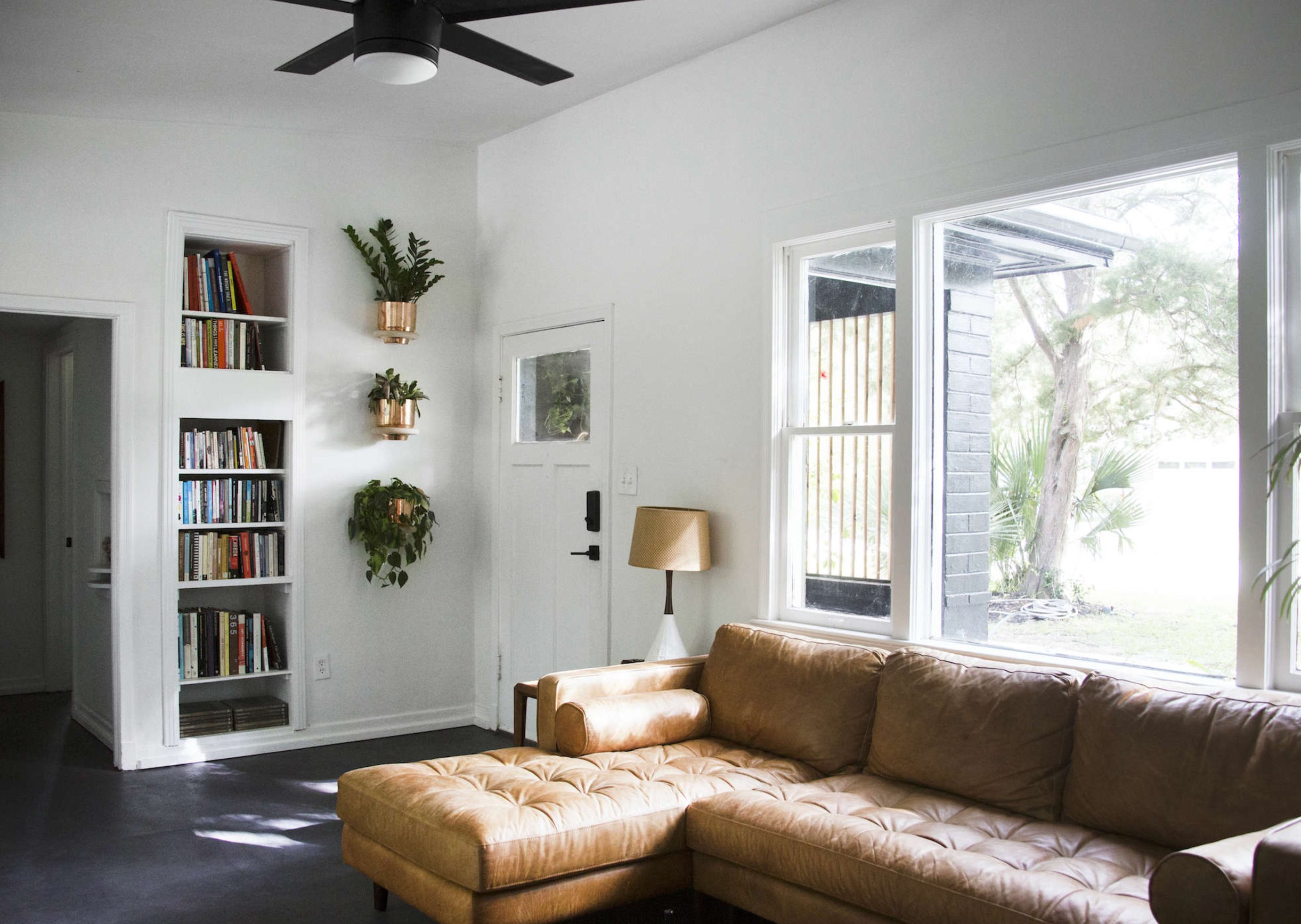
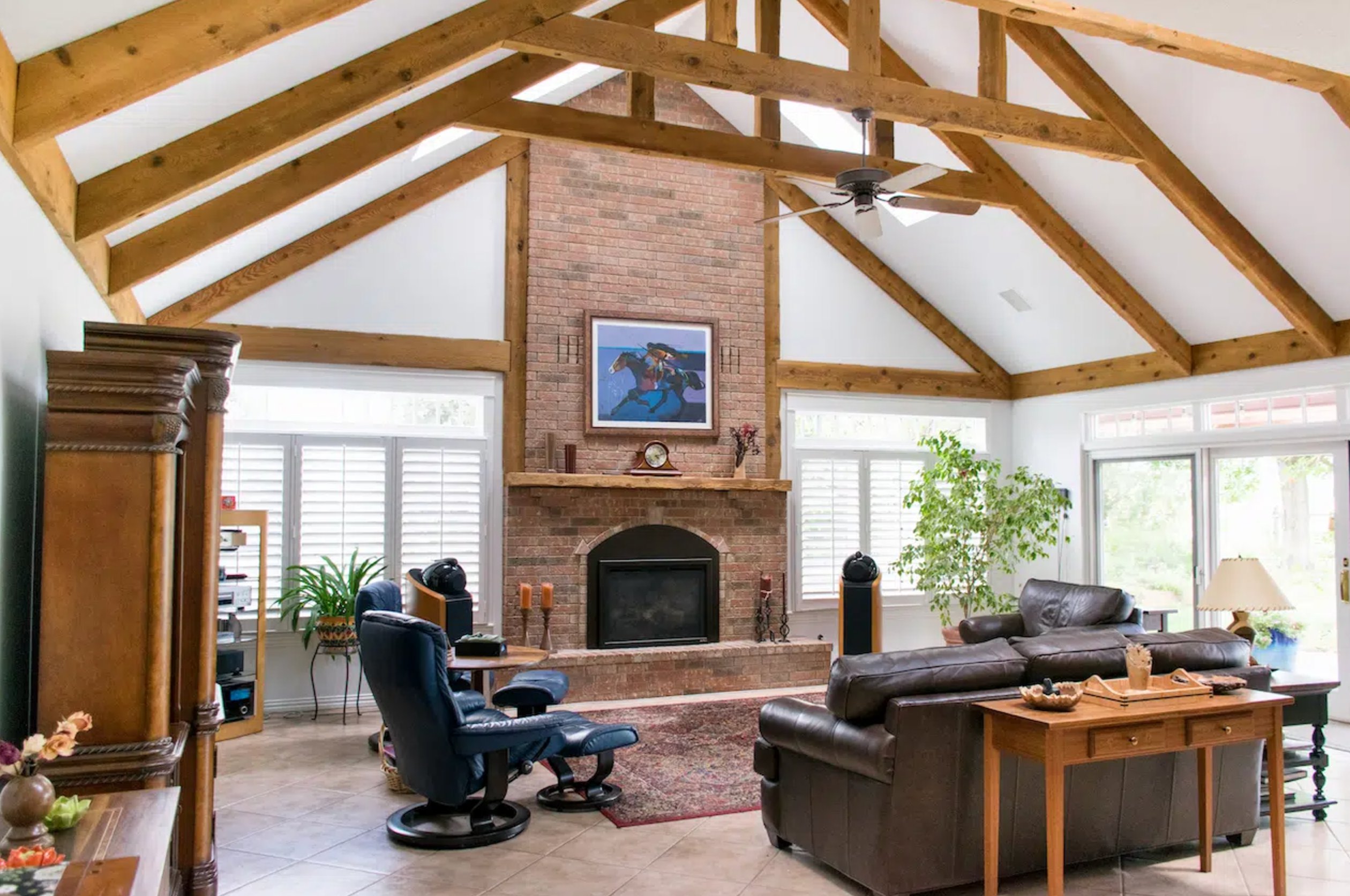
Extra White gives living rooms a more formal, modern look. Next to Pure White, it makes walls, trim, and architectural lines feel more structured.
In a north-facing living room, I would be careful with Extra White on all four walls. If you use it there, balance it with warm wood, woven textures, brass, or warmer bulbs so the room does not feel stark.
Kitchens
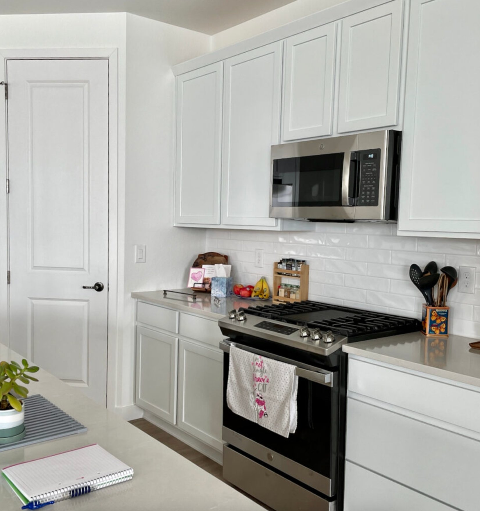

Choose Pure White in a kitchen with natural materials, warm wood, stone, or mixed metals. Its warm undertone softens stainless appliances and works well beside wood elements. It also stays fairly consistent as kitchen light shifts through the day.
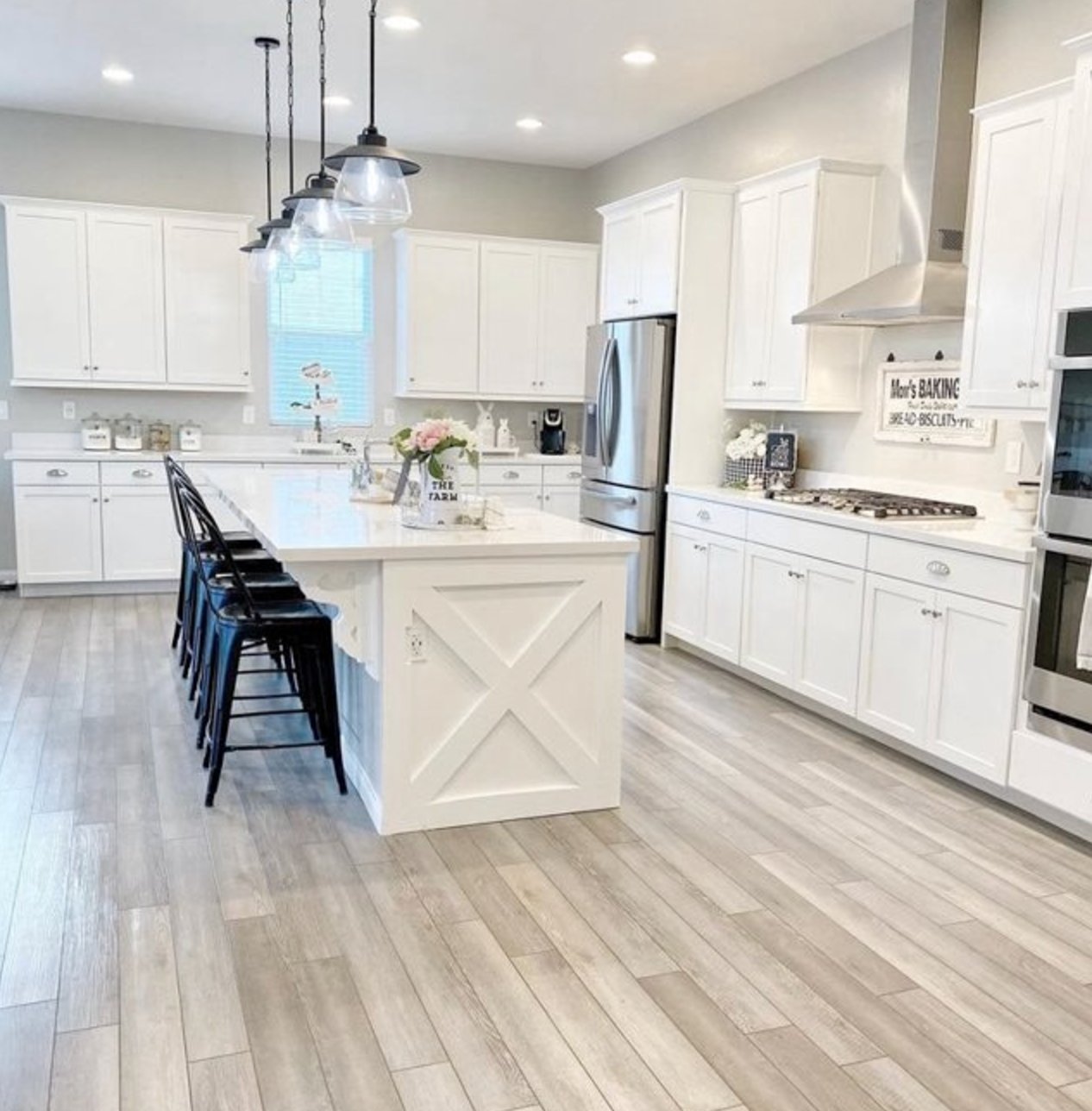
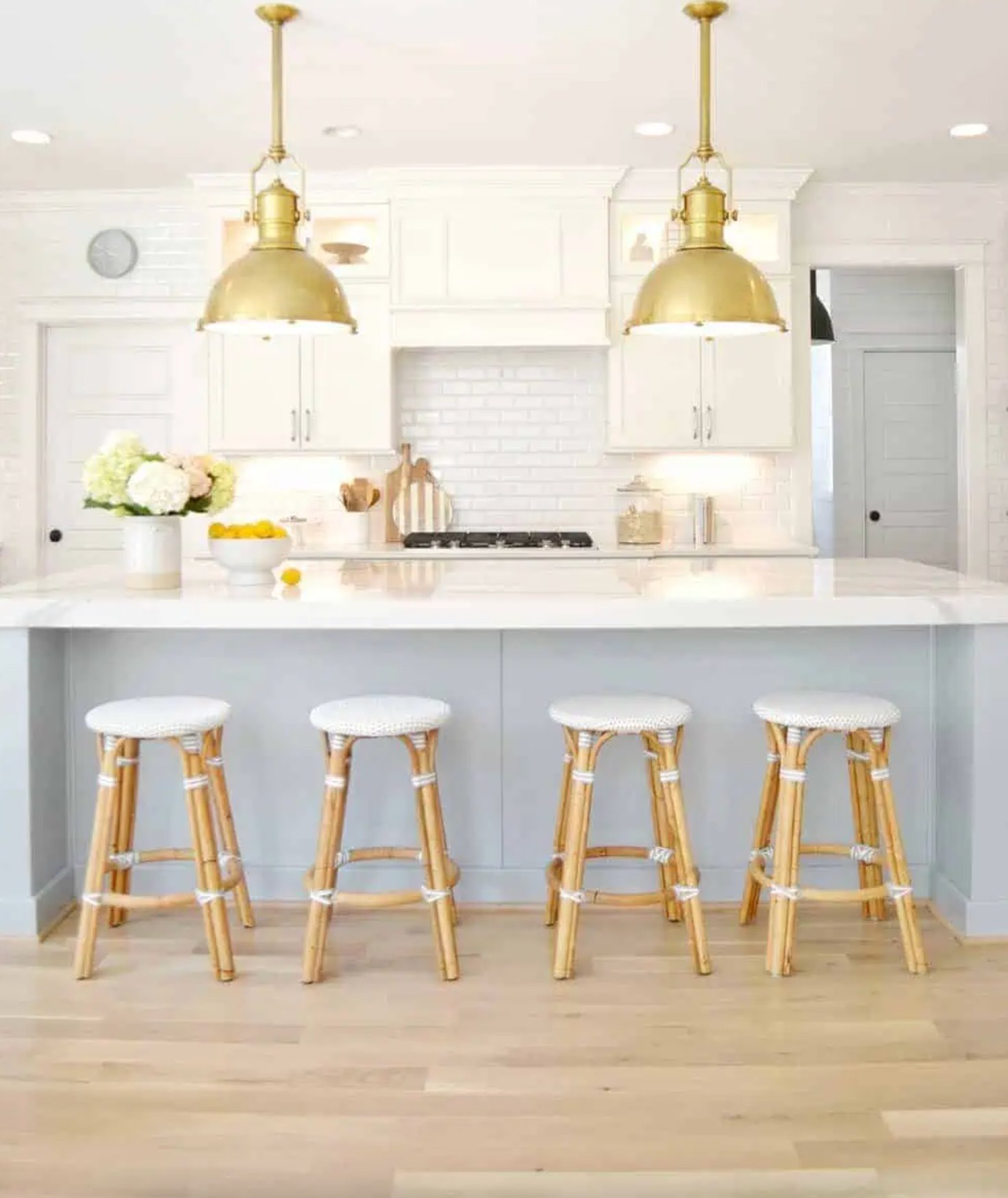
Choose Extra White for a kitchen that is intentionally modern, especially with flat-front cabinets, cool counters, polished chrome, or glossy cabinet surfaces. Compared with Pure White, it gives the room a cleaner edge, but it will make creamy counters and warm backsplashes look more yellow by comparison.
Bedrooms
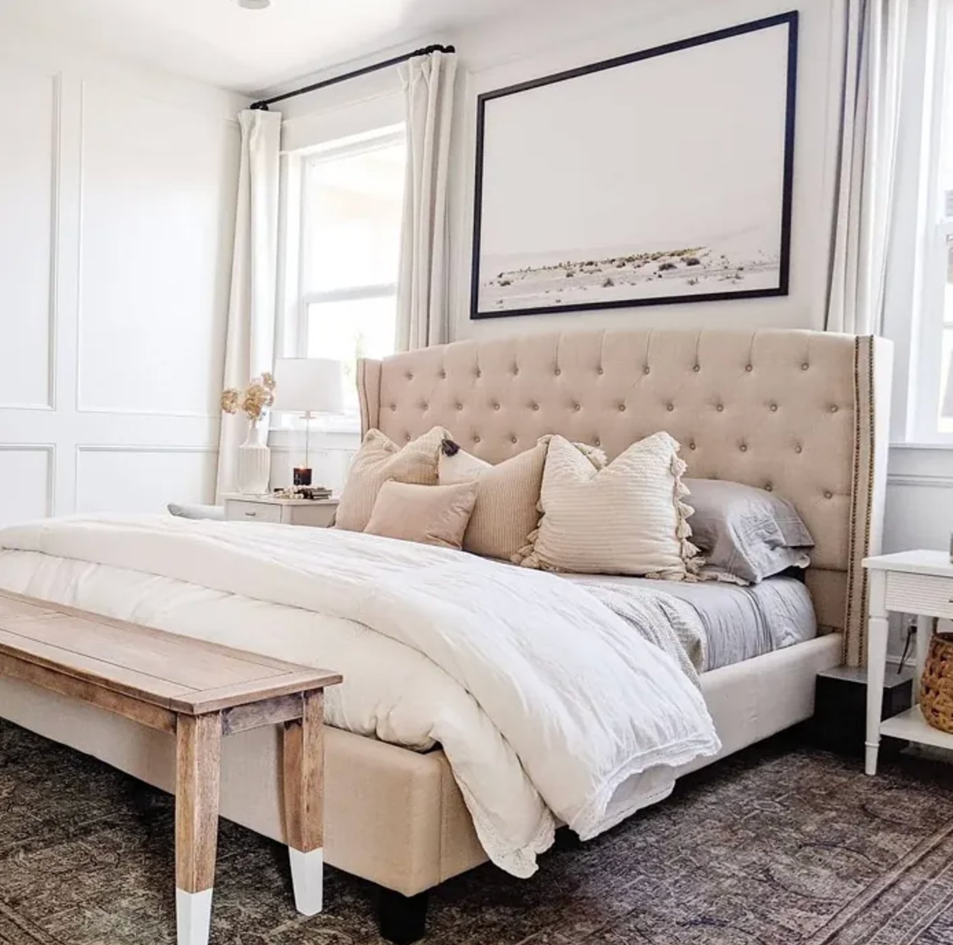
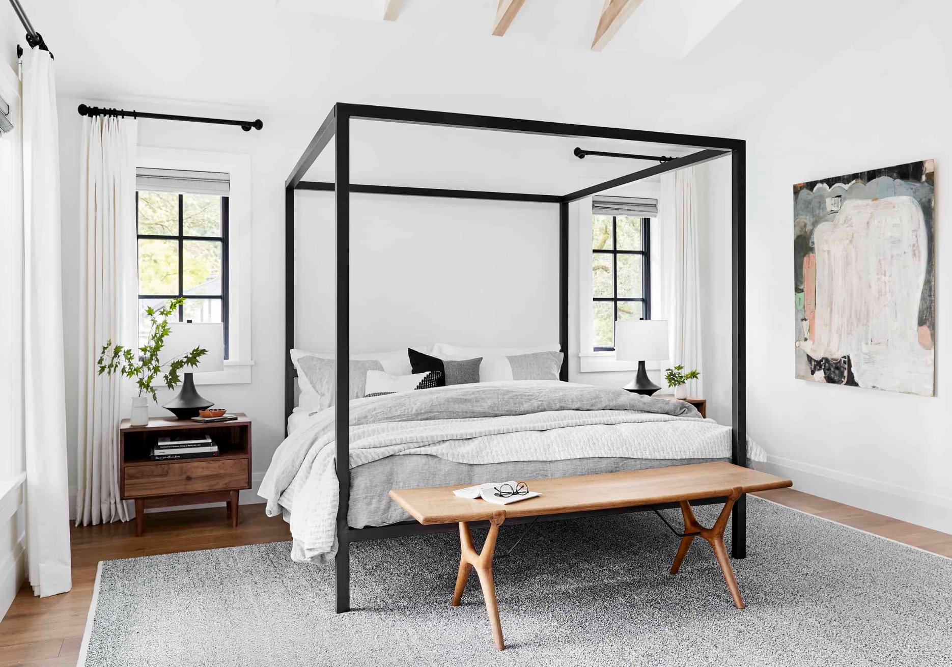
For bedrooms, Pure White is the easier wall color. It works in small and large rooms, and it does not need complicated pairings to feel finished. Textured fabrics, wool, cotton, and linen keep it from feeling plain.
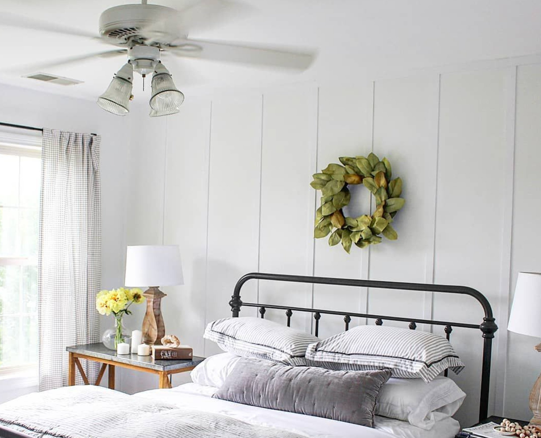
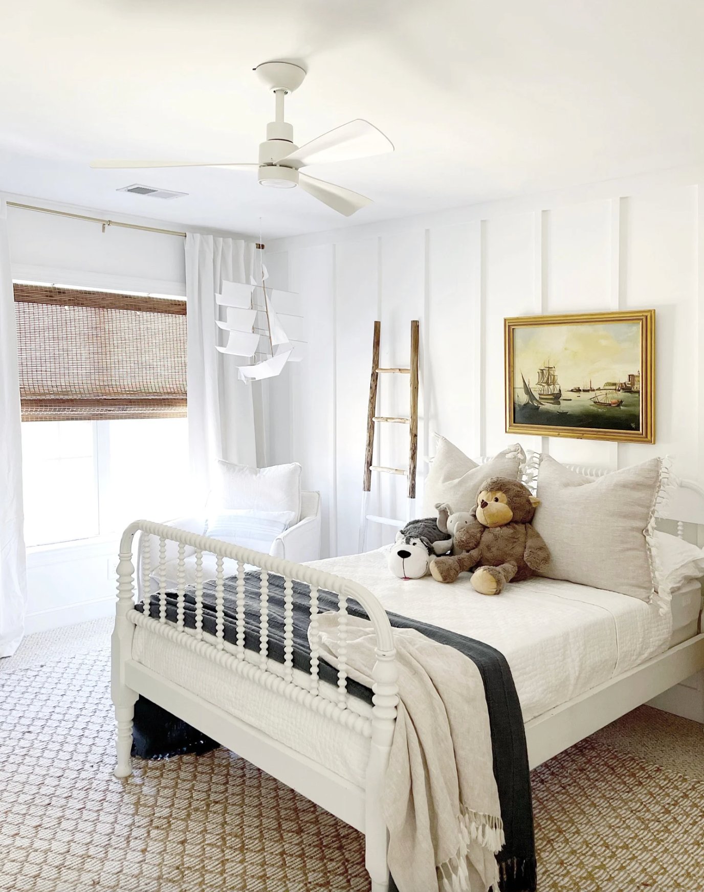
Extra White gives bedrooms a crisper, fresher feel than Pure White.
Use it in a bedroom when you want a clean hotel-sheet look and the room has enough light to support it. In a north-facing bedroom, add warm elements or choose Pure White instead.
Exteriors

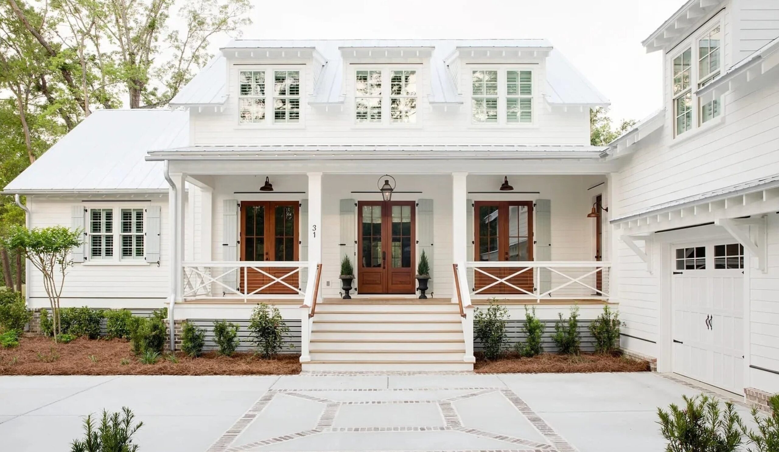
Pure White is the more forgiving exterior choice. It stays true to its color over time, with no obvious yellowing, and it works with many building materials. I especially like it on traditional homes where a blinding white would look too new or too sharp.

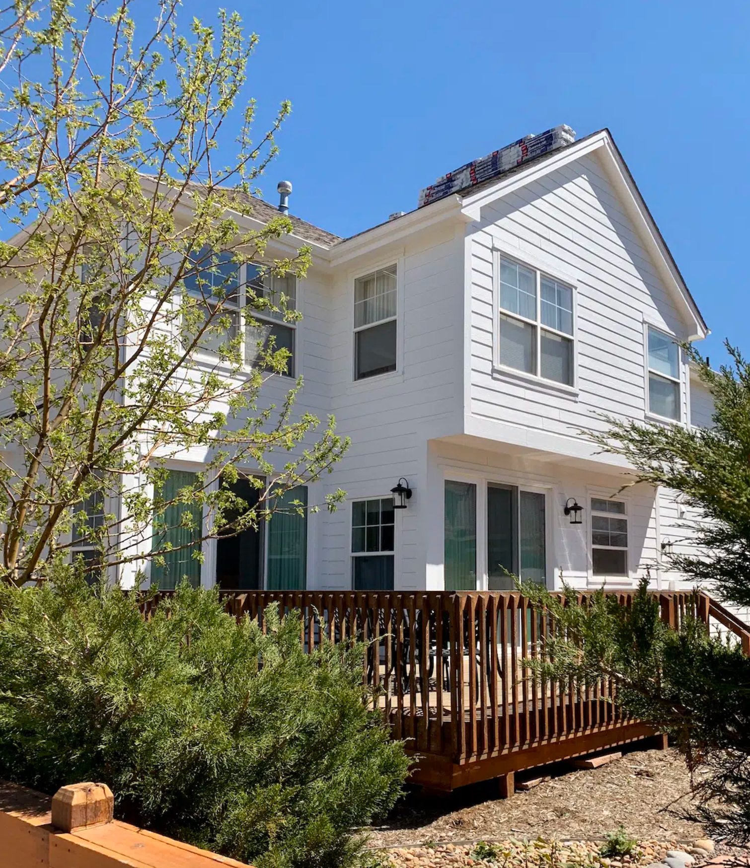
Extra White creates a bolder, more graphic exterior than Pure White. It needs strong accent elements, such as black windows, metal railings, deep trim color, or natural wood, so the house does not read flat. On a modern house with lots of glass, that cooler white can be the right call.
Lighting Impact


Pure White is the better choice if your light changes a lot during the day. In north-facing spaces, it stays soft and balanced, and its subtle warm undertone helps offset cooler light.
In west-facing rooms, it warms up at sunset but does not go yellow the way many warmer whites can. Under artificial light, it keeps its character without dramatic swings between warm and cool.
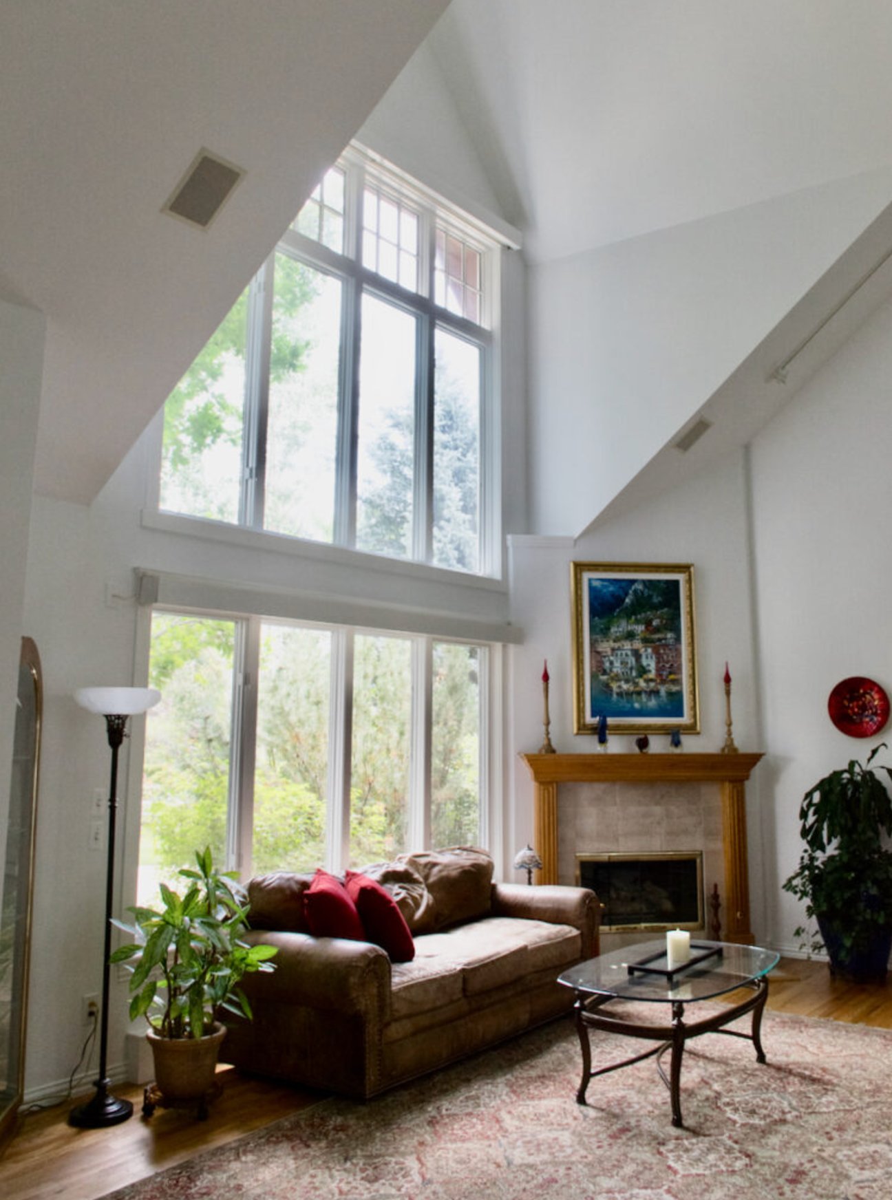
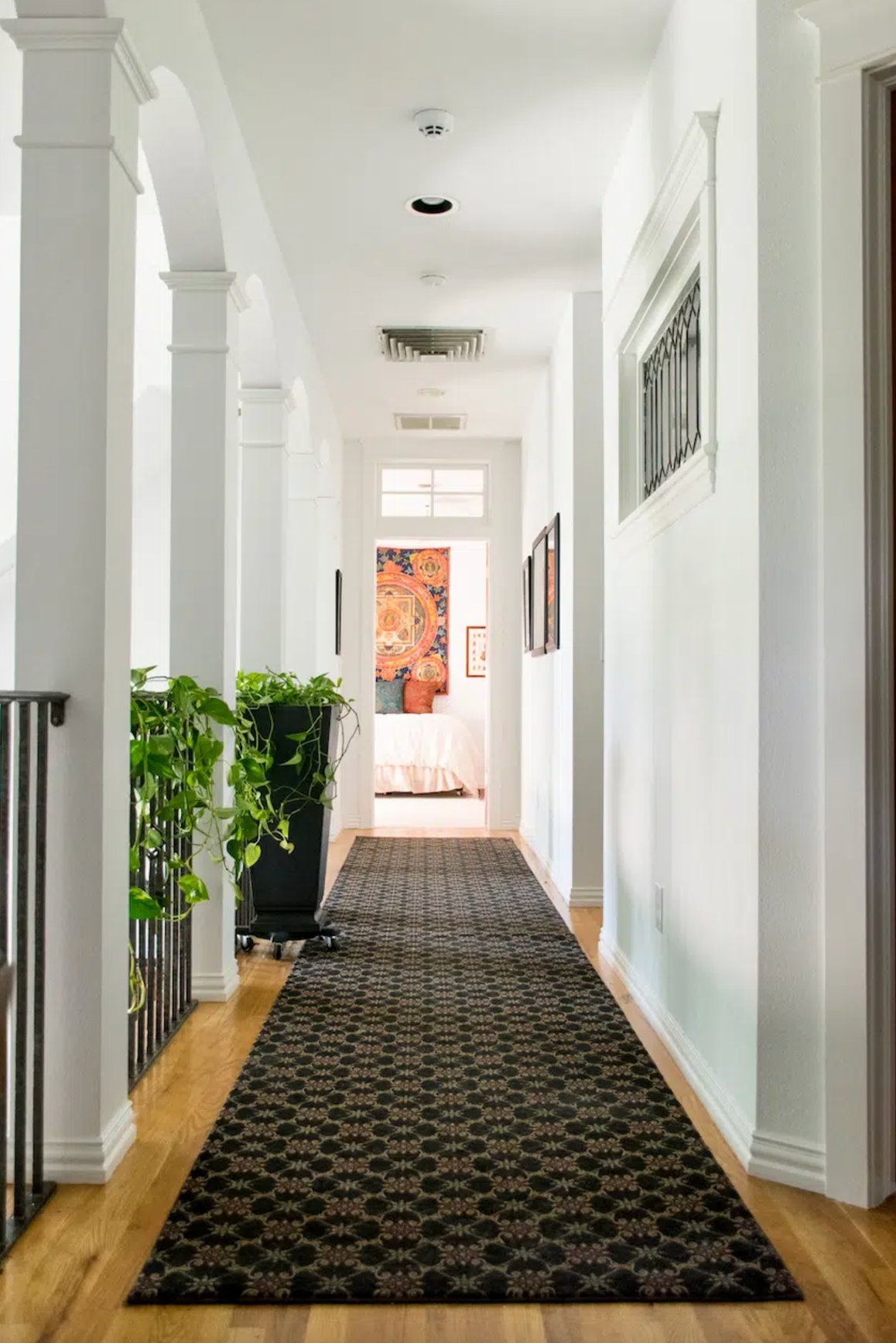
Extra White is best in rooms with bright, clean light. During the day it can look crisp, but in the evening those slight blue undertones become easier to see.
It also reflects the colors around it more clearly. Green trees outside the window, cool gray flooring, or saturated decor can all push Extra White cooler than it looked on the chip.
Coordinating Colors

Pure White balances warm and cool without tipping into obvious yellow or gray. It creates a soft neutral backdrop for deep blues, rich greens, and most earthy tones.
It also handles bold accents well, including coral and deep burgundy. Black elements look clear against it without feeling harsh, which is why Pure White is often easier for real homes than a colder gallery white.

Extra White is pickier about surrounding colors. Its cool undertone can fight warm beiges and creams, but it pairs well with grays, indigos, and metallic finishes.
Add balance with warm touches like copper or dark wood if the room starts to feel chilly. If your fixed finishes are already creamy, Pure White is usually the calmer match.
Making Your Decision
Here is the bottom line: for walls in most homes, I would choose Pure White. For trim, ceilings, glossy cabinets, and bright modern rooms, Extra White earns its place.
Go for SW Pure White when you want a soft white with just a hint of warmth. It is especially useful in north-facing rooms and in homes where the same wall color needs to work under different types of lighting.
Pick SW Extra White for modern clean-lined spaces when you need a bright white with cool undertones. It is especially useful for ceilings, trim work, and rooms with enough daylight to keep it from reading cold.
If you are still stuck, sample Pure White first on walls and Extra White first on trim. Test both on the actual surface before you commit, because your lighting, sheen, and fixed finishes can change the read of the color.

I'm Elizabeth, your go-to guide for all things paint and design! My days are filled with color swatches and innovative room makeovers. When I'm not painting the town - literally - I'm soaking up inspiration from my travels. This blog is my way of sharing my passion and making the world a more vibrant place, one color palette at a time.