Tricorn Black vs Iron Ore
Tricorn Black and Iron Ore solve two different design problems. Tricorn Black is the true black for crisp contrast. Iron Ore is the softer charcoal when you want depth without going all the way to black.
Both are popular Sherwin-Williams dark neutrals, but they do not behave the same once they are on a wall, cabinet, or exterior. I look at undertones, LRV, room use, lighting, and coordinating colors so you can choose the one that fits your actual space.
The photos matter here because black paint is especially hard to judge from a chip. A small sample can look similar, then a full wall shows you whether you picked a clean black or a charcoal with movement.
Undertones & Character
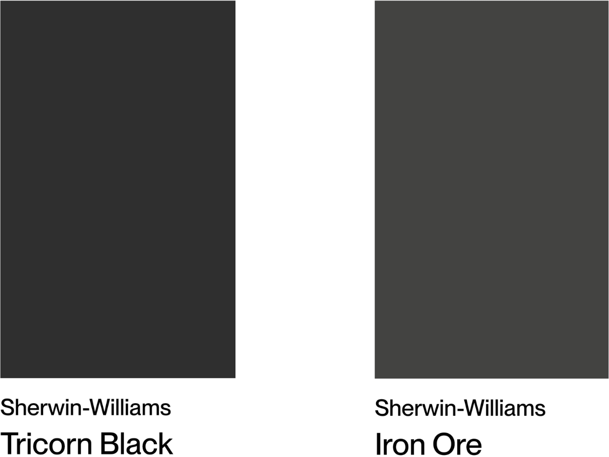
Tricorn Black has an LRV of 3, making it one of the darkest shades in Sherwin-Williams' lineup.
The first time I saw it on a large sample board, the useful thing was how little color showed up inside the black. It reads clean and saturated, not blue-black, green-black, or brown-black. In bigger, bright rooms, that purity gives the architecture a strong outline without turning muddy.
Next to warmer blacks it can look cooler, and next to cooler shades it can feel slightly warmer. That is comparison at work, not a strong undertone. I use Tricorn Black when the client wants a clean modern black on interior accents, doors, cabinetry, or a bold exterior.
Iron Ore is a deep charcoal with an LRV of 6, so it never quite goes full black.
The gray undertone is always present, and in brighter light you may catch subtle green notes. It is one of my favorite dark colors for bedrooms and home offices because it gives you the mood of black with more softness, especially beside light wood and clean white trim.
In spaces with plenty of natural light, Iron Ore shows more range. It can move from charcoal to near black during the day without looking flat.
The biggest difference between these two? Tricorn Black is the truer black and is noticeably darker. Iron Ore keeps its charcoal character, so even in dim light it does not read as completely black.
Choose Tricorn Black if you want a sharp black line, a graphic exterior, or high contrast against white. Choose Iron Ore if you want dark paint that feels easier to live with on large surfaces.
| SW Tricorn Black | SW Iron Ore | |
| Color Code | SW 6258 | SW 7069 |
| Light Reflectance Value (LRV) | 3 | 6 |
| Color Family | Neutral | Neutral |
| Undertones | Cool undertones, can appear warmer next to cool colors | Greenish undertones in bright light, can show bluish tints, warm charcoal character |
Room-by-Room Comparison
In real rooms, the safer choice depends less on the paint chip and more on scale, daylight, trim color, and how much surface area you plan to cover.
Living Rooms
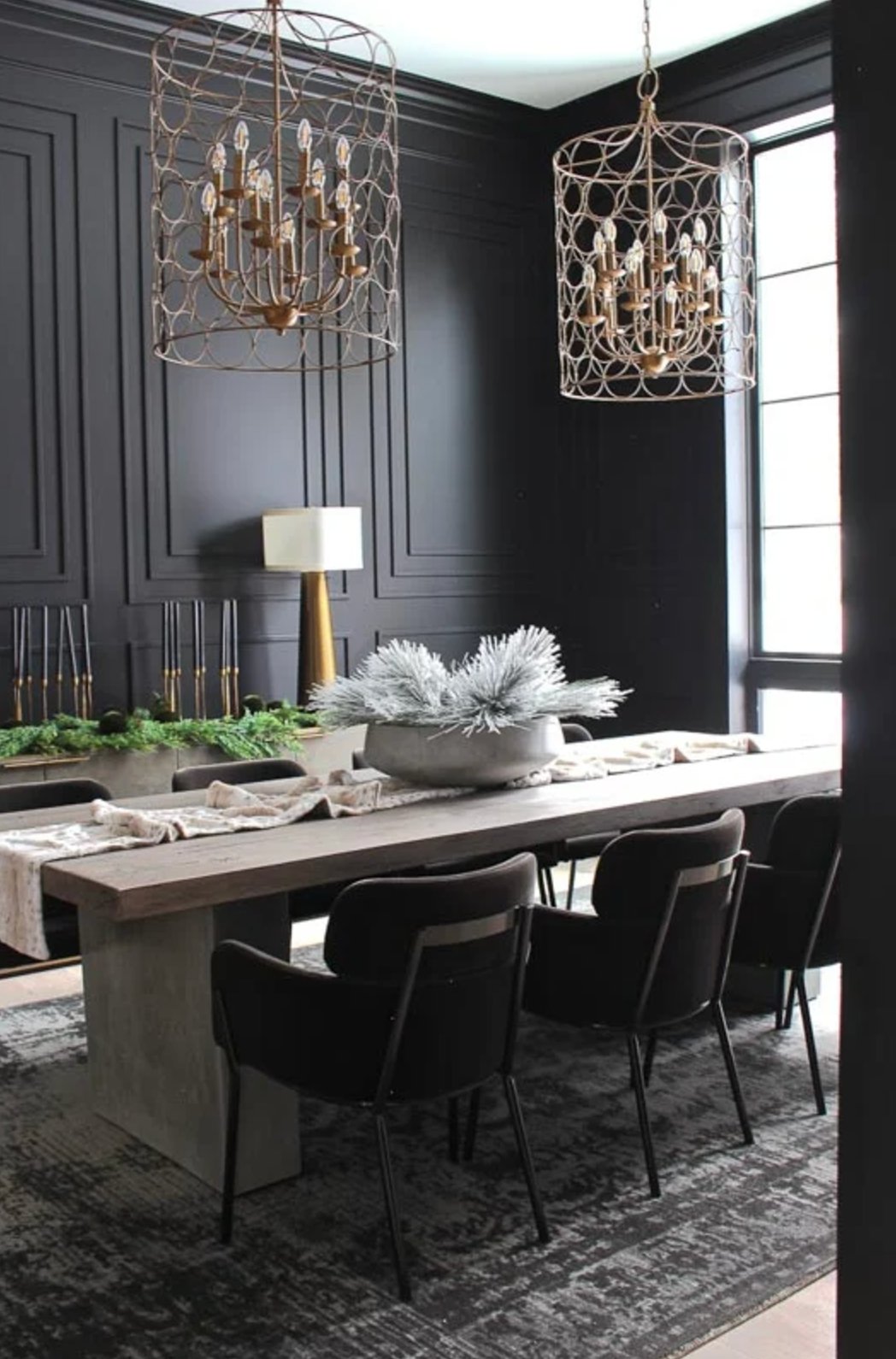
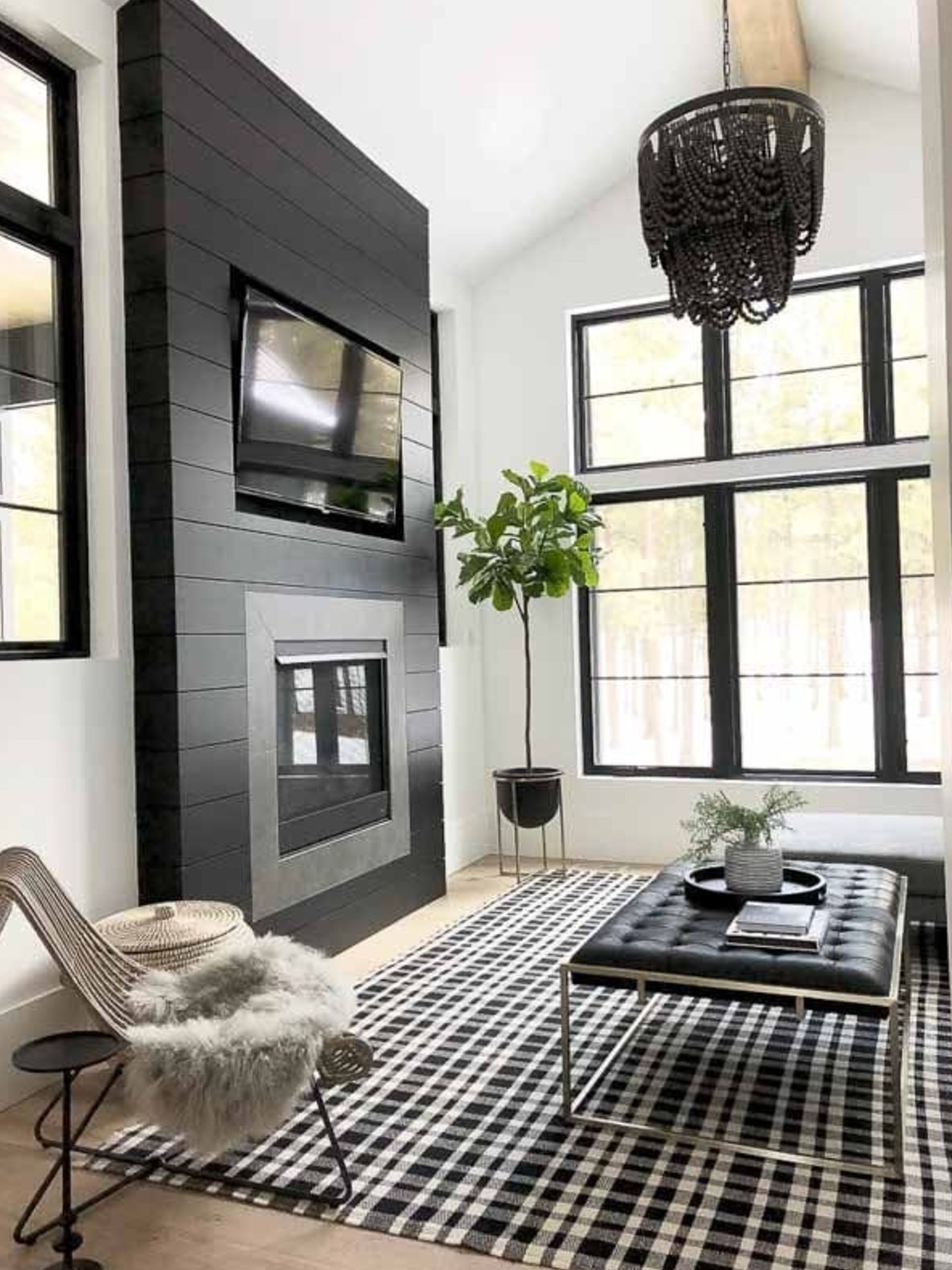
Tricorn Black works best in living rooms when the room has size, daylight, and enough pale contrast around it. On a fireplace, built-ins, doors, or one large feature wall, it gives the room a clean focal point.
I use it more often for accents than for every wall. Picture frames, door frames, stair rails, and window sashes are all places where its true black quality earns its keep.
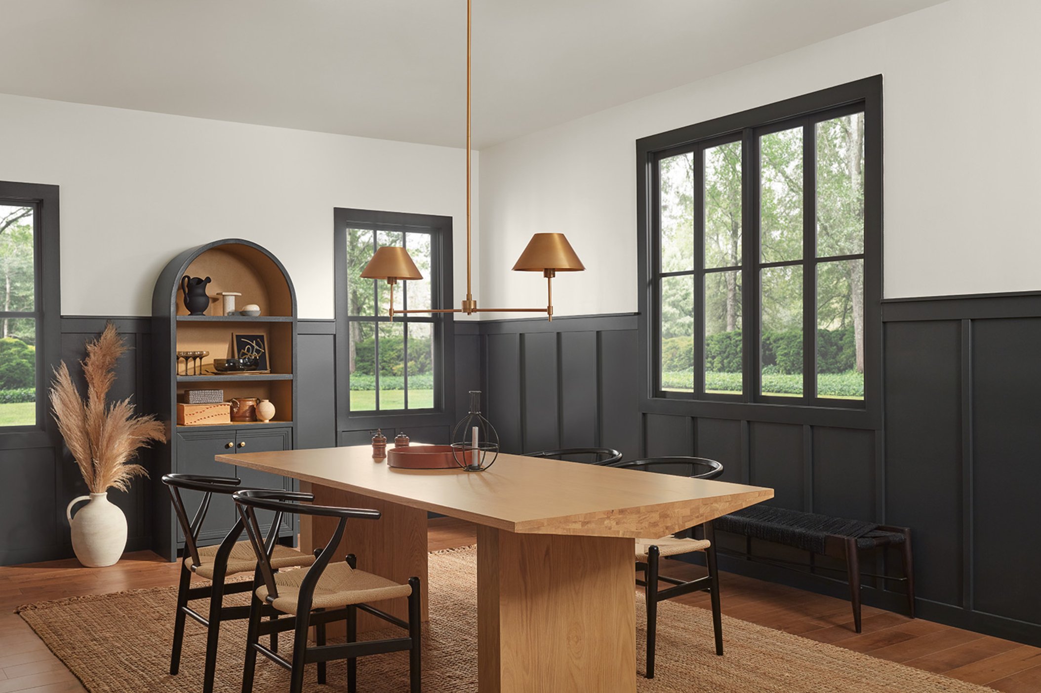
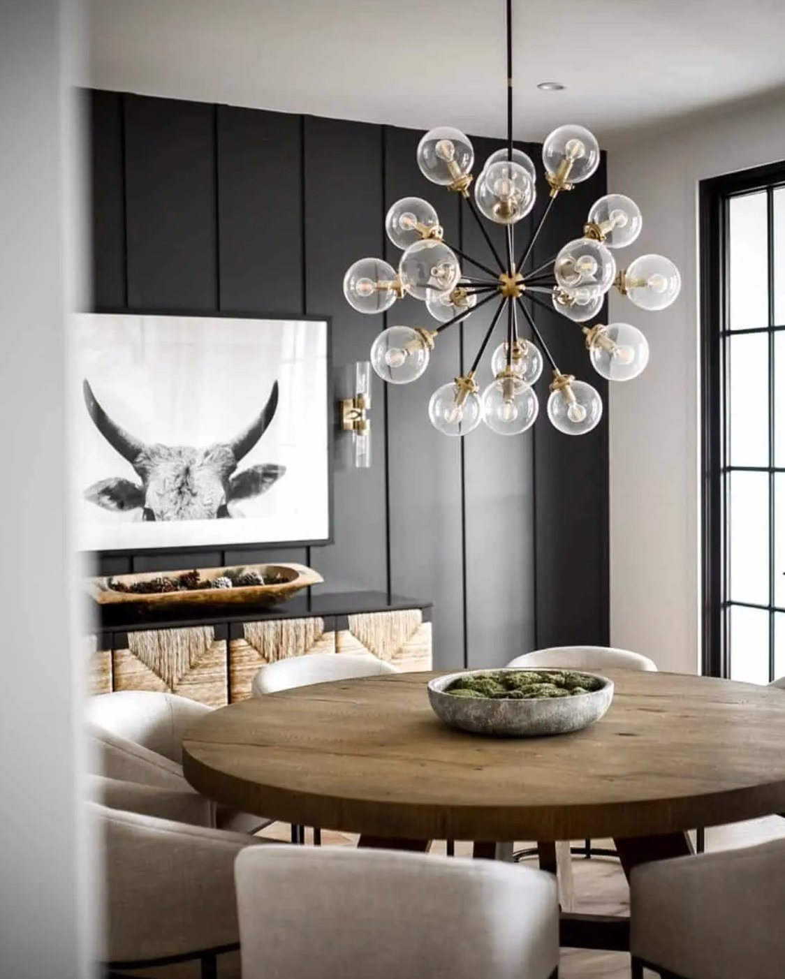
Iron Ore is usually the better living room color if you want the dark look across a larger area. Its warm charcoal quality sits comfortably with wood furniture, leather, natural rugs, and off-white upholstery. On an accent wall or fireplace, the contrast is softer than Tricorn Black but still intentional.
Kitchens
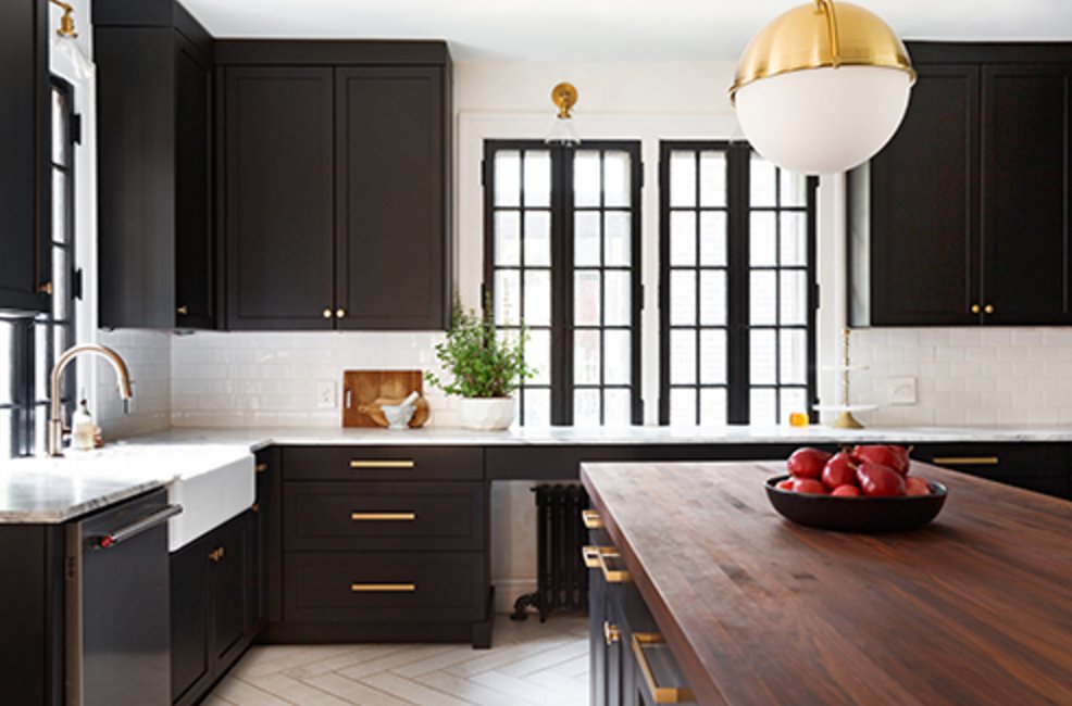
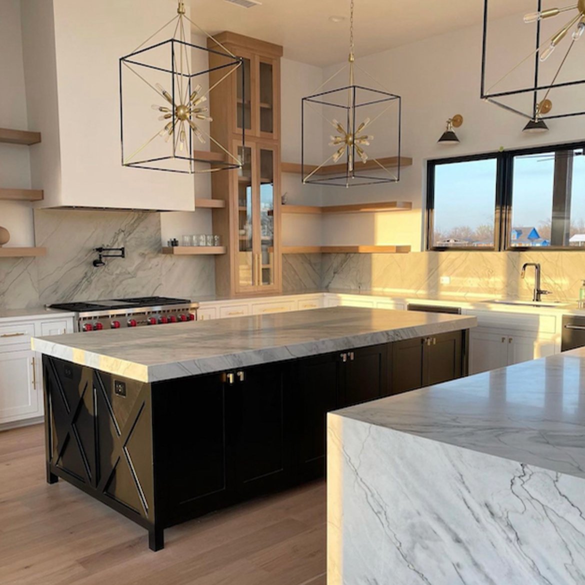
Tricorn Black is a strong choice for kitchen cabinets and islands when the rest of the kitchen can support it. It looks sharp with white counters, unlacquered brass, polished nickel, or warm wood floors.
With an LRV of 3, it absorbs a lot of light. I would avoid it on every cabinet in a small kitchen unless there is strong natural light, good task lighting, and a lighter counter or backsplash to keep the room from feeling heavy.
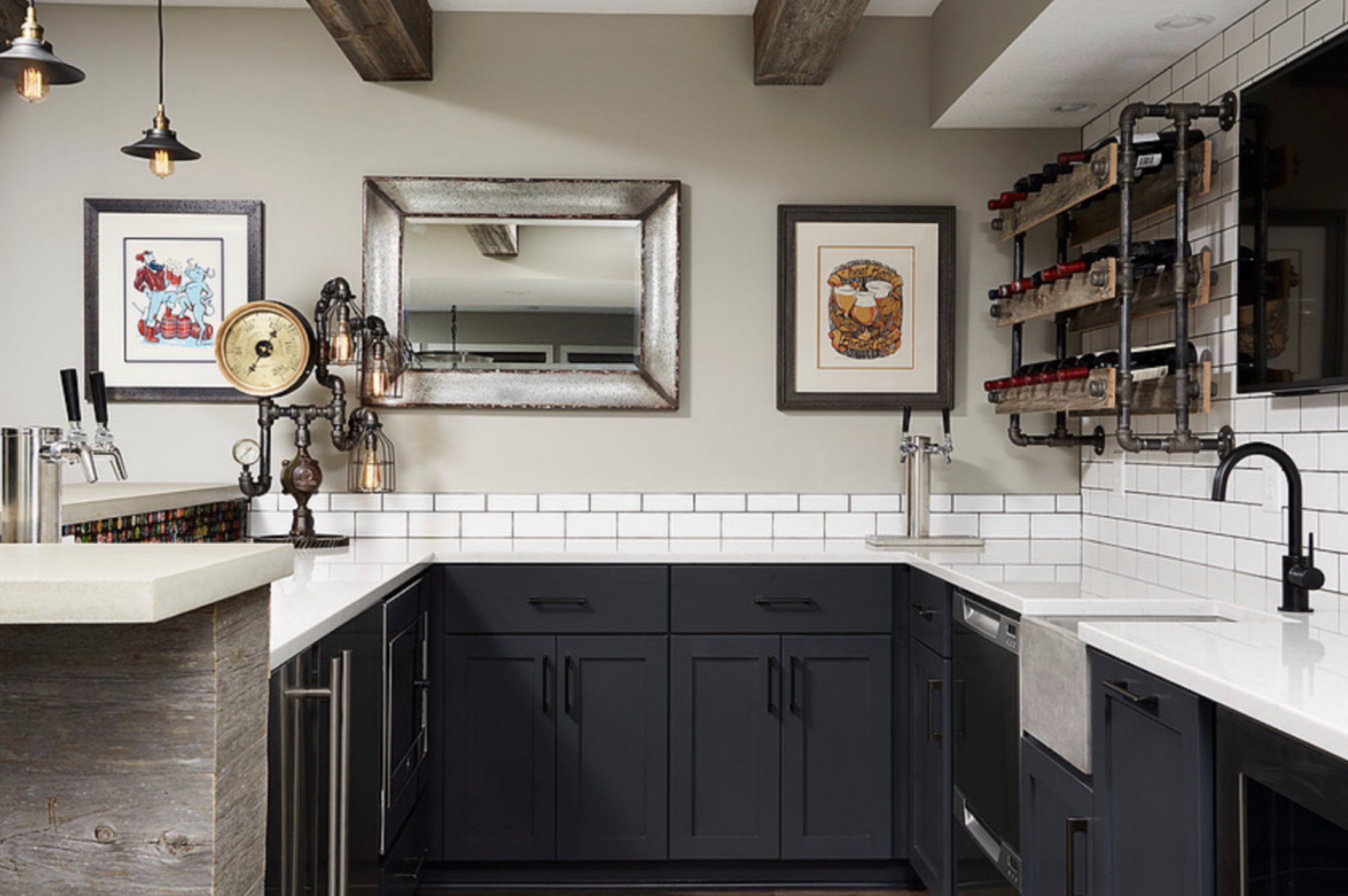
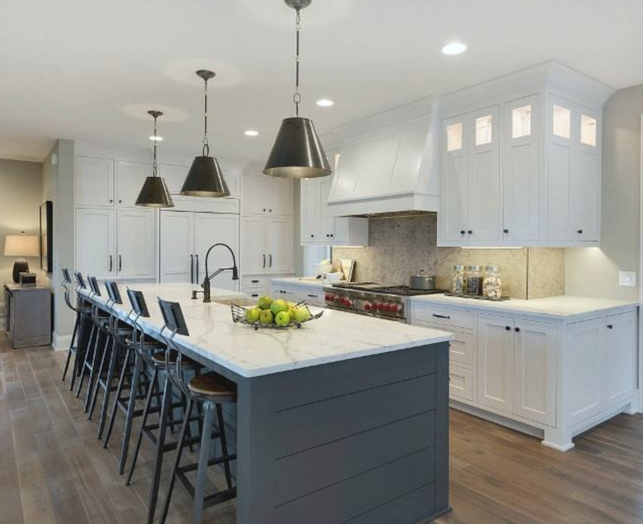
Iron Ore is more forgiving in kitchens. Its LRV of 6 is still dark, but the extra reflectance and gray character make cabinet detail, paneling, and hardware easier to read.
On larger cabinet runs, it picks up gray in daylight instead of reading as a solid black block. That makes it a better choice for many family kitchens where the goal is dark and tailored, not severe.
Bedrooms

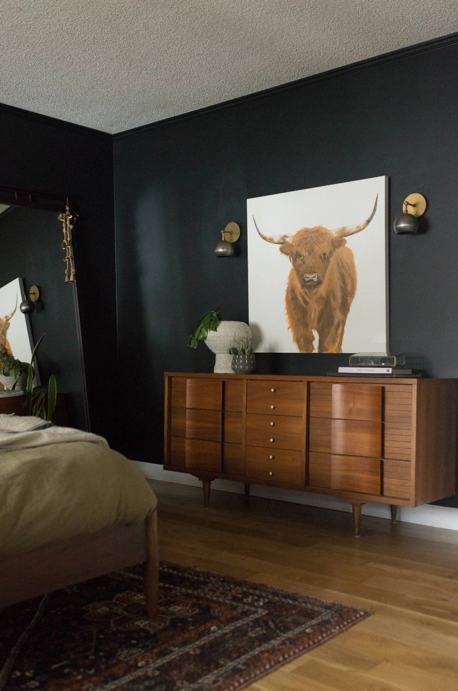
I am careful with Tricorn Black in bedrooms. I recommend it for larger rooms with plenty of windows, a single accent wall, or architectural details like trim and doors.
On all four walls, it can feel intense because it removes so much visual light from the room. If you sleep better in a cocoon-like space, that may be a benefit. If you want calm but not heavy, it is probably too much.

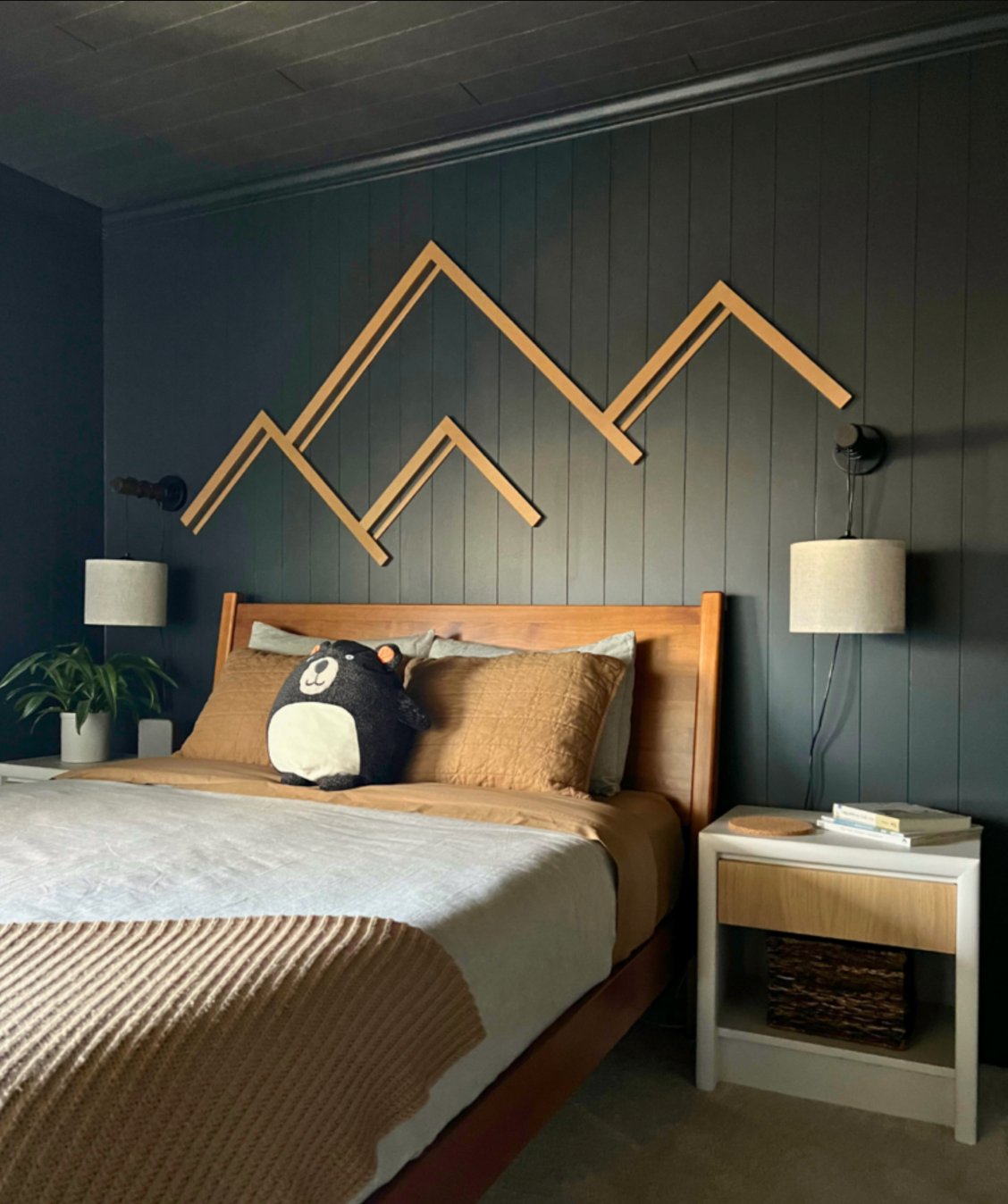
Iron Ore is more versatile in bedrooms. It can look close to black in the evening, then read as a softened charcoal during the day. That shift makes it easier to use behind a bed, on all walls in a larger room, or with linen bedding and oak nightstands.
Exteriors
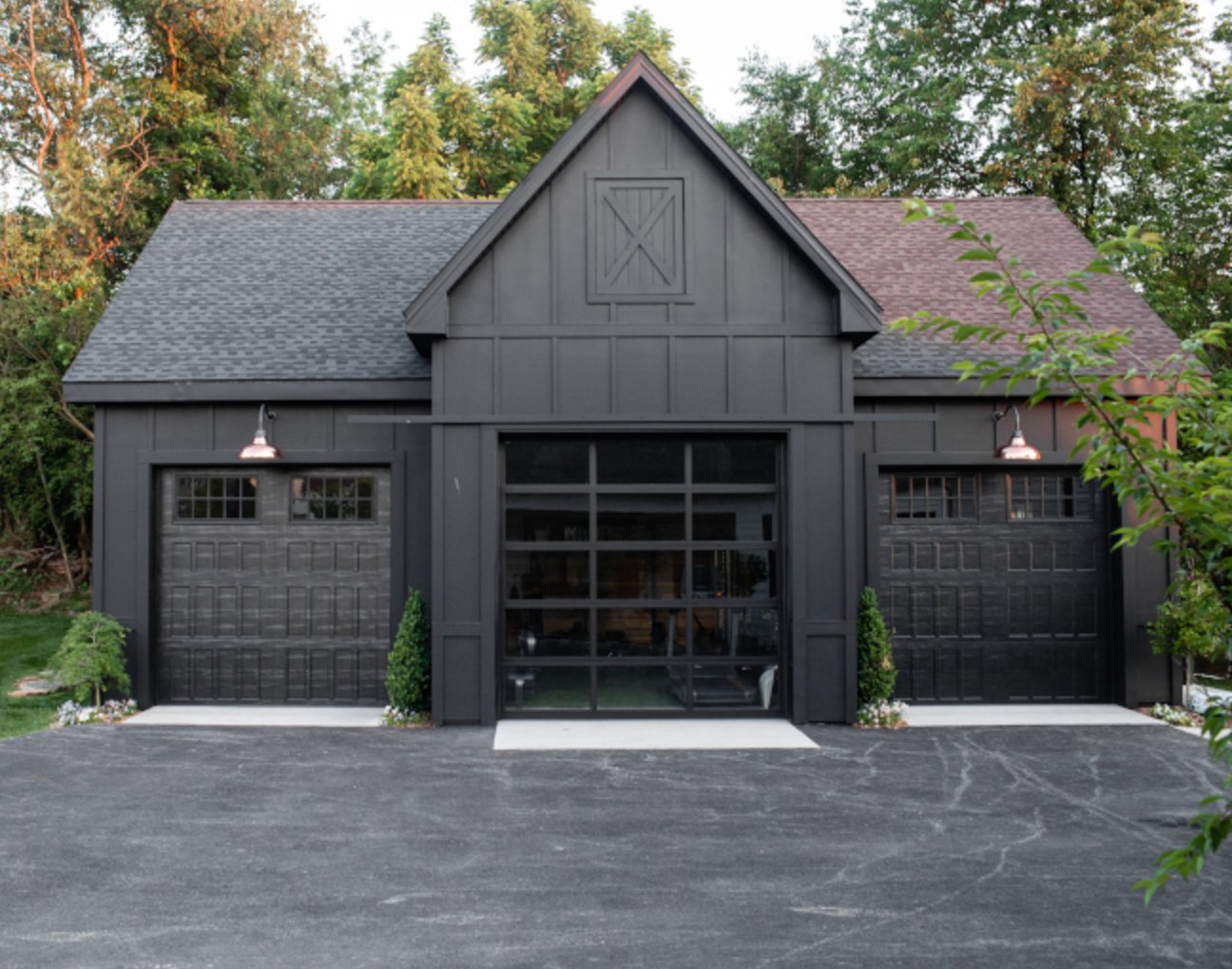
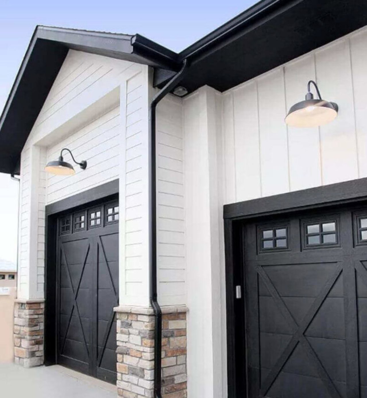
On exteriors, Tricorn Black gives the clearest architectural definition. It is the color I would pick for a modern farmhouse trim package, black windows, a front door, shutters, or a full exterior where the design calls for real black.
Across larger surfaces, it looks bold and deliberate. It also exposes dust, pollen, fading, and surface imperfections more readily than a charcoal, so the siding material and sun exposure matter.
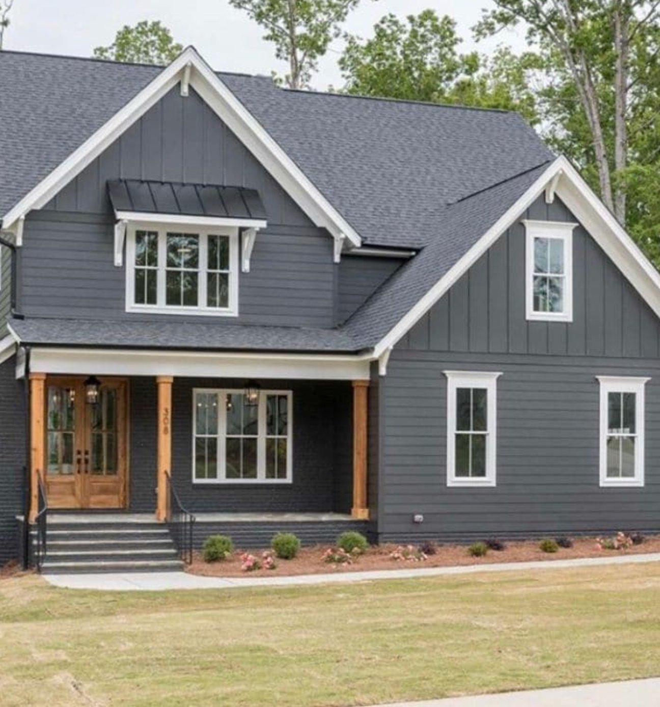
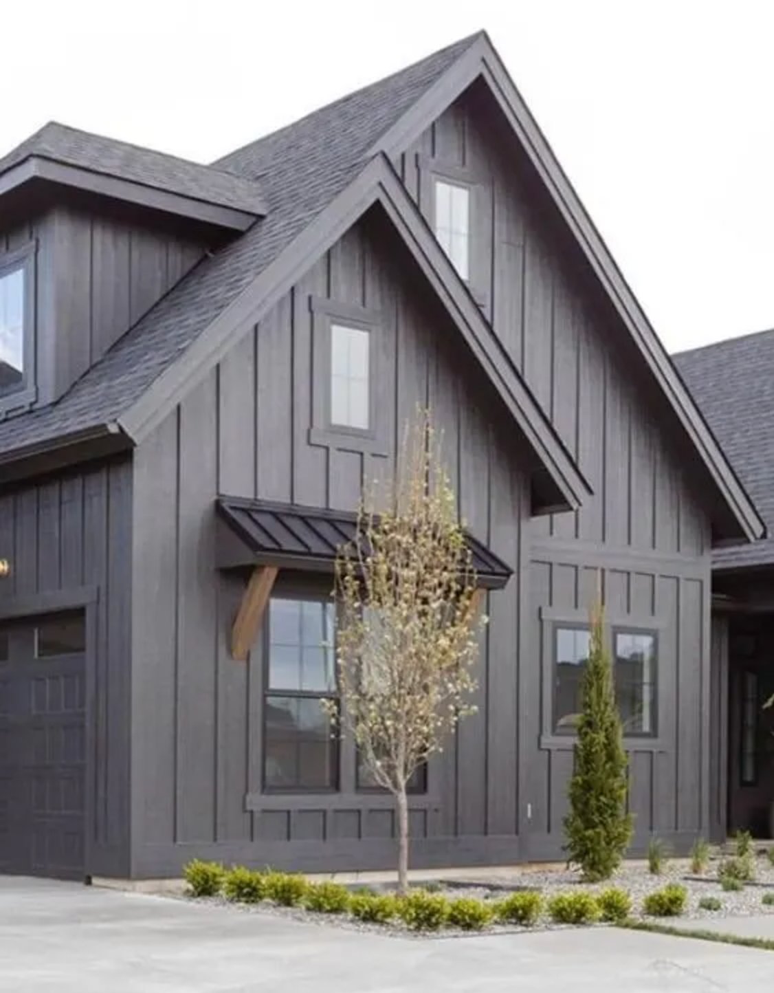
Iron Ore is the exterior choice when black feels a little too hard. It changes subtly throughout the day, and its warmth comes forward in bright sun. On siding, brick, garage doors, or trim, it gives a dark sophisticated look with less edge than Tricorn Black.
Lighting Impact
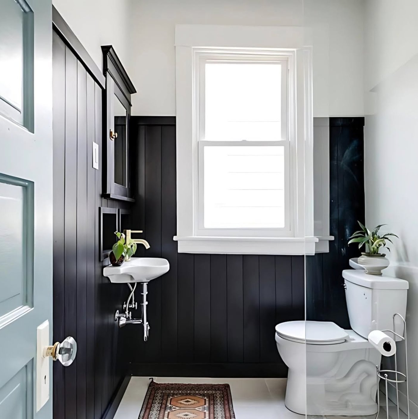
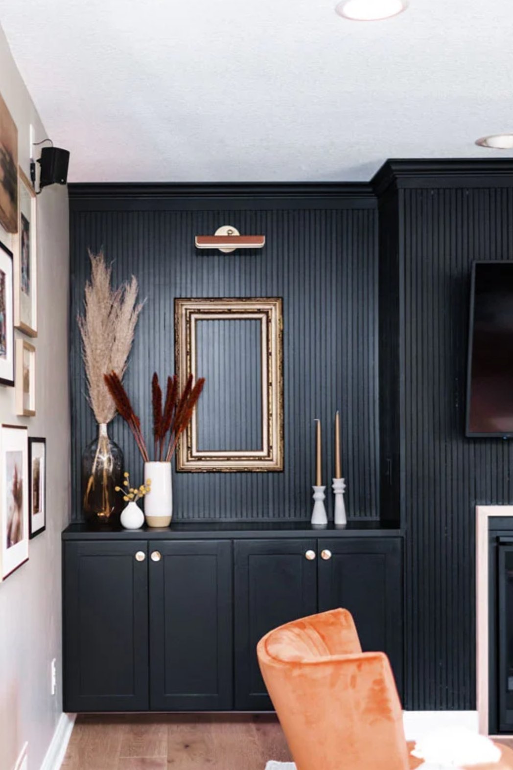
Tricorn Black is demanding in low light. It can look rich in a living room with large windows, but in a small bathroom I would usually limit it to an accent wall, vanity, door, or trim.
In natural light, it stays a deep black with very little undertone showing. Direct sun can make the contrast feel stark, which is useful for crisp black-and-white schemes but less forgiving beside creamy whites or busy stone.

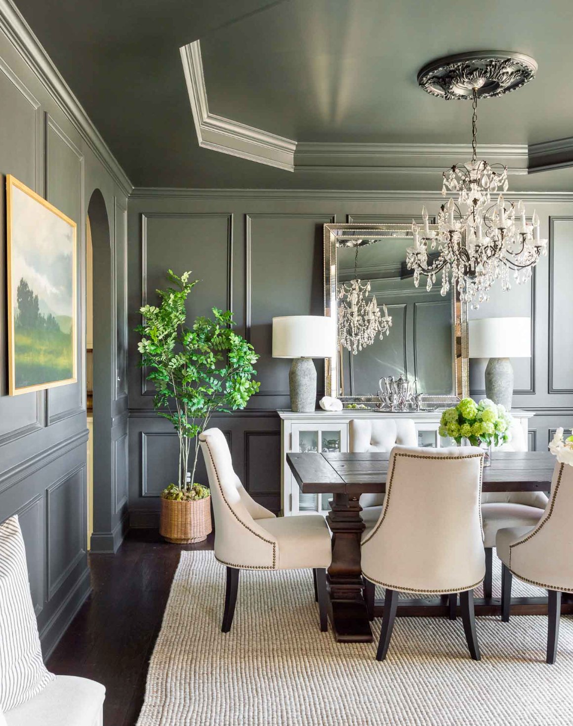
Iron Ore is more forgiving because it changes with the light instead of staying visually flat.
In morning light, you may see a soft dark gray that moves closer to black by evening. In bright daylight, its warm charcoal quality becomes easier to see.
Under artificial light, it can sometimes take on subtle blue hints, especially with cooler bulbs. It handles poorly lit spaces better than Tricorn Black because the gray base keeps some shape and detail visible.
Coordinating Colors
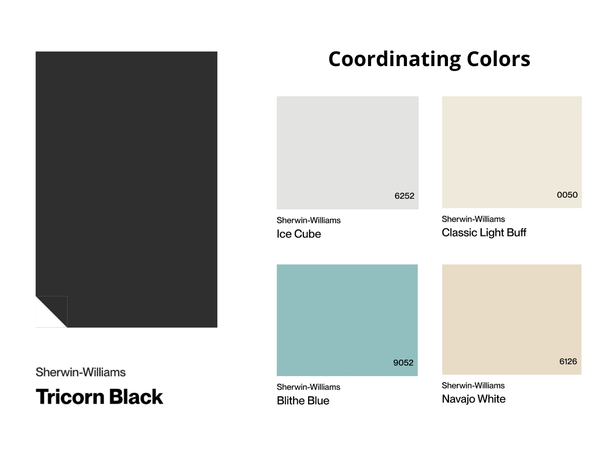
Tricorn Black pairs best with clean colors that can stand up to a true black. Rich emerald, mustard yellow, and sapphire blue all look clearer against it.
For modern spaces, pair it with warm whites and ivory tones so the contrast feels crisp without going cold. Gold and brass accents read especially strong against this deep backdrop.
For a more relaxed palette, use it with earthy tones and warm beiges. The key is to give Tricorn Black enough contrast so it looks intentional, not like a shadowed version of the surrounding colors.

Iron Ore is easier to coordinate because it already has charcoal softness built in. It works especially well with muted shades like lavender, terracotta, and sage green.
It gives you softer transitions and does not need the same stark contrast as Tricorn Black. It is a strong match for light woods, particularly oak and maple.
It also works with complex pastels because it adds depth without stealing the room. Matte metals like nickel and aged silver suit Iron Ore better than very shiny finishes when you want a quieter look.
Making Your Decision
My short answer: choose Tricorn Black for the cleanest black, and choose Iron Ore for the more livable dark charcoal.
Tricorn Black is the true deep black, with an LRV of 3, and it makes the bigger statement. Use it when you want crisp contrast, black exterior details, modern cabinetry, or a feature that should read clearly black from across the room.
Iron Ore is the softer, more complex option, with an LRV of 6, and it changes more through the day. Pick it for bedrooms, home offices, larger cabinet runs, and exteriors where pure black would feel too severe.
Sample both colors on boards at least 2 feet by 2 feet, then move them from morning light to evening light. If Tricorn Black feels too sharp, Iron Ore is likely the better long-term choice. If Iron Ore keeps reading gray and you wanted a real black, go with Tricorn Black.

I'm Elizabeth, your go-to guide for all things paint and design! My days are filled with color swatches and innovative room makeovers. When I'm not painting the town - literally - I'm soaking up inspiration from my travels. This blog is my way of sharing my passion and making the world a more vibrant place, one color palette at a time.