Best Ceiling Paint Colors
A white ceiling is still the safest choice in many rooms, but it is not the only good choice. Soft pinks, grays, deep blues, greens, and even black can work overhead when the room has the right light and enough visual balance below.
I pulled together ceiling colors I would actually consider for a client, with real rooms so you can see the scale of the decision. Classic whites are included, because they solve plenty of problems, but the stronger colors are where ceiling paint gets interesting.
Before you paint, sample the color overhead if you can. A shade that looks controlled on a vertical wall can read darker on the ceiling, especially in flat paint, and any patched texture or water stain will show through unless it is sealed first.
Honorable Mention: White Paints
I left white paints off the numbered list because most people already expect them on ceilings. They still deserve a mention, because the wrong white can make a room feel dingy, too stark, or oddly disconnected from the walls.
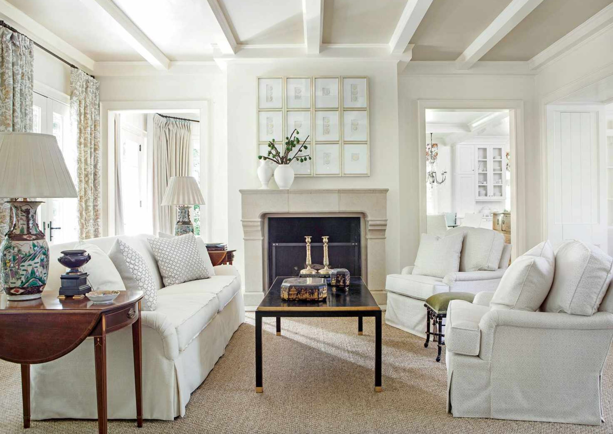
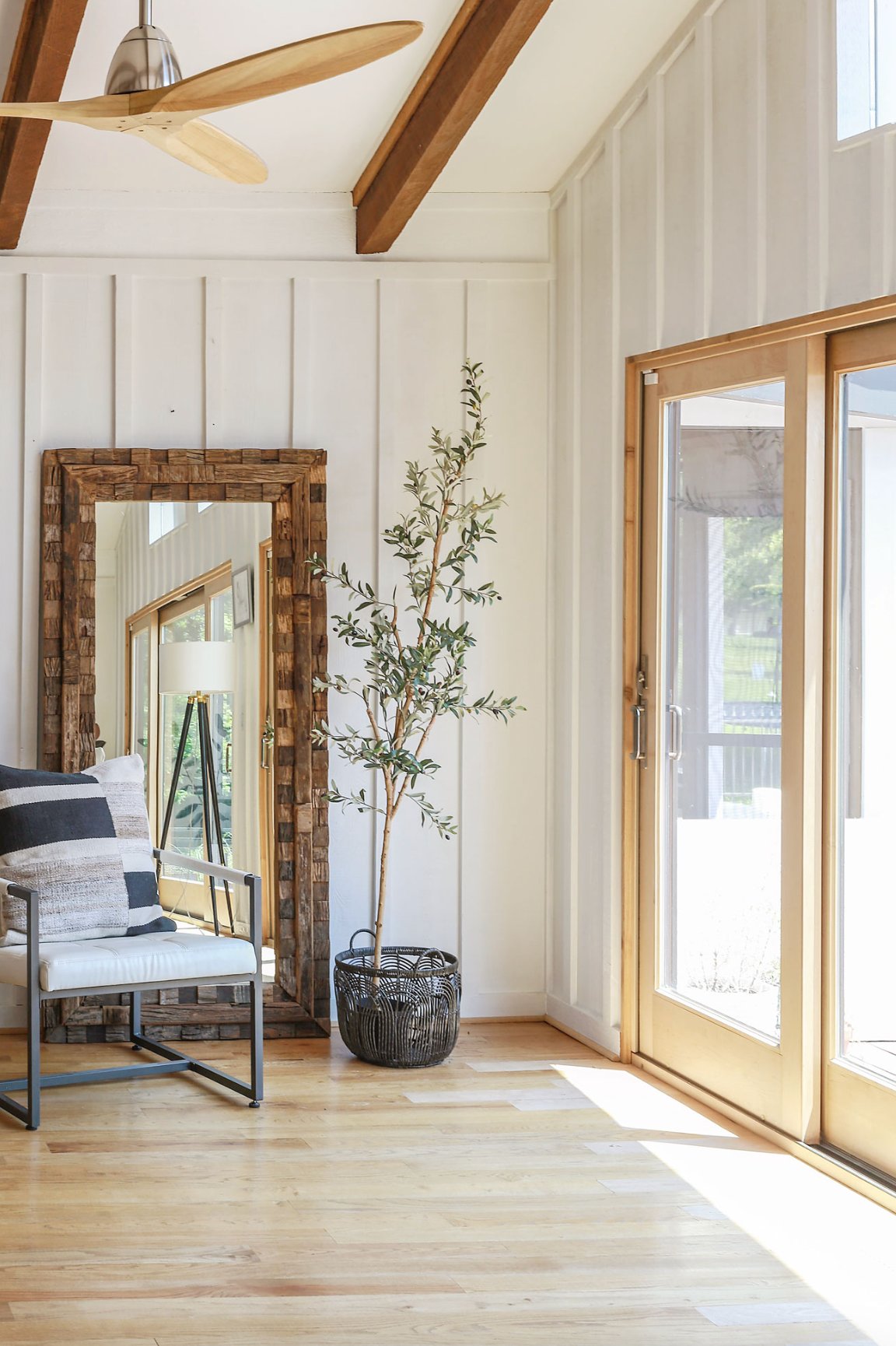
White paint is not one category. Warm whites with creamy undertones work well with wood floors, woven shades, brass, and older trim that already has a little yellow in it.

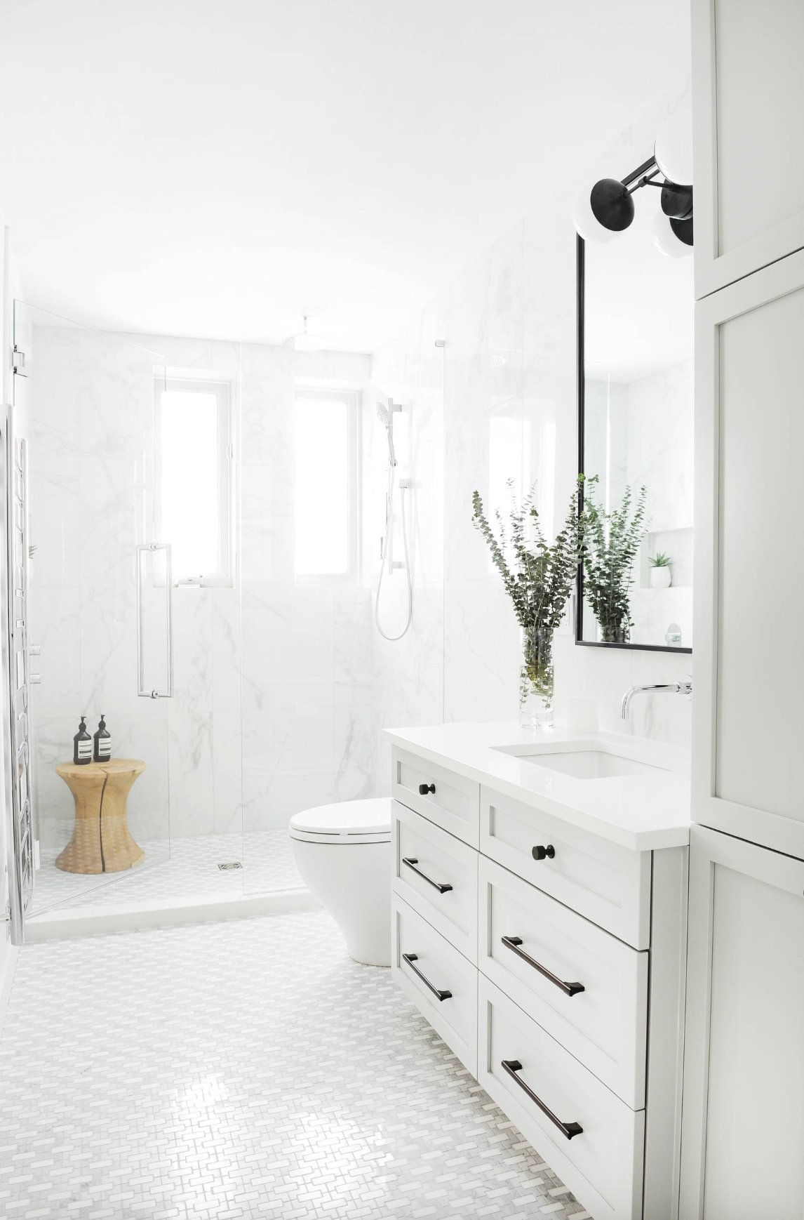
Pure whites and cool whites suit rooms with chrome fixtures, glass, crisp tile, and cooler wall colors. On a textured ceiling, I usually stay with flat or matte paint, because higher sheen catches every roller mark and repair.
White is the control group. The colors below are the ones I would sample when the ceiling needs to become part of the design instead of disappearing.
1. Stone Harbor by Benjamin Moore

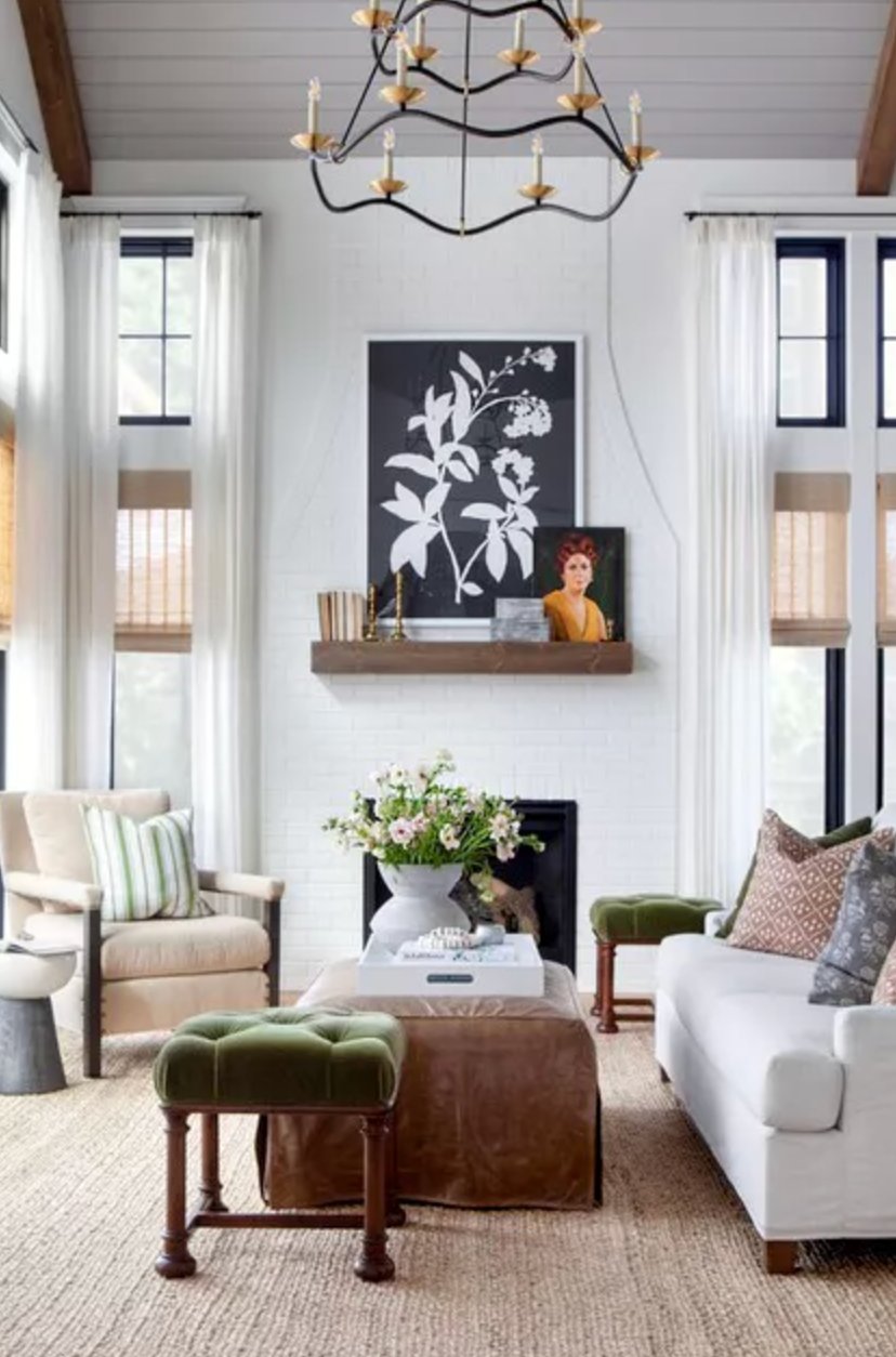
Stone Harbor by Benjamin Moore changes noticeably with the light. In daylight, this gray can show a soft purple cast. Under warm bulbs or overhead fixtures, the olive side comes forward.
That shift is useful on a ceiling, especially in a sunny room like the Bria Hammel Interiors example above. On painted or wood shiplap, Stone Harbor gives the boards definition without making the ceiling feel heavy.
Flooring matters with this one. Warm brown woods like walnut or maple can pull out the green undertone in the evening. If your sample starts looking too olive, try cooler textiles, cooler lamp bulbs, or more directional lighting before you give up on the color.
2. Gateway Gray by Sherwin Williams

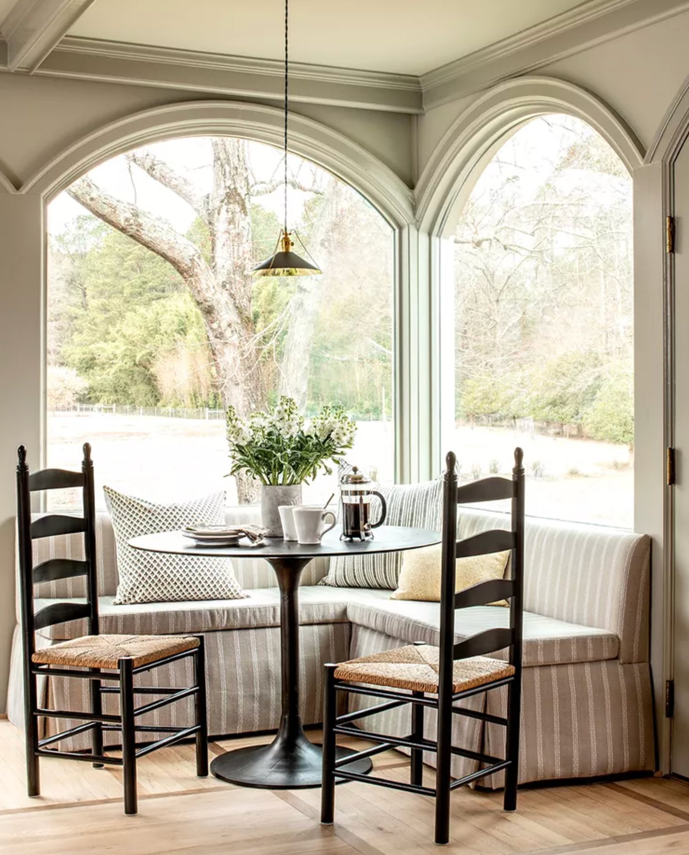
Gateway Gray by Sherwin-Williams is a gray with a green undertone, and it is especially useful on ceiling beams, coffers, and other architectural details. Pair it with a clean white on the flat ceiling field and the room gets depth without a hard color break.
It works well in rooms with trees or garden views because the green note connects to what is outside the windows. In bedrooms, I would use it when the walls are quiet and the fabrics have some natural texture, not when the room already has several competing accent colors.
3. Studio Green by Farrow & Ball

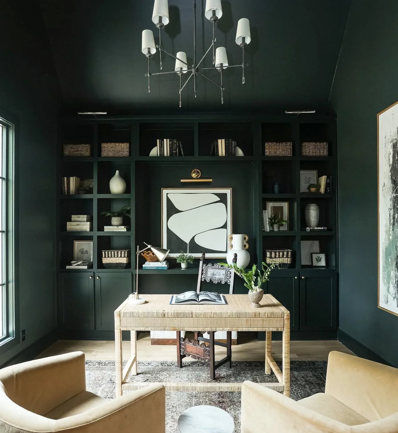
Studio Green by Farrow & Ball is one of those colors that keeps you guessing. In bright light, it's a rich, deep forest green, but dim the lights, and suddenly you're looking at what seems like a black ceiling.
Designer Mary Patton used that depth well in the bedroom shown above. She carried Studio Green across the walls and ceiling, then used cream trim to keep the edges readable. In a large room, that kind of color drenching can make the proportions feel more settled.
Interesting fact: they named this color after Farrow & Ball's original studio, where they first started developing their now-famous color palette.
4. Mount Etna by Sherwin Williams


Mount Etna by Sherwin-Williams sits between blue and green, with enough gray in the mix to keep it from looking tropical. On a ceiling, it reads as a deep teal rather than a clean blue.
I like this color for living rooms and home offices where the ceiling can carry some weight. It needs a few lighter surfaces nearby, such as white trim, pale upholstery, or a natural rug, so the room does not close in.
Mount Etna is strongest in monochromatic schemes. If you repeat it on walls, cabinetry, or built-ins, edit the accessories hard. Too many small accent colors will make the ceiling look accidental.


This is a flexible color beyond ceilings. It can work on accent walls, furniture, fireplaces, and exterior details, especially with neutral palettes that need more depth than another charcoal gray.
5. Finnie Gray by Benjamin Moore


Finnie Gray by Benjamin Moore has a real backstory. The color dates to the late 18th century and was found on the exterior of the historic Finnie House.
It is technically a gray, but the warmth and subtle green undertone give it a mushroom quality. In morning light it can feel like a warm gray. Under warmer lamps, it may move closer to olive.
Designer Alessia Zanchi Loffredo used it on an office ceiling as part of a monochromatic look. Finnie Gray pairs easily with green, black, brown, and ivory, and it holds up well beside steel, wood, brass, and vintage pieces.
6. Onyx by Benjamin Moore

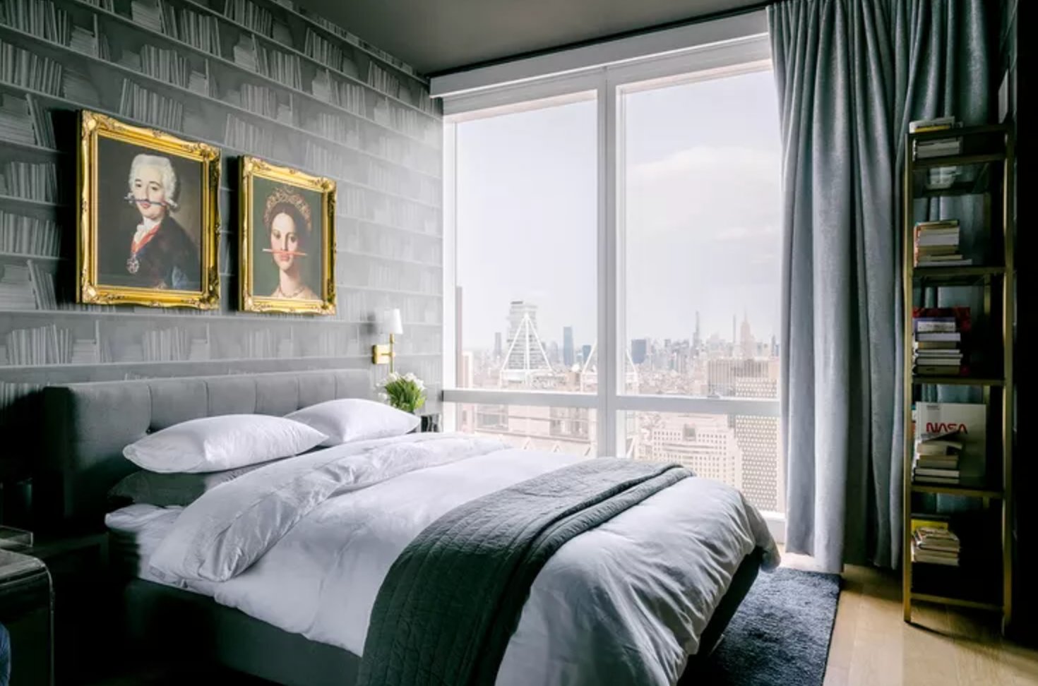
Benjamin Moore's Onyx is a deep black with an LRV of 5. Because it does not have a strong undertone, it can sit with warm woods, cool stone, brass, chrome, and bright artwork.
On a ceiling, black can make the surface recede instead of press down. That effect works best in bedrooms and living rooms with decent natural light, or in rooms where the walls are already dark enough that a white ceiling would look chopped up.
Designer Emma Kemper used this approach in the darker space above to avoid the jolt of a bright white ceiling.
Onyx acts like white in reverse. It gives artwork and colorful accents a clean background, and it often feels warmer than expected when natural wood is in the room.
7. Blue Porcelain by Benjamin Moore

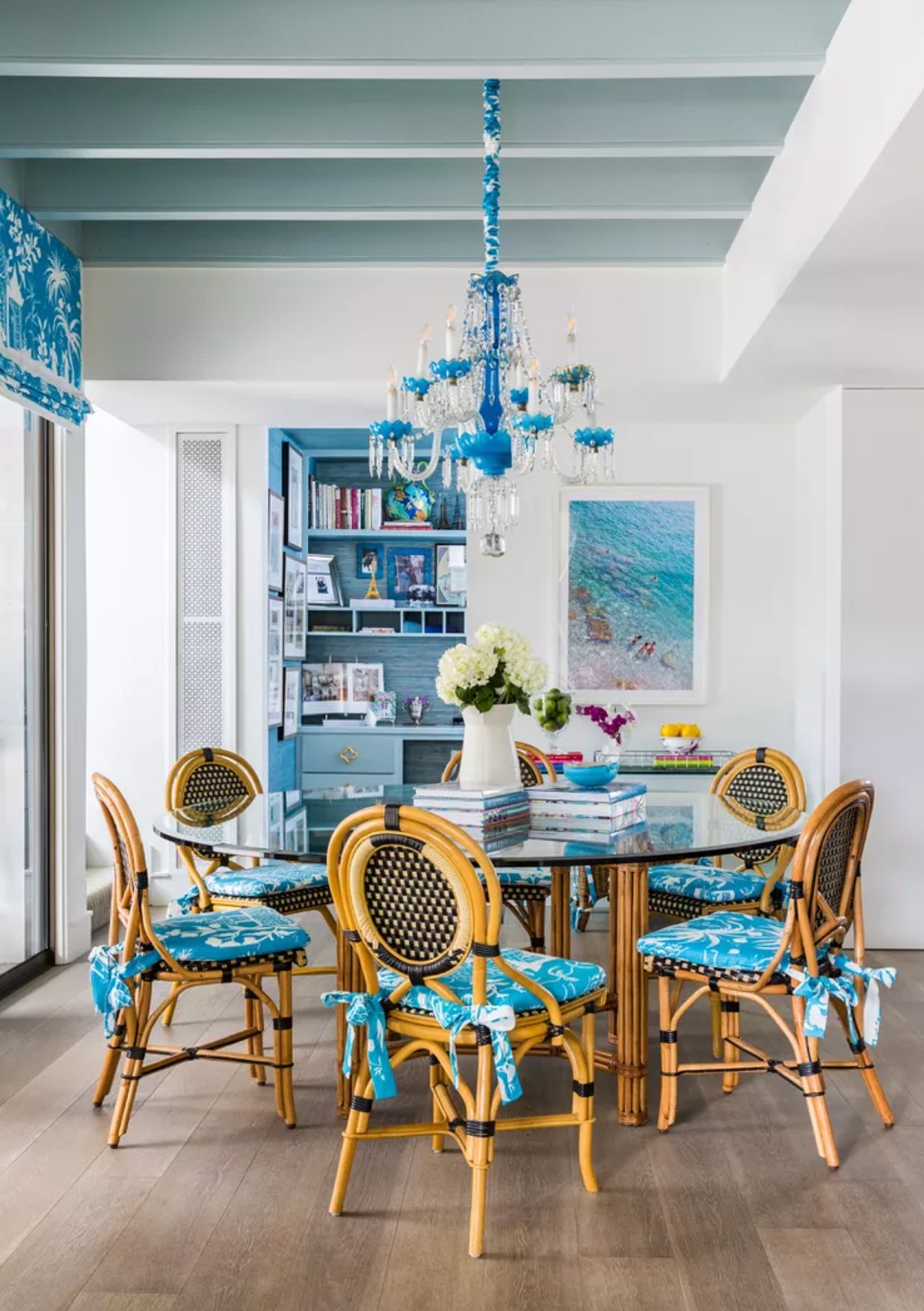
Blue Porcelain is a soft gray-blue that works when you want color overhead but not a dark ceiling. The gray keeps the blue from feeling sugary.
That muted quality makes it practical on ceilings in bedrooms, baths, and breakfast rooms. It adds interest but still lets tile, fabric, or wallpaper be the main event.
On ceiling beams, Blue Porcelain outlines the architecture without shouting. On a larger ceiling, test it at night too, because gray-blues can turn cooler once daylight is gone.
8. Newburyport Blue by Benjamin Moore


Newburyport Blue is a strong choice for accent ceilings in bright rooms. The deep navy can make the ceiling recede, which is why it often feels higher than a mid-tone blue would.
With white walls, it reads coastal without relying on obvious beach colors. I would keep the trim crisp and repeat the navy once or twice lower in the room so the ceiling is not the only dark surface.
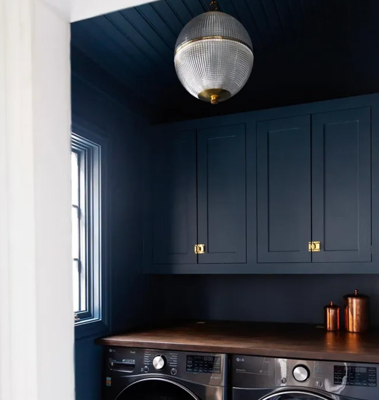

Room size matters with this shade. In larger, window-filled spaces, Newburyport Blue has enough light around it to show its navy character.
In smaller rooms like the one in the top left photo, it can read almost black. That is not automatically wrong, but you need good lamps, pale walls, or glossy accents to keep the room from feeling flat.
9. Yarmouth Blue by Benjamin Moore

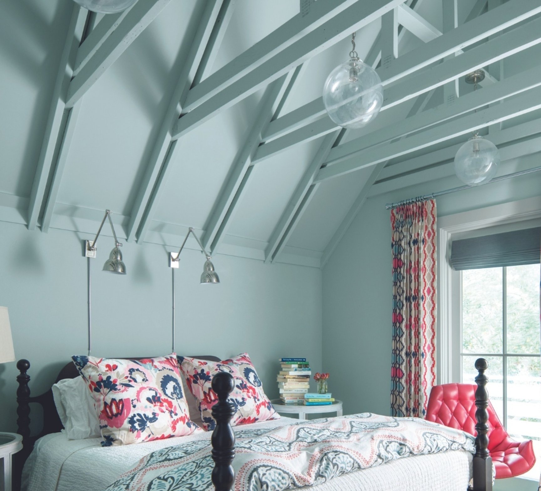
Yarmouth Blue by Benjamin Moore is a fresh take on "haint blue," the classic porch ceiling color from the American South. It also works indoors when you want the ceiling to feel lighter and more open.
Unlike sharper blues, Yarmouth Blue stays quiet. Natural light brings out its gray undertone, which makes it a useful pick for hallways, porches, laundry rooms, and transitional spaces where a stronger blue would look childish.
10. Dead Salmon by Farrow & Ball

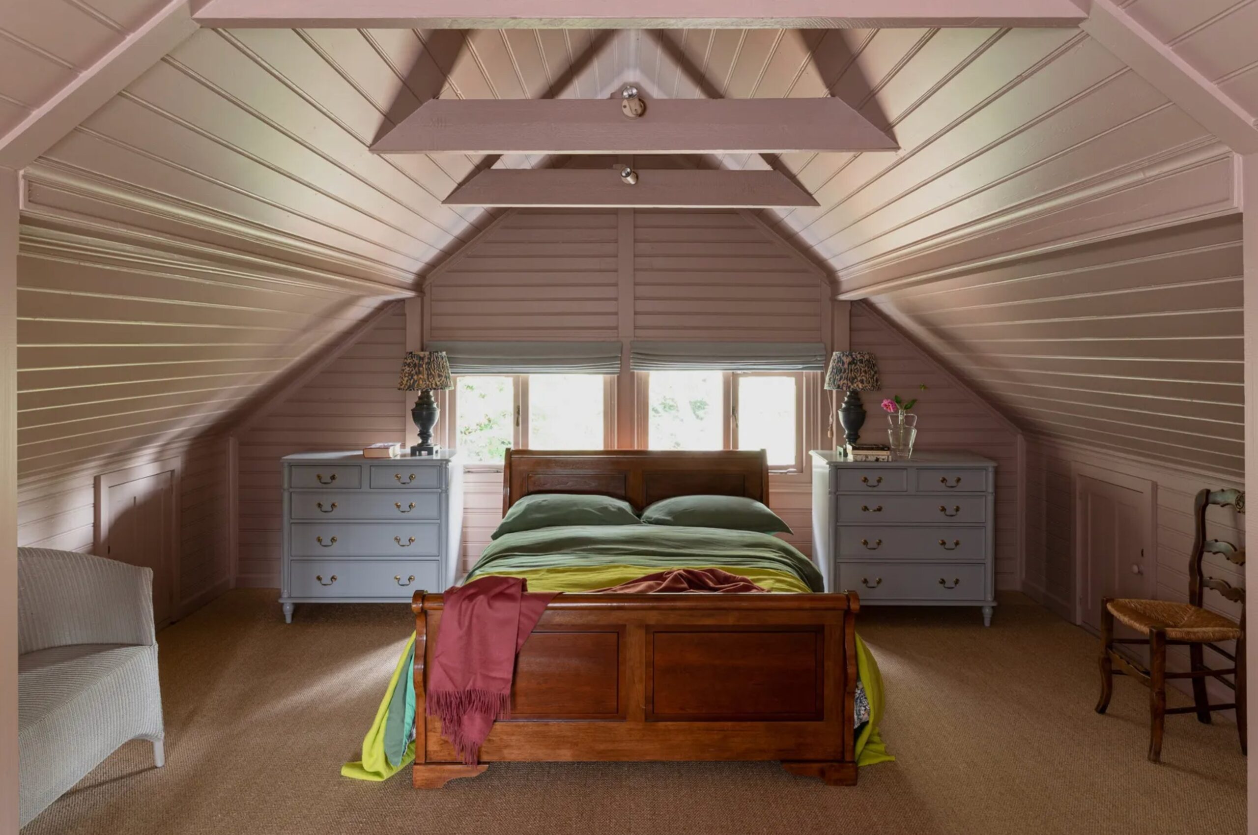
Dead Salmon by Farrow & Ball is a complex ceiling color that can move from muted pink to warm brown as the light changes.
In bedrooms, those warm undertones make the ceiling feel intentional instead of decorative. Designer Lauren Sullivan used it well in the guest bedroom above, where the color softens the room without turning it pastel.
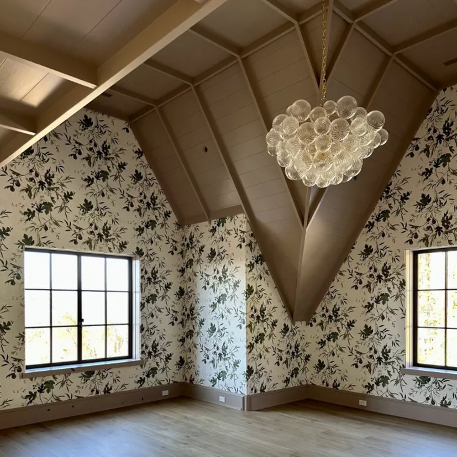
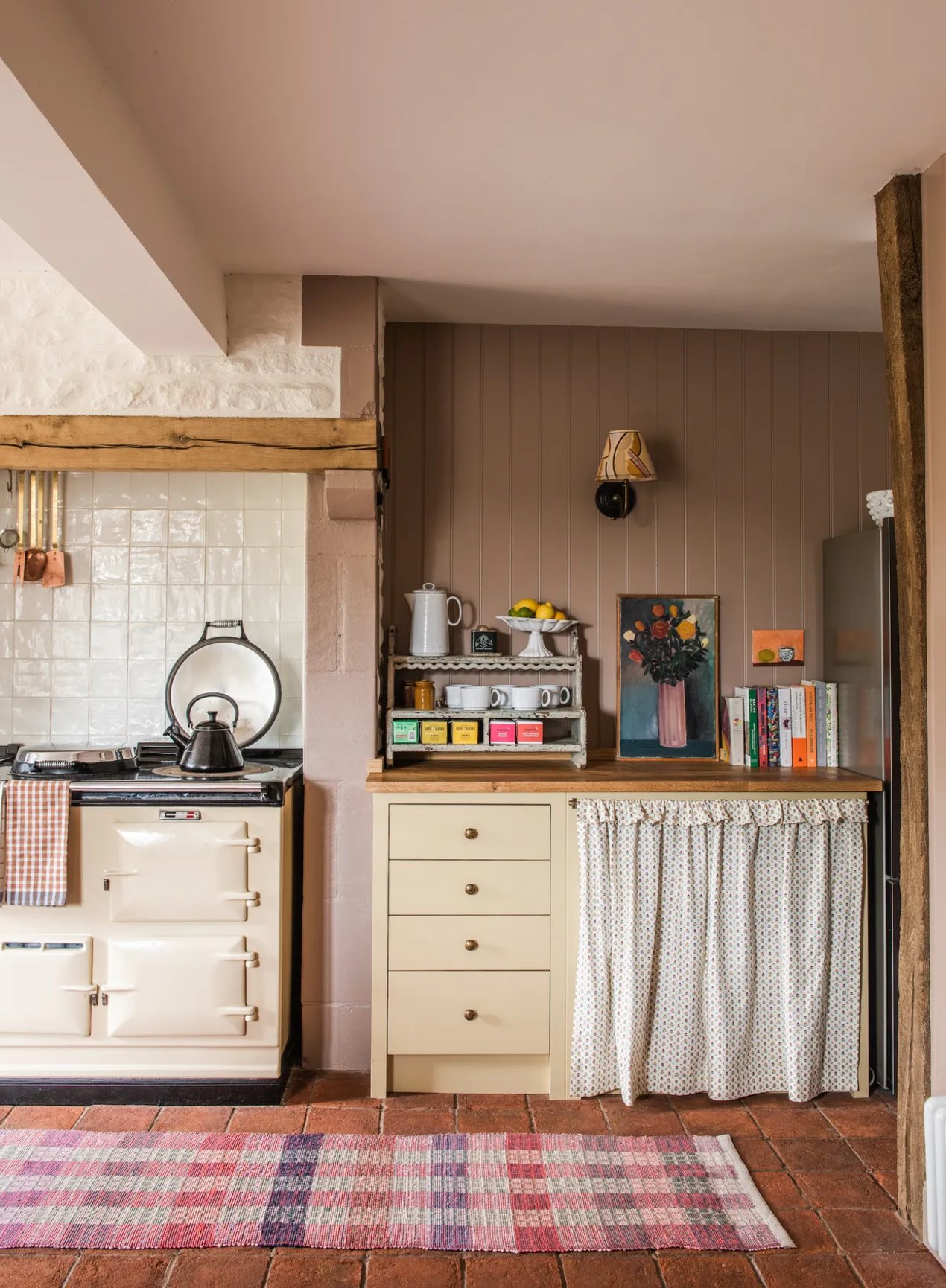
With Dead Salmon, creamy white trim keeps the color clean at the edges. Black accents and small touches of chartreuse make it feel current, but use those accents sparingly so the room does not become too busy.
This color goes back to 1805 at Kedleston Hall. The name is not about the fish. "Dead" refers to the matte finish, while "salmon" describes the pink tone found in an old painter's receipt.
11. Indigo Batik by Sherwin Williams

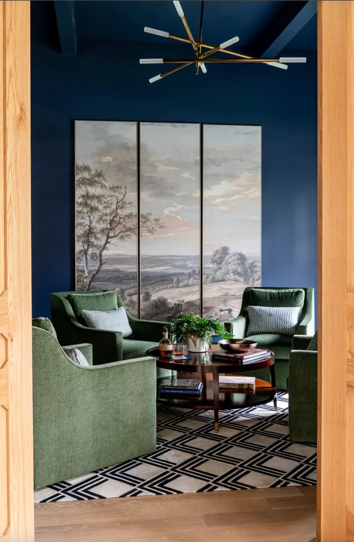
Indigo Batik by Sherwin-Williams has the worn-in depth of dark denim. In sunny rooms it reads blue. In dim rooms it moves closer to navy charcoal.
It is a strong fit for small offices, libraries, and dens where you can wrap the walls and ceiling in one color. Indigo Batik also works on a kitchen island when the main cabinets stay neutral.
Echo it lower in the room with fabric, art, or a painted furniture piece. Without that repeat, a dark blue ceiling can look unrelated to the rest of the plan.
12. Autumn Cover by Benjamin Moore

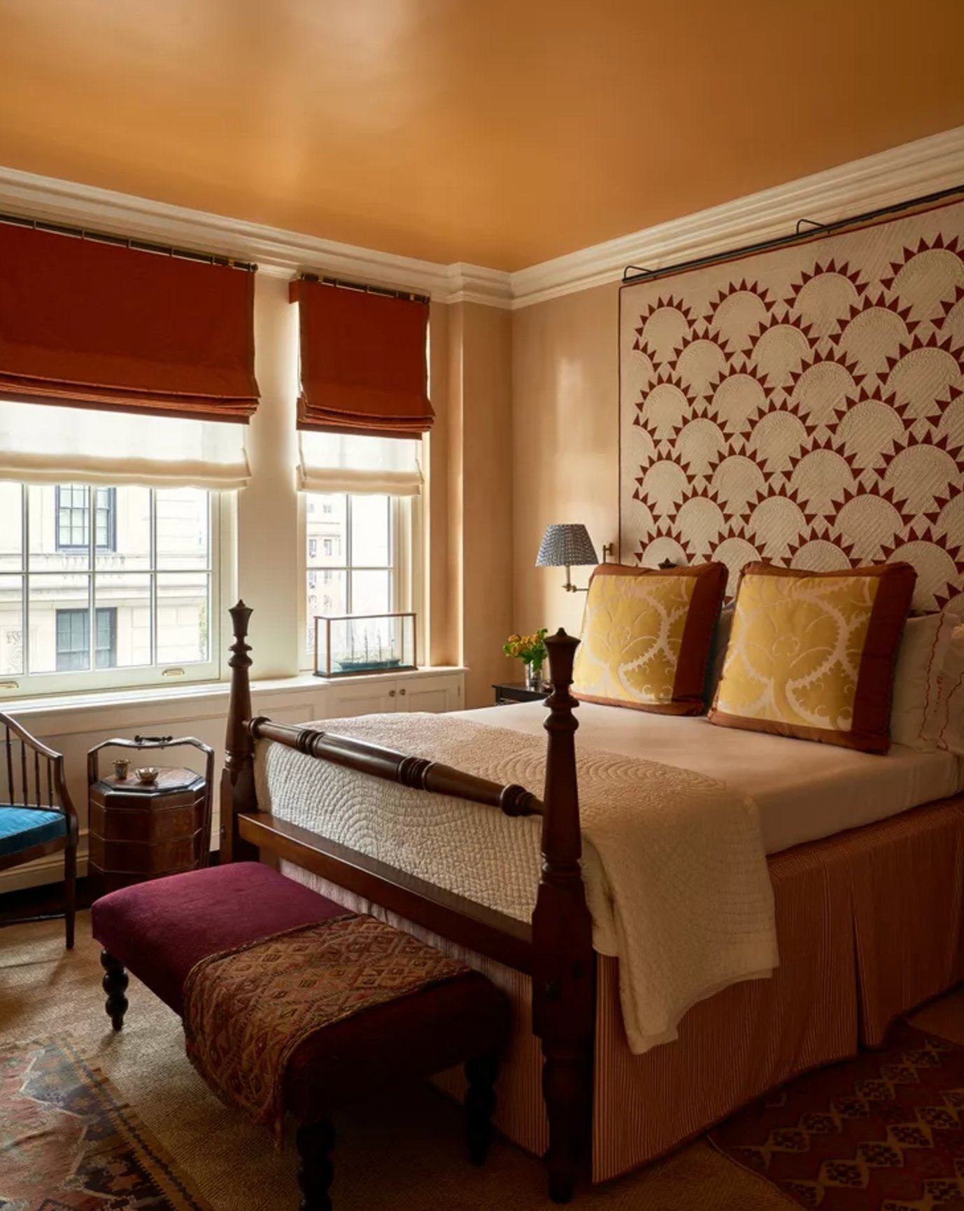
Autumn Cover by Benjamin Moore brings a warm reddish-orange note to the ceiling. It can look especially good in bedrooms with red, rust, mustard, or patterned textiles.
This color is useful in rooms with cool natural light that needs warmth. Plan the palette before you buy a gallon, because Autumn Cover works best with neutral walls and fabrics that stay in the same warm family.
13. Shamrock by Sherwin Williams

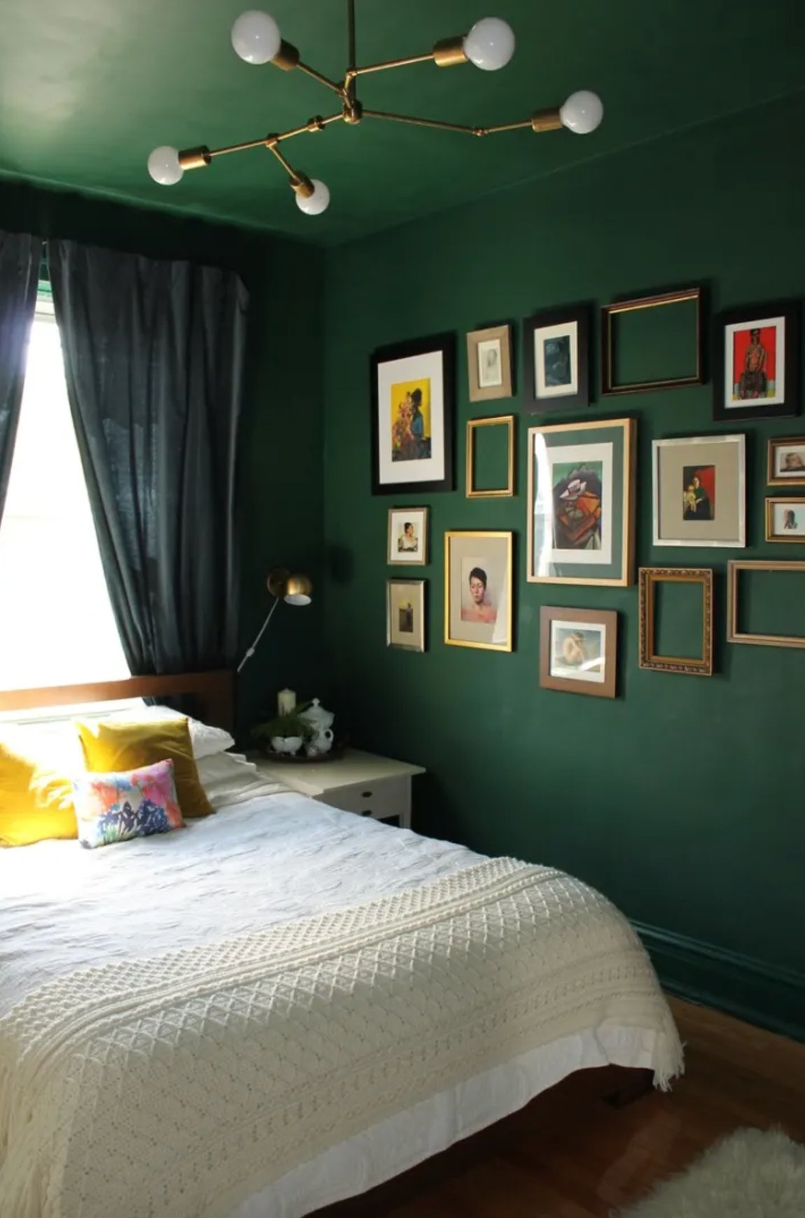
Shamrock by Sherwin-Williams is a bold green with a blue edge. In smaller spaces like home offices or bar areas, using it on both walls and ceiling can make the room feel designed rather than leftover.
Good lighting is non-negotiable with this shade. If you use a gloss or semi-gloss finish, the ceiling has to be smooth, patched carefully, and sanded clean, because shine will expose every flaw. I would keep Shamrock to smaller, separate rooms instead of carrying it through an open floor plan.

I'm Elizabeth, your go-to guide for all things paint and design! My days are filled with color swatches and innovative room makeovers. When I'm not painting the town - literally - I'm soaking up inspiration from my travels. This blog is my way of sharing my passion and making the world a more vibrant place, one color palette at a time.