Best Black Paint Colors for Kitchen Cabinets
Black kitchen cabinets can be beautiful, but they are not a shortcut color. The best ones look intentional because the black was chosen around the room's light, counters, flooring, and hardware.
Most homeowners start with white, greige, or wood tones, then hesitate when black enters the conversation. That hesitation is fair. Black can make a tight kitchen feel heavier, and some finishes show dust or fingerprints. Used well, though, dark cabinetry gives a kitchen weight that lighter colors cannot fake.
As white kitchens start feeling a bit overdone, more people are looking for cabinet colors with more character. Black also hides many everyday cooking marks better than pale paint, and it gives metals, stone, tile, and wood something strong to play against.
Not all black paints behave the same way. Some read blue. Some lean green or brown. Some are almost absolute black, which can look sharp in a sunny kitchen and flat in a dim one.
Sample the final two or three choices on painted boards, not just on a screen. Move them beside the countertop, backsplash, floor, and window wall before you commit.
1. Inkwell by Benjamin Moore

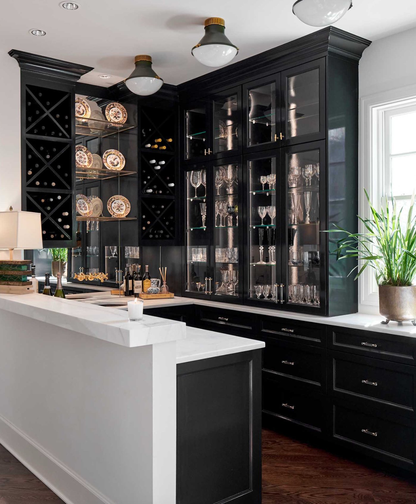
Inkwell is a deep black with cool blue-gray undertones. With an LRV (Light Reflectance Value) of 4, it sits near the bottom of the scale, so it absorbs a lot of light.
The blue-gray side is the whole point of this color. In a sunny kitchen, especially one with cool daylight, that blue note can show clearly. In lower natural light, Inkwell settles into a classic deep black and the undertone is quieter.
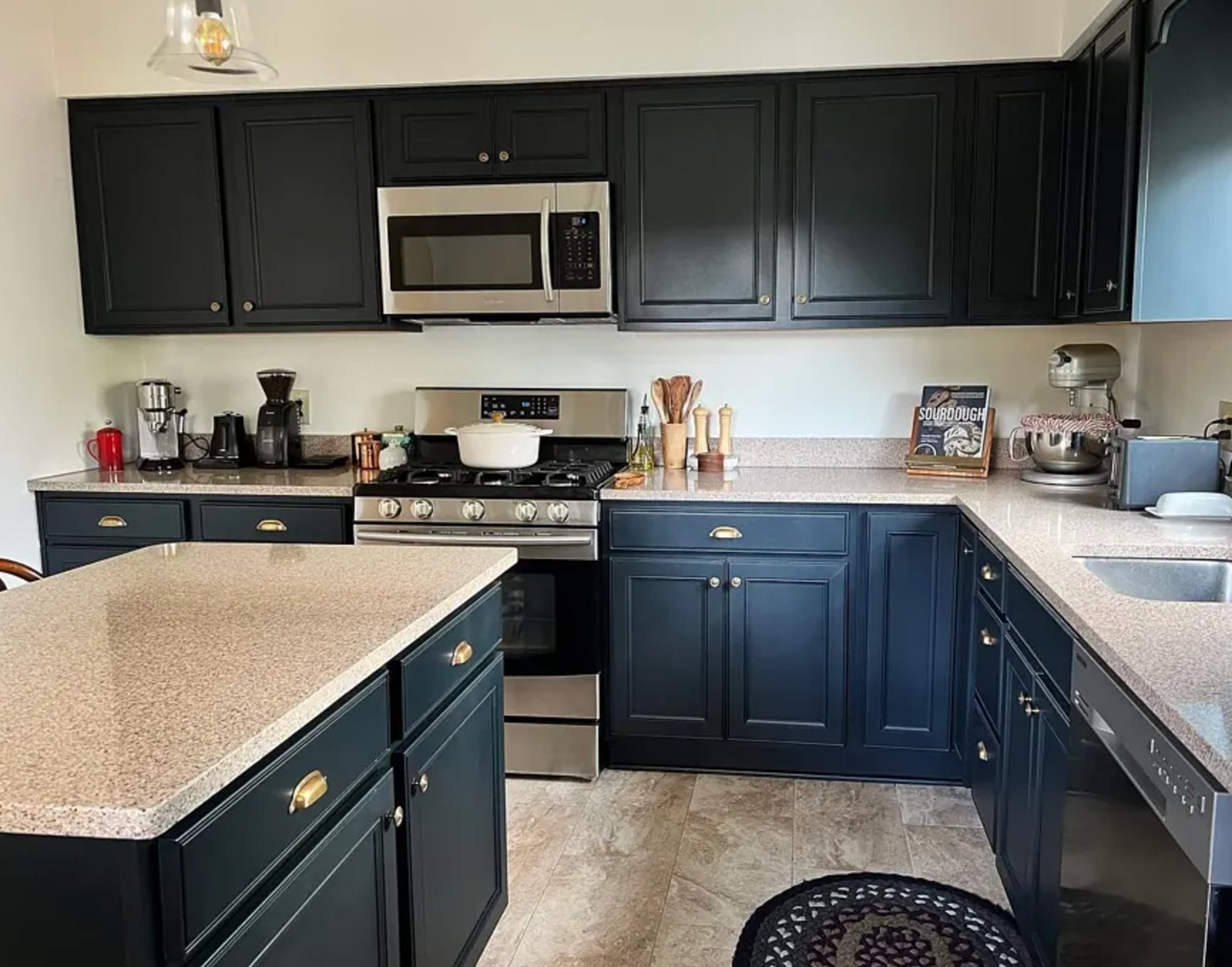
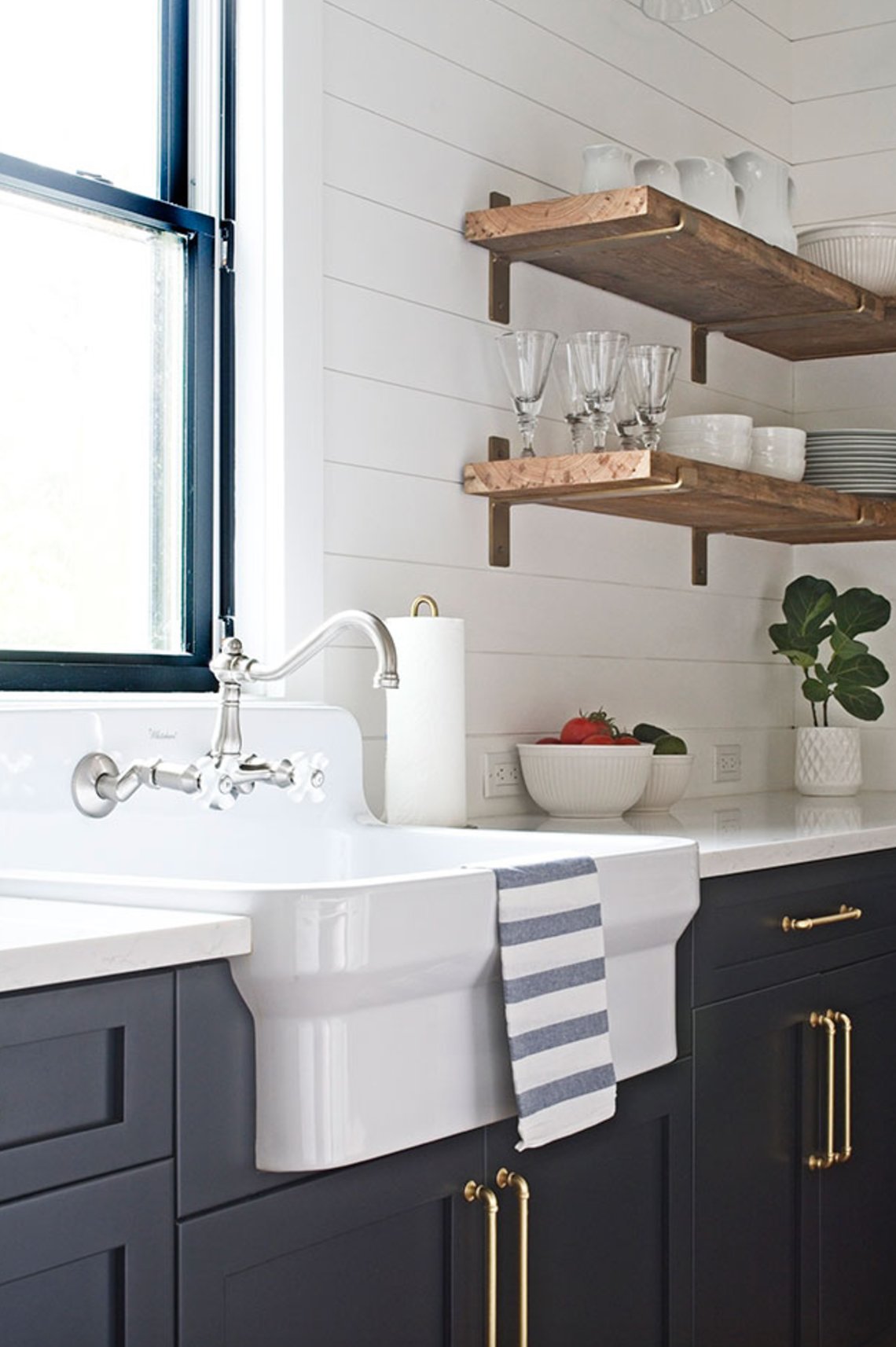
On cabinets, Inkwell looks best when the rest of the kitchen can handle a cool black. A glossier finish will bounce more light and make the color feel dressier, while a matte or satin finish will look softer and show the blue undertone less dramatically.
It pairs well with many neutral shades, but I like it most when there is some warmth nearby. Warm beige tones, brass, unlacquered metal, or natural oak keep the cool black from feeling too severe.
Use Inkwell on all the cabinets if the room has good light and lighter surrounding finishes. In a smaller or shaded kitchen, I would use it on an island, built-in hutch, or lower cabinets so the room still has breathing space.
2. Onyx by Benjamin Moore

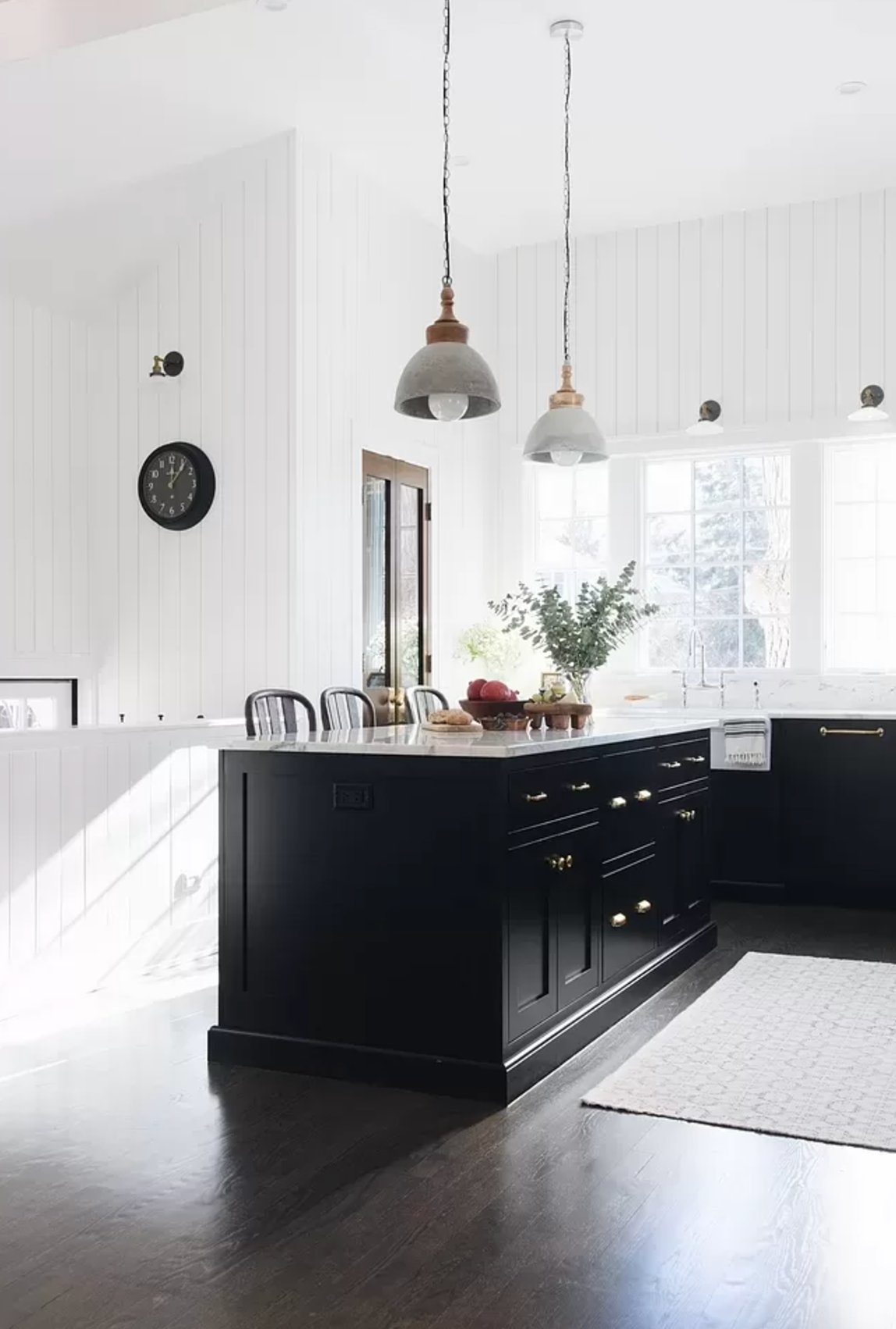
Benjamin Moore's Onyx is a deep black with 5 on the LRV scale, out of 100. It is just a touch lighter than pure black, which makes it easier to live with on real cabinets.
Onyx is useful because it stays close to neutral. Its RGB values are almost evenly balanced, with 20.78% red, 20.39% green, and 20.39% blue. That balance makes it less likely to fight a countertop or backsplash with its own undertone.
In a kitchen, Onyx gives you a clean black cabinet without much visual noise. It needs either good daylight or layered artificial lighting, especially under-cabinet lights and pendants over an island.
If you're using Onyx, pair it with crisp whites like Benjamin Moore's Chantilly Lace for your ceilings and moldings, or go slightly warmer with something like Swiss Coffee.
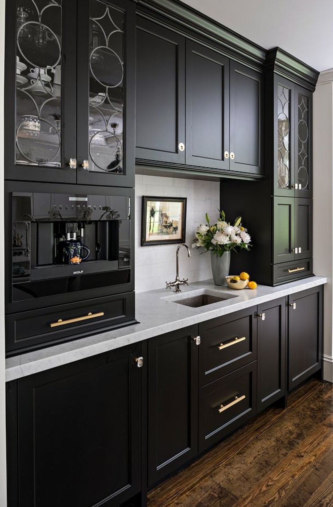
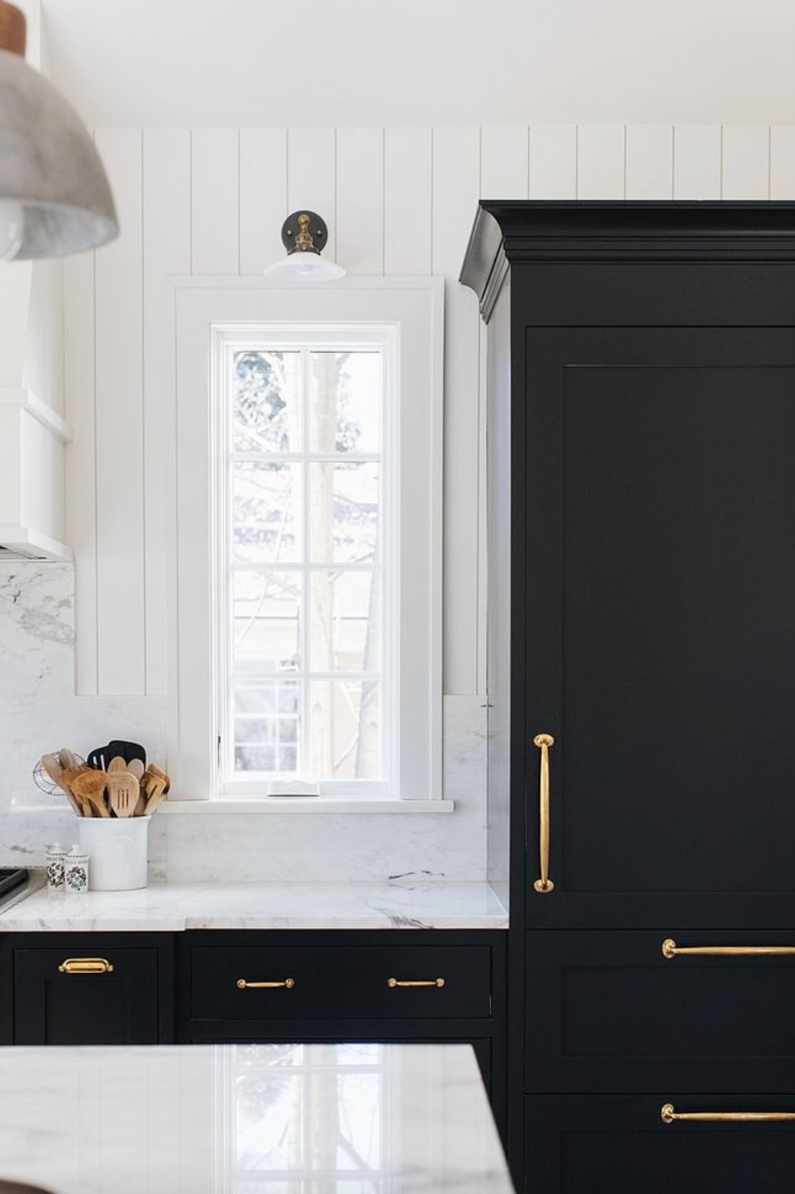
Do not judge Onyx by the wet paint in the can. It can look a little gray before it dries, then deepens into a rich black. Natural light and warm wood can make it feel slightly softer, which is often a good thing in a kitchen.
Beyond full cabinet runs, Onyx is a strong choice for kitchen islands, interior doors, bathroom vanities, and accent panels. I would avoid it only where the room already feels dark and the lighting plan is staying weak.
3. Iron Ore by Sherwin Williams

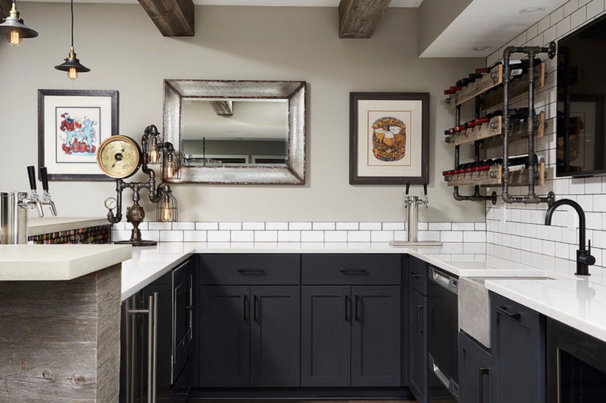
Iron Ore by Sherwin-Williams is the softest black in this group, closer to deep graphite than a hard black. Its barely there green undertone adds a little warmth and makes it easy to pair with other neutrals.
Iron Ore is the color I would show a client who likes black cabinets but worries Tricorn Black will feel too stark. If your kitchen is short on natural light, plan for serious artificial lighting before you paint every cabinet this dark.
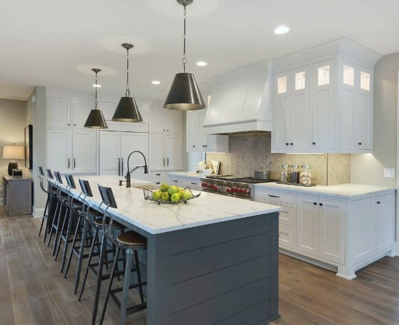

You are most likely to notice Iron Ore's green undertone in bright natural light, especially at higher altitudes where daylight can be clearer and stronger. In regular interior lighting, it usually reads as a soft black graphite.
4. Tricorn Black by Sherwin Williams

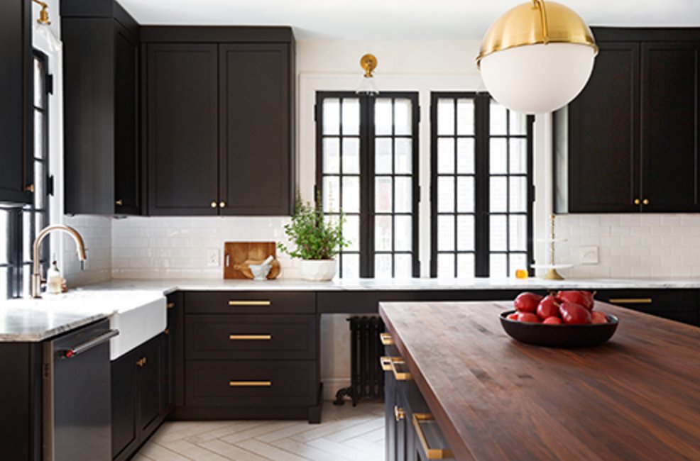
Tricorn Black is a pure black with no obvious undertones. Its LRV is 2.45, one of the lowest ratings in Sherwin-Williams' lineup, so this is one of their deepest paint colors.
Sherwin-Williams Color Marketing Director Jackie Jordan has described Tricorn Black as the brand's blackest black.
Tricorn Black is the right pick when you want a crisp black cabinet and do not want to manage a blue, green, or brown undertone. It gives sharp contrast against white surfaces and is flexible with backsplash, countertop, and wall colors.
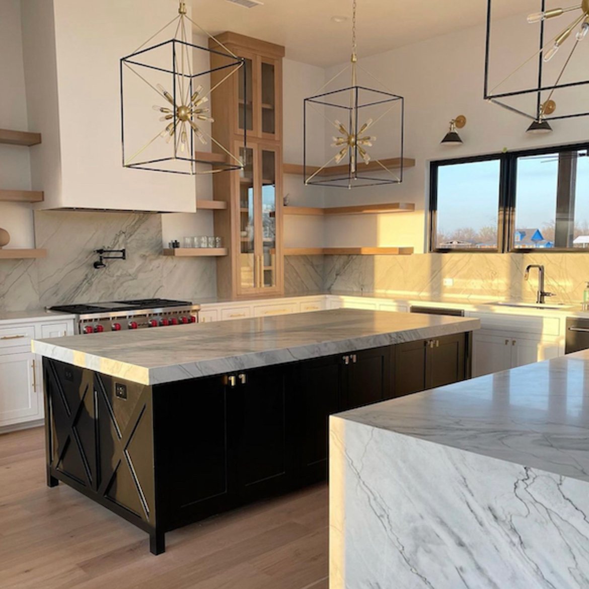
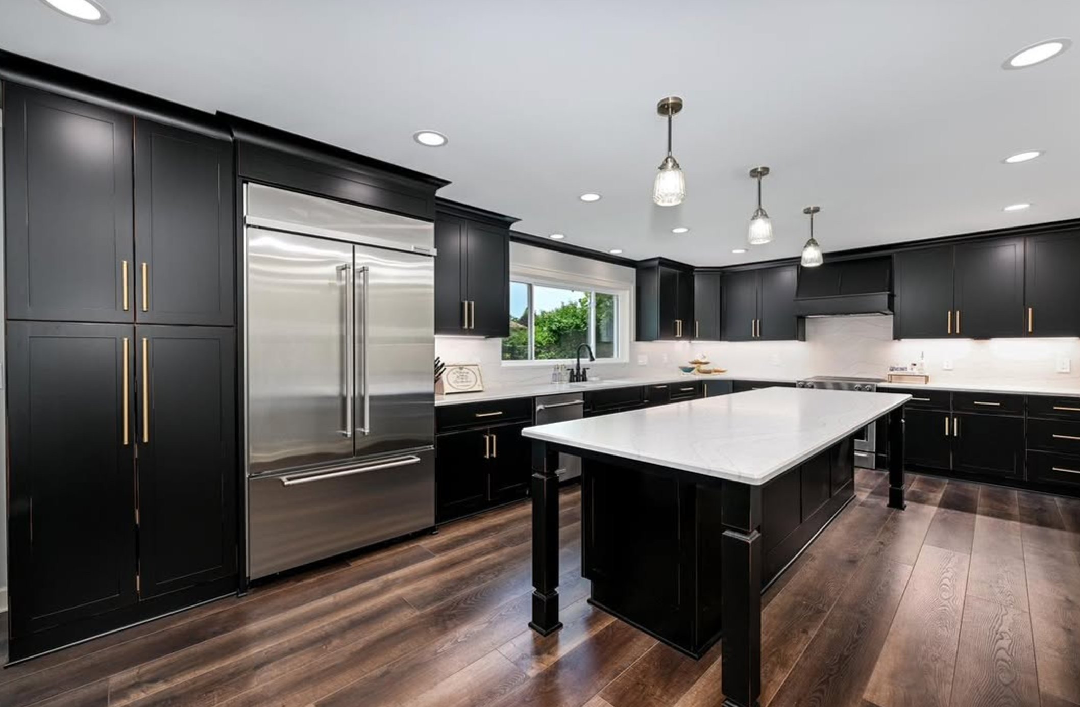
Before using Tricorn Black on every cabinet, look hard at your natural light. The more windows and sunlight you have, the better this color will show depth. In a darker kitchen, it needs strong ceiling, task, and under-cabinet lighting or it can look flat.
Its advantage is longevity. If you change the backsplash, swap brass for nickel, or replace counters later, Tricorn Black is unlikely to be the element that suddenly feels wrong.
5. Wrought Iron by Benjamin Moore

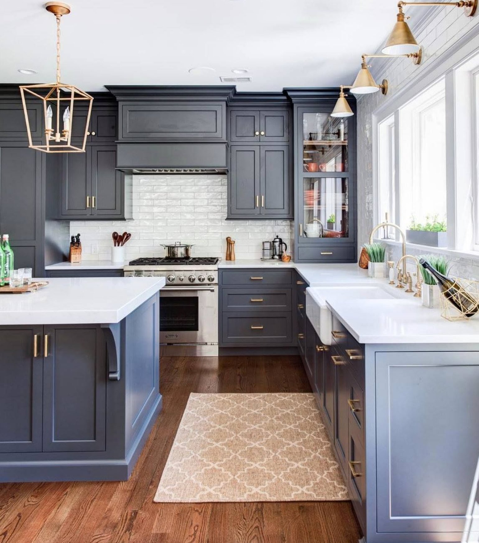
Designers reach for Wrought Iron because it gives the look of black cabinets without going fully black. This Benjamin Moore bestseller has hidden gray, brown, and dark blue undertones that shift as the light changes through the day.
Think of a fresh chalkboard. That is the range Wrought Iron lives in. This deep graphite black is especially good on lower cabinets in two-tone kitchens or on an island that needs more presence.
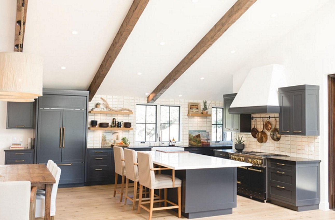
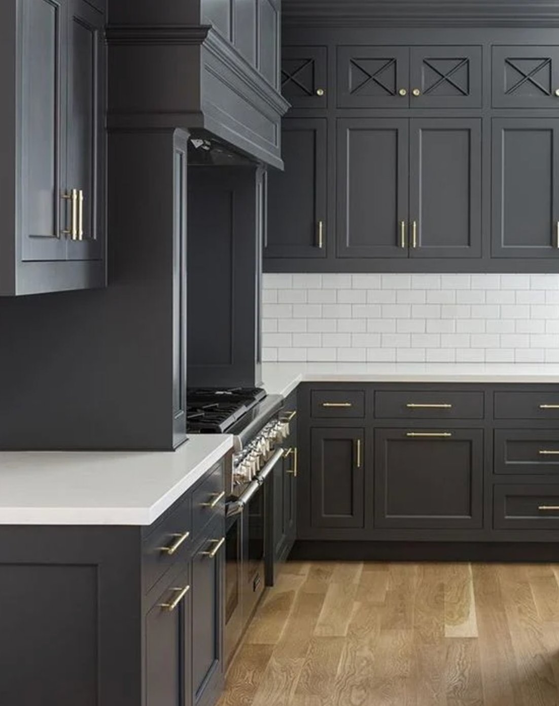
Fingerprints and small scratches do not jump out as quickly on Wrought Iron because the color is softer than a true black. It still has enough depth to contrast with pale counters, white tile, and light walls.
Natural daylight can bring out its warm brown notes, while evening lighting may reveal the blue side. Test it under the bulbs you actually use, because a 2700K warm bulb and a cooler 4000K task light can make Wrought Iron look like two different colors.
Because it has both warm and cool notes, Wrought Iron is forgiving with mixed finishes. It is a good bridge color when the kitchen has warm floors, cooler stone, and hardware that you are not replacing.
6. Flint by Benjamin Moore


Flint has been a go-to choice for kitchen cabinets because it gives you more color than a straight black. This deep blue-charcoal can look dark gray during the day, then show its blue side in evening light.
Benjamin Moore's Flint is strongest with light to medium-toned floors, especially hardwood with subtle orange undertones. The warmth in the floor keeps Flint from reading too cold.
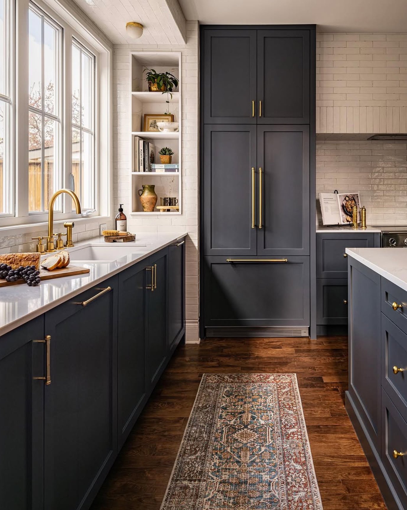
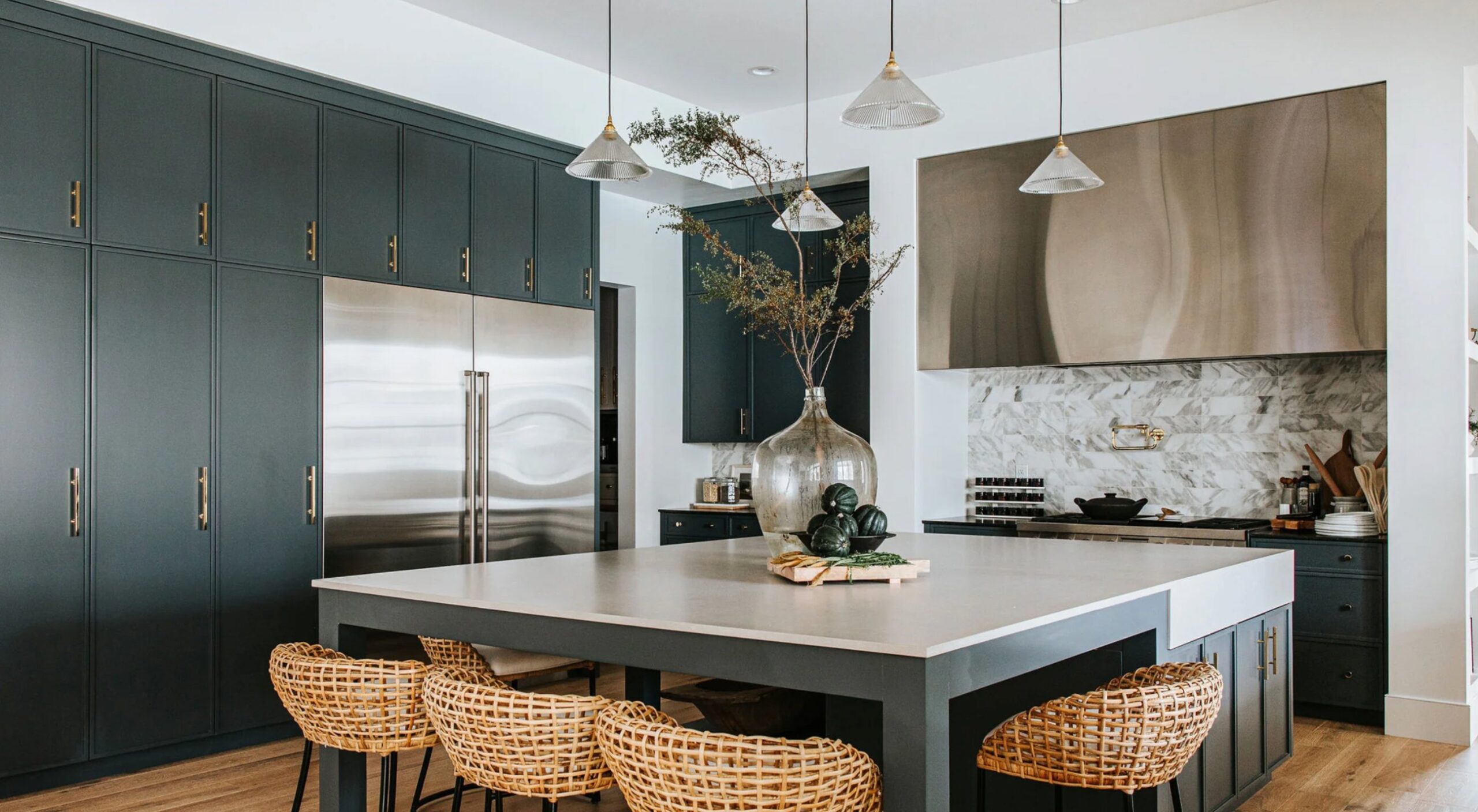
If you are updating a gray interior, Flint is often an easier move than true black. It bridges older gray walls, stainless appliances, and cooler stone counters without making the whole kitchen feel newly disconnected.
7. Kendall Charcoal by Benjamin Moore

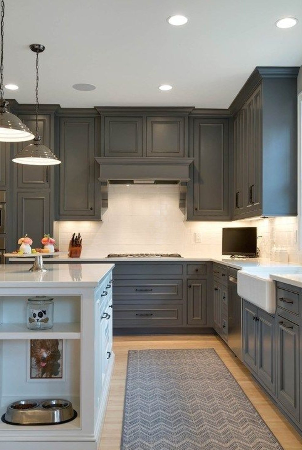
Kendall Charcoal is a rich gray-black with an LRV of 13, so it is noticeably lighter than the near-black colors above.
In bright light, you may notice a slight green undertone that adds warmth. In north-facing rooms, it usually reads as dark graphite.
This color is useful in kitchens with warm whites, wood, stone, and brass accents. It gives contrast without the visual weight of a black with an LRV under 5.
Kendall Charcoal lightens quite a bit in south-facing rooms flooded with natural light while keeping its depth. In shadowy corners, it can still look nearly black.
Is Black a Good Color for Kitchen Cabinets?
Black can be a good color for kitchen cabinets when the room has enough light, contrast, and visual relief. It is easiest to use in a spacious kitchen with large windows, but it can also work in smaller kitchens when the uppers, walls, counters, or backsplash stay light. Black cabinets look especially natural in loft-style spaces and modern classic kitchens.
Advantages:
- Black hides many everyday smudges and minor cooking stains better than pale paint
- Creates clear contrast against white walls and light countertops
- Helps define and organize your space visually
- Makes hardware, hinges, and decorative details more noticeable
Disadvantages:
- Can make a kitchen feel smaller if most surrounding finishes are also dark
- Shows fingerprints on some matte and very smooth finishes
- Can show dust more clearly than lighter cabinet colors
How to Make Black Cabinets Work for Your Kitchen?
Start with lighting. Add good task lighting so food prep areas, sink walls, and appliance zones do not disappear after sunset.
I usually pair black cabinets with light-colored walls, a lighter counter, or a backsplash with movement. Large windows help, but contrast in the finishes matters just as much.
For fingerprints, ask the cabinet shop or painter about fingerprint-resistant finishes and test the sheen. A satin finish is often the practical middle ground because it has some cleanability without looking too glossy.
What Colors Work Well with Black Cabinets?
Black cabinets work well with white elements because the contrast is clean and easy to read. Warm wood tones soften the black, brass or copper adds warmth, and shades of gray can bridge the cabinet color to stainless appliances or stone counters.
Black makes a strong statement and can dominate a space quickly. To keep the kitchen from feeling too dark, balance it with lighter surfaces where your eye naturally lands, such as counters, walls, backsplash tile, open shelving, or floors.
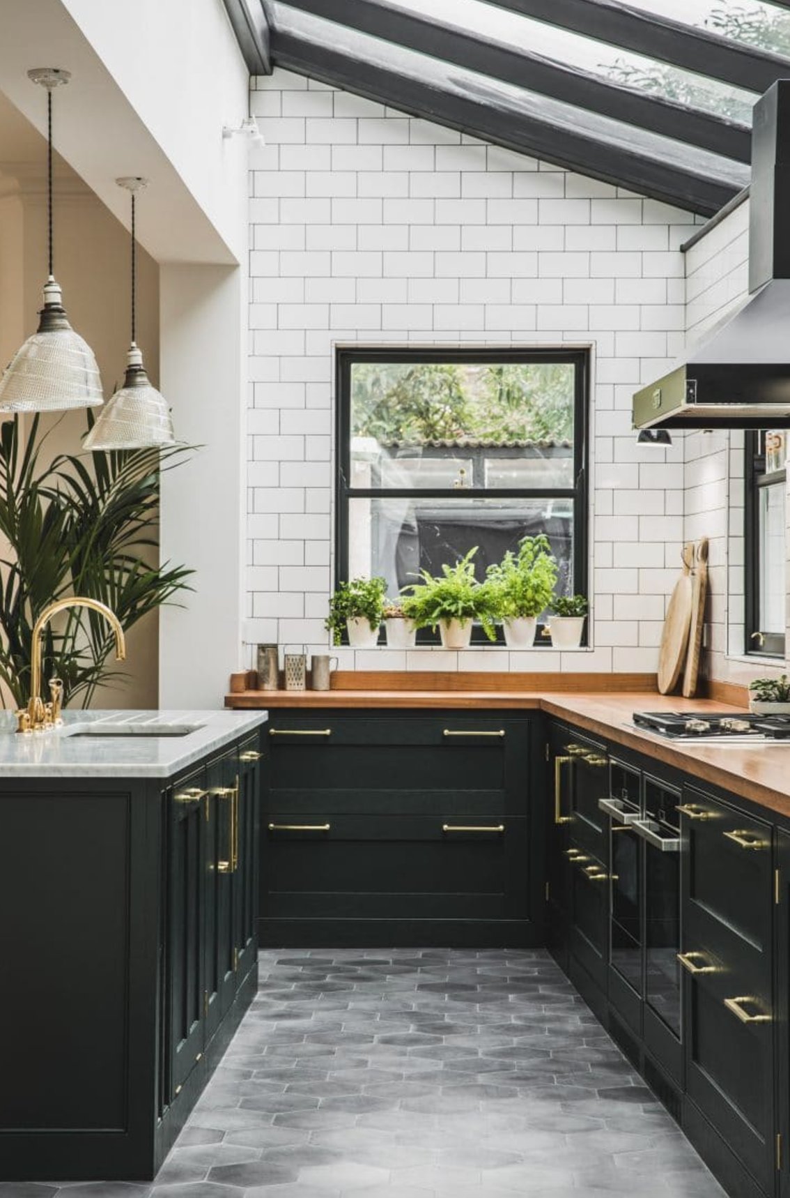

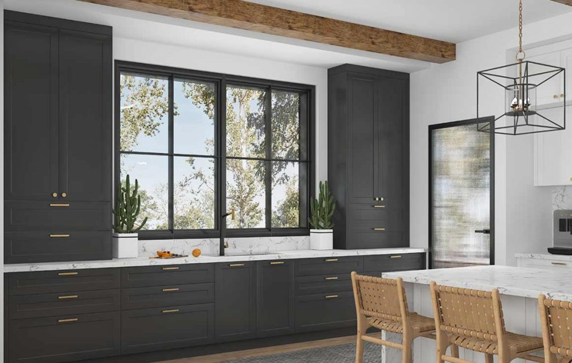
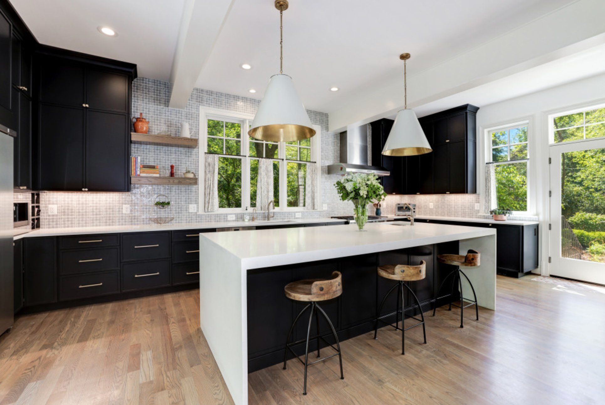
In modern kitchens, black cabinets often look best with crisp white quartz countertops and honey-colored wood floors. That combination gives you high contrast without making the room feel cold.
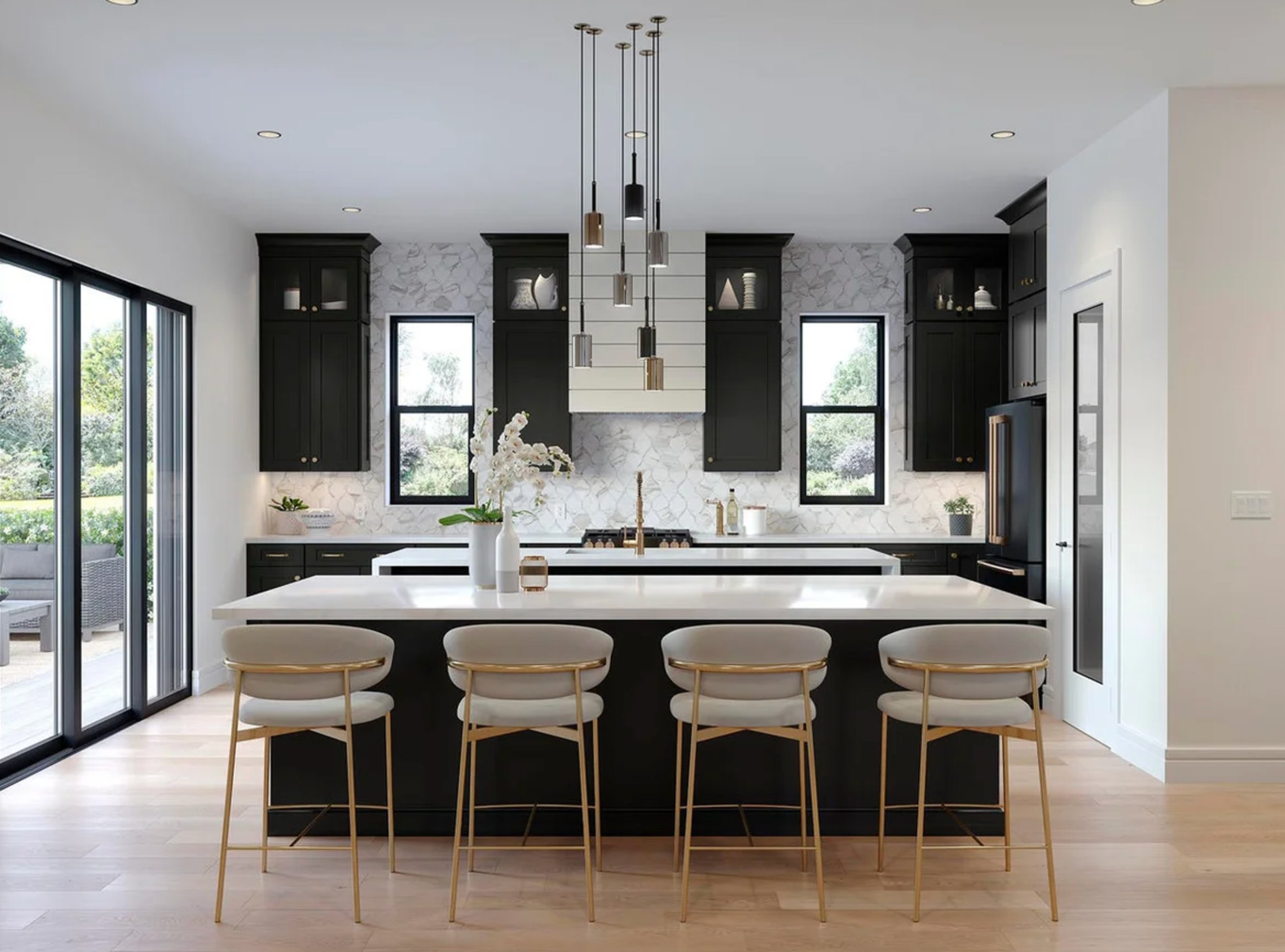
Black cabinets can also work with beige walls and dark wood floors when the room has enough light. The beige keeps the palette warmer, while the dark floor makes the cabinets feel connected instead of isolated.

I'm Elizabeth, your go-to guide for all things paint and design! My days are filled with color swatches and innovative room makeovers. When I'm not painting the town - literally - I'm soaking up inspiration from my travels. This blog is my way of sharing my passion and making the world a more vibrant place, one color palette at a time.