Simply White vs White Dove
If you're choosing between Benjamin Moore Simply White and White Dove, start with the light in your room. Simply White is the brighter, cleaner white. White Dove is creamier and more forgiving.
The difference looks small on a fan deck, but it matters once the color is on four walls. Simply White can wake up a dim room. White Dove can calm a bright room or warm up a space with wood, stone, or older trim.
Here are 20+ real photos and the decision rules I use with clients when these two whites are the final contenders.
Undertones & Character
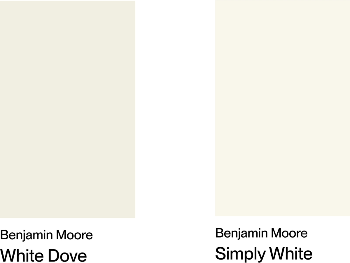
You can't compare these whites honestly until they sit side by side. In the collage above, White Dove reads softer and more muted, while Simply White reads brighter and cleaner. I usually put samples on two walls, one with the strongest daylight and one that stays shaded most of the day.
BM White Dove (OC-17) is a soft, creamy white with gray-beige undertones. It sits between white and beige, which is why it works so well when a clean white feels too sharp.
With an LRV of 83.16, it reflects plenty of light but doesn't glare. I like it in rooms where the fixed finishes already have warmth, such as oak floors, limestone, travertine, cream upholstery, or brass hardware.
BM Simply White (OC-117) leans much closer to pure white. With an LRV of 89.52, it's noticeably brighter and crisper than White Dove, but thanks to subtle warm notes, it doesn't feel sterile at all.
Use Simply White when the room needs lift, contrast, or a cleaner backdrop. It is the better choice for many low-light hallways, crisp trim packages, and kitchens with darker counters.
| BM Simply White | BM White Dove | |
|---|---|---|
| Color Code | OC-117 / 2143-70 | OC-17 / PM-19 |
| Light Reflectance Value (LRV) | 89.52 | 83.16 |
| Color Family | Warm white | Warm white |
| Undertones | Warm yellow undertones | Soft greige with minimal yellow |
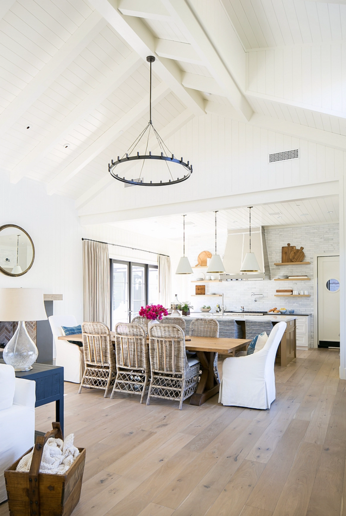
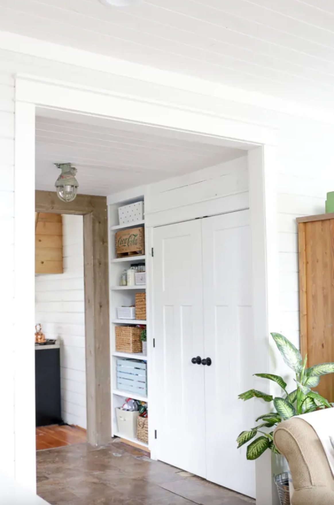
The difference is clearest on moldings. White Dove creates softer transitions between walls, trim, and doors. Simply White gives you more contrast and makes the edges of millwork read cleaner.
My short verdict: choose White Dove when you want the white to recede. Choose Simply White when you want the white to do some work and brighten the room.
Neither color is difficult, but they are not interchangeable. If your sample of Simply White looks yellow at night, test White Dove. If White Dove looks dull in the afternoon, test Simply White.
Best Applications
White Dove and Simply White can be used in the same types of rooms, but I don't specify them for the same reasons. The right choice depends on how much light the room gets, how warm the finishes are, and whether you want the white to soften or sharpen the space.
1. Kitchens
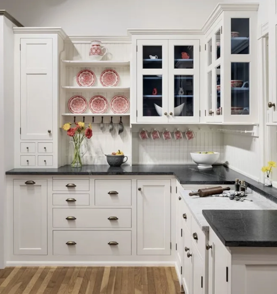
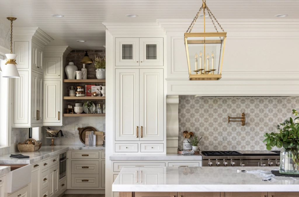
White Dove is usually the safer kitchen cabinet white when the room has warm stone, wood floors, unlacquered brass, or a traditional profile. Its gray-beige undertone keeps a large run of cabinets from looking stark.
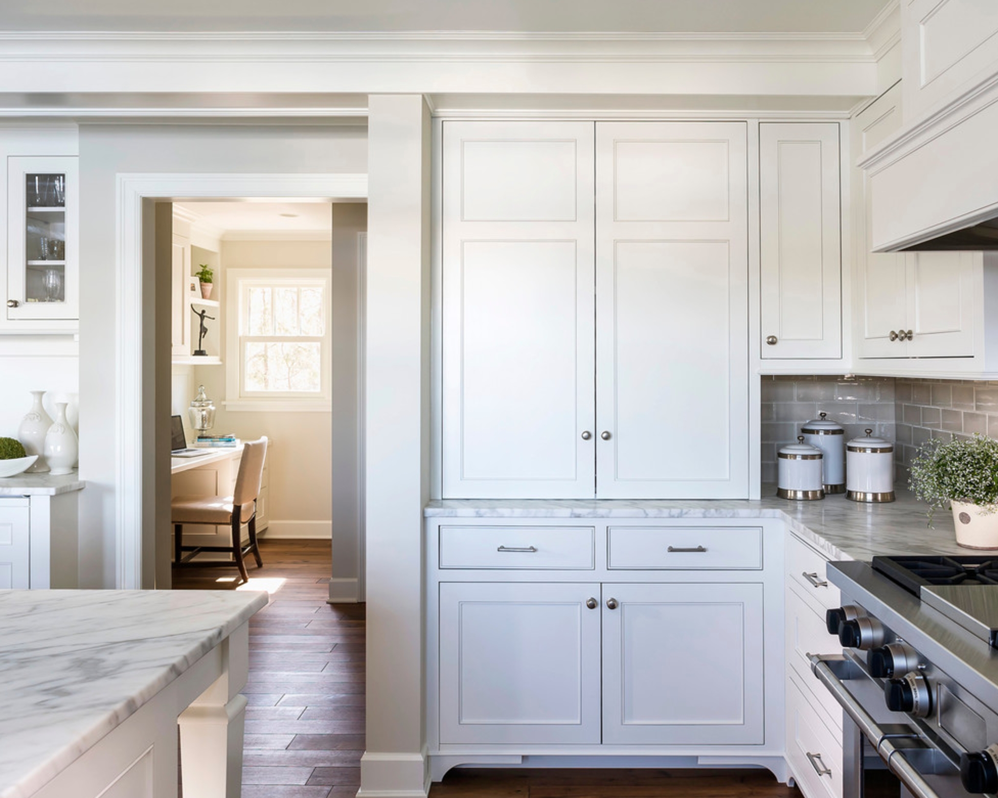
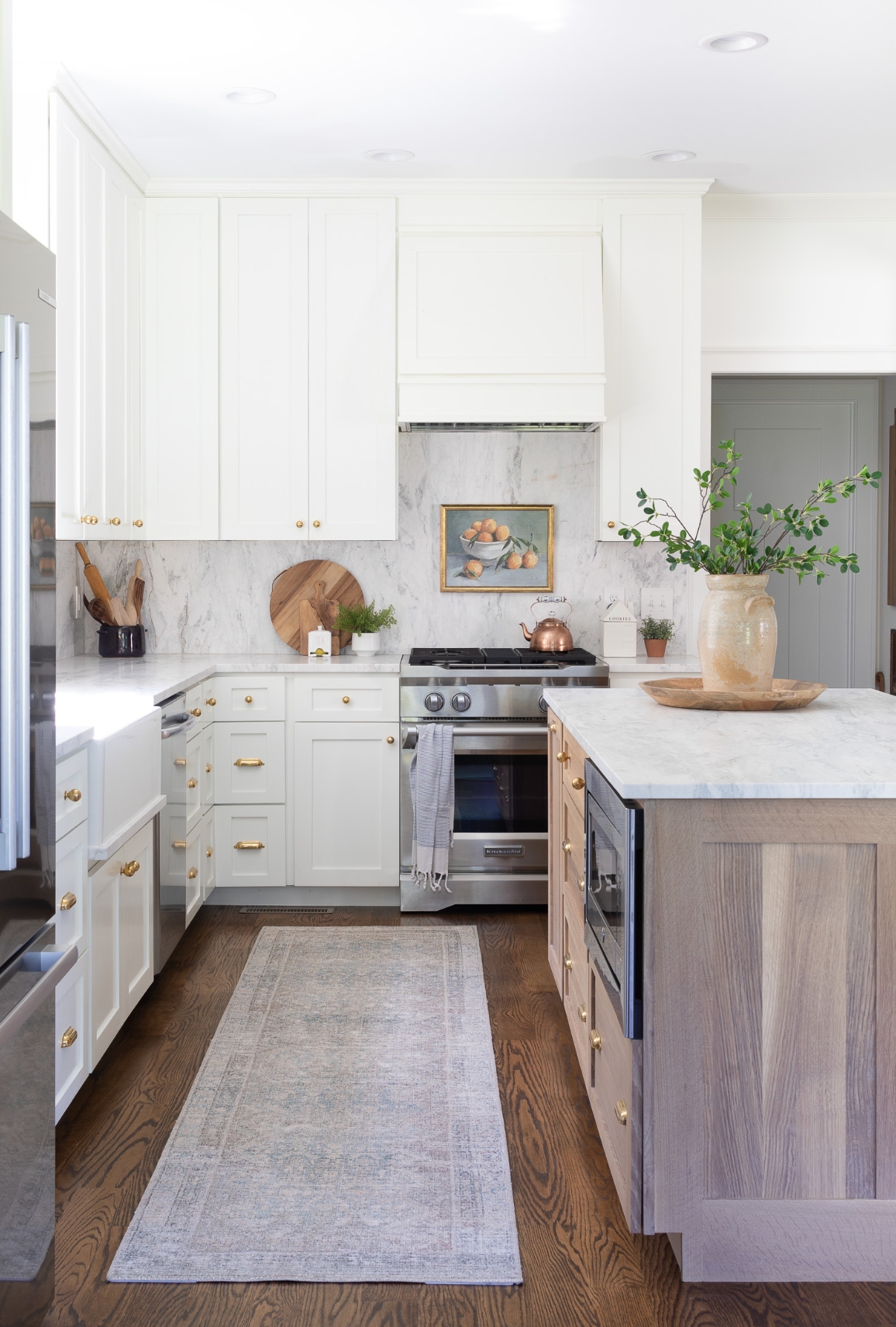
Simply White is stronger when the kitchen needs contrast. It makes dark countertops, black appliances, and graphic hardware read clearly. In a kitchen short on natural light, White Dove can flatten out, while Simply White's higher LRV helps the room feel more awake.
2. Hallways and Entryways
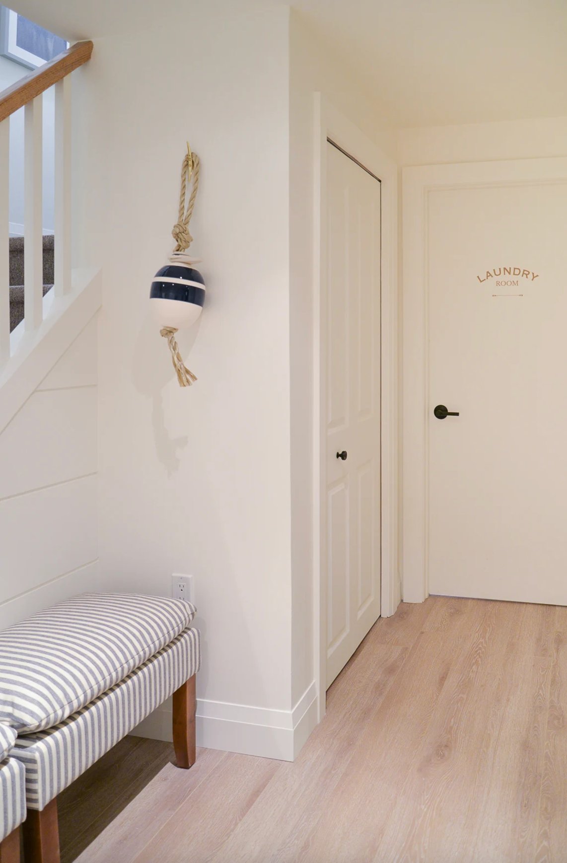
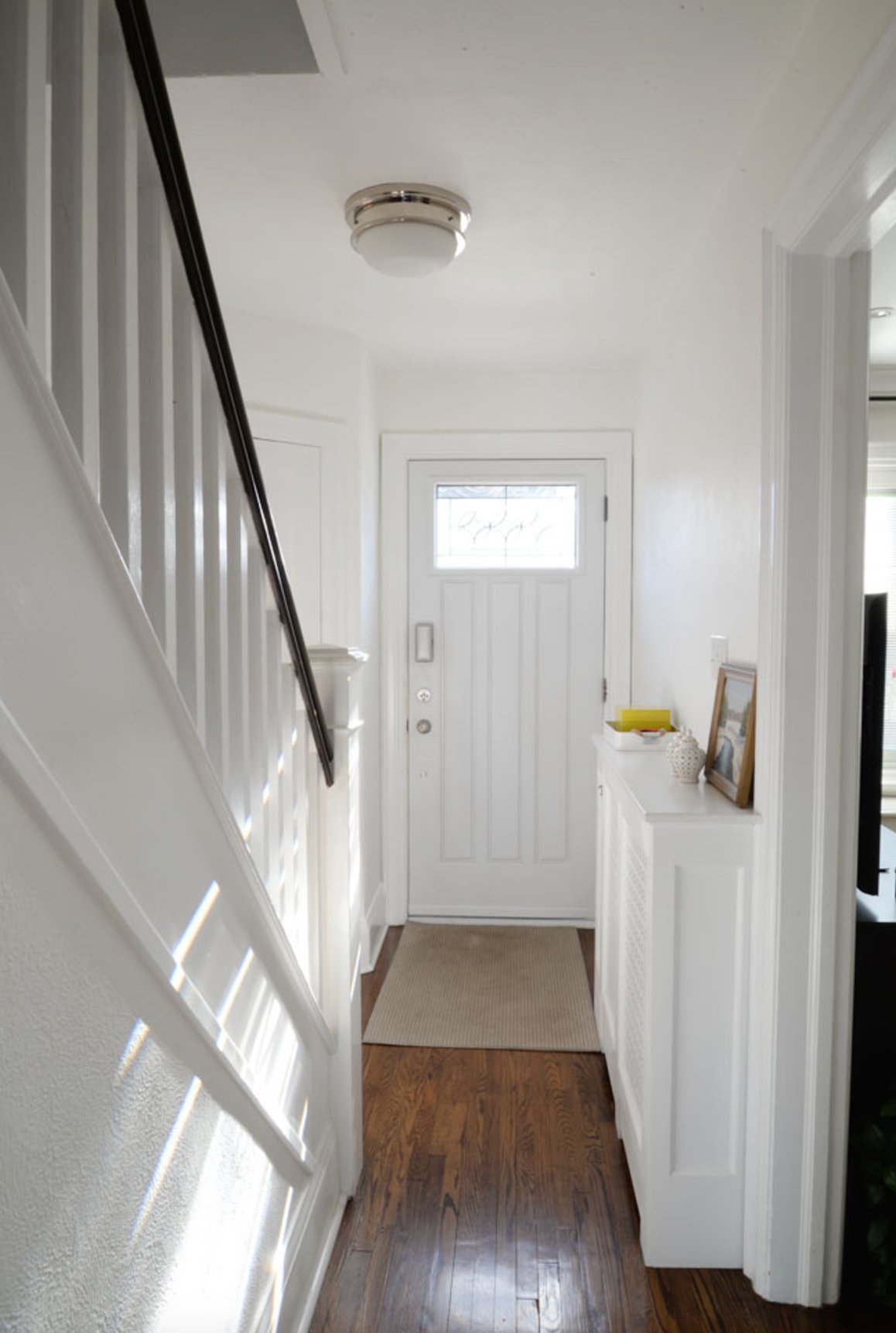
Simply White is often my first test in a dark entryway or interior hall. It has enough brightness to keep the space from feeling dingy, and it works well carried across walls, doors, and baseboards when you want one clean white envelope.
Use better bulbs here. Standard warm bulbs can make Simply White show more yellow than you expected, especially at night.
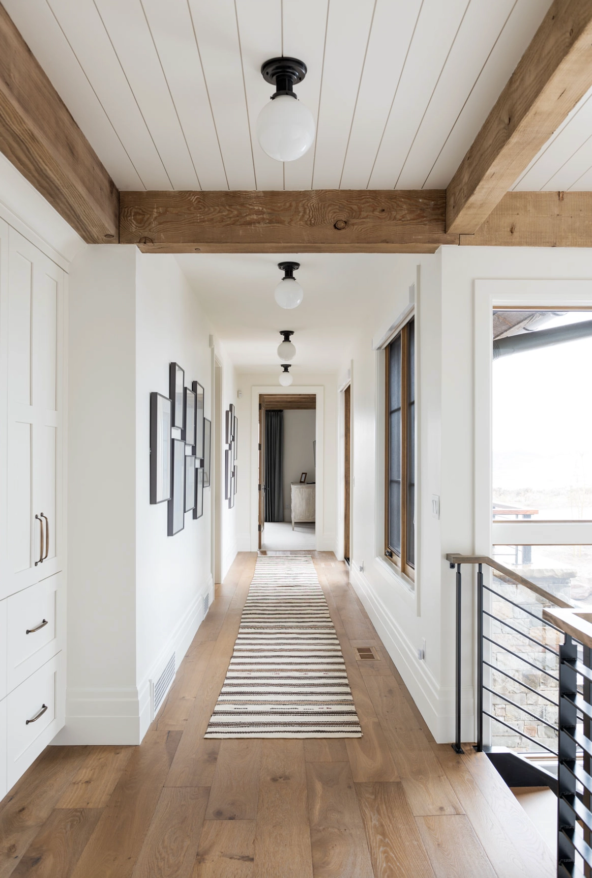
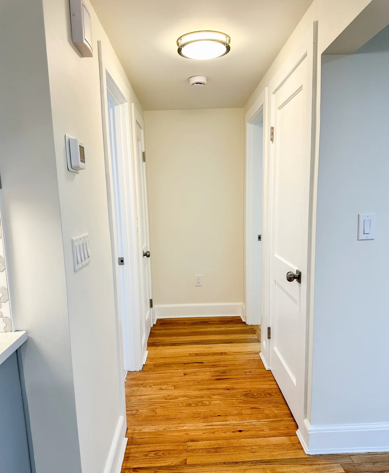
White Dove is the better hallway choice when the surrounding rooms are warmer or more traditional. Its gray-beige undertone is steadier in shifting light, and on moldings it looks soft instead of outlined.
3. Bedrooms
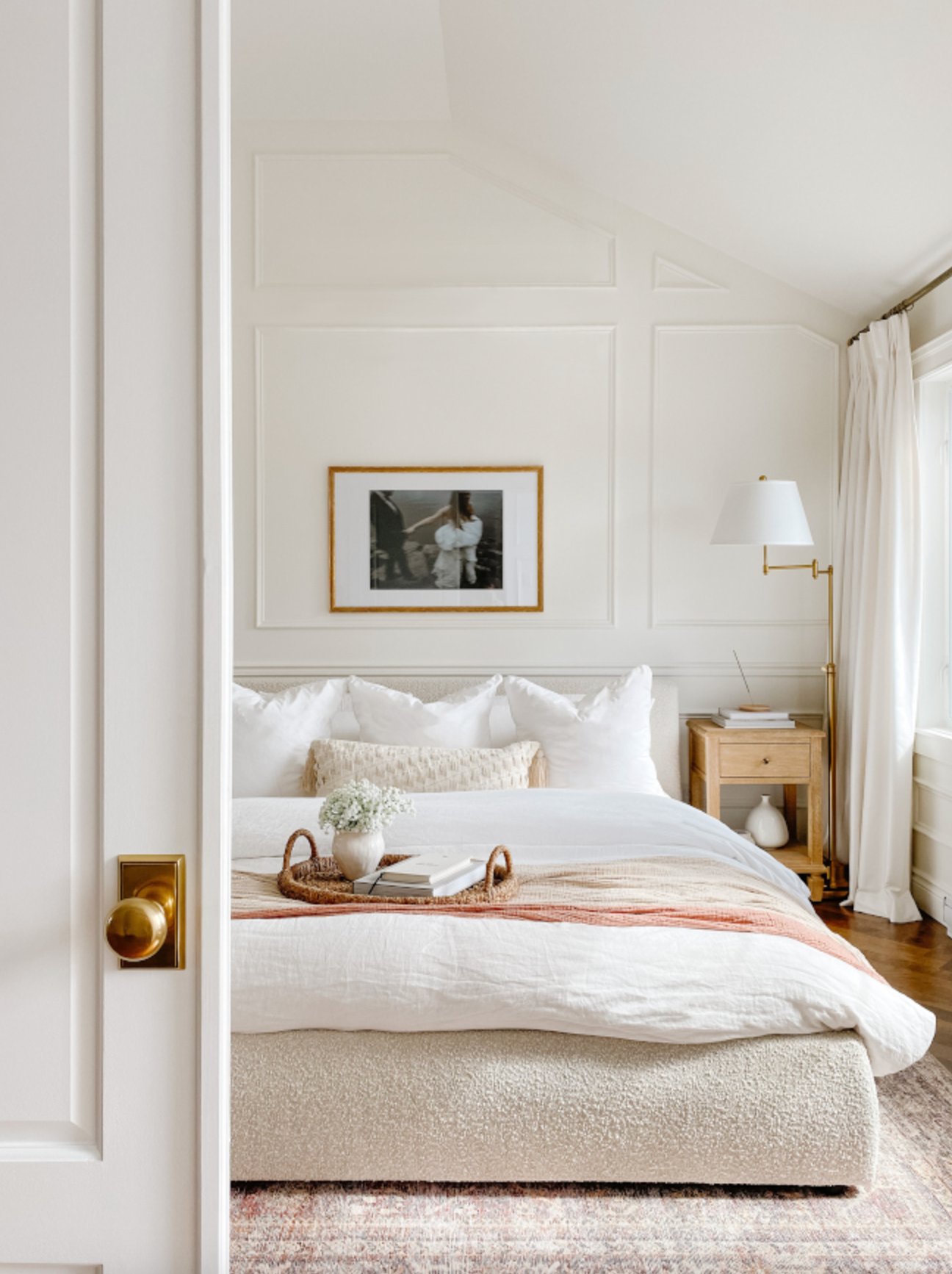
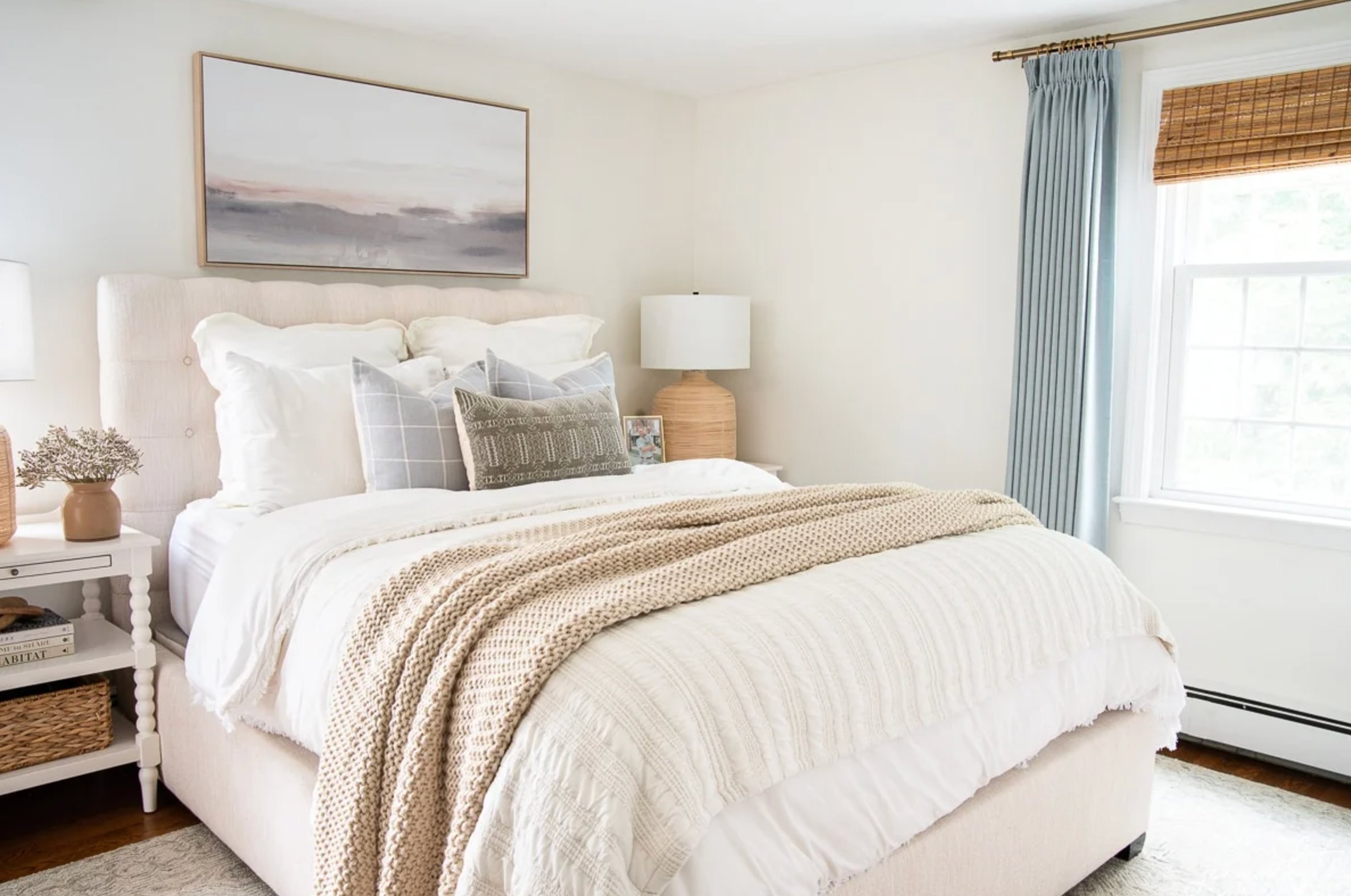
In bedrooms, I choose Simply White when the room needs a cleaner start in the morning. It suits minimal spaces, light woods, simple bedding, and rooms where you want the walls to feel bright without going cold.
White Dove is usually easier to live with in a bedroom used mostly at night. It feels calmer under lamps and works well with wood furniture, woven shades, linen, wool, and other textured fabrics.
4. Living Rooms
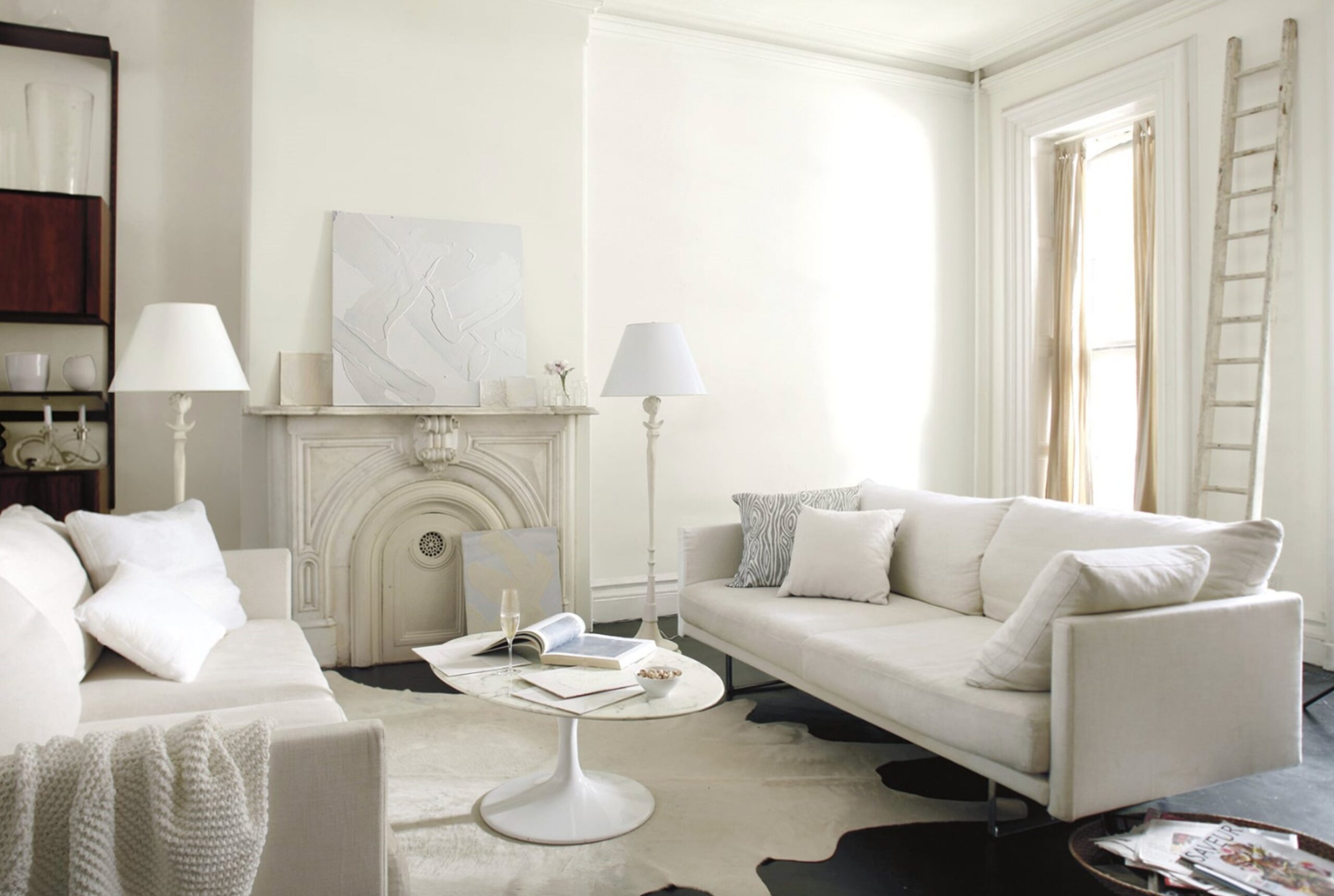
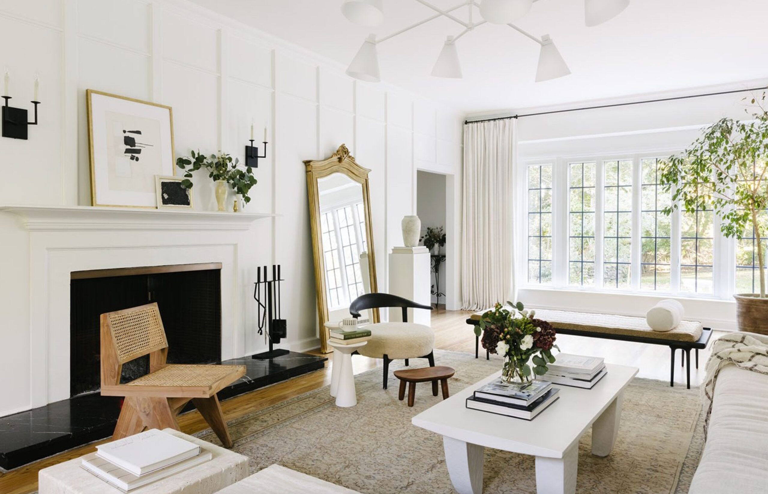
Simply White's LRV of 89.52 matters in a living room. It reflects more light, sharpens architectural details, and gives wood furniture a cleaner contrast. I like it most in casual modern rooms with good natural light or darker accents.
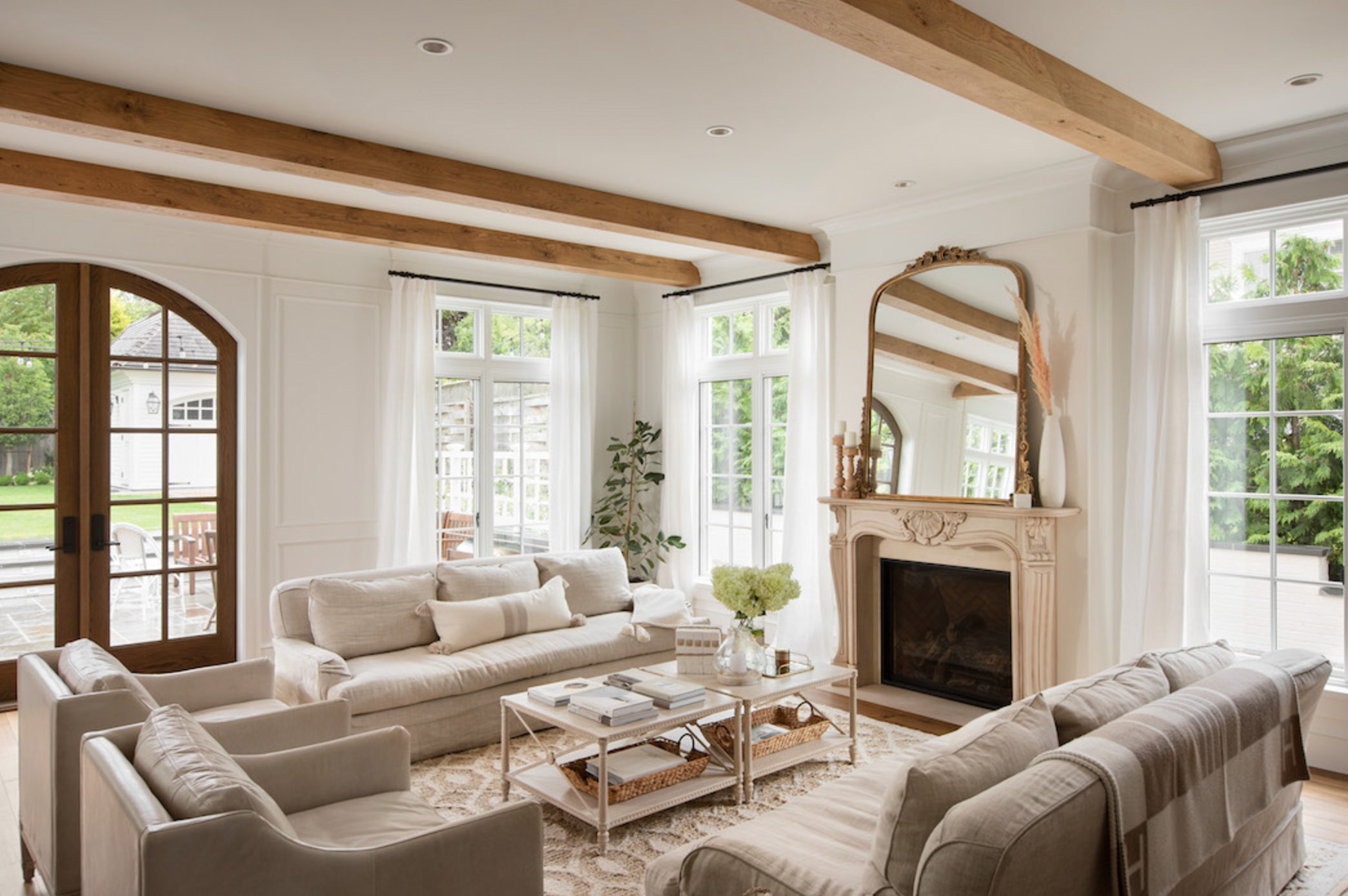
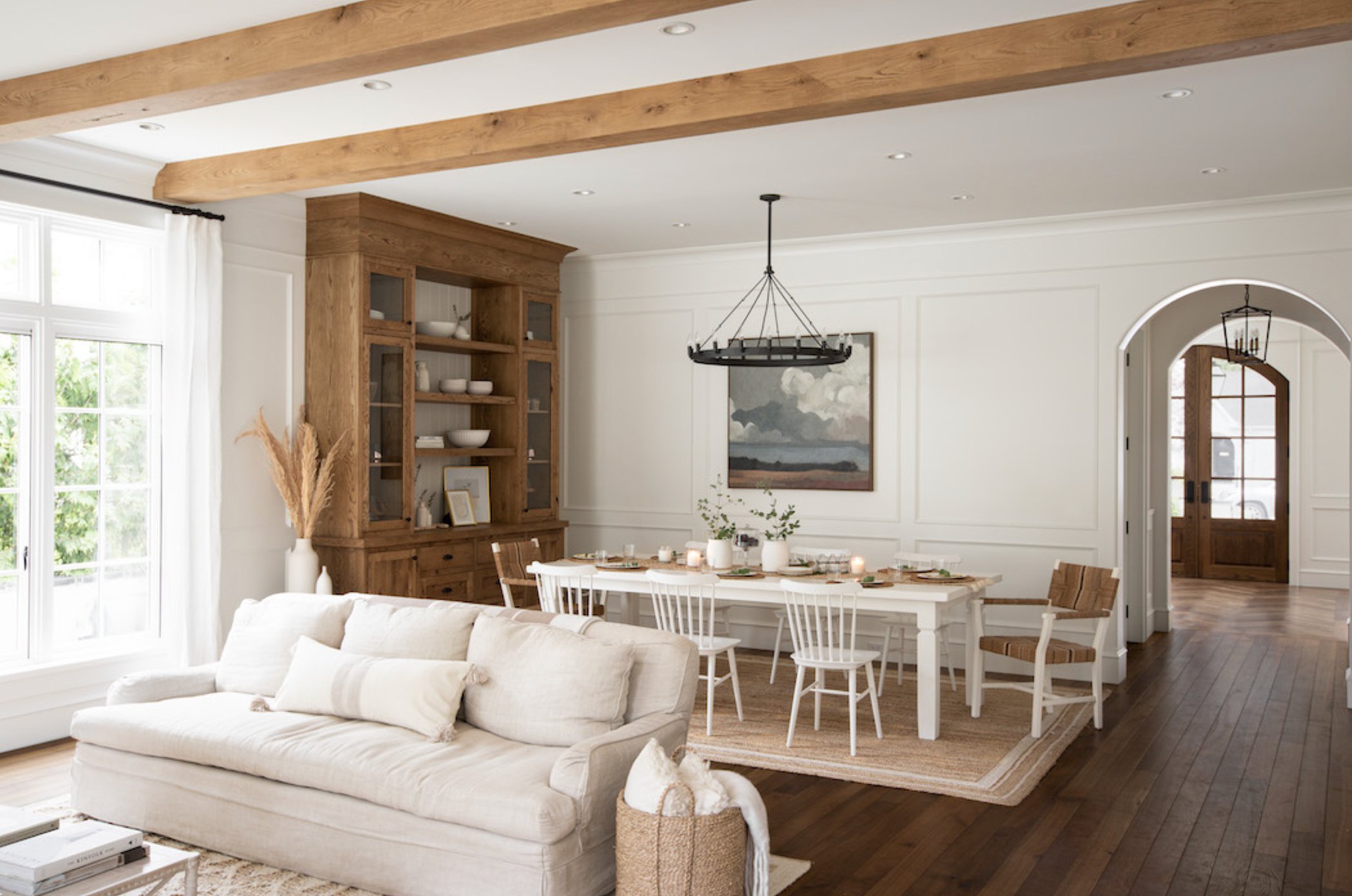
White Dove makes a living room feel more settled. Its gray-beige undertones soften strong contrast, which helps if you have a fireplace, built-ins, older floors, or a mix of warm finishes. It highlights traditional details without making them look newly painted in a harsh way.
At night, White Dove is the easier choice for a lamp-lit living room. Simply White stays brighter and more energetic, which is useful in a family room that feels dim before the lights go on.
Lighting Impact
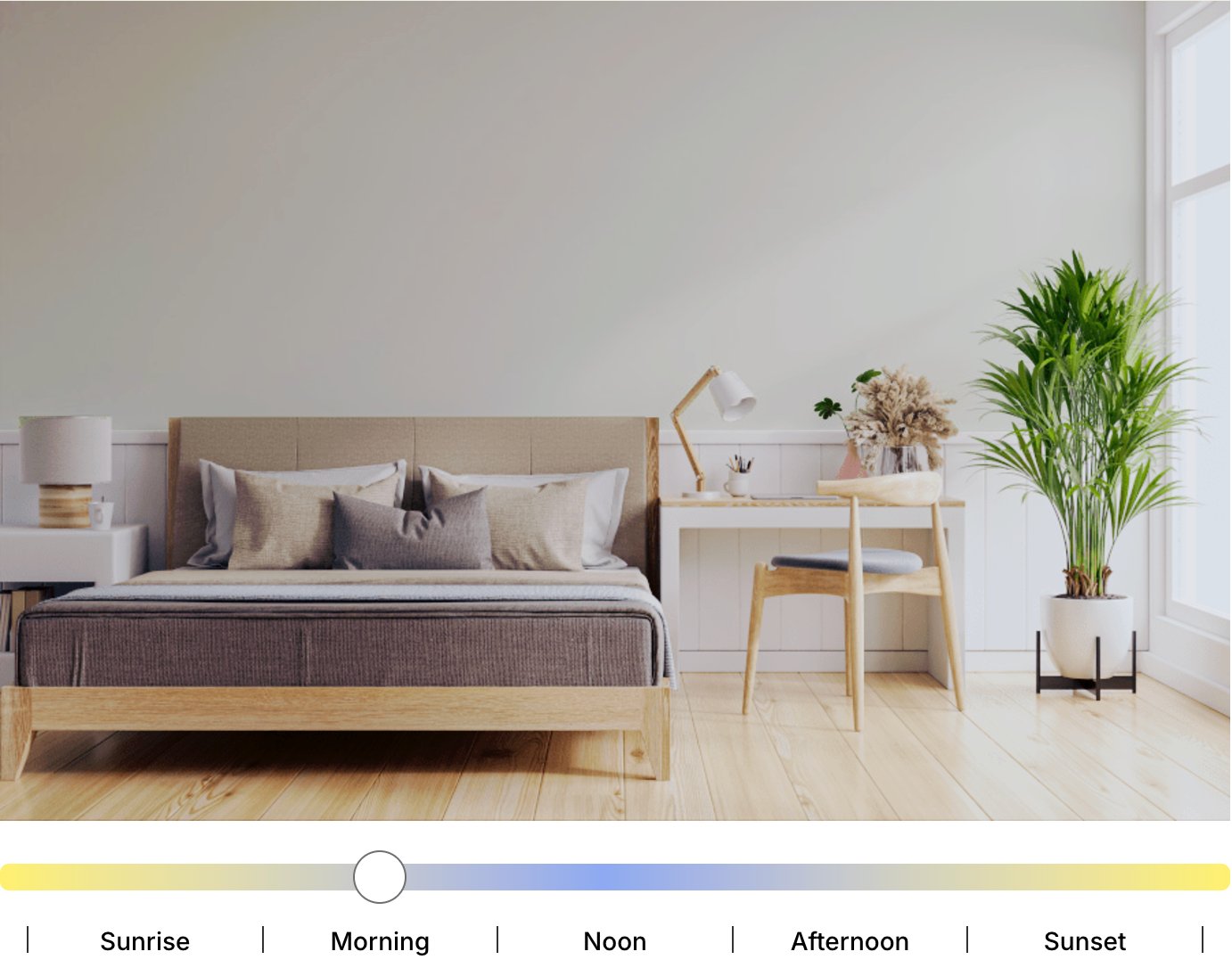
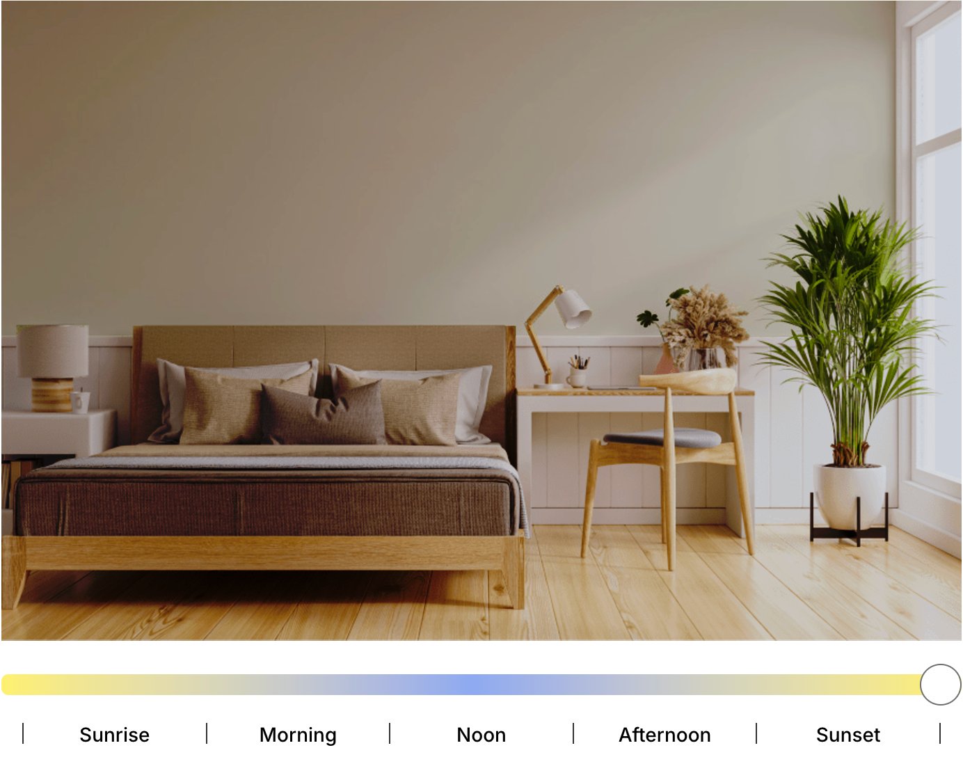
White Dove (LRV 83.16) is forgiving in changing light. In north-facing rooms, its warmth helps soften cool daylight, so the walls are less likely to look icy or chalky.
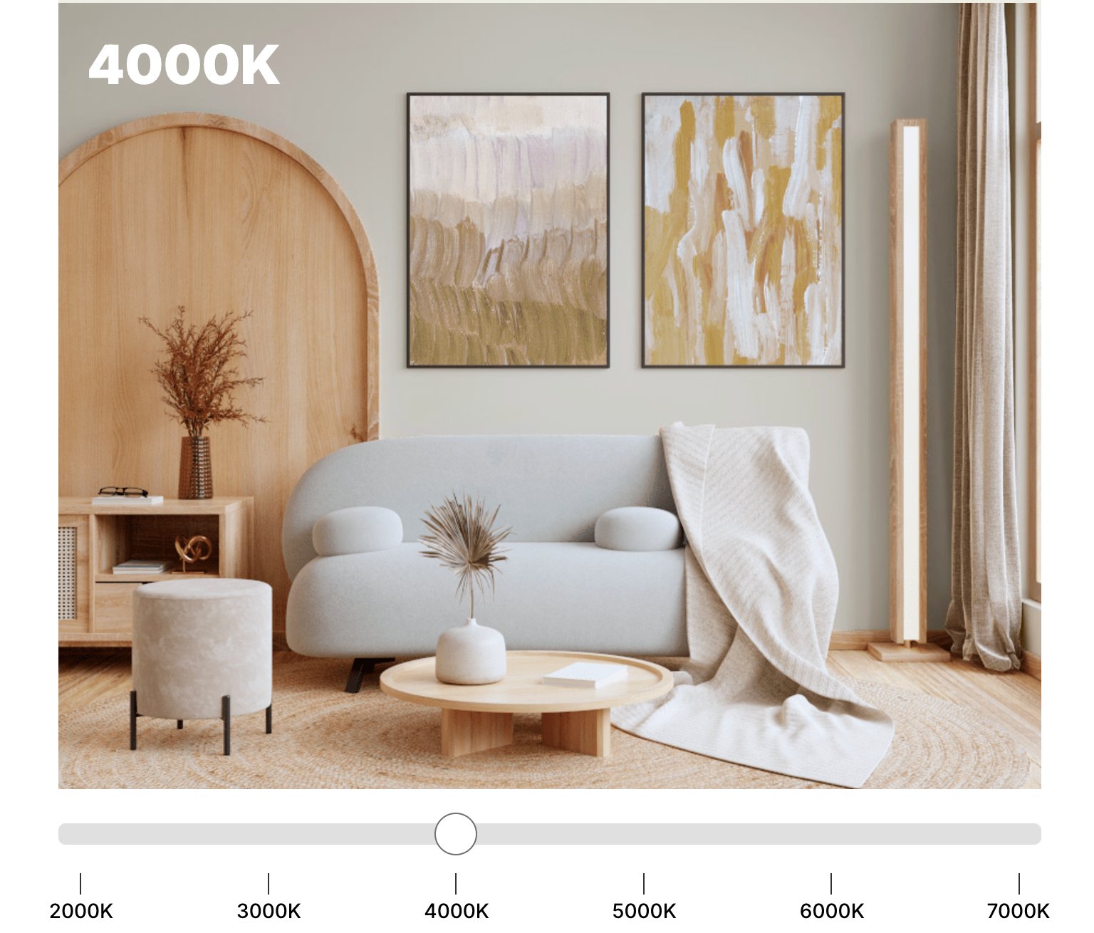
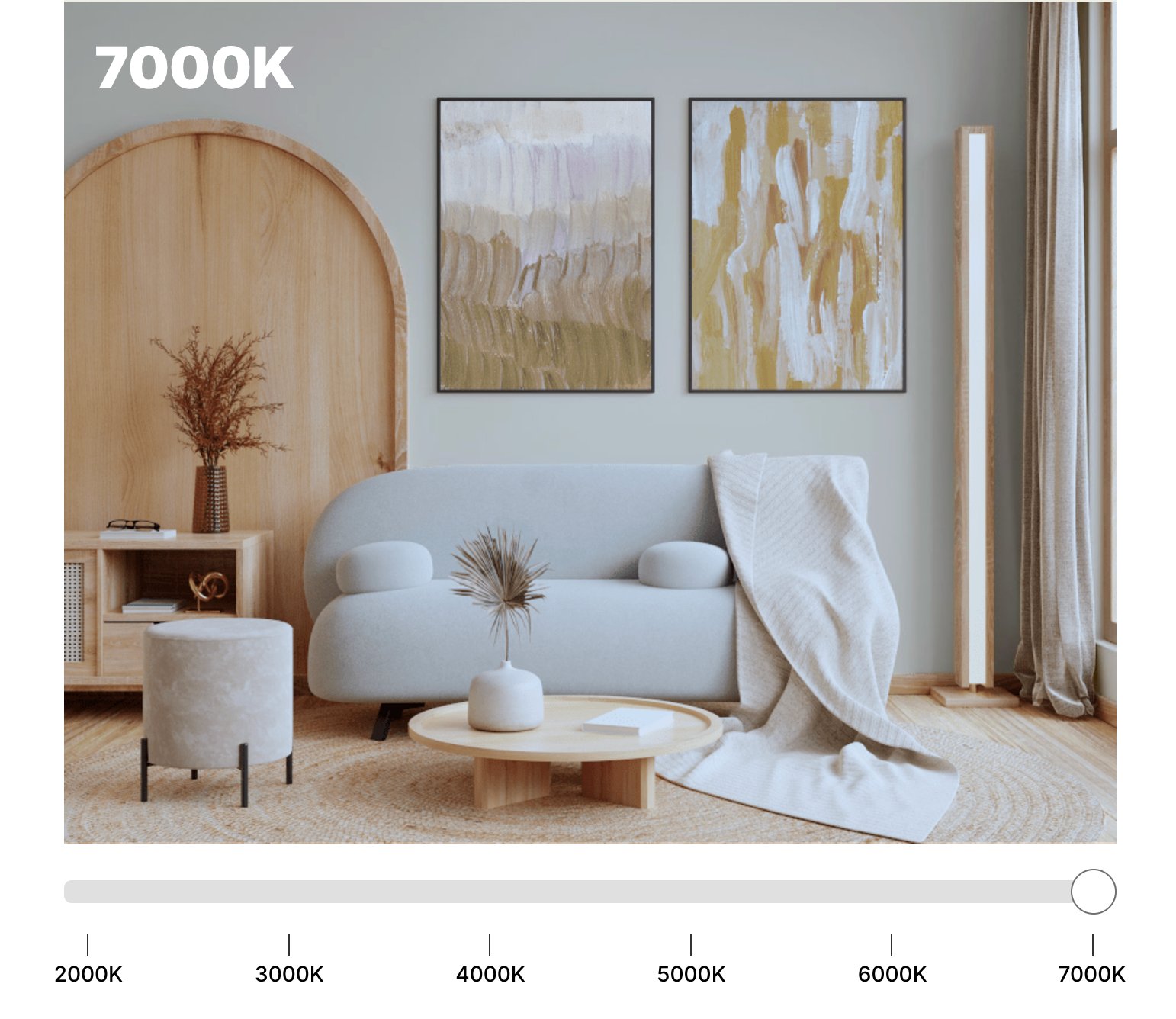
In natural daylight, White Dove reads like a soft neutral white. During golden hour you may see a small amount of warmth come forward. Under artificial light, it usually stays balanced instead of swinging sharply yellow or gray.
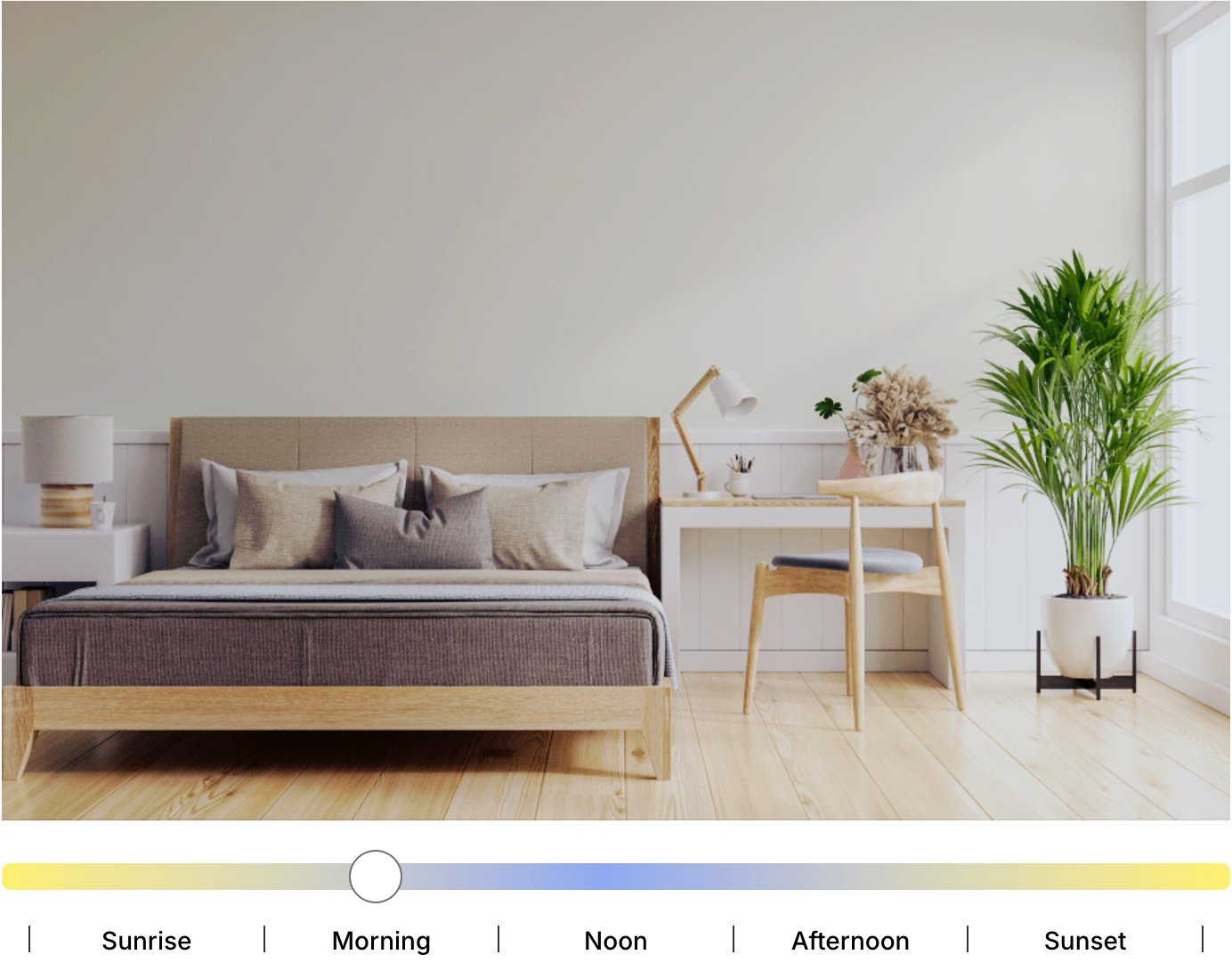
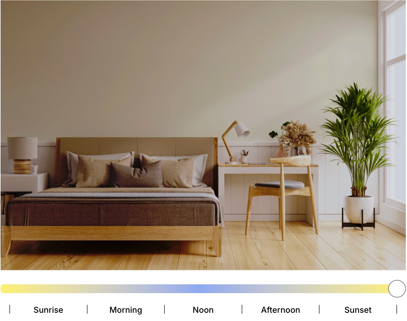
Simply White (LRV 89.52) changes more noticeably with lighting. In bright daylight it looks crisp and clean, with very little yellow showing. In a north-facing room, the warm base can become easier to see because the cooler light exposes it.
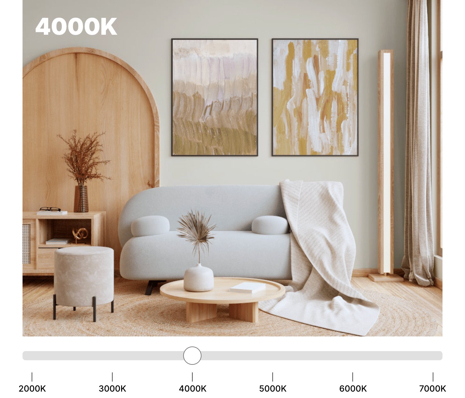
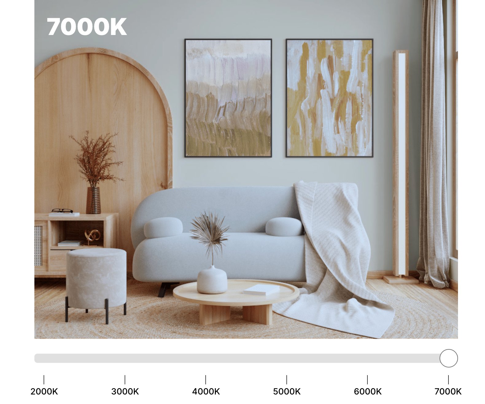
Under artificial light, especially in the evening, Simply White can warm up quite a bit. In dark rooms with little natural light, it may read creamier than it does on the paint chip. That is not a flaw, but it is the reason I sample it near lamps and sconces before committing.
Coordinating Colors
White Dove

BM White Dove is easier to pair with muted, earthy colors. Its gray-beige undertone works especially well with Revere Pewter and Balboa Mist because those colors share a similar softness.
For contrast, Kendall Charcoal gives White Dove enough depth without making the white look dirty. For a warm accent, especially in traditional rooms, Country Redwood is a better fit than a clean red because it has the same grounded quality.
Simply White
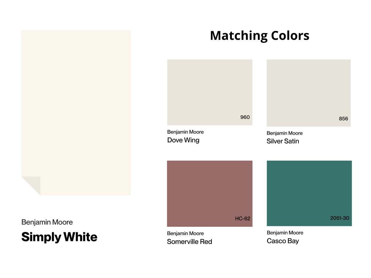
Simply White pairs best with cleaner companion colors. Dove Wing and Silver Satin keep the palette light without making Simply White look too yellow.
For warmth, Somerville Red brings in a terracotta accent without taking over. For color, Casco Bay gives you a muted sea green that still has enough weight to stand up to Simply White's brightness.
Making Your Decision
If your room is bright or full of warm natural materials, I would start with White Dove. If your room is dim or needs a cleaner white, I would start with Simply White.
Go with White Dove if you lean traditional or transitional, want a softer room, and use lots of wood and textured materials.
It is especially useful when you need a white that stays consistent under different lights and does not call attention to every trim line.
Simply White works better in modern and Scandinavian spaces, especially when the rest of the palette is clean and simple.
It is the better bet if you want the room to feel bigger, create bold contrast with darker elements, or brighten a space that's short on natural light.
Test the final two samples in your actual room before you buy gallons. Put them beside trim, flooring, counters, and fabric, then check them in morning light, afternoon light, and after dark.

I'm Elizabeth, your go-to guide for all things paint and design! My days are filled with color swatches and innovative room makeovers. When I'm not painting the town - literally - I'm soaking up inspiration from my travels. This blog is my way of sharing my passion and making the world a more vibrant place, one color palette at a time.