BM Swiss Coffee vs SW Alabaster
Swiss Coffee and Alabaster look close on a paint chip, but they solve different problems in a real room. I use Swiss Coffee when a space needs warmth. I use Alabaster when the room needs a cleaner white that still avoids looking stark.
Both BM Swiss Coffee and SW Alabaster are creamy off-whites with almost identical LRVs, 81.91 for Swiss Coffee and 82 for Alabaster. The real difference is undertone. Swiss Coffee has a clearer yellow warmth, while Alabaster sits closer to neutral with a soft gray influence.
If your room has north light, dated beige finishes, honey oak, or warm bulbs, that difference matters. I'll walk through where each color works best, how they change in light, and what to pair with them so you can choose the right white for your house.
Use the over 20 real photos below as a guide, then sample both colors on your own wall before you commit.
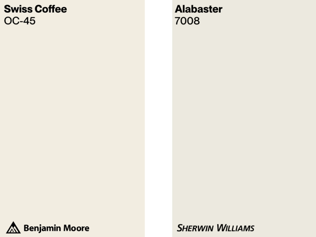
BM Swiss Coffee vs SW Alabaster at a Glance
Swiss Coffee is a creamy off-white from Benjamin Moore. Its yellow undertone gives walls a gentle warmth, so it reads softer than a clean white but still reflects plenty of light. Choose it when you want the room to feel settled rather than crisp.
Alabaster is a creamy off-white from Sherwin-Williams. It is still warm, but the hint of gray keeps it more balanced than Swiss Coffee. Choose it when you want an off-white that can handle modern finishes, black accents, stone, or cleaner cabinetry without turning yellow.
| BM Swiss Coffee | SW Alabaster | |
|---|---|---|
| Color Code | OC-45 | SW 7008 |
| Light Reflectance (LRV) | 81.91 | 82 |
| Color Family | Creamy off-white | Creamy off-white |
| Undertones | Yellow | Neutral with hints of gray |
| Best For | Cozy spaces | Contemporary spaces |
| Versatility | High | Very high |
Best Settings for Each Color
Swiss Coffee
Swiss Coffee works best in rooms that can use a little softness. I reach for it when the fixed finishes already lean warm, especially wood floors, cream upholstery, woven shades, or natural stone with beige veining.
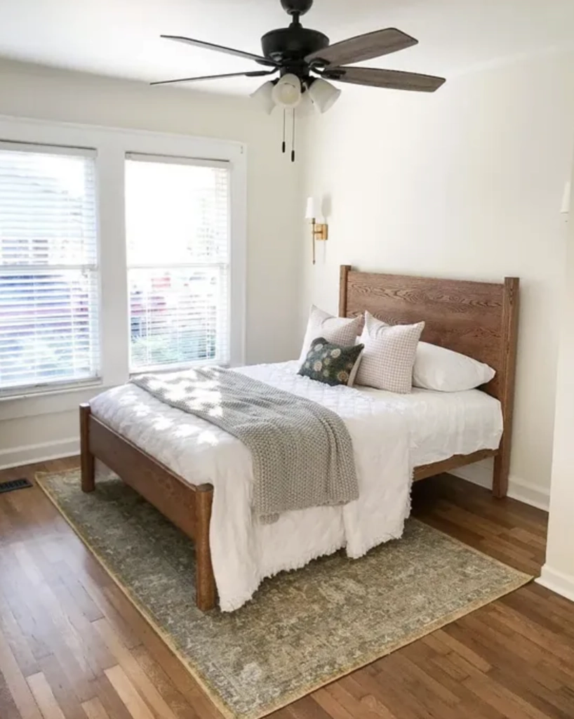
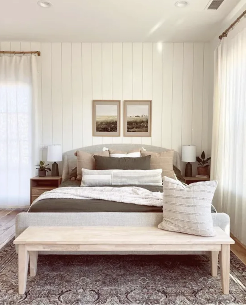
1. Bedrooms: Swiss Coffee is a strong bedroom choice when you want white walls without a chilly edge. It works especially well with linen bedding, warm wood nightstands, brass lamps, and soft carpeting because the yellow undertone keeps the room from feeling bare.
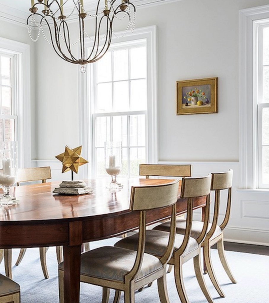
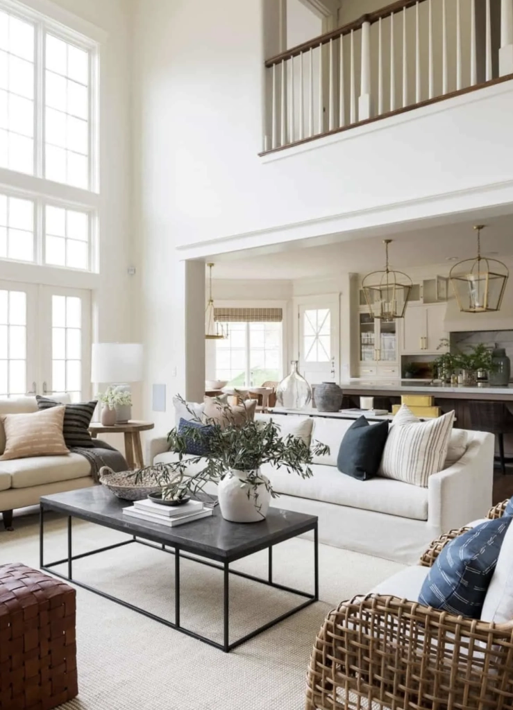
2. Dining Rooms: In dining rooms, Swiss Coffee is most useful when the furniture is traditional, antique, or medium-toned wood. It softens formal pieces and looks good at night under warm bulbs, which is when many dining rooms are actually used.
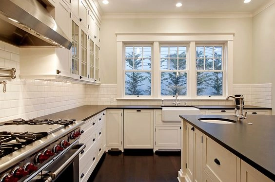
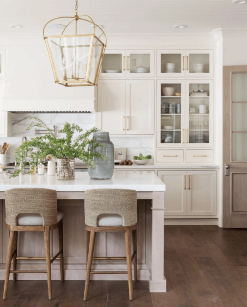
3. Kitchens: In kitchens, Swiss Coffee suits cream cabinets, unlacquered brass, warm marble, butcher block, and oak floors. Be careful with bright white quartz or cool gray tile. Next to those finishes, Swiss Coffee can show more yellow than you expected.
Alabaster
Sherwin-Williams Alabaster is the easier choice when the room has mixed finishes. It still has warmth, but it reads cleaner than Swiss Coffee, so it handles contrast better.
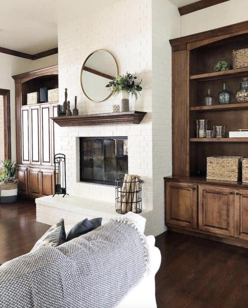
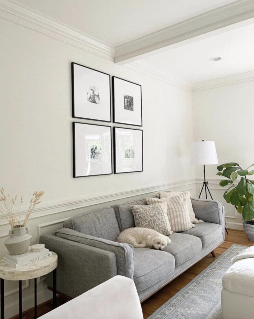
1. Living Rooms: Alabaster is a dependable living room white when you have black windows, charcoal furniture, colorful art, or a more edited furniture plan. It gives you a soft background without pushing the room into cream.
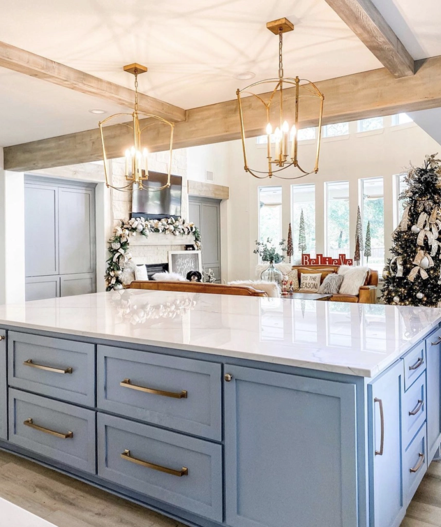
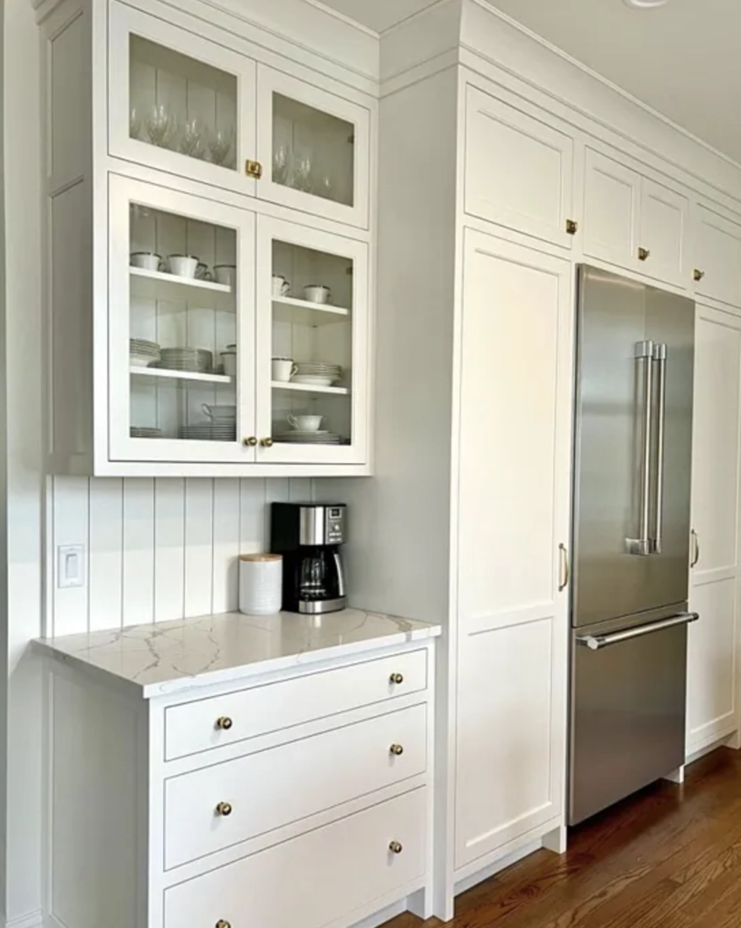
2. Kitchens: Alabaster is often safer than Swiss Coffee in kitchens with white appliances, light quartz, cool marble, stainless steel, or gray backsplash tile. It can still look warm in the evening, but it is less likely to fight cleaner finishes.
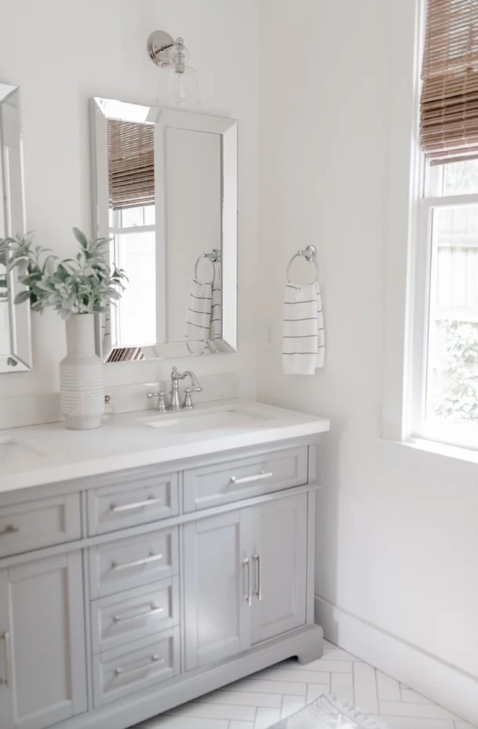

3. Bathrooms: Alabaster works well in bathrooms because tile, tubs, sinks, and counters often read cooler than wall paint. Its softness keeps the room from feeling clinical, while the gray hint helps it sit better beside porcelain and chrome.
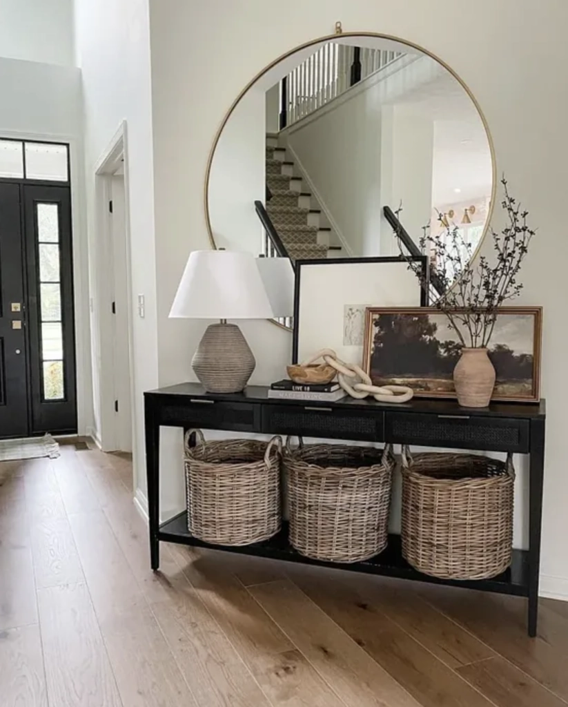
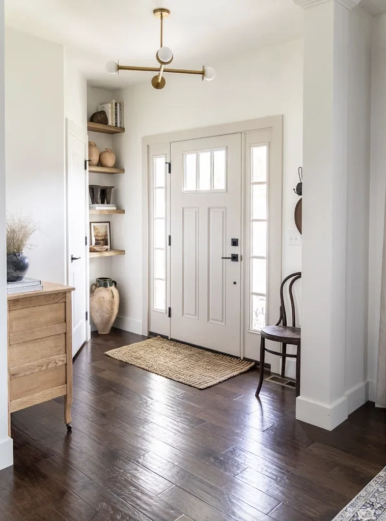
4. Hallways & Foyers: Alabaster is a good hallway and foyer color because it changes less dramatically as you move from brighter areas into lower light. If your trim, stair rail, doors, or lighting are a mix of warm and cool, Alabaster is usually the more forgiving white.
Lighting
Swiss Coffee
Swiss Coffee changes most when the light gets warm. Its LRV of 81.91 keeps it bright, but the undertone is yellow enough that bulbs and sunlight can pull it creamier.
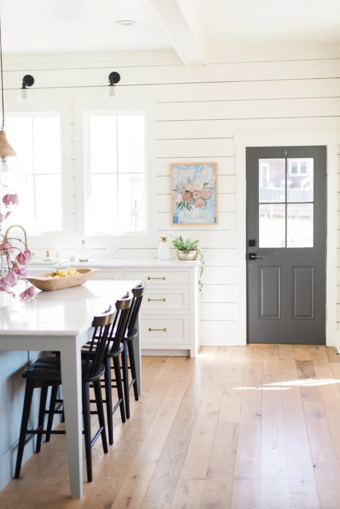
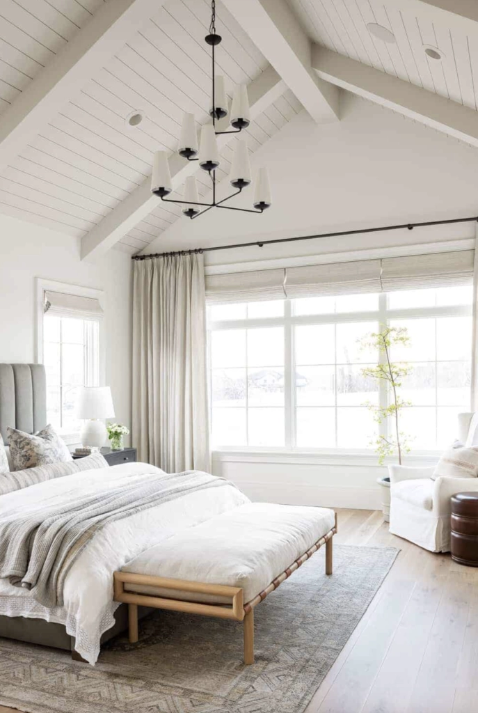
Natural Daylight: In natural daylight, Swiss Coffee reads warm and softly lit. In a south-facing room, it can look creamy and rich. In a north-facing room, it often holds onto enough warmth to keep the walls from going gray.
Warm Indoor Lights: Under warm indoor bulbs, especially 2700K to 3000K, Swiss Coffee becomes creamier. That is lovely in bedrooms and dining rooms, but risky in a kitchen with cool counters or very white trim.
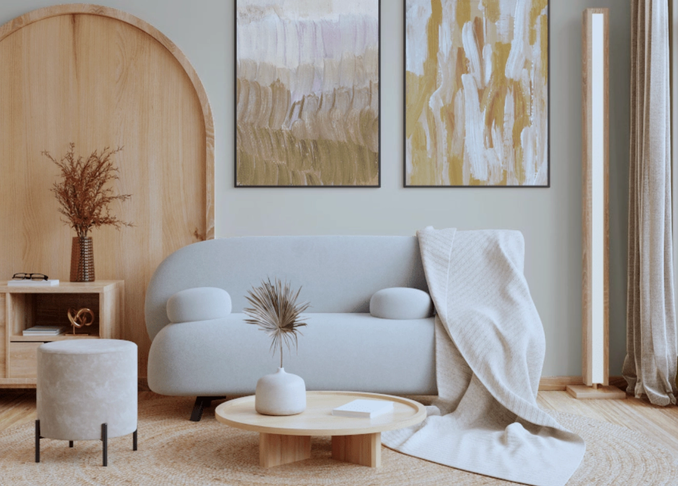
Cooler Lights: Under cooler bulbs, Swiss Coffee loses some of its creaminess and reads closer to a balanced off-white. If the room still looks too yellow in your sample, the issue is probably the surrounding finishes, not just the bulb temperature.
Alabaster
Alabaster is steadier across different light conditions. Its LRV of 82 is almost the same as Swiss Coffee, but the undertone is less yellow, so the shift is cleaner.
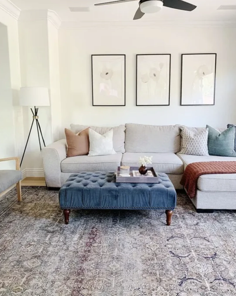
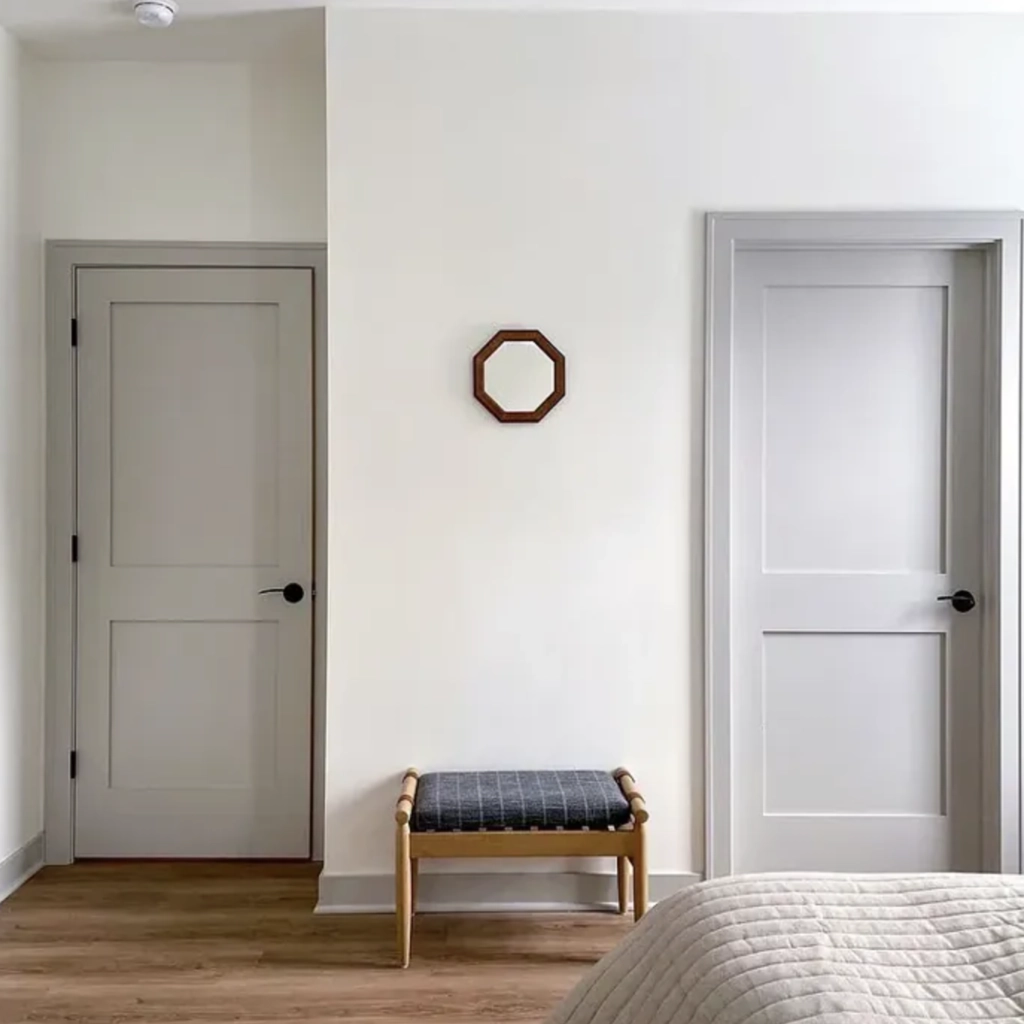
Natural Daylight: In natural daylight, Alabaster reads soft white rather than cream. In bright south or west light, it can still warm up, but it usually stops short of looking buttery.
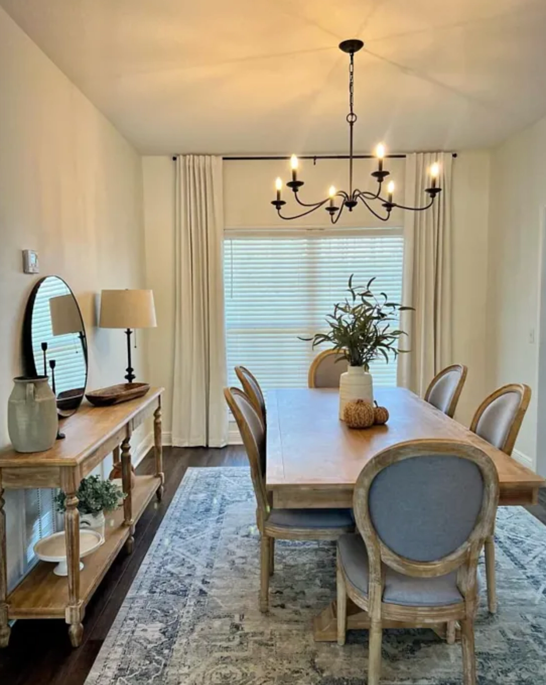
Warm Indoor Lights: Under warm indoor bulbs, Alabaster becomes gentler without turning as creamy as Swiss Coffee. This is why I like it for open plans where the kitchen, hallway, and living room all share one paint color.
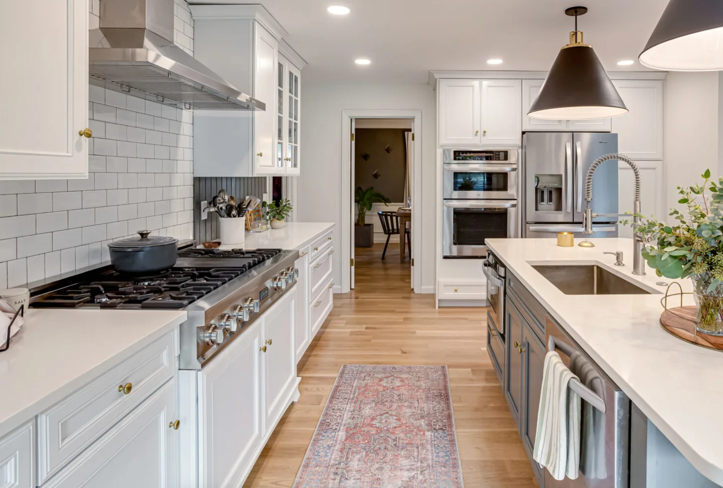
Cooler Lights: With cooler bulbs, Alabaster can look cleaner and a bit flatter. If your room has cool gray flooring or blue northern light, sample it beside the trim before painting the whole room. It may need warmer decor to keep it from feeling plain.
Matching Colors & Decor
With whites this close, decor often makes the decision for you. Compare each sample beside the finishes that are staying: flooring, counters, tile, trim, upholstery, and the largest wood piece in the room.
Swiss Coffee
Swiss Coffee likes materials with visible warmth. It is strongest in rooms where the palette already includes cream, beige, camel, walnut, oak, brass, terracotta, or muted greens.

Matching Colors: Pair Swiss Coffee with soft beiges, muted sage greens, and deep blues. Those colors have enough depth to make Swiss Coffee look intentional instead of simply old or yellowed.
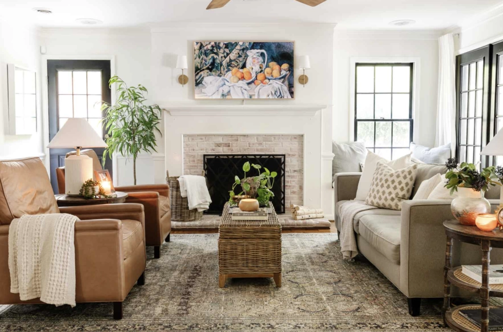
- Wooden Furniture: Swiss Coffee is kind to wood furniture, especially oak, walnut, pine, and medium brown antiques. It can make those pieces look collected rather than heavy.
- Textured Decor: Linen, jute rugs, woven shades, boucle, and macrame all work well with Swiss Coffee because they repeat the same natural warmth. Use contrast in the art or lighting so the room does not become too beige.
Alabaster
Alabaster is better when your decor has cleaner contrast. It sits comfortably with black, charcoal, brushed nickel, white oak, stone, and saturated accent colors.

Matching Colors: Alabaster pairs well with soft grays, teal, and stronger colors like emerald green. It also gives black accents enough contrast without making the walls look icy.
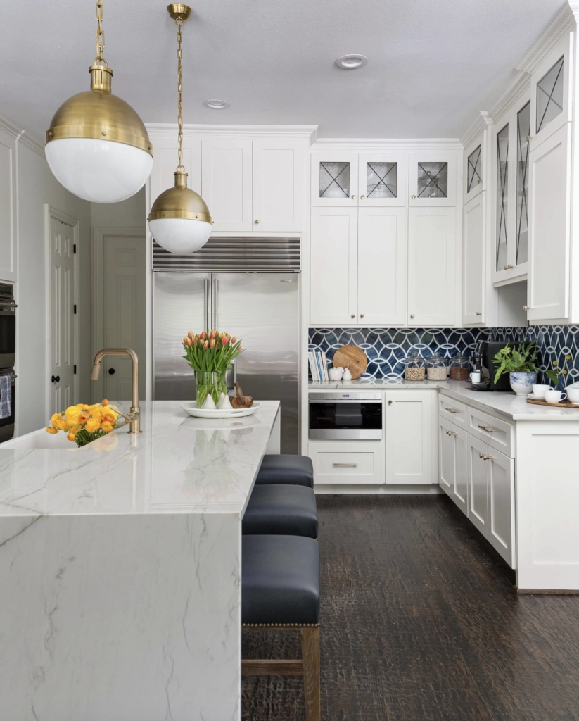
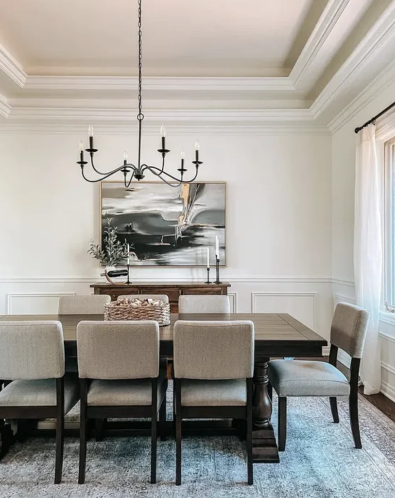
- Modern Accents: Geometric patterns, simple metal fixtures, and abstract art tend to look cleaner against Alabaster than Swiss Coffee. The wall color stays quiet while the shapes and contrast do the work.
- Glass and Metallic Decor: Clear glass, chrome, nickel, and polished metal accents usually sit better with Alabaster. If your room already has a lot of cool reflective surfaces, add wood or textiles so the white does not feel thin.
Which Should You Choose?
Choose Swiss Coffee if your room needs warmth. Choose Alabaster if your room needs a cleaner off-white that still feels soft.
Benjamin Moore Swiss Coffee is the better pick for warm, layered rooms. Use it with oak floors, brass hardware, cream fabrics, natural fiber rugs, traditional furniture, and rooms that feel a little cold or under-finished. It is also the one I would sample first in a north-facing bedroom or a dining room used mostly at night.
Sherwin-Williams Alabaster is the better pick for mixed finishes and cleaner rooms. Use it with black accents, cool stone, white or light quartz, gray tile, stainless steel, modern furniture, or an open floor plan where one white needs to behave in several kinds of light.
My practical tie-breaker is trim and fixed surfaces. If Swiss Coffee makes the trim look sharp and the room feel warmer, use Swiss Coffee. If Swiss Coffee looks yellow beside the counters, tile, or trim, use Alabaster. Paint large samples on two walls and check them in the morning, afternoon, and evening before ordering gallons.

I'm Elizabeth, your go-to guide for all things paint and design! My days are filled with color swatches and innovative room makeovers. When I'm not painting the town - literally - I'm soaking up inspiration from my travels. This blog is my way of sharing my passion and making the world a more vibrant place, one color palette at a time.