Ballet White vs Swiss Coffee
Ballet White and Swiss Coffee are both warm Benjamin Moore off-whites, but they solve different problems.
Benjamin Moore Ballet White vs Swiss Coffee usually comes down to depth. Ballet White is the softer, more muted choice. Swiss Coffee is lighter and reads closer to a creamy white.
I would sample Ballet White first if your room has wood floors, beige stone, or older cream finishes you don't want to fight. I would sample Swiss Coffee first if the room needs more brightness but stark white feels too sharp.
The trick is not choosing the prettier swatch. It is choosing the one that behaves better with your light, trim, counters, and furniture.
Here is how I would compare them on a real wall.
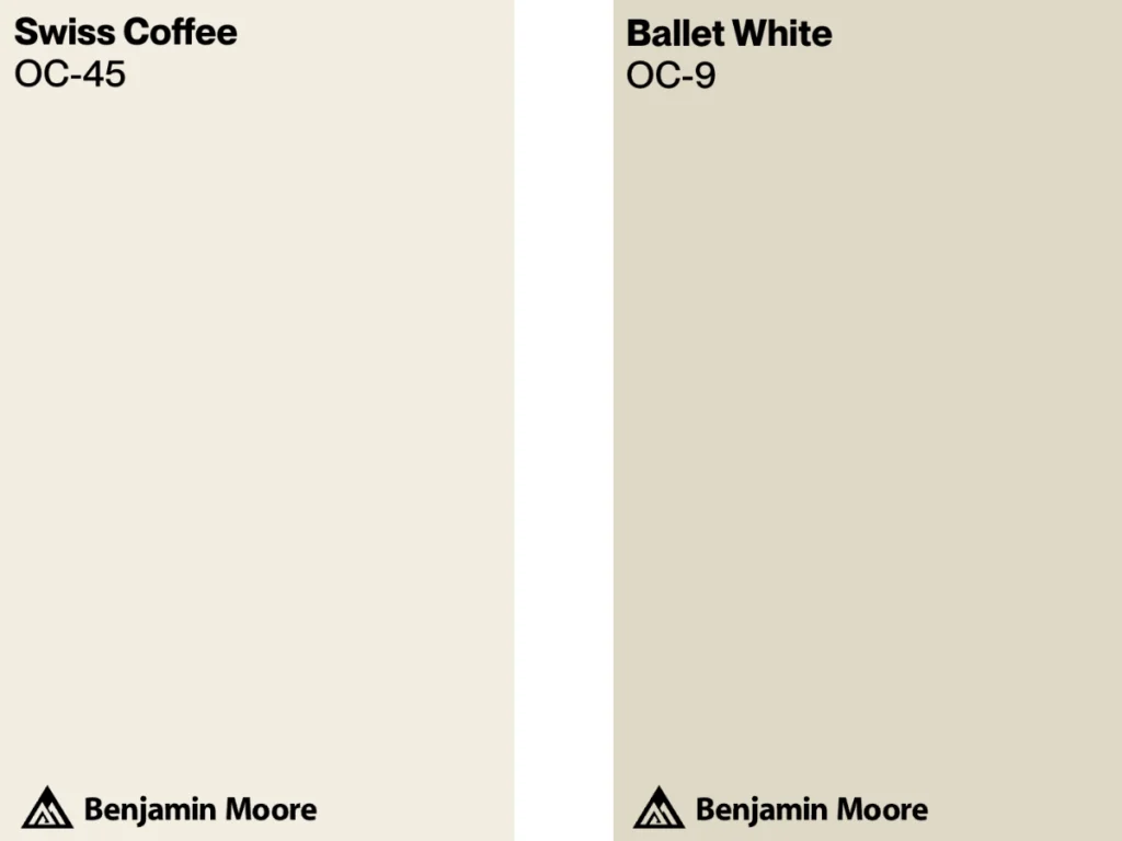
Ballet White vs Swiss Coffee at a Glance
Ballet White by Benjamin Moore is the deeper of the two. It has a Light Reflectance Value (LRV) of 71.97, so it still reflects a good amount of light, but it has enough body to read like a warm neutral instead of a clean white. Its yellow and greige undertones are useful when a room has wood, stone, linen, or cream finishes.
I like Ballet White when a homeowner wants the room to feel finished without adding obvious color. It can soften oak floors, beige carpet, travertine, and earthy accents without turning the walls yellow.
Swiss Coffee by Benjamin Moore is lighter and creamier. It has a higher Light Reflectance Value (LRV) of 81.91, so it reflects more light and usually reads brighter on the wall than Ballet White.
Swiss Coffee is a better starting point for larger rooms, kitchens, and open spaces where you want warmth but still need the walls to stay visibly light. The caution is trim. Next to a very crisp white, Swiss Coffee can look more yellow than expected.
| Ballet White | Swiss Coffee | |
|---|---|---|
| Color Code | OC-9 | OC-45 |
| Light Reflectance (LRV) | 71.97 | 81.91 |
| Color Family | Off-White | Off-White |
| Undertones | Yellow and Greige | Warm, Beige |
| Versatility | High | High |
Best Settings for Each Color
Ballet White
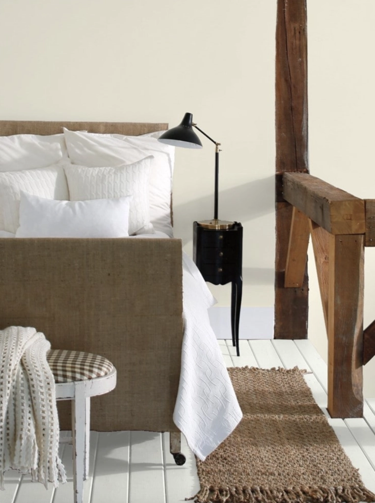
Bedrooms: Ballet White's warm undertones work well in bedrooms because they take the edge off bright bedding, white lampshades, and cool daylight. It is especially good in a bedroom with medium wood furniture, natural linen, or beige carpet. In a very dark bedroom, sample it carefully because it can look more beige than white.
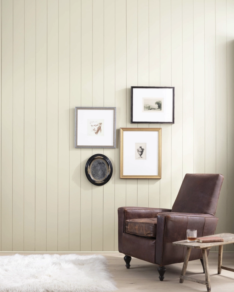
Living Rooms: Ballet White is strong in living rooms with wood floors, woven shades, leather chairs, stone fireplaces, or warm upholstery. It gives the walls enough depth that the room does not feel unfinished, which can happen when a very light white is used with heavier furniture.
Swiss Coffee
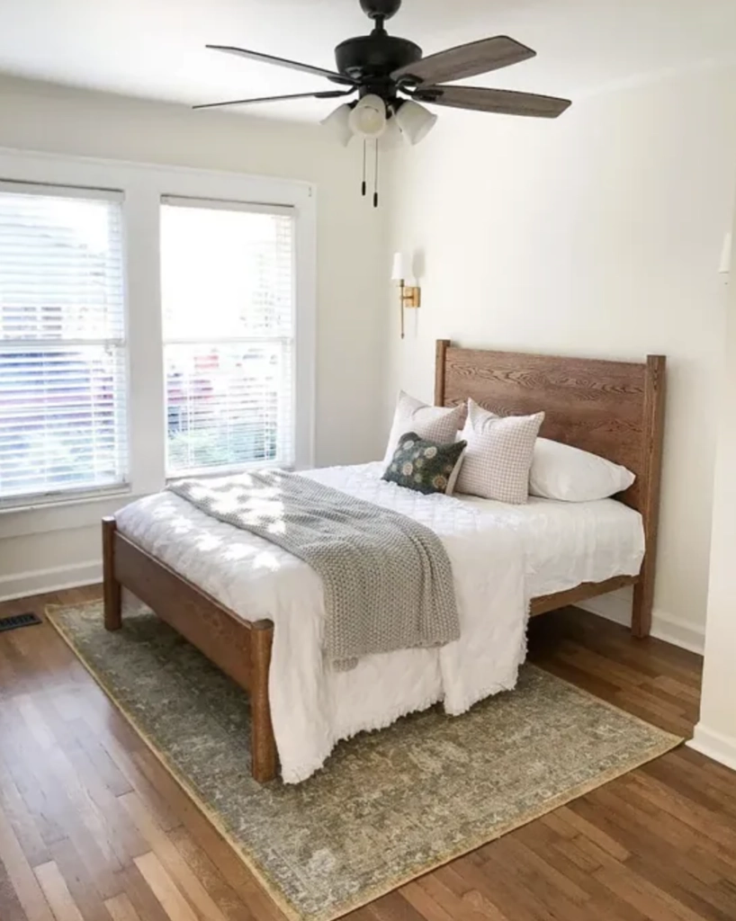
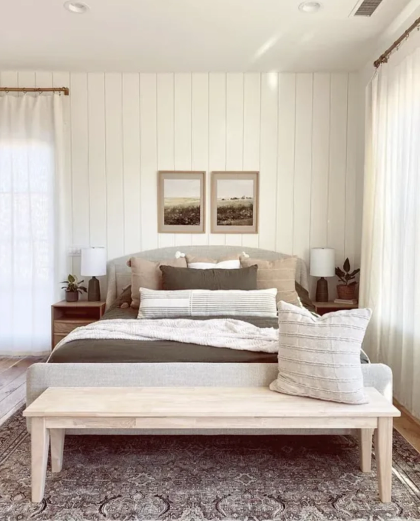
Bedrooms: Swiss Coffee is a good bedroom choice when you want a soft white backdrop rather than a beige wall. It works nicely with warm white bedding, pale wood, brass, and quiet green or blue accents. If your room already has yellow-toned lamps or cream carpet, test a large sample so it does not go too creamy at night.
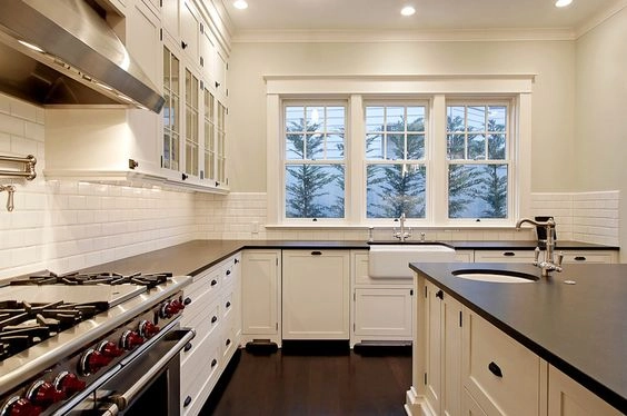
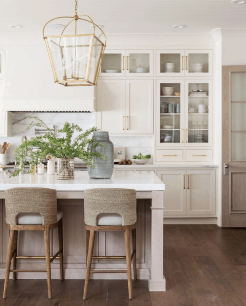
Kitchens: Swiss Coffee often makes more sense than Ballet White in kitchens because the higher LRV keeps the room brighter around cabinets and counters. It pairs well with warm wood islands, honed marble, soapstone, unlacquered brass, and creamy tile. Be careful with blue-white quartz or very cool gray counters, since those can make Swiss Coffee look dingy by comparison.
Lighting
Ballet White
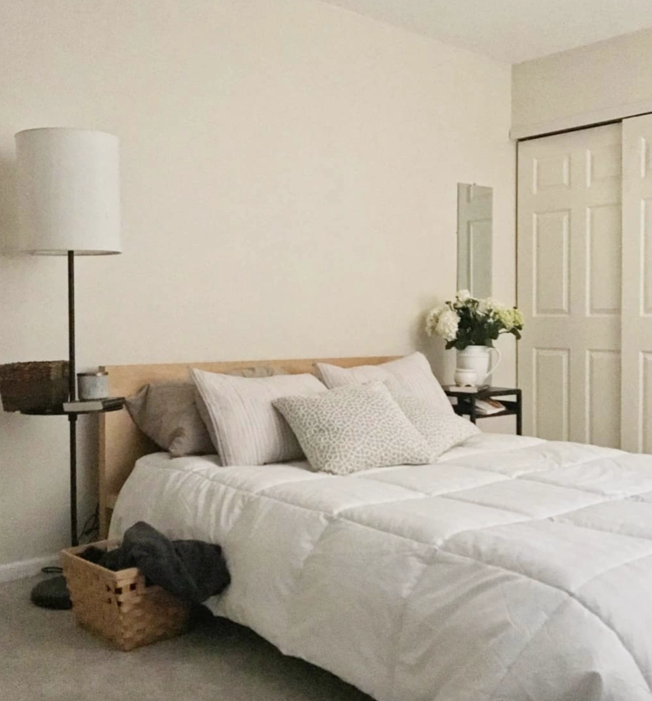
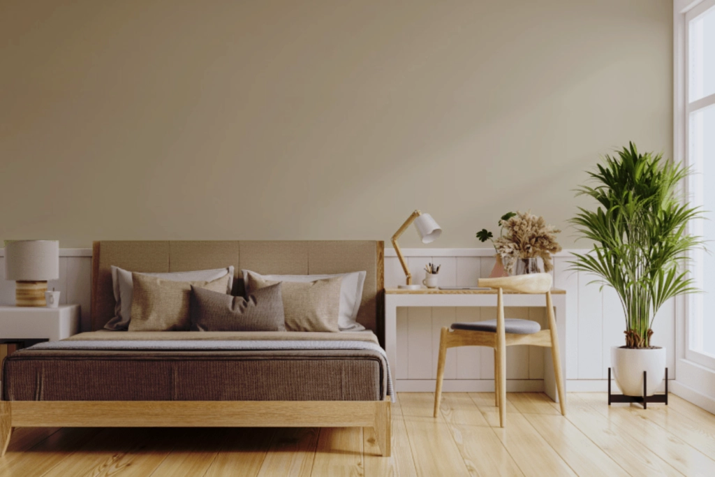
Ballet White has a Light Reflectance Value (LRV) of 71.97, which means it absorbs more light than Swiss Coffee. That lower LRV gives it more presence on the wall.
In south-facing light, Ballet White can look creamy and calm without washing out. In north-facing rooms, it can lean more greige, which is useful if you want softness but not much yellow. Under warm bulbs around 2700K, expect the creaminess to show more.
Swiss Coffee
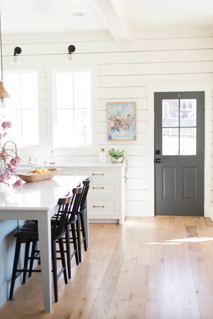
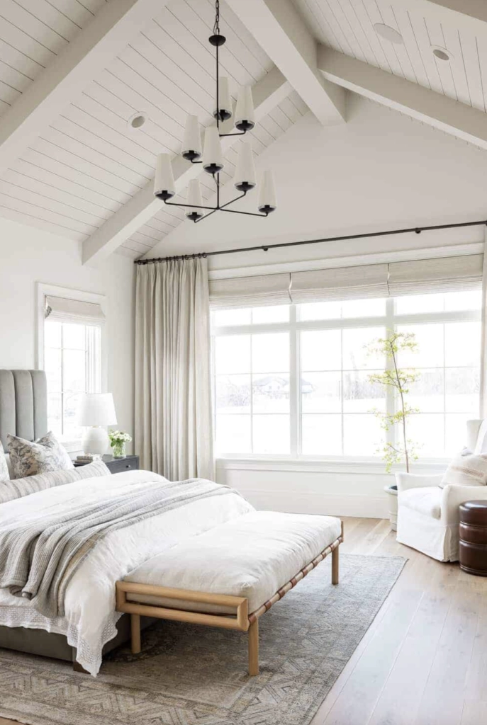
Swiss Coffee has an LRV of 81.91 and reflects more light than Ballet White, so it usually feels brighter and more open. It can look close to white in strong morning or afternoon sunlight.
In shaded rooms, Swiss Coffee's warmth becomes easier to see. That can be helpful when plain white feels cold, but it can also look too creamy beside cool white trim, blue-gray cabinets, or icy stone.
Matching Colors & Decor
The right choice depends on the fixed finishes first: trim, floors, counters, tile, fireplace stone, and large upholstery. Paint is easier to change than all of those, so let those materials lead.
Ballet White
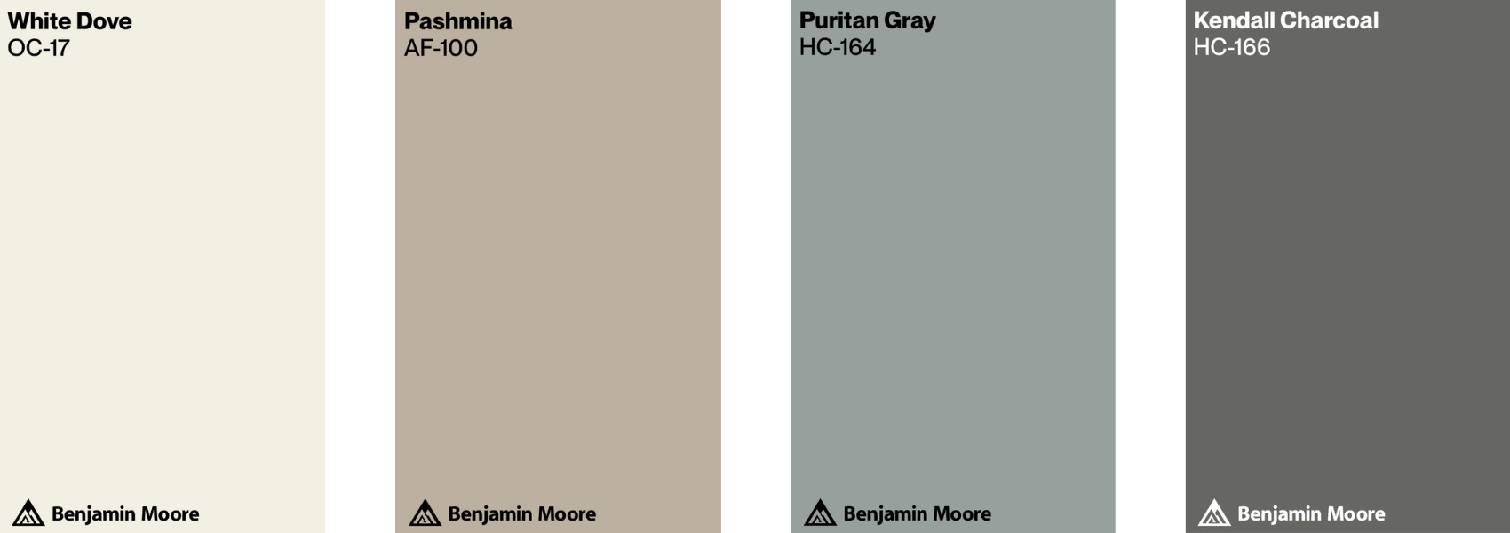
Matching Colors: Ballet White pairs well with soft creams, earthy tones, and muted pastels because it already has warmth and a greige note. Try it with mushroom, taupe, muted clay, dusty blue, sage, warm cream, and gentle charcoal accents.
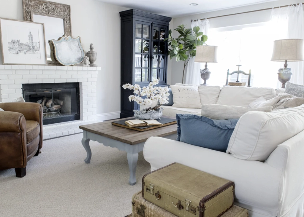
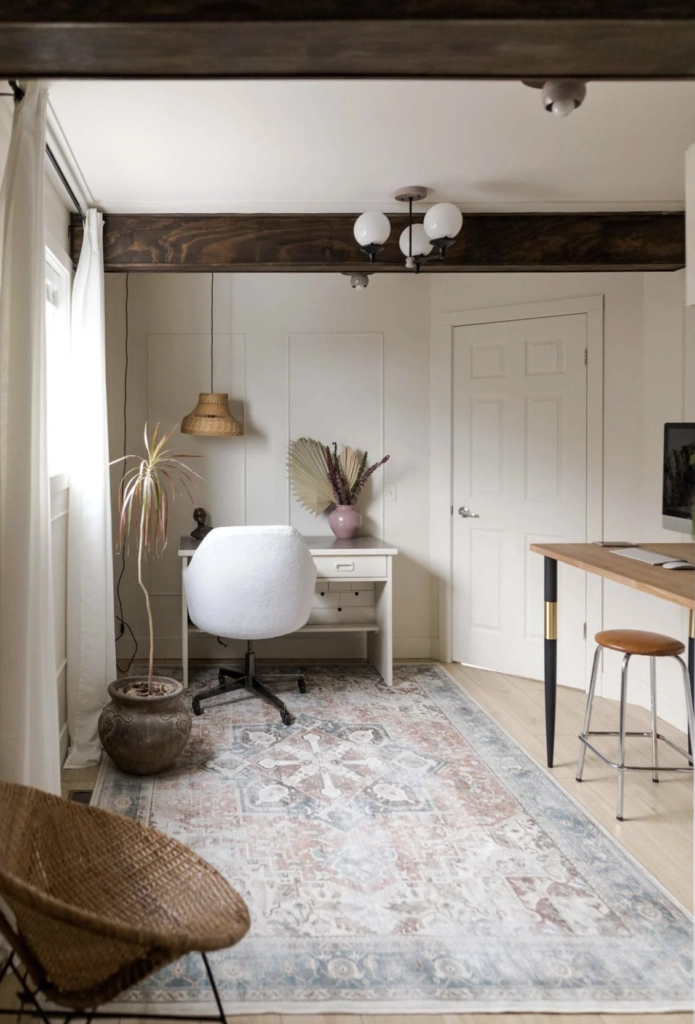
Timeless Furniture: Ballet White is a natural partner for traditional and antique furniture because it does not make stained wood look orange. Roll-top desks, carved coffee tables, walnut case pieces, and darker frames tend to sit comfortably against it.
Comforting Textiles: Use Ballet White with textured curtains, wool rugs, quilted throws, and nubby linen when you want layers to feel collected rather than high contrast. It is less successful with very cool, optic-white fabrics, which can make the wall color look slightly muddy.
Swiss Coffee

Matching Colors: Swiss Coffee works with soft greens, warm browns, muted golds, natural fiber, and plant-heavy rooms. It also looks good with warm black, aged brass, camel leather, rattan, and medium wood tones.
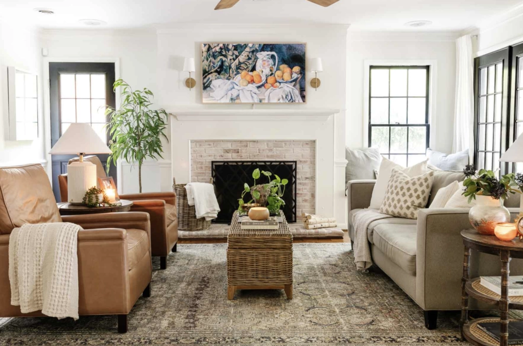
Wooden Furniture: Swiss Coffee gives wood furniture a clean background without the chill of a stark white. Oak, pine, and teak usually look warm against it, especially when the room has natural light and other creamy finishes.
Earthy Decor: Cork, linen, terracotta, baskets, and handmade ceramics all make sense with Swiss Coffee. Because the color is light, those earthy pieces keep the room grounded instead of letting the walls feel plain.
Which Should You Choose?
Choose Ballet White if you want a warmer neutral with more depth. Choose Swiss Coffee if you want a brighter creamy white.
If you are comparing them on sample boards, put each color next to your trim, flooring, and largest fabric or counter sample. Look at them in the morning, afternoon, and after dark.
For a Softer, More Muted Room: Ballet White
With its lower LRV of 71.97, Ballet White absorbs more light and feels more grounded. It is the better choice when your room has wood, beige stone, warm carpet, or furniture that needs a quieter wall color.
Use it for bedrooms, living rooms, dining rooms, and older homes where a crisp white would feel disconnected from the existing finishes.
For a Brighter, Creamier White: Swiss Coffee
Swiss Coffee has a higher LRV of 81.91, so it bounces back more light and feels closer to white. It is the better choice when the room needs lift but you do not want a sharp gallery white.
Use it in kitchens, hallways, open-concept living spaces, and rooms with warm finishes that can support its creamy undertone. Avoid it beside cool white trim unless you have sampled the pairing and like the contrast.

I'm Elizabeth, your go-to guide for all things paint and design! My days are filled with color swatches and innovative room makeovers. When I'm not painting the town - literally - I'm soaking up inspiration from my travels. This blog is my way of sharing my passion and making the world a more vibrant place, one color palette at a time.