Pale Oak vs Swiss Coffee
Choosing between Pale Oak and Swiss Coffee usually comes down to light. Pale Oak is a light greige with more body. Swiss Coffee is a warm off-white with more reflectance.
Both are Benjamin Moore favorites, but they solve different problems. Pale Oak and Swiss Coffee can both look soft and warm, but Pale Oak gives you a quieter wall color while Swiss Coffee gives you a brighter white backdrop.
Read this as a room-by-room decision guide. The better choice depends on your exposure, trim, flooring, and how white you actually want the walls to read.
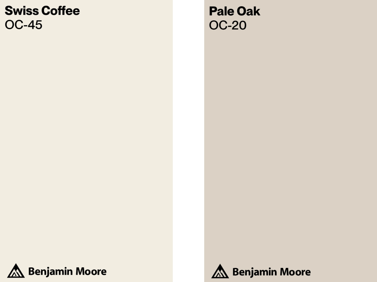
Pale Oak vs Swiss Coffee at a Glance
Pale Oak is the better choice when you want the walls to register as a color, not as white. With an LRV of 68.64, it has enough depth to soften glare, but it is still light enough for bedrooms, offices, and living rooms that need an easy neutral.
I use it most often in rooms where bright white feels too sharp. It is especially helpful with wood floors, linen fabrics, black accents, and older trim that is not a crisp factory white.
Swiss Coffee is the better choice when you want a warm white. Its higher LRV of 81.91 reflects much more light than Pale Oak, so the room will feel brighter and the walls will read closer to white.
I like it in kitchens and living rooms where a clean white would feel cold. It can also work on cabinets, especially when the counters, backsplash, and flooring have warm undertones.
| Pale Oak | Swiss Coffee | |
|---|---|---|
| Color Code | OC-20 (858) | OC-45 |
| Light Reflectance (LRV) | 68.64 | 81.91 |
| Color Family | Greige | Off-White |
| Undertones | Beige, Gray | Beige, Yellow |
| Best For | Bedrooms, Offices | Kitchens, Living Rooms |
| Versatility | High | High |
Best Settings for Each Color
Pale Oak
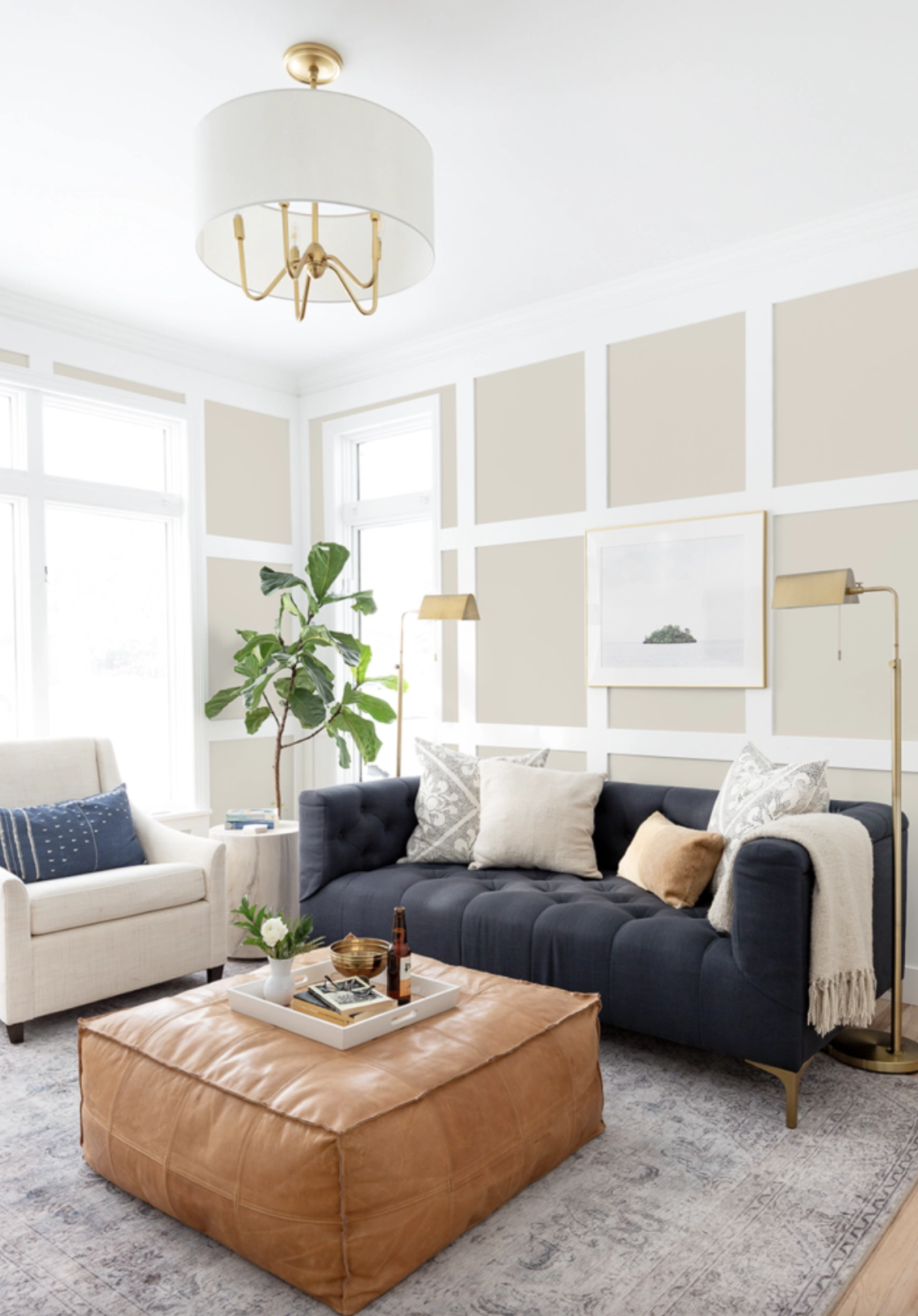
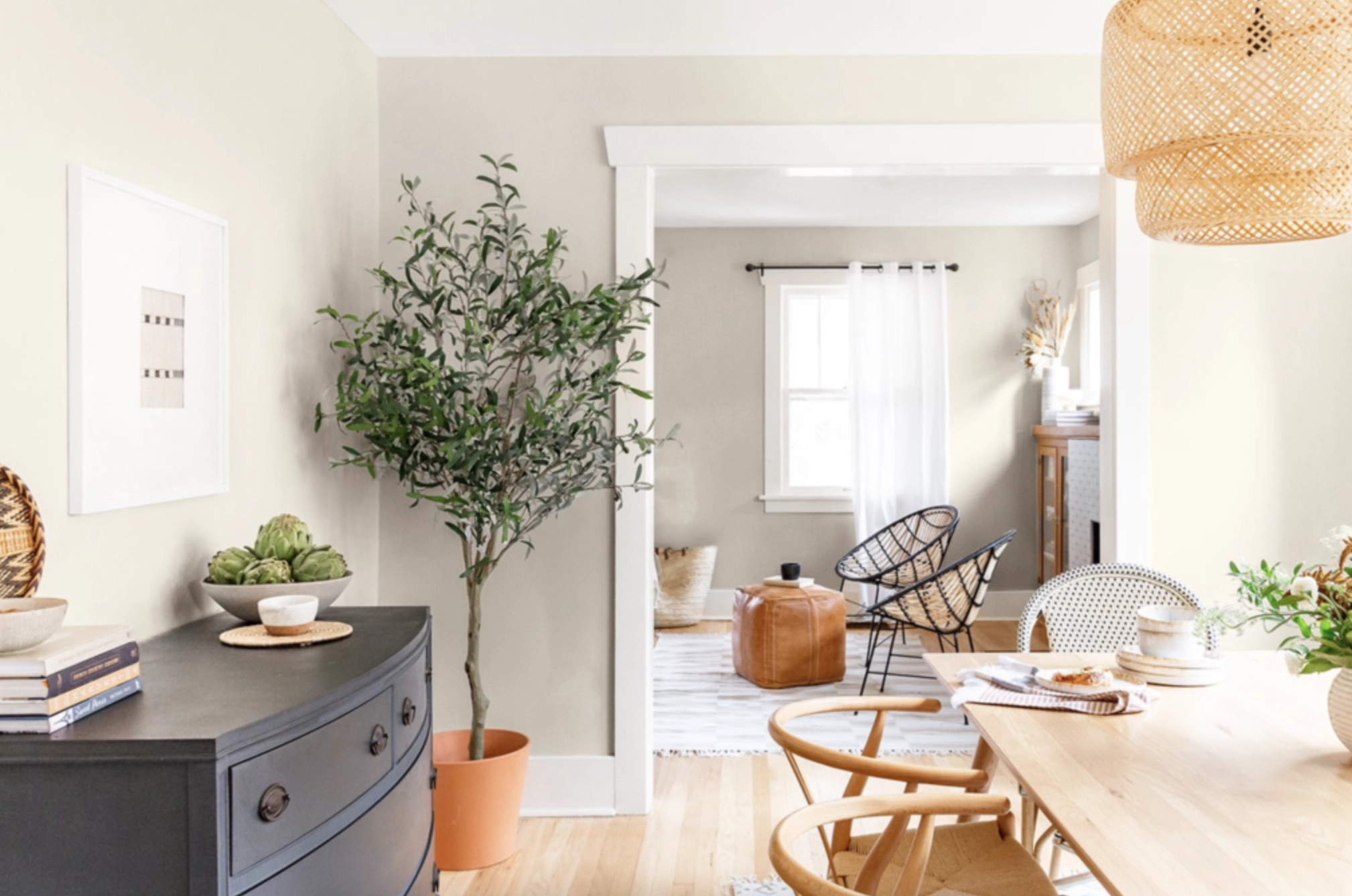
Living Rooms: Pale Oak is strongest in living rooms where you want softness without going beige. Its beige and gray undertones help bridge warm wood floors, taupe upholstery, stone fireplaces, and black window frames.
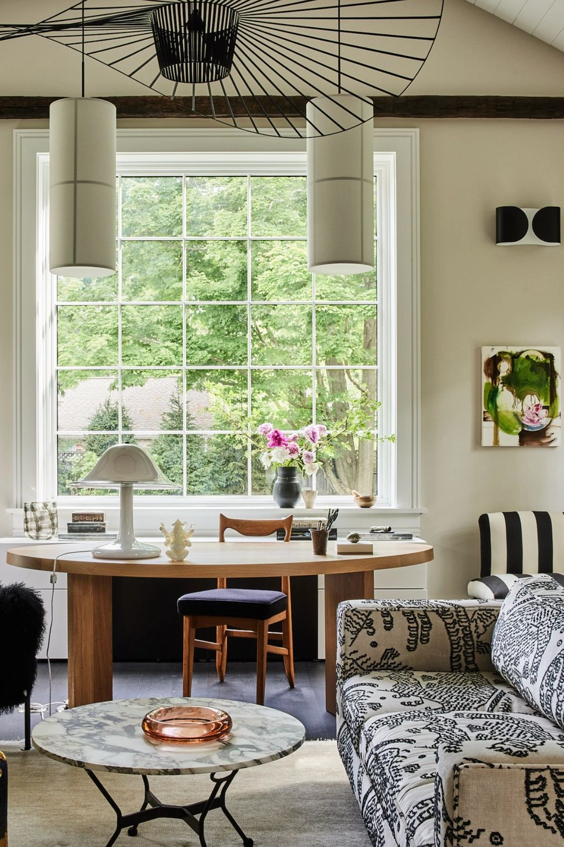
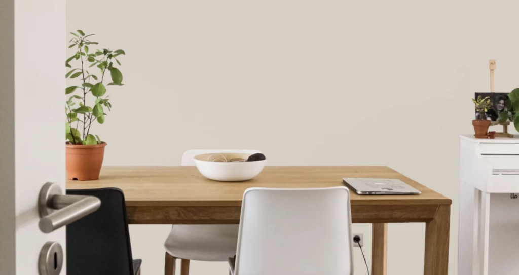
Home Offices: Pale Oak works well in a home office because it has enough pigment to keep the walls from looking blank on video calls. It is a practical choice when you want a calm backdrop that still has warmth.
Swiss Coffee
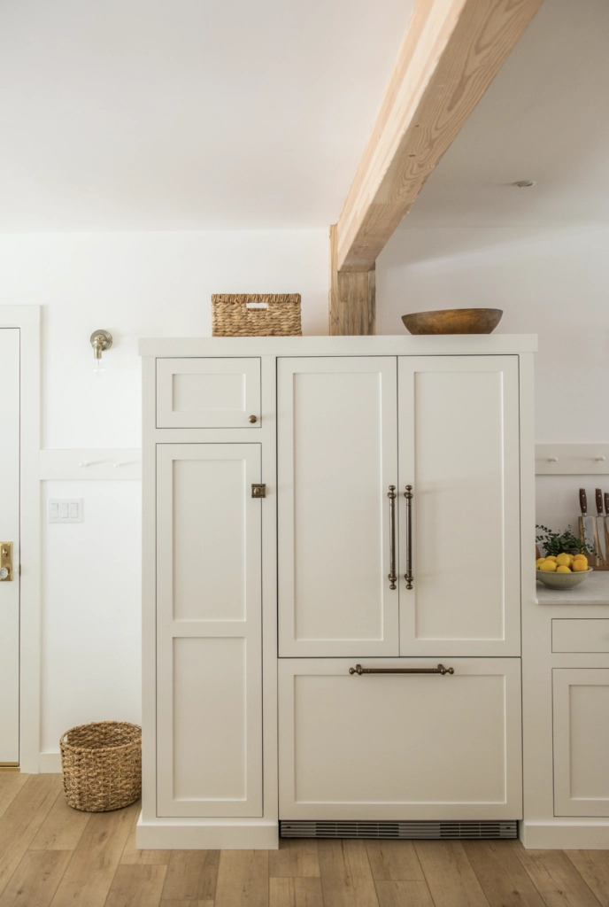
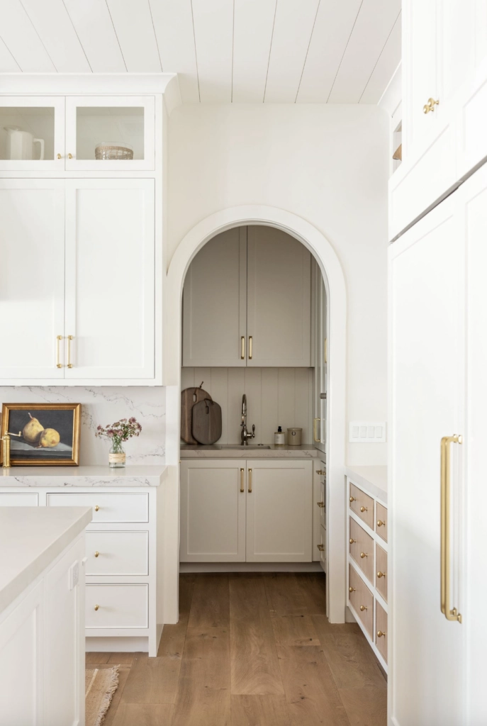
Kitchens: Swiss Coffee works in kitchens when the fixed finishes lean warm. It can make white tile feel less sterile next to wood cabinets, marble counters, brass hardware, or creamy stone. Because the LRV is 81.91, it keeps the room bright without the hard edge of a cooler white.
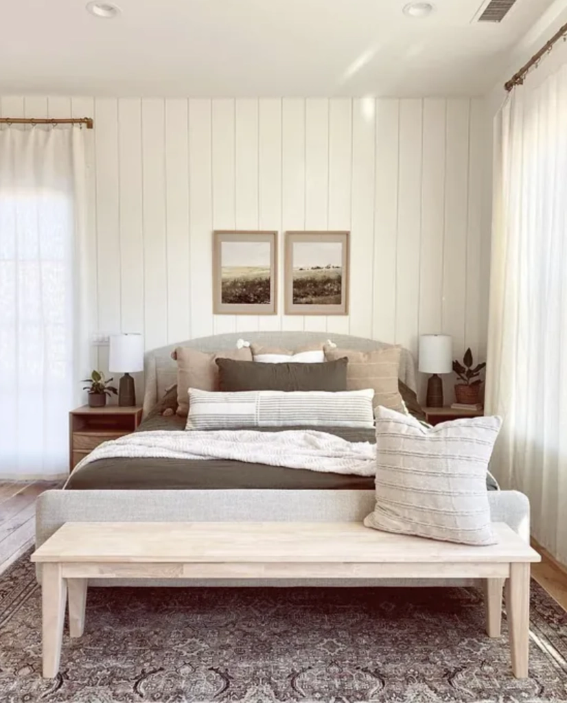
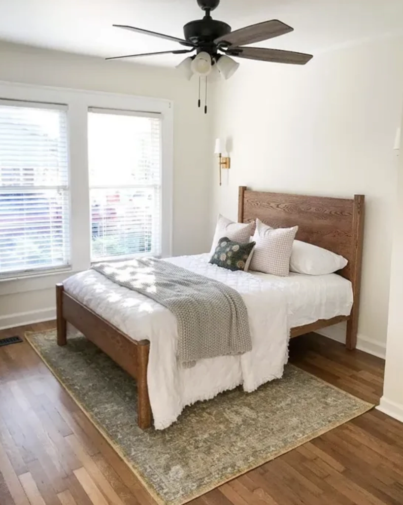
Bedrooms: In bedrooms, Swiss Coffee is best when you want a warm white envelope rather than a visible beige or greige wall color. It pairs nicely with white bedding, natural wood, warm metal finishes, and muted color in pillows or art.
Lighting
Pale Oak
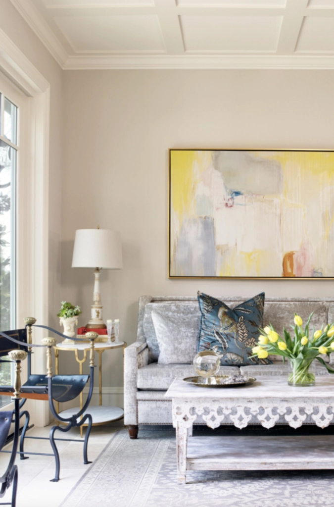
Natural Light: In natural daylight, Pale Oak shows its greige character. In south-facing rooms it can look soft and balanced. In north-facing rooms, it may read cooler and a little more gray, which is useful if your floors or furniture already have strong yellow undertones.
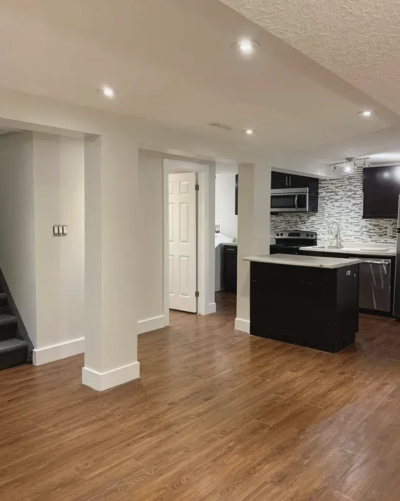
Artificial Light: Pale Oak changes noticeably under bulbs. Warm bulbs around 2700K can pull out more beige, while cooler bulbs around 4000K can make it look grayer. If the room relies on lamps most of the day, test it at night before committing.
Swiss Coffee
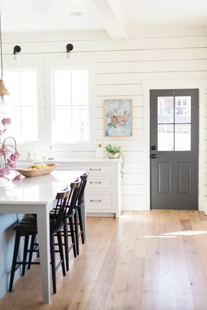
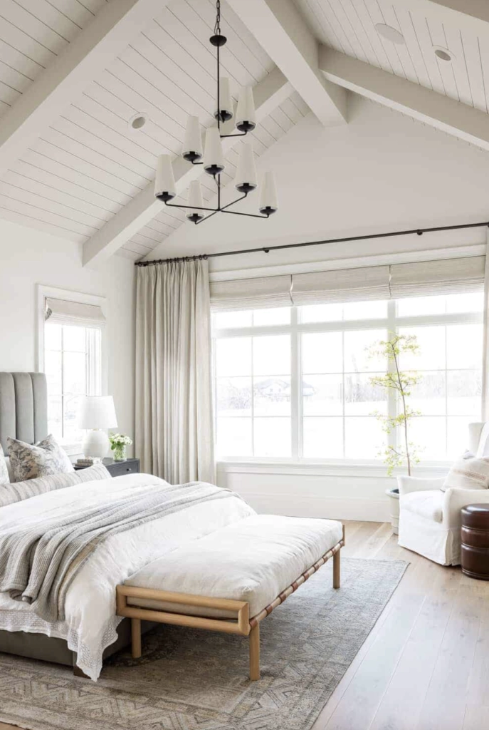
Natural Light: In strong natural light, Swiss Coffee reads like a warm white, not a greige. Its high LRV helps bounce light around the room, which is helpful in small kitchens, hallways, and living rooms where you want more brightness without using a stark white.
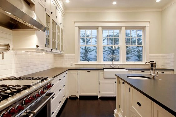
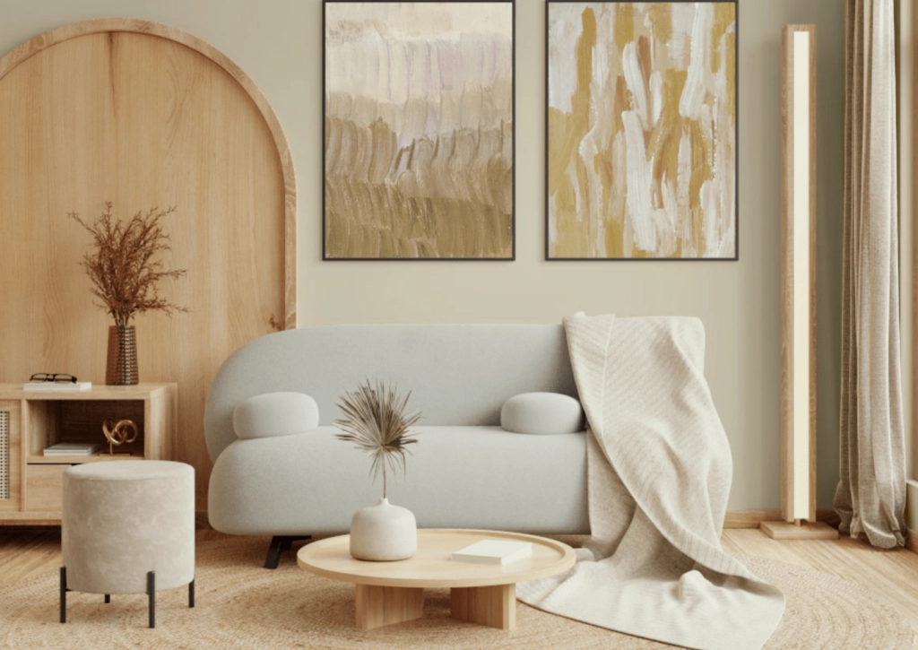
Artificial Light: Swiss Coffee can go creamier under warm bulbs because of its beige and yellow undertones. If your lamps use 2700K bulbs and your floors are honey oak, sample carefully. The combination can become more yellow than expected.
Matching Colors & Decor
Pale Oak
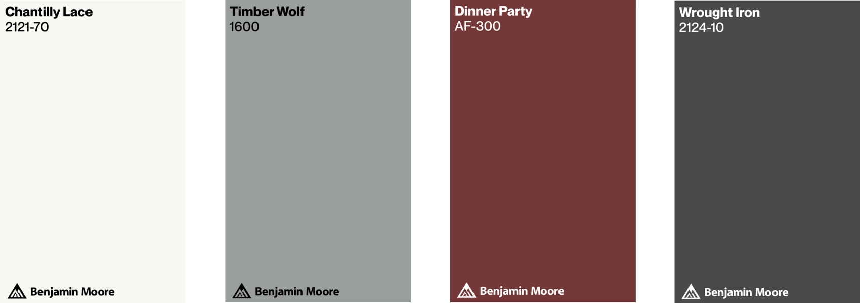
Matching Colors: Pale Oak works well with soft blues, light pinks, and gentle grays. Bring those colors in through art, pillows, a rug, or window treatments so the room feels layered instead of flat.
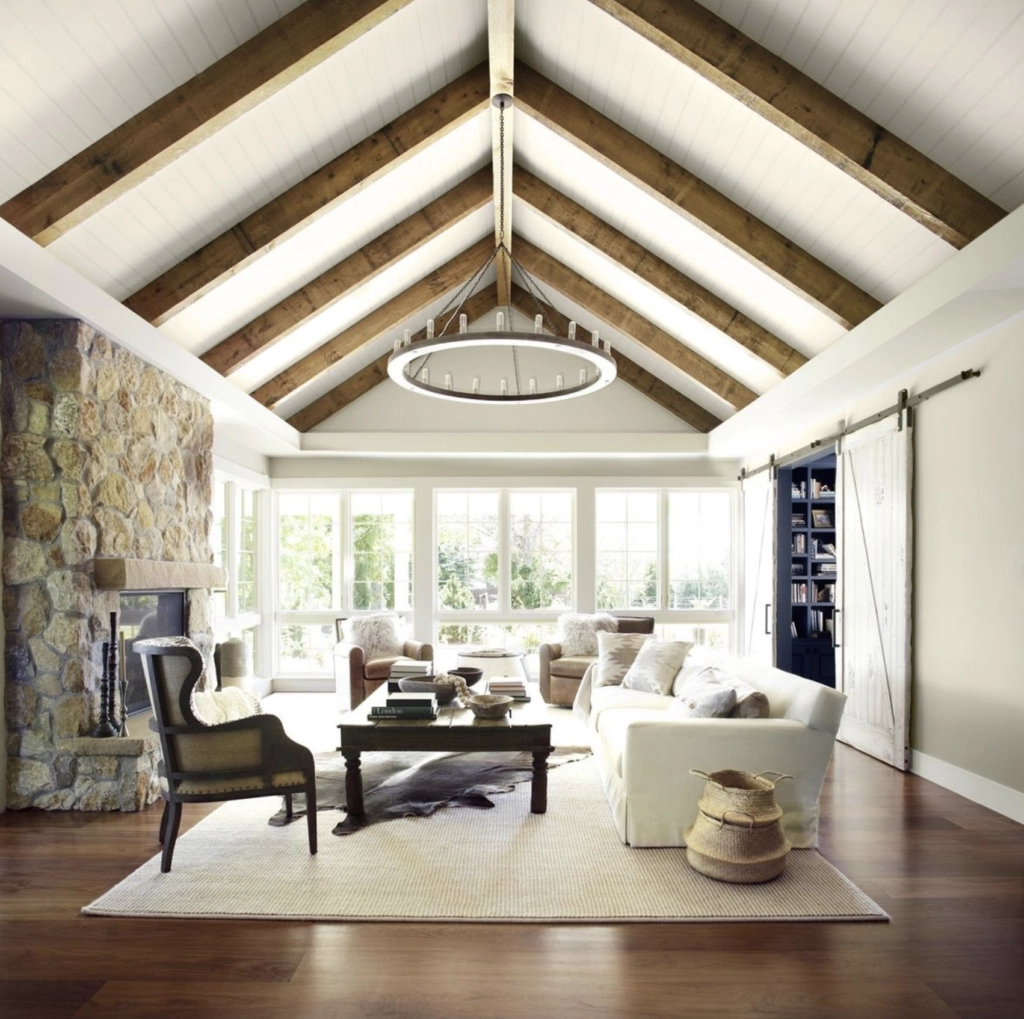
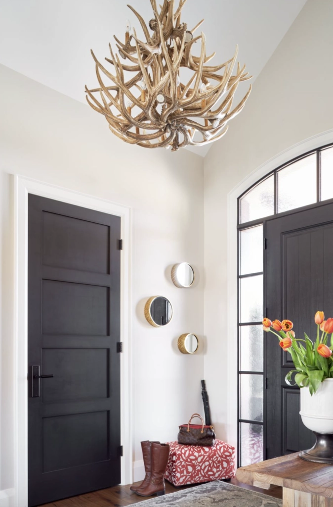
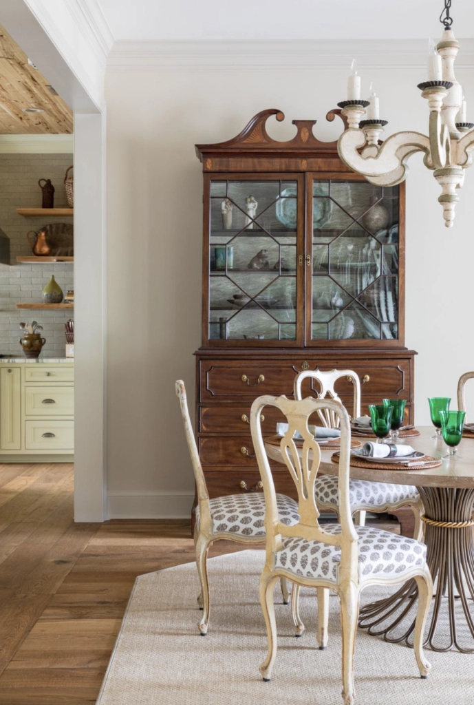
- Antique Wooden Pieces: If you have a roll-top desk, mahogany dining table, or older oak trim, Pale Oak usually plays nicely with those warmer wood tones. It gives the room contrast without making the wood look orange.
- Texture Play: Boucle, linen, wool, velvet, and woven shades all show up well against Pale Oak because the wall color has enough depth to create separation.
Swiss Coffee

Colors from Nature: Swiss Coffee is easy to pair with greens, browns, and soft grays. Plants, woven rugs, wood furniture, and stoneware all work because the paint has warmth built in.
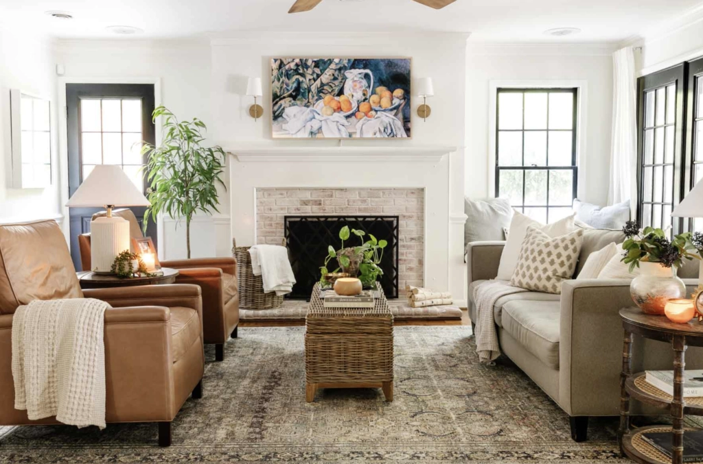
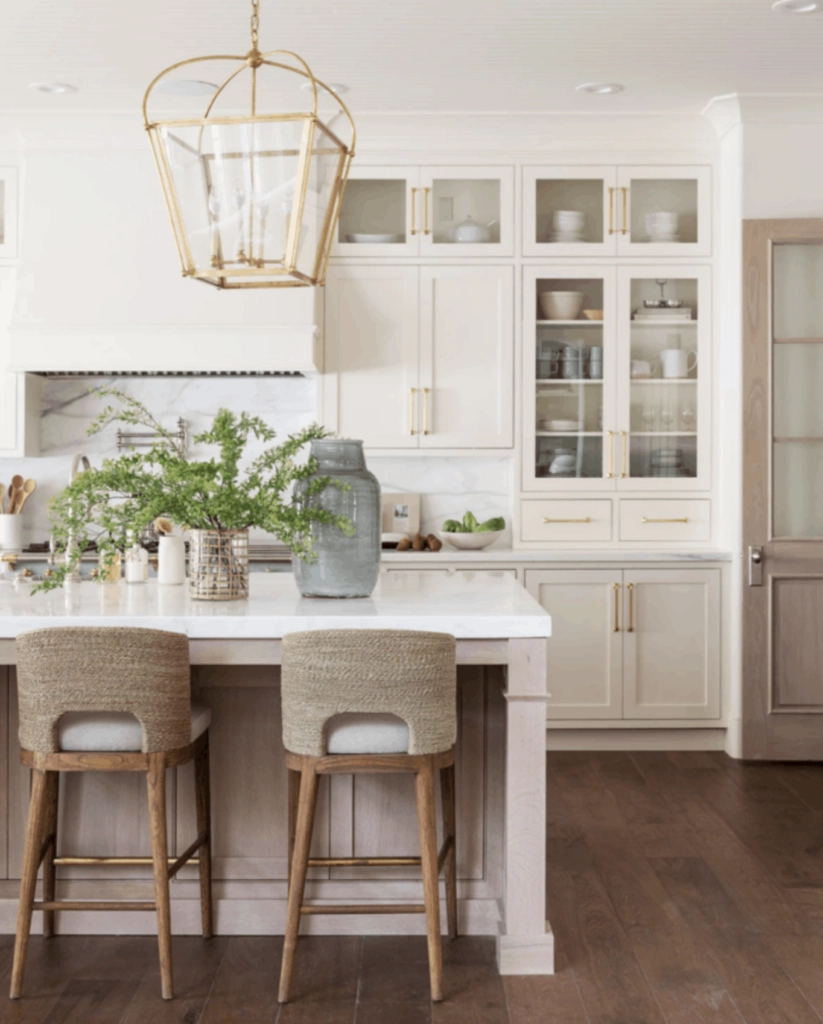
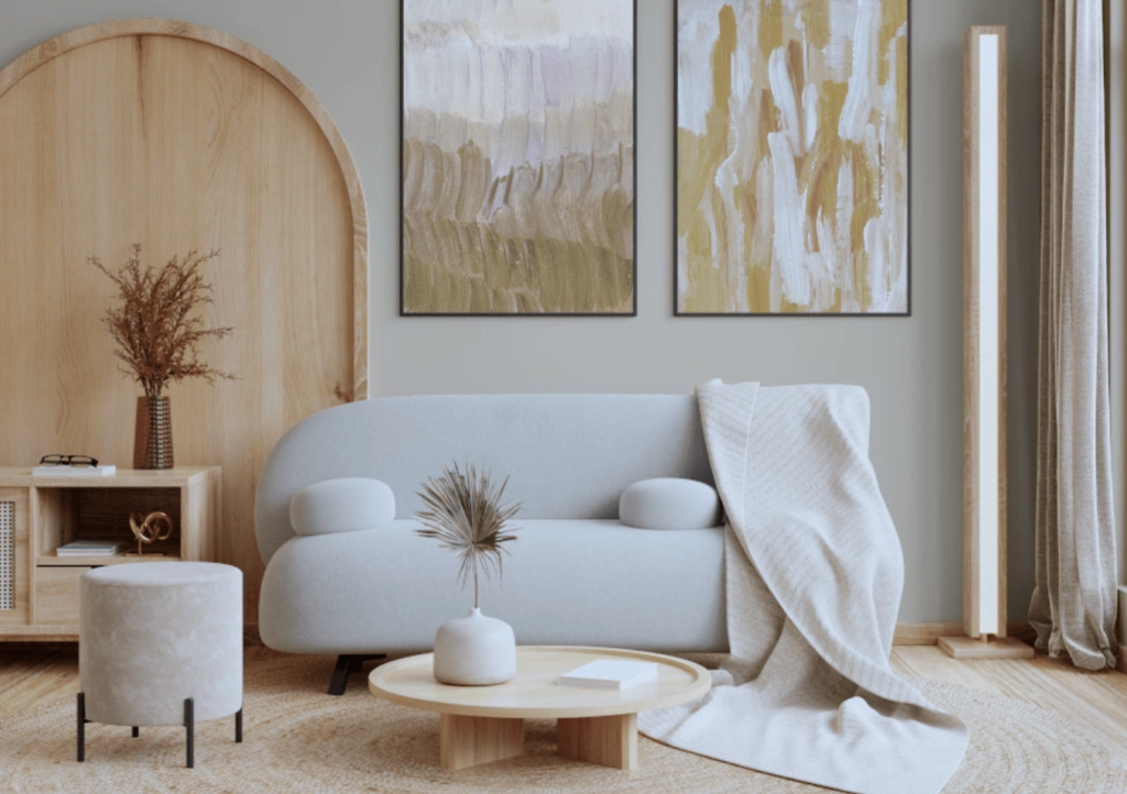
- Modern Art Pieces: If you own contemporary art, geometric sculpture, or abstract paintings, Swiss Coffee gives the work a quiet warm-white background. The art gets attention without fighting a busy wall color.
- Earthy Elements: Swiss Coffee suits woven baskets, terracotta pots, and macrame wall hangings because those pieces already share its warm undertone family.
Which Should You Choose?
Choose Pale Oak if your room needs a soft neutral with visible depth. Choose Swiss Coffee if your room needs a warm white that reflects more light.
The difference is not subtle once the paint is on four walls. Pale Oak will look more like a light greige. Swiss Coffee will look more like a creamy off-white.
When to Choose Pale Oak
Pick Pale Oak for bedrooms, offices, and living rooms where bright white feels too exposed. It is usually the better call with mixed furnishings, medium wood floors, black accents, or trim that is slightly creamy rather than crisp white.
When to Choose Swiss Coffee
Pick Swiss Coffee for kitchens, main living areas, cabinets, and rooms where you want warmth but still want the walls to read white. It is usually the better call when the room is dark, the ceiling feels low, or the finishes already lean warm and creamy.
My quick rule: if you are comparing these on a sample board and thinking, "Swiss Coffee is too white," use Pale Oak. If you are thinking, "Pale Oak looks a little dingy," use Swiss Coffee.

I'm Elizabeth, your go-to guide for all things paint and design! My days are filled with color swatches and innovative room makeovers. When I'm not painting the town - literally - I'm soaking up inspiration from my travels. This blog is my way of sharing my passion and making the world a more vibrant place, one color palette at a time.