BM White Dove vs SW Alabaster
If your room is dark, cool, or changeable through the day, Sherwin-Williams Alabaster is usually the easier white to live with. If your room has traditional trim, warm wood, or needs a softer classic white, Benjamin Moore White Dove usually looks better.
These two paints get compared constantly because they sit in the same useful range. White Dove has an LRV of 83.16. Alabaster has an LRV of 82. On paper, that looks almost identical. On walls, the undertones make the decision.
I would not choose between them from a tiny fan deck chip. Put both on a sample board, move them around the room, and look at them morning, afternoon, and after the lamps are on. The winner usually becomes obvious once you see them beside your flooring, counters, and trim.
Undertones & Character
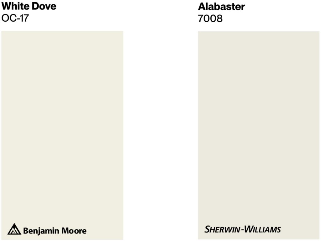
Benjamin Moore's White Dove (OC-17) is a warm white with a soft greige undertone and 83.16 LRV. I reach for it when a room needs warmth without going visibly cream, especially in traditional interiors, rooms with millwork, and north-facing spaces.
Sherwin-Williams Alabaster (SW 7008) is another warm white, with a yellow-beige undertone softened by a hint of gray and an LRV of 82. It is the better pick for many darker rooms because it stays steady instead of swinging yellow, gray, or dingy.
Both are off-whites, not pure whites. In an evenly lit room with simple finishes, either one can work. The tie breaks when you bring in your fixed elements, such as tile, counters, floors, brick, or existing trim.
In the comparison photo above, White Dove reads a little creamier. Alabaster looks slightly cleaner and more neutral. That small difference is exactly what shows up on full walls.
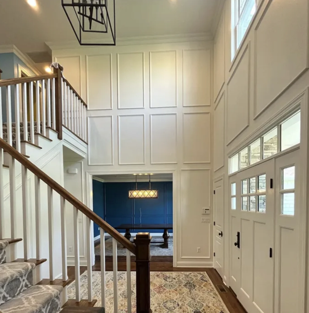
Side by side, White Dove has more movement.
White Dove's greige undertone can become more visible in certain light. You may catch a slight yellow cast during golden hour, but it usually stays soft rather than buttery.
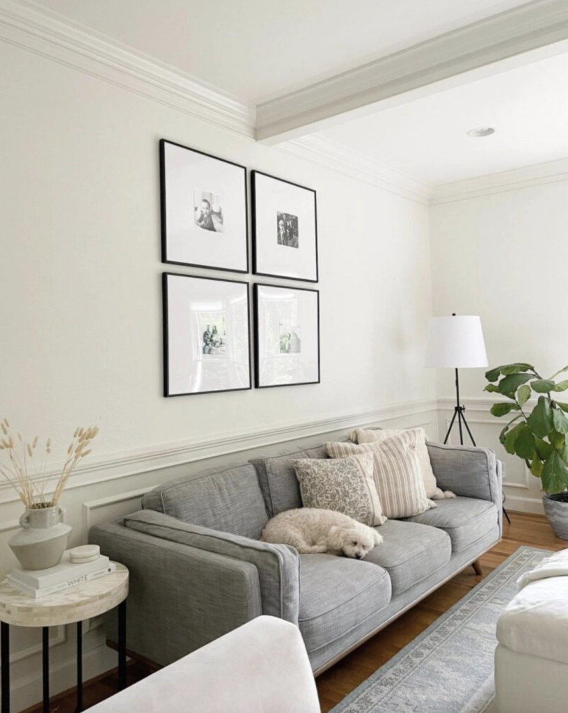
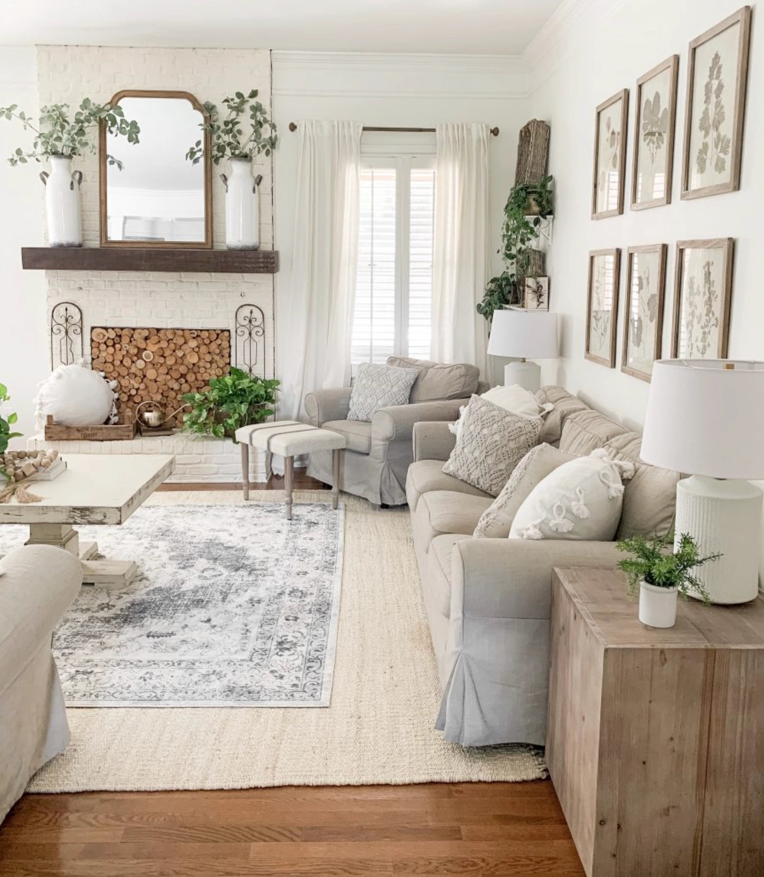
Alabaster has the steadier undertone. Many warm whites shift hard when the light changes. Alabaster tends to hold its white read.
Their high LRV numbers mean both colors reflect a lot of light. They can make a room feel brighter, but they will not fix a room with no daylight, heavy shadows, or the wrong bulb temperature.
The key difference: White Dove shows its warm side more in south-facing rooms. Alabaster stays more neutral in the same conditions.
Best Applications
Both White Dove and Alabaster are flexible whites, but I do not use them for the same problems. White Dove is better when the room needs softness. Alabaster is better when the room needs steadiness.
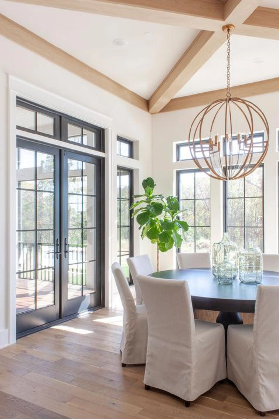
White Dove by Benjamin Moore
source
I like White Dove for larger open areas when the finishes already lean classic or warm. It connects living rooms, dining rooms, and halls without making the house feel newly primed.
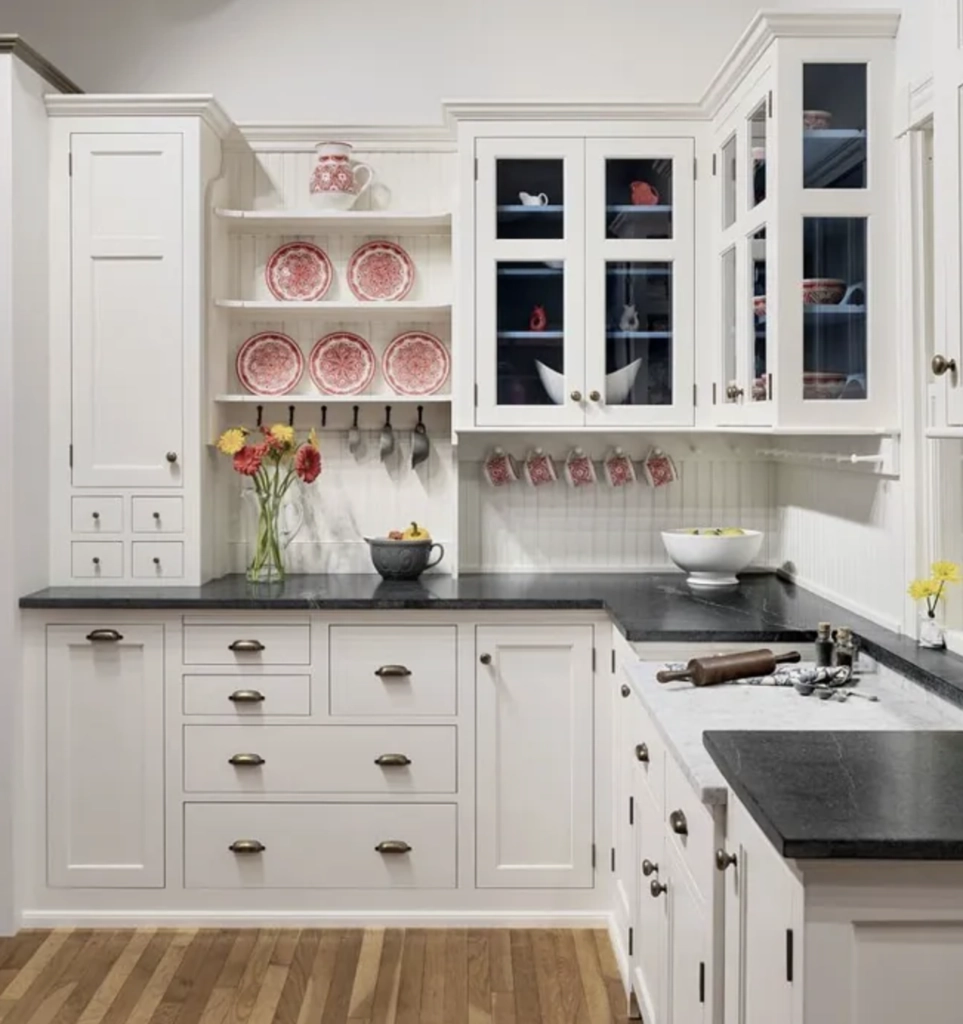
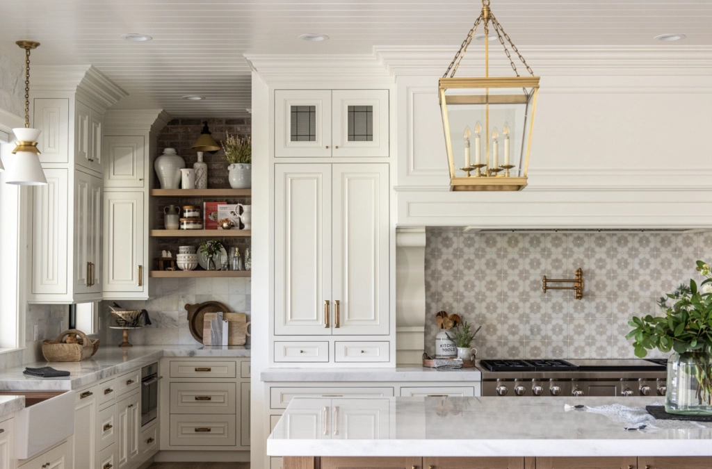
It is a strong choice for kitchen cabinets when the counters, backsplash, or floor have warmth in them. You get a softer cabinet white without tipping the whole kitchen into cream.
The greige undertone adds softness in practical spaces where pure white can look flat or too sharp. The 83.16 LRV also helps cabinets and trim reflect plenty of light.
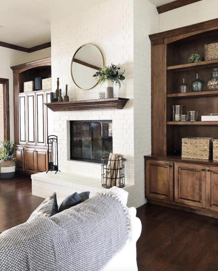
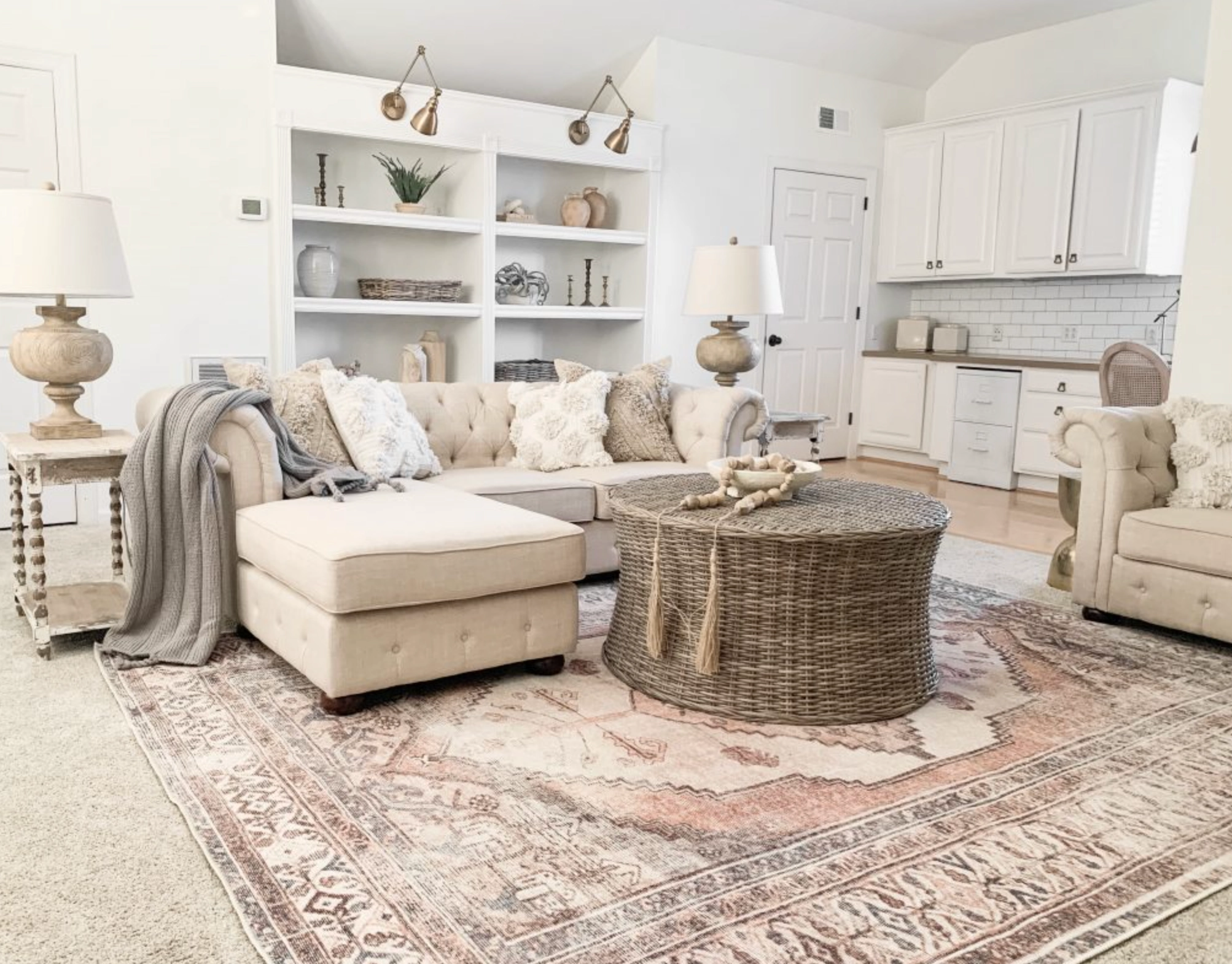
Alabaster is the more stable option. It is less likely to suddenly look yellow or gray in tricky lighting.
It works especially well in darker spaces, including north-facing bedrooms, hallways, and rooms with small windows. Its biggest strength is that it still reads white without feeling cold.
Lighting Impact
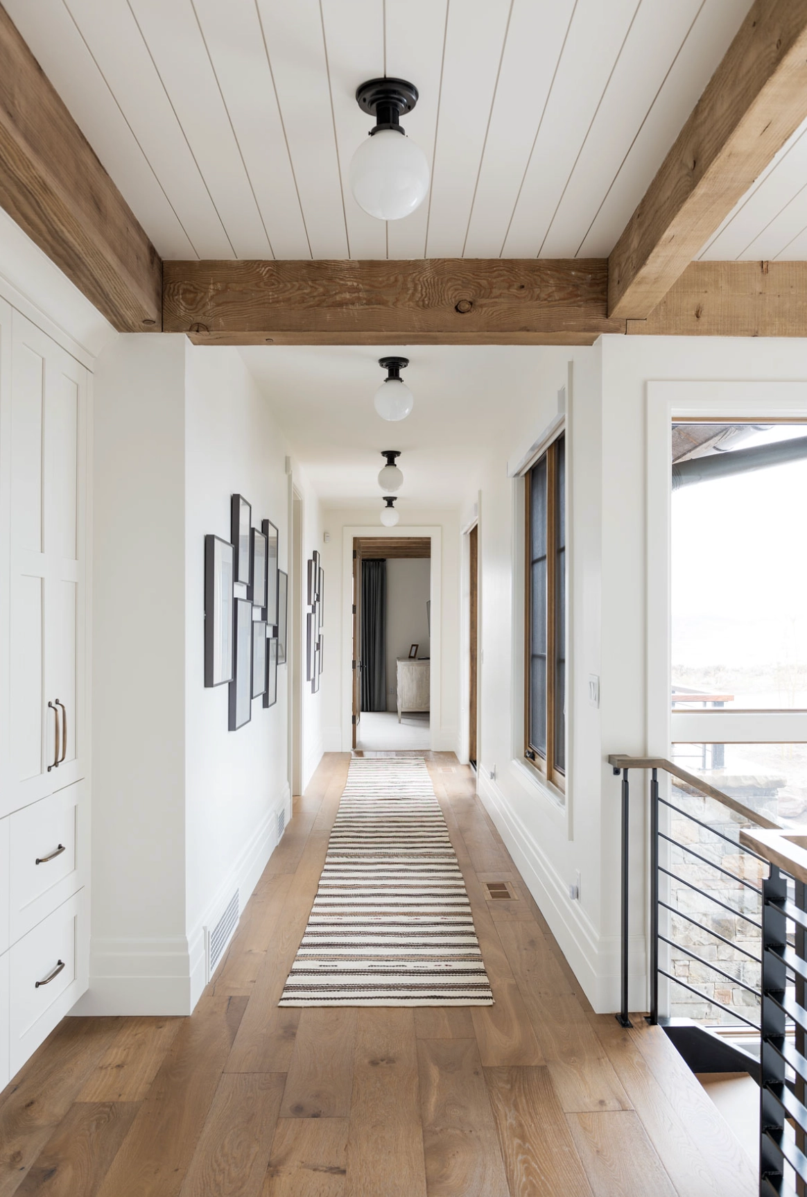
White Dove by Benjamin Moore
source
White Dove changes more with the light. That is the reason some clients love it and others reject it after sampling.
In north-facing rooms or on cloudy days, its warm undertone helps counter the cool light. I used it in a Portland home where sunlight was scarce, and it gave the room the warmth my client wanted without making the walls look beige.
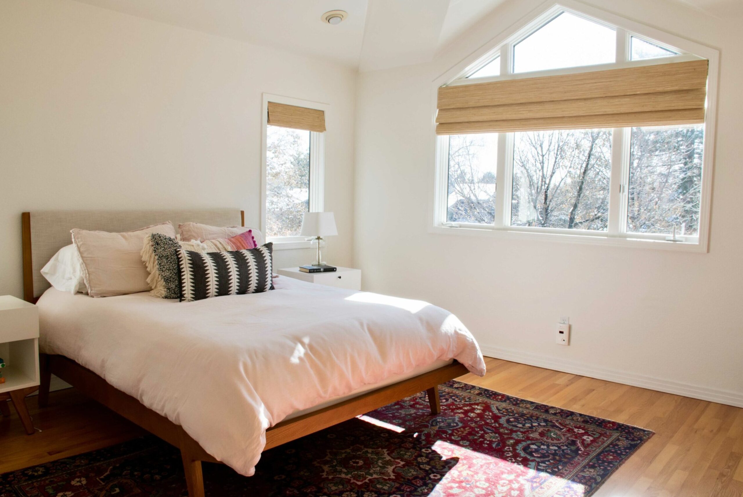
White Dove by Benjamin Moore
source
White Dove can surprise you in south-facing rooms. Late-day sun can pull out a subtle yellow cast.
That does not mean it turns harsh yellow. In the right room, it reads like warm evening light. In a room with yellow oak floors or creamy stone, though, it can become warmer than you planned.
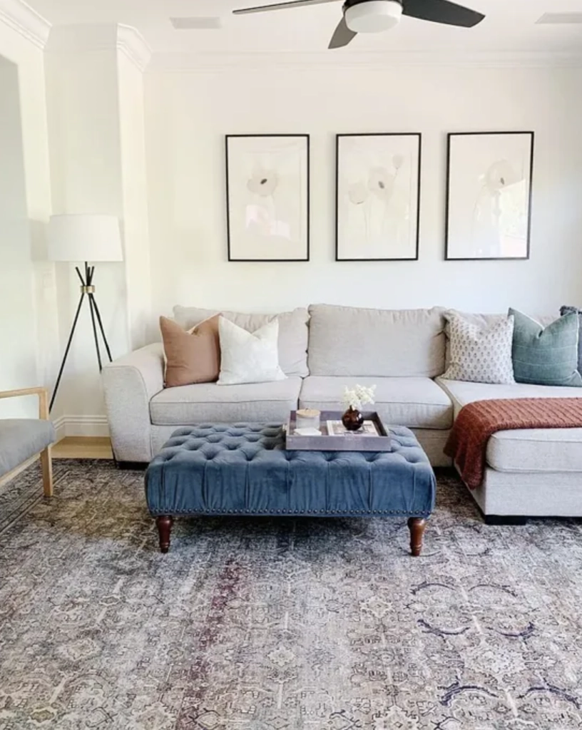
Alabaster by Sherwin-Williams
source
Alabaster is more predictable when the light changes. In north-facing rooms, it usually reads as a clean warm white. On gloomy days, it is less likely to turn muddy or gray.
In natural light, it stays clearly white without the hard look of a stark trim white.
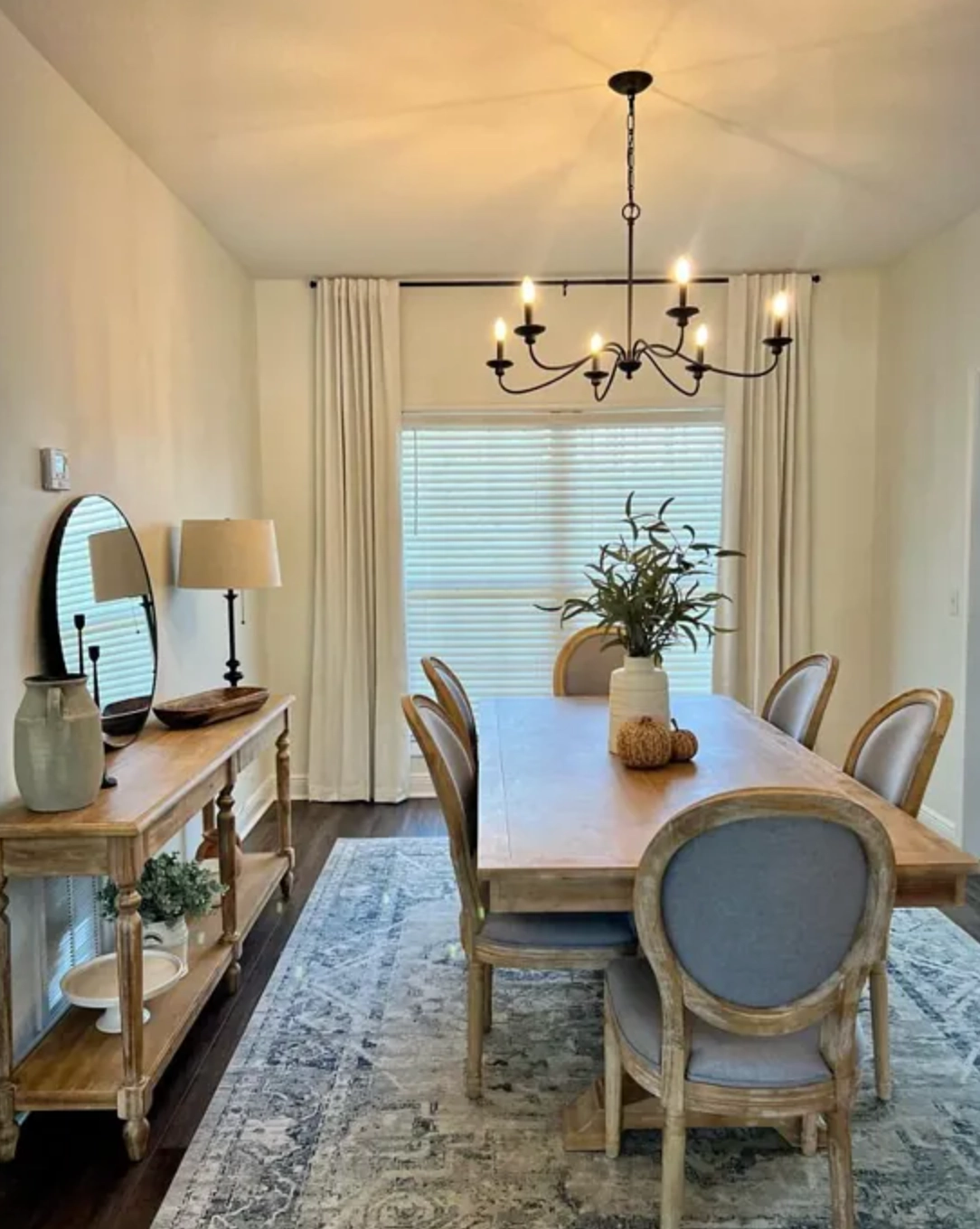
Alabaster by Sherwin-Williams
source
In the evening, Alabaster warms up under artificial light but usually avoids obvious yellow or cream.
Alabaster is the safer white for spaces with limited natural light. Its high LRV (82) bounces light around and helps rooms feel larger.
Even in shadowy areas, it keeps more brightness and clarity than many warm whites, which makes it useful for darker hallways and entryways.
Coordinating Colors
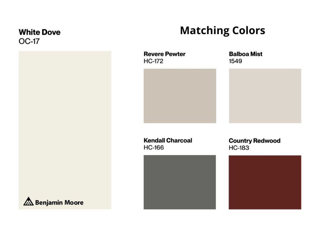
White Dove pairs especially well with deep grays. The contrast feels classic because the greige undertone keeps the white from looking too sharp against darker paint.
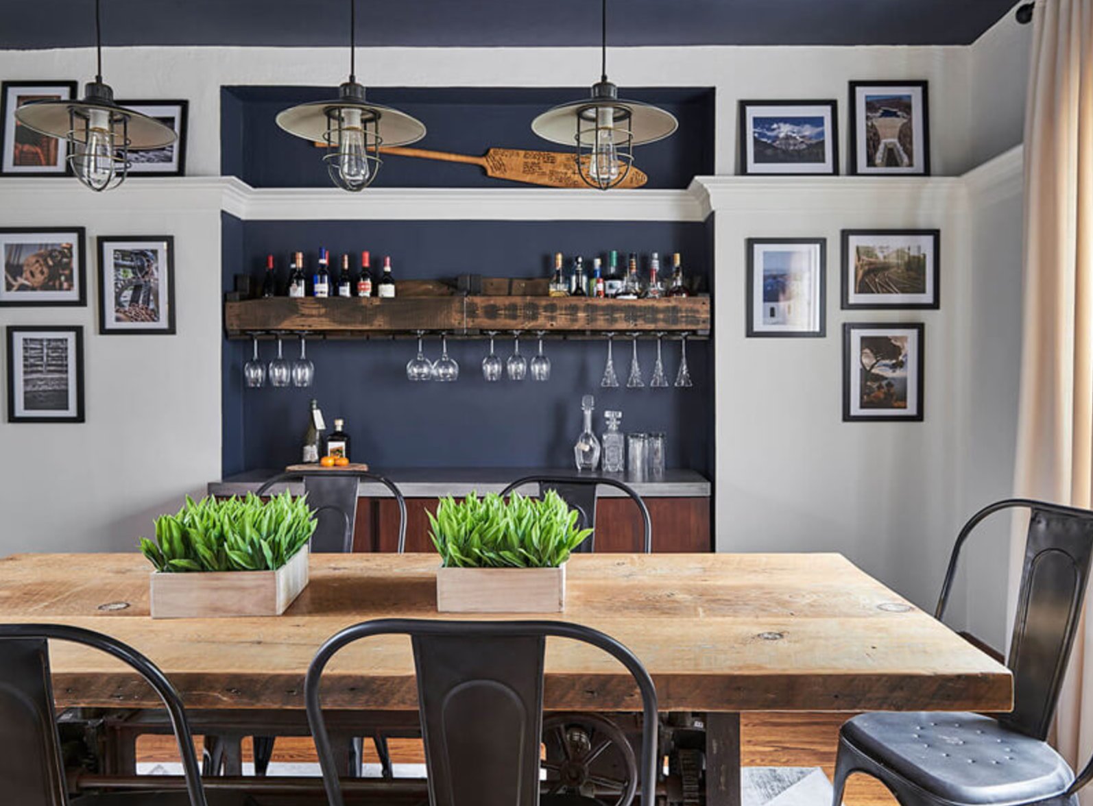
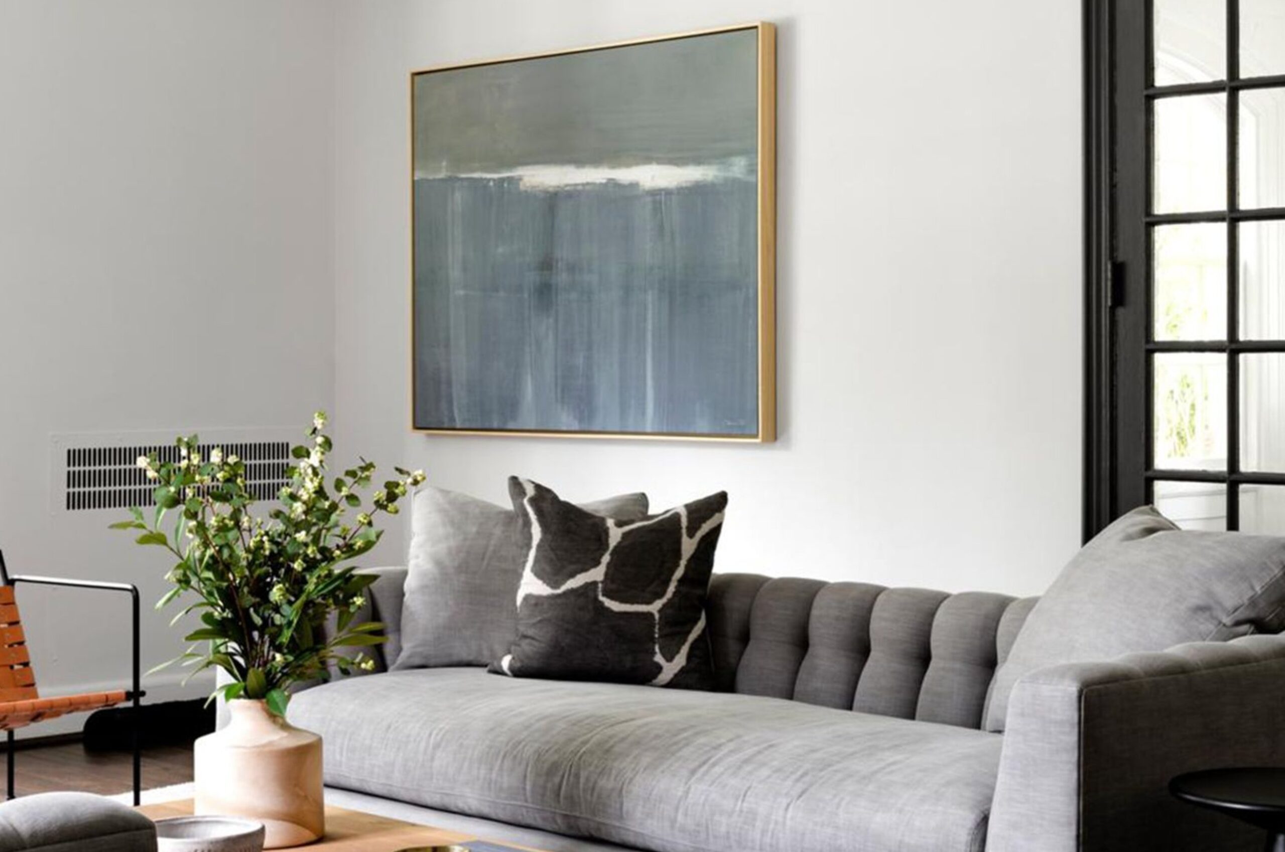
I also like it with medium greige tones on accent walls because the undertones are related. The room feels layered instead of chopped into separate colors.
While both colors work in modern and traditional spaces, White Dove has a slight edge in classical settings.

Alabaster works with several color families. Grays, from mid-tones to almost black, give it a clean foundation. Like White Dove, it handles dark gray accents well because the contrast adds depth without making the white look icy.
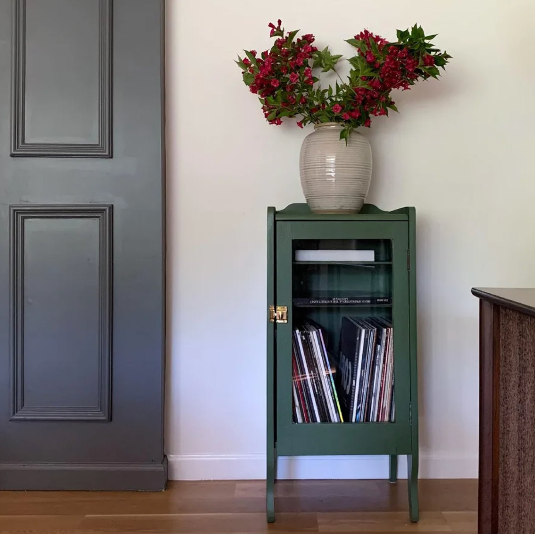
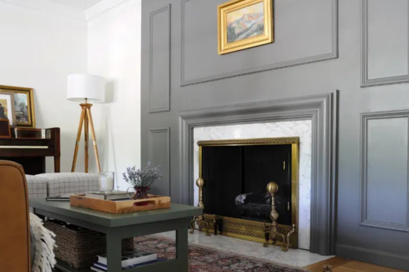
Earth tones also make sense with Alabaster's warm undertone. Browns, greens, and sandy hues keep it grounded, especially in homes with wood floors, woven textures, or stone.
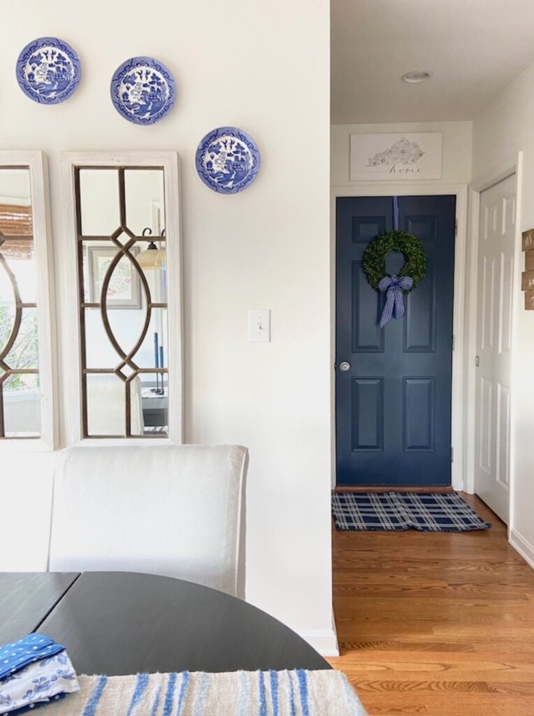
Alabaster by Sherwin-Williams
source
Blue pairings can work too, especially muted blues with gray undertones. Cleaner, brighter blues can make Alabaster look creamier by comparison.
Making Your Decision
Choose White Dove if your room needs a softer traditional white, your finishes are warm, or you want a little movement as the light changes. Choose Alabaster if your room is darker, your light is inconsistent, or you want the white to stay more neutral through the day.
Test both colors in your actual room before ordering gallons. A 12-by-12 inch sample board is enough to catch the big undertone shifts, and it is much easier than repainting later.
Benjamin Moore White Dove is my pick for classic interiors with moldings and panels, especially when you need to warm up cool northern light.
This shade changes through the day, so sample it if your room has strong afternoon sun, yellow-toned floors, or creamy stone.
Sherwin-Williams Alabaster is the safer bet when you want consistency. It handles low-light spaces well and works nicely when walls, trim, and ceilings are all painted the same color.
The short verdict: White Dove is warmer and more expressive. Alabaster is cleaner and steadier. If you are stuck between the two, let the room decide, choose White Dove for warmth and character, choose Alabaster for low light and predictability.

I'm Elizabeth, your go-to guide for all things paint and design! My days are filled with color swatches and innovative room makeovers. When I'm not painting the town - literally - I'm soaking up inspiration from my travels. This blog is my way of sharing my passion and making the world a more vibrant place, one color palette at a time.