Best Mauve Paint Colors
Mauve is a muted pink-purple with enough gray or brown in it to feel grown-up on a wall.
That undertone mix is why one mauve can read soft and dusty in a bedroom, while another can look almost beige in a hallway.
I like mauve most when the rest of the room has real texture: linen, unlacquered brass, aged wood, stone, warm white trim, or green-gray cabinetry. Without those grounding pieces, some mauves can slide too sweet.
Here is what to know before you sample, plus the best mauve paint colors I would start with in 2026.
What Color is Mauve?

Mauve sits between purple and pink, usually softened with gray or brown so it does not read like a clear pastel.
Lighter mauves are useful in bedrooms, nurseries, powder rooms, and reading nooks because they give you color without the visual weight of plum or burgundy.
Darker mauves work better in dining rooms, studies, and small rooms where you want a closer, more finished feeling. In a low-light room, test them carefully so they do not turn muddy by evening.
Is It Warm or Cool?

Mauve can be warm or cool. Blue-based mauves feel cooler and cleaner, while red or brown-based mauves feel warmer and more relaxed.
The easiest way to tell is to hold the sample next to your trim, flooring, and a true white sheet of paper. If it suddenly looks lavender, it is cooler. If it looks rosy or taupe, it is warmer.
Brief History of Mauve
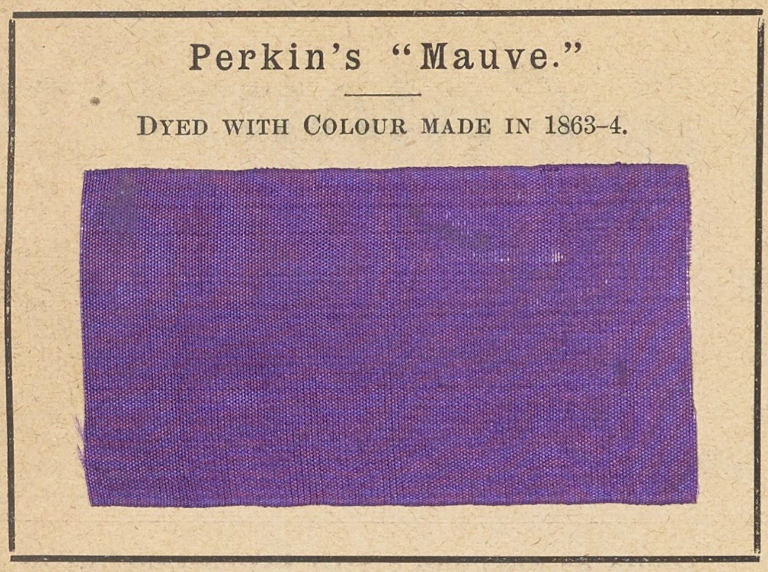
Mauve was one of the first synthetic dyes, discovered in 1856 by English chemist William Perkin. Its name comes from the French word "malva," which means mallow flower.
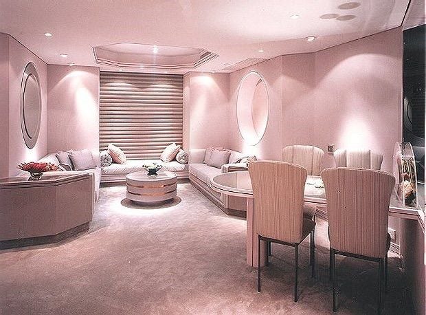
Mauve became a major interior color again in the 1980s, often paired with polished brass, floral fabrics, and gray carpet. The current version is quieter. It works best with cleaner whites, muted greens, natural wood, and less shine.
Mauve is worth considering when beige feels too flat and pink feels too sweet. The trick is choosing the right undertone for your room's light.
10 Best Mauve Paint Colors for 2026
This is not a countdown from good to best.
Each color solves a different problem. Some are barely-there mauves for whole rooms, while others are stronger choices for cabinetry, a powder room, or one focused accent wall.
Make Mine Mauve - PPG

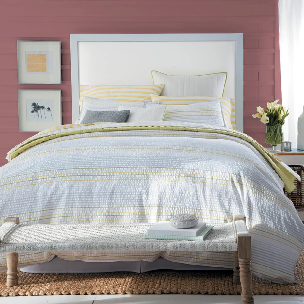
Make Mine Mauve is a medium mauve with a relatively high LRV (Light Reflectance Value), so it can hold its color without making the room feel closed in.
Its neutral undertones make it easier to use than a clear pink-purple. Try it in a living room with warm white trim, or on a bedroom accent wall behind an upholstered headboard.
Coordinating Colors: Calm, Portland Gray, White Dove, Silhouette
Setting Plaster - F&B

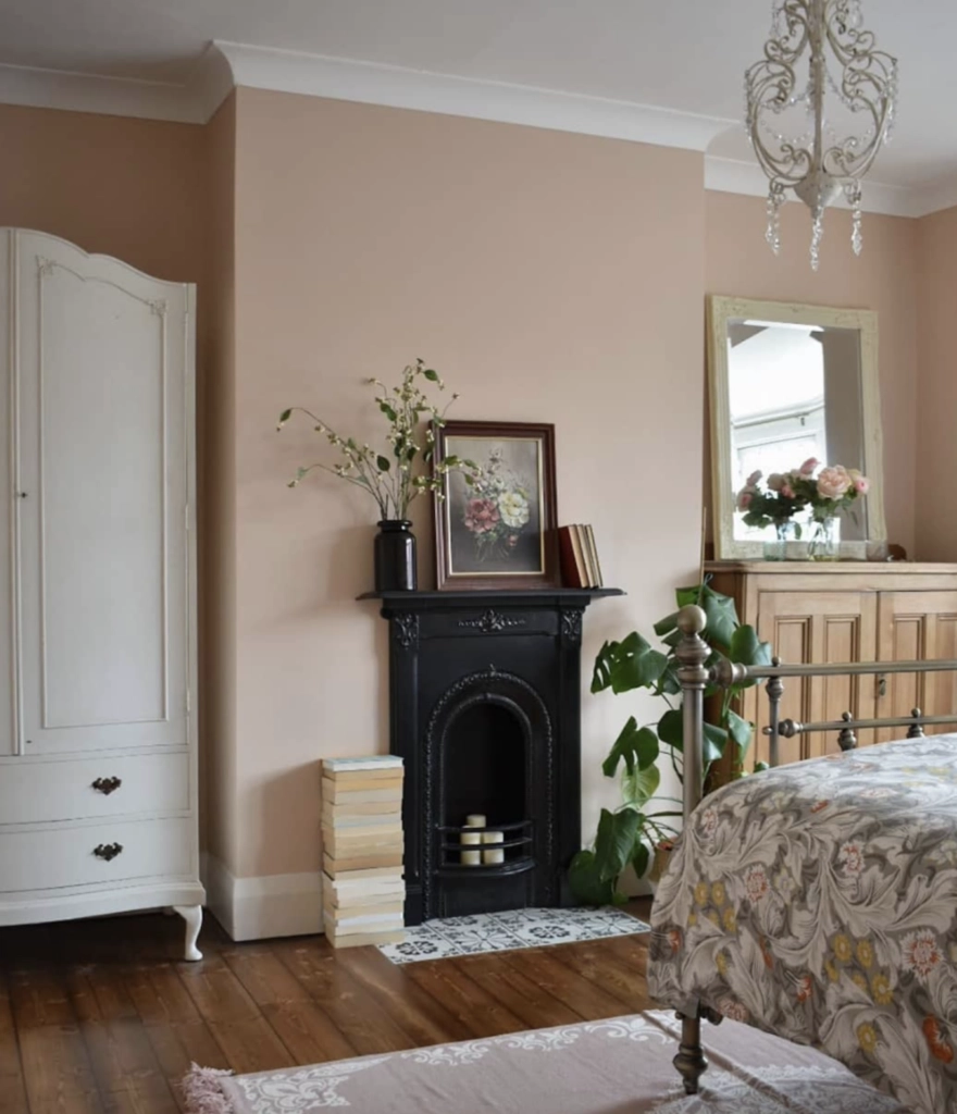
Setting Plaster by Farrow & Ball is a soft plaster pink that can read mauve in the right room. It has both warm and cool undertones, so it changes noticeably beside different whites and woods.
I would sample this one on two walls before committing. Next to creamy trim it can look warm and chalky, while cool gray flooring can pull out more pink.
Coordinating Colors: Olive Green, Soft Charcoal, Seashell Pink
Moody Mauve - PPG

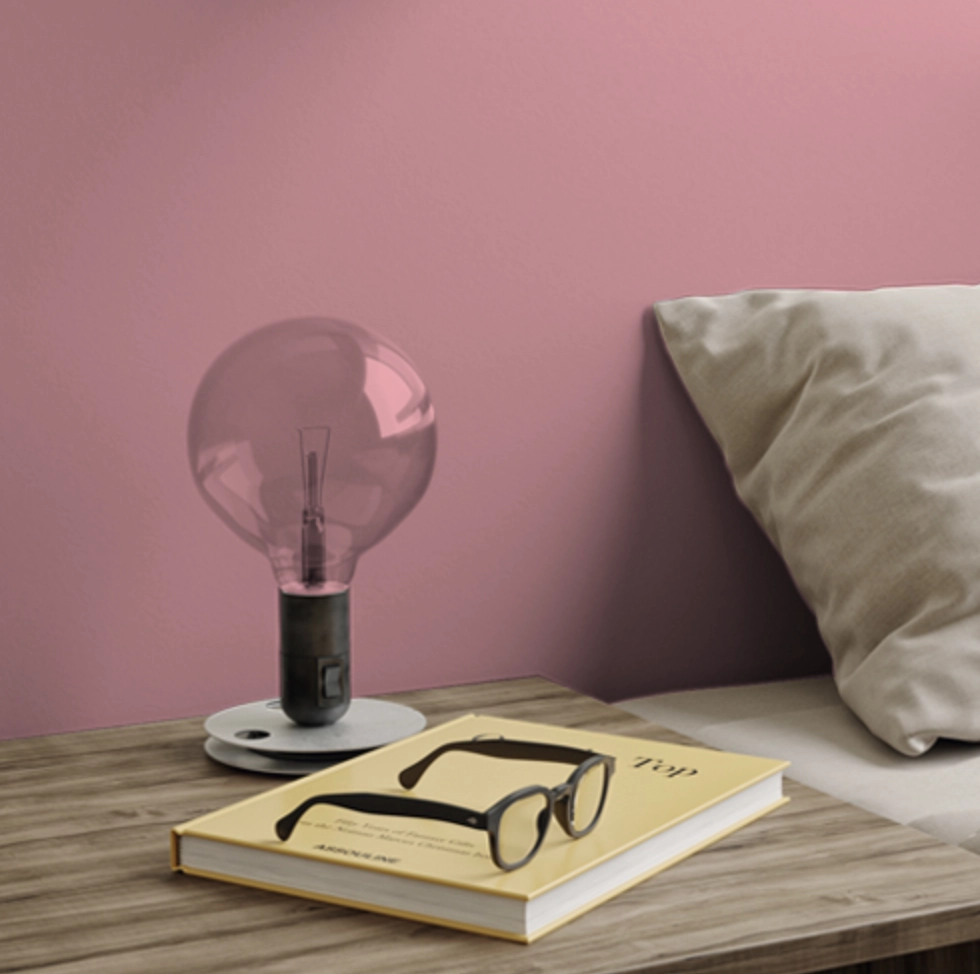
Moody Mauve is the deeper, plum-leaning option in this group.
Use it where a richer wall color makes sense, such as a dining room, study, or bedroom with good lamps. If your room has very little natural light, pair it with light trim and avoid brown-heavy furniture right against it.
Coordinating Colors: Frosted Jade, New House White, Plumville
Mauve Finery - SW


Mauve Finery from Sherwin-Williams is a refined mauve that still feels easy to live with.
Its warm undertones make it a solid pick for shared spaces like a living room or kitchen, especially if the room already has warm metals, butcher block, or off-white tile.
Coordinating Colors: Toasted Almond, Sea Salt, Urban Jungle
Wisp of Mauve - BM

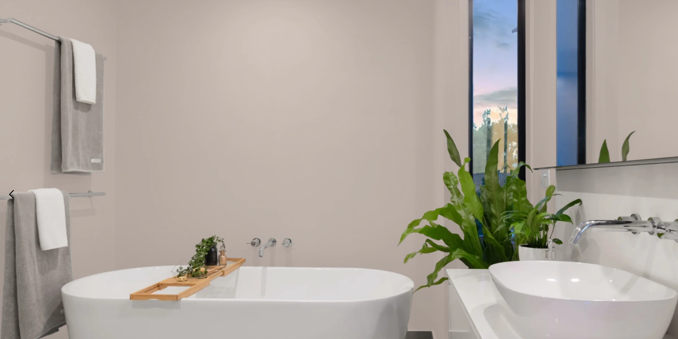
Wisp of Mauve by Benjamin Moore is a lighter mauve for rooms where you want the color to whisper rather than announce itself.
Its cool undertones suit bathrooms and bedrooms, but check it beside white fixtures. Some cool mauves can look more lavender next to bright porcelain.
Coordinating Colors: Lunar Blue, Fresh Mint, Tranquil Bay
Dusty Mauve - BM

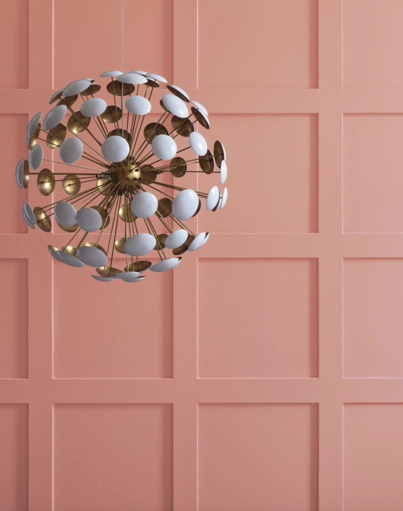
With a name like Dusty Mauve, you'd expect a more subdued shade, and this one delivers.
It has a vintage quality that works in modern rooms when the furnishings are simple. I would avoid pairing it with too many ruffles, florals, or glossy brass unless you intentionally want an 80s reference.
Coordinating Colors: Antique White, Urban Bronze, Cozy Cottage
Mauve Magic - PPG


Mauve Magic leans into the pink side of mauve, so it feels livelier than the grayer colors on this list. It makes sense in children's rooms, craft rooms, or creative spaces where a sweeter color will not fight the purpose of the room.
Coordinating Colors: Bubblegum Pink, Skyline Silver, Fiesta Red
Just Beige - BM

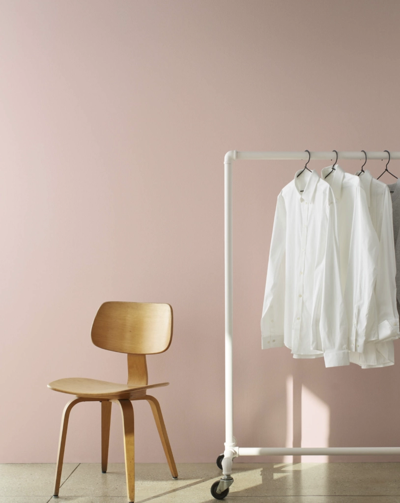
Although its name sounds plain, Just Beige by Benjamin Moore is anything but.
It is a neutral with mauve undertones, which makes it useful if you want a soft color shift instead of an obvious pink-purple wall.
Coordinating Colors: Vintage Cream, Classic Khaki, Walnut Shell
It's Your Mauve - KM


It's Your Mauve by Kelly-Moore is another lighter shade, but it still has enough undertone to read as a real color. Use it where plain off-white feels unfinished, such as a dining room, guest bedroom, or hallway with art.
Coordinating Colors: Soft Lavender, Pure White, Ocean Breeze
Art Deco Pink - Behr

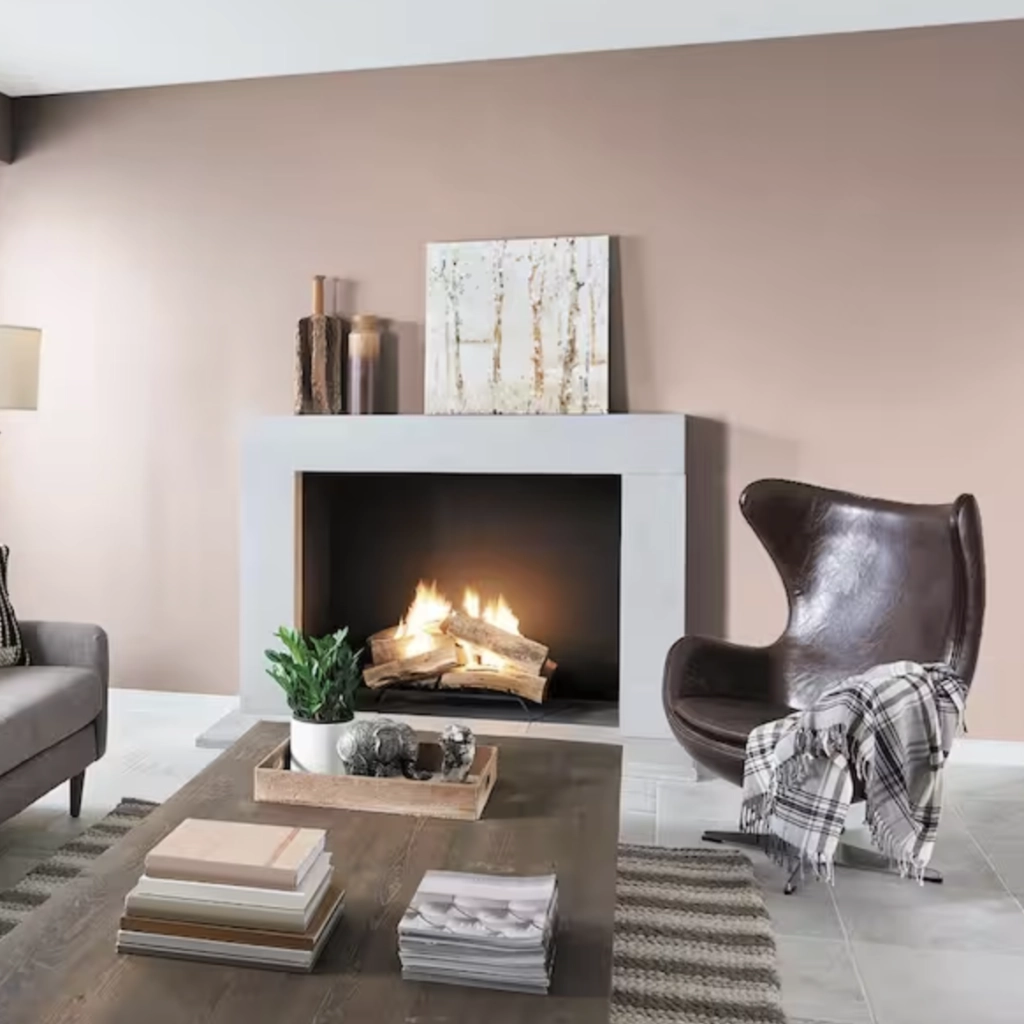
A throwback to the color confidence of the 1920s, Art Deco Pink from Behr has more presence than a quiet dusty mauve.
It has a warm coral undertone, making it more energetic than traditional mauves. I would use it with restraint in a living room, or more confidently in a powder room where a stronger color feels intentional.
Coordinating Colors: Golden Hour, Champagne Toast, Vintage Lace
What Colors Work Well with Mauve?
Mauve pairs best with colors that either calm down its pink side or make its purple side feel intentional.
Coordinating Colors

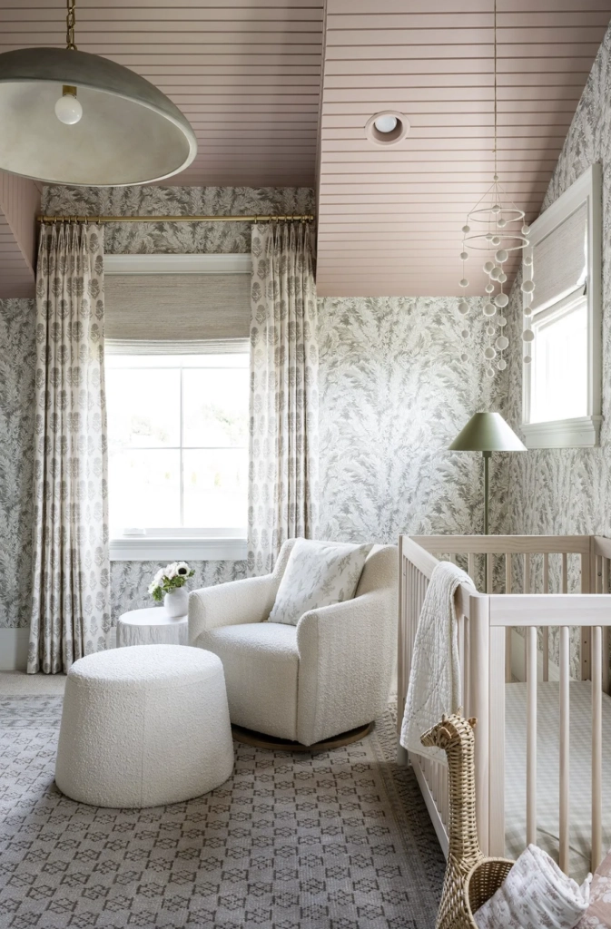
- Whites and Grays: Soft whites keep mauve clean. Light to medium grays can work too, but avoid cold builder gray if your mauve already leans lavender.
- Greens: Sage green and olive balance the rosy side of mauve and make it feel more grounded. I also have a guide to dark green paints if you want a deeper contrast color.
- Blues: Navy gives mauve structure, while sky blue makes it fresher. If the mauve is already cool, choose a slightly muted blue so the room does not turn icy.
Settings

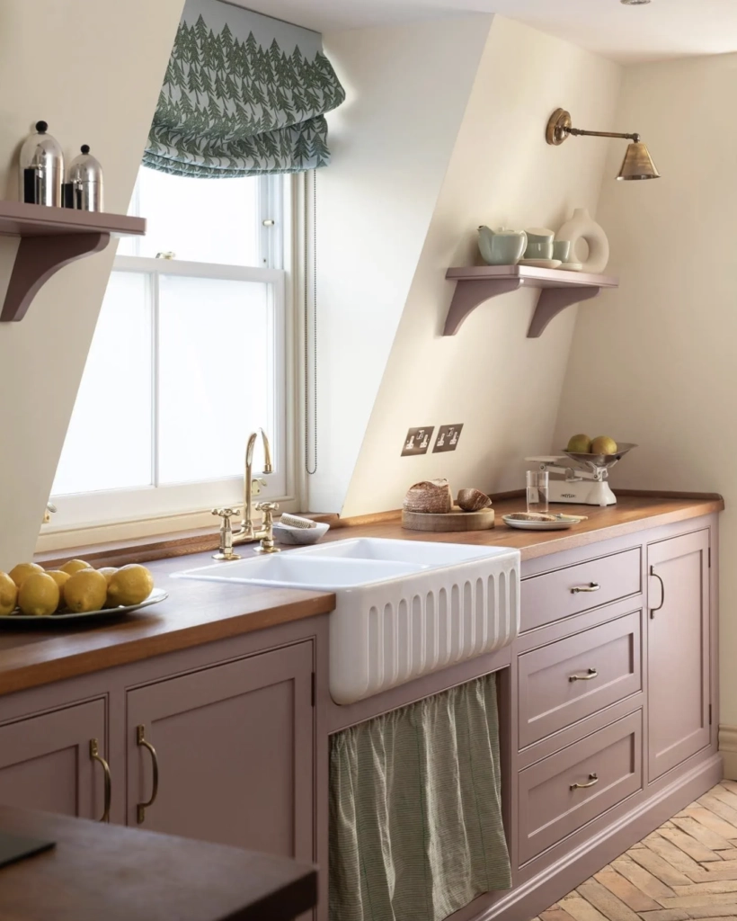
- Living Rooms: A mauve and white combination works when the white is not too stark. Add wood, woven shades, or black accents so the palette does not feel flat.
- Bedrooms: Pair mauve with cool blues if you want a quieter room. Use warm lamps at night, around 2700K, because harsh bulbs can make mauve look chalky.
- Kitchens: Warm mauves and earthy greens work well on walls or cabinetry. Sample next to counters first, especially if the stone has yellow, orange, or red veining.
Which Color Should You Choose?
Choose the mauve that behaves best in your room, not the one that looks best on a screen.
- Room's Purpose: For bedrooms and baths, start with cooler or softer mauves. For dining rooms, kitchens, and living rooms, look at warmer shades with beige, brownish, or coral undertones.
- Lighting: Check the sample in morning light, afternoon light, and at night with your lamps on. Mauves can shift from dusty pink to lavender to taupe as the light changes.
- Your Taste: Test a few peel-and-stick samples in your actual space. Put them next to trim, flooring, counters, and fabrics before you buy gallons.

I'm Elizabeth, your go-to guide for all things paint and design! My days are filled with color swatches and innovative room makeovers. When I'm not painting the town - literally - I'm soaking up inspiration from my travels. This blog is my way of sharing my passion and making the world a more vibrant place, one color palette at a time.