Snowbound vs Pure White
If you're choosing between Snowbound and Pure White, Pure White is the safer whole-house white, while Snowbound is the better choice when you want a softer white with a visible gray cast.
Both are Sherwin-Williams whites with very close LRVs, 83 for Snowbound and 84 for Pure White. That one-point difference is not what changes the room. The undertone does.
I specify these colors for different jobs. Snowbound needs the right light and finishes around it. Pure White forgives more, especially when the house has a mix of flooring, counters, trim, and exposures.
Undertones & Character

Sherwin Williams Snowbound has a creamy gray undertone with a quiet violet note. In direct sun it can look soft and slightly warm. In shade, that gray side becomes more obvious.
Snowbound is strongest in rooms with good natural light, especially south-facing or west-facing rooms where a stark white would feel too sharp. In a dim north-facing room, it can turn quiet and cool. With an LRV of 83, it reflects plenty of light without looking like a cold gallery white.
Pure White by Sherwin Williams is a cleaner soft white with a very small amount of warmth. The yellow undertone is restrained, so it does not usually read creamy on the wall.
I used Pure White in a living room with west-facing windows, and it held its color through the late afternoon. It did not go yellow when the warm evening light came in. At LRV 84, it is just a touch brighter than Snowbound, but the bigger difference is that it stays cleaner.
So what's the real difference? Snowbound has more visible undertone and more shift during the day. Pure White is cleaner and steadier, with warmth that stays mostly in the background.
Choose Snowbound when you want the white itself to add softness. Choose Pure White when the floors, counters, art, or furniture should do the talking.
| Property | SW Snowbound | SW Pure White |
|---|---|---|
| Color Code | SW 7004 | SW 7005 |
| Light Reflectance Value (LRV) | 83 | 84 |
| Color Family | White | White |
| Undertones | Cream, gray, and purple | Minimal yellow and black |
Room-by-Room Comparison
Because their LRVs are so close, do not make this decision based on brightness alone. Decide by room exposure, finishes, and how much undertone you want to see.
Living Rooms

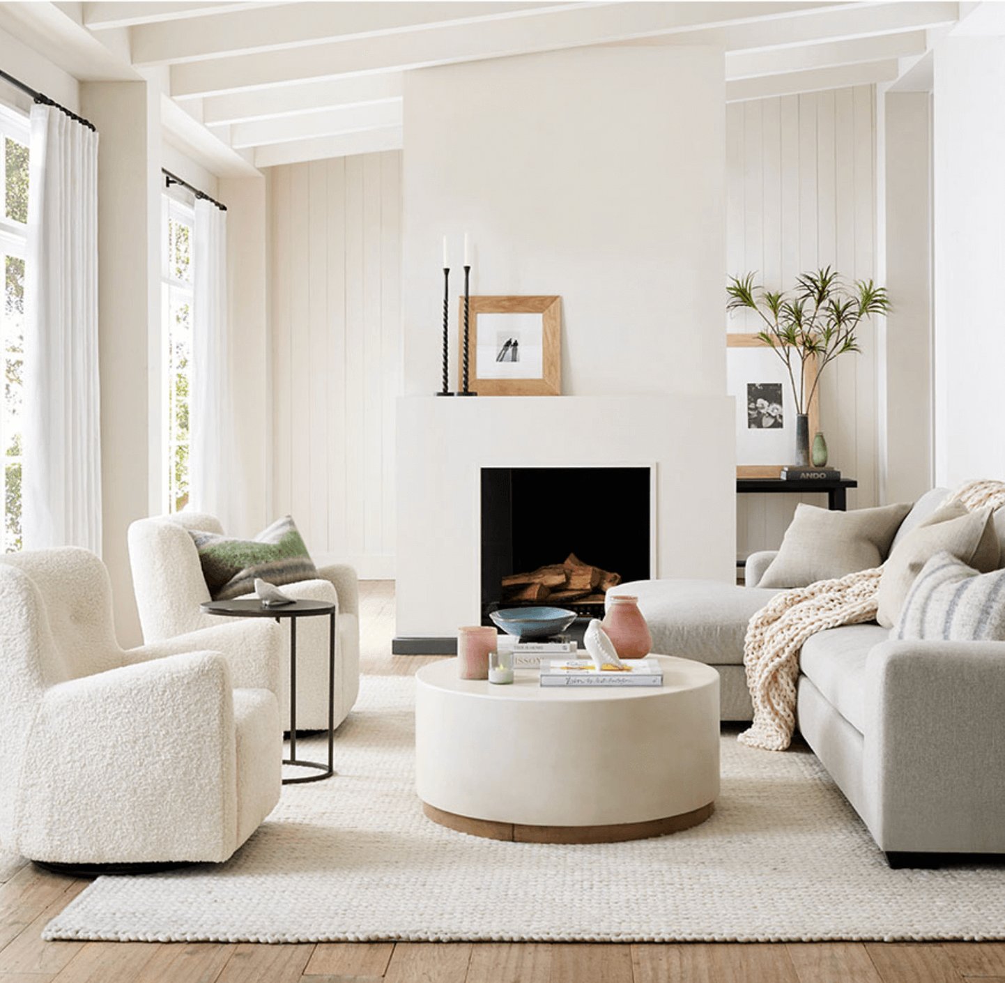
Snowbound works well in living rooms when you want the walls to feel soft instead of crisp. In west-facing rooms, it warms up late in the day and can make dark furniture, black window frames, and charcoal fabrics feel less severe.
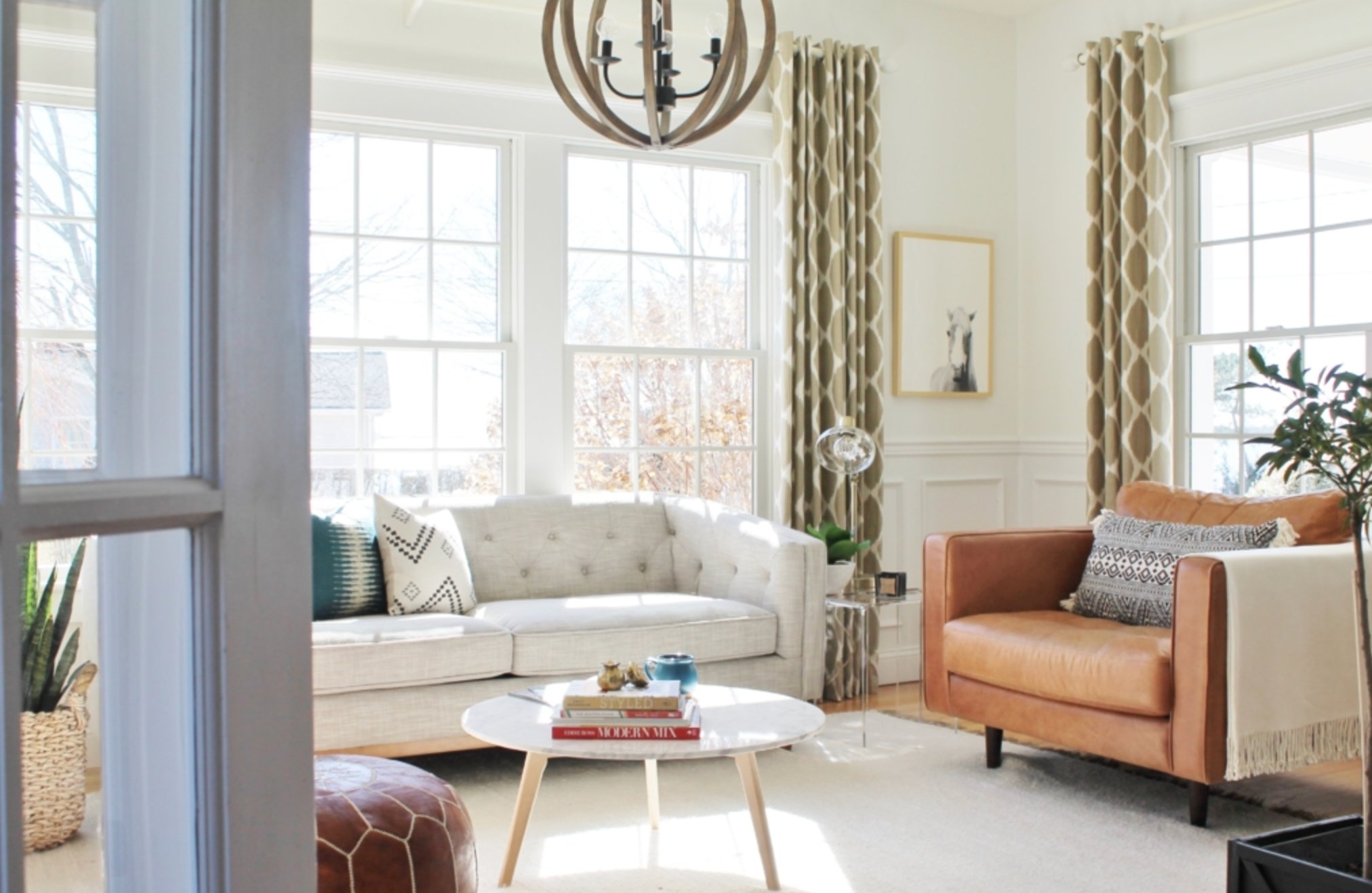
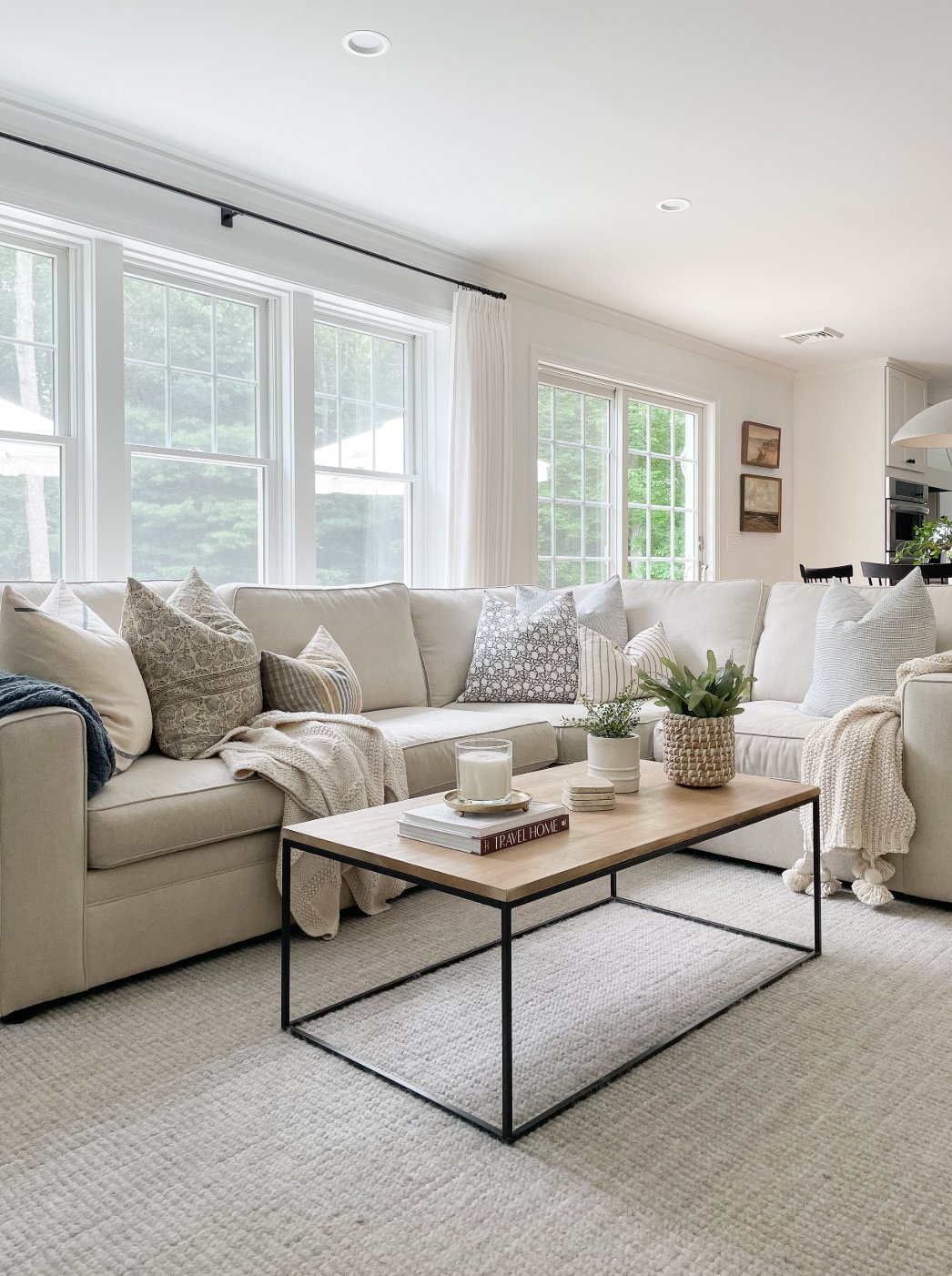
Pure White gives living rooms a cleaner look than Snowbound. It is the better pick if you have colorful art, patterned rugs, or decor that needs a quiet wall color behind it.
It can look bright in strong sun, but it usually avoids the sterile edge of a true untinted white. I like it when trim, ceiling, and walls need to relate without a lot of contrast.
Kitchens
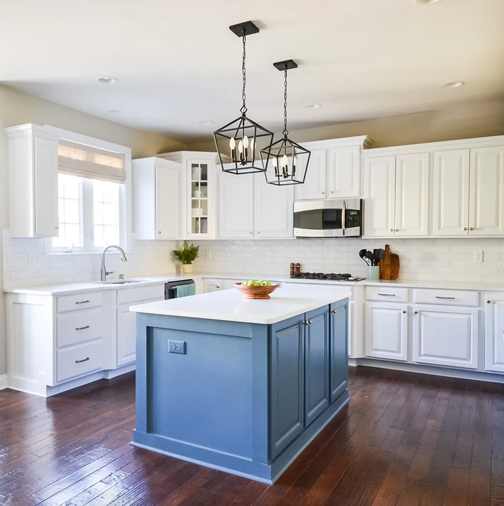
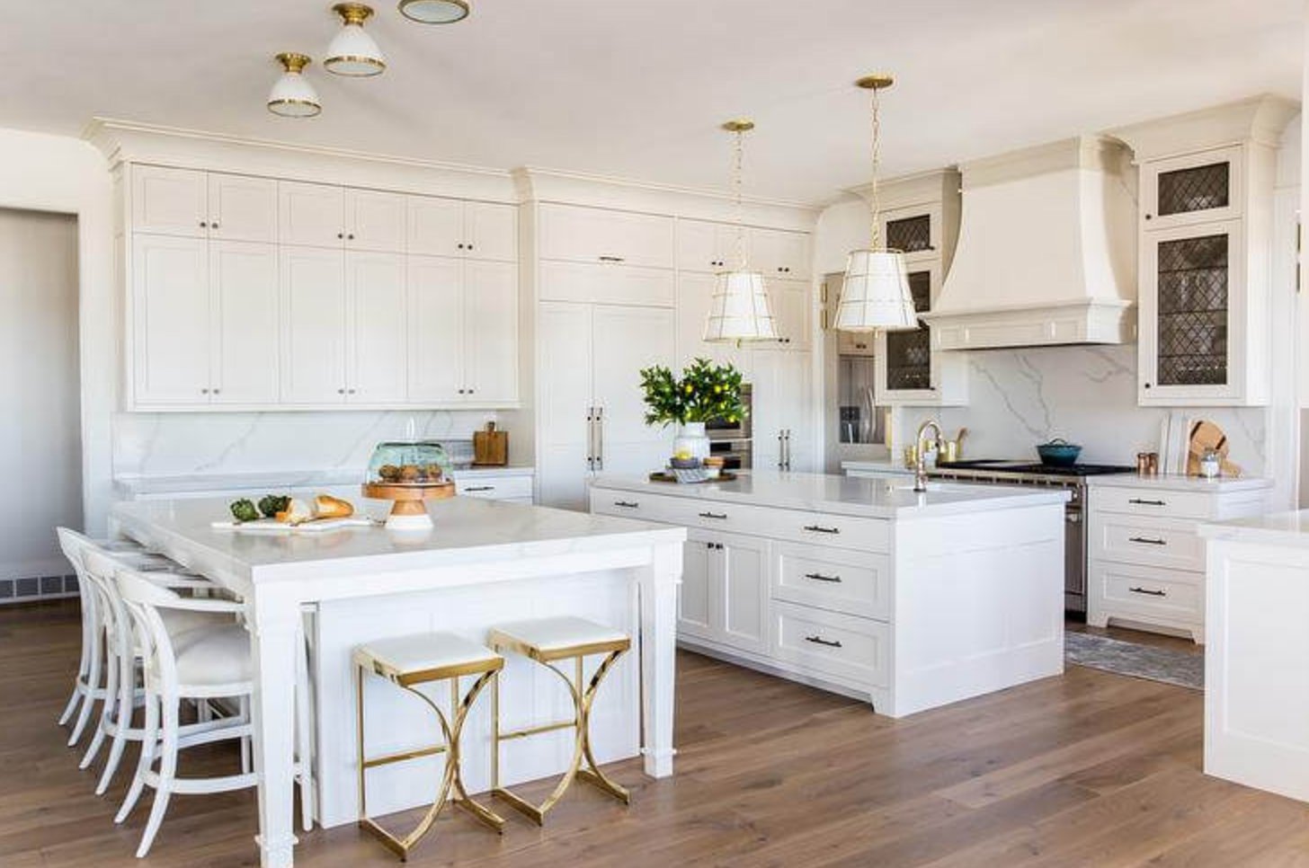
Snowbound is a good cabinet or wall color when the kitchen already has warmth from wood floors, brass, butcher block, or creamy stone. The slight gray tint can be forgiving on cabinet fronts and keeps the white from looking sugary.
Under fluorescent or cool LED light, Snowbound can read cleaner and grayer. If the kitchen is short on natural light, sample it carefully because it may lose dimension.
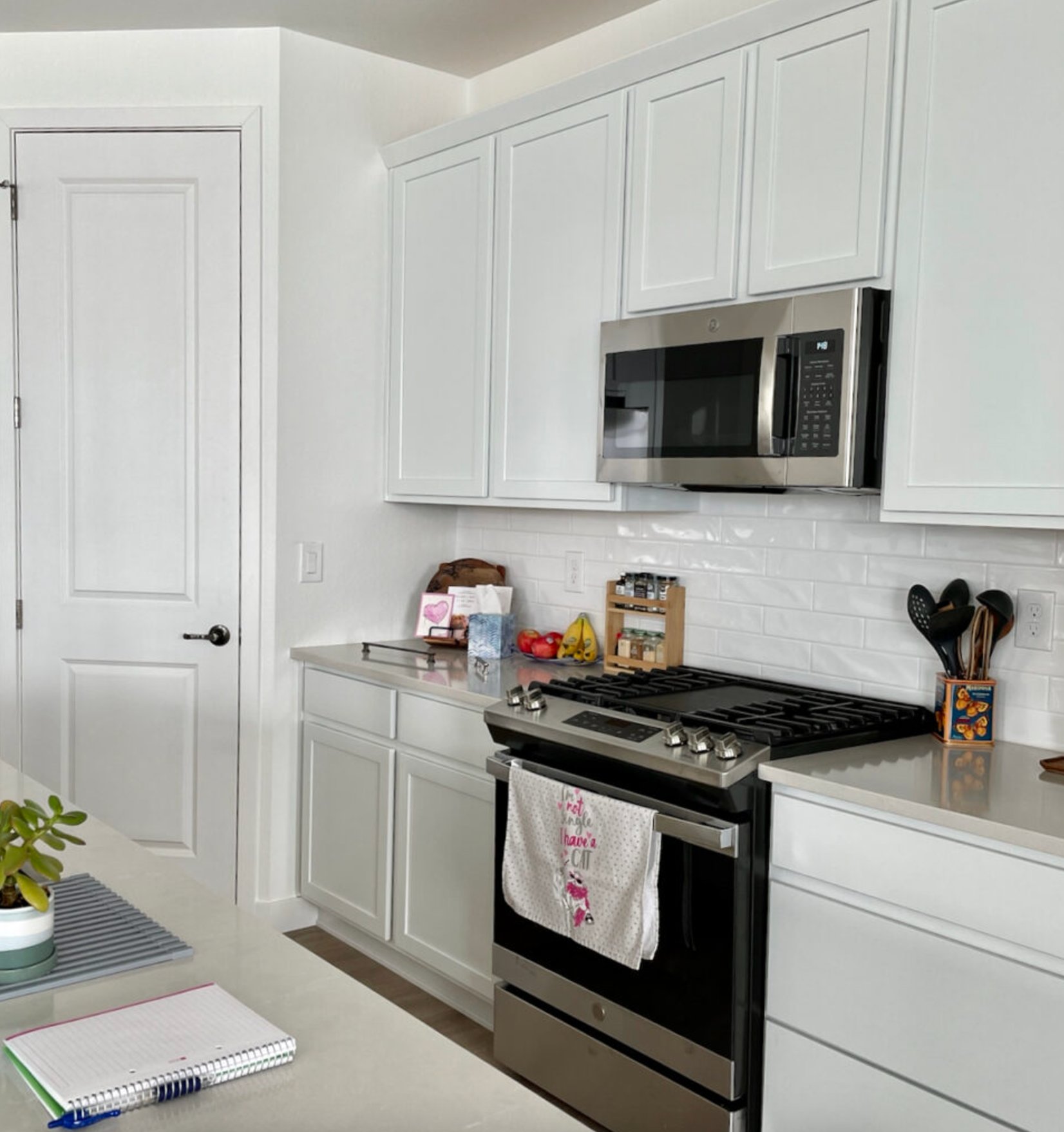

Pure White is the better kitchen choice when the goal is bright, clean cabinetry. It bounces light well and makes a small kitchen feel more open. It also works naturally with marble, quartz, stainless steel, and polished nickel, though white cabinet fronts will show fingerprints faster.
Bedrooms
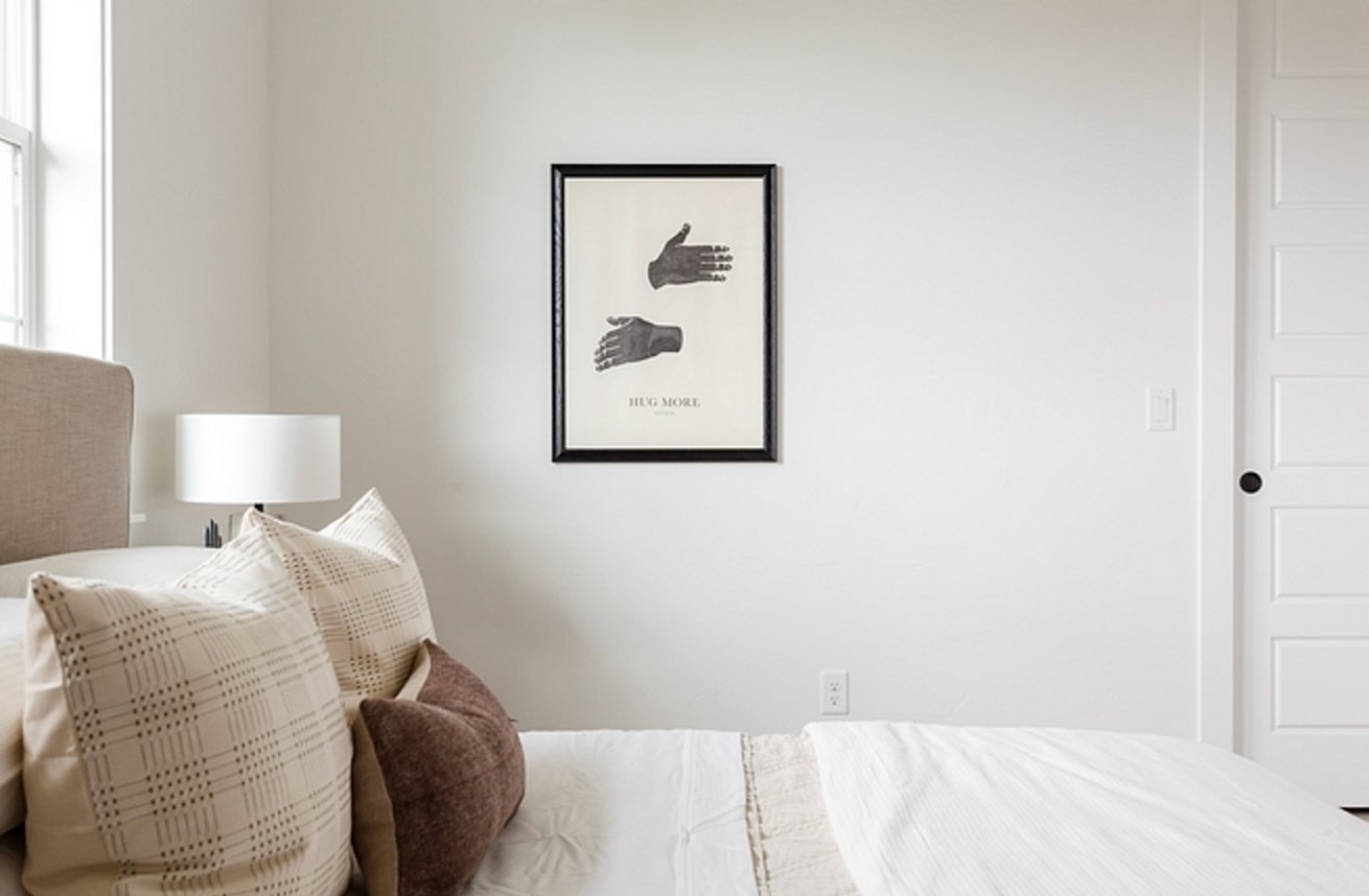

Snowbound is the one I reach for first in bedrooms if the client wants a calm white rather than a bright one. Its creamy gray undertone is easy on the eyes in morning light, especially with linen, wool, oak, or walnut in the room.
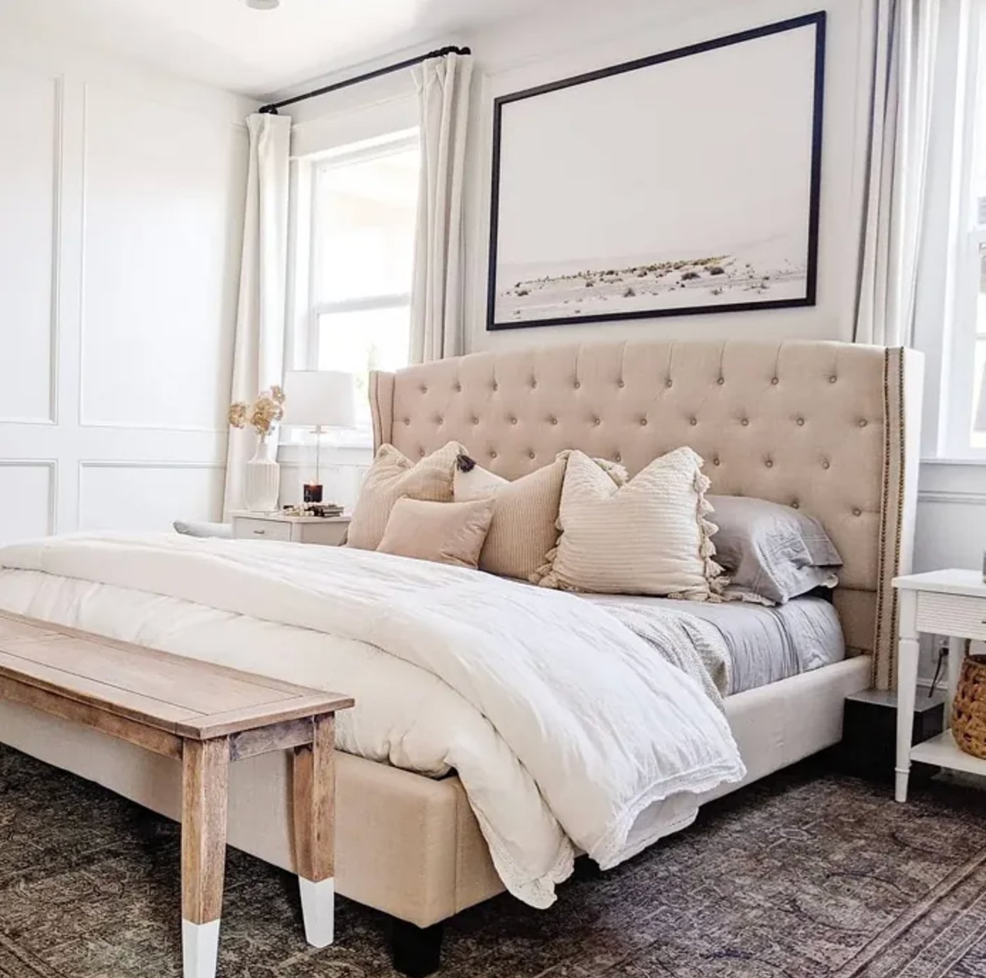
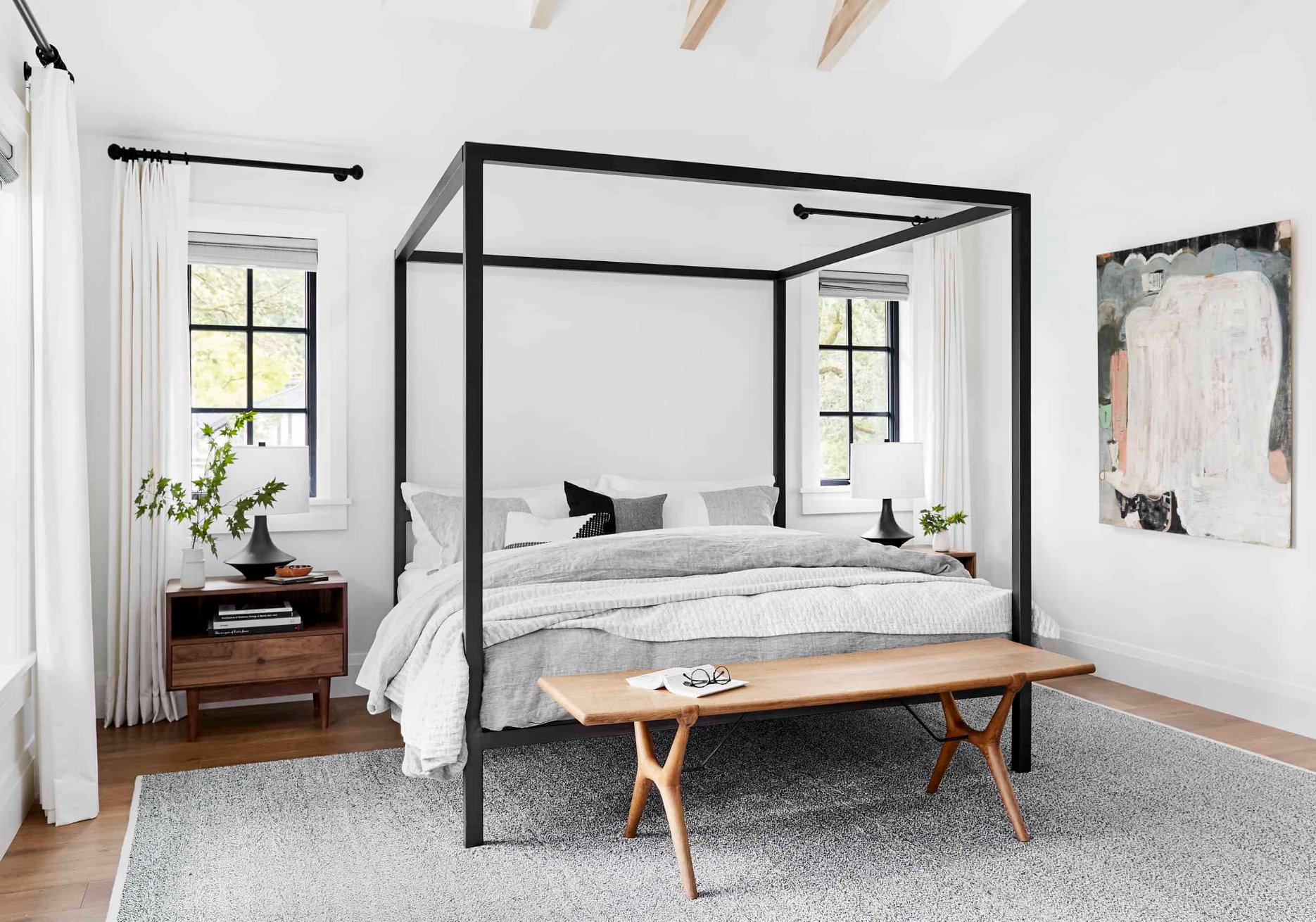
Pure White makes bedrooms feel lighter and more awake. I would use it for a simple hotel-like bedroom, a room with strong color in the bedding, or a space where Snowbound looks too muted. In many north-facing bedrooms, its tiny bit of warmth keeps it from feeling icy.
Exteriors
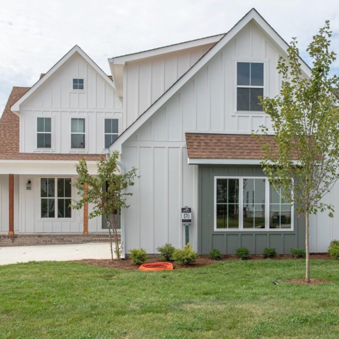
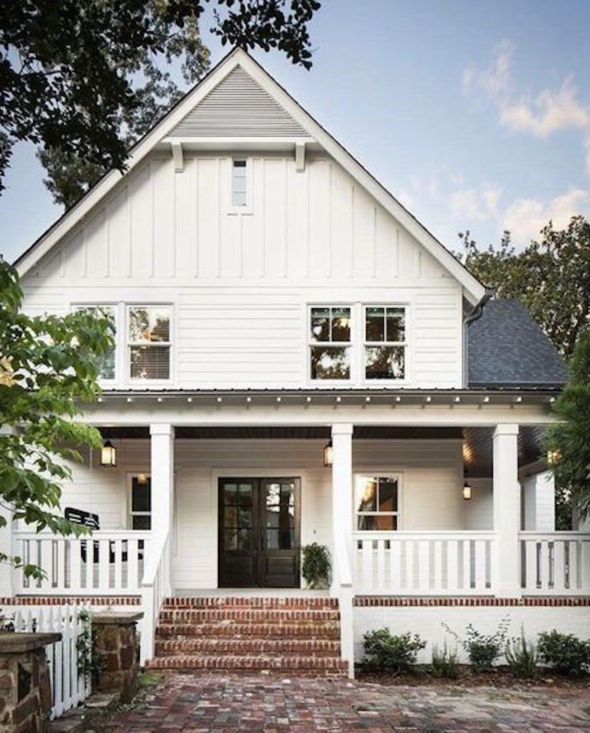
On exteriors, Snowbound is softer than many whites and does not create as much glare in full sun. On overcast days it can lean gray, which suits homes with dark roofs, stone accents, black windows, or cooler hardscaping.

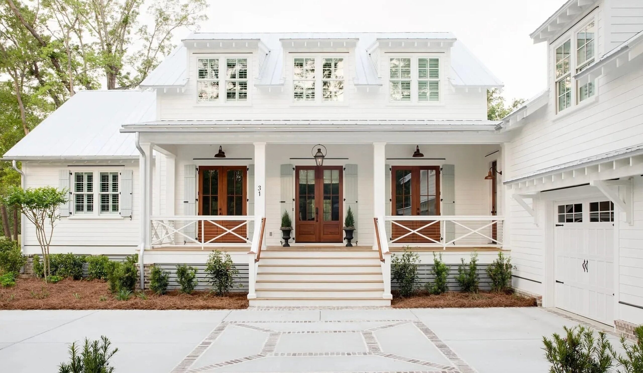
Pure White by Sherwin Williams reads cleaner and brighter outside than Snowbound. It is the better choice for classic white siding, black shutters, white brick, or a colonial-style exterior where you want a crisp but not fluorescent white.
Lighting Impact
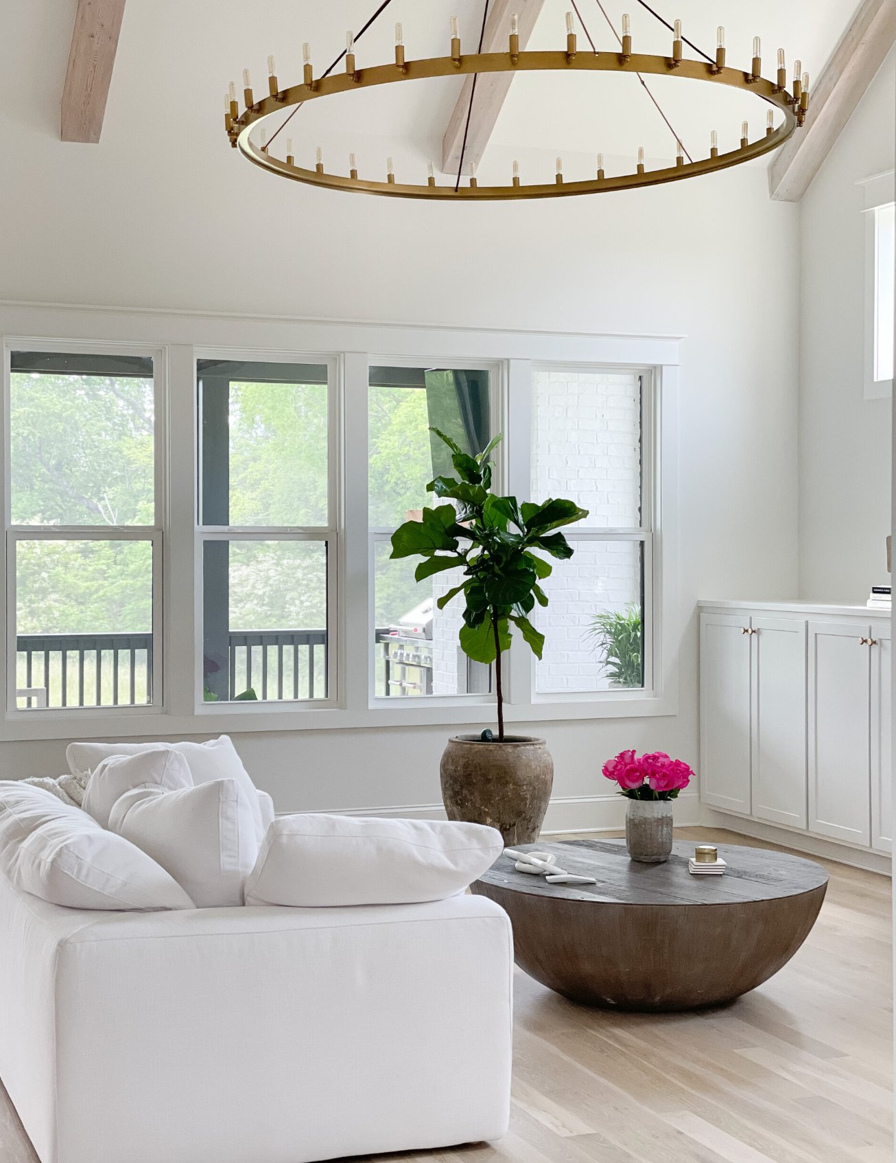

Snowbound changes more with light than Pure White. In sun-filled rooms it can look warm and soft. On gloomy days or in shaded corners, the gray undertone comes forward and can make the room feel flatter.


Pure White is a touch lighter at LRV 84 and much more consistent. I once used it in a kitchen that went muddy on cloudy days, and the room immediately looked cleaner without feeling blue-white.
Pure White's warmth is subtle enough that it holds steady at sunset, which matters in west-facing rooms. It still has enough softness to avoid the sterile look of a harsher white.
Coordinating Colors
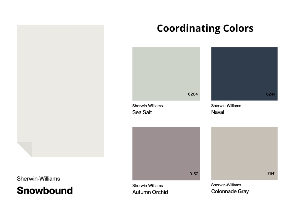
Snowbound looks best next to natural materials, especially warm woods, stone, gray fabrics, and matte nickel finishes. It also works well with deep blues and greens because those accents give the room weight.
Avoid pairing Snowbound with very stark white decor unless you have sampled both together. The cleaner white can make Snowbound look dingy by comparison.

Pure White is easier to coordinate than Snowbound. It can sit next to bright white elements, cool metals, warm wood grains, and cool marble without looking mismatched.
Use it behind bold colors such as terracotta, navy, emerald, or oxblood when you want contrast without a yellow cast. Thanks to its subtle warmth, it also works with chrome and stainless steel.
Making Your Decision
My default recommendation is Pure White for most homes. It is cleaner, steadier, and easier to repeat from room to room.
Choose Snowbound when Pure White looks too plain or too bright on your sample board. It is better for bedrooms, softer living rooms, and exteriors with stone or dark roofing.
If you have north-facing light, cool gray floors, or a lot of stark white fixed elements, be careful with Snowbound. If you have creamy tile, beige carpet, or warm oak trim from the 90s, be careful with Pure White because it may look cleaner than the finishes around it.
Paint large samples on two walls and check them in morning, afternoon, and evening light before you commit.

I'm Elizabeth, your go-to guide for all things paint and design! My days are filled with color swatches and innovative room makeovers. When I'm not painting the town - literally - I'm soaking up inspiration from my travels. This blog is my way of sharing my passion and making the world a more vibrant place, one color palette at a time.