Dover White vs Alabaster
If you're choosing between Dover White and Alabaster, the real difference is undertone. Dover White is warmer and more yellow. Alabaster is softer, quieter, and a little more balanced.
Both are popular Sherwin-Williams whites, and both can look beautiful in the right house. They do not behave the same once you put them next to flooring, trim, cabinets, stone, and real daylight.
I would use this comparison to answer one question first: does your room need extra warmth, or does it need a calmer white that can handle mixed finishes?
Dover White vs Alabaster at a Glance
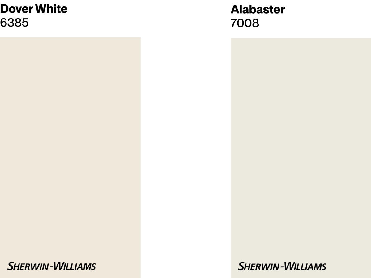
Dover White is a creamy off-white with clear yellow undertones. With an LRV of 83, it reflects plenty of light and can help a dull room feel warmer.
Choose Dover White when the room feels cold, especially with northern or eastern exposure, warm wood floors, cream upholstery, or earthy finishes. Be more careful with it beside cool gray tile, blue-white trim, or marble that already reads crisp.
Alabaster is a soft warm white with a creamy beige undertone. Its LRV of 82 makes it slightly less reflective than Dover White, but it still reads light on most walls.
Alabaster is the safer choice when you want one white for several rooms, or when your finishes are a mix of warm wood, black hardware, soft gray, linen, and natural stone. It has warmth, but it usually does not announce itself as yellow.
| Dover White | Alabaster | |
|---|---|---|
| Color Code | SW 6385 | SW 7008 |
| Light Reflectance (LRV) | 83 | 82 |
| Color Family | White | White |
| Undertones | Predominantly yellow | Creamy beige |
| Best for | Interiors that aim for a cozy and inviting atmosphere. | Homes seeking a light and airy feel without starkness. |
| Versatility | Suitable for various settings, especially nurseries, kids' rooms, and north-facing spaces where it can brighten the room. | Excellent for a range of spaces, including living rooms and kitchens. Works well as a backdrop for various decor styles. |
Best Settings for Each Color
Dover White
Sherwin-Williams Dover White is the warmer, yellower option in this comparison. I reach for it when a room needs help looking less chilly, not when the goal is a clean gallery white.
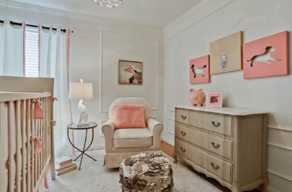
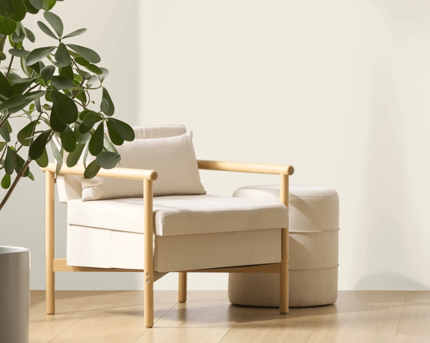
1. Nurseries and Kids' Rooms: The warm undertone keeps the room from feeling sterile, especially with pale wood, woven shades, and soft textiles. In a north-facing nursery, Dover White can look gentle instead of gray.
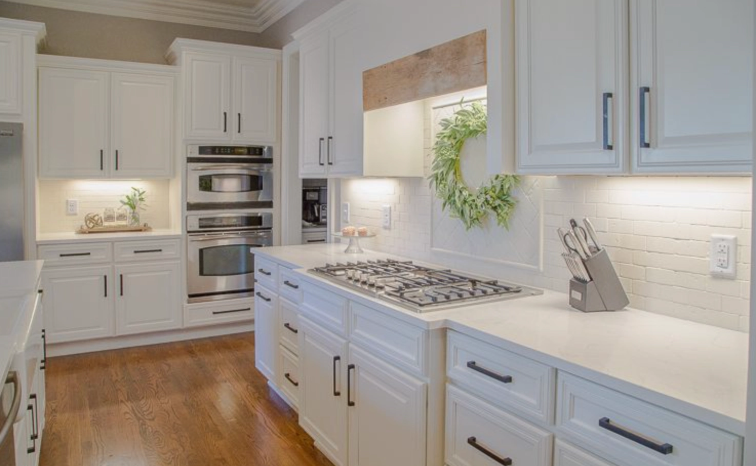
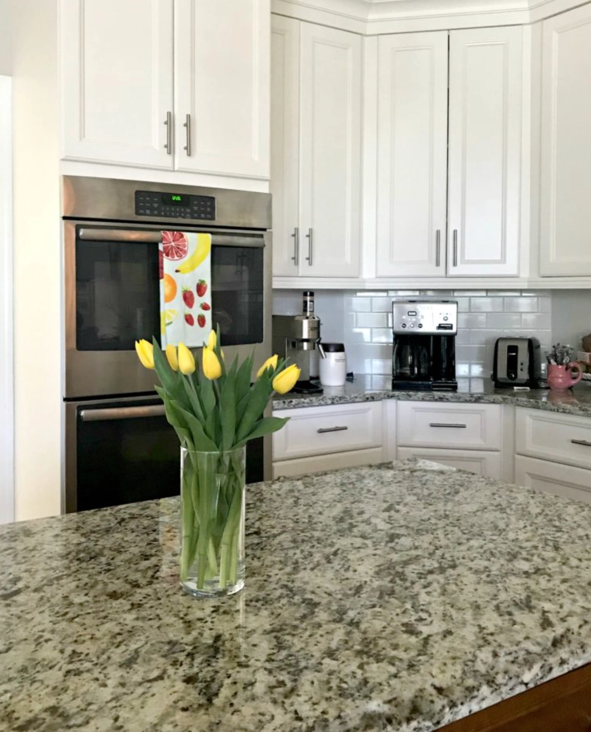
2. Cabinets: Dover White can be an excellent choice for kitchen cabinets. Its warm, creamy tone adds depth to cabinetry without looking stark. The yellow undertones can complement wood floors and warm-toned countertops.
Notice how lighting changes the cabinet color above. In one kitchen it reads soft white. In another, the yellow undertone is much easier to see.


3. Tropical or Warm Climate Exteriors: Dover White works well on exteriors that can support a creamy body color, especially Mediterranean or Spanish-style homes. In strong sun, the warmth looks intentional rather than dingy.
Alabaster
Alabaster is still warm, but it is less yellow than Dover White. That makes it easier to use across open floor plans, kitchens, living rooms, and exteriors with several fixed finishes.
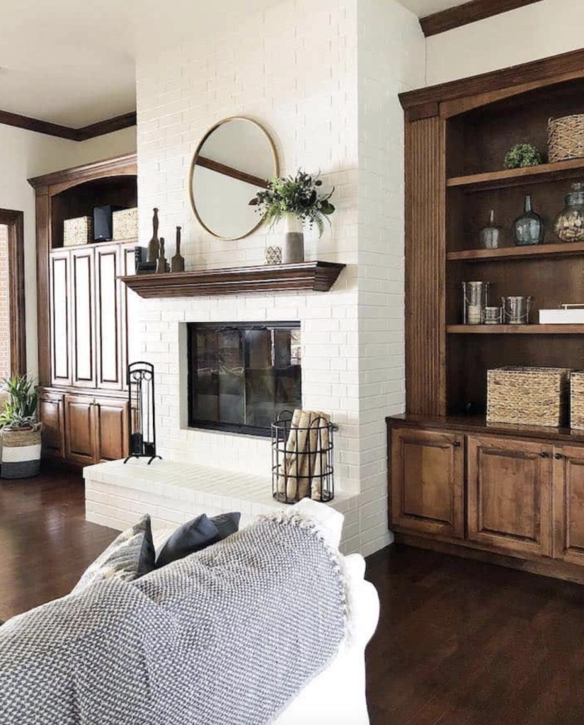
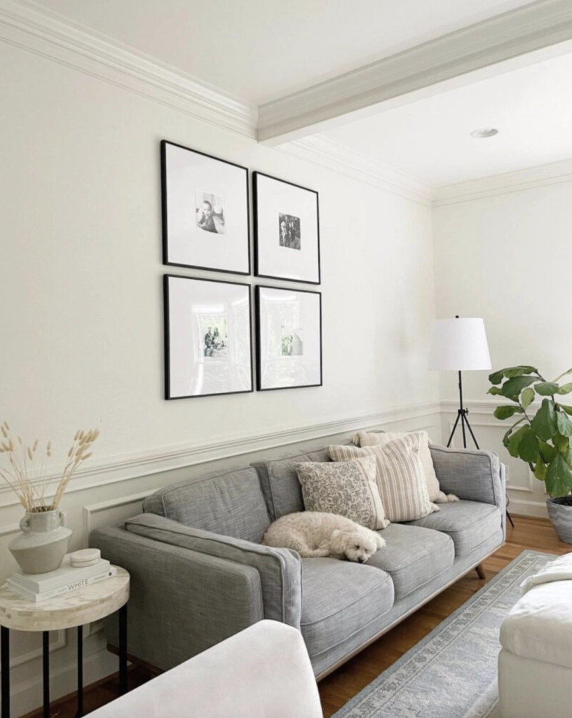
1. Living Rooms: Alabaster gives living rooms a soft white backdrop without making the walls look plain or cold. It works especially well when the room has linen upholstery, black accents, medium wood, or warm gray stone.
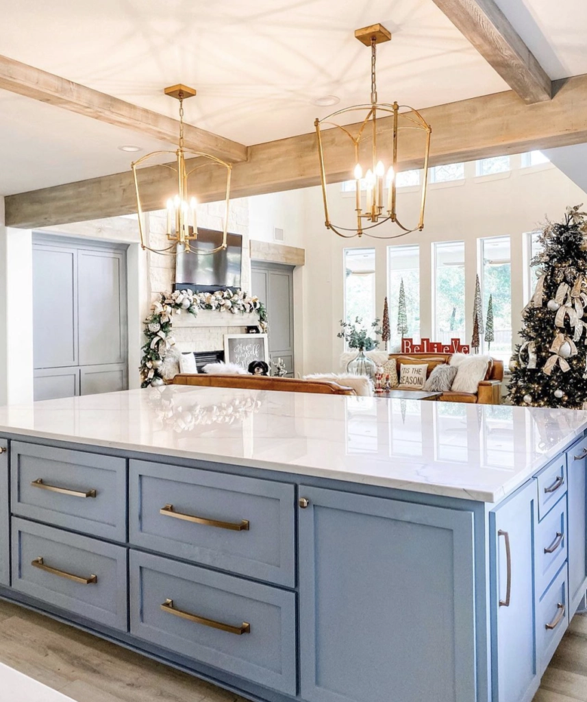
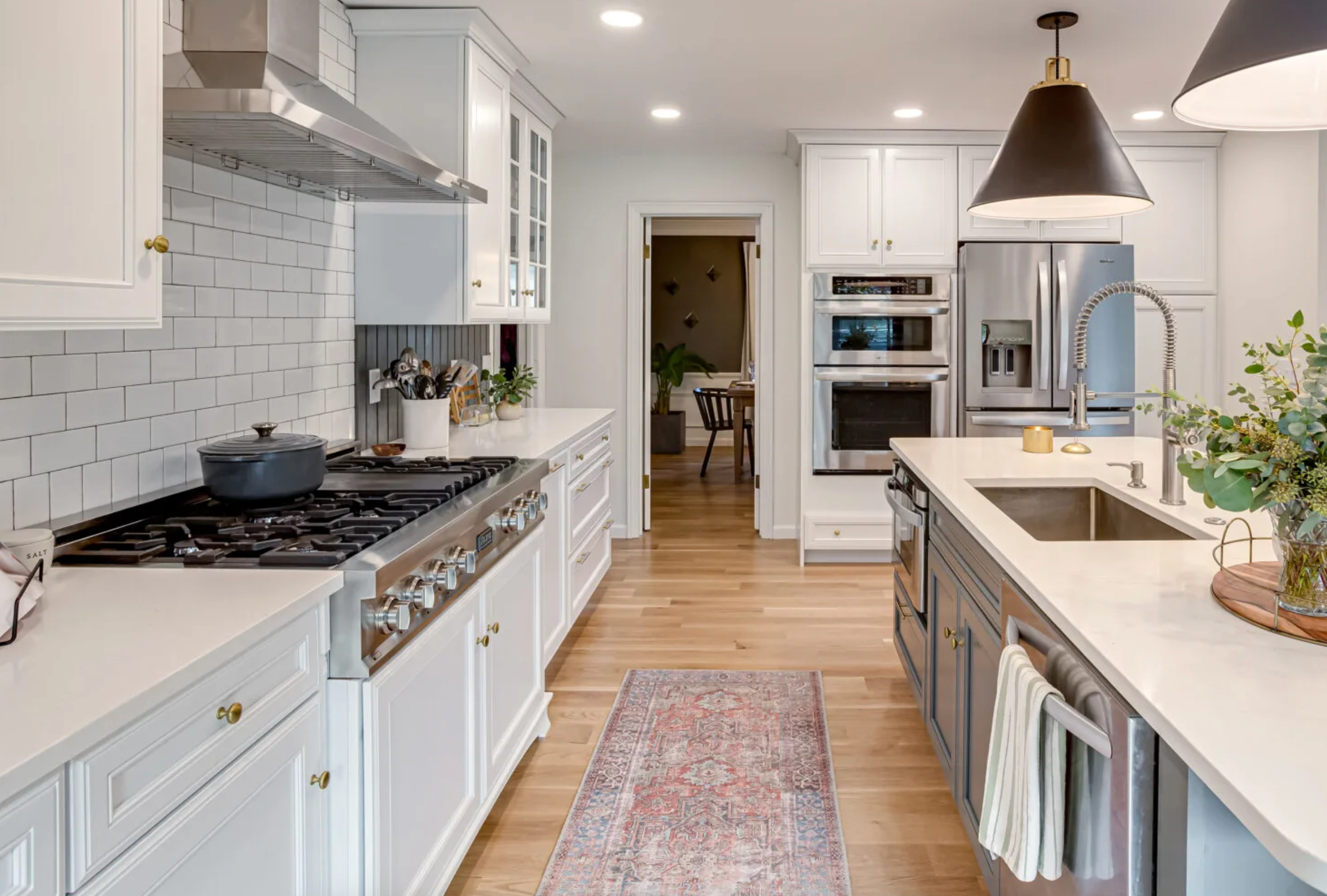
2. Kitchens: Alabaster provides a clean backdrop that complements both modern and traditional kitchen styles. It is often easier than Dover White if your kitchen has mixed materials, such as white quartz, warm wood, black metal, and soft gray tile.


3. House Exterior: An all-Alabaster exterior shifts with natural light, moving from soft warm white to a slightly cleaner white as the day changes. It is a strong choice when you want a white exterior that feels classic without looking too yellow.
Lighting
Lighting is where these two whites separate. Dover White gets creamier and more yellow as the light warms up. Alabaster stays closer to a soft neutral white.
Dover White
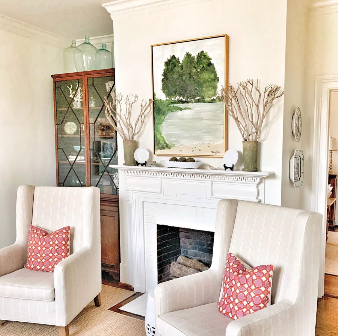
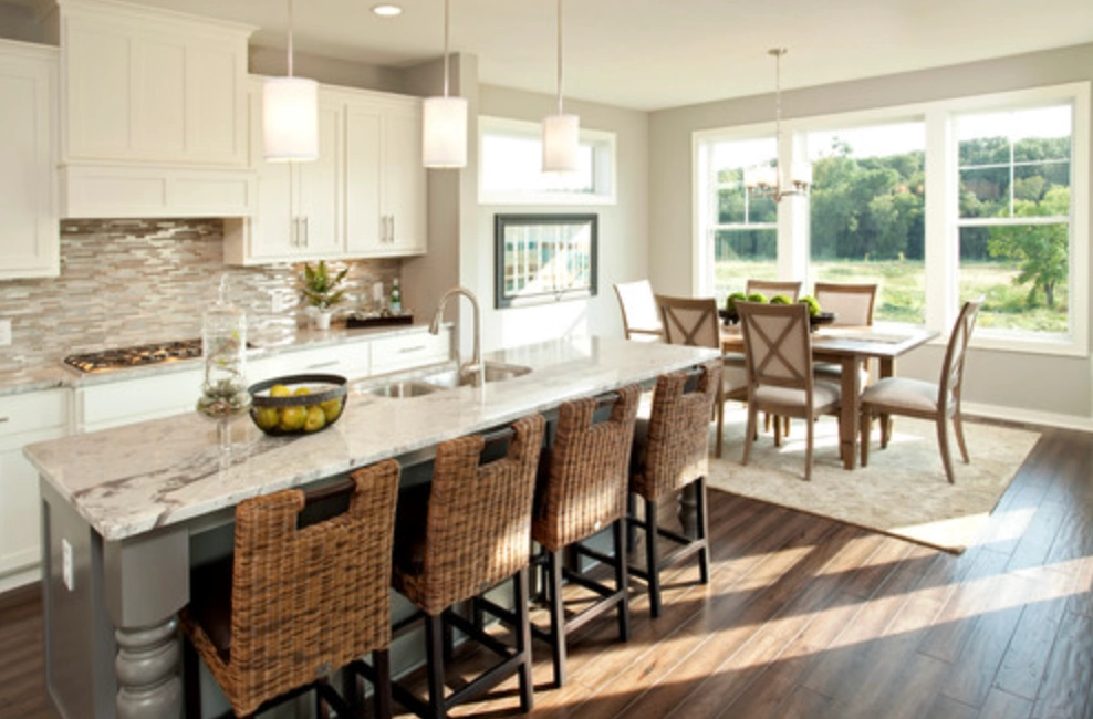
In bright daylight, especially in west-facing rooms, Dover White leans into its warm, creamy nature. If the room already has honey oak, beige carpet, or warm bulbs, sample it before committing because the yellow can build quickly.
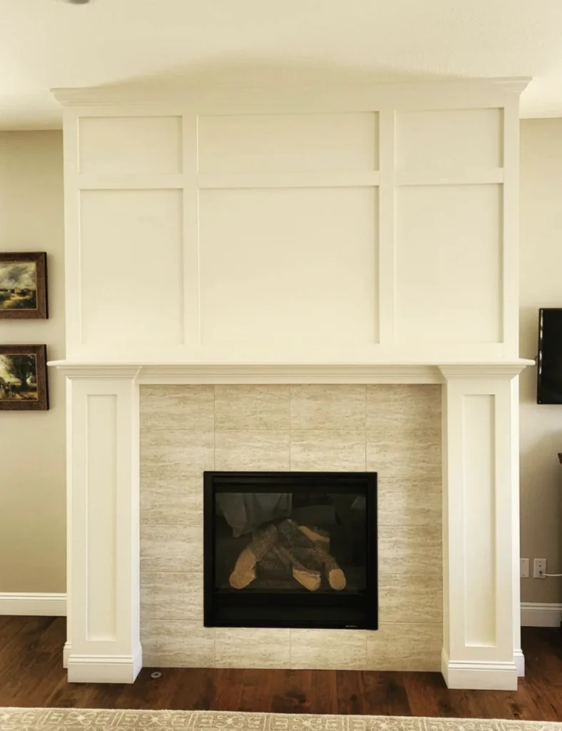
Under warm artificial lights, the yellow undertones become more pronounced. That can be cozy in bedrooms and family rooms, but it can feel too creamy beside cool countertops or bright white appliances.
Alabaster
Alabaster is more consistent across changing light, which is why it shows up in so many whole-house color plans.
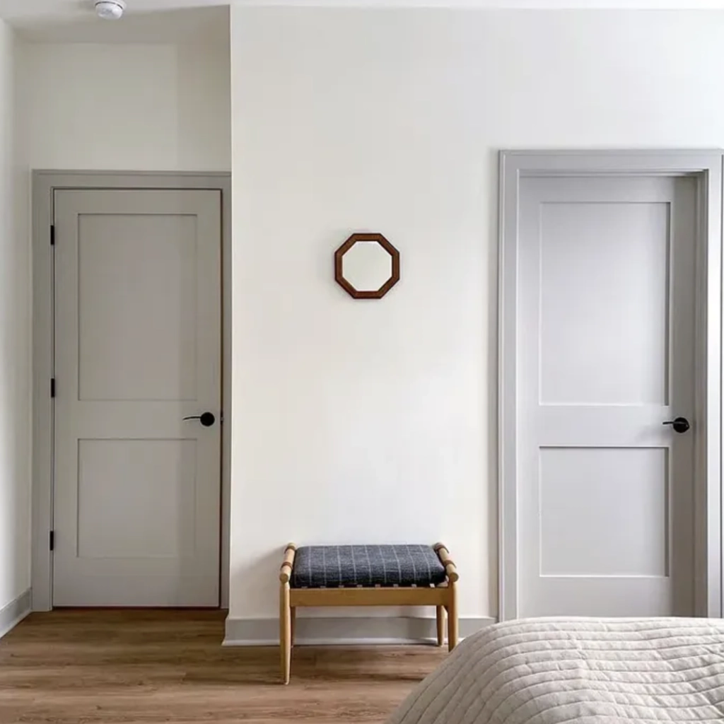
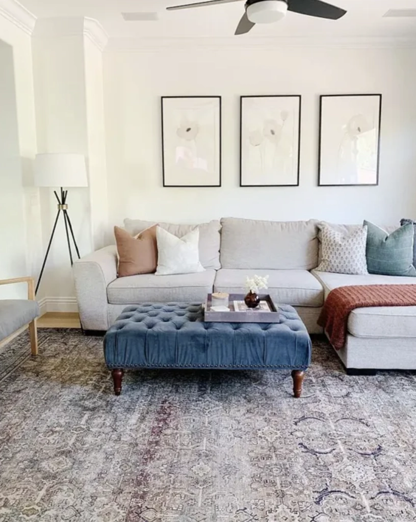
In daylight, Alabaster stays warm without looking too yellow or stark. In rooms with balanced natural light, it usually reads like a soft white rather than a cream.
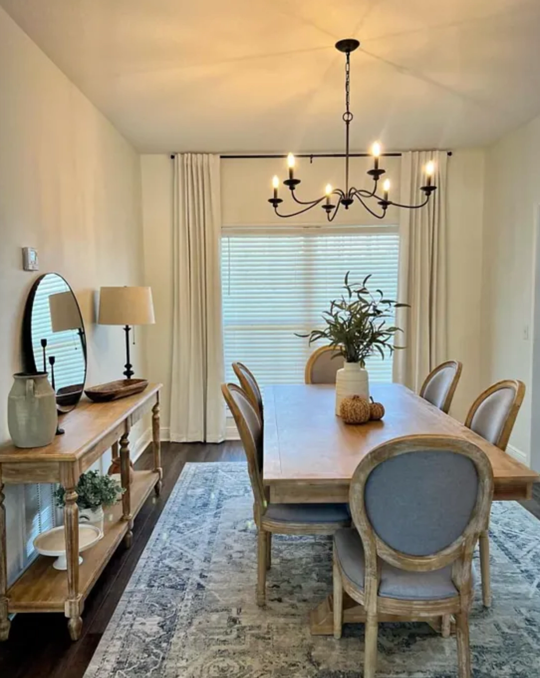
Under artificial lighting, Alabaster's beige undertone softens the brightness without pushing as yellow as Dover White. If your bulbs are very warm, around 2700K, it will still look creamier at night.
Matching Colors & Decor
The right white has to agree with the finishes you are not changing. Floors, counters, tile, stone, and trim matter more than the name on the swatch.
Dover White
Dover White's warm undertones make it a natural companion for warm palettes and earthy materials.
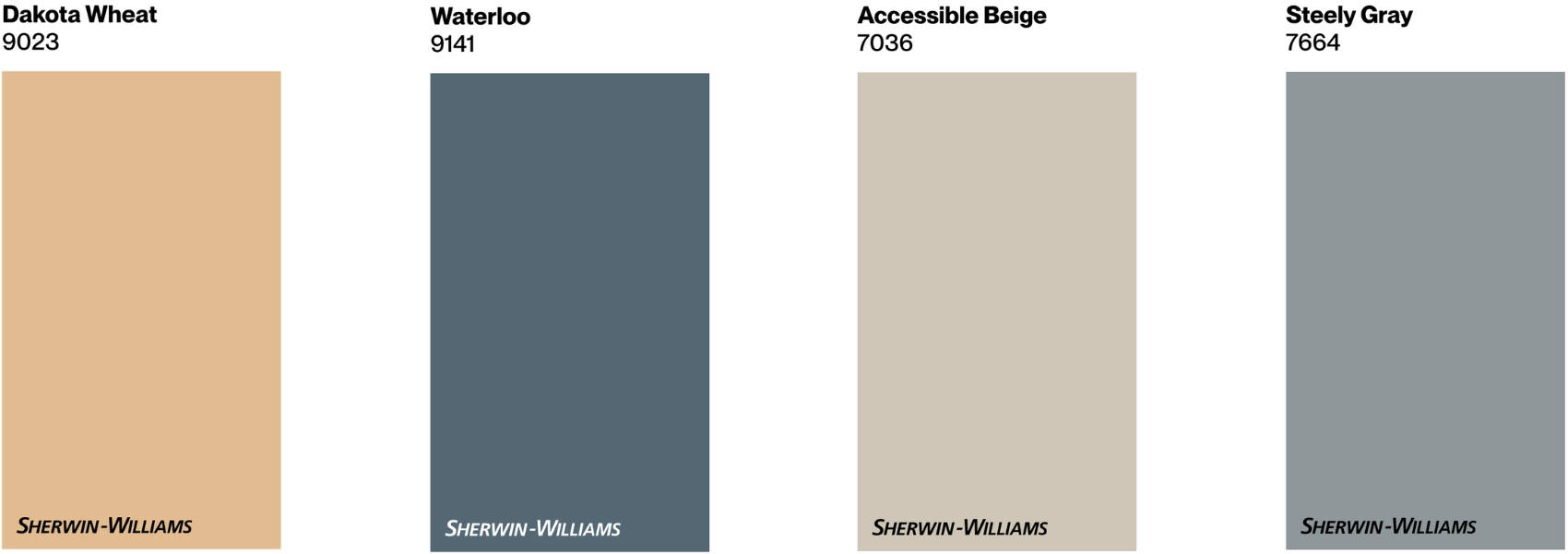
It plays well with earthy tones like SW 9023 Dakota Wheat and SW 9141 Waterloo. The shared warmth keeps the palette connected instead of making the white look accidentally yellow.
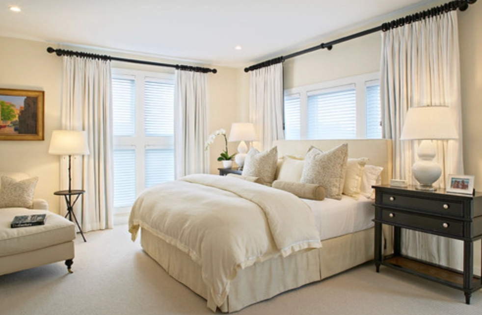
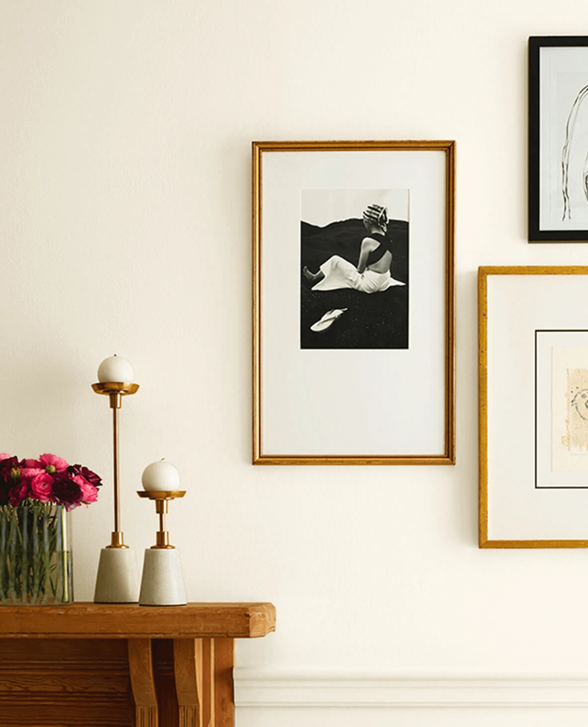
Dover White works well with natural textures like jute, rattan, and dark woods. It also pairs nicely with aged brass, warm stone, terracotta, and traditional wood furniture.
Pro Tip:
Dover White can be great on walls, but it is often too yellow for trim if the walls are a cleaner white or a cool neutral. For trim, compare it against a crisper white before you paint the whole house.
Alabaster
Alabaster works with a wider range of colors and decor styles because its warmth is softer.

It pairs beautifully with both cool and warm tones, from SW Sea Salt to SW Repose Gray and SW Urbane Bronze. That range is the main reason I would choose it over Dover White for many open-concept homes.
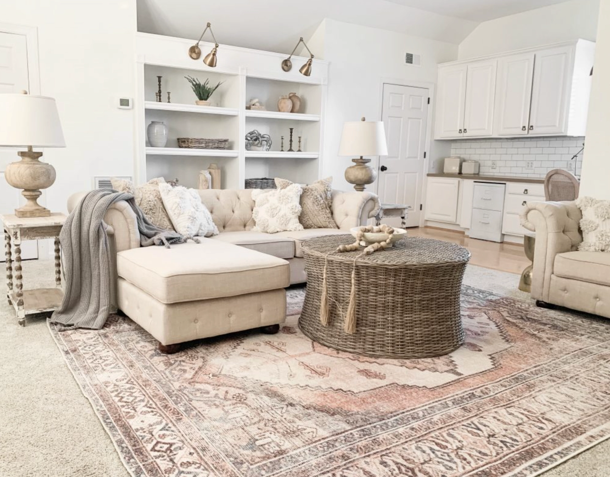
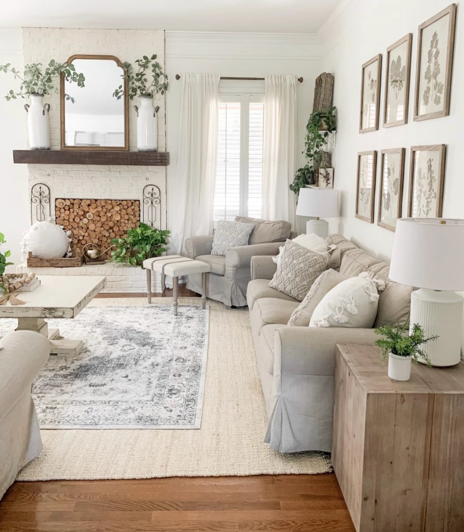
Alabaster complements creamy linen fabrics and natural wood tones equally well. It is a better backdrop when you want to change decor over time without repainting the shell of the room.
Which Should You Choose?
For most homes, I would choose Alabaster first. It gives you warmth without as much yellow, so it is easier to live with across different rooms and changing light.
Choose Dover White when your space is filled with warm woods and earthy textures, or when a north-facing room needs more warmth. It is the better pick for creamier cabinets, traditional rooms, and exteriors where a yellow-based white makes sense.
Choose Alabaster when you want the more flexible white. It is the better pick for open floor plans, mixed decor, kitchens with several finishes, and rooms where Dover White looks too creamy on the sample board.
My decision rule is simple: if you are worried about yellow, choose Alabaster. If you are worried the room will feel cold, sample Dover White. Put both samples next to your trim, flooring, and counters, then check them in morning light, afternoon light, and with your lamps on.

I'm Elizabeth, your go-to guide for all things paint and design! My days are filled with color swatches and innovative room makeovers. When I'm not painting the town - literally - I'm soaking up inspiration from my travels. This blog is my way of sharing my passion and making the world a more vibrant place, one color palette at a time.